
Job:03171 Title:Typography Referenced (Rockport)
Page: 46
030-051 03171.indd 46 9/22/11 4:25 PM
46
Typography, Referenced
Text
Job:03171 Title:Typography Referenced (Rockport)
Page: 46
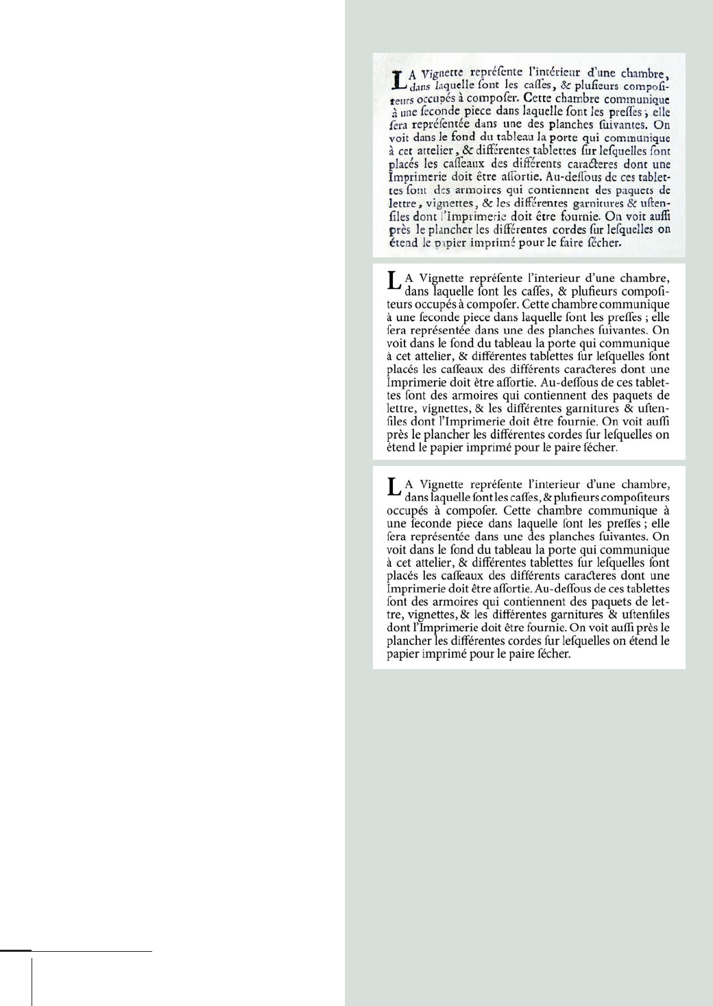
A well-spaced paragraph of foundry type, from the
Encyclopedie of 1754 demonstrates how an even
typographic texture makes a text readable even with
variations in the density of some letters, the horizontal
alignment on the x-height, and inconsistent inking
or pressure. In the digital versions, the top paragraph
is spaced to exactly match the letterpress example,
and the bottom one makes full use of InDesign’s
composer and spacing tools. The diff erences in texture
are modest. Both paragraphs have some rivers of
white. If anything, the lower paragraph is slightly
more cramped and overcompresses the space around
punctuation. The metal type preserves the minimum
amount of space to the left and right of letters, whereas
the digital version overcompresses some spaces.
A
lthough display typefaces (213)
are relatively straightforward
to space, spacing text typefaces
(212) can be extremely time-
consuming. It is not easy to describe how in
a few sentences, but careful examination of
good examples points to one basic rule and a
fundamental set of relationships. Here’s the
rule: The optimum average space between
typeforms depends on the relationship of the
vertical-stroke width and the width of the
counters in two-stroke forms (such as the n
and b), modifi ed by the optical size for which
the typeface is intended. Outside a relatively
narrow range, the x-height in relation to
the width of the stroke is also a factor. We
can easily imagine a system of interlocking
ratios that change with the modifi cation of
one of these variables.
Of course, this approach does not directly
answer how much space to leave between
letters; it only indicates a series of relation-
ships. The trick is to remember that a text
typeface is spaced for paragraphs, not indi-
vidual letter combinations. In other words,
the designer should aim for a specifi c density
in the texture. Well-spaced paragraphs tend
to have a minimum of a stroke width’s white
space (228) between round letters and pro-
portionately more between straight ones.
030-051 03171.indd 46 9/22/11 4:25 PM
Job:03171 Title:Typography Referenced (Rockport)
Page: 47
030-051 03171.indd 47 9/22/11 11:52 AM
47
Type Design and Development
Text
Job:03171 Title:Typography Referenced (Rockport)
Page: 47
T
he demand for typefaces with
extended character sets has
been growing steadily for many
years. Operating systems and
application interfaces must be capable
of displaying many languages. That
and the internationalization of publi-
cations as well as brands for products
and services means larger typeface
character sets. Today, a typical custom
typeface for a big brand may easily
extend to several thousand charac-
ters and span fi ve or more scripts.
Typefaces bundled with operating
systems and applications and custom
typefaces for brands are expected to cover
more than one script—and often three or
more. The current minimum for interna-
tional brands covers the wider European
region: Cyrillic, Greek, and extended
Latin. Increasingly character sets also
cover Arabic, Hebrew, and Indian scripts.
TYPE DESIGN AND DEVELOPMENT
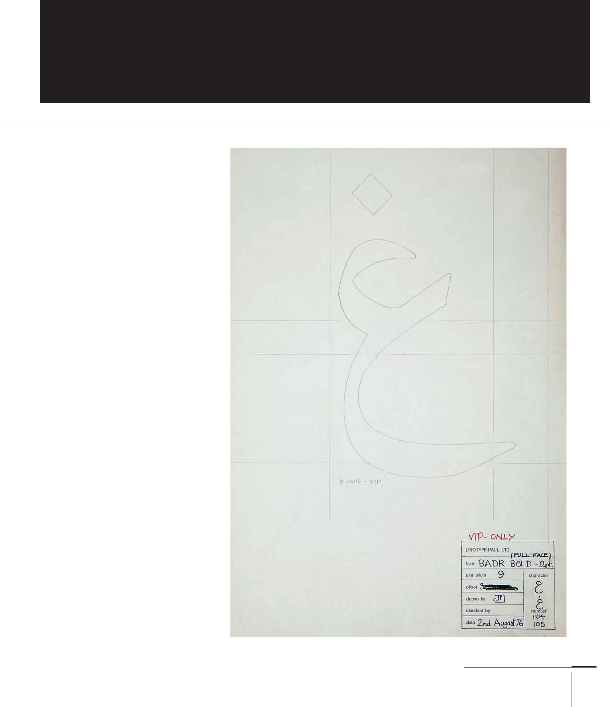
Character Expansion
This drawing for the
Linotype system from
shows a typeface still
in use in other formats
developed by a team of
designers. The type-making
process and the costs asso-
ciated mean that drawings
such as this encapsulate
signifi cant knowledge about
the typographic script.
030-051 03171.indd 47 9/22/11 11:52 AM

Job:03171 Title:Typography Referenced (Rockport)
Page: 48
030-051 03171.indd 48 9/22/11 4:28 PM
48
Typography, Referenced
Text
Job:03171 Title:Typography Referenced (Rockport)
Page: 48
Typeface design is linked to the limitations
of the typesetting environment. Most subsets of
the Latin script (simple, alphabetic, left-to-right
models) do not push the limits of a system based
on a simple structure of sequential rectangular
units. But this approach is strained by multi-
ple diacritics and collapses when the shapes do
not fi t in boxes or change shape in algorithmi-
cally complicated ways. As a result, typesetting
systems have had to be adapted, extended, and
even rewritten to accommodate the complexi-
ties of non-Latin scripts. Although designers do
design Latin typefaces with typesetting tech-
nology in mind, in many cases of non-Latin
scripts, they have had to modify their designs
quite drastically just to get the shapes to render.
In general, non-Latin scripts do not have the
full profusion in styles that arises from a com-
petitive publications market, as well as a culture
of constant text production. (It’s no surprise
that the language of display typography fi rst
developed in nineteenth-century Britain during
the Industrial Revolution.) This is gradually
changing, largely under the pressure of inter-
national branding and localized publications.
We are beginning to see rapid growth in new
typefaces for non-Latin scripts, and a growing
interest by typeface designers.
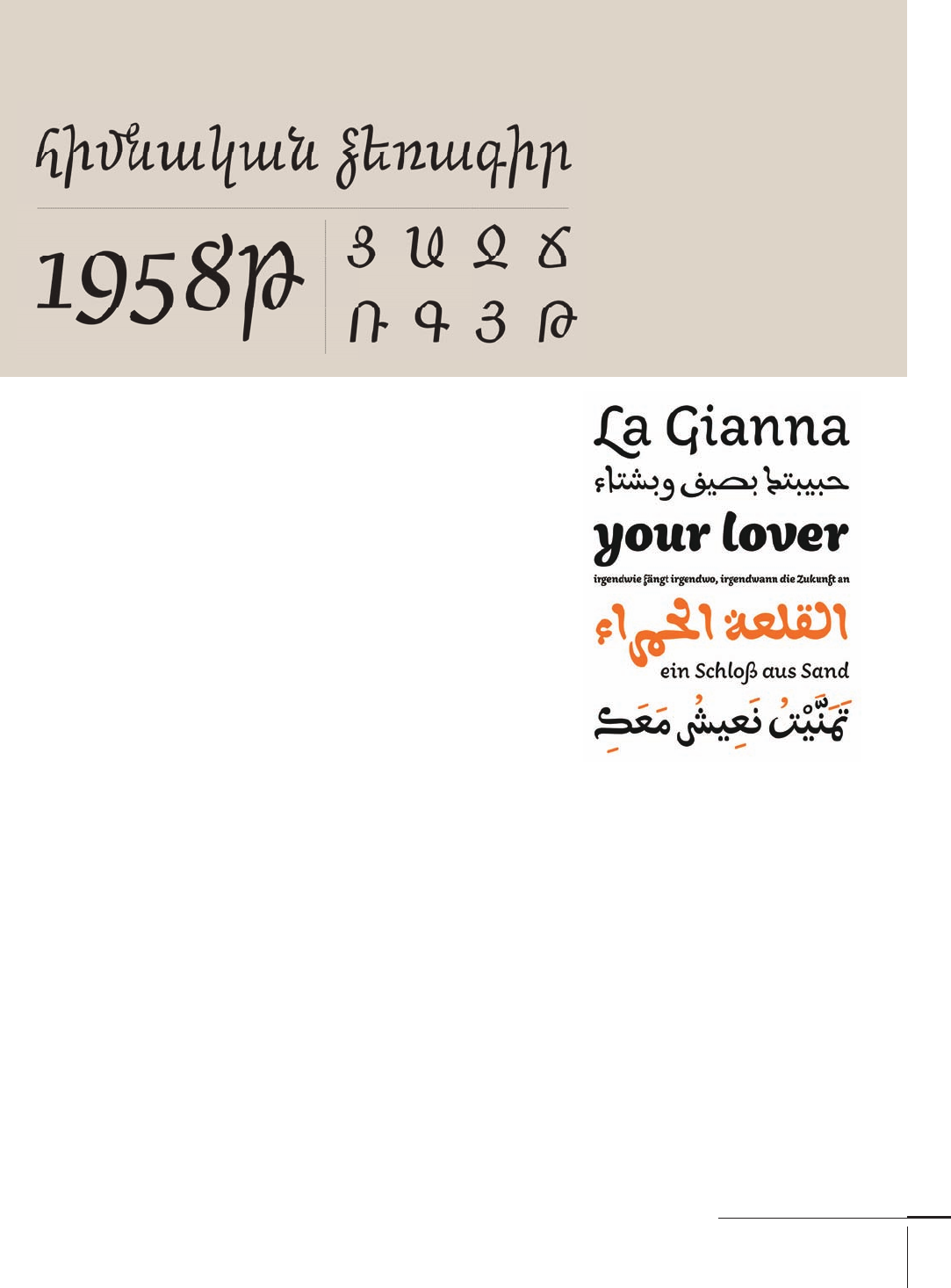
Three typeforms from the
Markant typeface exemplify
how similar proportions and
features can be integrated
within the constraints of
each writing model (italic
and upright Latin and Greek).
The Capucine family by Alice Savoie integrates
Latin and Greek text in magazines without
disrupting the texture of the paragraph. Despite
this, the typeforms for each script are developed
with sensitivity and do not appear derivative.
030-051 03171.indd 48 9/22/11 4:28 PM
Job:03171 Title:Typography Referenced (Rockport)
Page: 49
030-051 03171.indd 49 9/22/11 11:53 AM
49
Type Design and Development
Text
Job:03171 Title:Typography Referenced (Rockport)
Page: 49
Non-native Speakers
Can a non-native speaker design a
typeface for a language? A typeface
arises in response to a client’s brief,
which taps into wider design problems.
For example, many of the con-
ventions surrounding newspapers
apply regardless of the market; the
constraints on the typographic spec-
ifi cation can be deduced from the
general qualities of the script and the
language. Can the typeface include
hyphenation? How long are the words
and sentences? With what range
of word lengths? What is the edito-
rial practice in the region in terms of
article structure, levels of hierarchy
(), and headline composition?
Only after establishing the typo-
graphic environment can we examine
the written forms of the language
and the tools that have determined
the key shapes. In this matter most
scripts other than the Latin (and to
some degree Cyrillic) maintain a close
relationship between writing and
typographic forms. Writing exercises
and a structural analysis of examples
can help the designer develop a feel
for the script before reading the words.
More importantly, when working
with a language or alphabet that is
not his or her own, analysis of the
script’s structure and the relationship
between mark-making tools and type-
forms can help the designer to develop
criteria for evaluating quality.
Typographic history is well popu-
lated with designers excelling in the
design of scripts they could not read.
Encouraging students to address the
complicated design problems inherent
in non-Latin scripts is not only a way
of enriching the global typographic
environment, but also is a superb
means of producing designers who
can tackle a higher level of diffi culty
in any aspect of their design.
This is the italic style from Khajag
Apelian’s Arek typeface, a new
Armenian and Latin design and one of
the fi rst to introduce a more fl owing
style to the Armenian italic, hinting
at the scope of typographic invention
possible in non-Latin scripts.
Titus Nemeth’s Aisha typeface is
a new Arabic that draws on North
African infl uences and tradi-
tions. This area has been relatively
ignored by recent developments,
but promises a wealth of material
that can inform new designs.
030-051 03171.indd 49 9/22/11 11:53 AM
Job:03171 Title:Typography Referenced (Rockport)
Page: 50
030-051 03171.indd 50 9/22/11 11:53 AM
50
Typography, Referenced
Text
Job:03171 Title:Typography Referenced (Rockport)
Page: 50
E
xcellence in typeface
design can be diffi cult
to identify without
the perspective of
long-term review. Typefaces can
become prominent because they
embody a strong brand well or
capture the moment in terms
of their visual style. Typefaces
for important publications or
services are typical of the fi rst
kind (think Cheltenham [] for
the New York Times headlines, for
example) and Excoff on’s Mistral
of the second. Other typefaces
may become successful through
their wide use, even as designers
complain about their ubiquity.
(Times [] is a great example. It
has become, arguably, a meta-
typeface, existing in countless
versions and adaptations, but
its typographic feel is instantly
recognizable worldwide.) But
a capacity for discovery and
invention characterize the fi eld of
typeface design.
TYPE DESIGN AND DEVELOPMENT
Familiar Shapes,
New Interpretations
A typeface is a product of the applied arts: It embodies functionality and usability and has intrinsic
value through its utilization. On the most basic level, it allows encoding of textual meaning, but on
a higher level it allows expression of values such as association, style, identity, diff erentiation, and
beauty. This is the least tangible aspect of a typeface, but the one that most motivates designers.
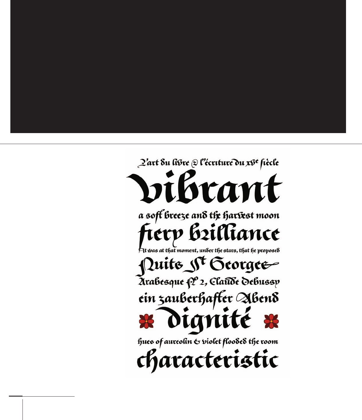
Tom Grace’s Givry is a
fresh take on the bâtarde
fl amande from the fi fteenth
century. This black-
letter is lesser known than
other heavy, pen-written
styles of the period but is
typographically more inter-
esting for the potential
of its fl owing strokes.
030-051 03171.indd 50 9/22/11 11:53 AM
..................Content has been hidden....................
You can't read the all page of ebook, please click here login for view all page.