Job:03171 Title:Typography Referenced (Rockport)
Page: 373
350-381 03171.indd 373 9/22/11 10:16 AM
373
Type-Specifi c Resources
Text
Job:03171 Title:Typography Referenced (Rockport)
Page: 373
gerine
www.jontangerine.com
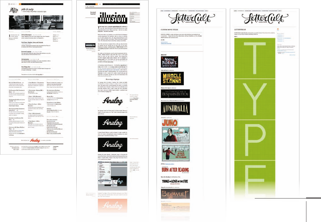
Jon Tan, who lives and works in Bristol, United Kingdom, is
a founding member of the Analog cooperative with other
members in San Francisco and New York. He is also the
cofounder of Web fonts service Fontdeck. His site is dedicated
mainly to the issues surrounding online typography and con-
tains numerous articles that provide useful tips to achieve the
best from fonts used within websites. There are also articles
that discuss more general issues surrounding typography such
as the correct use of quotation marks or the eff ects of reversing
type out of black or a color.
However, the thing that stands out across all articles posted
on the site is the level of cross-reference linking that Tan has
included. Every piece links to other sites that contain addi-
tional information about the subjects being discussed or refer
the viewer to the source material used to construct the original
article. This is another site big on words rather than extensive
imagery, and it is packed with useful content and some great
insights into the technical aspects of font use online.
LetterCult
www.lettercult.com
This great site is a one-stop shop for anything related
to custom lettering, and with its wealth of informa-
tion, is a wonderful source of inspiration. Brian Jaramillo
of Agency runs the site, which acts as a showcase for
anyone working with custom letters: type designers, sign
painters, graffi ti artists, calligraphers, poster artists,
and of course, typographers and graphic designers.
A principal feature of the site since March has been
its regular Alphabattles during which Jaramillo invites con-
tributors to post their custom letter designs for each alphabet
letter. At the time of this writing, the alphabattle for Z just fi n-
ished and the site was about to start on numbers. The results
are fascinating and incredibly diverse, and every contribu-
tor provides a link to his or her own site, creating a practically
endless trail to more lettering inspiration. Other tabbed sec-
tions include Letterstream, a collection of cherry-picked
letterforms, Custom Logos, Custom Movie Titles, and Custom-
Other, which contains some of the most interesting content
on the whole site. It’s a real gem for custom-lettering fans.
350-381 03171.indd 373 9/22/11 10:16 AM

Job:03171 Title:Typography Referenced (Rockport)
Page: 374
350-381 03171.indd 374 9/22/11 10:16 AM
374
Typography, Referenced
Text
Job:03171 Title:Typography Referenced (Rockport)
Page: 374
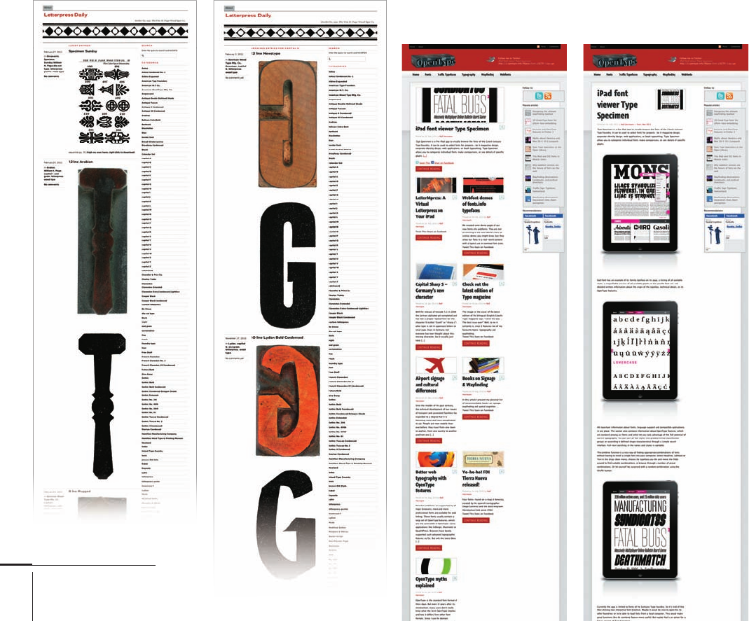
Letterpress Daily
www.letterpress.dwolske.com
For those who like everything wood type, this site is heaven.
David Wolske, cofounder of design company and letterpress
printer Smart & Wiley, lovingly puts together Letterpress
Daily. The premise is simple: Each day, Wolske posts a large
photographic image of a block of wood type selected from his
expanding collection, with the printed image from the block
beneath. He adds a short identifi er caption and occasionally a
little more information about the history of the typeface.
Viewers can access every individual post archived on the site
by using the list of tags. Search either by name of typeface or by
letter shown, for example all capital A’s; numbers ’s, and so on.
He also includes an extensive list of links to other letterpress
and wood type–related sites.
Ralf Herrmann: Wayfi nding
and Typography
www.opentype.info/blog
The blog of German designer and author Ralf Herrmann has
much to say about signage and wayfi nding, which undoubtedly
has much to do with the fact that as of this writing, Herrmann
is writing a P.h.D. dissertation that covers his investigation into
the implications of cognitive map research applied to the design
of maps and wayfi nding systems.
The result is useful pointers for anyone involved or inter-
ested in typography for traffi c signage and wayfi nding signage
for public spaces such as airports or shopping malls. He also
includes informative content discussing the diff erences
between font formats, font design in general, and the increas-
ingly important topic of Web fonts and Web font services; for
example, a well-constructed article explaining the myths sur-
rounding the OpenType format.
350-381 03171.indd 374 9/22/11 10:16 AM

Job:03171 Title:Typography Referenced (Rockport)
Page: 375
350-381 03171.indd 375 9/22/11 10:16 AM
375
Type-Specifi c Resources
Text
Job:03171 Title:Typography Referenced (Rockport)
Page: 375
RockPaperInk
rockpaperink.com
The people behind this new design blog are also the people
behind this book. Rockport has been in the business of
publishing books about design for many years so know a
thing or two about the subject. The site is billed as a place for
“inspiration, ideas, and opinions from design fanatics” and,
despite the short timespan since the site launched, it certainly
promises to fulfi ll this criteria. Much is covered by the regular
columnists drawn from the ranks of Rockport’s authors, and
whilst the content isn’t typography specifi c, Jason Tselentis’s
“Points, Pixels, Paper” column does focus on all things
typographic. The emphasis throughout the site is on interaction,
with numerous opportunities to add your own comments or
even contribute material.
Type Directors Club Online
ww.tdc.org
This site provides an online presence for the Type Direc-
tors Club () (), a New York–based organization that
operates internationally to encourage and support typo-
graphic excellence in print and on screen. The , founded
in by a group formed from the leading typographers
of the day, boasts a venerable history. The group off ers
membership and its benefi ts via an annual paid subscrip-
tion. It also holds two competitions per year, one for use
of typography in design, the other for typeface design.
The site itself is designed to promote the Club’s activities,
but also carries a range of articles and book reviews cover-
ing all things typographic. Anyone can access this material.
For anyone interested in becoming a member of the Club, the
site is obviously a must-read. If not, it’s likely still well worth
bookmarking as the articles off er a good insight into industry
opinions of the moment’s best typographic practices.
350-381 03171.indd 375 9/22/11 10:16 AM

Job:03171 Title:Typography Referenced (Rockport)
Page: 376
350-381 03171.indd 376 9/22/11 4:56 PM
376
Typography, Referenced
Text
Job:03171 Title:Typography Referenced (Rockport)
Page: 376
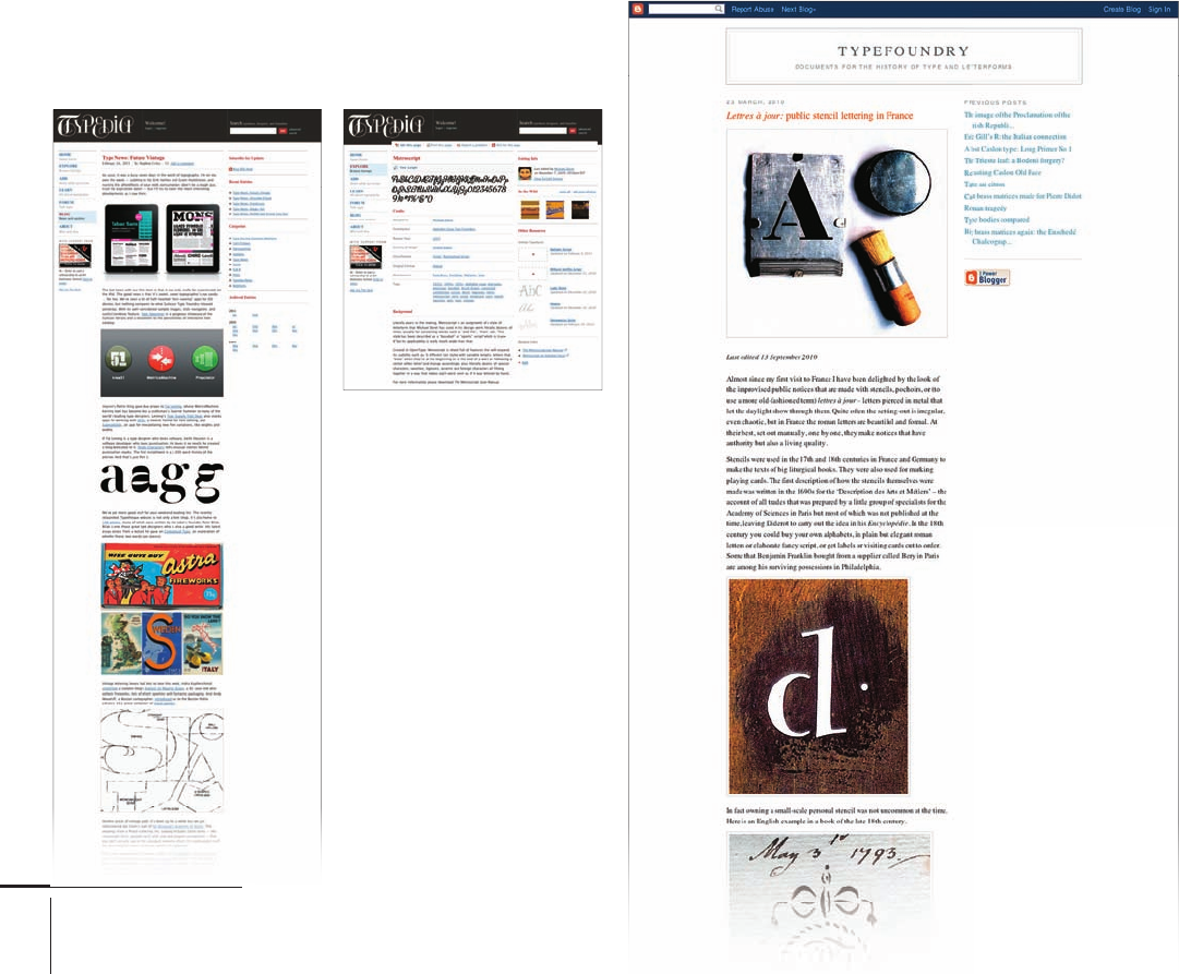
Typed ia
www.typedia.com
Typedia is like Wikipedia for typography. Several
individuals act as moderators for the site, but essentially it
is a community site for typographers that anyone can join
and to which anyone can contribute. The aim is to provide
a facility for designers to use to classify, identify, and
discover typefaces. It also aims to educate people about
how a typeface originated, who designed it, when and
where it was designed, and why it looks the way it does.
Apart from the typeface browser, which uses common
typographic terms to facilitate easy searches for groups of
typefaces with similar attributes, there is a learning section
with a glossary of typographic terms, plus a section explaining
the anatomy of type. There is also a lively forum and a blog
updated regularly with all manner of type-related articles.
The site is growing all the time as new users sign up and add
their own material. There are inevitably gaps in the content
(just like with Wikipedia), but the site is already so richly
populated with information that one can easily forgive this.
Typefoundry
www.typefoundry.blogspot.com
The fi rst thing a reader fi nds on this blog is its author,
James Mosley, owning up to the fact that, at the time of writing
at least, the blog contains just thirty-fi ve posts. However,
each post already on the site takes the form of a well-written
illustrated essay.
The posts cover a wide range of subjects, from an extensive
guide to the present location of typographical punches, matri-
ces, drawings, type specimens, and archives, to an examination
of the various lettering styles used to paint the “10” on the front
door of 10 Downing Street, home of the United Kingdom’s Prime
Minister. Despite being engagingly personal in their approach,
the posts are well-researched and packed with historical points
of reference of interest to anyone who enjoys reading about the
history of type and letterforms.
350-381 03171.indd 376 9/22/11 4:56 PM

Job:03171 Title:Typography Referenced (Rockport)
Page: 377
350-381 03171.indd 377 9/22/11 10:16 AM
377
Type-Specifi c Resources
Text
Job:03171 Title:Typography Referenced (Rockport)
Page: 377
Typeradio
www.typeradio.org
Visually, this site has little to off er. But the URL gives away the
fact that visuals are not the site’s forte. Typeradio is a specialist
radio channel about type and typographic design. It’s is a Micro
FM broadcast, an MP Internet radio stream, and a podcast
station that has been on air regularly since . The indi-
viduals behind the site, Donald Beekman, Liza Enebeis (a.k.a.
LoveLiza), and pan-European design collective Underware (),
are based in The Netherlands and Finland.
To collect material for their broadcasts, these three attend
various design events around the world to meet and talk to
designers and typographers. New material appears with sur-
prising regularity considering the obvious challenges the
team faces to get it. For those who do happen to work their way
through all the recent broadcasts, the channel also keeps an
extensive archive of material in which the big names of design
(Stefan Sagmeister, Paula Scher, Bruno Maag, to name a few) rub
shoulders with some new names.
typo/graphic posters
www.typographicposters.com
This site is pure inspiration, and there is plenty of it to go
around, with more than directories containing multiple
examples of each contributing designer’s work. The site aims to
provide a “timeless source for studies, inspiration, and promo-
tion of good design through poster culture and cultivation of
typography and pure forms of graphic design,” according to the
site’s creator André Felipe. It really does deliver quality visuals
that are a feast for the eyes.
The site is nicely put together with a variety of viewing
options such as grid or list view, plus the ability to change the
background color. (This is surprisingly useful when looking at
posters with dark or light backgrounds.) Also, using the free
navigation option, a viewer can use the mouse to scroll freely
around each profi le window rather than having to constantly
click a button to move between posters.
350-381 03171.indd 377 9/22/11 10:16 AM
..................Content has been hidden....................
You can't read the all page of ebook, please click here login for view all page.
