
Job:03171 Title:Typography Referenced (Rockport)
Page: 207
206-233 03171 C2.indd 207 10/12/11 10:09 AM
Text
Job:03171 Title:Typography Referenced (Rockport)
Page: 207
207
Typographic
Principles
By Jason Tselentis
D
esigning with type is as
much a science as an art,
requiring a delicate balance
between all items in the
format to deliver appropriate and func-
tional solutions. Designers who rely
“purely on instinct” often have the benefi t
of years of experience, and thanks to
their training, can call on formal quali-
ties and aesthetic conditions that have
worked well for them in the past.
Contrasts (230) in size, shape, tone,
placement, and color all factor into
how elements placed in the format
look. Being visually literate allows the
designer to give words and images shape,
bringing it all together as a composition
created within the required format.
Designing with type requires not only
an understanding of what makes a serif
and what makes a sans serif, but also a
working knowledge of their use and even
a small appreciation of the individual
attributes that make one font diff erent
from another, as well as how they interact
when placed together.
And what about style? Good typo-
graphic expression is an art, but it is
also, without question, based on princi-
ples. Designers may use knowledge and
experience to design works that evoke a
particular period, place, person, or move-
ment. Often, they will do so to further the
communicative message required. Many
intentionally take liberties and break the
rules to create stylistic marvels for the
client’s interest, the audience’s, and their
own. But one of the most valued typo-
graphic principles deals with purpose,
and more specifi cally function.
Designing a book requires a fair
amount of restraint as well as respect for
the divine principles that book designers
have used for centuries. And readability
(330) should take precedence. Creat-
ing a gigantic billboard, for example,
calls for larger typography than a book
designer employs. And then of course,
there are the delicate niceties, much like
stylistic guidelines that writers follow.
There’s a saying that goes, “If all you
have is a hammer, everything looks like
a nail.” This holds true for the designer.
If all a designer knows is a handful of
principles, then all a designer can create
is a handful of solutions. This chapter
may not include every rule, but knowing
as many rules as possible helps designers
expand their toolbox and decide what
to use, and when.
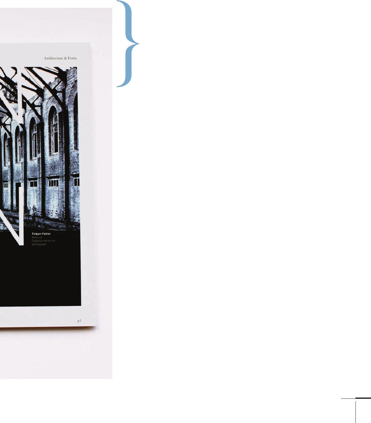
Westminster School’s Vision magazine,
2Creatives, United Kingdom
206-233 03171.indd 207 9/24/11 10:58 AM

Job:03171 Title:Typography Referenced (Rockport)
Page: 208
206-233 03171.indd 208 9/23/11 5:23 PM
Text
Job:03171 Title:Typography Referenced (Rockport)
Page: 208
208
Typography, Referenced
Design employed a dark
contrast black type to make
the lettering pop and read
on the yellow background
of the News Corporation
Dow Jones offi ce space.
This sign at
Snoqualmie Falls by
Lehrman Cameron
Studio uses not just
one type size, but
many, to delineate
information levels for
the reader. Large sizes
pull them in, medium
sizes give deep infor-
mation, and a third
level provides map
information.
206-233 03171.indd 208 9/23/11 5:23 PM

Job:03171 Title:Typography Referenced (Rockport)
Page: 209
206-233 03171.indd 209 9/23/11 5:23 PM
Text
Job:03171 Title:Typography Referenced (Rockport)
Page: 209
209
Typographic Principles
The offi ce of /Michael Osborne Design
created a predominantly image-based poster,
but gets the reader’s attention by placing
the headline in an off -angled element.
In her fl attened “Elevate” poster, designer Kelly Salchow
MacArthur willfully pulls the reader’s gaze to the start of the
word “elevate,” and then back to the composition’s top.
Creative’s T-shirt include a wealth
of typographic information, but each
typeface denotes designers by nationality—
British, French, German, Dutch—using
typefaces from the respected countries.
206-233 03171.indd 209 9/23/11 5:23 PM

Job:03171 Title:Typography Referenced (Rockport)
Page: 210
206-233 03171.indd 210 9/23/11 5:23 PM
Text
Job:03171 Title:Typography Referenced (Rockport)
Page: 210
210
Typography, Referenced
Format
Designers fi rst take note of the size and proportion of the page or screen in which they will work. And although
every format has edged boundaries that contain design elements, that shouldn’t limit creative opportunities.
U.S. Page Sizes
The base size for printing in the United States is the
broadsheet measuring inches (. . cm).
Half of a broadsheet is called tabloid size at
inches (. . cm). A quarter of a broadsheet is
called letter size, which is . inches (. .
cm). .. printers base many of their page sizes on
the letter-sized proportion that sometimes measures
inches (. . cm). Smaller sizes derived
from the letter sizes include:
•
.
. inch (. . cm)
•
inch (. . cm)
Of the four listed above, the . . inch
(. . cm) sheet measures closest to the “divine
proportions” found in the golden section of :.
(see “The Golden Section” at right for details).
Many .. page
sizes derive
from the propor-
tion of the
letter-page size
of . inches
(. . cm),
expandable to
the tabloid size
of inches
(. . cm).
. Letter Sheet
Tabloid Sheet
The System allows each format to be halved,
with the resulting format in the same proportion.
206-233 03171.indd 210 9/23/11 5:23 PM
TYPOGRAPHIC PRINCIPLES
Job:03171 Title:Typography Referenced (Rockport)
Page: 211
206-233 03171.indd 211 9/23/11 5:23 PM
Text
Job:03171 Title:Typography Referenced (Rockport)
Page: 211
211
Typographic Principles
The Golden Section
In Western cultures, the golden section refers to this ratio between two numbers: :.. It has also been
represented as a:b b:(ab). The proportion has been used since ancient times, even identifi ed in ancient Greek
architecture and art. It is said to create harmonious relationships between graphic elements placed on the page,
and it has been used for the express purpose of generating printed formats for books, posters, and brochures.
ISO Formats
Designers and printers outside of the United States use
the International Standards Organization () format system.
Nobel laureate Wilhelm Ostwald proposed a ratio of to
the square root of , yielding a :. ratio across all paper
sizes. When any sheet is halved, the resulting sheet remains
the same ratio.
Unlike .. measuring systems, the system relies on
metric measurements. The A sheet is . . inches
(. x . cm). Smaller sizes include:
•
A sheet, .
. inches (. . cm)
•
A sheet, . . inches (. . cm)
•
A sheet . . inches (. . cm)
•
A sheet . . inches (. . cm)
It continues up to A. Other series exist in the system
including the B sheet, . . inches (. .
cm), and C sheet, . . inches (. . cm).
Not only does the system allow for reproduction of the
:. ratio when pages are halved, but it also relies on the
mathematical nicety of the metric system based on tenths,
hundredths, and thousandths, whereas the .. system uses
inches, with diffi cult-to-delineate sixteenth proportions.
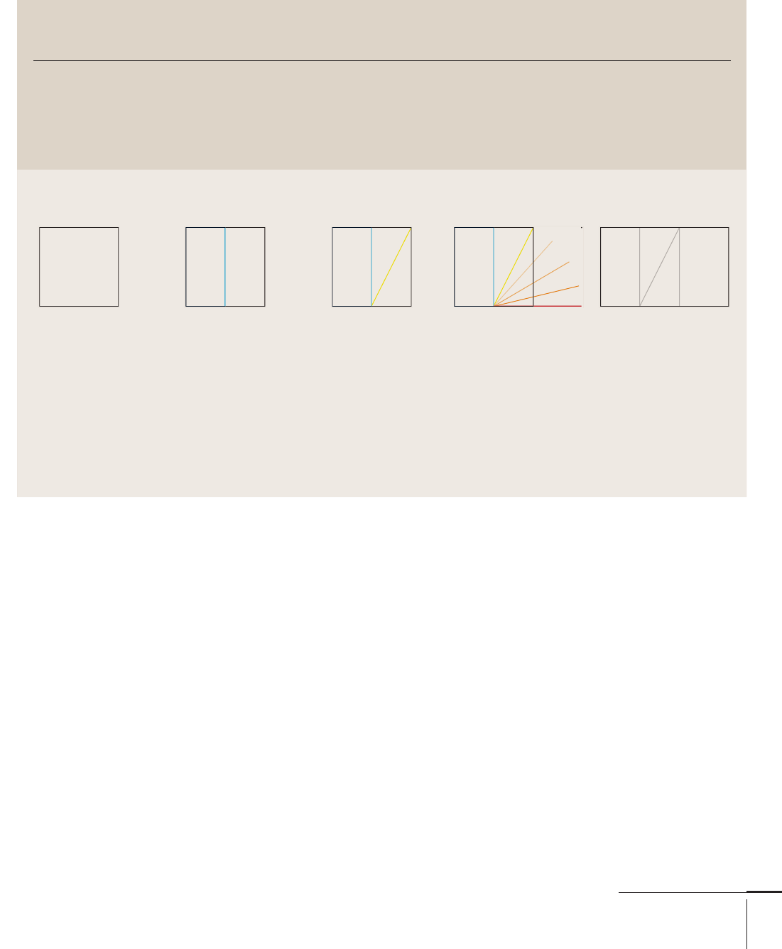
Here’s the process for building a golden section:
Begin by drawing a
square of any size.
Bisect the square
down the middle.
Draw a line
from the bottom
left corner of
the bisection
to the upper
right corner (as
indicated by the
yellow line).
Rotate the line down to
the square’s baseline.
Draw a vertical line up
from the new baseline to
the top of the square, then
left toward the square
to close the new form.
This is a golden section.
206-233 03171.indd 211 9/23/11 5:23 PM
..................Content has been hidden....................
You can't read the all page of ebook, please click here login for view all page.