
Job:03171 Title:Typography Referenced (Rockport)
Page: 217
206-233 03171.indd 217 9/23/11 5:24 PM
Text
Job:03171 Title:Typography Referenced (Rockport)
Page: 217
217
Typographic Principles
Focal Point Enhancements
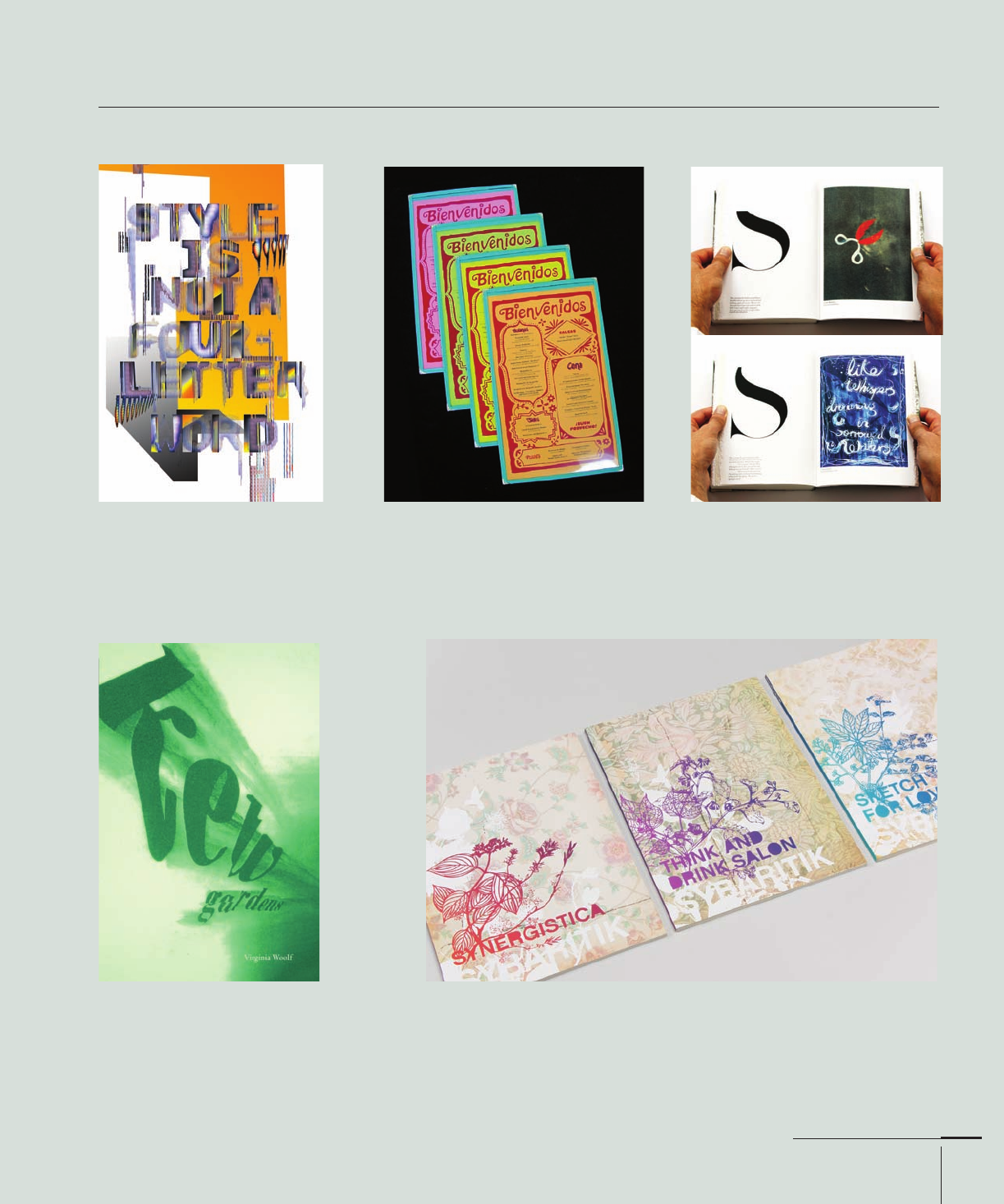
Other types of formal contrast that enhance focal point include, but are not limited to:
ACTIVE/STATIC
Anton Jeludkov’s “Form Is Style” poster
places hyperactive text on top of a static,
solid color to help legibility. York Univer-
sity Department of Design, Canada.
GROUPING/SEPARATION
These colorful restaurant menus contain
food dishes in separately boxed cate-
gories, but a friendly greeting sits
isolated at the top to welcome patrons.
AdamsMorioka, Inc., United States.
SEQUENCE/RANDOMNESS
As the letter S slowly disintegrates, new
images appear on the reader’s right,
delivering the predicable and unpre-
dictable. Creatives, United Kingdom.
FLAT/DEEP
Shayna Lauer’s book cover places the
title within a deep space setting, with the
author’s name sitting fl atly and quietly
as a line of white type. York Univer-
sity Department of Design, Canada.
ECONOMY/INTRICACY
Juxtaposing the linear titles amid a wash of ornamental and textured
graphics and backgrounds helps maintain a sense of order for the reader
to fi nd and read each book’s title. Jeff Domke, United States.
206-233 03171.indd 217 9/23/11 5:24 PM
Job:03171 Title:Typography Referenced (Rockport)
Page: 218
206-233 03171 C2.indd 218 10/12/11 10:10 AM
Text
Job:03171 Title:Typography Referenced (Rockport)
Page: 218
218
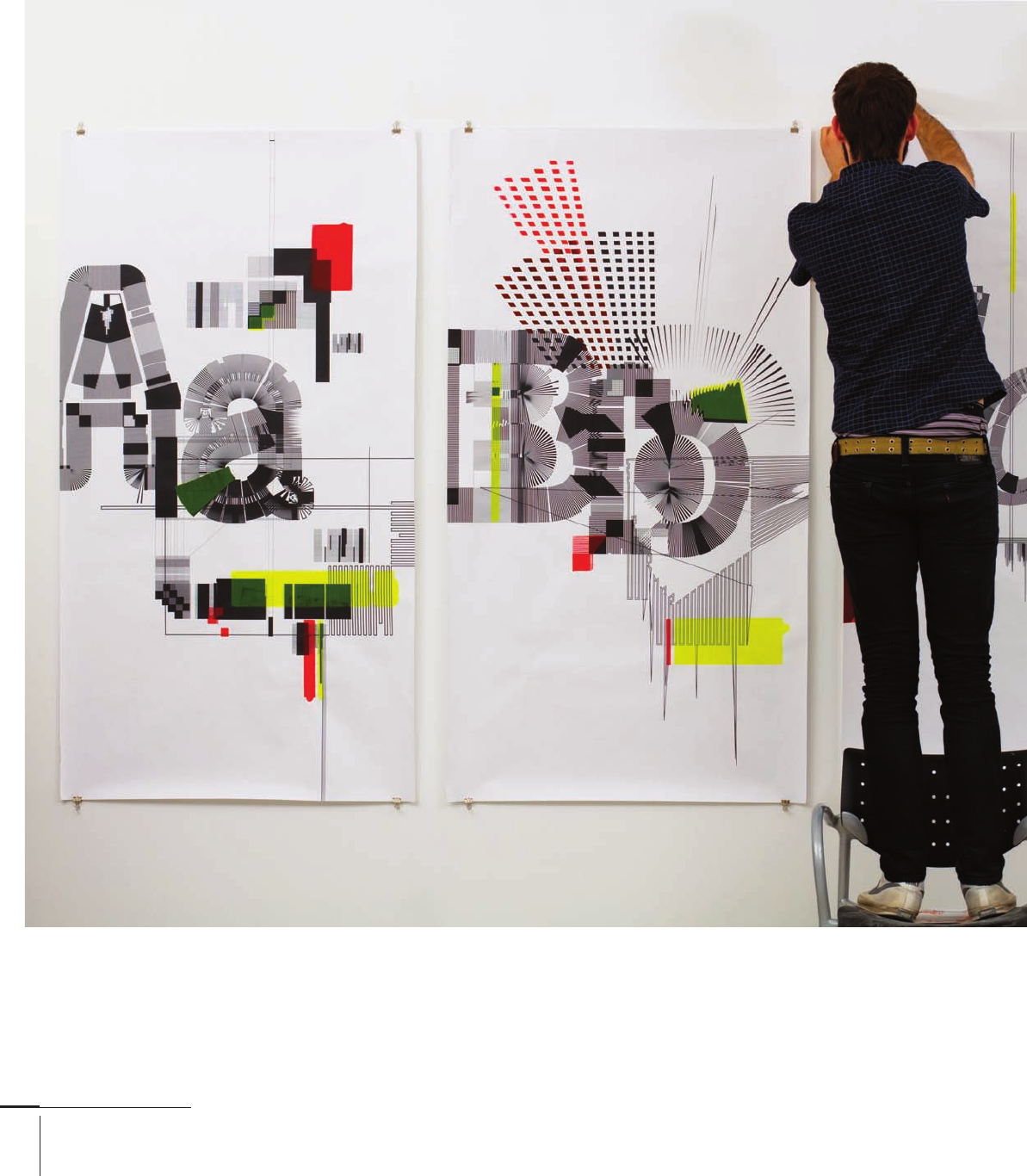
Typography, Referenced
Large letters punch forth from an array of textures,
radiations, and spatial illusions. In each case,
the letterforms serve as the binding element that
connects the graphics to the composition, gluing
it all together logically. Anton Jeludkov, York
University Department of Design, Canada.
206-233 03171.indd 218 9/23/11 5:24 PM
Job:03171 Title:Typography Referenced (Rockport)
Page: 219
206-233 03171 C2.indd 219 10/12/11 10:10 AM
Text
Job:03171 Title:Typography Referenced (Rockport)
Page: 219
219
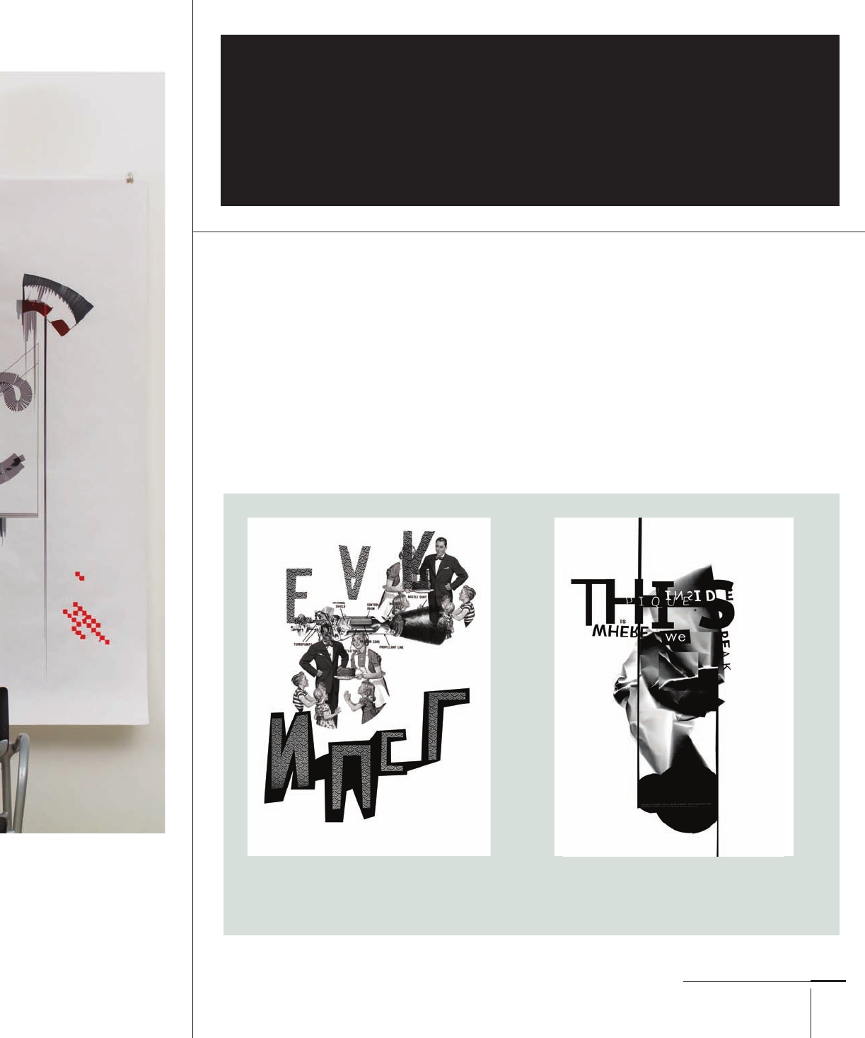
Typographic Principles
I
f you ask several designers how they go
about initiating the composition process
of laying down an element or elements on
a format, you’ll likely receive a wealth of
answers. This is especially true if you ask a cross-
section of designers who work in a variety of media.
Most would likely say they begin by building
a grid (). Chances are, however, that some of
them think image fi rst, perhaps laying down the
primary photograph or illustration upon which
the rest of the typographic information delineates.
Working in this manner can have its benefi ts, espe-
cially when a photograph or illustration has to be
a primary element. But even when an all-typo-
graphic layout is necessary, freely positioning
elements within the format can create exciting and
dynamic compositions.
What this layout lacks in terms of gridded order it makes
up for in the diagonal relationships created by the
lines of type and collaged photographs. Kevin Paolozzi,
York University Department of Design, Canada.
TYPOGRAPHIC PRINCIPLES
Free Placement
A mass of typography sits at the composition’s
top, intersecting the vertical image that demon-
stratively sits in the center. Kevin Paolozzi, York
University Department of Design, Canada.
206-233 03171.indd 219 9/23/11 5:24 PM

Job:03171 Title:Typography Referenced (Rockport)
Page: 220
206-233 03171.indd 220 9/23/11 5:24 PM
Text
Job:03171 Title:Typography Referenced (Rockport)
Page: 220
220
Typography, Referenced
S
imply put, the grid is a tool that
allows a designer to create com-
positions with some semblance
of unity () and variety ().
Diff erent grid structures already exist;
designers can use these default settings
imposed by software or create their own
grid system using columns or modules.
The number of modules, columns, and
rows is not clearly or defi nitively set,
but during a grid’s creation, designers
should consider at least these elements
of the project:
•
media
•
format
•
use
•
image size
•
typographic scope
•
word count (or lack thereof)
•
expandability
A traditional-looking and perfect-
bound book could benefi t from single
left- and right-page columns to make
text fl ow easily. With magazines, it’s
important to know where the gutter (the
center margin) sits and how much the
paper will creep toward the binding’s
center. And website grids often take
on a fl exible and dynamic nature, with
their hierarchical structures allowing
modules to morph in shape when
viewed on screens of diff erent sizes, for
example, a large computer monitor or a
phone’s small screen.
Teresa Yung designed these spreads from her book Pills with simple
grid structure to bind imagery and text across each spread. This under-
stated visual connection connotes a sense of sterility akin to the materials
presented. Teresa Yung, York University Department of Design, Canada.
Sara Cwynar’s
Kitsch Encyclopedia
opens with large,
heroic images fi lling
the pages’ single
columns, as well as
carrying over the
entire spreads.
The bonus, full-color
insert is a book within
a book that uses its
own grid structure.
Sara Cwynar, York
University Department
of Design, Canada.
Later in the book,
when headline and
text content arrive,
a two-column grid
layout allows for
more varied compo-
sitional play.
TYPOGRAPHIC PRINCIPLES
The Grid
206-233 03171.indd 220 9/23/11 5:24 PM
Job:03171 Title:Typography Referenced (Rockport)
Page: 221
206-233 03171.indd 221 9/23/11 5:24 PM
Text
Job:03171 Title:Typography Referenced (Rockport)
Page: 221
221
Typographic Principles
Anatomy of a Grid
Grid Types
The Cartesian grid system uses hor-
izontal lines across an X-axis that
intersects vertical lines on the Y-axis.
These intersecting lines create
individual modules that provide
a framework in which designers
can insert words and images. Each
module becomes part of a larger
system, such as columns and rows
(for example, fi ve modules makes
up one column). That larger system
becomes a tool—rather than a hin-
drance—for relating visual elements
to each other. When used success-
fully, the tool can help designers
achieve compositional unity and
variety, as well as functionality.
BOOK AND MANUSCRIPT GRID
Grids used for books and manu-
scripts typically have the fewest
complexities, but constructing
them takes time and forethought.
Because books are usable, highly
interactive pieces of design,
proportional relationships should
happen between the inside, outside,
top, and bottom margins, such
that readers can grasp the book’s
pages without obscuring the text
they’re reading.
Traditionally, book-length works
have one text column per page and
allow enough room at the top and
bottom for page numbers, author
name, and title. Giving readers
enough room at the left and right
sides to hold the book is also a
functional measure to consider.
COLUMNAR GRID
Columnar grids can have any
number of vertical divisions across
the format, with as few as one per
page. Though fewer fl owlines (hori-
zontal lines) across each page make
columnar grids less fl exible, the
decision-making and layout pro-
cesses become much easier for the
designer. This example shows how
the blocked tan-colored content
could sit in a full-column length
() or be broken into separate ele-
ments ().
MODULAR GRID
A series of horizontally and verti-
cally aligned modules create the
structure on which text and image
can reside.
Top Margin
Bottom Margin
Top Margin
Bottom Margin
Vertical IntervalGutter
Column
Left Margin
Right Margin
Module
Flowline
Horizontal
Interval
206-233 03171.indd 221 9/23/11 5:24 PM
..................Content has been hidden....................
You can't read the all page of ebook, please click here login for view all page.