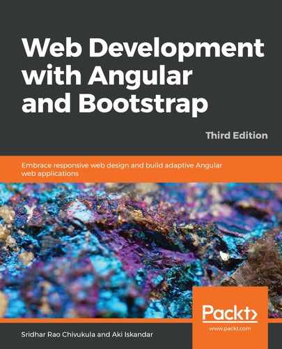
The first wireframe we will implement using the Bootstrap components and grid layout is the Welcome home page.
Take a look at the following wireframe screenshot. We have a header section that contains our application logo placeholder, navigation menu, and Login and Try Now buttons on the right. This is followed by a jumbotron header that showcases the title of the application. Then, our content sections are divided so that we can add our content to the page:

We will now proceed to implement our code implementation of the preceding wireframe screenshot. We are first going to implement the header section, and we will use the <nav> tag to categorize all of our header section code, including the logo, menu, and action buttons:
<nav class="navbar navbar-default navbar-fixed-top">
    <div class="container">
        <div class="navbar-header">
            <button type="button" class="navbar-toggle"
              data-toggle="collapse" data-target="#myNavbar">
                <span class="icon-bar"></span>
                <span class="icon-bar"></span>
                <span class="icon-bar"></span>
            </button>
            <a class="navbar-brand" href="#myPage">Logo</a>
        </div>
        <div class="collapse navbar-collapse" id="myNavbar">
            <ul class="nav navbar-nav mr-auto">
                <li><a href="#features">Features</a></li>
                <li><a href="#pricing">Pricing</a></li>
                <li><a href="#about">About</a></li>
            </ul>
        </div>
        <div class="collapse navbar-collapse ">
            <ul class="nav navbar-nav navbar-right">
                <li><a href="#features">Login</a></li>
                <li><a href="#pricing">Try Now</a></li>
            </ul>
        </div>
    </div>
</nav>
In the preceding code, we are implementing a nav tag element and using the Bootstrap navbar classes, navbar-default, navbar-fixed-top, navbar-brand, navbar-collapse, and so on. These classes come with default functionality that covers almost all aspects of a navigation section. One of the interesting things to note in the preceding code is the navbar-collapse class, which helps in rendering various device screen resolutions automatically. We have also added a few menu links for features, pricing, and about. We have also added our action items, Login and Try Now.
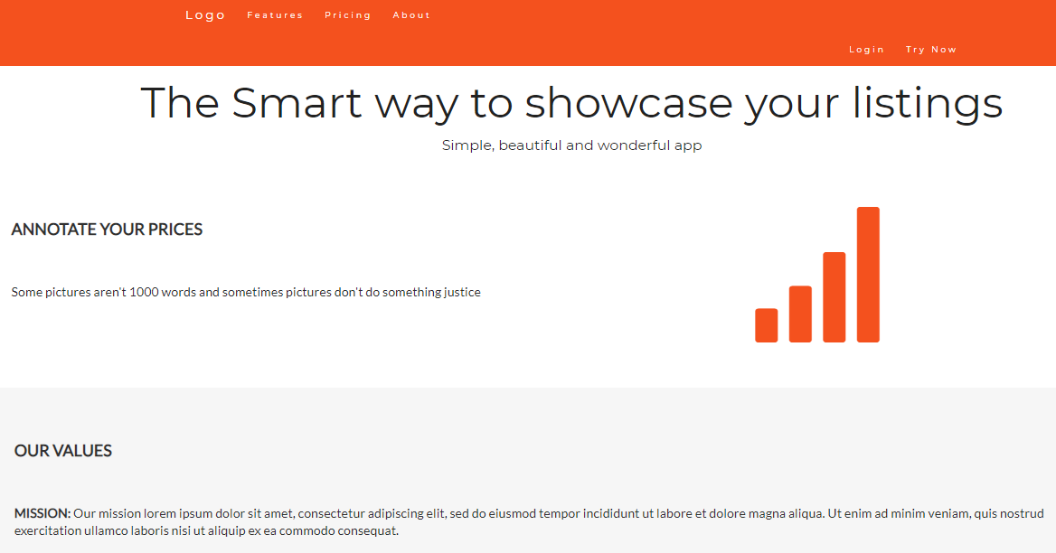
Launch the page in the browser and we should see the output, as shown in the following screenshot:

Next, we have to make our layouts for the content sections. The jumbotron and content sections. We will use the jumbotron class with a div section and, for the content sections, the Bootstrap grid column classes, row, col-sm-8, and col-sm-4:
<div class="jumbotron text-center">
 <h1>The Smart way to showcase your listings</h1>
 <p>Simple, beautiful and wonderful app</p>
</div>

<!-- Container (About Section) -->
<div id="about" class="container-fluid">
 <div class="row">
 <div class="col-sm-8">
 <h2>Annotate your prices</h2><br>
 <h4>Some pictures aren't 1000 words and sometimes pictures
     don't do something justice</h4><br>
 </div>

 <div class="col-sm-4">
 <span class="glyphicon glyphicon-signal logo"></span>
 </div>
 </div>
</div>

<div class="container-fluid bg-grey">
 <div class="row">
 <div class="col-sm-4">
 <span class="glyphicon glyphicon-globe logo slideanim"></span>
 </div>
 <div class="col-sm-8">
 <h2>Our Values</h2><br>
 <h4><strong>MISSION:</strong> Our mission lorem ipsum dolor sit amet,
    consectetur adipiscing elit, sed do eiusmod tempor incididunt ut labore
    et dolore magna aliqua. Ut enim ad minim veniam, quis nostrud
    exercitation ullamco laboris nisi ut aliquip ex ea commodo consequat.</h4>

<br> <p><strong>VISION:</strong> Our vision Lorem ipsum dolor sit amet,
    consectetur adipiscing elit, sed do eiusmod tempor incididunt ut labore
    et dolore magna aliqua. Ut enim ad minim veniam, quis nostrud
    exercitation ullamco laboris nisi ut aliquip ex ea commodo
    consequat.

Lorem ipsum dolor sit amet, consectetur adipiscing elit, sed do eiusmod tempor incididunt ut labore et dolore magna aliqua. Ut enim ad minim veniam, quis nostrud exercitation ullamco laboris nisi ut aliquip ex ea commodo consequat.</p>

</div>
</div>
</div>
Now, let's analyze the preceding code to understand some of the important points. We are making use of the awesome Bootstrap grid utilities to create our application layout, using the column classes to create the layout, which will render on various screen resolutions. Run the application in the browser and we should see the output as shown in the following screenshot:
Nice work, fellas, so far. We have just created our first Welcome page layout using the Bootstrap layout components. We will continue to use the same and build some more wireframes to make you comfortable. In the next section, we will learn to create signup and login screens using the Bootstrap modal component.