Getting section headings right, as described above, makes the article’s table of contents—generated automatically from those headings—concise and readable. You can take further steps to improve a TOC by reducing its length, or changing where it’s located and how text flows around it.
Long tables of contents defeat the whole purpose of a table of contents, which is to provide a quick understanding of what the article is about. When TOCs get really long, readers may even have to scroll down to read the whole thing. Some readers won’t realize that they can either click the small Hide link to shrink the TOC, or click the first link to jump to the top of the article’s body.
A quick sampling in late 2007 of four weeks of articles featured on the Main Page found that the average number of lines in the table of contents was a succinct 16. Only four featured articles had TOCs with more than 24 lines. Since featured articles are those judged to be the best by editors, a 16-line TOC is a good goal to shoot for.
You have two approaches to getting excess lines out of a TOC—reduce the number of sections and subsections, or use one of Wikipedia’s technical gizmos. Cutting down on headings is the sure-fire way to succeed, although using one of the gizmos, if applicable, may be faster.
If you have sections or subsections that are very short, you can combine them. To eliminate subsections, remove subheadings and revise the text as needed. For sections, create a single section heading for the contents of two sections, and revise the transitional text. (If you haven’t already done so, see the advice earlier in this chapter, starting on Body of the Article, about the proper length of sections and subsections.)
Another way to get fewer subsections is to spin off the content of a section that has lots of subsections into a separate article, as discussed on When an article gets too long. That leaves you with just the one remaining section heading in the TOC.
If neither of these work, then your only other option is to see if Wikipedia has a technical gizmo that can help.
Wikipedia offers three technical solutions to shorten lengthy TOCs.
Keep lower-level subsections out of the TOC. Add the template {{TOClimit}}, which lets you specify which level (and above) you want the TOC to include. Figure 13-7 shows an example.
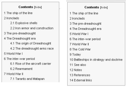
Figure 13-7. The table of contents for the article Battleship: on the left side are the first 15 lines of the TOC before the template {{TOClimit | limit=2}} was added to the article; on the right is the TOC after the template was added. A 38-line TOC is now 14 lines.
Using the {{TOClimit}} template has advantages and disadvantages. It reduces the white space to the right of the TOC, and shows only the most important headings, for a quicker understanding of the article. On the minus side, the reader doesn’t get as good a feel for the details of the article, and can’t click a link to get to a subsection that isn’t shown. Another option in Figure 13-7 would be to use limit=3 instead of limit=2 as the parameter. That would reduce the TOC length to 30 lines, which is a compromise between the original length of 38 lines and the dramatically shortened 14 lines.
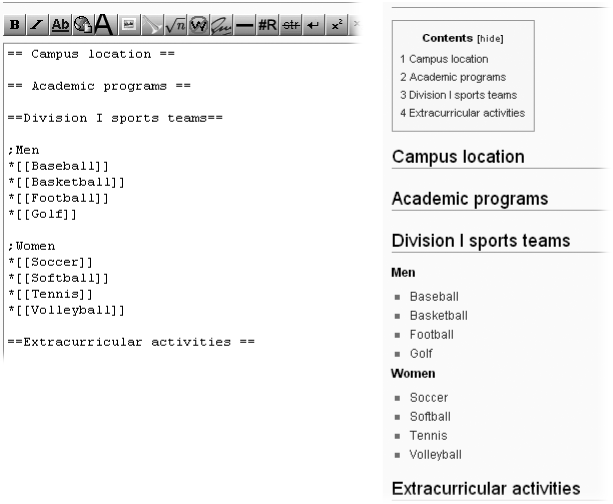
Use semicolons as pseudo-headings. When an article covers a long list of items, it makes sense to organize them under subheadings. Yet from a reader’s viewpoint, such subheadings aren’t very useful when scanning the table of contents. Consider a list of towns within a county: It would be nice to split the list into several groups by subheading (east, west, north, and south), yet “Towns in the county” is all you need for the TOC. In Wikipedia, you can use a semicolon at the beginning of a line to create a heading that doesn’t appear in the TOC. It’s not quite having your cake and eating it too, but pretty close. Figure 13-8 shows the semicolon in use.
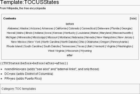
Compact TOC. These are pre-made, specialized tables of contents where multiple links to sections are on one line. Figure 13-9 shows one of the most common compact TOCs, for the 50 U.S. states.
Figure 13-9. Shown here is the entire page for the template {{TOCUSStates}}. This compact TOC, for U.S. states, can be tailored by adding links (which point to sections of the page) both above and below the standard list (links). In this documentation, the words “before” and “after” are inserted as (non-link) placeholders.
Compact TOCs take up very little space, so if your article’s sections match up well with an existing compact TOC, it’s an excellent choice. (Typically, such articles are lists.) Figure 13-10 shows another common compact TOC, the Alphanumeric TOC.
Figure 13-10. At the top of this figure is the standard version of the A-to-Z TOC ({{AlphanumericTOC}}). You can tailor most compact tables of contents, including this one, to add or subtract sections. In the middle is a variant with only the 26 letters displayed; and at the bottom is another variant, with editor-specified additional sections.
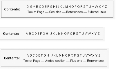
You’ll find a full list of compact TOCs on the page Wikipedia:Template messages/Compact tables of contents (shortcut: WP:CTOC).
If you don’t specify otherwise, the TOC of a Wikipedia page appears just below the lead section, on the left, with no text to its right. If the TOC is long, the reader may have to scroll quite a bit before seeing any of the body text. In many cases, you can improve the layout of articles by telling the software exactly where to put the TOC. This technique, called floating the table of contents, also wraps text around the TOC.
Figure 13-11 shows the TOC of the article Stock car racing with the standard TOC, and Figure 14-12 shows the same article, with a {{TOCleft}} template. The template tells the software exactly where to put the TOC, and makes the text wrap around the TOC.
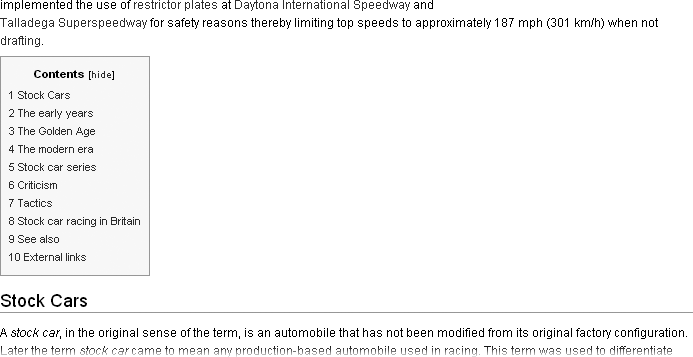
Figure 13-11. The standard table of contents for the article Stock car racing appears on the left side of the page, immediately below the lead section. With all the white space on the right, the layout isn’t particularly attractive, and the main article text can’t begin until after the TOC.
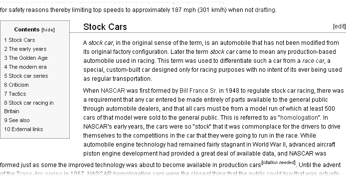
Figure 13-12. Here’s how the table of contents for the article Stock car racing looks with a {{TOCleft}} template inserted. Note how the text wraps neatly around the TOC, unlike the previous figure.
Figure 13-13 shows the wikitext that creates the left-floating TOC in Figure 13-12. The standard location for {{TOCleft}} templates is the bottom of the lead section, to avoid accessibility problems for impaired readers. In general, a floating TOC should never be put into the middle of a section.
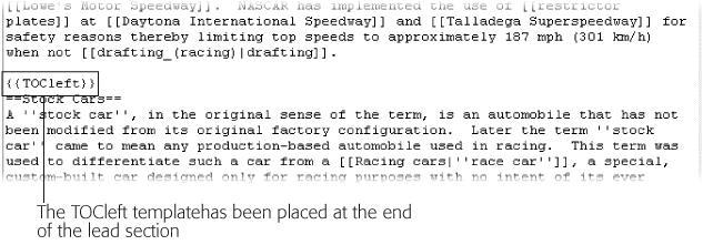
Figure 13-13. Inserting {{TOCleft}} in the wikitext of the Stock car racing article wraps text around the right of the TOC as shown in Figure 14-12.
A less common alternative is placing the table of contents on the right, using the template {{TOCright}}. If you look at the wikitext for Figure 13-14, you see the {{TOCright}} template at the top of the edit box. No text should ever be in the lead section above this template.
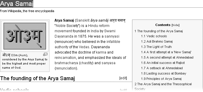
Figure 13-14. This article has the table of contents on the right. The image at the top of the article is on the left instead of the right, since the TOC is on the right. The layout makes efficient use of space—the entire TOC is visible on one screen, yet the reader has the option of simply reading the article and ignoring the TOC.
Note
The page Help:Section (shortcut: WP:SEC) offers specific suggestions on floating the TOC. In particular, be aware that floating a wide TOC can squeeze the article text into a very narrow column on low-resolution monitors. (Yet another reason why short section headings are better.) Still, even with a narrow TOC on one side, a wide, deep image can cause problems for readers with older, smaller monitors. So if you don’t have at least 50 percent of your screen still available for text to flow between the TOC on one side and images on the other, think twice about floating the TOC.