
Nevertheless, we can now create some kind of musical fingerprint of a song using FFT. If we do this for a couple of songs, and manually assign their corresponding genres as labels, we have the training data that we can feed into our first classifier.
Before we dive into the classifier training, let us first spend some time on experimentation agility. Although we have the word "fast" in FFT, it is much slower than the creation of the features in our text-based chapters, and because we are still in the experimentation phase, we might want to think about how we could speed up the whole feature-creation process.
Of course, the creation of the FFT for each file will be the same each time we run the classifier. We could therefore cache it and read the cached FFT representation instead of the wave file. We do this with the create_fft() function, which in turn uses scipy.fft() to create the FFT. For the sake of simplicity (and speed!), let us fix the number of FFT components to the first 1,000 in this example. With our current knowledge, we do not know whether these are the most important ones with regard to music genre classification—only that they show the highest intensities in the earlier FFT example. If we would later want to use more or less FFT components, we would of course have to recreate the cached FFT files.
def create_fft(fn):
    sample_rate, X = scipy.io.wavfile.read(fn)
    fft_features = abs(scipy.fft(X)[:1000])
    base_fn, ext = os.path.splitext(fn)
    data_fn = base_fn + ".fft"
    np.save(data_fn, fft_features)
We save the data using NumPy's save() function, which always appends .npy to the filename. We only have to do this once for every wave file needed for training or predicting.
The corresponding FFT reading function is read_fft():
def read_fft(genre_list, base_dir=GENRE_DIR):
    X = []
    y = []
    for label, genre in enumerate(genre_list):
        genre_dir = os.path.join(base_dir, genre, "*.fft.npy")
        file_list = glob.glob(genre_dir)
        for fn in file_list:
            fft_features = np.load(fn)

            X.append(fft_features[:1000])
            y.append(label)

    return np.array(X), np.array(y)
In our scrambled music directory, we expect the following music genres:
genre_list = ["classical", "jazz", "country", "pop", "rock", "metal"]
Let us use the logistic regression classifier, which has already served us well in the chapter on sentiment analysis. The added difficulty is that we are now faced with a multiclass classification problem, whereas up to now we have had to discriminate only between two classes.
One aspect that which is surprising the first time one switches from binary to multiclass classification is the evaluation of accuracy rates. In binary classification problems, we have learned that an accuracy of 50 percent is the worst case as it could have been achieved by mere random guessing. In multiclass settings, 50 percent can already be very good. With our six genres, for instance, random guessing would result in only 16.7 percent (equal class sizes assumed).
With multiclass problems, we should also not limit our interest to how well we manage to correctly classify the genres. In addition, we should also look at which genres we actually confuse with each other. This can be done with the so-called confusion matrix:
>>> from sklearn.metrics import confusion_matrix
>>> cm = confusion_matrix(y_test, y_pred)
>>> print(cm)
[[26  1  2  0  0  2]
 [ 4  7  5  0  5  3]
 [ 1  2 14  2  8  3]
 [ 5  4  7  3  7  5]
 [ 0  0 10  2 10 12]
 [ 1  0  4  0 13 12]]
It prints the distribution of labels that the classifier predicted for the test set for every genre. Since we have six genres, we have a six by six matrix. The first row in the matrix says that for 31 classical songs (sum of the first row), it predicted 26 to belong to the genre classical, one to be a jazz song, two to belong to the country genre, and two to be metal. The diagonal shows the correct classifications. In the first row, we see that out of 31 songs (26 + 1 + 2 + 2 = 31), 26 have been correctly classified as classical and 5 were misclassifications. This is actually not that bad. The second row is more sobering: only 4 out of 24 jazz songs have been correctly classified—that is only 16 percent.
Of course, we follow the train/test split setup from the previous chapters, so that we actually have to record the confusion matrices per cross-validation fold. We also have to average and normalize later on so that we have a range between 0 (total failure) to 1 (everything classified correctly).
A graphical visualization is often much easier to read than NumPy arrays. Matplotlib's matshow() is our friend:
from matplotlib import pylab

def plot_confusion_matrix(cm, genre_list, name, title):
    pylab.clf()
    pylab.matshow(cm, fignum=False, cmap='Blues', vmin=0, vmax=1.0)
    ax = pylab.axes()
    ax.set_xticks(range(len(genre_list)))
    ax.set_xticklabels(genre_list)
    ax.xaxis.set_ticks_position("bottom")
    ax.set_yticks(range(len(genre_list)))
    ax.set_yticklabels(genre_list)
    pylab.title(title)
    pylab.colorbar()
    pylab.grid(False)
    pylab.xlabel('Predicted class')
    pylab.ylabel('True class')
    pylab.grid(False)
    pylab.show()
When you create a confusion matrix, be sure to choose a color map (the cmap parameter of matshow()) with an appropriate color ordering, so that it is immediately visible what a lighter or darker color means. Especially discouraged for these kind of graphs are rainbow color maps, such as Matplotlib's default "jet" or even the "Paired" color map.
The final graph looks like the following screenshot:
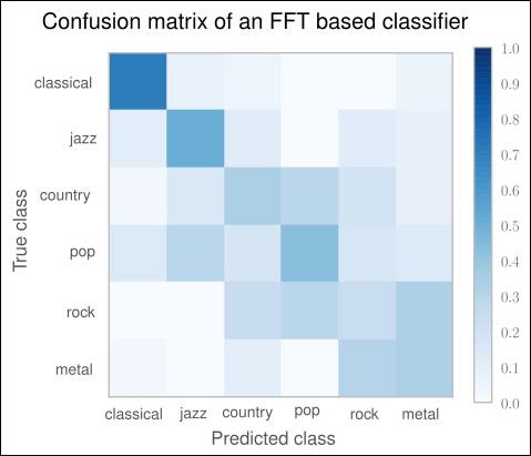
For a perfect classifier, we would have expected a diagonal of dark squares from the left-upper corner to the right-lower one, and light colors for the remaining area. In the graph, we immediately see that our FFT-based classifier is far away from being perfect. It only predicts classical songs correctly (dark square). For rock, for instance, it prefers the label metal most of the time.
Obviously, using FFT points to the right direction (the classical genre was not that bad), but it is not enough to get a decent classifier. Surely, we can play with the number of FFT components (fixed to 1,000). But before we dive into parameter tuning, we should do our research. There we find that FFT is indeed not a bad feature for genre classification—it is just not refined enough. Shortly, we will see how we can boost our classification performance by using a processed version of it.
Before we do that, however, we will learn another method of measuring classification performance.
We have already learned that measuring accuracy is not enough to truly evaluate a classifier. Instead, we relied on precision-recall curves to get a deeper understanding of how our classifiers perform.
There is a sister of precision-recall curves, called receiver operator characteristic (ROC) that measures similar aspects of the classifier's performance, but provides another view on the classification performance. The key difference is that P/R curves are more suitable for tasks where the positive class is much more interesting than the negative one, or where the number of positive examples is much less than the number of negative ones. Information retrieval or fraud detection are typical application areas. On the other hand, ROC curves provide a better picture on how well the classifier behaves in general.
To better understand the differences, let us consider the performance of the trained classifier described earlier in classifying country songs correctly:
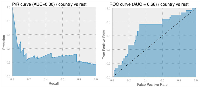
On the left-hand side graph, we see the P/R curve. For an ideal classifier, we would have the curve going from the top-left corner directly to the top-right corner and then to the bottom-right corner, resulting in an area under curve (AUC) of 1.0.
The right-hand side graph depicts the corresponding ROC curve. It plots the true positive rate over the false positive rate. Here, an ideal classifier would have a curve going from the lower-left to top-left corner and then to the top-right corner. A random classifier would be a straight line from the lower-left to upper-right corner, as shown by the dashed line having an AUC of 0.5. Therefore, we cannot compare the AUC of a P/R curve with that of an ROC curve.
When comparing two different classifiers on the same dataset, we are always safe to assume that a higher AUC of a P/R curve for one classifier also means a higher AUC of the corresponding ROC curve and vice versa. Therefore, we never bother to generate both. More on this can be found in the very insightful paper The Relationship Between Precision-Recall and ROC Curves, Jesse Davis and Mark Goadrich, ICML 2006.
The definitions of both the curves' x and y axes are given in the following table:
|
x axis |
y axis | |
|---|---|---|
|
P/R |
|
|
|
ROC |
|
|
Looking at the definitions of both curves' x axes and y axes, we see that the true positive rate in the ROC curve's y axis is the same as Recall of the P/R graph's x axis.
The false positive rate measures the fraction of true negative examples that were falsely identified as positive ones, giving a 0 in a perfect case (no false positives) and 1 otherwise. Contrast this to the Precision curve, where we track exactly the opposite, namely the fraction of true positive examples that we correctly classified as such.
Going forward, let us use ROC curves to measure our classifier's performance to get a better feeling for it. The only challenge for our multiclass problem is that both ROC and P/R curves assume a binary classification problem. For our purpose, let us therefore create one chart per genre that shows how the classifier performed a "one versus rest" classification:
        y_pred = clf.predict(X_test)

        for label in labels:
            y_label_test = np.asarray(y_test==label, dtype=int)
            proba = clf.predict_proba(X_test)
            proba_label = proba[:,label]
            fpr, tpr, roc_thresholds = roc_curve(y_label_test, proba_label)
            # plot tpr over fpr
            # ...
The outcome will be the six ROC plots shown in the following screenshot. As we have already found out, our first version of a classifier only performs well on classical songs. Looking at the individual ROC curves, however, tells us that we are really underperforming for most of the other genres. Only jazz and country provide some hope. The remaining genres are clearly not usable:
