
Chapter 26. Using Statistical Functions
In this chapter
Examples of Functions for Descriptive Statistics 642
Examples of Functions for Regression and Forecasting 658
Examples of Functions for Inferential Statistics 682
Using the Analysis Toolpak to Perform Statistical Analysis 711
Statistics in Excel fall into three broad categories:
- Descriptive statistics that describe a dataset—These include measures of central tendency and dispersion.
- Regression tools—These allow you to predict future values based on past values.
- Inferential statistics—This type of statistic allows you to predict the likelihood of an event happening, based on a sample of a population.
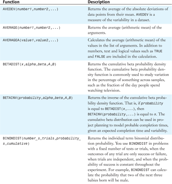
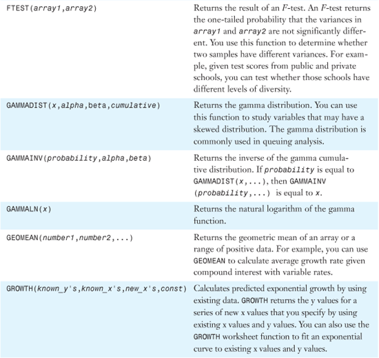
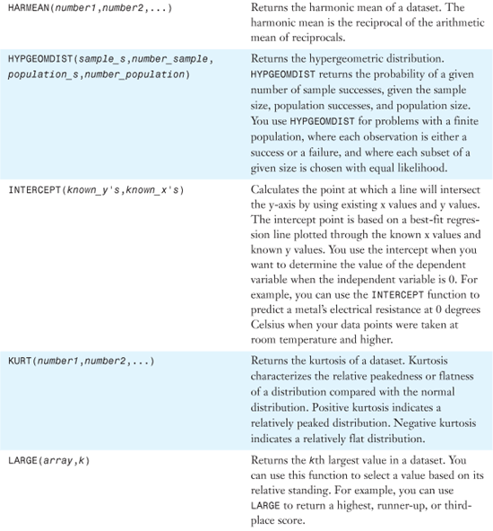
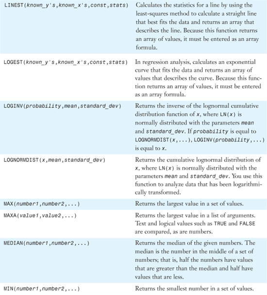
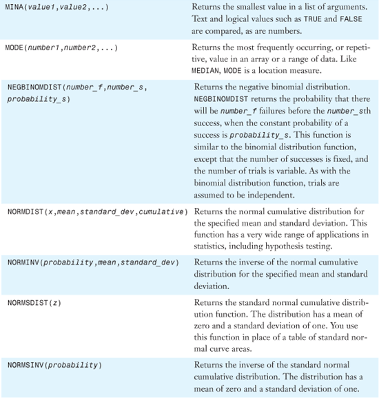
Table 26.1 provides an alphabetical list of all of Excel 2007’s statistical functions. Detailed examples of the functions are provided in the remainder of the chapter.
Table 26.1. Alphabetical List of Statistical Functions
Examples of Functions for Descriptive Statistics
Descriptive statistics help describe a population of data. What is the largest? the smallest? the average? Are data points grouped to the left of the average or to the right of the average? How wide is the range of expected values? Do many members of the population have values in the middle, or are they evenly spread throughout the range? All these are measures of descriptive statistics.
Many situations in a business environment involve finding basic information about a dataset such as the largest or smallest values or the rank within a dataset.
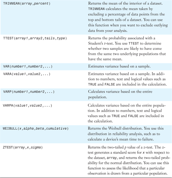
Using MIN or MAX to Find the Smallest or Largest Numeric Value
If you have a large dataset and want to find the smallest or largest value in a column, rather than sort the dataset, you can use a function to find the value. To find the smallest numeric value, you use MIN. To find the largest numeric value, you use MAX.
Figure 26.1 shows a list of open receivables, by customer, for 59 customers. Even though the function references says that you can only find the MIN for 255 numbers, a single rectangular reference counts as one of the 255 arguments for the function. To find the smallest value in the range, you use =MIN(B2:B360). To find the largest value in the range, you use =MAX(B2:B360).
Figure 26.1. You use MIN and MAX to find the smallest or largest receivables.
Syntax: =MIN(number1,number2,...)
The MIN function returns the smallest number in a set of values. The arguments number1,number2,... are 1 to 255 numbers for which you want to find the minimum value. You can specify arguments that are numbers, empty cells, logical values, or text representations of numbers. Arguments that are error values or text that cannot be translated into numbers cause errors. If an argument is an array or a reference, only numbers in that array or reference are used. Empty cells, logical values, or text in the array or reference are ignored. If logical values and text should not be ignored, you should use MINA instead. If the arguments contain no numbers, MIN returns 0.
Syntax: =MAX(number1,number2,...)
The MAX function returns the largest value in a set of values. The arguments number1,number2,... are 1 to 255 numbers for which you want to find the maximum value. The remaining rules are similar to those for MIN, described in the preceding section.
Note
If you read the descriptions for MINA and MAXA, you might think that the functions can be used to find the smallest text value in a range. However, here is the Excel Help description for MAXA:
MAXA(value1,value2) returns the largest value in a list of arguments. Text and logical values such as TRUE and FALSE are compared as well as numbers.
The problem, however, is that text values are treated as the number 0 in the compare. It is a struggle to imagine a scenario where this would be mildly useful. If you have a series of positive numbers and want to know if any of them are text, you can use =MINA(A1:A99). If the result is 0, then you know that there is a text value in the range.
Similarly, if you have a range of negative numbers in A1:A99, you could use =MAXA(A1:A99). If any of the values are text, the result will return 0 instead of a negative number.
MINA and MAXA could be used to evaluate a series of TRUE/FALSE values. FALSE values are treated as 0. TRUE values are treated as 1.
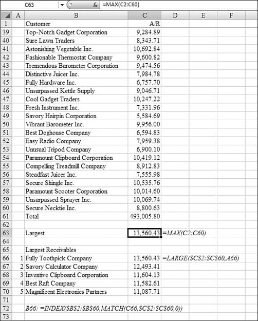
Using LARGE to Find the Top N Values in a List of Values
The MAX function discussed in the preceding section finds the single largest value in a list. Sometimes, it is interesting to find the top 10 values in a list. Say that with a list of customer receivables, someone in accounts receivable may want to call the top 10 receivables in an attempt to collect the accounts. The LARGE function can find the first, second, third, and so on largest values in a list.
Syntax: =LARGE(array,k)
The LARGE function returns the kth largest value in a dataset. You can use this function to select a value based on its relative standing. For example, you can use LARGE to return a highest, runner-up, or third-place score. This function takes the following arguments:
array—This is the array or range of data for which you want to determine thekth largest value. Ifarrayis empty,LARGEreturns a#NUM!error.k—This is the position (from the largest) in the array or cell range of data to return. Ifkis less than or equal to 0 or ifkis greater than the number of data points,LARGEreturns a#NUM!error.
You follow these steps to build a table of the five largest customer receivables:
- Make the second argument of the function the numbers
1through5. Starting from the dataset shown in Figure 26.1, insert a new Column A to hold the values1through5. - In A66:A70, enter the numbers
1through5. - In the column letters above the grid, grab the line between Columns A and B. Drag to the left to make this column narrower. It should be just wide enough to display the numbers in Column A.
- In Column C, Row 66, enter
=LARGE(. Use the mouse or arrow keys to highlight the range of data. After highlighting the data, press the F4 key to add dollar signs to the reference. This allows you to copy the reference to the next several rows while always pointing at the same range. - For the second argument, point to the 1 in Cell A66. Leave this reference as relative (that is, no dollar signs) so that it will change to A67, A68, and so on when copied. The first formula in Cell C66 indicates that the largest value is 13,560.43. So far, you’ve done a lot of work just to find out the same thing that the
MAXfunction could have told you. However, the power comes in the next step. - Select Cell C66. Click the fill handle and drag down to Cell C70. You now have a list of the top five open receivables.
- At this point, you know the amounts of the top receivables, but this immediately brings up the question of which customers have those receivables. Using lookup functions discussed in Chapter 24, “Using Financial Functions,” you can retrieve the name associated with each receivable amount. Note that this method assumes that no two customers in the top five have exactly the same receivable.
- Enter the following intermediate formula in Cell B66:s
=MATCH(C66,$C$2:$C$60,0). This formula tells Excel to take the receivable value in Cell C66 and to find it in the list of open receivables. TheMATCHfunction returns the row number within C2:C60 that has the matching value. For example,13,560.43is found in Cell C9. This is the eighth row in the range of C2:C60, soMATCHreturns the number8. - Finding out that the largest receivable in the eighth row of a range is not useful to a person trying to collect accounts receivables, so to return the name, ask for the eighth value in the range of B2:B66. You can use the
INDEXfunction to do this.=INDEX($B$2:$B$66,8)returns the customer with the largest receivable. - Combine the formulas from step 8 and step 9 into a single formula in Cell B66:
=INDEX($B$2:$B$60,MATCH(C66,$C$2:$C$60,0)). - Copy the formula in Cell B66 down through Cell B70.
As shown in Figure 26.2, the result is a table in A66:A70 that shows the five largest customers. After receiving checks today, you can update the receivable amounts in C2:C60. If Best Raft sent in a check for $10,000, the formulas would automatically move Magnificent Electronics up to the fourth position and move the sixth customer up to the fifth spot.
Figure 26.2. The LARGE function in Column C allows this dynamic table to be built to show the five largest problems.
Using SMALL to Sequence a List in Date Sequence
The MIN function finds the smallest value in a dataset. The SMALL function can find the kth smallest value. This can be great for finding not just the smallest value but the second-smallest, third-smallest, and so on. If n is the number of data points in an array, SMALL(array,1) equals the smallest value, and SMALL(array,n) equals the largest value.
Syntax: =SMALL(array,k)
The SMALL function returns the kth smallest value in a dataset. You use this function to return values with a particular relative standing in a dataset. array is an array or a range of numeric data for which you want to determine the kth smallest value. If array is empty, SMALL returns a #NUM! error. k is the position (from the smallest) in the array or range of data to return. If k is less than or equal to 0 or if k exceeds the number of data points, SMALL returns a #NUM! error.
In Figure 26.3, range A2:B19 contains a list of book titles and their publication dates. To find the earliest dates for the books, you use =SMALL().
Figure 26.3. The SMALL function in Column D finds the earliest years in the list.
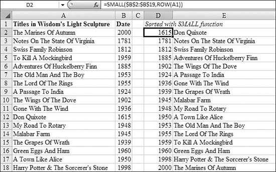
This example contains a twist that makes the formula easier than in the example for LARGE. In the initial formula in Cell D2, the argument for k was generated using ROW(A1). This function returns the number 1. As the formula is copied from Cell D2 down to the remaining rows, the reference changes to ROW(A2) and so on. This allows each row in Column D to show a successively larger value from array.
The formula in Cell D2 is =SMALL($B$2:$B$19,ROW(A1)). After you have found the year in Column D, the formula in Cell E2 to return the title is =INDEX($A$2:$A$19,MATCH(D2,$B$2:$B$19,0)).
Using MEDIAN, MODE, and AVERAGE to Find the Central Tendency of a Dataset
There are three popular measures to use when trying to find the middle scores in a range:
- Mean—The mean of a dataset is the mathematical average. It is calculated by adding all the values in the range and dividing by the number of values in the set. To calculate a mean in Excel, you use the
AVERAGEfunction. - Median—The median of a dataset is the value in the middle when the set is arranged from high to low. In the dataset, half the values are higher than the median and half the numbers are lower than the median. To calculate a median in Excel, you use the
MEDIANfunction. - Mode—The mode of a dataset is the value that happens most often. To calculate a mode in Excel, you use the
MODEfunction.
Syntax: =AVERAGE(number1,number2,...)
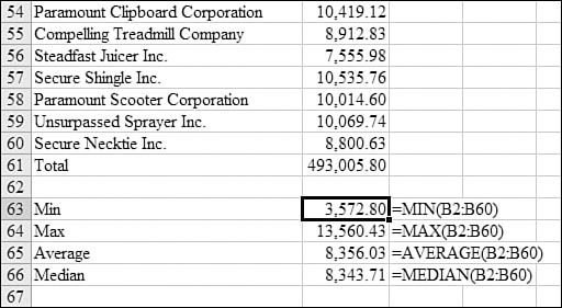
The AVERAGE function returns the average (that is, arithmetic mean) of the arguments. The arguments number1,number2,... are 1 to 255 numeric arguments for which you want the average. The arguments must be either numbers or names, arrays, or references that contain numbers. If an array or a reference argument contains text, logical values, or empty cells, those values are ignored; however, cells containing the value 0 are included.
Caution
When averaging cells, keep in mind the difference between empty cells and those that contain the value 0. This can be particularly troubling if you have unchecked the Show a Zero in Cells That Have a Zero Value setting. You find this setting by clicking the Office icon and then selecting Excel Options, Advanced, Display Options for This Worksheet.
Syntax: =MEDIAN(number1,number2,...)
The MEDIAN function returns the median of the given numbers. The median is the number in the middle of a set of numbers; that is, half the numbers have values that are greater than the median and half have values that are less. If there is an even number of numbers in the set, then MEDIAN calculates the average of the two numbers in the middle.
The arguments number1, number2,... are 1 to 255 numbers for which you want the median. The arguments should be either numbers or names, arrays, or references that contain numbers. Microsoft Excel examines all the numbers in each reference or array argument. If an array or a reference argument contains text, logical values, or empty cells, those values are ignored; however, cells that contain the value 0 are included.
Syntax: =MODE(number1,number2,...)
The MODE function returns the most frequently occurring, or repetitive, value in an array or a range of data. Like MEDIAN, MODE is a location measure. In a set of values, the mode is the most frequently occurring value; the median is the middle value; and the mean is the average value. No single measure of central tendency provides a complete picture of the data. Suppose data is clustered in three areas, half around a single low value, and half around two large values. Both AVERAGE and MEDIAN may return a value in the relatively empty middle, and MODE may return the dominant low value.
The arguments number1, number2,... are 1 to 255 arguments for which you want to calculate the mode. You can also use a single array or a reference to an array instead of arguments separated by commas. The arguments should be numbers, names, arrays, or references that contain numbers. If an array or reference argument contains text, logical values, or empty cells, those values are ignored; however, cells that contain the value 0 are included. If the dataset contains no duplicate data points, MODE returns a #N/A error.
Figure 26.4 shows examples of AVERAGE, MEAN, and MODE. Cell E2 calculates the arithmetic mean of the test scores in Column B: 80.55. The median in Cell E3 is higher: 82. This means that half the students scored above 82 and half scored below 82. The mode in Cell E4 is 88. This is because 88 was the only score that appeared more than once in the class.
Figure 26.4. AVERAGE, MEDIAN, and MODE all describe the central tendencies of a dataset.
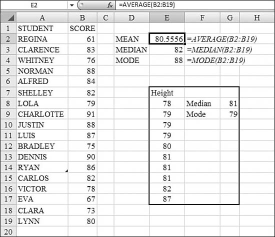
The range in E17:G17 demonstrates two anomalies with the median and mode. In this case, there are an even number of entries—10. It is impossible to figure out a median in this case, so Excel takes the average of the two values in the middle—80 and 81—to produce 80.5. This is the only situation in which the median is not a value from the table.
The table contains the height, in inches, of several members of the Cleveland Cavaliers. In this dataset, three players are 79 inches tall, and three players are 81 inches tall. Either answer qualifies as the value that happens most often. Thus, either answer could be the mode. In this case, MODE returns the first of these values it encounters in the dataset. If E7:E17 were sorted high to low, the MODE would report 81 inches.
Using TRIMMEAN to Exclude Outliers from the Mean
Sometimes a dataset includes a few outliers that radically skew the average. For example, say you have a list of gross margin percentages. Most percentages fall in the 45% to 50% range, but there was one deal where for customer satisfaction reasons, the product was given away at a loss. This one data point would skew the average unusually low.
The TRIMMEAN function takes the mean of data points but excludes the n% highest and lowest values. You have to use some care in expressing the n%.
Syntax: =TRIMMEAN(array,percent)
The TRIMMEAN function returns the mean of the interior of a dataset. TRIMMEAN calculates the mean taken by excluding a percentage of data points from the top and bottom tails of a dataset. You can use this function when you want to exclude outlying data from your analysis. This function takes the following arguments:
array—This is the array or range of values to trim and average.percent—This is the fractional number of data points to exclude from the calculation. For example, ifpercentis0.2, 4 points are trimmed from a dataset of 20 points (that is, 20 × 0.2): 2 from the top and 2 from the bottom of the set.
If percent is less than 0 or percent is greater than 1, TRIMMEAN returns a #NUM! error. TRIMMEAN rounds the number of excluded data points down to the nearest multiple of 2. If percent equals 0.1, 10% of 30 data points equals 3 points. For symmetry, TRIMMEAN excludes a single value from the top and bottom of the dataset.
Using GEOMEAN to Calculate Average Growth Rate
Say that your 401(k) plan is invested in a stock market index fund. The stock market goes up 5%, 40%, and 15% in three successive years. Taking the average of these numbers might lead someone to believe that the average increase was 20% per year. This is not correct. The growth rates are all multiplied together to find an ending value of your investment. To find the average growth rate, you need to find a number that, when multiplied together three times, yields the same result as 105% × 140% × 115%. You can calculate this by using GEOMEAN.
To find the geometric mean of 10 numbers, you multiply the 10 numbers together and raise the sum to the 1/10 power. Excel lets you do this quickly with GEOMEAN.
Syntax: =GEOMEAN(number1,number2,...)
The GEOMEAN function returns the geometric mean of an array or a range of positive data. For example, you can use GEOMEAN to calculate average growth rate, given compound interest with variable rates.
The arguments number1,number2,... are 1 to 255 arguments for which you want to calculate the mean. You can also use a single array or a reference to an array instead of arguments separated by commas.
The arguments must be either numbers or names, arrays, or references that contain numbers. If an array or a reference argument contains text, logical values, or empty cells, those values are ignored; however, cells that contain the value 0 are included. If any data point is less than or equal to 0, GEOMEAN returns a #NUM! error.
Using HARMEAN to Find Average Speeds
The typical averaging function fails when you are measuring speeds over a period of time. Say that your exercise regimen is 5 minutes of walking at 2 mph, 25 minutes of running at 5 mph, and then 10 minutes of jogging at 3 mph. If you took the average of (2, 5, 5, 5, 5, 5, 3, 3), you would assume that you averaged 4.125 miles per hour.
The actual calculation for average speed would be to take the reciprocals of each speed, average those values, and then take the reciprocal of the result. In the exercise example, you would average (½, ![]() ,
, ![]() ,
, ![]() ,
, ![]() ,
, ![]() ,
, ![]() ,
, ![]() ) to obtain
) to obtain ![]() . The you would take the reciprocal,
. The you would take the reciprocal, ![]() , to find the actual average speed of 3.69 mph.
, to find the actual average speed of 3.69 mph.
Syntax: =HARMEAN(number1,number2,...)
The HARMEAN function returns the harmonic mean of a dataset. The harmonic mean is the reciprocal of the arithmetic mean of reciprocals. The arguments number1,number2,... are 1 to 255 arguments for which you want to calculate the mean. You can also use a single array or a reference to an array instead of arguments separated by commas.
The arguments must be either numbers or names, arrays, or references that contain numbers. If an array or a reference argument contains text, logical values, or empty cells, those values are ignored; however, cells that contain the value 0 are included. If any data point is less than or equal to 0, HARMEAN returns a #NUM! error. The harmonic mean is always less than the geometric mean, which is always less than the arithmetic mean.
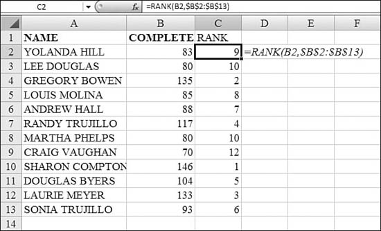
Using RANK to Calculate the Position Within a List
There are times when you need to determine the order of values but you are not allowed to sort the data. The RANK function helps with this task. However, there is an anomaly with the function that you should understand.
Let’s say five bowlers scored 187, 185, 185, 170, and 160. The traditional way to rank the players is that two players would have a rank of 2, and the next player would have a rank of 4. There would be no one ranked number 3. Although this is technically correct, it can cause problems if you have lookup values expecting to find a person ranked number 3. The example at the end of this section explains how to overcome such a situation.
Syntax: =RANK(number,ref,order)
The RANK function returns the rank of a number in a list of numbers. The rank of a number is its size relative to other values in a list. (If you were to sort the list, the rank of the number would be its position.) This function takes the following arguments:
number—This is the number whose rank you want to find.ref—This is an array of, or a reference to, a list of numbers. Nonnumeric values in ref are ignored.order—This is a number that specifies how to ranknumber. For a value of0or if this argument is omitted, Excel ranksnumberas ifrefwere a list sorted in descending order. Iforderis any nonzero value, Excel ranksnumberas if ref were a list sorted in ascending order.
RANK gives duplicate numbers the same rank. However, the presence of duplicate numbers affects the ranks of subsequent numbers. For example, in a list of integers, if the number 10 appears twice and has a rank of 5, then 11 would have a rank of 7 (no number would have a rank of 6).
In Figure 26.5, Column B contains a list of scores. The formula for Cell C2 is =RANK(B2,$B$2:$B$13). Notice that the third argument is omitted, so the highest score will be ranked as number 1. Also notice that the second argument is marked as absolute so that the formula can be copied, and it will always point to the same ref range.
Figure 26.5. In this case, RANK works okay. Two students have a rank of 10, and no one is ranked 11.
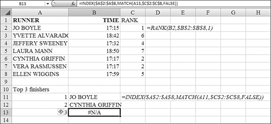
In Figure 26.6, the values in Column B are times in a cross-country race. In this case, the lowest rank should go to the fastest score. The formula in Cell C2 is =RANK(B2,$B$2:$B$8,1). Note that there is a third argument to specify that the lowest value should be ranked 1. In this case, however, there was a tie. The runners in Cells C6 and C7 both had the same time. The RANK function gives both of these values a rank of 2. This causes a problem in Row 13. This table is trying to identify the top three finishers by using lookup formulas. Because no one is ranked number 3, an error occurs.
Figure 26.6. Two runners tied with the same score. This causes the lookup formulas in Row 13 to never find a match.
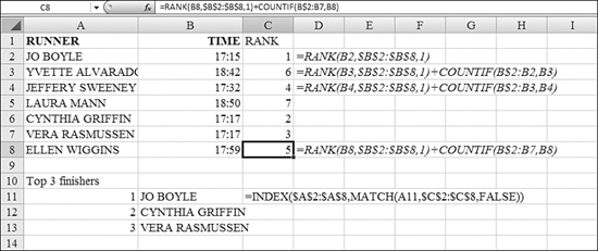
The generally accepted solution is to use the RANK function and add the COUNTIF of how many times this value occurred previously in the list.
In Figure 26.7, examine the formula in Cell C8. COUNTIF asks how many times the value in Cell B8 was found in B$2:B7. This final reference is an interesting reference. It tells Excel to count always from Row 2 down to the row above the current row. It is easier to build this formula in the final cell of the column and then copy it upwards.
Figure 26.7. You use a COUNTIF to break ties.
Using QUARTILE to Break a Dataset into Quarters
Use QUARTILE to divide populations into groups.
Syntax: =QUARTILE(array,quart)
The QUARTILE function returns the quartile of a dataset. Quartiles are often used in sales and survey data to divide populations into groups. For example, you can use QUARTILE to find the top 25% of incomes in a population. This function takes the following arguments:
array—This is the array or cell range of numeric values for which you want the quartile value. Ifarrayis empty,QUARTILEreturns a#NUM!error.quart—This indicates which value to return. You use0for the minimum value,1for the first quartile (25th percentile),2for the median value (50th percentile),3for the third quartile (75th percentile), and4for the maximum value. Ifquartis not an integer, it is truncated. Ifquartis less than 0 or if quart is greater than 4,QUARTILEreturns a#NUM!error.
MIN, MEDIAN, and MAX return the same value as QUARTILE when quart is equal to 0, 2, and 4, respectively.
In Figure 26.8, the formulas in B20:C23 break out the limits for each quartile. The formula in Cell B20 is =QUARTILE($B$2:$B$17,0) to find the minimum value. The formula in Cells C20 and B21 is =QUARTILE($B$2:$B$17,1) to define the end of the first quartile and the start of the second quartile.
Figure 26.8. The QUARTILE function can break up a dataset into four equal pieces.
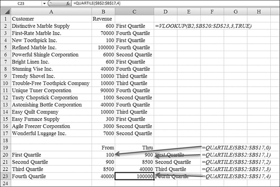
After the QUARTILE functions build the table in B20:C23, the VLOOKUP function returns the text in C2:C17. The formula in Cell C2 is =VLOOKUP(B2,$B$20:$D$23,3,TRUE).
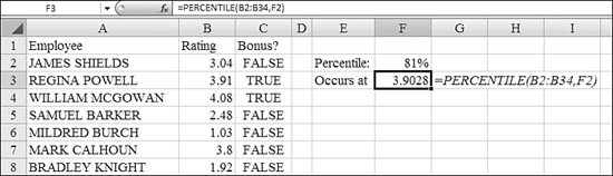
Using PERCENTILE to Calculate Percentile
The QUARTILE function is fine if you are trying to find every record that is in the top 25% of a range. Sometimes, however, you need to find some other percentile. For example, all employees ranked above the 81st percentile may be eligible for a bonus this year. You can use the PERCENTILE function to determine the threshold for any percentile.
Syntax: =PERCENTILE(array,k)
The PERCENTILE function returns the kth percentile of values in a range. You can use this function to establish a threshold of acceptance. For example, you can decide to examine candidates who score above the 90th percentile. This function takes the following arguments:
array—This is the array or range of data that defines relative standing. Ifarrayis empty,PERCENTILEreturns a#NUM!error.k—This is the percentile value in the range 0...1, inclusive. Ifkis nonnumeric,PERCENTILEreturns a#VALUE!error. Ifkis less than 0 or ifkis greater than 1,PERCENTILEreturns a#NUM!error. Ifkis not a multiple of 1 / (n – 1),PERCENTILEinterpolates to determine the value at thekth percentile.
In Figure 26.9, there are 33 employees in Column A. Their ratings on an annual review are shown in Column B. The formula in Cell F3, =PERCENTILE(B2:B34,F2), calculates the level of the 81st percentile. After you determine the particular percentile, you can mark all the qualifying employees by using the formula =B2>=$F$3 in cells C2:C33.
Figure 26.9. Unlike QUARTILE, the PERCENTILE function can determine the breaking point for any particular percentile.
Using PERCENTRANK to Assign a Percentile to Every Record
Say that you have a database of students in a graduating class. Each student has a certain grade point average. To determine each student’s standing in the class, you use the PERCENTRANK function.
Syntax: =PERCENTRANK(array,x,significance)
The PERCENTRANK function returns the rank of a value in a dataset as a percentage of the dataset. This function can be used to evaluate the relative standing of a value within a dataset. For example, you can use PERCENTRANK to evaluate the standing of an aptitude test score among all scores for the test. This function takes the following arguments:
array—This is the array or range of data with numeric values that defines relative standing. Ifarrayis empty,PERCENTRANKreturns a#NUM!error.x—This is the value for which you want to know the rank. Ifxdoes not match one of the values inarray,PERCENTRANKinterpolates to return the correct percentage rank.significance—This is an optional value that identifies the number of significant digits for the returned percentage value. If it is omitted,PERCENTRANKuses three digits (that is, 0.xxx). If significance is less than 1,PERCENTRANKreturns a#NUM!error.
This function is slightly different from RANK, so use caution. Typically, RANK and other functions would ask for x as the first argument and array as the second argument. If you use this function and everyone is assigned to the 100% level, you might have reversed the arguments. The Excel Help is a bit misleading with regard to significance. The Help topic indicates that a significance of 3 generates a value accurate to 0.xxx%. In fact, a significance of 3 returns xx.x%.
In Figure 26.10, the students’ GPAs are in B2:B301. The rank for the first student is =PERCENTRANK($B$2:$B$301,B2,3). Note that PERCENTRANK always starts with the lowest score at the lowest percentile. To find the top students in the class, you use a conditional format to highlight the students with percentiles above 90%.
Figure 26.10. The PERCENTRANK function assigns percentile values to an array of values.
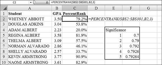
The table in E4:F9 shows the actual behavior of the significance argument. The values in Column F show the PERCENTRANK of Cell B2 to the significance in Column E. You can see that the student ranked at the 79.2th percentile is in the 70th percentile when the significance is 1. A significance of 1 would assign 30 records to be at the 70th percentile.
Using AVEDEV, DEVSQ, VAR, and STDEV to Calculate Dispersion
Functions such as AVERAGE tell you about the center of a range of data. Seeing the center is not always the entire picture. The other key element of descriptive statistics is dispersion. If you have a population, the average height might be x. If you look at dispersion, you can find out if every member of the population is tightly grouped around the average or if there is wide variability.
Here are several measures of dispersion:
- Average deviation is calculated by measuring the absolute difference of each data point from the mean and then averaging these values. Say the values in a population are 12, 14, 16, 18, and 20. The mean is 16. Average deviation adds up 4, 2, 0, 2, and 4 and divides the total by 5 to yield 2.4. Excel offers
AVEDEVto calculate this. - Average deviation is not perfect. Say that you have another population of 11, 15, 16, 17, and 21. Again, the mean is 16. The average deviation averages 5, 1, 0, 1, and 5 to yield an average deviation of 2.4. If you want to measure how far from the mean the points range, you can add up the squares of each deviation. In this case, the square of 5 is 25, and it indicates more dispersion than the square of 4. Excel offers
DEVSQto calculate the squares of each deviation. - Variance is a common measurement of dispersion. It averages the square deviations to come up with the variance of a dataset. Here is the one odd thing about variance: Say that you have 20 measurements, and they represent the entire population (for example, the 20 fish in an aquarium). In this case, you divide
DEVSQby 20 to calculate the variance. You useVARPin Excel to do this. However, if your 20 values are a random sample, then variance is calculated by dividingDEVSQby 20 – 1, or 19. You useVARin Excel to calculate this. - The measurement for variance is a square, right? You took all the deviations, squared them, and then averaged (or nearly averaged) them. The final popular measure of dispersion is calculated by taking the square root of the variance. This number is called standard deviation. Excel offers two functions for standard deviation. You use
STDEVPif your dataset represents the entire population, and you useSTDEVif your dataset represents only a sample of the population.
There are many theories about standard deviation. One rule of thumb says that 95% of a population will be located within two standard deviations of the mean. If you extend your range to within three standard deviations of the mean, that range should encompass 99.7% of the population.
Figure 26.11 shows the lengths of fish. Column A contains the lengths of all 20 fish in one particular tank at a science museum. Column E contains the lengths of 20 random fish observed while snorkeling at a coral reef. Both groups have a mean value of 18.58 inches, as shown in Cells C4 and G4.
Figure 26.11. Although the averages are the same, the dispersion measurements paint a different picture of these populations.
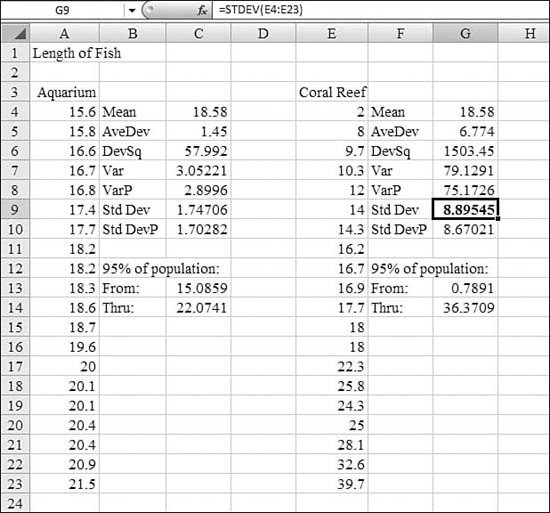
The fish in the museum tank have an average deviation of 1.45 inches from the mean. Cells C6, C8, and C10 walk through the calculation of squares of deviation, variance, and standard deviation. The theory about standard deviation says that of the fish in the tank, 95% will occur between 15.08 inches and 22.07 inches.
The fish at the coral reef have an average deviation of 6.7 inches from the mean. Cells G6, G7, and G9 walk through the calculation of squares of deviation, variance, and standard deviation. The theory about standard deviation says that of the fish at the coral reef, 95% will be between 0.78 inches and 36.37 inches long.
Comparing these two results helps you to picture the likely populations of both locations. Although both have the same mean size, the variety of fish (that is, the measure of dispersion) at the coral reef is much higher than that at the aquarium.
Syntax: =AVEDEV(number1,number2,...)
The AVEDEV function returns the average of the absolute deviations of data points from their mean. AVEDEV is a measure of the variability in a dataset. AVEDEV is influenced by the unit of measurement in the input data.
Syntax: =DEVSQ(number1,number2,...)
The DEVSQ function returns the sum of squares of deviations of data points from their sample mean.
Syntax: =VAR(number1,number2,...)
The VAR function estimates variance based on a sample.
Syntax: =VARP(number1,number2,...)
The VARP function calculates variance based on the entire population.
Syntax: =STDEV(number1,number2,...)
The STDEV function estimates standard deviation based on a sample. The standard deviation is a measure of how widely values are dispersed from the average value (that is, the mean). The standard deviation is calculated using the “nonbiased” or “n – 1” method.
Syntax: =STDEVP(number1,number2,...)
The STDEVP function calculates standard deviation based on the entire population, given as arguments. The standard deviation is a measure of how widely values are dispersed from the average value (that is, the mean). STDEVP assumes that its arguments are the entire population. If your data represents a sample of the population, you can compute the standard deviation by using STDEV. For large sample sizes, STDEV and STDEVP return approximately equal values. The standard deviation is calculated using the “biased” or “n” method.
The arguments number1, number2,... are 1 to 255 arguments for which you want the average of the absolute deviations. You can also use a single array or a reference to an array instead of arguments separated by commas. The arguments must be either numbers or names, arrays, or references that contain numbers. If an array or a reference argument contains text, logical values, or empty cells, those values are ignored; however, cells that contain the value 0 are included.
Logical values (TRUE/FALSE) are ignored in the STDDEV and STDDEVP calculations. There are some statistics for which you need to figure out how many people answered TRUE to a question. In order to count TRUE values as 1 and FALSE values as 0, you use VARA, VARPA, STDEVA, and STDEVPA versions of those four functions.
Examples of Functions for Regression and Forecasting
Regression analysis allows you to predict the future, based on past events. Say that you have observed total sales for the past several years. Regression analysis finds a line that best fits the past data points. You can then use the description of that line to predict results for the future data points.
Regression works by finding a line that can best be drawn through existing data points. In real-life data, the data points aren’t arranged exactly in a line. Any line that the computer draws will have errors at any data point. Regression finds the line that minimizes the errors at each data point.
Consider the error in a regression line. The actual data point in Year 1 might by higher than the regression line by 2. In Year 2, the data might be lower by 1, and in Year 3 it might be lower by 1. If you added up these three errors, you would have an error of 0. This is a bad method. If you used this method to judge a line with errors of +400, –300, –100, it would also add up to an error of 0.
Instead, the regression engine sums the square of each error. In this case, the first line would have an error of 2^2 + –1^2+ –1^2 or 4 + 1 + 1, or 6. The second line would have an error of 400^2+ –300^2 + –100^2 or 160,000 + 90,000 + 10,000, or 260,000. With this method, the error for the first line is clearly better than the error for the second line. This method is called the least-squares method.
You might wonder why regression doesn’t add the absolute value of each error. Ideally, the errors around the regression line should be narrow. A line with errors of –4, +4, –4, +4 would results in a sum of squares of 64. A line with errors of –7, 1, 7, –1 would result in a sum of squares of 100. The sum of squares method would deem the earlier line to be better, while using absolute values would call them equal.
You need to consider one question before doing regression analysis. First, is the data series growing linearly or exponentially? Sales for a company might grow linearly. The number of bacteria cells in a Petri dish might grow exponentially. You use LINEST and TREND to predict sales that are growing linearly. You use LOGEST and GROWTH to predict bacteria that are growing exponentially.
In Figure 26.12, the chart on the left shows sales over time. These sales are growing linearly and could probably be predicted fairly well by a straight line. The dotted line in the chart is the straight-line regression for the dataset. Although each data point is either above or below the regression line, the error at any given data point is fairly small.
Figure 26.12. These two datasets can be accurately predicted using regression.
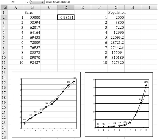
The chart on the right shows an exponential growth curve. In this chart, the dotted line shows the regression line plotted using LOGEST. Again, although the dotted line does not correlate exactly with the actual data points, it is fairly close.
Here is the problem: Regression always finds a line to fit your dataset. In Figure 26.13, there is no apparent correlation between sales and time. Each year, the sales fluctuate wildly up or down. If you asked Excel to use regression, it would gladly predict the dotted line shown in the graph. The problem is that this line has no predictive ability. If you base your future sales on this line, you will get results that will vary greatly from the prediction.
Figure 26.13. This dataset has no correlation to time. LINEST happily predicts a line, but it is severely wrong most of the time.
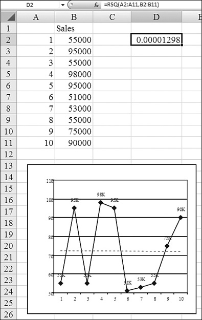
Part of the results of regression analysis are statistics that tell how well the regression line fits the actual data. You should always check statistics such as r-squared or the standard error to see if the past data shows a relationship between the variables. The r-squared value is a value between 0 and 1. The closer that r-squared is to 1, the better the regression line. The r-squared for the left chart in Figure 26.12 is 0.985. The r-squared for the chart in Figure 26.13 is 0.000001, indicating that there is no correlation.
When you have data like the data in Figure 26.13, it does not mean that you cannot use regression analysis. It means that you need to think about the data to see if other factors could help describe the data. Let’s say that the data represents sales of squares of roofing shingles in Florida. If you add data to the chart that describes the number of category 3+ hurricanes making landfall each year, the sales numbers begin to make sense. The r-squared for predicting sales based on year is nearly 0. The r-squared for predicting sales based on hurricanes is 0.987. Since an r-squared of 1 means almost perfect correlation, you could base prediction of sales on a forecast of hurricanes.
For all the following regression functions, the arguments list generally includes these two arguments (for brevity, they are described here once):
known_y's—This is an array or a cell range of numeric dependent data points. This is the range of data that you want to predict. It might be the actual sales for the past several years or the population of bacteria for the past several hours.known_x's—This is the set of independent data points. These are the values that you think will lead to a prediction of the y values. For a simple time series, this might be a list of year numbers. It might be a list of other independent data points, such as the number of hurricanes making landfall each year.
The arguments must be either numbers or names, arrays, or references that contain numbers. If an array or a reference argument contains text, logical values, or empty cells, those values are ignored; however, cells that contain the value 0 are included. If known_y's and known_x's are empty or have a different number of data points, the function returns a #N/A error.
Functions for Simple Straight-Line Regression: SLOPE and INTERCEPT
With many things in Excel, there is a right way to do something. However, sometimes the powers-that-be decide that the right way is too difficult for Excel customers, so they offer alternative, easier ways to solve problems.
The LINEST function is powerful, and using it is the right way to calculate straight-line regression. However, because the LINEST function returns an array of values, it seemed too difficult, so Microsoft also offers the SLOPE and INTERCEPT functions to retrieve the key results from LINEST.
In mathematical terms, a line is described as y = mx + b:
- y—This is the value you are trying to predict. It could be sales for a given year.
- b—This is called the y-intercept. This is the base level of sales that you can count on year after year after year.
- m—This is the slope of the line. If your sales are going up by 1,000 per year, the slope is 1,000. If your sales are going up by 100,000 per year, the slope is 100,000.
- x—This is a point along the x-axis. In a problem where you are measuring sales over a span of several years, you can assign year numbers 1, 2, 3, and so on to each year. x then corresponds to a year number.
If you have a series of year numbers and sales for each year, you need to calculate both the SLOPE and INTERCEPT in order to describe the line.
Syntax: =SLOPE(known_y's,known_x's)
The SLOPE function returns the slope of the linear regression line through data points in known_y's and known_x's. The slope is the vertical distance divided by the horizontal distance between any two points on the line; in other words, it is the rate of change along the regression line.
Syntax: =INTERCEPT(known_y's,known_x's)
The INTERCEPT function calculates the point at which a line intersects the y-axis by using existing x values and y values. The intercept point is based on a best-fit regression line plotted through the known x values and known y values. You use the intercept when you want to determine the value of the dependent variable when the independent variable is 0.
In Figure 26.14, the sales in B2:B11 are the dependent variables. In the language of Excel, these are the known_y's. You are predicting that sales are increasing linearly over time. The year numbers in A2:A11 are the independent variables. In the language of Excel, these are the known_x's.
Figure 26.14. Using the SLOPE and INTERCEPT functions is a simple way to calculate a linear regression line.
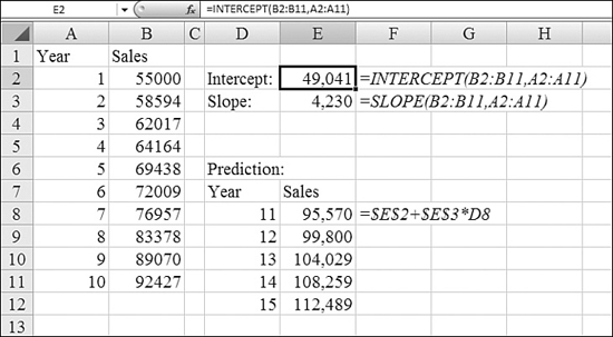
The formula in Cell E2 calculates the intercept for the line by using =INTERCEPT(B2:B11,A2:A11). The answer of 49,041 means that the model predicts that your sales in a hypothetical Year 0 would have been 49,041.
The formula in Cell E3 calculates the slope of the line by using =SLOPE(B2:B11,A2:A11). The answer of 4,230 means that the model predicts that your sales are increasing by about 4,230 each year.
When you have the slope and y-intercept, you can build a new table to predict future sales. You enter year numbers 11 through 15 in D8:D12. The formula in Cell E8 needs to multiply the year number by the slope and add the intercept. That formula is =$E$2+$E$3*D8.
The values in Cells E8 through E12 are one prediction of future sales. This assumes that the past trends continue to work over the next five years.
Using LINEST to Calculate Straight-Line Regression with Complete Statistics
Although SLOPE and INTERCEPT would do the job, the more powerful function is LINEST. Here is the difficulty: LINEST returns both the slope and the intercept. In addition, it returns a whole series of statistics. Anytime a function returns several values, you must enter the function by using Ctrl+Shift+Enter. You should also select a large enough range in advance before entering the formula. Figuring out the size of the range in advance is difficult because it varies, depending on the shape of the independent variables and also whether you ask for statistics.
However, LINEST is far more powerful than SLOPE and INTERCEPT. There are additional arguments available in LINEST that are not available in the easier functions.
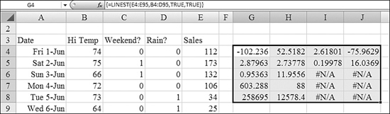
Syntax: =LINEST(known_y's,known_x's,const,stats)
The LINEST function calculates the statistics for a line by using the least-squares method to calculate a straight line that best fits the data, and it returns an array that describes the line. Because this function returns an array of values, it must be entered as an array formula with Ctrl+Shift+Enter. The equation for the line is y = mx + b or y = m1×1 + m2×2 + ... + b (if there are multiple ranges of x values) where the dependent y value is a function of the independent x values. The m values are coefficients corresponding to each x value, and b is a constant value. Note that y, x, and m can be vectors. The array that LINEST returns is backward from what you would expect. The slope for the last independent variable appears first: {mn,mn-1,...,m1,b}. LINEST can also return additional regression statistics.
The LINEST function takes the following arguments:
known_y's—This is the set of y values you already know in the relationship y = mx + b. If the arrayknown_y'sis in a single column, each column ofknown_x'sis interpreted as a separate variable. If the arrayknown_y'sis in a single row, each row ofknown_x'sis interpreted as a separate variable.known_x's—This is an optional set of x values that you may already know in the relationship y = mx + b. The arrayknown_x'scan include one or more sets of variables. If only one variable is used,known_y'sandknown_x'scan be ranges of any shape, as long as they have equal dimensions. If more than one variable is used,known_y'smust be a vector (that is, a range with a height of one row or a width of one column). Ifknown_x'sis omitted, it is assumed to be the array{1,2,3,...}that is the same size asknown_y's.const—This is a logical value that specifies whether to force the constant b to equal 0. IfconstisTRUEor omitted, b is calculated normally. IfconstisFALSE, b is set equal to 0, and the m values are adjusted to fit y = mx.stats—This is a logical value that specifies whether to return additional regression statistics. IfstatsisTRUE,LINESTreturns the additional regression statistics, so the returned array is{mn,mn-1,...,m1,b;sen,sen-1,...,se1,seb;r2,sey;F,df;ssreg,ssresid}. IfstatsisFALSEor omitted,LINESTreturns only the m coefficients and the constant b. If you specifyTRUEforstats, the additional regression statistics shown in Table 26.2 are possible return values.
Table 26.2. Additional Regression Statistics for LINEST
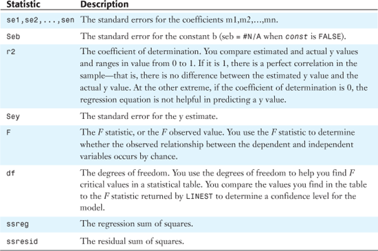
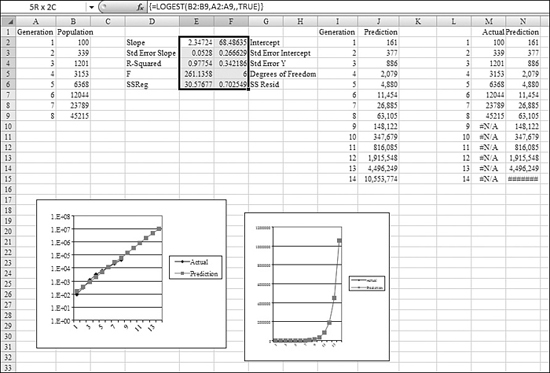
Figure 26.16, later in this chapter, shows a visual map of the statistics being returned.
The accuracy of the line calculated by LINEST depends on the degree of scatter in the data. The more linear the data, the more accurate the LINEST model. LINEST uses the method of least squares for determining the best fit for the data.
The line- and curve-fitting functions LINEST and LOGEST can calculate the best straight line or exponential curve that fits the data. However, you have to decide which of the two results best fits the data. You can calculate TREND(known_y's,known_x's) for a straight line or GROWTH(known_y's,known_x's) for an exponential curve. These functions, without the known_x's argument, return an array of y values predicted along that line or curve at your actual data points. You can then compare the predicted values with the actual values. You might want to chart them both for a visual comparison.
In regression analysis, Microsoft Excel calculates for each point the squared difference between the y value estimated for that point and its actual y value. The sum of these squared differences is called the residual sum of squares. Microsoft Excel then calculates the sum of the squared differences between the actual y values and the average of the y values, which is called the total sum of squares (that is Regression sum of squares + Residual sum of squares). The smaller the residual sum of squares compared with the total sum of squares, the larger the value of the coefficient of determination, r-squared, which is an indicator of how well the equation resulting from the regression analysis explains the relationship among the variables.
Say that you rent a snowcone cart at a local amusement park. You create a table showing total snow cones sold for each day of last summer. In Figure 26.15, Column E shows the total snow cones sold by day. As you can see, the sales rise and fall sharply from day to day.
Figure 26.15. The results of the LINEST function in G4:J8 are seemingly meaningless.
The previous manager of the cart had noticed certain trends in the data. Sales were better on the weekends than on weekdays. Sales were horrible when it rained. Sales improved as the weather became hotter in July and August.
Columns B:D in Figure 26.15 contain data related to temperature, weekends, and rain. Note that in Column C, the weekend data is binary data—either 0 or 1. In Column D, the manager could have kept information about the amount of rainfall each day but instead kept this as binary data as well. If the day was predominantly rainy, the manager recorded a 1 to indicate a rainout. If the day had just a spot of rain, the manager recorded it as a non-rainy day.
To perform regression on this data, you follow these steps:
- Total the number of independent variables and add one. This is the number of columns the results of the regression will occupy. In the snow cone cart example, that is four columns.
- Figure out how may rows the result of the regression will occupy. Because you plan on asking for statistics in the snow cone example, this is five rows.
- Off to the side of the data, select a range that is four columns wide by five columns tall. This size is determined by the results of the first two steps.
- Start to type the formula, =
LINEST(. - For the
known_y's, use the sales data in Column E; this would be E4:E95. - For the
known_x's, use the values for temperature, weekend, and rain. This would be B4:D95. Note that the dates in Column A are not being used as an independent variable. The amusement park is an established park: There is nothing to indicate that attendance rises over the course of the season. - User
TRUEfor the next argument, which asks whether the intercept should be forced to be 0. This is not a requirement in the current situation. You want to allow the intercept to be calculated normally. - Use 1 or
TRUEfor thestatsargument. - Although you have now typed the complete formula,
=LINEST(E4:E95,B4:D95,TRUE,TRUE), do not press the Enter key. This is one formula that returns many results. You have to tell Excel to interpret the formula as an array formula. To do this, hold down Ctrl+Shift while pressing Enter. The function returns a seemingly meaningless range of numbers, as shown in Figure 26.15. - Start labeling the regression results in the upper-right corner. The value in the upper-right corner is the y-intercept. This is equivalent to the result of the
INTERCEPTfunction. - Working in the top row from right to left, look at the slopes of the independent variables. These appear backward from how you originally specified them. Your independent variables were temperature, weekend, and rain. The slope for the last independent variable is in the top-left corner of the results. In Figure 26.16, Cell G4 is the slope associated with rain. Cell H4 is the slope associated with weekend. Cell H5 is the slope associated with temperature.
Figure 26.16. When you have the
LINESTresults, there are many more tests and charts that you can perform to test how good the regression model is.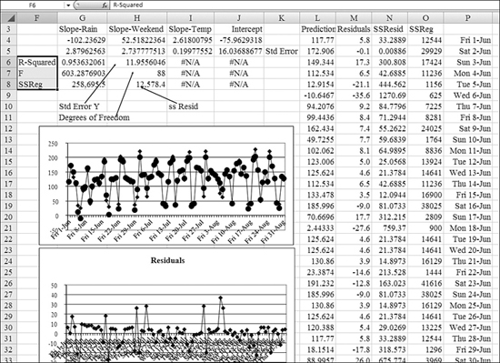
- Take a look at these numbers for a second to see if they make sense. The intercept says you are going to sell –75 snow cones each day. This initially seems wrong. However, the value in Column I says that you will sell 2.6 snow cones for every degree of temperature. Because the lowest minimum high temperature for the summer would be about 60 degrees, the result suggests that you would sell a minimum of (60 × 2.6), or about 156 snow cones, due to temperature. Adding the –75 and 156 gets you to a minimum of 80 snow cones on a sunny day. Cell H4 suggests that you would sell about 52 extra snow cones on a weekend. Cell G4 suggests that you would sell 102 fewer snow cones on a rainy day.
- Fill in the rest of the labels for statistics. The second row of the results shows the standard error for the number above it. The first column of the third row returns the all-important r-squared value. If this value is close to 1, your model is doing a good job of predicting the data. The value of 0.95 shows that this model is fairly good. Row 3, Column 2 shows the standard error of Y. It is normal to have
#N/Ain any additional columns of Row 3. Row 4 contains the F statistic and degrees of freedom. Row 5 contains the sum of squares of the regression and the residual sum of squares. This is the number that Excel is trying to minimize when it fits the line using least squares. - In Column L, build a formula to predict sales with the results of the regression. This formula would be Intercept + Slope temp × Temp + Slope weekend × Weekend + Slope rain × Rain. The formula in Cell L4 is therefore
=$J$4+$I$4*B4+$H$4*C4+$G$4*D4. - To visually compare the data, plot the actuals in Column E and the prediction in Column L on a chart. The chart in rows 12:22 shows that the prediction is tracking fairly well with the actual. There was a cold, rainy weekday near the beginning where the model predicted –10 sales versus an actual of 25.
- For another interesting test, calculate the residual or error for each day. The data in Column M is the difference of Column L minus Column E. Plot this data. You should see many small positive and negative values. The values should swing from positive to negative frequently. The amount of scatter should not vary over time. You should not see many clusters of points that are either positive or negative. The chart in rows 24:34 shows that there are many positive residuals early in the summer, and there are fewer later in the summer. This might mean that the model is less successful at lower June temperatures than at higher August temperatures. Perhaps only real snow cone fans buy the product at temperatures of 60 to 80. Above 80 degrees, more people might buy the product.
Troubleshooting LINEST
Remember that LINEST returns an array of values. In addition, you need to select a large enough range before entering the function, and you need to use Ctrl+Shift+Enter to enter the formula.
If you forget to use Ctrl+Shift+Enter, Excel returns just the top-left cell from the result set. In the dataset in Figure 26.15, this would just be the slope for the final independent variable (–102.236). If you enter LINEST and receive just one value, you should follow these steps:
- Select a range starting with the
LINESTformula in the upper-left corner. The range should be five rows tall. It should be at least two columns wide for models with oneknown_xcolumn. Add additional columns for additionalknown_xseries. - Press the F2 key to edit the current
LINESTformula. - Hold down Ctrl+Shift+Enter to reenter the formula as an array.
Alternatively, you can use the INDEX function to pluck one particular value out of the LINEST function. For example, if you wanted to retrieve the F statistic from Row 4, Column 1, you could use =INDEX(LINEST(E4:E95,B4:D95,TRUE,TRUE),4,1).
In the simpler situation when you have only one independent x variable, you can obtain the slope and y-intercept values directly by using the following formula for slope:
INDEX(LINEST(known_y's,known_x's),1)
You use the following formula for the y-intercept:
INDEX(LINEST(known_y's,known_x's),2)
Using FORECAST to Calculate Prediction for Any One Data Point
When you understand straight-line regression, you can use the FORECAST function to return a prediction for any point in the future.
Syntax: =FORECAST(x,known_y's,known_x's)
The FORECAST function calculates, or predicts, a future value by using existing values. The predicted value is a y value for a given x value. The known values are existing x values and y values, and the new value is predicted by using linear regression. You can use this function to predict future sales, inventory requirements, or consumer trends.
The FORECAST function takes the following arguments:
x—This is the data point for which you want to predict a value. Ifxis nonnumeric,FORECASTreturns a#VALUE!error.known_y's—This is the dependent array or range of data.known_x's—This is the independent array or range of data.
If known_y's and known_x's are empty or contain a different number of data points, FORECAST returns a #N/A error. If the variance of known_x's equals 0, then FORECAST returns a #DIV/0! error.
Figure 26.17 shows actual sales data for the past decade. Years are in Column A, and sales are in Column C. The sales data in C2:C12 is the range of known_y's. The years in A2:A12 is the range of known_x's.
Figure 26.17. You use the FORECAST function to find the data point for one future time period.
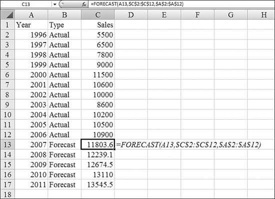
To predict sales for future periods, you follow these steps:
- Enter future years in A13:A2011.
- In Column B, enter
ActualorForecastfor each row so that the person reading the table understands that the new values are a forecast. - To predict sales for 2007, enter this formula in Cell C13:
=FORECAST(A13,$C$2:$C$12,$A$2:$A$12). - Copy the formula from Cell C13 down to C14:C17.
Note
Note that FORECAST works only for straight-line regression. It also does not offer the ability to force the intercept to be 0. If you need this ability, you have to use LINEST and then build a prediction formula as in step 14 of the previous section or the TREND function as discussed in the next section.
Using TREND to Calculate Many Future Data Points at Once
The TREND function is another array function. This means that it can return many values from a single formula. If you think about the previous use of FORECAST in Figure 26.17, you realize that Excel really had to perform the linear regression multiple times—once for each of the cells in C13:C17. It would be better if you could perform the regression once and have Excel calculate all the values from that regression. The TREND function helps you do this.
Syntax: =TREND(known_y's,known_x's,new_x's,const)
The TREND function returns values along a linear trend. It fits a straight line (using the least-squares method) to the arrays known_y's and known_x's. It returns the y values along that line for the array of new_x's that you specify.
The TREND function takes the following arguments:
known_y's—This is the set of y values you already know in the relationship y = mx + b. If the arrayknown_y'sis in a single column, each column ofknown_x'sis interpreted as a separate variable. If the arrayknown_y'sis in a single row, each row ofknown_x'sis interpreted as a separate variable.known_x's—This is an optional set of x values that you may already know in the relationship y = mx + b. The arrayknown_x'scan include one or more sets of variables. If only one variable is used,known_y'sandknown_x'scan be ranges of any shape, as long as they have equal dimensions. If more than one variable is used,known_y'smust be a vector (that is, a range with a height of one row or a width of one column). Ifknown_x'sis omitted, it is assumed to be the array{1,2,3,...}that is the same size asknown_y's.new_x's—These are new x values for which you wantTRENDto return corresponding y values.new_x'smust include a column (or row) for each independent variable, just asknown_x'sdoes. So, ifknown_y'sis in a single column,known_x'sandnew_x'smust have the same number of columns. Ifknown_y'sis in a single row,known_x'sandnew_x'smust have the same number of rows. If you omitnew_x's, it is assumed to be the same asknown_x's. If you omit bothknown_x'sandnew_x's, they are assumed to be the array{1,2,3,...}that is the same size asknown_y's.const—This is a logical value that specifies whether to force the constant b to equal0. IfconstisTRUEor omitted, b is calculated normally. IfconstisFALSE, b is set equal to0, and the m values are adjusted so that y = mx.
Formulas that return arrays must be entered as array formulas. This means that after entering the formula, you need to hold down Ctrl+Shift while pressing Enter.
Say that you are responsible for forecasting the material needs for a company that supplies roofing material. You have historical trends of usage by year. You’ve included past hurricane data because those events caused extraordinary demand. Your job is to predict how much roofing material you will sell, assuming that there are no hurricanes, but how much you might want to have lined up in case there are one, two, or three hurricanes. Here’s what you do:
- As in the worksheet shown in Figure 26.18, enter the actual data in A4:C17. Make the sales in Column C the
known_y's.Figure 26.18. The
TRENDfunction is an array formula that can do one regression and return many future data points.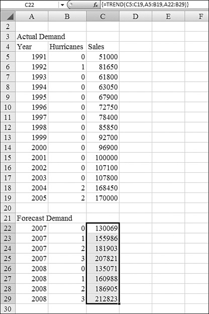
- Make the years and hurricane data in Columns A and B the
known_x's. - Enter a new table in A22:B29. You want to find the forecasted requirements for 2007 and 2008 for the possibility that there are zero, one, two, or three hurricanes. The year and hurricane columns must be in the same format as the
known_x'sin step 2. - Keep in mind that because the
TRENDfunction is an array function, it can return several answers from one formula. Select the range C22:C29. With that range selected, start to type the formula=TREND(. - Enter C5:C19 for
known_y's, which are past sales. Enter A5:A19 forknown_x's. The new x values are the data in A22:B29. - Ensure that your formula is now
=TREND(C5:C19,A5:B19,A22:B29). To finish the formula, hold down Ctrl+Shift while pressing Enter.
The result is shown in C22:C29. The TREND function predicts that you will need a base level of 130 thousand in 2007 with no hurricanes. With two hurricanes in 2007, demand would rise to 182 thousand.
Using LOGEST to Perform Exponential Regression
Some patterns in business follow a linear regression. However, other items are not linear at all. If you are a scientist monitoring the growth of bacteria in a Petri jar, you will see exponential growth in the generations.
If you try to fit an exponential growth to a straight line, you have a large error. If the r-squared from linear regression is too low, you can try using exponential regression to see if the pattern of data matches exponential regression better. For exponential regression, you use the LOGEST function, which is similar to the LINEST function.
Syntax: =LOGEST(known_y's,known_x's,const,stats)
In regression analysis, the LOGEST function calculates an exponential curve that fits the data and returns an array of values that describes the curve. Because this function returns an array of values, it must be entered as an array formula. The equation for the curve is y = b*m^x or y = (b*(m1^x1)*(m2^x2)*_) (if there are multiple x values), where the dependent y value is a function of the independent x values. The m values are bases that correspond to each exponent x value, and b is a constant value.
The LOGEST function takes the following arguments:
known_y's—This is the set of y values you already know in the relationship y = b × m^x. If the arrayknown_y'sis in a single column, each column ofknown_x'sis interpreted as a separate variable. If the arrayknown_y'sis in a single row, each row ofknown_x'sis interpreted as a separate variable.known_x's—This is an optional set of x values you may already know in the relationship y = b × m^x. The arrayknown_x'scan include one or more sets of variables. If only one variable is used,known_y'sandknown_x'scan be ranges of any shape, as long as they have equal dimensions. If more than one variable is used,known_y'smust be a range of cells with a height of one row or a width of one column (which is also known as a vector). Ifknown_x'sis omitted, it is assumed to be the array{1,2,3,...}that is the same size asknown_y's.const—This is a logical value that specifies whether to force the constant b to equal1. IfconstisTRUEor omitted, b is calculated normally. IfconstisFALSE, b is set equal to1, and the m values are fitted to y = m^x.stats—This is a logical value that specifies whether to return additional regression statistics. IfstatsisTRUE,LOGESTreturns the additional regression statistics (refer to Figure 26.16), so the returned array is{mn,mn-1,...,m1,b;sen,sen-1,...,se1,seb;r2,sey; F,df;ssreg,ssresid}. IfstatsisFALSEor omitted,LOGESTreturns only the m coefficients and the constant b.
The more a plot of data resembles an exponential curve, the better the calculated line fits the data. Like LINEST, LOGEST returns an array of values that describes a relationship among the values, but LINEST fits a straight line to the data; LOGEST fits an exponential curve.
Figure 26.19 shows an estimated population in Column B and the generation in Column A. To perform a exponential regression, you follow these steps:
- Because there is one independent variable, the results from the regression occupy two columns, so find a blank range of the spreadsheet and select a range that is two columns wide by five rows tall, such as E2:F6.
- Enter the beginning of the formula:
=LOGEST(. Enter theknown_y'sas B2:B9 and theknown_x'sas A2:A9. Leave theconstvalue blank. SpecifyTRUEforstatistics. The formula should be=LOGEST(B2:B9,A2:A9,,TRUE). - Do not press Enter for the formula. Instead, hold down Ctrl+Shift while pressing Enter to tell Excel to interpret the result as an array formula and to return a table of values from
LOGEST. - Add some labels to help interpret the statistics. The labels shown in Column D and G are examples.
- To use the results of the regression in a prediction calculation, enter a different formula than with
LINEST. The formula is Intercept × Slope^X. In Figure 26.19, to predict population values for a given generation in Cell I2, use=$F$2*$E$2^I2. Alternatively, you can use theGROWTHfunction, discussed in the next section.
Figure 26.19. When data is growing at an exponential rate, you use LOGEST to perform a regression analysis.
Usign GROWTH to Predict Many Data Points from an Exponential Regression
As the TREND function is able to extrapolate points from a linear regression, the GROWTH function is able to extrapolate points from an exponential regression.
Syntax: =GROWTH(known_y's,known_x's,new_x's,const)
The GROWTH function calculates predicted exponential growth by using existing data. GROWTH returns the y values for a series of new x values that you specify by using existing x values and y values. You can also use the GROWTH worksheet function to fit an exponential curve to existing x values and y values. This function takes the following arguments:
known_y's—This is the set of y values you already know in the relationship y = b × m^x. If the arrayknown_y'sis in a single column, each column ofknown_x'sis interpreted as a separate variable. If the arrayknown_y'sis in a single row, each row ofknown_x'sis interpreted as a separate variable. If any of the numbers inknown_y'sis0or negative,GROWTHreturns a#NUM!error.known_x's—This is an optional set of x values that you may already know in the relationship y = b × m^x. The arrayknown_x'scan include one or more sets of variables. If only one variable is used,known_y'sandknown_x'scan be ranges of any shape, as long as they have equal dimensions. If more than one variable is used,known_y'smust be a vector (that is, a range with a height of one row or a width of one column). Ifknown_x'sis omitted, it is assumed to be the array{1,2,3,...}that is the same size asknown_y's.new_x's—These are new x values for which you wantGROWTHto return corresponding y values.new_x'smust include a column (or row) for each independent variable, just asknown_x'sdoes. So, ifknown_y'sis in a single column,known_x'sandnew_x'smust have the same number of columns. Ifknown_y'sis in a single row,known_x'sandnew_x'smust have the same number of rows. Ifnew_x'sis omitted, it is assumed to be the same asknown_x's. If bothknown_x'sandnew_x'sare omitted, they are assumed to be the array{1,2,3,...}that is the same size asknown_y's.const—This is a logical value that specifies whether to force the constant b to equal1. IfconstisTRUEor omitted, b is calculated normally. IfconstisFALSE, b is set equal to1, and the m values are adjusted so that y = m^x.
When you have formulas that return arrays, you must enter them as array formulas after selecting the correct number of cells. To specify an array formula, you hold down Ctrl+Shift while pressing Enter.
In Figure 26.20, the original data is the population for the first 10 generations in A2:B11.
Figure 26.20. GROWTH performs an exponential regression and extrapolates the results in one step.
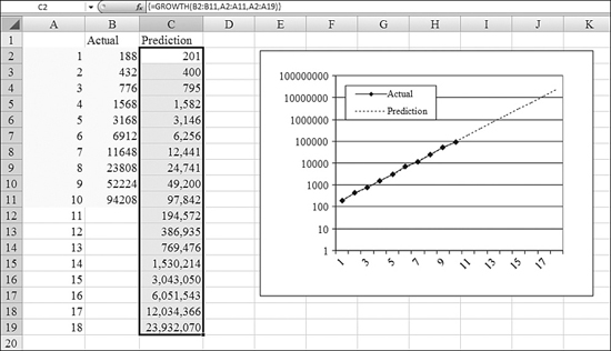
It would be interesting to run an exponential regression and see the prediction for future generations but also for the known generations as well. This would allow you to see how well the prediction tracks with current values. To do this, you follow these steps:
- Add new generation numbers in A12:A18. The
GROWTHfunction will use these numbers and return an array of values. - Select the entire range C2:C19 for the results before entering the formula.
- Put the
known_y'sin B2:B11. Theknown_x'sare in A2:A11. Put thenew_x'sin A2:A19. The formula is=GROWTH(B2:B11,A2:A11,A2:A19). - After typing the formula, hold down Ctrl+Shift while pressing Enter. This should cause the formula to return values in each cell in C2:C19.
- To visualize the original data and the prediction, plot A1:C19 on a line chart. Numbers at the end of the progression (24 million) make the scale of the chart so large that you cannot see the detail of the first 12 generations.
- Right-click the numbers along the y-axis and choose Format Axis. On the Scale tab, choose Logarithmic Scale. The resulting chart allows you to examine both the smaller and larger numbers in the chart.
Using PEARSON to Determine Whether a Linear Relationship Exists
Remember that Excel blindly fits a regression line to any dataset. The fact that Excel returns a regression line does not mean that you should use it to make any predictions. The initial question to ask yourself is Does a linear relationship exist in this data?
The Pearson product–moment correlation coefficient, named after Karl Pearson, returns a value from –1.0 to +1.0. The calculation could make your head spin, but the important thing to know is that a PEARSON value closer to 1 or –1 means that a linear relationship exists. A value of 0 indicates no correlation between the independent and dependent variables.
Note
I am somewhat jealous that Microsoft has named an obscure function after fellow Excel consultant Chip Pearson. I am lobbying Microsoft for the inclusion of a JELEN function, possibly used to measure the degree of laid-backness caused by the gel in your shoe insoles. Seriously, Chip Pearson’s website is one of the best established sources of articles on the Web about Excel. To peruse the articles, visit www.cpearson.com.
Syntax: =PEARSON(array1,array2)
The PEARSON function returns the Pearson product–moment correlation coefficient, r, a dimensionless index that ranges from –1.0 to 1.0, inclusive, and reflects the extent of a linear relationship between two datasets.
The PEARSON function takes the following arguments:
array1—This is a set of independent values.array2—This is a set of dependent values.
The arguments must be either numbers or names, array constants, or references that contain numbers. If an array or a reference argument contains text, logical values, or empty cells, those values are ignored; however, cells that contain the value 0 are included. If array1 and array2 are empty or have a different number of data points, PEARSON returns a #N/A error.
The result of PEARSON is also sometimes known as r. Multiplying PEARSON by itself leads to the more famous r-squared test.
Using RSQ to Determine the Strength of a Linear Relationship
r-squared is a popular measure of how well a regression line explains the variability in the y values. It is popular because the values range from 0 to 1. Numbers close to 1 mean that the regression line does a great job of predicting the values. Numbers close to 0 mean that the regression result can’t predict the values at all.
r-squared is the statistic in the third row, first column of a LINEST function. It is also the square of the PEARSON function. You could use =INDEX(LINEST(),3,1) or =PEARSON()^2. But instead, Excel provides the easy-to-remember RSQ function.
Syntax: =RSQ(known_y's,known_x's)
The RSQ function returns the square of the Pearson product–moment correlation coefficient through data points in known_y's and known_x's. (For more information, see the section on the PEARSON function, earlier in this chapter.) The r-squared value can be interpreted as the proportion of the variance in y that is attributable to the variance in x.
The RSQ function takes the following arguments:
known_y's—This is an array or a range of data points.known_x's—This is an array or a range of data points.
The arguments must be either numbers or names, arrays, or references that contain numbers. If an array or a reference argument contains text, logical values, or empty cells, those values are ignored; however, cells that contain the value 0 are included. If known_y's and known_x's are empty or have a different number of data points, RSQ returns a #N/A error.
Figure 26.21 shows four datasets and their associated r-squared values:
Figure 26.21. As r-squared approaches 1.0, the predictive ability of the regression line improves.
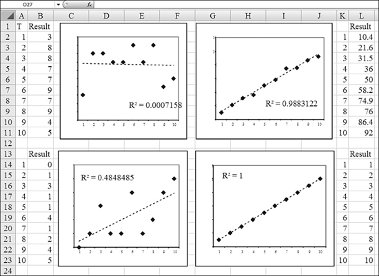
- The chart in the top-left corner has an r-squared near 0. There is little predictive ability in this regression line. In fact, the regression line is practically a horizontal line drawn through the mean of the data points.
- The chart in the lower-left corner has an r-squared of 0.48. There is a lot of variability in the dots, but they do seem to trend up. There are huge relative errors on certain data points (for example, the value of y = 1 when x = 7).
- The chart in the upper-right corner shows a nearly perfect correlation. The r-squared is appropriately high, at 0.988. This means that most of the variability in y is explained by x. There are some tiny minor variations above or below the line, but the regression is doing a great job.
- The final chart, in the lower right, illustrates a perfect correlation and an r-squared of 1.0. Every occurrence of y falls exactly on the regression line.
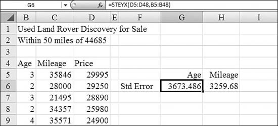
Using STEYX to Calculate Standard Regression Error
Standard error is a measure of the quality of a regression line. In rough terms, the standard error is the size of an error that you might encounter for any particular point on the line. Smaller errors are better, and larger errors are worse. Standard error can also be used to calculate a confidence interval for any point.
Syntax: =STEYX(known_y's,known_x's)
The STEYX function returns the standard error of the predicted y value for each x in the regression. The standard error is a measure of the amount of error in the prediction of y for an individual x.
The STEYX function takes the following arguments:
known_y's—This is an array or a range of dependent data points.known_x's—This is an array or a range of independent data points.
The arguments must be either numbers or names, arrays, or references that contain numbers. If an array or a reference argument contains text, logical values, or empty cells, those values are ignored; however, cells that contain the value 0 are included. If known_y's and known_x's are empty or have a different number of data points, STEYX returns a #N/A error.
To calculate standard error, you square all the residuals and add them together. Then you divide by the number of points, excluding the starting and ending points. Finally, you take the square root of that result to calculate standard error.
In general, a lower standard error is better than a higher one. A standard error of 2,000 when you are trying to predict the price of a $30,000 car isn’t too bad. A standard error of 2,000 when you are trying to predict the price of a $3 jar of pickles is horrible. You need to compare the standard error to the size of the value you are predicting.
In Figure 26.22, two regressions attempt to predict the price of a car based on either mileage or age. The standard error for the mileage method is a little less than the standard error for the age method.
Figure 26.22. Standard error is another measure of the quality of a regression line.
Using COVAR to Determine Whether Two Variables Vary Together
Covariance is a measure of how greatly two variables vary together. If the value is 0, the variables do not appear to be related. For positive values, covariance indicates that as x increases, y also increases. For negative values, covariance indicates that as x increases, y decreases.
Syntax: =COVAR(array1,array2)
The COVAR function returns covariance, the average of the products of deviations for each data point pair. You use covariance to determine the relationship between two datasets. For example, you can examine whether greater income accompanies greater levels of education.
The COVAR function takes the following arguments:
array1—This is the first cell range of integers.array2—This is the second cell range of integers.
The arguments must be either numbers or names, arrays, or references that contain numbers. If an array or a reference argument contains text, logical values, or empty cells, those values are ignored; however, cells that contain the value 0 are included. If array1 and array2 have different numbers of data points, COVAR returns a #N/A error. If either array1 or array2 is empty, COVAR returns a #DIV/0! error.
Covariances can become incredibly large. The unit of measurement is on the order of x times y. For a dimensionless measurement of correlation, you use CORREL instead of COVAR.
In Figure 26.23, the CORREL function measures the covariance between mileage and price. As mileage increases, price decreases.
Figure 26.23. COVAR shows that price and mileage are inversely correlated.
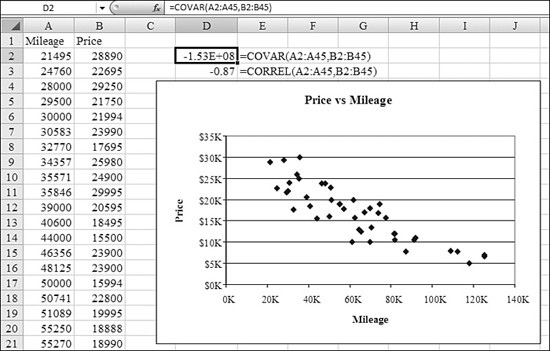
Using CORREL to Calculate Positive or Negative Correlation
Instead of using covariance, you can calculate a correlation coefficient for two arrays. Let’s use the mileage and price comparison from Figure 26.23. The two values would have a strong positive correlation if price went up as mileage went up. A perfect positive correlation would result in a correlation coefficient of 1.0.
It is also possible (as in the mileage–price comparison case) for values to have an inverse correlation. As mileage increases, the price tends to decrease. If mileage were the only factor in the price of a car, the correlation coefficient would be –1.0 to indicate a perfect inverse correlation.
A correlation coefficient of 0 indicates that there is no correlation between the values.
Syntax: =CORREL(array1,array2)
The CORREL function returns the correlation coefficient of the array1 and array2 cell ranges. You use the correlation coefficient to determine the relationship between two properties. For example, you can examine the relationship between a location’s average temperature and the use of air conditioners.
The CORREL function takes the following arguments:
array1—This is a cell range of values.array2—This is a second cell range of values.
The arguments must be numbers or names, arrays, or references that contain numbers. If an array or reference argument contains text, logical values, or empty cells, those values are ignored; however, cells that contain the value 0 are included. If array1 and array2 have a different number of data points, CORREL returns a #N/A error. If either array1 or array2 is empty, or if s (the standard deviation) of their values equals 0, CORREL returns a #DIV/0! error.
In Figure 26.24, price and mileage have a correlation coefficient of 0.87. This indicates a fairly strong inverse correlation. As mileage increases, price decreases. The bottom-left chart shows two series with no correlation at all; the correlation coefficient is very close to 0. The bottom-right chart shows two series with perfect positive correlation of 1.0.
Figure 26.24. The CORREL function returns values from –1.0 to 1.0. Values near 0 indicate no correlation.
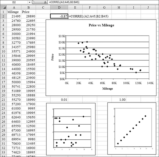
Using FISHER to Perform Hypothesis Testing on Correlations
The Pearson value does not have a normal distribution. The graph of expected r values skews heavily toward 1. A statistician named Fisher found a formula that would transform the skewed r value into a normal distribution. You use the FISHER function to convert an r value. To take a FISHER value and return it to an r value, you use FISHERINV.
Syntax: =FISHER(x)
The FISHER function returns the Fisher transformation at x. This transformation produces a function that is approximately normally distributed rather than skewed. You use this function to perform hypothesis testing on the correlation coefficient.
The argument x is a numeric value for which you want the transformation. If x is nonnumeric, FISHER returns a #VALUE! error. If x is less than or equal to –1 or if x is greater than or equal to 1, FISHER returns a #NUM! error.
Syntax: =FISHERINV(y)
The FISHERINV function returns the inverse of the Fisher transformation. You use this transformation when analyzing correlations between ranges or arrays of data. If y is equal to FISHER(x), then FISHERINV(y) is equal to x.
The argument y is the value for which you want to perform the inverse of the transformation. If y is nonnumeric, FISHERINV returns a #VALUE! error.
Using SKEW and KURTOSIS
Two final statistics are used to describe a population:
- Skew—Skew is an indicator of symmetry. Actually, it is a measure of lack of symmetry. A skew value of 0 indicates that the population is perfectly symmetrical around the mean. Negative values indicate that the data is skewed to the left of the mean. Positive values indicate that the data is skewed to the right of the mean. You can use Excel’s
SKEWfunction to calculate skew. - Kurtosis—Kurtosis indicates whether the distribution contains a spiky peak or is relatively flat. This measure compares a population to the standard normal distribution. If the kurtosis is less than 0, the population is flatter than the normal distribution. If the kurtosis is greater than 0, then the population is spikier than the normal distribution. You use Excel’s
KURTfunction to calculate kurtosis.
In Figure 26.25, there are two populations. The population in Column A contains one large spike of 19 data points at 2.36 inches and a single data point at 60.25 inches. You can think of this as a tank with 1 shark and 19 goldfish. The average size is 5.25 inches. The tail of the distribution is a very long tail to the right of the 5.25 inches mean, indicating a positive skew. The 19 goldfish cause a very spiky data point, causing a high kurtosis.
Figure 26.25. Skew and kurtosis return information about the symmetry and spikiness of a dataset.

In Column E, the data points are uniformly distributed around the mean. The data is perfectly symmetrical, leading to a skew of 0.00. No data point has more than one member, causing the data to be extremely flat, with a negative kurtosis.
Syntax: =SKEW(number1,number2,...)
The SKEW function returns the skewness of a distribution. Skewness characterizes the degree of asymmetry of a distribution around its mean. Positive skewness indicates a distribution with an asymmetric tail extending toward more positive values. Negative skewness indicates a distribution with an asymmetric tail extending toward more negative values.
The arguments number1,number2... are 1 to 255 arguments for which you want to calculate skewness. You can also use a single array or a reference to an array instead of arguments separated by commas. The arguments must be either numbers or names, arrays, or references that contain numbers. If an array or a reference argument contains text, logical values, or empty cells, those values are ignored; however, cells that contain the value 0 are included. If there are fewer than three data points, or if the sample standard deviation is 0, SKEW returns a #DIV/0! error.
Syntax: =KURT(number1,number2, ...)
The KURT function returns the kurtosis of a dataset. Kurtosis characterizes the relative peakedness or flatness of a distribution compared with the normal distribution. Positive kurtosis indicates a relatively peaked distribution. Negative kurtosis indicates a relatively flat distribution.
The arguments number1,number2,... are 1 to 255 arguments for which you want to calculate kurtosis. You can also use a single array or a reference to an array instead of arguments separated by commas. The arguments must be either numbers or names, arrays, or references that contain numbers. If an array or a reference argument contains text, logical values, or empty cells, those values are ignored; however, cells that contain the value 0 are included. If there are fewer than four data points, or if the standard deviation of the sample equals zero, KURT returns a #DIV/0! error.
Examples of Functions for Inferential Statistics
Inferential statistics is the really powerful side of statistics. With descriptive statistics, you are able to describe a dataset. Describing a dataset might allow you to better understand the dataset. With regression, you use past trends to predict future results. With inferential statistics, you extrapolate information about a sample of the population to make predictions about the entire population.
Using BINOMDIST to Determine Probability
A binomial test is a situation in which there are only two possible outcomes: Either an event happens or it does not happen.
For example, say that you have determined that on several nights of the week, someone has been sneaking in and eating leftovers from the department fridge. You don’t know if it is the night security guard or the cleaning crew or even just Bob who works later than everyone else. After tracking this behavior for a month, you determine that food has been missing 27% of the time. How many days next week will food be missing? The BINOMDIST function can answer this question.
Syntax: =BINOMDIST(number_s,trials,probability_s,cumulative)
The BINOMDIST function returns the individual term binomial distribution probability. You use BINOMDIST in problems with a fixed number of tests or trials, when the outcomes of any trial are only success or failure, when trials are independent, and when the probability of success is constant throughout the experiment. For example, BINOMDIST can calculate the probability that two of the next three babies born will be male.
The BINOMDIST function takes the following arguments:
number_s—This is the number of successes in trials.trials—This is the number of independent trials.probability_s—This is the probability of success on each trial.cumulative—This is a logical value that determines the form of the function. IfcumulativeisTRUE, thenBINOMDISTreturns the cumulative distribution function, which is the probability that there are at mostnumber_ssuccesses; ifcumulativeisFALSE,BINOMDISTreturns the probability mass function, which is the probability that there arenumber_ssuccesses.
number_s and trials are truncated to integers. If number_s, trials, or probability_s is nonnumeric, BINOMDIST returns a #VALUE! error. If number_s is less than 0 or number_s is greater than trials, BINOMDIST returns a #NUM! error. If probability_s is less than 0 or probability_s is greater than 1, BINOMDIST returns a #NUM! error.
In Figure 26.26, range B5:B10 calculates the probability that food will be missing x days next week. In each case, trials is 5 because there are five workdays next week. The probability_s is 0.27.
Figure 26.26. For tests that are either TRUE or FALSE, the BINOMDIST function can calculate the probability of events.
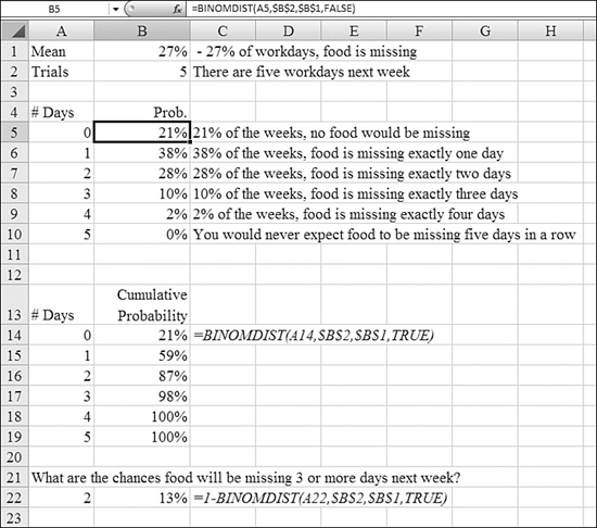
Cell B15 calculates the cumulative probability that 0 or 1 successes will be encountered next week.
Note that BINOMDIST always calculates the probability starting from the left side of the curve. If you wanted to calculate the probability of three or more successes next week, you would have to use one minus the probability of two or fewer successes, as shown in Cell B22.
Using CRITBINOM to Cover Most of the Possible Binomial Events
Many tests are binomial, as described in the preceding section. Say that you are exhibiting at a trade show. You expect 2,000 attendees at the trade show. Based on data from past trade shows, you predict that there is a 17% chance that an attendee will visit your booth and take a catalog. Your goal is to have enough catalogs so that you will be 95% sure to have enough catalogs for everyone. You can use the CRITBINOM function to predict how many catalogs you need.
Syntax: =CRITBINOM(trials,probability_s,alpha)
The CRTIBINOM function returns the smallest value for which the cumulative binomial distribution is greater than or equal to a criterion value. You use this function for quality assurance applications. For example, you can use CRITBINOM to determine the greatest number of defective parts you can allow to come off an assembly line run without needing to reject the entire lot.
The CRTIBINOM function takes the following arguments:
trials—This is the number of Bernoulli trials.probability_s—This is the probability of a success on each trial.alpha—This is the criterion value.
If any argument is nonnumeric, CRITBINOM returns a #VALUE! error. If trials is not an integer, it is truncated. If trials is less than 0, CRITBINOM returns a #NUM! error. If probability_s is less than 0 or if probability_s is greater than 1, CRITBINOM returns a #NUM! error. If alpha is less than 0 or if alpha is greater than 1, CRITBINOM returns a #NUM! error.
In the trade show example, the number of trials is 2,000: Each attendee has a chance of picking up a catalog. The probability_s is 17%, and alpha is 0.95, although it would be interesting to see how many catalogs could be required at each level. Using this information, you follow these steps to determine how many catalogs you need:
- Build a range with different values for
alphain Column A. - End the formula
=CRITBINOM($B$2,$B$1,A8)in Cell B8. - Copy the formula from Cell B8 to the other cells in Column B.
As shown in Figure 26.27, you need to have 368 catalogs for the trade show.
Figure 26.27. Based on response rates at last year’s trade show, you can use CRITBINOM to predict how many catalogs to print.
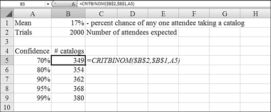
Using NEGBINOMDIST to Calculate Probability
It is a fact that LeBron James has a career free throw percentage of 0.746. What are the odds that James would miss three free throws before he makes one free throw? You can use Excel’s NEGBINOMDIST function to figure this out.
Syntax: =NEGBINOMDIST(number_f,number_s,probability_s)
The NEGBINOMDIST function returns the negative binomial distribution. It returns the probability that there will be number_f failures before the number_sth success, when the constant probability of a success is probability_s. This function is similar to the binomial distribution function, except that the number of successes is fixed, and the number of trials is variable. As with the binomial distribution function, trials are assumed to be independent. For example, you need to find 10 people who have excellent reflexes, and you know the probability that a candidate has these qualifications is 0.3. NEGBINOMDIST calculates the probability that you will interview a certain number of unqualified candidates before finding all 10 qualified candidates.
The NEGBINOMDIST function takes the following arguments:
number_f—This is the number of failures.number_s—This is the threshold number of successes.probability_s—This is the probability of a success.
number_f and number_s are truncated to integers. If any argument is nonnumeric, NEGBINOMDIST returns a #VALUE! error. If probability_s is less than 0 or if probability is greater than 1, NEGBINOMDIST returns a #NUM! error. If (number_f + number_s – 1) is less than or equal to 0, NEGBINOMDIST returns a #NUM! error.
To solve the LeBron James problem, you use =NEGBINOMDIST(3,1,0.746). The answer is a 1.22% probability.
Using POISSON to Predict a Number of Discrete Events Over Time
Say that you have to predict the number of discrete events that will happen over a certain period of time. This might be the number of customers who walk into a bank in an hour. It might be the number of lightning strikes on the Sears Tower in a year. (It can also be discrete events that occur in a certain distance or area or any other measurement.)
Unlike the binomial distribution, in which an event either happens or does not happen, the Poisson distribution can be zero, one, two, three, and so on events in the period. The nature of the Poisson distribution is that before the third customer can walk into the bank, the second customer has to walk into the bank. In theory, if you had a run on the bank, the upper limit would be the number of total account holders, but in practice, there is probably some logical upper limit to how many customers walk in, such as the number that walk in during a Friday payday lunch hour.
If you measure the average number of customers per hour over the several weeks, you can use this number to predict the likelihood that a particular number of customers will enter the bank in any hour by using the POISSON function.
Syntax: =POISSON(x,mean,cumulative)
The POISSON function returns the Poisson distribution. A common application of the Poisson distribution is predicting the number of events over a specific time, such as the number of cars arriving at a toll plaza in one minute. This function takes the following arguments:
x—This is the number of events.mean—This is the expected numeric value.cumulative—This is a logical value that determines the form of the probability distribution returned.
If x is not an integer, it is truncated. If x or mean is nonnumeric, POISSON returns a #VALUE! error. If x is less than or equal to U, POISSON returns a #NUM! error. If mean is less than or equal to 0, POISSON returns a #NUM! error. If cumulative is TRUE, POISSON returns the cumulative Poisson probability that the number of random events occurring will be between 0 and x, inclusive; if cumulative is FALSE, it returns the Poisson probability mass function that the number of events occurring will be exactly x.
To solve the bank customer example, you follow these steps:
- Calculate the mean number of customers entering the bank per hour over several weeks. Enter this in Cell B1 of the worksheet.
- In A4:A24, enter the numbers from 0 to 20.
- In Column B, calculate the probability that exactly n customers will enter the bank. In Cell B4, enter the formula
=POISSON($A4,$B$1,FALSE). - In Column C, calculate the probability that
0toncustomers will enter the bank. In Cell C4, enter the formula=POISSON($A4,$B$1,TRUE).
In Figure 26.28, you can see that 84% of the time, your number of customers is expected to be between 0 and 11 customers per hour. If you staff up to handle 11 customers per hour, you should be covered 85% of the time.
Figure 26.28. You can figure the number of customers per hour by using POISSON.
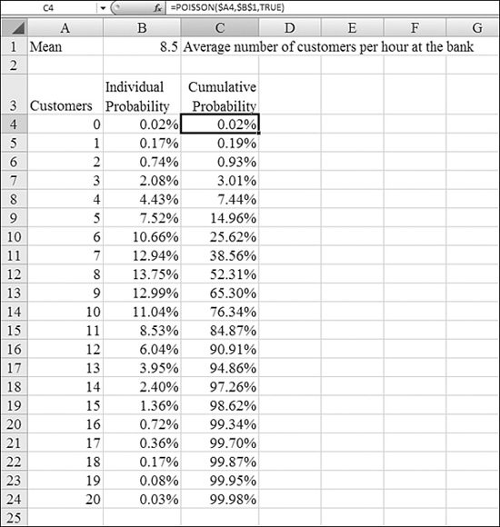
Using FREQUENCY to Categorize Continuous Data
The past few examples count whole numbers. It would be fairly difficult to have 0.3 persons walk into a bank. The outcome from the Poisson distribution would therefore have to be a whole number.
Other measurements are continuous. The speed of a car passing a checkpoint is an example. Depending on the accuracy of the radar unit, a car could be determined to be going 55.1, 55.2, 55.3, 55.4 and so on miles per hour. It would not make sense to try to predict how many cars will be going exactly 55.0123 miles per hour; if you did, you would be lucky to have a height of 2 for any point along the continuous scale. Typically, the prediction question would be What percentage of cars are likely to be going between 65 and 70 miles per hour?
When you are working with a continuous range of measurements, the normal procedure is to group the measurements into ranges. Statisticians call each range a bin.
In Figure 26.29, the left chart shows the frequency curve for the speed of 2,000 cars passing a highway checkpoint. The recording unit measured speeds to the accuracy of 0.1 mile. The curve is incredibly noisy, with intense variation from point to point.
Figure 26.29. With continuous variables, you can group the observed values into bins to see the underlying distribution curve emerge.
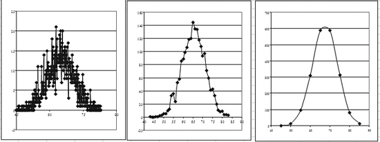
The middle chart shows the frequency curve after the data has been fit into bins of 1 mph each. There is still some noise in the distribution. For some reason, fewer people happened to be going 56 mph.
The right chart shows the frequency curve after the data has been fit into bins of 5 mph each. This curve is very smooth and shows that the data points seem to follow the normal bell curve.
The process of grouping data into bins is handled with another array function: the FREQUENCY function.
Syntax: =FREQUENCY(data_array,bins_array)
The FREQUENCY function calculates how often values occur within a range of values, and it returns a vertical array of numbers. For example, you can use FREQUENCY to count the number of test scores that fall within ranges of scores. Because FREQUENCY returns an array, it must be entered as an array formula.
The FREQUENCY function takes the following arguments:
data_array—This is an array of or a reference to a set of values for which you want to count frequencies. Ifdata_arraycontains no values,FREQUENCYreturns an array of zeros.bins_array—This is an array of or a reference to intervals into which you want to group the values indata_array. Ifbins_arraycontains no values,FREQUENCYreturns the number of elements indata_array.
You enter FREQUENCY as an array formula after you select a range of adjacent cells into which you want the returned distribution to appear.
The number of elements in the returned array is one more than the number of elements in bins_array. The extra element in the returned array returns the count of any values above the highest interval. For example, when counting three ranges of values (intervals) that are entered into three cells, you need to be sure to enter FREQUENCY into four cells for the results. The extra cell returns the number of values in data_array that are greater than the third interval value. FREQUENCY ignores blank cells and text.
To use the FREQUENCY function, you follow these steps:
- Figure out the expected range of values in the original dataset. You can do this by sorting the dataset or by using the
MINandMAXfunctions. - Decide on your bin sizes. Each bin should be roughly the same size. Use enough bins to get an accurate picture but not so many bins that the data becomes spiky and noisy. In Figure 26.30, the goal was bins of 5 mph each.
Figure 26.30. The tedious process of grouping values into ranges is handled easily with the FREQUENCY function.
- Enter the bins. This process is a bit tricky. If you want a bin for 40–45 mph, enter the number
45. For the bin of 45–50 mph, enter the number50. In C2–C10, the numbers represent bins starting with 40–45 and ending with 80–85. - Select the range where the values will be returned. (The
FREQUENCYfunction returns several values at once.) In Figure 26.30, select Cells D2:D11. Notice that this selection is one cell larger than your range of bins. The function returns one extra value in case there are any speeds faster than your top bin speed. - With D2:D11 selected, type the formula
=FREQUENCY(A2:A2001,C2:C10). Do not press Enter at the end. You have to tell Excel to evaluate the formula as an array formula, so hold down Ctrl+Shift and then press Enter. Excel automatically groups the 2,000 individual data points into the 10 bins. You can then chart or analyze this range.
Using NORMDIST to Calculate the Probability in a Normal Distribution
In Figure 26.31, the observed speeds along a highway seem to be following a normal distribution. A normal distribution is sometimes referred to as a bell curve. When you have a normal distribution, the curve can be described mathematically using only the average and standard deviation of the data.
Figure 26.31. If your data is normally distributed, you can predict the future by using NORMDIST.
The NORMDIST function has a strange twist: It always returns the probability that a car will be going less than or equal to a value x. If you want to know the probability that the next car will be traveling between 65 and 75 mph, you have to figure out the cumulative probability of the car going less than 75 miles per hour and then subtract the cumulative probability of the car going less than 65 miles per hour. This requires two calls to the NORMDIST function.
Syntax: =NORMDIST(x,mean,standard_dev,cumulative)
The NORMDIST function returns the normal cumulative distribution for the specified mean and standard deviation. This function has a very wide range of applications in statistics, including hypothesis testing. This function takes the following arguments:
x—This is the value for which you want the distribution.mean—This is the arithmetic mean of the distribution.standard_dev—This is the standard deviation of the distribution.cumulative—This is a logical value that determines the form of the function. IfcumulativeisTRUE,NORMDISTreturns the cumulative distribution function; ifcumulativeisFALSE,NORMDISTreturns the probability mass function.
If mean or standard_dev is nonnumeric, NORMDIST returns a #VALUE! error. If standard_dev is less than or equal to 0, NORMDIST returns a #NUM! error. If mean is 0 and standard_dev is 1, NORMDIST returns the standard normal distribution.
In Figure 26.31, the range of observed values is in A2:A2001. Formulas in Cells D1 and D2 calculate the average and standard deviation of the dataset. The goal is to find the probability of any car going between 65 and 75 mph. The formula in Cell F4 is =NORMDIST(75,$D$1,$D$2,TRUE); it predicts the likelihood of a car going 75 mph or less at 95.3%. The formula in Cell F5 is =NORMDIST(65,$D$1,$D$2,TRUE). This predicts the probability of a car going 65 mph or less at 50.2%.
You can back into the probability that the car will be going between 65 and 75 mph by subtracting 50.2% from 95.3%. The answer to your problem is 45.1% that the next car passing the checkpoint will be going between 65 and 75 mph.
Using NORMINV to Calculate the Value for a Certain Probability
In the preceding section, you used NORMDIST to find the probability that a car was going less than 75 mph. Sometimes, you might want to find the speed associated with a certain probability. For example, say you need to design a billboard that can be read by 80% of the drivers. If you know the mean and standard deviation of the speeds on the highway, you can use the NORMINV function to ask Excel to tell you that 80% of the drivers will be driving at X miles per hour or less.
Syntax: =NORMINV(probability,mean,standard_dev)
The NORMINV function returns the inverse of the normal cumulative distribution for the specified mean and standard deviation. This function takes the following arguments:
probability—This is a probability corresponding to the normal distribution.mean—This is the arithmetic mean of the distribution.standard_dev—This is the standard deviation of the distribution.
If any argument is nonnumeric, NORMINV returns a #VALUE! error. If probability is less than 0 or if probability is greater than 1, NORMINV returns a #NUM! error. If standard_dev is less than or equal to 0, NORMINV returns a #NUM! error.
NORMINV uses an iterative technique for calculating the function. Given a probability value, NORMINV iterates until the result is accurate to within ± 3 × 10^–7. If NORMINV does not converge after 100 iterations, the function returns a #N/A error.
In Figure 26.32, a sample of speeds is listed in Column A. The formulas in Cells D2 and D3 calculate the mean and standard deviation. If you assume that the speeds follow a normal distribution, then 80% of the cars will be traveling 70 mph or less along this stretch of highway. The formula in Cell E6 is =NORMINV(D6,D$1,D$2).
Figure 26.32. Rather than use Goal Seek with the NORMDIST function, you can let Excel handle the iterations to back into an answer using NORMINV.
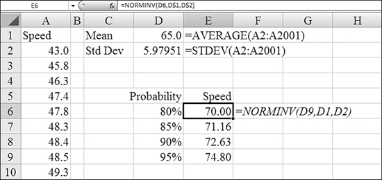
Using NORMSDIST to Calculate Probability
Before the days of spreadsheets, most statistics textbooks had tables of probabilities. In such a textbook, the basic problem states, for example, that the mean is 57.1 and the standard deviation is 8.2. To calculate the probability that a member of the population would have a value of 64 or less, your first step is to calculate a z value. z is simply the number of standard deviations away from the mean. In this case, 64 is 6.9 units above the mean. The standard deviation is 8.2. Your z score is 6.9 / 8.4, or 0.841. Thus, you need to find the probability that any value is at 0.841 standard deviations above the mean or less. You then turn to a large appendix in the back of the textbook that lists many different z scores and the probability associated with each one. The table would look somewhat like Figure 26.33.
Figure 26.33. The NORMSDIST formula in Cell C17 makes tables of probabilities in statistics textbooks (like the one displayed in A2:K14) obsolete.
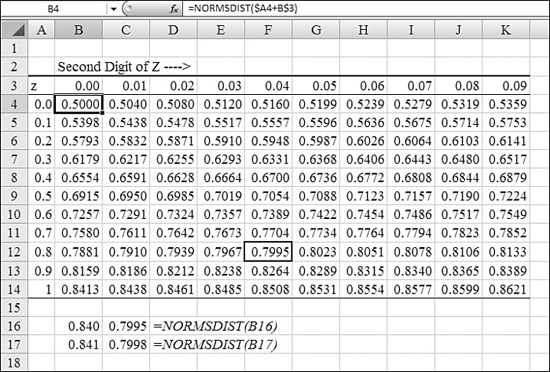
Depending on the accuracy of the table, you could find the probability associated with the z score. In Figure 26.33, you would go down the left column to the 0.8 row and across the table to the 0.04 column to find a value of 0.7995. This means that there is a 0.7995 probability that any random member will be at 0.84 standard deviations above the mean or below it.
The NORMSDIST function makes this table obsolete. (In fact, I created the table in the figure by using NORMSDIST). While the typical statistics textbook would show the approximate probability for z = 0.84 as 0.7995, Excel can now calculate the exact probability for z = 0.841 as 0.7998.
Syntax: =NORMSDIST(z)
The NORMSDIST function returns the standard normal cumulative distribution function. The distribution has a mean of 0 and a standard deviation of 1. You use this function in place of a table of standard normal curve areas.
The argument z is the value for which you want the distribution. If z is nonnumeric, NORMSDIST returns a #VALUE! error.
Using NORMSINV to Calculate a z Score for a Given Probability
To calculate a z score for a given probability, you use the NORMSINV function. In Figure 26.34, the z score for 15% is –1.036. This means that in a normally distributed population, 15% of the population exists at the value of the mean minus 1.036 standard deviations.
Figure 26.34. You can back into a z score from a probability by using NORMSINV. You can then take the z score multiplied by a standard deviation to figure out the distance that your value lies from the mean.
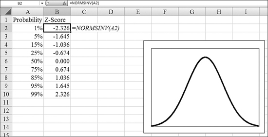
Syntax: =NORMSINV(probability)
The NORMSINV function returns the inverse of the standard normal cumulative distribution. The distribution has a mean of 0 and a standard deviation of 1.
The argument probability is a probability that corresponds to the normal distribution. If probability is nonnumeric, NORMSINV returns a #VALUE! error. If probability is less than 0 or if probability is greater than 1, NORMSINV returns a #NUM! error.
NORMSINV uses an iterative technique for calculating the function. Given a probability value, NORMSINV iterates until the result is accurate to within ± 3 × 10^–7. If NORMSINV does not converge after 100 iterations, the function returns an #N/A error.
The z score refers to a number of standard deviations away from the mean. If the z score is negative, the value lies to the left of the mean. if the z score is positive, the value lies to the right of the mean.
Using STANDARDIZE to Calculate the Distance from the Mean
To calculate the distance from a mean, you use the STANDARDIZE function. This function returns the positive or negative distance from the mean, expressed as the number of standard deviations.
Syntax: =STANDARDIZE(x,mean,standard_dev)
The STANDARDIZE function returns a normalized value from a distribution characterized by mean and standard_dev. This function takes the following arguments:
x—This is the value you want to normalize.mean—This is the arithmetic mean of the distribution.standard_dev—This is the standard deviation of the distribution.
If standard_dev is less than or equal to 0, STANDARDIZE returns a #NUM! error. In Figure 26.35, a population has a mean of 65 and a standard deviation of 5. The normalized value of 75 is 2, indicating that 75 is 2 standard deviations away from the mean of 65.
Figure 26.35. STANDARDIZE does the basic math to calculate the distance from the mean, expressed as a number of standard deviations.
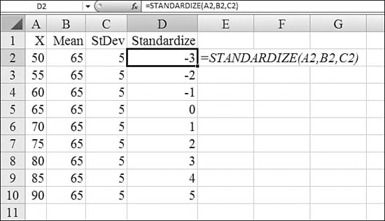
Using Student’s t-Distribution for Small Sample Sizes
All the previous examples using a normal distribution assume that the sample size is 30 or more. If you are using a small sample size—even as small as three members—you should use the Student’s t-distribution.
Note
The unique assumption with the Student’s t-distribution is that the underlying population is normally distributed.
An important concept in the Student’s t-distribution is the degrees of freedom. If you know the mean of the sample but not the standard deviation of the population, the degrees of freedom is the sample size minus 1. When the degrees of freedom is 29 or above, the Student’s t-distribution is nearly identical with the normal distribution. However, as the degrees of freedom drops, the distribution becomes flatter and wider.
Syntax: =TDIST(x,degrees_freedom,tails)
The TDIST function returns the percentage points (that is, probability) for the Student’s t-distribution, where a numeric value (x) is a calculated value of t for which the percentage points are to be computed. The t-distribution is used in the hypothesis testing of small sample datasets. You use this function in place of a table of critical values for the t-distribution.
The TDIST function takes the following arguments:
x—This is the numeric value at which to evaluate the distribution.degrees_freedom—This is an integer that indicates the number of degrees of freedom.tails—This specifies the number of distribution tails to return. Iftailsis1,TDISTreturns a one-tailed distribution. Iftailsis2,TDISTreturns a two-tailed distribution.
If any argument is nonnumeric, TDIST returns a #VALUE! error. If degrees_freedom is less than 1, TDIST returns a #NUM! error. The degrees_freedom and tails arguments are truncated to integers. If tails is any value other than 1 or 2, TDIST returns a #NUM! error.
Syntax: =TINV(probability,degrees_freedom)
The TINV function returns the t-value of the Student’s t-distribution as a function of the probability and the degrees of freedom. This function takes the following arguments:
probability—This is the probability associated with the two-tailed Student’s t-distribution.degrees_freedom—This is the number of degrees of freedom to characterize the distribution.
If either argument is nonnumeric, TINV returns a #VALUE! error. If probability is less than 0 or if probability is greater than 1, TINV returns a #NUM! error. If degrees_freedom is not an integer, it is truncated. If degrees_freedom is less than 1, TINV returns a #NUM! error. TINV is calculated as TINV = p( t<X ), where X is a random variable that follows the t-distribution.
A one-tailed t value can be returned by replacing probability with 2*probability. For a probability of 0.05 and degrees of freedom of 10, the two-tailed value is calculated with TINV(0.05,10), which returns 2.28139. The one-tailed value for the same probability and degrees of freedom can be calculated with TINV(2*0.05,10), which returns 1.812462.
TINV uses an iterative technique for calculating the function. Given a probability value, TINV iterates until the result is accurate to within ±3 × 10^–7. If TINV does not converge after 100 iterations, the function returns an #N/A error.
Syntax: =TTEST(array1,array2,tails,type)
Excel can also calculate the t-test to predict whether two samples come from populations with the same mean. For this, you use the TTEST function. The TTEST function returns the probability associated with a Student’s t-test. You use TTEST to determine whether two samples are likely to have come from the same two underlying populations that have the same mean.
The TTEST function takes the following arguments:
array1—This is the first dataset.array2—This is the second dataset.tails—This specifies the number of distribution tails. Iftailsis1,TTESTuses the one-tailed distribution. Iftailsis2,TTESTuses the two-tailed distribution.type—This is the kind of t-test to perform. See Table 26.3 for more information.
Table 26.3. Types of t-Tests Available with the TTEST Function
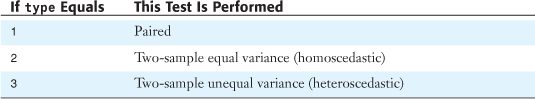
If array1 and array2 have a different number of data points, and if type is 1 (paired), TTEST returns an #N/A error. The tails and type arguments are truncated to integers. If tails or type is nonnumeric, TTEST returns a #VALUE! error. If tails is any value other than 1 or 2, TTEST returns a #NUM! error.
In Figure 26.36, the means of the two samples are different: 11.15 versus 13.5. However, in Cell F2, TTEST returns 0.1577. Because this is greater than the typical alpha of 0.05, the difference in means may not be statistically significant. It is possible that these two samples were taken from the same population.
Figure 26.36. TTEST provides a formulaic equivalent to the key result from the Analysis Toolpak’s T-Test feature.
Note
The results in D6:F19 in Figure 26.36 are a snapshot produced by the Analysis Toolpak’s T-Test feature. The formula in Cell F2 is a live version of the T-Test feature’s result in Cell E16.
Using CHITEST to Perform Goodness-of-Fit Testing
A chi-squared test compares expected frequencies with observed frequencies. The CHITEST function performs the chi-square test for independence.
CHIINV is used to find the critical chi value for a certain probability and degrees of freedom. CHIDIST is used to determine the probability for a chi value and certain degrees of freedom.
Syntax: =CHITEST(actual_range,expected_range)
The CHITEST function returns the test for independence. CHITEST returns the value from the chi-squared distribution for the statistic and the appropriate degrees of freedom. You can use chi-squared tests to determine whether hypothesized results are verified by an experiment.
The CHITEST function takes the following arguments:
actual_range—This is the range of data that contains observations to test against expected values.expected_range—This is the range of data that contains the ratio of the product of row totals and column totals to the grand total.
If actual_range and expected_range have different numbers of data points, CHITEST returns an #N/A error.
The chi-squared test first calculates a chi-squared statistic and then sums the differences of actual values from the expected values. CHITEST returns the probability for a chi-squared statistic and degrees of freedom, df, where df = (r – 1) (c – 1).
Syntax: =CHIDIST(x,degrees_freedom)
The CHIDIST function returns the one-tailed probability of the chi-squared distribution. The chi-squared distribution is associated with a chi-squared test. You use the chi-squared test to compare observed and expected values. For example, a genetic experiment might hypothesize that the next generation of plants will exhibit a certain set of colors. By comparing the observed results with the expected ones, you can decide whether your original hypothesis is valid.
The CHIDIST function takes the following arguments:
x—This is the value at which you want to evaluate the distribution.degrees_freedom—This is the number of degrees of freedom.
If either argument is nonnumeric, CHIDIST returns a #VALUE! error. If x is negative, CHIDIST returns a #NUM! error. If degrees_freedom is not an integer, it is truncated. If degrees_freedom is less than 1 or if degrees_freedom is greater than or equal to 10^10, CHIDIST returns a #NUM! error.
Syntax: =CHIINV(probability,degrees_freedom)
The CHIINV function returns the inverse of the one-tailed probability of the chi-squared distribution. If probability equals CHIDIST(x,...), CHIINV(probability,...) equals x. You use the CHIINV function to compare observed results with expected ones to decide whether your original hypothesis is valid.
The CHIINV function takes the following arguments:
probability—This is a probability associated with the chi-squared distribution.degrees_freedom—This is the number of degrees of freedom.
If either argument is nonnumeric, CHIINV returns a #VALUE! error. If probability is less than 0 or probability is greater than 1, CHIINV returns a #NUM! error. If degrees_freedom is not an integer, it is truncated. If degrees_freedom is less than 1 or if degrees_freedom is greater than or equal to 10^10, CHIINV returns a #NUM! error.
CHIINV uses an iterative technique for calculating the function. Given a probability value, CHIINV iterates until the result is accurate to within ±3 × 10^–7. If CHIINV does not converge after 100 iterations, the function returns an #N/A error.
Figure 26.37. You can calculate chi-squared testing with CHITEST.
The Sum of Squares Functions
Excel offers four functions with confusingly similar names. The hardest part of using these functions is figuring out which function does what. The first three functions require two identically sized arrays, named x and y. These are Excel’s four sum of squares functions:
SumX2MY2—For each pair of x and y, Excel calculates x^2 – y^2 and then sums these values. In this case, theMin the function name indicates minus.SumX2PY2—For each pair of x and y, Excel calculates x^2 + y^2 and then sums these values. In this case, thePin the function name indicates plus.SumXMY2—For each pair of x and y, Excel calculates (x – y)^2 and then sums these values. Again, the M indicates minus, and the lack of a 2 after theXindicates that it is the difference that is squared.SumSQ—Returns the sum of the squares of the arguments.
In Figure 26.38, the x array is in A2:A5, and the y array is in B2:B5. The formulas in D2:D5 calculate x – y for each pair. The formulas in E2:E5 square that difference for each pair. The formula in Cell E6 totals the sum of the squares. You could replace the five formulas in Column E with a single formula in Cell D6: =SUMSQ(D2:D5). Alternately, you could replace all the formulas in Columns D and E with a single use of SumXMY2 in Cell B9.
Figure 26.38. Without doing any regression, you use SUMXMY2 to calculate the sum of the squares of the difference of two arrays.
Syntax: =SUMSQ(number1,number2,...)
The SUMSQ function returns the sum of the squares of the arguments. The arguments number1,number2,... are 1 to 255 arguments for which you want the sum of the squares. You can also use a single array or a reference to an array instead of arguments separated by commas.
Syntax: =SUMXMY2(array_x,array_y)
The SUMXMY2 function returns the sum of squares of differences of corresponding values in two arrays. It takes the following arguments:
array_x—This is the first array or range of values.array_y—This is the second array or range of values.
The arguments should be either numbers or names, arrays, or references that contain numbers. If an array or reference argument contains text, logical values, or empty cells, those values are ignored; however, cells that contain the value 0 are included. If array_x and array_y have a different number of values, SUMXMY2 returns an #N/A error.
Syntax: =SUMX2MY2(array_x,array_y)
The SUMX2MY2 function returns the sum of the difference of squares of corresponding values in two arrays. This function takes the following arguments:
array_x—This is the first array or range of values.array_y—This is the second array or range of values.
The arguments should be either numbers or names, arrays, or references that contain numbers. If an array or a reference argument contains text, logical values, or empty cells, those values are ignored; however, cells that contain the value 0 are included. If array_x and array_y have a different number of values, SUMX2MY2 returns an #N/A error.
Syntax: =SUMX2PY2(array_x,array_y)
The SUMX2PY2 function returns the sum of the sum of squares of corresponding values in two arrays. The sum of the sum of squares is a common term in many statistical calculations. This function takes the following arguments:
array_x—This is the first array or range of values.array_y—This is the second array or range of values.
The arguments should be either numbers or names, arrays, or references that contain numbers. If an array or reference argument contains text, logical values, or empty cells, those values are ignored; however, cells that contain the value 0 are included. If array_x and array_y have a different number of values, SUMX2PY2 returns an #N/A error.
In Figure 26.39, the one SUMX2PY2 formula in Cell B9 is much simpler than the five formulas in Column D, but if you really wanted to do this calculation, you could simply use SUMSQ, as shown in Cell B12.
Figure 26.39. Microsoft won’t say that these two functions are useful in statistics. I don’t think they are useful anywhere.
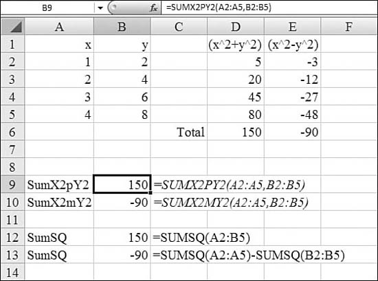
I will go out on a limb and propose that none of the 400 million people using Excel actually use SUMX2PY2.
Testing Probability on Logarithmic Distributions
In the life sciences, a number of populations have logarithmic distributions. In the population shown in Figure 26.40, the values in the sample range from under 2 to over 38,000. The data clearly does not follow a normal distribution.
Figure 26.40. The LOGNORMDIST and LOGINV functions can make sense of a population where the natural logarithm of the population is normally distributed.
However, if you took the natural logarithm of each data point, the LN(x) of the members does follow a normal distribution. The mean of the natural logarithms is 5, with a standard deviation of 2.
Populations where the natural logarithm is normally distributed are called lognormal distributions. An example of a population with a lognormal distribution is the length of time that bacteria live in a disinfectant.
In the example where the mean of the natural logarithm values is 5 and the standard deviation is 2, take a look at what this really means: You use EXP(5) to see that the mean of 5 translates to 148. You would expect 65% of the population to be within 1 standard deviation of the mean. This range from EXP(3) to EXP(7) is from 20 to 1,096. The range for two standard deviations from the mean is EXP(1) and EXP(9), or 2.7 and 8,103.
Given a lognormal distribution where the mean of the natural logarithm of the population is 5 and the standard deviation is 2, you can predict what percentage of the population will be at a number x or below by using LOGNORMDIST. To find the value of x associated with a certain probability, you use LOGINV.
Syntax: =LOGNORMDIST(x,mean,standard_dev)
The LOGNORMDIST function returns the cumulative lognormal distribution of x, where the natural logarithm is normally distributed with the parameters mean and standard_dev. You use this function to analyze data that has been logarithmically transformed. This function takes the following arguments:
x—This is the value at which to evaluate the function.mean—This is the mean of the natural logarithm.standard_dev—This is the standard deviation of the natural logarithm.
If any argument is nonnumeric, LOGNORMDIST returns a #VALUE! error. If x is less than or equal to 0 or if standard_dev is less than or equal to 0, LOGNORMDIST returns a #NUM! error.
Syntax: =LOGINV(probability,mean,standard_dev)
The LOGINV function returns the inverse of the lognormal cumulative distribution function of x, where the natural logarithm is normally distributed with the parameters mean and standard_dev. If probability is equal to LOGNORMDIST(x,...), LOGINV(probability,...) is equal to x. You use the lognormal distribution to analyze logarithmically transformed data.
The LOGINV function takes the following arguments:
probability—This is a probability associated with the lognormal distribution.mean—This is the mean of the natural logarithm.standard_dev—This is the standard deviation of the natural logarithm.
If any argument is nonnumeric, LOGINV returns a #VALUE! error. If probability is less than 0 or if probability is greater than 1, LOGINV returns a #NUM! error. If standard_dev is less than or equal to 0, LOGINV returns a #NUM! error.
In Figure 26.40, the population varies from 1.7 to 38,577, but the LOGNORMDIST function predicts that 72.8% of the population is under 500, 87.6% is under 1,500, and 96.1% is under 5,000.
In Cell T60, the LOGINV function reveals that 95% of the population should be under 3,983.
Using GAMMADIST and GAMMAINV to Analyze Queuing Times
Earlier in this chapter, we discussed how to use a Poisson distribution to analyze how many customers might walk into a bank during any given hour. However, if the time between customers is relevant, you need to use the gamma distribution. The gamma distribution is described by two variables, alpha and beta. For a gamma distribution described by alpha and beta, you can find the probability that a value of x or less will occur with GAMMADIST. To find the value of x for a certain probability, you use GAMMAINV. The other remaining gamma-related function is GAMMALN.
Syntax: =GAMMADIST(x,alpha,beta,cumulative)
The GAMMADIST function returns the gamma distribution. You can use this function to study variables that may have a skewed distribution. The gamma distribution is commonly used in queuing analysis. This function takes the following arguments:
x—This is the value at which you want to evaluate the distribution.alpha—This is a parameter to the distribution.beta—This is a parameter to the distribution.cumulative—This is a logical value that determines the form of the function. IfcumulativeisTRUE,GAMMADISTreturns the cumulative distribution function; ifcumulativeisFALSE,GAMMADISTreturns the probability mass function.
If beta is 1, GAMMADIST returns the standard gamma distribution. If x, alpha, or beta is nonnumeric, GAMMADIST returns a #VALUE! error. If x is less than 0, GAMMADIST returns a #NUM! error. If alpha is less than or equal to 0 or if beta is less than or equal to 0, GAMMADIST returns a #NUM! error. When alpha is a positive integer, GAMMADIST is also known as the Erlang distribution.
Syntax: =GAMMAINV(probability,alpha,beta)
The GAMMAINV function returns the inverse of the gamma cumulative distribution. If probability is equal to GAMMADIST(x,...), then GAMMAINV(probability,...) is equal to x. You can use this function to study a variable whose distribution may be skewed. This function takes the following arguments:
probability—This is the probability associated with the gamma distribution.alpha—This is a parameter to the distribution.beta—This is a parameter to the distribution. Ifbetais1,GAMMAINVreturns the standard gamma distribution.
If any argument is nonnumeric, GAMMAINV returns a #VALUE! error. If probability is less than 0 or probability is greater than 1, GAMMAINV returns a #NUM! error. If alpha is less than or equal to 0 or if beta is less than or equal to 0, GAMMAINV returns the #NUM! error. If beta is less than or equal to 0, GAMMAINV returns a #NUM! error.
GAMMAINV uses an iterative technique to do its calculation. Given a probability value, GAMMAINV iterates until the result is accurate to within ±3 × 10^–7. If GAMMAINV does not converge after 100 iterations, the function returns an #N/A error.
Syntax: =GAMMALN(x)
The GAMMALN function returns the natural logarithm of the gamma function, G(x). The argument x is the value for which you want to calculate GAMMALN.
If x is nonnumeric, GAMMALN returns a #VALUE! error. If x is less than or equal to 0, GAMMALN returns a #NUM! error. The number e raised to the GAMMALN(i) power, where i is an integer, returns the same result as (i – 1)!.
Calculating Probability of Beta Distributions
A beta distribution is used to describe the variability of the percentage of something across samples, such as the percentage of the day people spend sleeping.
A beta distribution curve is described by two parameters, alpha and beta. For any given distribution, you can predict the likelihood that a value will be less than or equal to x by using BETADIST. To find the value of x associated with a certain probability, you use BETAINV.
Syntax: =BETADIST(x,alpha,beta,A,B)
The BETADIST function returns the cumulative beta probability density function. The cumulative beta probability density function is commonly used to study variation in the percentage of something across samples, such as the fraction of the day people spend watching television. This function takes the following arguments:
x—This is the value betweenaandbat which to evaluate the function.alpha—This is a parameter to the distribution.beta—This is a parameter to the distribution.a—This is an optional lower bound to the interval ofx.b—This is an optional upper bound to the interval ofx.
If any argument is nonnumeric, BETADIST returns a #VALUE! error. If alpha is less than or equal to 0 or beta is less than or equal to 0, BETADIST returns a #NUM! error. If x is less than a, x is greater than b, or a equals b, BETADIST returns a #NUM! error. If you omit values for a and b, BETADIST uses the standard cumulative beta distribution, so that a equals 0 and b equals 1.
Syntax: =BETAINV(probability,alpha,beta,A,B)
The BETAINV function returns the inverse of the cumulative beta probability density function. That is, if probability is equal to BETADIST(x,...), then BETAINV(probability,...) is equal to x. The cumulative beta distribution can be used in project planning to model probable completion times, given an expected completion time and variability.
The BETAINV function takes the following arguments:
probability—This is a probability associated with the beta distribution.alpha—This is a parameter to the distribution.beta—This is a parameter to the distribution.a—This is an optional lower bound to the interval ofx.b—This is an optional upper bound to the interval ofx.
If any argument is nonnumeric, BETAINV returns a #VALUE! error. If alpha is less than or equal to 0 or if beta is less than or equal to 0, BETAINV returns a #NUM! error. If probability is less than or equal to 0 or probability is greater than 1, BETAINV returns a #NUM! error. If you omit values for a and b, BETAINV uses the standard cumulative beta distribution, so that a equals 0 and b equals 1.
BETAINV uses an iterative technique for calculating the function. Given a probability value, BETAINV iterates until the result is accurate to within ±3 × 10 – 7. If BETAINV does not converge after 100 iterations, the function returns an #N/A error.
Using FTEST to Measure Differences in Variability
There are three functions for measuring variability among two populations. Say that you need to compare test results from males and test results from females. To determine whether one population has more variability than the other, you use FTEST. The FDIST function determines the probability that a value will be less than or equal to X. The FINV function returns the X value associated with a certain probability.
Syntax: =FTEST(array1,array2)
The FTEST function returns the result of an F-test. An F-test returns the one-tailed probability that the variances in array1 and array2 are not significantly different. You use this function to determine whether two samples have different variances. For example, given test scores from public and private schools, you can test whether these schools have different levels of diversity.
The FTEST function takes the following arguments:
array1—This is the first array or range of data.array2—This is the second array or range of data.
The arguments must be either numbers or names, arrays, or references that contain numbers. If an array or a reference argument contains text, logical values, or empty cells, those values are ignored; however, cells that contain the value 0 are included. If the number of data points in array1 or array2 is less than 2, or if the variance of array1 or array2 is 0, FTEST returns a #DIV/0! error.
Syntax: =FDIST(x,degrees_freedom1,degrees_freedom2)
The FDIST function returns the F probability distribution. You can use this function to determine whether two datasets have different degrees of diversity. For example, you can examine test scores given to men and women entering high school and determine whether the variability in the females is different from that found in the males.
The FDIST function takes the following arguments:
x—This is the value at which to evaluate the function.degrees_freedom1—This is the numerator degrees of freedom.degrees_freedom2—This is the denominator degrees of freedom.
If any argument is nonnumeric, FDIST returns a #VALUE! error. If x is negative, FDIST returns a #NUM! error. If degrees_freedom1 or degrees_freedom2 is not an integer, it is truncated. If degrees_freedom1 is less than 1 or degrees_freedom1 is greater than or equal to 10^10, FDIST returns a #NUM! error. If degrees_freedom2 is less than 1 or degrees_freedom2 is greater than or equal to 10^10, FDIST returns a #NUM! error. FDIST is calculated as FDIST=P( F<x ), where F is a random variable that has an F distribution.
Syntax: =FINV(probability,degrees_freedom1,degrees_freedom2)
The FINV function returns the inverse of the F probability distribution. If probability is equal to FDIST(x,...), then FINV(probability,...) is equal to x. The F distribution can be used in an F-test that compares the degree of variability in two datasets. For example, you can analyze income distributions in the United States and Canada to determine whether the two countries have a similar degree of diversity.
This function takes the following arguments:
probability—This is a probability associated with the F cumulative distribution.degrees_freedom1—This is the numerator degrees of freedom.degrees_freedom2—This is the denominator degrees of freedom.
If any argument is nonnumeric, FINV returns a #VALUE! error. If probability is less than 0 or probability is greater than 1, FINV returns a #NUM! error. If degrees_freedom1 or degrees_freedom2 is not an integer, it is truncated. If degrees_freedom1 is less than 1 or degrees_freedom1 is greater than or equal to 10^10, FINV returns a #NUM! error. If degrees_freedom2 is less than 1 or degrees_freedom2 is greater than or equal to 10^10, FINV returns a #NUM! error.
FINV can be used to return critical values from the F distribution. For example, the output of an ANOVA calculation often includes data for the F statistic, F probability, and F critical value at the 0.05 significance level. To return the critical value of F, you use the significance level as the probability argument to FINV.
FINV uses an iterative technique for calculating the function. Given a probability value, FINV iterates until the result is accurate to within ± 3 × 10^–7. If FINV does not converge after 100 iterations, the function returns an #N/A error.
Other Distributions: Exponential, Hypergeometric, and Weibull
A few remaining probability distributions are available in Excel: exponential, hypergeometric, and Weibull.
Syntax: =EXPONDIST(x,lambda,cumulative)
The EXPONDIST function returns the exponential distribution. You use EXPONDIST to model the time between events, such as how long a bank’s automated teller machine takes to deliver cash. For example, you can use EXPONDIST to determine the probability that the process takes, at most, one minute.
The EXPONDIST function takes the following arguments:
x—This is the value of the function.lambda—This is the parameter value.cumulative—This is a logical value that indicates which form of the exponential function to provide. IfcumulativeisTRUE,EXPONDISTreturns the cumulative distribution function; ifcumulativeisFALSE,EXPONDISTreturns the probability density function.
If x or lambda is nonnumeric, EXPONDIST returns a #VALUE! error. If x is less than 0, EXPONDIST returns a #NUM! error. If lambda is less than or equal to 0, EXPONDIST returns a #NUM! error.
Syntax: =HYPGEOMDIST(sample_s,number_sample,population_s,number_population)
The HYPGEOMDIST function returns the hypergeometric distribution. HYPGEOMDIST returns the probability of a given number of sample successes, given the sample size, population successes, and population size. You use HYPGEOMDIST for a problem that has a finite population, where each observation is either a success or a failure, and where each subset of a given size is chosen with equal likelihood.
The HYPGEOMDIST function takes the following arguments:
sample_s—This is the number of successes in the sample.number_sample—This is the size of the sample.population_s—This is the number of successes in the population.number_population—This is the population size.
All arguments are truncated to integers. If any argument is nonnumeric, HYPGEOMDIST returns a #VALUE! error. If sample_s is less than 0 or sample_s is greater than the lesser of number_sample or population_s, HYPGEOMDIST returns a #NUM! error. If sample_s is less than the larger of 0 or (number_sample – number_population + population_s), HYPGEOMDIST returns a #NUM! error. If number_sample is less than 0 or number_sample is greater than number_population, HYPGEOMDIST returns a #NUM! error. If population_s is less than 0 or population_s is greater than number_population, HYPGEOMDIST returns a #NUM! error. If number_population is less than 0, HYPGEOMDIST returns a #NUM! error. HYPGEOMDIST is used in sampling without replacement from a finite population.
Syntax: =WEIBULL(x,alpha,beta,cumulative)
The WEIBULL function returns the Weibull distribution. You use this distribution in reliability analysis, such as for calculating a device’s mean time to failure. This function takes the following arguments:
x—This is the value at which to evaluate the function.alpha—This is a parameter to the distribution.beta—This is a parameter to the distribution.cumulative—This determines the form of the function.
If x, alpha, or beta is nonnumeric, WEIBULL returns a #VALUE! error. If x is less than 0, WEIBULL returns a #NUM! error. If alpha is less than or equal to 0 or if beta is less than or equal to 0, WEIBULL returns a #NUM! error.
Using PROB to Calculate Probability for a Population That Fits No Distribution Curve
In some cases, you might have a dataset that does not appear to follow any standard probability distribution curve. However, you may have sufficient past data to figure the probability of each outcome. In such a case, you can build a table of the possible outcomes and the probability of each outcome. You use the PROB function to figure out the chances that a value X will fall between an upper and a lower limit.
Syntax: =PROB(x_range,prob_range,lower_limit,upper_limit)
The PROB function returns the probability that values in a range are between two limits. If upper_limit is not supplied, PROB returns the probability that values in x_range are equal to lower_limit. This function takes the following arguments:
x_range—This is the range of numeric values ofxwith which there are associated probabilities.prob_range—This is a set of probabilities associated with values inx_range.lower_limit—This is the lower bound on the value for which you want a probability.upper_limit—This is the optional upper bound on the value for which you want a probability.
If any value in prob_range is less than or equal to 0 or if any value in prob_range is greater than 1, PROB returns a #NUM! error. If the sum of the values in prob_range is greater than 1, PROB returns a #NUM! error. If upper_limit is omitted, PROB returns the probability of being equal to lower_limit. If x_range and prob_range contain a different number of data points, PROB returns an #N/A error.
In Figure 26.41, the table in A2:B9 shows the probability of achieving a particular score on a seven-point quiz. The range of possible scores in A2:A9 is used as the first argument. The range of probabilities in B2:B9 is used as the second argument. Various formulas in Column G find the probability of any given test falling between two values.
Figure 26.41. This may not fall into any known distribution curve, but the PROB function can calculate probabilities, nonetheless.
Using ZTEST and CONFIDENCE to Calculate Confidence Intervals
Confidence testing is one of the most confusing topics in statistics. Say that you have a very large population, such as the 400 million people who use Microsoft Excel. You would like to find out how many minutes per month people use pivot tables. It would be difficult to survey the 400 million people.
Instead, you find a way to survey 30 people. The mean of those 30 answers is 155 minutes per month. Think about the standard deviation of the entire population. There has to be wide variability because more than half the people using Excel never use pivot tables, and their answer would be zero. Somehow, you miraculously figure out that the standard deviation of the entire population is 220.
You can use the CONFIDENCE function to ask for the 90% confidence interval about this statistic. The formula =CONFIDENCE(0.10,220,30) returns a confidence interval of 66. This means that for any sample of 30 people using Excel, the mean of that sample will be within 66 of the true population mean 90% of the time.
In Figure 26.42, a confidence interval is drawn around the sample mean of 11 samples. The 90% confidence level is saying that in 90% of the samples, the confidence level drawn on the chart will include the true mean of the population.
Figure 26.42. The CONFIDENCE function does not give me a lot of confidence that I can predict the activities of 400 million people using Excel based on a survey of 10 people.
Caution
It is tempting to interpret the CONFIDENCE result to say that 90% of the population is within the error bars. This is wrong. Reread the last paragraph: If you use the sample mean plus or minus the confidence interval, you will include the true mean 9 out of 10 times.
Although the data in Figure 26.42 is fictitious, the actual mean of that entire population is 78. Of the 11 series drawn on the chart, 10 of the 11 happen to encompass the true mean of 78. Note, however, that the first sample mean of 156 is the one that does not include the true mean.
Syntax: =CONFIDENCE(alpha,standard_dev,size)
The CONFIDENCE function returns the confidence interval for a population mean. The confidence interval is a range on either side of a sample mean. For example, if you order a product through the mail, you can determine, with a particular level of confidence, the earliest and latest the product will arrive. This function takes the following arguments:
alpha—This is the significance level used to compute the confidence level. The confidence level equals 100 × (1 –alpha)% or, in other words, analphaof 0.05 indicates a 95% confidence level.standard_dev—This is the population standard deviation for the data range and is assumed to be known.size—This is the sample size.
If any argument is nonnumeric, CONFIDENCE returns a #VALUE! error. If alpha is less than or equal to 0 or alpha greater than or equal to 1, CONFIDENCE returns a #NUM! error. If standard_dev is less than or equal to 0, CONFIDENCE returns a #NUM! error. If size is not an integer, it is truncated. If size is less than 1, CONFIDENCE returns a #NUM! error.
Note
A slight problem with the confidence interval function is that the CONFIDENCE function expects that you know with certainty the standard deviation of the entire population. In real life, if you don’t know the mean of the 400 million people using Excel, how would you ever calculate the standard deviation? In reality, when you don’t know the population standard deviation, you often substitute the sample standard deviation, but this causes you to have to use the t distribution instead of CONFIDENCE.
Using ZTEST to Accept or Reject a Hypothesis
You use the ZTEST function for hypothesis testing. Say that I make a claim that you will be more confident using pivot tables after attending one of my Power Excel seminars. One month after one of my seminars, I randomly select 30 students from the class and ask them how many minutes during the month they used pivot tables. The sample mean comes back at 156 minutes. This mean is higher than most sample means. But is it high enough to be statistically valid? Could I have achieved a sample mean of 156 just randomly?
Syntax: =ZTEST(array,x,sigma)
The ZTEST function returns the two-tailed p value of a z-test. The z-test generates a standard score for x with respect to the dataset, array, and returns the two-tailed probability for the normal distribution. You can use this function to assess the likelihood that a particular observation is drawn from a particular population. This function takes the following arguments:
array—This is the array or range of data against which to testx.x—This is the value to test.sigma—This is the population (known) standard deviation. If this argument is omitted, the sample standard deviation is used.
If array is empty, ZTEST returns an #N/A error.
Using PERMUT to Calculate the Number of Possible Arrangements
Say your company has 40 products in its catalog. You must choose four items to be featured in an upcoming SkyMall issue. The sequence in which the products appear in the ad is relevant. You would like to test the possible ads with a test audience. How many different possible ads could you generate? You use the PERMUT function to solve this problem.
Syntax: =PERMUT(number,number_chosen)
The PERMUT function returns the number of permutations for a given number of objects that can be selected from number objects. A permutation is any set or subset of objects or events in which internal order is significant. Permutations are different from combinations, for which the internal order is not significant. You use this function for lottery-style probability calculations.
The PERMUT function takes the following arguments:
number—This is an integer that describes the number of objects.number_chosen—This is an integer that describes the number of objects in each permutation.
Both arguments are truncated to integers. If number or number_chosen is nonnumeric, PERMUT returns a #VALUE! error. If number is less than or equal to 0 or if number_chosen is less than 0, PERMUT returns a #NUM! error. If number is less than number_chosen, PERMUT returns a #NUM! error.
The formula to solve the SkyMall problem is =PERMUT(40,4). The result is that there are 2,193,360 possible permutations of products to appear in a one-page ad in the catalog. That is a lot of possibilities!
Using the Analysis Toolpak to Perform Statistical Analysis
The functions discussed in this chapter are wonderful for doing statistical analysis. If you can use a function to perform some analysis, the function offers a live result. You can change some assumptions, and the results automatically update.
However, many statisticians instead rely on the data tools available in the Analysis Toolpak. The Analysis Toolpak can provide beautiful snapshot-type reports that analyze a dataset. While these reports provide more information than a typical function, they have the downside that they do not automatically recalculate. If you change one of the assumptions in the dataset, you will have to rerun the analysis.
Excel offers many options for performing statistical analysis. Using functions in Excel provides real-time, live results of the data.
The Data Analysis tools in the Analysis Toolpak vary greatly. Some of them are poorly implemented and provide such narrow functionality that it would almost always be better to use your own functions rather than those tools.
On the other hand, some of the tools, such as Regression, provide additional statistics that run circles around the equivalent functions in Excel. In this case, it would be advantageous to use the Analysis Toolpak.
Remember, however, that when you use the Data Analysis tools from the Analysis Toolpak, they create static snapshots of the results. If you change the underlying data, you have to rerun the analysis.
Installing the Analysis Toolpak in Excel 2007
In previous versions of Excel, many people would install the Analysis Toolpack because they needed it to enable the 89 functions it contained. When you enabled the Analysis Toolpak in order to access the additional functions, Excel silently added a new Data Analysis item to the Tools menu.
However, in Excel 2007, you have to enable the Analysis Toolpak in order to access the Data Analysis Menu Commands group. To do so, you follow these steps:
- Click the Office icon to the left of the Home ribbon.
- At the bottom of the menu, click Excel Options.
- From the left list, choose Add-Ins. You see a long list of active and inactive add-ins.
- From the very bottom of the window, select the Manage drop-down box and then choose Excel Add-ins, Click Go. You are taken back to the Excel 2003 Add-Ins dialog.
- In the Add-Ins dialog, choose the Analysis Toolpak check box. Click OK.
If this process is successful, you get a new Analysis group on the Data ribbon. The group has a single button called Data Analysis, as shown in Figure 26.43. Note that this item is rather finicky. You must click Data Analysis in order to invoke the Data Analysis dialog box.
Figure 26.43. After you successfully install the Analysis Toolpak, a new group on the Data ribbon offers access to the Data Analysis dialog box.
Generating Random Numbers Based on Various Distributions
Whereas the RAND and RANDBETWEEN functions generate random numbers, the Random Number Generation choice in the Data Analysis dialog box allows you to create more sophisticated random number populations. Here’s how you use it:
- Make sure the Analysis Toolpak is installed.
- From the Data ribbon, choose Data Analysis.
- Scroll down and select Random Number Generation and click OK. The Random Number Generation dialog appears (see Figure 26.44).
Figure 26.44. You can generate random numbers by using the Random Number Generation dialog.
- In the Random Number Generation dialog, choose the number of columns that you would like to fill with random numbers. If you want three columns of random numbers, enter
3in the Number of Variables text box. - Choose the number of rows that you would like to fill with random numbers. If you want 100 rows of random numbers, fill in
100in the Number of Random Numbers text box. - Select one of the seven options in the Distribution drop-down. The questions in the Parameters frame change for each distribution option:
• For a uniform distribution, you choose upper and lower limits in the Parameters frame. This functionality is similar to using the
RANDworksheet function.• For a normal distribution, you choose a mean and standard deviation. This functionality is very cool and is not available through the normal Excel functions.
• For a Bernoulli distribution, you choose a probability of success on each trial. Bernoulli random variables have a value of
0or1. If you want to model LeBron James’s ability to make free throws, you use a Bernoulli distribution with a probability of success of 79.4%• For a binomial distribution, you specify a p value and the number of trials. For example, you can generate number-of-trials Bernoulli random variables, the sum of which is a binomial random variable.
• For a Poisson distribution, you specify a value, lambda, that is equal to 1 / Mean. Poisson distributions are often used to characterize the number of events that occur per unit of time (for example, the average rate at which cars arrive at a toll plaza).
• For a patterned distribution, you specify five parameters. You specify a lower and upper limit in steps of a certain value. You can also specify that each number repeats n times and that the whole sequence repeats y times. Note that there is really nothing random about this method. You are actually simply creating numbers that follow a certain pattern.
• For a discrete distribution, you specify a range of values and their probabilities. In this case, you might have a list of 40 products in A2:A41 and then their probabilities of being selected in B2:B41. Note that the sum of the values in the probability column must add to 100%.
- In the Random Seed text box, enter any numeric seed. This concept is a little bizarre. In a computer, random numbers are not really random. Scientists call them pseudo-random. If you leave the Random Seed text box, Excel uses some strange number (perhaps the number of seconds since 1900 or perhaps the free memory in the stack) as a seed. This ensures that you get different random numbers every time. However, if you enter your own seed, say 123, and then come back a month later with the same seed, Excel generates exactly the same list of random numbers.
- For the output range, you can either choose an output range, a new worksheet, or a new workbook. For some unknown reason, this dialog box refers to a new worksheet as New Worksheet Ply.
Generating a Histogram
Consider a set of 100 observations. If the possible values are from a continuous series, it is likely that you won’t have any two values that are exactly the same. The chart of this data will show a lot of noise, as shown in Figure 26.45.
Figure 26.45. Plotting the individual points of a sample does not tell you a lot about the sample.
Statisticians instead prefer to group those values into similar categories. Perhaps logical categories for this dataset are 24–34, 35–44, 45–54, and so on The technical term for these groups is bins.
The Histogram tool takes a set of observations and groups them into bins, similarly to the way that the FREQUENCY function normally does. However, the histogram function goes further, offering the cumulative percentage of each bin, and then it re-sorts the bins into a Pareto analysis. Excel also offers to create a chart based on the output.
To use the Histogram tool, you follow these steps:
- Make sure the Analysis Toolpak is installed.
- Think about some groupings for your data and enter these in a new column in the worksheet. The first bin should be less than the minimum value in your dataset. If your bin range contains 25, 35, 45, then the first bin will include from 25 up through values just less than 35.
- From the Data ribbon, choose Data Analysis. Then select Histogram and click OK. The Histogram dialog appears.
- In the Histogram dialog, specify the range that contains your observations as the input range. This range does not need to be sorted. You may include a one-cell heading as part of the range. If you do, you must also include a one-cell heading for the bin range and also check the Labels option in step 6.
- Specify your range from step 2 as the bin range. If you leave this blank, Excel chooses equal-size values between the minimum and maximum of your data. This rarely comes out to nice, neat bins, so feel free to use your own instead.
- If your input and bin ranges contain one-cell headings, check the Labels box.
- For the output, specify the upper-left corner of a blank spot on the current worksheet, or specify a new worksheet or a new workbook.
- Check the Pareto box. Excel produces the histogram and then produces a second histogram. In the second histogram, the most popular bin is sorted to the top of the list.
- Check the Cumulative box. Excel reports the cumulative percentage accounted for by values from the bottom of the list through the current bin.
- Check the Chart Output box to ask for a chart. Note that this default chart is fairly plain looking and needs some customization to be acceptable.
- Click OK to create the histogram.
Figure 26.46 shows the Histogram dialog box, along with the results of the histogram.
Figure 26.46. Using input area of Column A and the bins in Column C, Excel produces a histogram in E:J. This is significantly easier than using the FREQUENCY array formula.
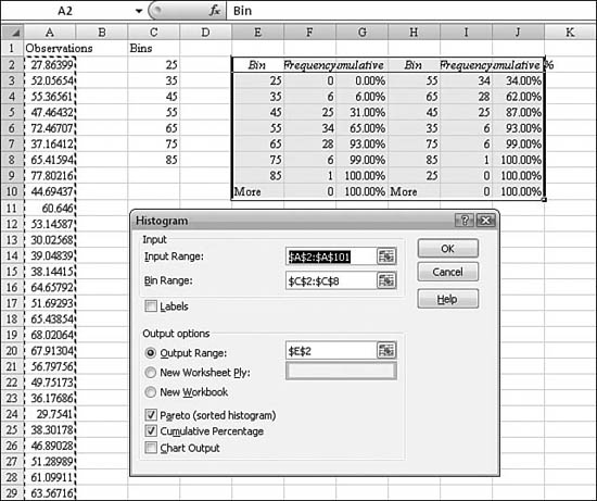
Generating Descriptive Statistics of a Population
Excel provides a large number of functions to describe datasets. Earlier in this chapter, you learned about functions to calculate the mean, median, mode, skew, and so on of your data. By using the Data Analysis tools, you can generate all these statistics in a single command. To do so, you follow these steps:
- Make sure the Analysis Toolpak is installed.
- From the Data ribbon, choose Data Analysis. Then select Descriptive Statistics and click OK. The Descriptive Statistics dialog appears.
- In the Descriptive Statistics dialog, choose the input range for your dataset.
- If the range in step 3 contains a heading in the first row, choose the Labels check box.
- Set the output as a new range, a new worksheet, or a new workbook.
- Choose Summary Statistics. Excel provides values for mean, standard error (of the mean), median, mode, standard deviation, variance, kurtosis, skewness, range, minimum, maximum, sum, count, largest (#), smallest (#), and confidence level.
- Check the Confidence Level for Mean check box and specify the confidence level you want to use. For example, a confidence level of 95% calculates the confidence level of the mean at a significance of 5%.
- If you would like row(s) in the output for the kth largest and/or smallest values, choose the appropriate check boxes and fill in the value for k. For example, if you ask for the kth largest with a value of
3, Excel report the third-largest value in the dataset. - Click OK. Results similar to those shown in Figure 26.47 are generated.
Figure 26.47. Excel can generate every descriptive statistic for a dataset with a single command. The output range in C3:D20 is generated from the dialog box shown.
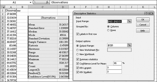
Ranking Results
The Excel RANK function has an inherent problem when two results in the dataset are tied. While the RANK function provides a workaround for this problem, the Rank and Percentile feature cannot overcome this limitation. If you are worried about the possibility of a tie in your dataset, you should use the RANK function instead of this command.
To assign a rank and percentage to a dataset, you follow these steps:
- Make sure the Analysis Toolpak is installed. Then scroll down and select Rank and Percentile and click OK. The Rank and Percentile dialog appears.
- From the Data ribbon, choose Data Analysis.
- In the Rank and Percentile dialog, choose the input range for your dataset. The input range may contain a single-cell heading at the top of the data, but it may not contain any other nonnumeric data. In Figure 26.48, it would be nice if Excel could accept the names associated with each data point, but it cannot. You have to add them back later.
Figure 26.48. The rank and percentile function will sort the data, calculate a rank and a percentile function. It cannot resolve ties, however.
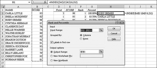
- If your input range has a heading in the first row, check the Labels in First Row check box.
- Choose an output range for the dataset. Excel returns the statistics shown in D1:G16 in Figure 26.48. Notice that the data points have been sorted in high-to-low sequence. In Column D, Excel refers to each cell as being at Point 1, Point 2, Point 3, and so on.
In Figure 26.48, Column H was added after the fact, using the formula =INDEX($A$2:$A$16,D2). Cell D2 contains the point number for this row. Basically, this function asks for the third value in A2:A16.
Notice that Carla and Jessica are in a tie for second place. No one in this dataset is ranked third because of this tie. If you used the RANK function as described earlier in this chapter, you could break the ties by using a COUNTIF function.
Using Regression to Predict Future Results
The Regression tool available in the Analysis Toolpak runs circles around the LINEST function in Excel. As described previously, LINEST returns a bizarre unlabeled set of results for a regression. The Regression tool, on the other hand, provides a myriad of well-labeled statistics, analysis, and charts as the output.
To perform a regression analysis using the Regression tool, you follow these steps:
- Make sure the Analysis Toolpak is installed.
- Ensure that your data includes one independent variable, such as sales per day. It can also contain one or more dependent variables—items that might explain the variability in sales. (In this example, dependent variables include outside temperature, if it rained, and if it was a weekend.)
- From the Data ribbon, choose Data Analysis. Then scroll down and select Regression and click OK. The Regression dialog appears.
- In the Regression dialog, the Input Y range must be a single column of data. In this example, it is the range containing sales for each day. Be sure to include a cell at the top of the column that describes the data.
- In the Input X Range text box, use a range that is the same height as the Y range. The X range can contain one column for each independent variable. In this example, the X range contains columns for temperature, rain, and weekend. For best results, include a cell at the top of each column, with the name of the variable.
- If your ranges in steps 4 and 5 include headings, check the Labels check box.
- If you want to force the y-intercept to be 0, check the Constant Is Zero check box.
- The Confidence Level box is interesting. The program always gives statistics for a 95% confidence level. If you enter a different percentage in this box, you get two confidence levels: one for the default 95%, and one for the other value you enter.
- Specify the output range as the top-left cell of a range. In this example, the regression output occupies from G2 to O119, so make sure that you have a really large area set aside for the results.
- Fill in the remaining options in the Regression dialog to add sections to the report:
• Residuals—Select this to include residuals in the residuals output table.
• Standardized Residuals—Select this to include standardized residuals in the residuals output table.
• Residual Plots—Select this to generate a chart for each independent variable versus the residual.
• Line Fit Plots—Select this to generate a chart for predicted values versus the observed values.
• Normal Probability Plots—Select this to generate a chart that plots normal probability.
When you are done, the dialog box should look roughly as shown in Figure 26.49.
Figure 26.49. The hardest part of specifying a regression is remembering that the y range is the value you are trying to predict.
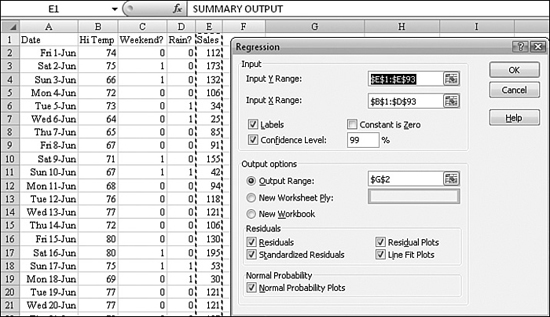
After you run the regression, Excel provides the following sections of the report (see Figure 26.50):
- Regression statistics such as r-squared are provided in the top section.
- An ANOVA analysis is provided.
- The actual regression results are provided in Column 2 of the third section. In this example, the prediction for sales comes from H18:H21. The formula would be that sales for any day will be –75 + 2.6 × High temperature + 52 if it is a weekend. If it is raining, you subtract 102 from this prediction. Remaining columns in this section return the standard error, t statistic, p value, and confidence limits for each variable.
Figure 26.50. The regression report from the Analysis Toolpak is fantastic. It provides a more comprehensive view than the LINEST function.
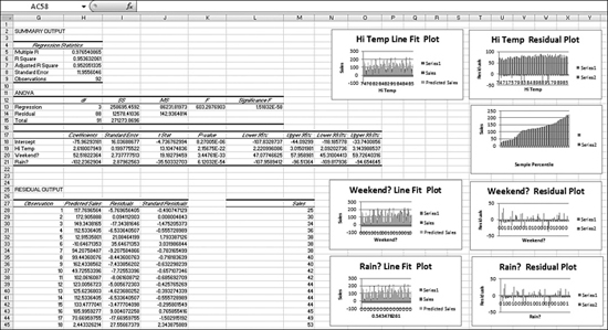
- The next section goes way beyond the
LINESTfunction. Excel uses the regression results to predict sales for each day in the dataset. The predicted sales are in Column 2 of the dataset. The comparison of predicted sales to actual sales is shown in the Residuals column. - Finally, Excel provides a probability table. The table explains that on the worst 12.5% of days, you might sell $44 or less.
Using a Moving Average to Forecast Sales
The Moving Average command in the Data Analysis tools is disappointing. The technique of using a moving average to produce future forecasts is based on the concept that variability in the month-to-month actuals is lessened if you always average three months.
After choosing Data Analysis, Moving Average, you can specify an input range that contains one column of sales data. The interval value of 3 produces a three-month moving average.
After you use the Moving Average command, Excel adds one column with a series of simple =AVERAGE() formulas. Each formula averages the sales from the previous month, this month, and the next month. In theory, you would then use this column as input to the forecasting methods to produce a future forecast.
In Figure 26.51, Column C is the new moving average column. Column D is the standard error column. This command is really a lot of hassle when you could easily add your own =AVERAGE formula in Column C.
Figure 26.51. The Moving Average feature of the Data Analysis tools is a long route to adding a simple formula.
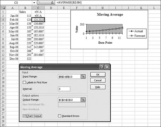
Using Exponential Smoothing to Forecast Sales
The Exponential Smoothing feature in the Data Analysis tools allows you to set up a forecasting formula that uses exponential smoothing.
This method of forecasting requires only two points: the forecast for the previous month and the actual for the current month. The forecast for the next month is created by adding together 75% of the most recent actuals and 25% of the prior forecast.
In this example, the 25% is called a damping factor. You can assign any damping factor that you want, but values in the 20% to 30% range are recommended.
To set up an exponential smoothing forecast, you follow these steps:
- Make sure the Analysis Toolpak is installed.
- Ensure that your data includes one column of sales data, such as sales per month.
- From the Data ribbon, choose Data Analysis. Then select Exponential Smoothing and click OK. The Exponential Smoothing dialog appears.
- In the Exponential Smoothing dialog, the Input range should be your single column of sales data. If you include a heading cell, check the Labels check box.
- Ensure that the damping factor is between 0.20 and 0.30. With a damping factor of 0.30, the current forecast is based 70% on the most recent actuals and 30% on all the past forecasts.
- Limit the output range to a cell on the current worksheet. Ideally, this range starts in the same row as your input range, in an adjacent column.
- To create a chart comparing forecast and actuals, select the Chart Output check box.
- Choose the Standard Errors check box. The output contains a second column with a standard error calculation. This calculation analyzes the current period and last three periods. In Row 5, enter the standard error formula
=SQRT(SUMXMY2(B3:B5,C2:C4)/3). This formula subtracts the forecast from the actual for the last three months, squares the differences, adds them, divides to find an average, and then takes the square root of the average. - Click OK to produce the analysis.
Figure 26.52 shows the Exponential Smoothing dialog and the subsequent results of the analysis.
Figure 26.52. Exponential smoothing provides a forecast that is heavily weighted toward recent actuals.
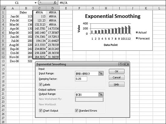
Note
Note that a bug prevents Excel from entering the label Sales Forecast in the top row of the output. You have to manually change the headings Excel generates.
Because the standard error column must analyze four months of forecasts and actuals, the first three data points in the standard error column are always #N/A!.
Using Correlation or Covariance to Calculate the Relationship Between Many Variables
Both covariance and correlation are measures of the extent to which two measurement variables vary together. I prefer the correlation coefficient because it is independent of the units involved.
Say that you are comparing height in inches or centimeters to weight in pounds or kilograms. The correlation coefficient returns a value from 1 to –1. Correlation coefficient values close to 0 indicate that there is little or no correlation between the measures. A value close to 1 indicates a strong positive correlation: As one variable increases, the other is likely to increase. A value close to –1 indicates a strong negative correlation: The value of one variable is likely to decrease as the value of the other variable increases.
You could calculate these values manually by using the CORREL or PEARSON functions in Excel, but the Data Analysis version is particularly well suited to datasets that have many measurements for each member of a population. In this case, the Correlation tool generates a correlation coefficient for every possible combination of the measurement statistics.
Figure 26.53 shows a database of body statistics for a sample of 125 people. For each person, the clinician measured 13 key measurements, such as height, weight, and so on. It would be interesting to see if height is a good predictor of weight or if some other measurement is appropriate.
Figure 26.53. In a collection of key measurement stats for 125 members of a population, which measurements are most related?
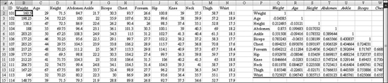
To build a matrix of correlation coefficients (or covariances), you follow these steps:
- Make sure the Analysis Toolpak is installed.
- Ensure that your data includes several columns of measurements for a population. Each row should represent another member of the population. Try to avoid missing values. If one measurement is missing for a population member, that member is thrown out of the entire calculation.
- From the Data ribbon, choose Data Analysis. Then select Correlation (or Covariance) and click OK. The Correlation dialog appears.
- In the Correlation dialog, ensure that the input range includes your row of headings and all the measurements. If you have an ID field, do not include it in the input range.
- If your data has labels as the first row or column of the input range, check the Labels check box. If you don’t include the labels, Excel has to make up labels, such as Column 1, Column 2, and so on.
- Select the upper-left corner of the output range. If your input range has n columns, the size of the output range will be (n + 1) × (n + 1).
- Click OK to create the correlation matrix.
Figure 26.54 shows the Correlation dialog box and the resulting correlation matrix. In this particular example, height and weight have a weak correlation coefficient of 0.21. You can compare this to the correlation coefficient for hip and weight, which has a positive correlation of 0.93.
Figure 26.54. The correlation coefficient matrix produces results from –1 to 1. Values further away from 0 indicate a strong correlation between the measurement variables.

The covariance feature works the same as the correlation feature, except the output table is not scaled to provide answers between –1 and 1.
Using Sampling to Create Random Samples
Earlier in this chapter, in the section on the RAND function, you learned about a way to collect a random sample. You can also allow the Data Analysis tools to produce a random sample for you.
Caution
Perplexingly, the Random Sampling feature works only if your data is completely numeric. This function does not work if you need to select a sample of customers or products.
The Random Sampling feature offers two interesting ways to collect a sample. Excel can either randomly select n members of the population, or you can specify that Excel should select every kth member of the population.
You follow these steps to select a random sample:
- Make sure the Analysis Toolpak is installed.
- Ensure that your data is completely numeric. This feature works best on a single column of data, so ensure that you are selecting just a single column. If you have multiple columns of data, Excel randomly selects cells from the entire range; for example, the random sample might include Cells B2, A5, C7, D10, B2. Ensure that you do not include column headings if your data spans multiple columns.
- From the Data ribbon, choose Data Analysis. Then scroll down and select Sampling and click OK. The Sampling dialog appears.
- In the Sampling dialog, ensure that the input range includes your data range. If your data includes a single column, and you have headings in the first cell, select the Labels check box. Do not include labels if your population spans multiple columns.
- For random sampling, ask for a specific number of samples. The other option is to specify periodic sampling, which provides every nth value in the dataset.
- Specify the top-left cell of the output range and click OK.
In Figure 26.55, Excel has produced a random sample of 10 from a rectangular range of data.
Figure 26.55. A random sample from the Sampling dialog might include duplicates.
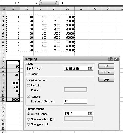
Note
The Random Sampling feature allows for duplicates within the same sample. If you need to make sure that any given sample contains no duplicates, you should use the RAND function instead.
Note
If you ask for a periodic sample, Excel traverses each column from left to right. Selecting every fourth value from G2:K10 in Figure 26.55 would select 4, 8 from the first column, and then 30, 70 from the second column. From 70, Excel would skip the next three values of 80, 90, and 100, and it would return 200 as the next periodic member of the sample.
Using ANOVA to Perform Analysis of Variance Testing
ANOVA stands for analysis of variance. The Data Analysis tools offer three forms of ANOVA testing:
- Single-factor ANOVA—This is for measuring variance for two or more samples with a single variable. For example, say that you have 18 farm fields. All are planted with the same variety of wheat. Six are treated with Nutrient A, six are treated with Nutrient B, and six are treated with Nutrient C. Single-variable ANOVA would analyze whether the variances in the populations were simply random or due to the fertilizers.
- Two-factor ANOVA without replication—This is for use when your data can be classified along two different dimensions. For example, say that half of the farm fields were downwind from an interstate highway that is heavily traveled by diesel trucks. You could analyze the variance caused by the fertilizer versus the variance caused by the carbon monoxide from the highway.
- Two-factor ANOVA with replication—If you have enough samples so that every combination of {fertilizer, highway} has multiple samples, you can perform two-factor ANOVA with replication. Otherwise, you use two-factor ANOVA without replication.
You follow these steps to perform a one-way ANOVA test:
- If your data is set up as records with data for each field, arrange the data in columns for each variable. In Figure 26.56, this means taking the data from Column B and arranging it in three columns, E, F, and G, with a heading above each column.
Figure 26.56. The difference in the sample means is statistically significant.
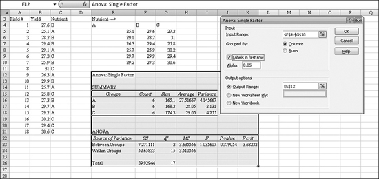
- Choose a null hypothesis. For example, your null hypothesis might be that all the nutrients produce a similar mean. If you can reject the null hypothesis, then your hypothesis is that the selection nutrient has an impact on yield.
- Choose a significance level, alpha, of 0.05. If the statistics from the ANOVA output show a p value greater than the alpha, then you can reject the null hypothesis and assume that the nutrient has an impact on yield.
- Make sure the Analysis Toolpak is installed.
- From the Data ribbon, choose Data Analysis. Then select ANOVA: Single Factor and click OK. The ANOVA: Single Factor dialog appears.
- In the ANOVA: Single Factor dialog, ensure that the input range includes your columns of means.
- If your input range includes a heading above each column, choose the Labels in First Row check box.
- In the Alpha box, enter the level at which you want to evaluate critical values for the F statistic. The alpha level is a significance level related to the probability of having a type I error (that is, rejecting a true hypothesis).
- Choose the top-left corner for the output range.
- Click OK to produce the result.
In Figure 26.56, the important statistic is the p value in Cell J23. Because this number is larger than alpha, you can reject the null hypothesis and assume that the nutrients had an impact on the yield.
You follow these steps to perform a two-way ANOVA test with replication:
- Arrange your data so that one dimension is spread across the columns. (This can be tricky.)
- Ensure that you have equal numbers of samples along the second dimension. In Figure 26.57, there were three rows of yields from fields downwind from a highway. These rows must be arranged together. For convenience, have a row label in Cell A7 to identify this block of data.
Figure 26.57. Setting up the input range in equal size rows is the key to successful use of Two-Factor ANOVA analysis.
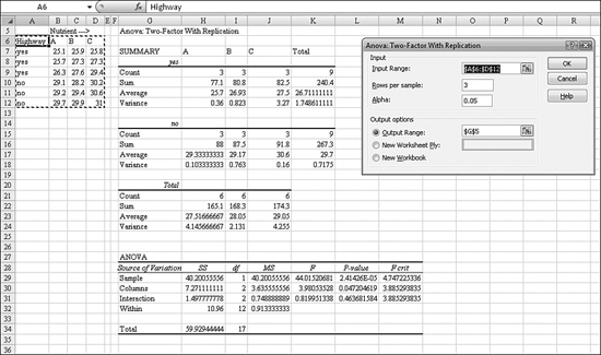
- Because you had three rows of sample yields for fields adjacent to highways, you also have to find three rows of sample yields for fields away from highways. This block of three rows must immediately follow the other data. Again, for convenience, make sure there is a heading in the first column and first row of this block to identify the value along the second dimension.
- Make sure the Analysis Toolpak is installed.
- From the Data ribbon, choose Data Analysis. Then select ANOVA: Two-Factor with Replication and click OK. The ANOVA: Two-Factor with Replication dialog appears.
- In the ANOVA: Two-Factor with Replication dialog, ensure that the input range includes sample values as well as an additional row above to identify the first-dimension variables and an additional column to the left to identify the second-dimension variable.
- In the Rows per Sample text box, enter the number of rows in each block of data. In this present example, there are 3 rows of yields for highway fields and 3 rows for non-highway fields, so enter
3. - In the Alpha box, enter the level at which you want to evaluate critical values for the F statistic. The alpha level is a significance level related to the probability of having a type I error (that is, rejecting a true hypothesis).
- For the output range, select the top-left corner of a large blank area. The ANOVA results will take up 30 rows by 7 columns.
- Click OK to perform the analysis.
In the results from this analysis, watch for the values in italics in the first column of the output range. The first block of data in the output range describes the first block of three rows in the input range, with a value of “yes” to the highway question.
The final block of the analysis shows the p values for each dimension and the two dimensions combined. In this particular analysis, it appears that much of the variability is due to highway proximity and does not necessarily have that much to do with the nutrients. The p value of 0.047 for the columns is not enough to reject the null hypothesis that the variability due to nutrients could just be random.
In some cases, you may have two factors for the ANOVA testing, but you may not have multiple samples for every combination of {dimension1, dimension2}. In this case, you can run two-factor ANOVA testing without replication. The results from this test contain less analysis than do the results from the test with replication. In this test, Excel does not predict if factors beyond the two dimensions are causing variability.
To perform a two-factor ANOVA without replication, you follow these steps:
- Arrange your data in a crosstab fashion. Have values from Dimension 1 going across the top row of the data. Have values from Dimension 2 going down the left column of the data. Enter the sample value in each intersection.
- Make sure the Analysis Toolpak is installed.
- From the Data ribbon, choose Data Analysis. Then select ANOVA: Two-Factor Without Replication and click OK. The ANOVA: Two-Factor Without Replication dialog appears.
- In the ANOVA: Two-Factor Without Replication dialog, ensure that the input range includes sample values as well as an additional row above to identify the first-dimension variables and an additional column to the left to identify the second-dimension variables.
- Check the Labels box so that Excel can get the headings for the Dimension 1 and Dimension 2 values from the worksheet.
- In the Alpha box, enter the level at which you want to evaluate critical values for the F statistic. The alpha level is a significance level related to the probability of having a type I error (that is, rejecting a true hypothesis).
- Click OK to run the analysis.
Excel analyzes the variance based on the rows and columns, as shown in Figure 26.58.
Figure 26.58. In this particular sample, the column drives variability more than the rows.
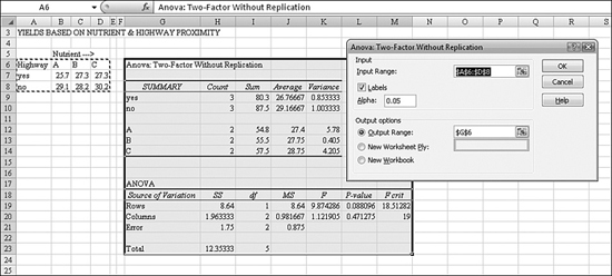
Using the F-Test to Measure Variability Between Methods
If you want to compare two methods, it is helpful to know if the variances the two methods are roughly the same. The F-test was designed by statistician R. A. Fisher. (The F here stands for Fisher and nothing intuitive.) The F-test compares two variances, V1 / V2, to produce an F statistic. Values close to 1 indicate that the variances are similar.
To run an F-test, you follow these steps:
- Set up two ranges with samples from each population. These samples do not have to have the same number of members.
- Make sure the Analysis Toolpak is installed.
- From the Data ribbon, choose Data Analysis. Then select F-Test Two-Sample for Variances. The F-Test Two Sample for Variances dialog appears.
- In the F-Test Two Sample for Variances dialog, choose the range for both of your sample ranges.
- In the Alpha box, enter the level at which you want to evaluate critical values for the F statistic. The alpha level is a significance level related to the probability of having a type I error (that is, rejecting a true hypothesis).
- Select the top-left cell of an output range.
- Click OK to produce the analysis.
The F-Test tool provides the result of a test of the null hypothesis that these two samples come from distributions with equal variances against the alternative that the variances are not equal in the underlying distributions.
The F-Test tool calculates the value of an F statistic. A value of F close to 1 provides evidence that the underlying population variances are equal.
There is a tricky element to the output table. If the F value is less than 1, you need to look to the next row, which has the label “P(F <= f) one-tail.” It gives the probability of observing a value of the F statistic less than f when population variances are equal. The next row, labeled “F Critical one-tail,” gives the critical value less than 1 for the chosen significance level, alpha.
If the F statistic is greater than 1, the meanings of these rows are reversed. The row labeled “P(F <= f) one-tail” gives the probability of observing a value of the F statistic greater than f when population variances are equal, and “F Critical one-tail” gives the critical value greater than 1 for alpha.
In Figure 26.59, the F statistic of 0.88 is less than 1. This means that the null hypothesis is that the variances are unequal. The F critical value is 0.35, meaning that you can reject the null hypothesis.
Figure 26.59. The F-test indicates whether two populations have an equal variance.
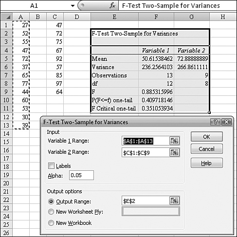
Performing a z-Test to Determine Whether Two Samples Have Equal Means
You use the Z-Test tool to test the null hypothesis that there is no difference between two population means against either one-sided or two-sided alternative hypotheses. z-tests are appropriate when the sample sizes are greater than 30. For sample sizes smaller than 30, you use t-tests, as described in the following section.
To run a z-test, you follow these steps:
- Set up two ranges with data from each sample. Calculate the standard deviation of each population.
- Make sure the Analysis Toolpak is installed.
- From the Data ribbon, choose Data Analysis. Then Scroll down and select z-Test: Two-Sample for Means. The z-Test: Two Sample for Means dialog appears.
- For Variable 1 Range, select the range of data for your first sample. If you choose a heading cell in this range, be sure to choose a heading cell in step 5.
- For Variable 2 Range, select the range of data for your second sample.
- For Hypothesized Mean Difference, if you have a reason to believe that there is a shift from one population to the other caused by an external event, note it here. For example, if you measured the height of every kid in the classroom, and the next day you measured the height of every kid while they were standing on a 6-inch bench, the 6 inches would be an explainable shift in the means.
- For the variances, enter the standard deviations for both populations. As mentioned previously, if you don’t know these, you should use the
ZTESTworksheet function instead of this tool. - In the Alpha box, enter the confidence level for the test. This value must be in the range 0...1. The alpha level is a significance level related to the probability of having a type I error (that is, rejecting a true hypothesis).
- Select the top-left cell of an output range.
- Click OK to produce the analysis.
The results of a z-test are shown in Figure 26.60.
Figure 26.60. This z-test indicates that the samples came from different populations.
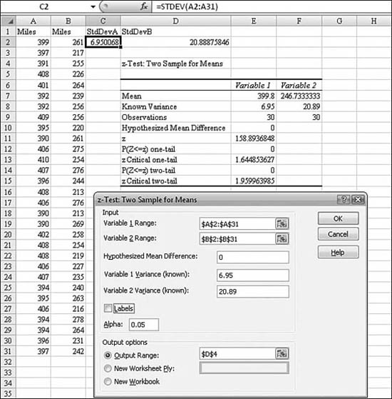
When analyzing the results, you should be careful to understand the output:
- “P(Z <= z) one-tail” is really
P(Z >= ABS(z)), the probability of a z value further from 0 in the same direction as the observed z value when there is no difference between the population means. - “P(Z <= z) two-tail” is really
P(Z >= ABS(z)orZ <= -ABS(z)), the probability of a z value further from 0 in either direction than the observed z value when there is no difference between the population means. The two-tailed result is just the one-tailed result multiplied by 2.
Performing Student’s t-Testing to Test Population Means
The two-sample T-Test tool tests for equality of the population means underlying each sample. There are three varieties of this test, based on assumptions:
- t-Test: Paired Two Sample for Means—If the two samples came from the same population, one before a treatment and one after the treatment, you use this test.
- t-Test: Two-Sample Assuming Equal Variances—If you believe that the variances of each population are equal, you use this test.
- t-Test: Two Sample Assuming Unequal Variances—If you believe that the variances of the two populations are unequal, you use this test.
All three varieties produce a t statistic. The t statistic can be negative or nonnegative. Under the assumption of equal underlying population means, if t is less than 0, “P(T <= t) one-tail” gives the probability that a value of the t statistic would be observed that is more negative than t. If t is greater than or equal to 0, “P(T <= t) one-tail” gives the probability that a value of the t statistic would be observed that is more positive than t. “t Critical one-tail” gives the cutoff value so that the probability of observing a value of the t statistic greater than or equal to “t Critical one-tail” is alpha.
“P(T <= t) two-tail” gives the probability that a value of the t statistic would be observed that is larger in absolute value than t. “P Critical two-tail” gives the cutoff value so that the probability of an observed t statistic larger in absolute value than “P Critical two-tail” is alpha.
To perform a t-test, you follow these steps:
- Set up two ranges with data from each sample.
- Make sure the Analysis Toolpak is installed.
- From the Data ribbon, choose Data Analysis. Then scroll down and select t-Test: Two-Sample Assuming Equal Variance. The t-Test dialog appears.
- For Variable 1 Range, select the range of data for your first sample. If you choose a heading cell in this range, be sure to choose a heading cell in step 5.
- For Variable 2 Range, select the range of data for your second sample.
- For Hypothesized Mean Difference, if you have a reason to believe that there is a shift from one population to the other caused by an external event, note it here.
- In the Alpha box, enter the confidence level for the test. This value must be in the range 0...1. The alpha level is a significance level related to the probability of having a type I error (that is, rejecting a true hypothesis).
- Select the top-left cell of an output range.
- Click OK to produce the analysis.
The results of a t-test are shown in Figure 26.61.
Figure 26.61. Based on a t statistic close to 0, you cannot assume that these came from different populations.
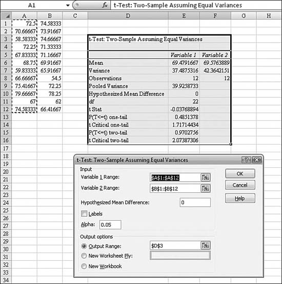
Using Functions Versus Using the Analysis Toolpak Tools
Excel offers many options for performing statistical analysis. Using functions in Excel provides real-time, live results of the data.
The Data Analysis tools in the Analysis Toolpak vary greatly. Some of them are poorly implemented and provide such narrow functionality that it would almost always be better to use your own functions rather than those tools.
On the other hand, some of the tools, such as Regression, provide additional statistics that run circles around the equivalent functions in Excel. In this case, it would be advantageous to use the Analysis Toolpak.
Remember, however, that when you use the Data Analysis tools from the Analysis Toolpak, they create static snapshots of the results. If you change the underlying data, you have to rerun the analysis.