
Chapter 2 Understanding XAML
In This Chapter
What would software development be without acronyms? Let’s meet XAML, also known as eXtensible Application Markup Language (and pronounced “Zammel”). Located at the border between graphics designers and software developers, this language enables new workflows and allows the designers to implement markup instead of working on static screenshots. Optimized for tools like Expression Blend, but still readable (and writable) by humans (with the help of Visual Studio), XAML is a really fascinating new language that admittedly comes with a learning curve. Don’t be afraid, though, soon you will have fun mastering this markup language!
Using XML for Data
XAML is based on XML, the eXtensible Markup Language. Sometimes we say that XAML is an XML dialect. What does it mean?
Data used to be stored in databases, a special type of file handled by a database system or application. Databases are efficient when it comes to storing and retrieving data. They are fast. But they are complex. Managing a database is so complex that there are engineers who dedicate their job to doing just this. Even the simplest database applications (such as Microsoft Access) are complex, and accessing the stored data from an application can be difficult.
XML, on the other hand, is simple to handle: It’s just a text file. If you open an XML file in a text editor, you will see something like the markup shown in Listing 2.1. In fact, a standard text editor will not color-code the XML file. More advanced XML editors like the one integrated into Visual Studio use color with XML tags, attributes, strings to make it easier to read. The samples in this book follow this practice and all the XML and XAML samples are color coded for clarity.
<!--MyLibrary.xml - All my books-->
<MyLibrary>
<Authors>
<Author Name=″Zola″
FirstName=″Emile″>
<Books>
<Book ReleaseYear=″1883″>
<Title>Au bonheur des dames</Title>
</Book>
<Book ReleaseYear=″1885″>
<Title>Germinal</Title>
</Book>
</Books>
</Author>
<Author Name=″Balzac″>
<Books>
<Book ReleaseYear=″1831″>
<Title>La Peau de chagrin</Title>
</Book>
</Books>
</Author>
<Author Name=″Flaubert″ />
</Authors>
</MyLibrary>
Let’s review the main characteristics of an XML document:
 XML is a hierarchic language, where nodes contain children nodes. Every node has a parent, except the top one, called the root node.
In addition to containing 0 or more children, each node can also have attributes. For example, the ReleaseYear is an attribute of the Book node.
A node may be empty; for example the author ″Flaubert″ is defined, but the library doesn’t contain any of his books. Instead of writing an opening tag <Author> and a closing tag </Author>, which would have been possible and allowed, the node is “self-closed” to make the markup more readable and shorter.
Similarly, not all attributes are compulsory. In Listing 2.1, the attribute FirstName is defined only in one of the Nodes. It is an optional attribute.
When you have data in an XML file, you must parse the file to retrieve the data. Parsing a file is a long and error-prone process. Thankfully, many programming platforms (including JavaScript and .NET) offer built-in ways to handle XML files in a much easier way. If you pass a valid XML file to an XML parser, you can get an object, containing all the nodes, organized in collections just like they are defined in the XML file. XML files can be used as lightweight databases, containing information without the heavy infrastructure of a database system.
Using XML for User Interfaces
Another use for XML is to describe a user interface (UI). The idea of using a markup language for this purpose is not new. The most famous UI markup language is without a doubt HTML (Hypertext Markup Language), but there are other XML-based UI languages, for example, SVG (Scalable Vector Graphics), XUL (XML User Interface Language, a Mozilla project), and so on.
However, HTML is not fully compliant with XML. Trying to load an HTML file with an XML parser will most probably result in errors. But HTML proved that a hierarchic markup language is good at describing complex user interfaces.
XAML obeys stricter rules than HTML. This is a good thing, really. Like XML, XAML must be parsed, and as mentioned already, parsing is a long and error-prone process. If you apply loose rules, the parser must accept many different text strings, and sometimes try to imagine what the programmer actually meant. This is why it is so difficult to write web pages that work the same in different web browsers: The rules of HTML allow too many variations, so the parser implementations use different interpretations, and the same markup can mean different things, depending on which browser loads it.
Understanding XML Namespaces
In XAML as in XML, the rules are defined in namespaces. You may have heard this term in relation to .NET, but this is not the same, so don’t be confused. .NET namespaces are discussed later in this book. Take a look at the simplest Silverlight file in Listing 2.2:
<Canvas xmlns=″http://schemas.microsoft.com/client/2007″ />
The Canvas element in this (too simple) XAML file uses one XML namespace. Note that the address used here does not correspond to a website. If you enter it in a web browser, you will get a “File Not Found” error (go on, try it!). It is only a URI (Unique Resource Identifier) used to designate a uniquely named resource, in this case the schema in which the XAML structure is defined. The schema is used by the XML parser to validate the file (to make sure that the file complies with the rules). Later, we will see that the schema is also used by XML editors to offer assistance to the user when she is typing XML (and XAML) to make this task easier and to reduce the number of errors.
When a XAML file is loaded into the Silverlight engine, the schema is loaded and checked to see whether a Canvas element is defined. If that is the case, the element is read and used to instantiate (create) a Canvas object.
Defining Additional Namespaces
The “X” in XML and in XAML stands for “eXtensible.” One XML document can refer to multiple XML namespaces, making it possible to mix multiple schemas and to extend the document with elements coming from other sources.
There can be, however, only one default namespace. Additional namespaces must define a prefix. For example, XAML typically uses an additional namespace as shown in Listing 2.3:
<Canvas xmlns=″http://schemas.microsoft.com/client/2007″
xmlns:x=″http://schemas.microsoft.com/winfx/2006/xaml″ />
The second namespace is assigned to the x prefix (that’s just a convention; the prefix can be any word as long as it is a valid XML identifier according to XML rules for naming elements that can be found online at www.w3.org/TR/REC-xml). If you want to use elements defined in this second namespace, you must prefix the element’s name with x.
For example, the x namespace in Silverlight defines general purpose attributes:
Name—Gives a name to the element, used to identify it in the code associated to this markup.
Key—When an element is defined in a resource dictionary (a collection of objects), it is identified by a key. This allows retrieving the object later to use it in the code.
Class—Used to link a XAML file with a .NET code file. See Chapter 9.
Other attributes—These are discussed in the next chapters when needed.
Knowing this, it is easy to assign a name to the root Canvas, allowing this object to be referenced in the code later, as shown in Listing 2.4:
<Canvas xmlns=″http://schemas.microsoft.com/client/2007″
xmlns:x=″http://schemas.microsoft.com/winfx/2006/xaml″
x:Name=″MyCanvas″ />
This syntax allows adding many more namespaces, and these are used later when we create user controls (reusable XAML structures), or when we want to use our own .NET classes in the XAML markup. This is where the XML namespaces meet the .NET namespaces: WPF and Silverlight make it possible to use your code-behind classes in XAML files, like in Listing 2.5! However, we will not use this particular feature before we start using .NET to program Silverlight.
<Canvas
xmlns=″http://schemas.microsoft.com/client/2007″
xmlns:x=″http://schemas.microsoft.com/winfx/2006/xaml″
x:Name=″MyCanvas″
xmlns:src=″clr-namespace:MyOwnClrNamespace″
xmlns:external=″clr-namespace:MyOtherClrNamespace;assembly=MyAssembly″ />
Creating a Canvas with Children
An empty Canvas is not very useful, however, so Listing 2.6 presents a more complete example.
<!--SimpleExampleWithChildren.xaml - a simple Canvas with children-->
<Canvas xmlns=″http://schemas.microsoft.com/client/2007″
xmlns:x=″http://schemas.microsoft.com/winfx/2006/xaml″
Background=″Red″
Width=″500″
Height=″300″>
<Ellipse Width=″400″
Height=″200″
Fill=″Yellow″
Stroke=″Orange″
StrokeThickness=″4″
Canvas.Left=″50″
Canvas.Top=″50″/>
<TextBlock Text=″Hello world″
FontSize=″36″
Foreground=″Blue″
Canvas.Left=″150.763″
Canvas.Top=″122.34″/>
</Canvas>
This Canvas has three attributes:
Background is a brush; in that case, we use a plain red color to “paint” the background of the Canvas. We will see later that there are various types of brushes.
Width and Height define the dimension of the Canvas.
The Canvas also has two children:
An Ellipse, also with the following attributes:
Width and Height—Define the Ellipse’s dimensions.
Fill—Like the Canvas’s background, it is also a brush; in that case we use a plain yellow color to paint the Ellipse’s insides.
Stroke—This is again a brush, used to draw the outside border of the Ellipse. In this case, we use a plain orange.
StrokeThickness—Defines the thickness of the outside border of the Ellipse.
Canvas.Left and Canvas.Top—These are special, and are discussed later in the chapter.
Another element has been placed in the Canvas: a TextBlock. Because it appears after the Ellipse, the TextBlock will be drawn on top of it. The TextBlock also defines a few attributes:
Text—The string that will be written when the TextBlock is rendered.
FontSize—This element is self-explanatory.
Foreground—This is (again) a brush, in this case a plain blue, used to draw the text.
Attaching Properties: Canvas.Left and Canvas.Top
The Ellipse element doesn’t define a Left or Top attribute. These attributes are specified in the Canvas element and “attached” to the Ellipse (and later to the TextBlock). That’s why these properties are called attached properties in WPF and in Silverlight. These two specify the location of the Ellipse on the Canvas, relative to the top-left corner, with the X axis pointing to the right and the Y axis pointing down (as is usual in UI development).
There are multiple benefits to using attached properties: Instead of defining a Left and a Top in the Ellipse object, and another Left and another Top inside the TextBlock object, they are implemented only on the Canvas object. Because a Canvas can contain a lot of various elements, defining these properties on the Canvas and attaching them to the target element are easier. Also, Left and Top make sense for a Canvas, a simple type of panel. But Silverlight supports other types of panels (for example, Grid, StackPanel, and so on). For these panels, Left and Top don’t make sense, so why define these two properties on the children elements? It makes more sense to define them only on the Canvas panel and to attach them when we add children to it.
Documenting Your Markup with XML Comments
XML allows entering comments in the markup. The comments will be parsed, but they do not have any effect on the resulting objects. Commenting your markup (and also your source code as we will see later) is important and is a good programming practice, because:
You will sometimes read markup written by other people, and their way of thinking isn’t always the same as yours (yes, yours is better, but still…).
You will sometimes read your own code years later and need to remember what the heck you were trying to do.
Writing comments in the XAML markup will help you a lot when you are confronted with these scenarios. XML comments use the following syntax:
<!--This is a comment-->
Testing XAML Markup
That was a lot of theory; now we can put this in practice and experiment with XAML. There are many ways to execute XAML markup. Of course, you can create a Silverlight application (for example, with Expression Blend like we will do later), but that’s a bit heavy if you just want to test a few simple (or even not so simple!) XAML constructs.
Thankfully, we have other tools at our disposal.
Using SilverlightPad
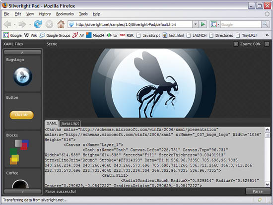
Point your browser to the following URL to start the SilverlightPad application, shown in Figure 2.1: http://silverlight.net/samples/1.0/Silverlight-Pad/default.html.
Figure 2.1 SilverlightPad
SilverlightPad is a Silverlight sample application, available on the community website Silverlight.net. It can either run online (if you are connected to the Internet) or can be installed locally, with the following steps:
1. Navigate to the Silverlight 1.0 gallery website at http://silverlight.net/community/communitygallery.aspx.
2. Click on View All 1.0 Samples.
3. Locate the SilverlightPad application (see Figure 2.2).
Figure 2.2. View or Download SilverlightPad
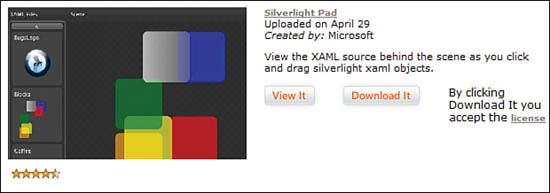
4. Click on Download It. This triggers the download of a Zip file. Open the file or save it to your hard disk.
5. Extract the Zip file content to a folder on your disk.
6. Navigate to this folder and start index.html in your favorite browser.
If you run SilverlightPad online, you can see sample XAML files on the left, useful to learn complex constructs. In the bottom, you can see (and type) XAML markup. There is also a JavaScript tab, used to attach JavaScript code to the XAML elements. The XAML markup you type is parsed when you click on the Parse button on the bottom right, and the corresponding UI is rendered in the Scene pane. Note also the Zoom controls on the top-right corner. This allows testing the “zoomability” of vector graphics (we’ll talk more about that in Chapter 5, “Using Media”).
SilverlightPad also allows running animations; for example, if you click on the Blocks XAML file (available if you run SilverlightPad from the Silverlight.net website), you’ll see that the blocks are moving. We will program XAML animations in Chapter 3, “XAML Transforms and Animations.”
Using KaXaml
SilverlightPad is a great application to train your XAML skills, but it is limited to Silverlight 1. To dig deeper in Silverlight 2 and its XAML markup, you can use the excellent KaXaml created by Robby Ingebretsen.
1. Navigate to the website http://kaxaml.com.
2. Click on the “Download” button and run the installer file.
3. After the installation is complete, run KaXaml from your Start menu. KaXaml appears like in Figure 2.3.
Figure 2.3 KaXaml
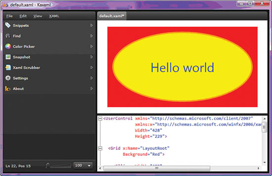
4. On the right hand side, KaXaml has a XAML markup pane (in the bottom), in which you can type or paste Silverlight markup.
5. On the right hand side, top, the visual rendering of the XAML markup will be displayed.
6. In addition, utilities are available on the left hand side:
A collection of “snippets,” small pieces of XAML markup that can be dragged to the XAML markup pane.
A “Find” dialog handy to look for information in big XAML files.
A Color picker including a Color palette.
A Snapshot utility, copying the current visual to a PNG image file.
A XAML “Scrubber,” a utility cleaning up the XAML markup according to user-defined settings.
KaXaml is a very useful tool to learn XAML, and a very fast way to visualize the results of your XAML experiments.
Setting Properties in XAML
Most properties can be set using the XML attribute syntax, but sometimes it is not enough. That’s why there is also an expanded syntax in XAML. For example, copy Listing 2.7 in SilverlightPad. Then don’t forget to click the Parse button to trigger SilverlightPad to render your markup.
<Canvas xmlns=″http://schemas.microsoft.com/client/2007″
xmlns:x=″http://schemas.microsoft.com/winfx/2006/xaml″
Background=″Red″
Width=″500″
Height=″300″>
</Canvas>
This creates an empty, red rectangle. It’s red because you set the Background property using the string ″Red″. Now, modify the markup to look like Listing 2.8:
<Canvas xmlns=″http://schemas.microsoft.com/client/2007″
xmlns:x=″http://schemas.microsoft.com/winfx/2006/xaml″
Width=″500″
Height=″300″>
<Canvas.Background>
<SolidColorBrush Color=″Red″/>
</Canvas.Background>
</Canvas>
The result is exactly the same. How is that possible? In the first case, using the attribute syntax (also called simple property syntax), when the XAML markup is parsed and objects are created, the string ″Red″ will be converted into an object (of type SolidColorBrush), and assigned to the Background property. Converters in XAML are powerful. They do their best to understand the programmer’s intentions and to create the object best suited to reflect the markup.
In the second case, the one with the expanded property syntax, the markup is straightforward. We tell the parser exactly what we want to happen: Create a SolidColorBrush object and assign it to the Background property of the Canvas. Note that one converter is still involved: The one converting the string ″Red″ in a Color object, so that this object can be assigned to the Color property of the SolidColorBrush.
Sometimes, you have to use the expanded property syntax, because it is not possible to define complex objects in just one string so that the converters can create the corresponding objects, as shown in Listing 2.9 and in Figure 2.4.
<!--RainbowBrush.xaml - a simple LinearGradientBrush-->
<Canvas xmlns=″http://schemas.microsoft.com/client/2007″
xmlns:x=″http://schemas.microsoft.com/winfx/2006/xaml″
Width=″500″
Height=″300″>
<Canvas.Background>
<LinearGradientBrush StartPoint=″0,0″
EndPoint=″1,0″>
<GradientStop Color=″Red″ Offset=″0″/>
<GradientStop Color=″Orange″ Offset=″0.25″/>
<GradientStop Color=″Yellow″ Offset=″0.5″/>
<GradientStop Color=″Green″ Offset=″0.75″/>
<GradientStop Color=″Blue″ Offset=″1″/>
</LinearGradientBrush>
</Canvas.Background>
<TextBlock Text=″Start″ TextWrapping=″Wrap″
Canvas.Top=″8″ Canvas.Left=″8″/>
<TextBlock Text=″End″ TextWrapping=″Wrap″
Canvas.Top=″8″ Canvas.Left=″465.717″/>
</Canvas>
Figure 2.4 LinearGradientBrush
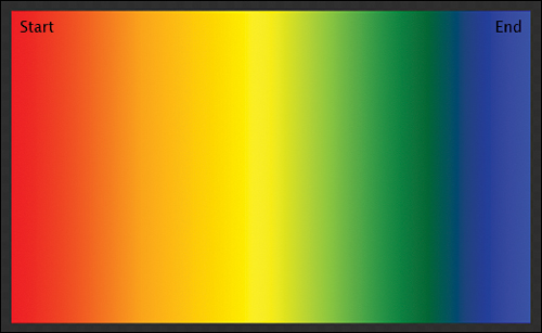
This markup creates another type of brush, a LinearGradientBrush. It produces a gradient, starting in the top-left corner (x=0, y=0) and ending in the top-right corner (x=1, y=0).
The expanded syntax may seem complicated at first, but once you get used to it, you’ll notice that it is in fact very logical and well structured.
Changing Brushes
How can you assign an object of type SolidColorBrush to the Background property, and later change that to an object of type LinearColorBrush? When we check the documentation online, we see that the Background property of a Canvas object is of type Brush:
http://msdn2.microsoft.com/en-us/library/bb738074.aspx (Canvas.Background)
http://msdn.microsoft.com/en-us/library/bb188310.aspx (Brush)
In fact, the Brush class is abstract, meaning that you cannot directly create an object of this type. But there are derived types, for example SolidColorBrush. Since SolidColorBrush and LinearColorBrush both inherit the Brush class, you can say that the SolidColorBrush is a Brush, and the LinearColorBrush is also a Brush. This concept is important when you do so-called Object Oriented Programming (OOP), and is called polymorphism.
Composing Scenes in XAML
XAML being XML, it is based on the composition of objects. This means that every object has a parent (except the topmost one), and a parent may have 0 or more children, as shown in Listing 2.10 and Figure 2.5.
<!--ComposedScene.xaml - Hierarchical scene-->
<Canvas xmlns=″http://schemas.microsoft.com/client/2007″
xmlns:x=″http://schemas.microsoft.com/winfx/2006/xaml″
Background=″Red″
Width=″500″ Height=″400″>
<Rectangle Width=″240″ Height=″150″
Fill=″Yellow″ Margin=″40″/>
<Grid Width=″330″ Height=″250″
Canvas.Left=″120″ Canvas.Top=″110″
Background=″#CCFFFFFF″>
<Ellipse Width=″200″ Height=″140″
Fill=″Orange″
HorizontalAlignment=″Right″
VerticalAlignment=″Bottom″
Margin=″20″ />
</Grid>
</Canvas>
Figure 2.5 Composing a scene
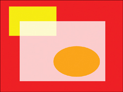
In Figure 2.5, the yellow Rectangle is one of the children of the red Canvas. There is also a white Grid, defined as another child of the red Canvas. You might wonder why you can see through this white Grid: The Background is set to #CCFFFFFF, which creates an 80% transparent white color. You learn more about transparency in Chapter 5, which deals with media in general and colors in particular.
Tip
Grid and Canvas are two Panels, with different functionalities. The various panels available will be reviewed in detail in Chapter 15, “Digging into Silverlight Elements.”
A Grid is a Panel in which you can define rows and columns, a little like a table (or a grid, for that matter).
A Canvas is another Panel, like a piece of paper, on which you can draw objects with Top and Left coordinates.
The red Canvas has two children, one of them a Rectangle and the other one a Grid. The half white Grid has a child, the orange Ellipse. So the XAML markup can be represented as a tree:
Red Canvas
Yellow Rectangle
Half white Grid
Orange Ellipse
This tree is called the logical tree and plays an important role in Silverlight.
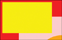
Another important thing is that the children of a Grid or a Canvas appear on top of each other, depending on the order in which they appear in the tree. In Figure 2.5, the yellow Rectangle appears under its sibling, the half-white Grid. The first child in the tree has a lower ZIndex than the second one, which in turn has a lower ZIndex than the third one, and so on. You can also change the ZIndex in the markup, changing the superposition effect. Change the Rectangle markup as in Listing 2.11:
<Rectangle Width=″246″
Height=″152″
Fill=″Yellow″
Canvas.ZIndex=″2″/>
This causes the Rectangle to appear on top of the half-white Grid, as shown in Figure 2.6, (because the ZIndex of the Rectangle is set to 2, which is higher than the default value of 0 assigned to the half-white Grid). Note also that ZIndex, like Left and Top, is an attached property of the Canvas class, thus the syntax Canvas.ZIndex.
Figure 2.6 Rectangle in front
Saving Typing, Saving Space
As you already found out, typing XAML can take some time. In fact, XAML was not created for humans. It was created for computer tools (like Expression Blend or Visual Studio), to be used as a storage medium, and then later optimized so that humans can type it anyway without too much pain. In further chapters, we will see how a good editor can help you save time, using a technology called Intellisense, automatic tag completion, and so on.
One such improvement is that for each class, one of the properties can be defined as the default property. In Silverlight, we talk about the Content Property. It doesn’t need to be explicitly mentioned when you type XAML markup, to save typing and space. For each object in Silverlight, the most used property may be marked as the Content Property by the developer. For example, the Children property of each Panel is the Content Property, so you can add elements in a Canvas without having to use the Canvas.Children syntax like in Listing 2.12.
<!--Children.xaml-->
<Canvas
xmlns=″http://schemas.microsoft.com/client/2007″
xmlns:x=″http://schemas.microsoft.com/winfx/2006/xaml″
Width=″640″
Height=″480″>
<Canvas.Children>
<Ellipse Width=″400″
Height=″200″
Fill=″Yellow″
Stroke=″Orange″
StrokeThickness=″4″
Canvas.Left=″50″
Canvas.Top=″50″/>
<TextBlock Text=″Hello world″
FontSize=″36″
Foreground=″Blue″
Canvas.Left=″150.763″
Canvas.Top=″122.34″/>
</Canvas.Children>
</Canvas>
Summary
This chapter gave you a first contact with XAML and some important features of this new language. XAML comes with a learning curve, especially for developers or designers not used to XML. This learning curve can be a little frightening sometimes, but as time goes by, you will learn how to master this language and be productive with it.
In the next chapter, we continue to work with XAML and learn more complex constructs, adding movement to our applications without writing one line of C# or JavaScript. Later, we introduce Expression Blend, a tool that allows you to visually edit the XAML markup. This is where XAML gives us the best of both worlds: a great visual designer and the possibility to act on markup level if we prefer.