
C H A P T E R 20
Using the Tabs Widget
This chapter is dedicated to the tabs widget. The tabs widget is superficially similar to the accordion that I described in Chapter 19 but offers a lot more functionality and opportunities for customization. In common with the earlier widget chapters, I’ll start with details of how to create the widget and then show you the settings, methods, and events that are supported. I finish this chapter with an example of how you can use the tabs widget to present forms to users in sections, which is a useful technique for dealing with long forms that require a lot of data input. Table 20-1 provides the summary for this chapter.
Creating the Tabs
You create jQuery UI tabs using the tabs method. As with the accordion widget, you need a particular structure of HTML elements in order to correctly apply the tab method. Listing 20-1 shows an example of this structure.
Listing 20-1. Creating jQuery UI Tabs
<!DOCTYPE html>

<html>

<head>

    <title>Example</title>

    <script src="jquery-1.7.js" type="text/javascript"></script>

    <script src="jquery.tmpl.js" type="text/javascript"></script>

    <script src="jquery-ui-1.8.16.custom.js" type="text/javascript"></script>

    <link rel="stylesheet" type="text/css" href="styles.css"/>

    <link rel="stylesheet" type="text/css" href="jquery-ui-1.8.16.custom.css"/>

    <script type="text/javascript">

        $(document).ready(function() {

            var data = [{"name":"Astor","product":"astor"},

                        {"name":"Daffodil","product":"daffodil"},

                        {"name":"Rose","product":"rose"},

                        {"name":"Peony","product":"peony"},

                        {"name":"Primula","product":"primula"},

                        {"name":"Snowdrop","product":"snowdrop"},
{"name":"Carnation","product":"carnation"},
{"name":"Lily","product":"lily"},
{"name":"Orchid","product":"orchid"}];
var elems = $('#flowerTmpl').tmpl(data);
elems.slice(0, 3).appendTo("#tab1");
elems.slice(3, 6).appendTo("#tab2");
elems.slice(6).appendTo("#tab3");
$('#tabs').tabs();
$('button').button();
});
</script>
<script id="flowerTmpl" type="text/x-jquery-tmpl">
<div class="dcell">
<img src="${product}.png"/>
<label for="${product}">${name}:</label>
<input name="${product}" value="0" />
</div>
</script>
</head>
<body>
<h1>Jacqui's Flower Shop</h1>
<form method="post" action="http://node.jacquisflowershop.com/order">
<div id="tabs">
<ul>
<li><a href="#tab1">Row 1</a>
<li><a href="#tab2">Row 2</a>
<li><a href="#tab3">Row 3</a>
</ul>
<div id="tab1"></div>

<div id="tab2"></div>

<div id="tab3"></div>
</div>
<div id="buttonDiv"><button type="submit">Place Order</button></div>
</form>
</body>
</html>
The element that you select for use with the tabs method needs to contain two kinds of element. The first is the content elements, which are those elements whose contents should appear inside the tabs. The second kind of element is the structure elements, which give the jQuery UI tab widget the information it needs to create the tab structure.
You use the div element to contain the content. In this example, I have used three div elements, each of which will hold one row of flower product information, just as in earlier examples, as follows:
<div id="tab1"></div>
<div id="tab2"></div>
<div id="tab3"></div>
It is important that each content element has an id attribute so that the jQuery UI tab widget can find the right element to display. For the structure, you use li elements, each of which must contain an a element, like this:
<ul>

    <li><a href="#tab1">Row 1</a>

    <li><a href="#tab2">Row 2</a>

    <li><a href="#tab3">Row 3</a>

</ul>
The number of li items defines the number of tabs. The content of the a element is used as the tab label, and the href attribute specifies which content element the tab relates to.
 Tip I used the data templates plugin to generate the tab content dynamically because it lets me show the required structure more clearly. The content can be defined statically or, as I explain in the next section, obtained dynamically from the server.
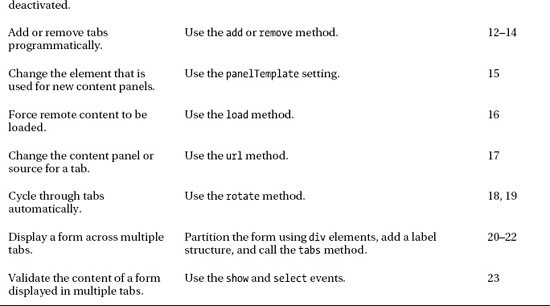
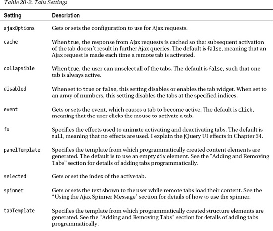
You can see how the structure in the example is transformed into a set of tabs in Figure 20-1.
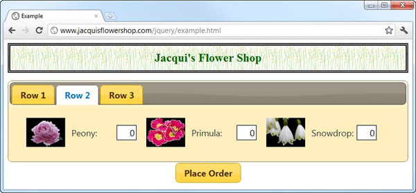
Figure 20-1 Creating jQuery UI tabs
Tabs are a familiar user interface metaphor. Clicking a tab causes jQuery UI to display the corresponding content element. As with the accordion, the tabs widget allows you to present a lot of content in a relatively compact manner, allowing the user to focus on what is important to them. This means you have to think carefully about how the tabs and their content relate to one another. Your goal is to group your content to minimize the amount of switching the user has to do between tabs to find what they are looking for. As with any user interface, this requires a solid understanding of the task that the user is performing and how their workflow (and not your systems) operates.
Getting Tab Content with Ajax
One of the nice features of the tab widget is the ability to obtain tab content via Ajax. To do this, you simply specify a URL as the href attribute for the appropriate a element. To demonstrate this feature, I have created an HTML document called tabflowers.html, the contents of which are shown in Listing 20-2. A tab that gets its content via Ajax is known as a remote tab.
Listing 20-2. The Contents of the tabflowers.html File
<div>

    <div class="dcell">

        <img src="astor.png"/><label for="astor">Astor:</label>

        <input name="astor" value="0" />

    </div>

    <div class="dcell">

        <img src="daffodil.png"/><label for="daffodil">Daffodil:</label>

        <input name="daffodil" value="0" />

    </div>

    <div class="dcell">

        <img src="rose.png"/><label for="rose">Rose:</label>

        <input name="rose" value="0" />

    </div>

</div>

<div>

    <div class="dcell">

        <img src="peony.png"/><label for="peony">Peony:</label>

        <input name="peony" value="0" />

    </div>

    <div class="dcell">

        <img src="primula.png"/><label for="primula">Primula:</label>

        <input name="primula" value="0" />

    </div>

    <div class="dcell">

        <img src="snowdrop.png"/><label for="snowdrop">Snowdrop:</label>

        <input name="snowdrop" value="0" />

    </div>

</div>
I have used the same structure and content as for the generated content elements in order to keep the example simple. Listing 20-3 shows how you can use the tabflowers.html file as the content for a tab.
Listing 20-3. Obtaining the Content of a Tab via Ajax
...

<body>

    <h1>Jacqui's Flower Shop</h1>

    <form method="post" action="http://node.jacquisflowershop.com/order">

        <div id="tabs">

            <ul>

                <li><a href="tabflowers.html">Ajax Content</a>
<li><a href="#tab1">Row 1</a>
<li><a href="#tab2">Row 2</a>
<li><a href="#tab3">Row 3</a>
</ul>
<div id="tab1"></div>
<div id="tab2"></div>
<div id="tab3"></div>
</div>
<div id="buttonDiv"><button type="submit">Place Order</button></div>
</form>
</body>
...
You modify the element structure rather than use settings for the tabs method. In this example, I have added a new tab called Ajax Content and specified the URL of the content that should be loaded. You can see the effect in Figure 20-2.
Tip You don’t need to create a content element for a remote tab. This is done for you automatically by the tabs widget.
Figure 20-2 Getting the contents of a tab via Ajax
Tip By default, you can load only HTML documents into tabs via Ajax, but in the “Configuring Ajax Requests” section, I’ll show you how you can achieve the same result with JSON.
Configuring the jQuery UI Tabs
At first glance, the tabs may look like a vertical variation of the accordion widget that I showed you in Chapter 19. There are some common characteristics, but you have a wider number of configuration options and settings when you use tabs. Table 20-2 describes the settings that are supported by the jQuery UI tabs widget. In the sections that follow, I show you how to use these settings to configure the widget.
Configuring Ajax Requests
The ajaxOptions setting allows you to provide a map object containing the configuration that will be used when making Ajax requests for remote tabs. You can specify all of the settings that I described in Chapters 14 and 15. I most frequently use the ajaxOptions setting so that I can generate content for remote tabs with JSON rather than regular HTML. Listing 20-4 shows the content of the mydata.json file, which I will use to demonstrate this technique. This is the same file you first used in Chapter 14.
Listing 20-4. The Contents of the mydata.json Fil
[{"name":"Astor","product":"astor","stocklevel":"10","price":"2.99"},

 {"name":"Daffodil","product":"daffodil","stocklevel":"12","price":"1.99"},

 {"name":"Rose","product":"rose","stocklevel":"2","price":"4.99"},

 {"name":"Peony","product":"peony","stocklevel":"0","price":"1.50"},

 {"name":"Primula","product":"primula","stocklevel":"1","price":"3.12"},

 {"name":"Snowdrop","product":"snowdrop","stocklevel":"15","price":"0.99"}]
Now that you have the source data, you can turn to the ajaxOptions setting, as shown in Listing 20-5.
Listing 20-5. Using the ajaxOptions Setting to Work with JSON
...

$('#tabs').tabs({

    ajaxOptions: {

        dataType: "html",

        dataFilter: function(result){

            var data = $.parseJSON(result).slice(0, 3);

            return $('<div></div>')

                .append($('#flowerTmpl').tmpl(data)).html();

        }

    }

});

...
I need to use two of the Ajax configuration options to get the right result. The first is dataFilter, which allows you to parse the JSON data (using the parseJSON method, which I describe in Chapter 33), apply a data template, slice the array of HTML elements, and then return the content as an HTML string. This is standard stuff, and I showed you how it all worked in Chapters 14 to 16.
The second setting is dataType. Since the server informs the browser that the content is JSON (through the HTTP Content-Type header), the jQuery Ajax feature encounters problems when trying to deal with the HTML string that my dataFilter function generates. To resolve this, I use the dataType setting to tell jQuery that it is working with HTML, even though the server has reported JSON.
Of course, to take advantage of these changes, I also have to specify the JSON file as the source for the remote tab, as follows:
...

<ul>

    <li><a href="mydata.json">Ajax Content</a>

    <li><a href="#tab1">Row 1</a>

    <li><a href="#tab2">Row 2</a>

    <li><a href="#tab3">Row 3</a>

</ul>

...
Now the jQuery UI tabs widget will request my JSON file, my ajaxOptions settings will transform the JSON to HTML using a data template, and the result will be displayed in the panel of the remote tab, as you can see in Figure 20-3.
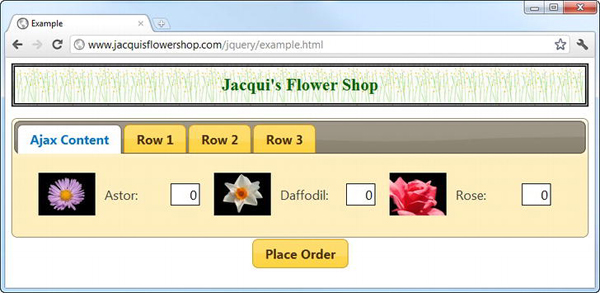
Figure 20-3 Using JSON to generate content for remote tabs
Dealing with Ajax Errors
By default, the jQuery UI tabs widget deals with Ajax problems by quietly ignoring them, which is far from ideal. Fortunately, you can apply your jQuery Ajax know-how in combination with the ajaxOptions setting to inform the user when something goes wrong. Listing 20-6 provides a demonstration.
Listing 20-6. Reporting a Remote Tab Ajax Error to the User
...

$('#tabs').tabs({

    ajaxOptions: {

        dataType: "html",

        dataFilter: function(result){

            var data = $.parseJSON(result).slice(0, 3);

            return $('<div></div>')

                .append($('#flowerTmpl').tmpl(data)).html();

        },

        error: function(jqxr, status, index, anchor) {

           $(anchor.hash).text("Sorry. There was an error loading the content");

        }

    }

});

...
The tabs widget passes an extra argument to the error function in addition to those used by the regular jQuery Ajax feature. This argument is the a element used as the header for the remote tab that has encountered an error. To create an error, I have changed the name of the file that I specified for the remote content, as follows:
<ul>

    <li><a href="mydata.jsonX">Ajax Content</a>

    <li><a href="#tab1">Row 1</a>

    <li><a href="#tab2">Row 2</a>

    <li><a href="#tab3">Row 3</a>

</ul>
There is no such file, so you can be sure that the tabs widget will encounter a problem. When you use a remote tab, the tabs widget creates a content element dynamically, and it looks something like this:
<div id="ui-tabs-1" class="ui-tabs-panel ui-widget-content ui-corner-bottom"></div>
The tabs widget generates a unique value for the id attribute, which I have shown in bold. The href that I used to specify the URL for the remote content is changed to match the id of the newly created content element, like this:
<li class="ui-state-default ui-corner-top ui-tabs-selected ui-state-active">

    <a href="#ui-tabs-1">Ajax Content</a>

</li>
It is the a element that is passed to your error function via the ajaxOptions setting. This means you can use the hash property defined by the DOM object that represents a element to get the id of the content element and then use the jQuery text method to display a message to the user, like this:
$(anchor.hash).text("Sorry. There was an error loading the content");
You can see the effect in Figure 20-4. You don’t have to display the error in the content element, but I think it is the most natural place for most web applications, largely because this is where the user will be expecting the content advertised by the tab label to be.
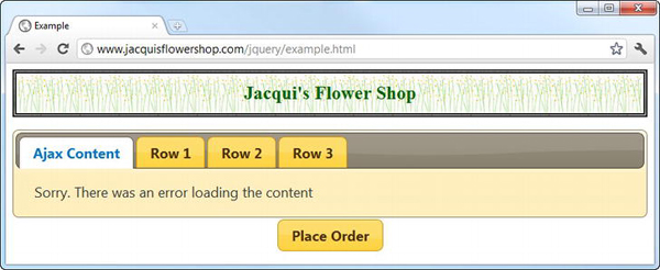
Figure 20-4 Displaying an error message to the user
Using the Ajax Spinner Message
The tabs widget will display a message to the user in the label of a remote tab while the content is being loaded. To enable this feature, you need to wrap the contents of the a element in a span, as shown in Listing 20-7.
Listing 20-7. Enabling the Ajax Spinner
...

<ul>

    <li><a href="tabflowers.html"><span>Ajax Content<span></a>

    <li><a href="#tab1">Row 1</a>

    <li><a href="#tab2">Row 2</a>

    <li><a href="#tab3">Row 3</a>

</ul>

...
For the duration of the Ajax request, the tabs widget will replace the tab label with a spinner message, which is “Loading...” by default (to be precise, the default is the HTML string <em>Working…</em>). You can see the effect in Figure 20-5.
Figure 20-5 The jQuery UI tabs widget displaying the spinner message
Tip It is very important that the span element contain the text of the message. A common mistake is to leave the span element empty so that the spinner message is displayed before or after the tab label. The tab widget will add the spinner message when loading starts but will be unable to remove it when the request has completed.
You can change the message through the spinner setting, as shown in Listing 20-8.
Listing 20-8. Using the spinner Setting to Change the Message Displayed to Users
...

$('#tabs').tabs({

    spinner: "<em>Working...</em>"

});

...
Be careful when using long spinner messages. They are more expressive, but the tabs widget will simply resize the tab label to accommodate whatever the spinner setting specifies, which means that the label will suddenly grow when the request starts and then suddenly shrink again when the request finishes. You can get a sense of what I mean in Figure 20-6.
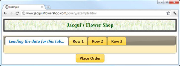
Figure 20-6 The tabs widget resizes the tab label to accommodate long spinner messages.
Disabling Individual Tabs
The disable setting works on the whole tabs widget if you use boolean values, but you can enable and disable individual tabs by using an array of numbers. Listing 20-9 provides a demonstration.
Listing 20-9. Enabling and Disabling Individual Tabs
<!DOCTYPE html>

<html>

<head>

    <title>Example</title>

    <script src="jquery-1.7.js" type="text/javascript"></script>

    <script src="jquery.tmpl.js" type="text/javascript"></script>

    <script src="jquery-ui-1.8.16.custom.js" type="text/javascript"></script>

    <link rel="stylesheet" type="text/css" href="styles.css"/>

    <link rel="stylesheet" type="text/css" href="jquery-ui-1.8.16.custom.css"/>

    <style type="text/css"> #buttonDiv {margin: 5px}</style>

    <script type="text/javascript">

        $(document).ready(function() {
$('#tabs').tabs({
select: function(event, ui) {
$('input:checkbox').button("enable")
.filter('#cb' + ui.index).button("disable")
}
});
$('input:checkbox').button().click(function() {
var disabledPositions = [];
$('input:checkbox[checked]').each(function(index, elem) {
disabledPositions.push($(this).data("index"));
})
$('#tabs').tabs("option", "disabled", disabledPositions)
});
});
</script>
</head>
<body>
<h1>Jacqui's Flower Shop</h1>
<form method="post" action="http://node.jacquisflowershop.com/order">
<div id="tabs">
<ul>
<li><a href="#tab1">Tab 1</a>
<li><a href="#tab2">Tab 2</a>
<li><a href="#tab3">Tab 3</a>
</ul>
<div id="tab1">This is the content for tab 1</div>
<div id="tab2">This is the content for tab 2</div>
<div id="tab3">This is the content for tab 3</div>
</div>
<div id="buttonDiv">
<label for="cb0">Tab 1</label>
<input type="checkbox" id="cb0" data-index=0 disabled>
<label for="cb1">Tab 2</label><input type="checkbox" id="cb1" data-index=1>
<label for="cb2">Tab 3</label><input type="checkbox" id="cb2" data-index=2>
</div>
</form>
</body>
</html>
In this document, I have created a tabs widget with static content and added a set of check boxes that I have transformed into jQuery UI toggle buttons. When a button is clicked, the corresponding tab is enabled or disabled. I have also used the select event so that I disable the toggle button for the active tab when it changes. (I explain the tabs events later in this chapter.) You can see the effect in Figure 20-7.
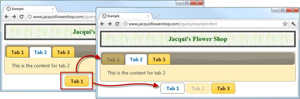
Figure 20-7 Disabling and enabling tabs in response to button clicks
Changing the Event Trigger
The tabs widget responds to the click event by default, meaning that users must click a tab to activate it. You can use the event setting to specify a different event to respond to. This is most useful for responding to mouse events, as shown in Listing 20-10.
Listing 20-10. Changing the Event That Activates a Tab
<!DOCTYPE html>

<html>

<head>

    <title>Example</title>

    <script src="jquery-1.7.js" type="text/javascript"></script>

    <script src="jquery.tmpl.js" type="text/javascript"></script>

    <script src="jquery-ui-1.8.16.custom.js" type="text/javascript"></script>

    <link rel="stylesheet" type="text/css" href="styles.css"/>

    <link rel="stylesheet" type="text/css" href="jquery-ui-1.8.16.custom.css"/>

    <style type="text/css"> #buttonDiv {margin: 5px}</style>

    <script type="text/javascript">

        $(document).ready(function() {


            $('#tabs').tabs({

                event: "mouseover"

            });

        });

    </script>

</head>

<body>

    <h1>Jacqui's Flower Shop</h1>

    <form method="post" action="http://node.jacquisflowershop.com/order">

        <div id="tabs">

            <ul>

                <li><a href="#tab1">Tab 1</a>

                <li><a href="#tab2">Tab 2</a>
<li><a href="#tab3">Tab 3</a>
</ul>
<div id="tab1">This is the content for tab 1</div>
<div id="tab2">This is the content for tab 2</div>
<div id="tab3">This is the content for tab 3</div>
</div>
</form>
</body>
</html>
In this example, I specified the mouseover event, which means that the tabs widget will switch between tabs as the mouse moves across the tab labels.
Tip I recommend using this approach sparingly, just as I did for the same setting of the accordion widget. It is visually appealing effect, but it creates an annoying effect, forcing the user to take care not to move the mouse away from the label of the tab they want to interact with.
Using Collapsible Tabs
You can create a sort of hybrid between tabs and accordions by using the collapsible setting, as shown in Listing 20-11.
Listing 20-11. Using the collapsible Setting
...

<script type="text/javascript">

    $(document).ready(function() {


        $('#tabs').tabs({

            collapsible: true

        });

    });

</script>

...
When the collapsible setting is true, clicking the active tab collapses it just like an accordion content element. You can see the transition in Figure 20-8.
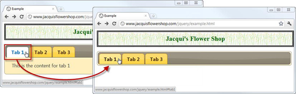
Figure 20-8 Collapsing the active tab
Tip I have included this setting for completeness, but it is one that I never use in my projects because I think the result is counterintuitive and confusing to users.
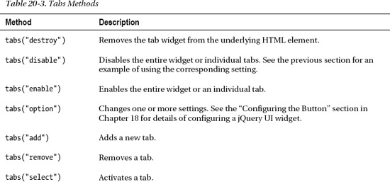
Using the jQuery UI Tabs Methods
Table 20-3 shows the methods that are supported by the jQuery UI tabs widget. I demonstrate the most useful of these in the sections that follow.
Adding and Removing Tabs
You can add and remove tabs programmatically using the add and remove methods. This is useful when you are dealing with dynamic content or are generating tabs in response to user input. Listing 20-12 shows how you can use these methods.
Listing 20-12. Adding and Removing Tabs Programmatically
<!DOCTYPE html>

<html>

<head>

    <title>Example</title>

    <script src="jquery-1.7.js" type="text/javascript"></script>

    <script src="jquery.tmpl.js" type="text/javascript"></script>

    <script src="jquery-ui-1.8.16.custom.js" type="text/javascript"></script>

    <link rel="stylesheet" type="text/css" href="styles.css"/>

    <link rel="stylesheet" type="text/css" href="jquery-ui-1.8.16.custom.css"/>

    <style type="text/css"> #buttonDiv {margin: 5px}</style>

    <style type="text/css">

        input {width: 150px; text-align: left}

        #dc1 {margin: 5px}

    </style>

    <script type="text/javascript">

        $(document).ready(function() {


            $('#tabs').tabs();


            $('button').button().click(function(e) {

                var tabsElem = $('#tabs'),

                if (this.id == "add") {

                    tabsElem.tabs("add", "tabflowers.html", $('#tabLabel').val());

                } else {

                    tabsElem.tabs("remove", tabsElem.tabs("option", "selected"))

                }

            })

        });

    </script>

</head>
<body>
<h1>Jacqui's Flower Shop</h1>
<div id="dc1" class="ui-widget">
<label for="tabLabel">Tab Name: </label><input id="tabLabel"/>
<button id="add">Add Tab</button>
<button id="remove">Remove Active Tab</button>
</div>
<div id="tabs">
<ul>
<li><a href="#tab1">Tab 1</a>
<li><a href="#tab2">Tab 2</a>
<li><a href="#tab3">Tab 3</a>
</ul>
<div id="tab1">This is the content for tab 1</div>
<div id="tab2">This is the content for tab 2</div>
<div id="tab3">This is the content for tab 3</div>
</div>
</body>
</html>
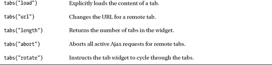
In this example, I have added an input element and a pair of button elements so that you can add new tabs and remove existing ones. You can see the additions in Figure 20-9.
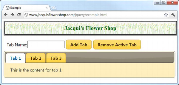
Figure 20-9 Additions to the document to programmatically add and remove tabs
When the user clicks the Remove Active Tab button, I get the index of the active tab using the selected setting and pass it as an argument to the remove method, like this:
The tabs widget removes the tab at the specified index and activates the next tab. If the removed tab was the last tab in the widget, then the tab that is now last is activated.
When the Add Tab button is clicked, I call the tabs add method, like this:
tabsElem.tabs("add", "tabflowers.html", $('#tabLabel').val());
After the add argument comes the URL for the tab and then the label you want to use. In this case, I use the val method to get the contents of the input element. In the example, I set the URL to be the tabflowers.html document, which has the effect of creating a remote tab.
Tip The new tab is added as the last tab in the widget. To change this, you can supply an additional argument to the add method specifying the zero-based position into which the new tab should be inserted.
Figure 20-10 shows what happens if I type New Tab into the input element and click the Add Tab button.
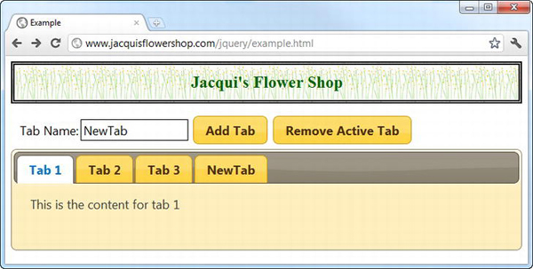
Figure 20-10 Adding a tab programmatically
The new tab isn’t activated by default. The easiest way to activate a new tab is to handle the add event, as shown in Listing 20-13. I detail the event supported by the tabs widget later in this chapter, but the add event is useful in the context of the add method.
Listing 20-13. Automatically Activating a New Tab
...

<script type="text/javascript">

    $(document).ready(function() {


        $('#tabs').tabs({

            add: function(event, ui) {

                $(this).tabs("select", ui.index);

            }

        });
        $('button').button().click(function(e) {

            var tabsElem = $('#tabs'),

            if (this.id == "add") {

                tabsElem.tabs("add", "tabflowers.html", $('#tabLabel').val());

            } else {

                tabsElem.tabs("remove", tabsElem.tabs("option", "selected"))

            }

        })

    });

</script>

...
The tabs widget provides you with information about the newly created tab through the ui object. The index property returns the index of the new tab, which I have used in conjunction with the select method to activate the tab as soon as it is created.
Adding Tabs with Static Content
You can also use the add event and the ui object to add tabs that contain static content, as shown in Listing 20-14.
Listing 20-14. Adding Tabs with Static Content
...

<script type="text/javascript">

    $(document).ready(function() {


        $('#tabs').tabs({

            add: function(event, ui) {

                $(this).tabs("select", ui.index);

                $(ui.panel).html("This is a <b>new</b> panel")

            }

        });


        var newTabCount = 0;


        $('button').button().click(function(e) {

            var tabsElem = $('#tabs'),

            if (this.id == "add") {

                tabsElem.tabs("add", "#" + (newTabCount++), $('#tabLabel').val());

            } else {

                tabsElem.tabs("remove", tabsElem.tabs("option", "selected"))

            }

        })

    });

</script>

...
To create a static tab, you specify a fragment identifier as the URL, just as you do when defining the tab structure using HTML elements. It is important to ensure that the fragment is unique among tabs. The jQuery UI tabs widget has problems activating tabs programmatically if there are duplicates.
Static tabs are created without any content. Fortunately, the ui object that is passed to the add event function defines a property called panel that returns the HTML element that the tabs widget created during the call to the add method. You can add content to this panel using any jQuery technique. I used the html method to insert a simple message, like this:
$(ui.panel).html("This is a <b>new</b> panel")
You can see the effect in Figure 20-11.
Figure 20-11 Adding content to a newly added static tab
Another approach is to use the panelTemplate setting to change the template that the widget uses when creating new tabs. Listing 20-15 provides a demonstration.
Listing 20-15. Changing the Panel Template
...

<script type="text/javascript">

    $(document).ready(function() {


        $('#tabs').tabs({

            add: function(event, ui) {

                $(this).tabs("select", ui.index);

            },

            panelTemplate: "<div>This is the <b>default</b> content</div>"

        });


        var newTabCount = 0;


        $('button').button().click(function(e) {

            var tabsElem = $('#tabs'),

            if (this.id == "add") {
tabsElem.tabs("add", "#" + (newTabCount++), $('#tabLabel').val());
} else {
tabsElem.tabs("remove", tabsElem.tabs("option", "selected"))
}
})
});
</script>
...
The default template is an empty div element. In this example, I have replaced this with a div element that contains a simple message. You can see the result in Figure 20-12. You can still use the add event to specify additional content or replace the default, of course, but replacing the template gives you a nice starting point for new tabs.
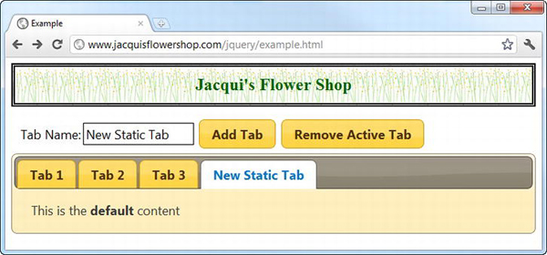
Figure 20-12 Defining default content for programmatically added static tabs
Tip You can also change the HTML used to create new tab labels. You do this through the tabTemplate setting, and the default is <li><a href="#{href}"><span>#{label}</span></a></li>. Notice the placeholders for the href and label. Change these to customize your labels.
Controlling Remote Tab Ajax Requests
You can use a number of methods to control the way that content is loaded for remote tabs. The one that I use most frequently is load, which immediately starts an Ajax request for the content in a tab. I find this useful when I am creating tabs dynamically and don’t want the user to have to wait for the content to load and then activate the tab. Listing 20-16 shows the user of the load method.
Listing 20-16. Explicitly Loading the Content of a Remote Tab
...

<script type="text/javascript">

    $(document).ready(function() {


        $('#tabs').tabs({

            add: function(event, ui) {

                $(this).tabs("load", ui.index);

            },

            load: function(event, ui) {

                $(this).tabs("select", ui.index);

            }

        });


        $('button').button().click(function(e) {

            var tabsElem = $('#tabs'),

            if (this.id == "add") {

                tabsElem.tabs("add", "tabflowers.html", $('#tabLabel').val());

            } else {

                tabsElem.tabs("remove", tabsElem.tabs("option", "selected"))

            }

        })

    });

</script>

...
The argument to the load method is the index of the remote tab you want to affect. In this case, I have used the load method in response to the add event, meaning that the content is loaded automatically when I add a new remote tab.
I have also used the load event. This event is triggered when the content for a remote tab has been loaded. I use this event to activate the tab when the Ajax request that I triggered with the load method has finished.
Changing the URL of a Remote Tab
The url method allows you to change the URL that is used to obtain content for a tab. The arguments for this method are the index of the tab you want to affect and the new URL you want to use. Listing 20-17 shows the use of this method.
Listing 20-17. Using the url Method to Change the Content Source for a Remote Tab
...

<script type="text/javascript">

    $(document).ready(function() {


        $('#tabs').tabs({

            add: function(event, ui) {

                $(this).tabs("load", ui.index);
},
load: function(event, ui) {
$(this).tabs("select", ui.index);
}
});
$('<button id=change>Change URL</button>').appendTo("#dc1");
$('button').button().click(function(e) {
var tabsElem = $('#tabs'),
switch (this.id) {
case "add":
tabsElem.tabs("add", "tabflowers.html", $('#tabLabel').val());
break;
case "remove":
tabsElem.tabs("remove", tabsElem.tabs("option", "selected"))
break;
case "change":
var selectedIndex = tabsElem.tabs("option", "selected");
tabsElem.tabs("url", selectedIndex, "tabflowers.html");
tabsElem.tabs("load", selectedIndex);
break;
}
})
});
</script>
...
In this script, I have added a Change URL button that calls the url method and changes the content location for the active tab. By changing the URL, you can switch a tab between local and remote content (it is harder to switch in the other direction because you need to associate the tab with a local HTML element).
When you change the URL to make a tab remote, the content won’t be loaded until the user deactivates and reactivates the tab. To work around this, I call the load method to force an Ajax request immediately.
Tip jQuery UI will allow you only to change to URLs within the same origin. See Chapter 14 for a description of origins.
Automatically Cycling Through the Tabs
You can use the rotate method to automatically cycle through the tabs in the widget. This can be a very nice feature, especially if you have some visually striking content that the user might not see otherwise (I am thinking of a site I use to book vacations, which uses jQuery UI tabs to showcase stunning pictures of exotic locations). My example content is not as appealing, but I can still use it to demonstrate the method. See Listing 20-18 for a demonstration.
Listing 20-18. Cycling Through Tabs Automatically
<!DOCTYPE html>

<html>

<head>

    <title>Example</title>

    <script src="jquery-1.7.js" type="text/javascript"></script>

    <script src="jquery.tmpl.js" type="text/javascript"></script>

    <script src="jquery-ui-1.8.16.custom.js" type="text/javascript"></script>

    <link rel="stylesheet" type="text/css" href="styles.css"/>

    <link rel="stylesheet" type="text/css" href="jquery-ui-1.8.16.custom.css"/>

    <script type="text/javascript">

        $(document).ready(function() {

            var data = [{"name":"Astor","product":"astor"},

                        {"name":"Daffodil","product":"daffodil"},

                        {"name":"Rose","product":"rose"},

                        {"name":"Peony","product":"peony"},

                        {"name":"Primula","product":"primula"},

                        {"name":"Snowdrop","product":"snowdrop"},

                        {"name":"Carnation","product":"carnation"},

                        {"name":"Lily","product":"lily"},

                        {"name":"Orchid","product":"orchid"}];


            var elems = $('#flowerTmpl').tmpl(data);

            elems.slice(0, 3).appendTo("#tab1");

            elems.slice(3, 6).appendTo("#tab2");

            elems.slice(6).appendTo("#tab3");


            $('#tabs').tabs({

                fx: {

                    opacity: "toggle",

                    duration: "normal"

                }

            }).tabs("rotate", "5000", false);


            $('button').button();

        });

    </script>

    <script id="flowerTmpl" type="text/x-jquery-tmpl">

        <div class="dcell">

            <img src="${product}.png"/>

            <label for="${product}">${name}:</label>

            <input name="${product}" value="0" />

        </div>

    </script>

</head>

<body>

    <h1>Jacqui's Flower Shop</h1>

    <form method="post" action="http://node.jacquisflowershop.com/order">

        <div id="tabs">

            <ul>

                <li><a href="#tab1">Row 1</a>
<li><a href="#tab2">Row 2</a>
<li><a href="#tab3">Row 3</a>
</ul>
<div id="tab1"></div>
<div id="tab2"></div>
<div id="tab3"></div>
</div>
<div id="buttonDiv"><button type="submit">Place Order</button></div>
</form>
</body>
</html>
The arguments for the rotate method are the number of milliseconds for which each tab should be shown and a Boolean that specifies whether the tabs will continue to cycle automatically after a user has explicitly activated a tab.
My recommendation is to transition between tabs slowly. The five seconds that I have specified in this example is a comfortable minimum direction. Any faster and you start to create a effect that is discomforting to users. Anything less than two seconds feels like a strobe effect and is distinctly unpleasant. I have added an animation effect to this example, which makes the transition between tabs less jarring. I explained the basic jQuery animations and effects in Chapter 10, and I describe the additional features added by jQuery UI in Chapter 34.
Resuming Tab Cycling Following User Interaction
The option to resume cycling the tabs after the user has activated one should always be false as far as I am concerned. The user has selected the tab they want to review, and by activating a tab, they have indicated that they understand the way that the content has been presented. By resuming cycling through the tabs, you run the risk of replacing the content that the user is studying with something they have already seen and discarded.
If you really must resume cycling the tabs, then I recommend doing so in a different way. Part of the problem with resuming via the rotate method is that cycling commences after the duration you specified. In my example, this means the user gets exactly five seconds to study the tab they activated before it is replaced with something else, which is just useless. Listing 20-19 shows how you can combine the rotate method with some of the tabs widget events to give the user a more graceful experience.
Listing 20-19. Resuming Tab Cycling in a More Elegant Way
...

<script type="text/javascript">

    $(document).ready(function() {

        var data = [{"name":"Astor","product":"astor"},

                    {"name":"Daffodil","product":"daffodil"},

                    {"name":"Rose","product":"rose"},

                    {"name":"Peony","product":"peony"},

                    {"name":"Primula","product":"primula"},

                    {"name":"Snowdrop","product":"snowdrop"},

                    {"name":"Carnation","product":"carnation"},

                    {"name":"Lily","product":"lily"},

                    {"name":"Orchid","product":"orchid"}];
var elems = $('#flowerTmpl').tmpl(data);
elems.slice(0, 3).appendTo("#tab1");
elems.slice(3, 6).appendTo("#tab2");
elems.slice(6).appendTo("#tab3");
var displayDuration = 5000;
var loadFactor = 5;
var selectCount = 0;
$('#tabs').tabs({
fx: {
opacity: "toggle",
duration: "normal"
},
select: function() {
var localCount = ++selectCount;
setTimeout(function() {
if (localCount == selectCount) {
$('#tabs').tabs("rotate", displayDuration, false)
}
}, displayDuration * loadFactor)
}
}).tabs("rotate", displayDuration, false);
$('button').button();
});
</script>...
In this script, I use the rotate method to set up tab cycling without the automatic resumption feature. I respond to the select event, which is triggered when the user activates a tab (but not when a tab is displayed as part of the rotation). In the handler function, I use the JavaScript setTimeout feature to invoke a function in the future. In this function I call the rotate method only if the user hasn’t activated another tab since I initially responded to the select event.
I have expressed the period before I resume the rotation as a multiple of the display duration. In this example, the multiple is 5, and the display duration is 5000. This means each tab is displayed for 5 seconds and that rotation resumes 25 seconds after the user has last activated a tab. You should tune this multiple to suit your content such that the user has plenty of time to peruse the content of the activated tab.
Caution Use rotation only with content that does not require user interaction. If you are using tabs to contain HTML forms, for example, then you should never resume rotation once the user has started to enter data into the input elements.
Using the jQuery UI Tabs Events
I have already demonstrated some of the events that are supported by the jQuery UI tabs widget, but you can find the complete list in Table 20-4.
The select, show, load, and add events are provided with a ui object that defines three properties that provide useful information about the event. These properties are described in Table 20-5. The create, remove, enable, and disable events don’t provide this additional information.
I am going to focus on two particularly important events—select and show—and the difference between them. This difference provides the basis for using the tabs widget in some sophisticated settings. In this section, I am going to show you how to break up an HTML form and display sections of it in a series of tabs and then use the select and show events to perform validation in response to the user using the tabs to move through the sections of the form.
Using Tabs to Display a Form
This is a useful technique for making a long form more approachable while giving the user a sense of how far they have progressed through the form. To begin, Listing 20-20 shows the document that contains the form that you will use.
Listing 20-20. The Document That Contains a Form
<!DOCTYPE html>

<html>

<head>

    <title>Example</title>

    <script src="jquery-1.7.js" type="text/javascript"></script>

    <script src="jquery.tmpl.js" type="text/javascript"></script>

    <script src="jquery-ui-1.8.16.custom.js" type="text/javascript"></script>

    <link rel="stylesheet" type="text/css" href="styles.css"/>

    <link rel="stylesheet" type="text/css" href="jquery-ui-1.8.16.custom.css"/>

    <style type="text/css">

        #tab2 input, #tab3 input {width: 200px; text-align: left}

        #tab1, #tab2, #tab3 {padding: 10px}

        .fl {float: left}

        #buttonDiv {clear: both}

        #tabs, h1 {margin: 10px}

        .regLabel {width: auto}

    </style>

    <script type="text/javascript">

        $(document).ready(function() {

            var data = [{"name":"Astor","product":"astor"},

                        {"name":"Daffodil","product":"daffodil"},

                        {"name":"Rose","product":"rose"},

                        {"name":"Peony","product":"peony"}];


            var elems = $('#flowerTmpl').tmpl(data);

            elems.slice(0, 2).appendTo("#row1");

            elems.slice(2, 4).appendTo("#row2");


            var detailsData = [{name: "Name", hint: "Enter your name"},

                    {name: "Street", hint: "Enter your street"},

                    {name: "City", hint: "Enter your city"},

                    {name: "State", hint: "Enter your state"},

                    {name: "Zip", hint: "Enter your zip code"}];


            $('#detailsTmpl').tmpl(detailsData).appendTo("#tab2")

                .clone().appendTo("#tab3")


            $('button').button();

        });

    </script>

    <script id="flowerTmpl" type="text/x-jquery-tmpl">

        <div class="dcell ui-widget">

            <img src="${product}.png"/>
<label for="${product}">${name}:</label>
<input name="${product}" value="0"/>
</div>
</script>
<script id="detailsTmpl" type="text/x-jquery-tmpl">
<div class="ui-widget">
<label for="${name}">${name}:</label>
<input name="${name}" placeholder="${hint}"/>
</div>
</script>
</head>
<body>
<h1>Jacqui's Flower Shop</h1>
<form method="post" action="http://node.jacquisflowershop.com/order">
<div id="tabs" class="ui-widget">
<ul>
<li><a href="#tab1">1. Select Products</a>
<li><a href="#tab2">2. Your Details</a>
<li><a href="#tab3">3. Your Shipping Address </a>
</ul>
<div id="tab1">
<h2>1. Select Products</h2>
<div id="row1"></div>
<div id="row2"></div>
</div>
<div id="tab2" class="fl"><h2>2. Your Details</h2></div>
<div id="tab3" class="fl">
<h2>3. Your Shipping Address</h2>
</div>
</div>
<div id="buttonDiv"><button type="submit">Place Order</button></div>
</form>
</body>
</html>
I have added some extra content and structure to the document to flesh out previous examples. There are fewer flower products, but I have added regions of the document to capture the user’s personal and shipping details. You can see the basic form in Figure 20-13.
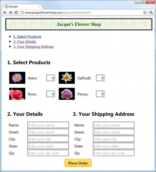
Figure 20-13 The multipart form for use with the tabs widget
There is nothing special about the form, other than it being well-suited for use with the jQuery UI tabs widget because it is neatly divided into distinct regions, each of which can be displayed in a tab.
I have added all of the content programmatically using the data templates plugin and a part of JavaScript arrays. You can see how I use the jQuery functionality I demonstrated in earlier chapters to generate elements from the data, clone them as required, and then add the results to the document. This isn’t a requirement for using tabs to display forms, but in a book about jQuery, I like to use the core features as much as possible.
You can also see the ul element in the figure and the links that it contains that point to the content elements. I would usually hide this element, but I wanted to show you a nice side effect of the structure that the tabs widget uses for the labels. Because you create a list and each list contains a link, you can click the link to jump to that part of the document, and, if the link is to another file, then the browser will navigate to that document.
Applying the Tabs
You are now ready to create the tabs widget. Listing 20-21 shows the changes that are required in the script element. No changes are required anywhere else in the document.
Listing 20-21. Creating the Tabs Widget
...

<script type="text/javascript">

    $(document).ready(function() {

        var data = [{"name":"Astor","product":"astor"},

                    {"name":"Daffodil","product":"daffodil"},

                    {"name":"Rose","product":"rose"},

                    {"name":"Peony","product":"peony"}];


        var elems = $('#flowerTmpl').tmpl(data);

        elems.slice(0, 2).appendTo("#row1");

        elems.slice(2, 4).appendTo("#row2");


        var detailsData = [{name: "Name", hint: "Enter your name"},

                {name: "Street", hint: "Enter your street"},

                {name: "City", hint: "Enter your city"},

                {name: "State", hint: "Enter your state"},

                {name: "Zip", hint: "Enter your zip code"}];


        $('#detailsTmpl').tmpl(detailsData).appendTo("#tab2")

            .clone().appendTo("#tab3")


        $('.fl').removeClass("fl");

        $('#tabs').tabs().find("h2").remove();


        $('button').button()

    });

</script>

...
I remove the fl class that I used to position the content for the details and shipping address regions and remove the h2 elements that I was using for section headers. I then apply the tabs method, which uses the content elements as the basis for the tabs, as you can see in Figure 20-14.
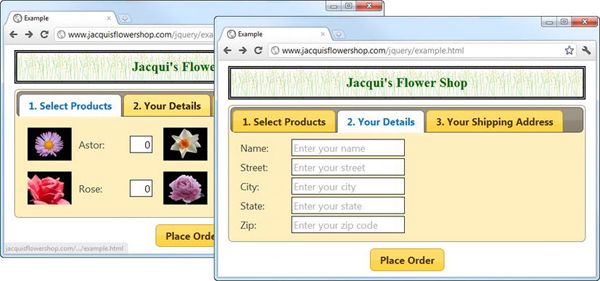
Figure 20-14 Applying tabs to the form
Handling the Button Presses
To make the form easier to fill in using the tabs, I have registered a handler for the click event of the submit button. In this handler, I suppress the default action for the event and move to the next tab in the sequence until the last tab is reached. At this point, pressing the button submits the form to the server. Listing 20-22 shows the additions to the script.
Listing 20-22. Progressing Through the Form Using the Submit Button
...

$('button').button().click(function(e) {

    var tabsElem = $('#tabs'),

    var activeTab = tabsElem.tabs("option", "selected");

    if (activeTab < (tabsElem.tabs("length") -1)) {

        e.preventDefault();

        tabsElem.tabs("select", activeTab + 1)

    }

});

...
I use the selected option and the length method to figure out where the user is in the sequence of tabs, and I use the select method to advance from one tab to another. I call the preventDefault method only when the user isn’t on the final tab, which allows the form to be submitted at the end of the tab sequence.
Performing Validation
At the moment, the user can just jump to the last page and submit the form. To prevent this, I am going to apply some basic form validation. To keep this example simple, I am going to handle the validation manually, but for real projects I recommend using the validation plugin and the techniques I described in Chapter 13. Listing 20-23 shows the changes to the script to implement some basic validation and stop the user from jumping to the end of the tab sequence prematurely.
Listing 20-23. Preventing the User from Skipping Through the Tabs with Some Basic Validation
...

<script type="text/javascript">

    $(document).ready(function() {

        var data = [{"name":"Astor","product":"astor"},

                    {"name":"Daffodil","product":"daffodil"},

                    {"name":"Rose","product":"rose"},

                    {"name":"Peony","product":"peony"}];


        var elems = $('#flowerTmpl').tmpl(data);

        elems.slice(0, 2).appendTo("#row1");

        elems.slice(2, 4).appendTo("#row2");


        var detailsData = [{name: "Name", hint: "Enter your name"},

                {name: "Street", hint: "Enter your street"},

                {name: "City", hint: "Enter your city"},

                {name: "State", hint: "Enter your state"},

                {name: "Zip", hint: "Enter your zip code"}];


        $('#detailsTmpl').tmpl(detailsData).appendTo("#tab2")

            .clone().appendTo("#tab3")


        var visiblePanel;

        var visibleIndex;


        $('.fl').removeClass("fl");

        $('#tabs').tabs({

            show: function(event, ui) {

                visiblePanel = ui.panel;

                visibleIndex = ui.index;

            },

            select: function(event, ui) {

                if (ui.index > visibleIndex && !validateTab(visiblePanel)) {

                    event.preventDefault();

                }

            }

        }).find("h2").remove();


        function validateTab(contentPanel) {

            var valid = false;

            if (contentPanel.id == "tab1") {
var productCount = 0;
$('#tab1 input').each(function(index, elem) {
productCount += Number($(elem).val());
})
valid = (productCount > 0);
} else {
var emptyCount = 0;
$(contentPanel).find("input").each(function(index, elem) {
if ($(elem).val() == "") {
emptyCount++;
}
})
valid = (emptyCount == 0);
}
if (!valid) {
alert("Validation Problem!");
}
return valid;
}
$('button').button().click(function(e) {
var tabsElem = $('#tabs'),
var activeTab = tabsElem.tabs("option", "selected");
if (activeTab < (tabsElem.tabs("length") -1)) {
e.preventDefault();
tabsElem.tabs("select", activeTab + 1)
}
});
});
</script>
...
The problem you face when trying to validate part of a form contained in a tab is that the tabs widget doesn’t provide any convenient way to find the active content panel. You can dig through the CSS or the HTML elements created by the widget, but you expose yourself to problems if the jQuery UI team ever changes the way that the widget works.
I have used the show event to keep track of the active index and content panel. I have defined a pair of variables, like this:
...

var visiblePanel;

var visibleIndex;

...
I update these variables each time the show method is triggered:
...

show: function(event, ui) {

    visiblePanel = ui.panel;

    visibleIndex = ui.index;

},

...
I then use the select event to call my validation method:
select: function(event, ui) {

    if (ui.index > visibleIndex && !validateTab(visiblePanel)) {

        event.preventDefault();

    }

}
The difference between the select and show events is critical to this technique. The show event is triggered whenever the tabs widget displays a tab. This can be in response to user input, the select method being called, the initial creating of the widget, or the rotate setting being used. The show event will also be triggered if a new tab is displayed as a side effect of another operation. For example, disabling the active tab will trigger the show event when the tabs widget shows the next available enabled tab to the user. The select event will be triggered only when the user explicitly selects a tab or when the select method has been called.
This difference allows me to keep track of all tab changes using the show event and validate the user’s input only in response to the select event.
Notice that I perform validation in the select handler function only if the user is moving forward through the tabs. I don’t perform validation if the select event is triggered for a tab whose index is smaller than the index of the currently displayed tab. This allows the user to return to earlier tabs and change their entries.
Finally, notice how I stop the tab the user has selected by calling the preventDefault method on the Event object passed to the handler function. The default action for the select event is to display the selected tab, and by preventing this, I force the widget to stay on the current tab. You can see the effect of the validation in Figure 20-15. The validation in this example is trivial, and it just displays a dialog box if there is a problem. For a real project, you should use the validation plugin, as described in Chapter 13.
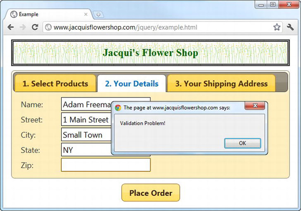
Figure 20-15 The alert box shown in response to a validation error
Summary
In this chapter, I showed you the jQuery UI tabs widget. This widget offers rich and complex functionality and can be used in a wide range of situations. I find myself using this widget a lot. It is flexible and completely customizable, and users are generally familiar with the idea of selectively revealing content contained in individual tabs, something that is not always the case with other widgets such as the accordion.