
C H A P T E R 19
Using the Autocomplete and Accordion Widgets
In this chapter, I describe the jQuery UI autocomplete and accordion widgets. These are more complex than the widgets I showed you in Chapter 18, but they follow the same pattern of settings, methods, and events as all jQuery UI widgets. They are highly configurable, flexible, and clever user interface controls, and used wisely, they can significantly enhance the appearance and usability of your documents and web applications. Table 19-1 provides the summary for this chapter.
Using jQuery UI Autocomplete
The autocomplete widget provides suggestions to the user as they enter values into an input element. Used well, this widget can be a helpful timesaver to the user, speeding up data entry and reducing errors. In the sections that follow, I'll show you how to create, configure, and use the jQuery UI autocomplete widget.
Creating the Autocomplete Element
You use the autocomplete method on an input element to create an autocompleting control. Listing 19-1 demonstrates the use of the method to set up basic autocompletion.
Listing 19-1. Creating an Autocompleting Input Element
<!DOCTYPE html>

<html>

<head>

    <title>Example</title>

    <script src="jquery-1.7.js" type="text/javascript"></script>

    <script src="jquery-ui-1.8.16.custom.js" type="text/javascript"></script>

    <link rel="stylesheet" type="text/css" href="jquery-ui-1.8.16.custom.css"/>

    <script type="text/javascript">

        $(document).ready(function() {


            var flowers = ["Astor", "Daffodil", "Rose", "Peony", "Primula", "Snowdrop",

                           "Poppy", "Primrose", "Petuna", "Pansy"];


            $('#acInput').autocomplete({

                source: flowers

            })

        });
</script>
</head>
<body>
<form>
<div class="ui-widget">
<label for="acInput">Flower Name: </label><input id="acInput"/>
</div>
</form>
</body>
</html>
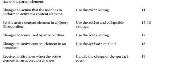
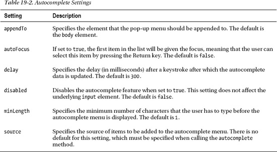
The autocomplete method works just like the other jQuery UI methods you have seen, with the exception that you must pass in a map object containing a value for the source setting. This setting specifies where the autocomplete entries will come from. In this example, I have used a simple array of values. Figure 19-1 illustrates the way that the autocomplete feature is presented to the user.
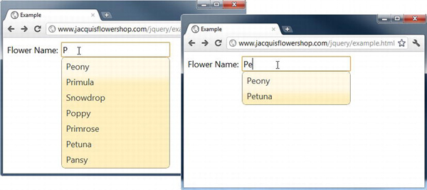
Figure 19-1 A basic jQuery UI autocomplete element
There are two screenshots in the figure. The first shows what happens when I type the letter P. As you can see, a list of the data items that contain the letter P are shown. This includes all of the flower names that start with P but also includes Snowdrop as well. In the second screenshot, I have typed Pe, and jQuery UI shows only the items that contain that combination of letters. The user can continue to type their entry or select one from the autocomplete list. The autocomplete feature doesn't enforce any kind of validation, and the user can enter any value into the input element, not just those that are defined by the source setting.
Notice that I have not sorted the items in the array that I used for the source setting. This is done automatically by jQuery UI. You can use a range of different data sources for the autocomplete values, which I demonstrate later in this chapter.
 Tip In the document, I put the
 input element and its label inside a div element that belongs to the ui-widget class. This sets the CSS font properties for the label and input elements to match those used by the autocomplete pop-up. I'll explain more about how you can use the jQuery UI CSS classes in Chapter 34 (and I give a quick demonstration in Chapter 25).
Using an Object Array as the Data Source
An alternative approach is to use an array of objects, rather than just strings. This allows you to separate the label that is displayed in the pop-up menu from the value that is inserted into the input element. Listing 19-2 provides a demonstration.
Listing 19-2. Using an Array of Objects for Autocompletion
<!DOCTYPE html>
<html>
<head>
<title>Example</title>
<script src="jquery-1.7.js" type="text/javascript"></script>
<script src="jquery-ui-1.8.16.custom.js" type="text/javascript"></script>
<link rel="stylesheet" type="text/css" href="jquery-ui-1.8.16.custom.css"/>
<style type="text/css">
button {margin-bottom: 5px}
</style>
<script type="text/javascript">
$(document).ready(function() {
var flowers = [{label: "Astor (Purple)", value: "Astor"},
{label: "Daffodil (White)", value: "Daffodil"},
{label: "Rose (Pink)", value: "Rose"},
{label: "Peony (Pink)", value: "Peony"}]
$('#acInput').autocomplete({
source: flowers
})
});
    </script>

</head>

<body>

    <form>

        <div class="ui-widget">

            <label for="acInput">Flower Name: </label><input id="acInput"/>

        </div>

    </form>

</body>

</html>
When you use an array of objects, the autocomplete feature looks for properties called label and value. The label property is used to create the pop-up list, and the value entry is inserted into the input element if the item is selected. In this example, I have added some color information to the labels, which is not included in the values. You can see the effect in Figure 19-2.
Figure 19-2 Using an array of objects to separate labels from values
Configuring Autocomplete
The autocomplete feature supports a number of settings that let you control different aspects of its functionality. These settings are described in Table 19-2. In the sections that follow, I show you how to use these settings to configure the widget.
Using a Remote Data Source
The most interesting autocomplete setting is source because you can use it to work with a wide range of different kinds of data to populate the pop-up menu. I used a JavaScript array in the previous example, which is fine for simple static lists of data. For more complex situations, you can get the list of matching items from a server. All you have to do is specify the URL that will generate the data, as shown in Listing 19-3.
Listing 19-3. Using a Remote Data Source
<!DOCTYPE html>

<html>

<head>

    <title>Example</title>

    <script src="jquery-1.7.js" type="text/javascript"></script>

    <script src="jquery-ui-1.8.16.custom.js" type="text/javascript"></script>

    <link rel="stylesheet" type="text/css" href="jquery-ui-1.8.16.custom.css"/>

    <script type="text/javascript">

        $(document).ready(function() {


            $('#acInput').autocomplete({

                source: "http://node.jacquisflowershop.com/auto"

            })

        });

    </script>

</head>

<body>

    <form>

        <div class="ui-widget">

            <label for="acInput">Flower Name: </label><input id="acInput"/>

        </div>

    </form>

</body>

</html>
When jQuery UI needs the list of items for the pop-up autocomplete menu, it will make an HTTP GET request to the specified URL. The characters that the user has typed so far are included in the request query string using the key term. So, for example, is the user has typed the letter s, then jQuery UI will request the following URL:
http://node.jacquisflowershop.com/auto?term=s
If the user then types the letter n, then jQuery UI will request the following:
http://node.jacquisflowershop.com/auto?term=sn
This technique is useful when there are a lot of data items and you don't want to send them all to the client. It can also be useful when the list of items changes dynamically and you want to make sure the user benefits from the latest data available.
The server is responsible for taking the term value from the query string and returning a JSON string representing the array of items to display to the user. Listing 19-4 shows a simple Node.js script that does just that.
Listing 19-4. The Node.js Script to Support Remote Autocompletion
var http = require('http'),

var url = require('url'),


http.createServer(function (req, res) {

    console.log("[200 OK] " + req.method + " to " + req.url);


    var flowers = ["Astor", "Daffodil", "Rose", "Peony", "Primula", "Snowdrop",

                    "Poppy", "Primrose", "Petuna", "Pansy"];


    req.on('end', function() {

        var matches = [];

        var term = url.parse(req.url, true).query["term"];


        if (term) {

            var pattern = new RegExp("^" + term, "i");

            for (var i = 0; i < flowers.length; i++) {

                if (pattern.test(flowers[i])) {

                    matches.push(flowers[i]);

                }

            }

        } else {

            matches = flowers;

        }


        res.writeHead(200, "OK", {

            "Content-Type": "application/json",

            "Access-Control-Allow-Origin": "*"});

        res.write(JSON.stringify(matches));

        res.end();

    });


}).listen(80);

console.log("Ready on port 80");
This script uses the same set of flower names as in the previous example and returns those that match the term sent by the browser. I have changed the search slightly so that only those names that start with the term are returned. For example, if jQuery UI sends a request like this:
http://node.jacquisflowershop.com/auto?term=p
then the Node.js server will return the following JSON:
["Peony","Primula","Poppy","Primrose","Petuna","Pansy"]
Because I am matching at the start of the flower name, Snowdrop is omitted from the list, as you can see in Figure 19-3.
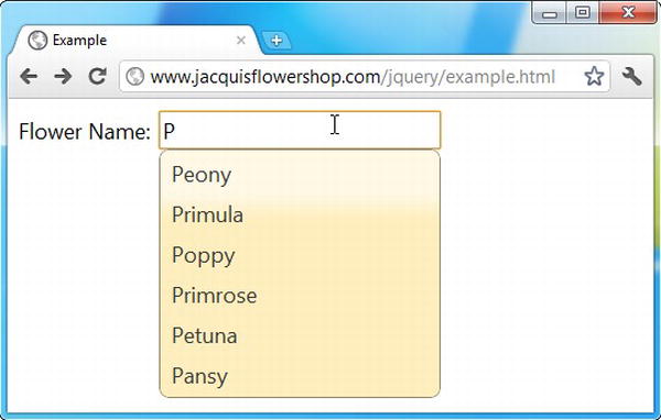
Figure 19-3 Obtaining autocomplete entries from a remote server
This is a really nice technique, but it can generate a lot of requests to the server. This isn't important in my example because I am performing only a simple search and my server and browser are on the same network. But for complex searches, across a wide-area network that can suffer delays, the load on the server can become an issue.
The best way to manage the rate at which autocomplete requests are made is to use the minLength and delay settings. The minLength setting specifies the number of characters that the user has to type before jQuery UI makes an autocomplete request to the server. You can use this setting such that you only request data from the server after several characters have been entered, by which time you have enough information to narrow the scope of your search.
The delay setting specifies the amount of time after a key press that the autocomplete information will be requested. You can use this setting to prevent requests from being made when the user is typing quickly. So, if the user types s and n, you can avoid hitting the server for the s list and then immediately doing so again for the sn list. By combining these settings, you can reduce the number of requests and still provide the user with guidance when it is needed. Listing 19-5 shows the uses of these settings.
Listing 19-5. Using the delay and minLength Settings to Reduce Server Requests
<!DOCTYPE html>

<html>

<head>

    <title>Example</title>

    <script src="jquery-1.7.js" type="text/javascript"></script>

    <script src="jquery-ui-1.8.16.custom.js" type="text/javascript"></script>

    <link rel="stylesheet" type="text/css" href="jquery-ui-1.8.16.custom.css"/>

    <script type="text/javascript">

        $(document).ready(function() {


            $('#acInput').autocomplete({

                source: "http://node.jacquisflowershop.com/auto",

                minLength: 3,
delay: 1000
})
});
</script>
</head>
<body>
<form>
<div class="ui-widget">
<label for="acInput">Flower Name: </label><input id="acInput"/>
</div>
</form>
</body>
</html>
In this example, the initial request to the server won't be made until the user has entered three characters and has not typed any additional characters for one second.
Using a Function as the Data Source
You can use a function to create a truly customized source for autocomplete entries. You assign the function to the source setting, and it is called each time the autocomplete feature needs to display items to the user. Listing 19-6 provides a demonstration.
Listing 19-6. Using a Function to Generate Autocomplete Items
<!DOCTYPE html>

<html>

<head>

    <title>Example</title>

    <script src="jquery-1.7.js" type="text/javascript"></script>

    <script src="jquery-ui-1.8.16.custom.js" type="text/javascript"></script>

    <link rel="stylesheet" type="text/css" href="jquery-ui-1.8.16.custom.css"/>

    <style type="text/css">

        button {margin-bottom: 5px}

    </style>

    <script type="text/javascript">

        $(document).ready(function() {


            var flowers = ["Astor", "Daffodil", "Rose", "Peony", "Primula", "Snowdrop",

                            "Poppy", "Primrose", "Petuna", "Pansy"];


            $('#acInput').autocomplete({

                source: function(request, response) {

                    var term = request.term;

                    var pattern = new RegExp("^" + term, "i");


                    var results = $.map(flowers, function(elem) {

                        if (pattern.test(elem)) {

                            return elem;

                        }

                    })
response(results);
}
})
});
</script>
</head>
<body>
<form>
<div class="ui-widget">
<label for="acInput">Flower Name: </label><input id="acInput"/>
</div>
</form>
</body>
</html>
Two arguments are passed to the function. The first argument is an object that has a single property called term. The value of this property is the string of characters that the user has entered into the input element. The second argument is a function that you call when you have generated the list of autocomplete items that you want to show to the user. The argument to this function is an array of strings or objects.
In this example, I have reproduced the server-side functionality from the previous listing, and I generate an array containing those items that start with the specified term.
Tip I processed the contents of the array using the jQuery map utility method, which I describe in Chapter 33.
I then pass the results back to jQuery UI by passing the array as an argument to the response function, like this:
response(results);
This is an odd way to process the results, but it works well enough, and the user is shown the items you generate, and you get the same effect as for the Node.js example.
Using the Autocomplete Methods
The jQuery UI autocomplete feature supports a number of methods that you can use to manipulate the autocomplete process. These methods are described in Table 19-3.
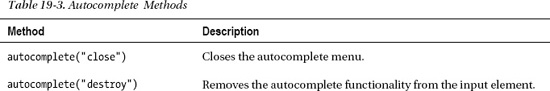
The two methods that are unique to the autocomplete feature are search and close, which you can use to explicitly start and end the autocomplete process, as demonstrated in Listing 19-7.
Listing 19-7. Using the search and close Methods
<!DOCTYPE html>

<html>

<head>

    <title>Example</title>

    <script src="jquery-1.7.js" type="text/javascript"></script>

    <script src="jquery-ui-1.8.16.custom.js" type="text/javascript"></script>

    <link rel="stylesheet" type="text/css" href="jquery-ui-1.8.16.custom.css"/>

    <style type="text/css">

        button {margin-bottom: 5px}

    </style>

    <script type="text/javascript">

        $(document).ready(function() {


            var flowers = ["Astor", "Daffodil", "Rose", "Peony", "Primula", "Snowdrop",

                            "Poppy", "Primrose", "Petuna", "Pansy"];


            $('#acInput').autocomplete({

                source: flowers,

                minLength: 0,

                delay: 0

            })


            $('button').click(function(e) {

                e.preventDefault();

                switch (this.id) {

                    case "close":

                        $('#acInput').autocomplete("close");

                        break;

                    case "input":

                        $('#acInput').autocomplete("search");

                        break;

                    default:

                        $('#acInput').autocomplete("search", this.id);

                        break;
}
})
});
</script>
</head>
<body>
<form>
<button id="s">S</button>
<button id="p">P</button>
<button id="input">Input Content</button>
<button id="close">Close</button>
<div class="ui-widget">
<label for="acInput">Flower Name: </label><input id="acInput"/>
</div>
</form>
</body>
</html>
In this example, I have added some button elements and used the click method to set up different autocomplete method calls. When the buttons marked S or P are pressed, I call the search method, passing in the selected letter as the search value. This triggers the autocomplete feature using the selected letter, irrespective of the contents of the input element, as shown in Figure 19-4.
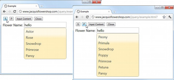
Figure 19-4 Using the search method with a search term
As you can see in the figure, the pop-up menu displays the entries that contain the letter from the button even though the input element contains the word hello.
The Input Content button triggers the autocomplete feature using whatever characters are contained in the input element. When I configured the autocomplete, I specified a minLength value of 0, which means that all of the items will be displayed in the list when I click the Input Content button, as shown in Figure 19-5. If the user had entered any characters in the input box, then the results would have been limited to items that contained that string.
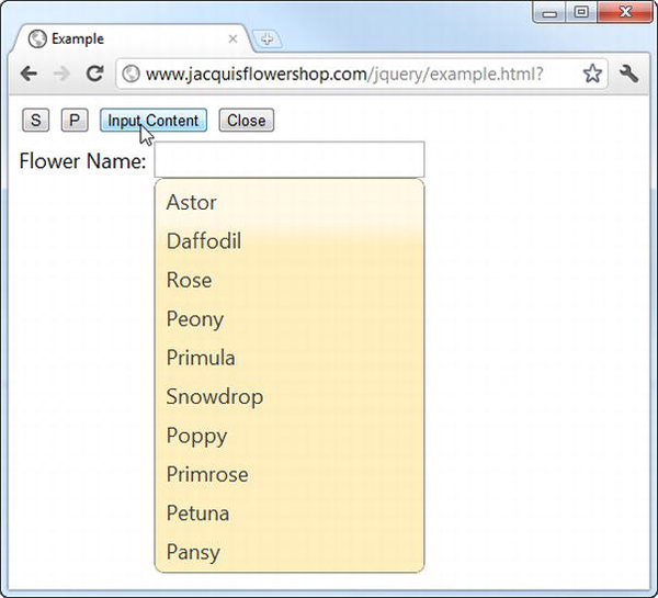
Figure 19-5 Searching using the contents of the input element
The final button, Close, calls the close method that dismisses the pop-up menu.
Using the Autocomplete Events
A number of events are triggered by the autocomplete feature, as described in Table 19-4.
Getting Details of the Selected Item
jQuery UI provides additional information about an event through a second argument, typically called ui. For the change, focus, and select events, jQuery UI gives the ui object an item property that returns an object describing the selected or focused item from the pop-up menu. Listing 19-8 shows how you can use this feature to get information about the item.
Listing 19-8. Using the ui Object in Event Handlers
<!DOCTYPE html>

<html>

<head>

    <title>Example</title>

    <script src="jquery-1.7.js" type="text/javascript"></script>

    <script src="jquery-ui-1.8.16.custom.js" type="text/javascript"></script>

    <link rel="stylesheet" type="text/css" href="jquery-ui-1.8.16.custom.css"/>

    <script type="text/javascript">

        $(document).ready(function() {


            var flowers = ["Astor", "Daffodil", "Rose", "Peony", "Primula", "Snowdrop",

                            "Poppy", "Primrose", "Petuna", "Pansy"];


            $('#acInput').autocomplete({

                source: flowers,

                focus: displayItem,

                select: displayItem,

                change: displayItem

            })


            function displayItem(event, ui) {

                $('#itemLabel').text(ui.item.label)

            }

        });

    </script>

</head>

<body>

    <form>

        <div class="ui-widget">

            <label for="acInput">Flower Name: </label><input id="acInput"/>

            Item Label: <span id="itemLabel"></span>

        </div>

    </form>

</body>

</html>
In this example, I have added a span element that I use to display the label property of the selected object. jQuery UI creates objects with label and value properties even when you use a simple string array for the source setting, so you always need to read one of these properties from the ui.item object. In this example, I use the same function to display the item from the focus, select, and change events. You can see the effect in Figure 19-6.
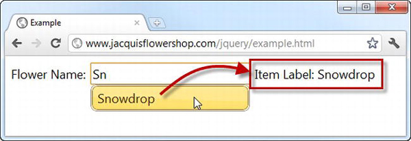
Figure 19-6 Getting the details of the selected item
Overriding the Default Select Action
The select event has a default action, which is to replace the contents of the input element with the contents of the value property of the item selected from the pop-up menu. This is exactly what you want most of the time, but you can use this event to either supplement the default action or prevent it entirely and do something different. Listing 19-9 contains an example of supplementing the default by setting the value of a related field.
Tip I described default actions for events in Chapter 9.
Listing 19-9. Overriding the Default Action of the select Event
<!DOCTYPE html>

<html>

<head>

    <title>Example</title>

    <script src="jquery-1.7.js" type="text/javascript"></script>

    <script src="jquery-ui-1.8.16.custom.js" type="text/javascript"></script>

    <link rel="stylesheet" type="text/css" href="jquery-ui-1.8.16.custom.css"/>

    <script type="text/javascript">

        $(document).ready(function() {


            var flowers = ["Astor", "Daffodil", "Rose"];


            var skus = { Astor: 100, Daffodil: 101, Rose: 102};


            $('#acInput').autocomplete({
source: flowers,
select: function(event, ui) {
$('#sku').val(skus[ui.item.value]);
}
})
});
</script>
</head>
<body>
<form>
<div class="ui-widget">
<label for="acInput">Flower Name: </label><input id="acInput"/>
<label for="sku">Stock Keeping Unit: </label><input id="sku"/>
</div>
</form>
</body>
</html>
When the select event is triggered, my handler function uses the ui argument to get the value of the selected item and set the value of a related field. In this case, the stock keeping unit, which is obtained from the skus object. In this way, I can help the user by providing default values for other fields based on the initial selection. This can be helpful in lots of situations, especially when selecting items such as shipping addresses. You can see the result in Figure 19-7, although this is an example where you should load a browser to get the full effect. The HTML for this document and all of the other examples in this book is available in the source code download that is freely available at Apress.com.
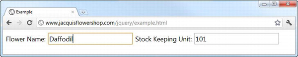
Figure 19-7 Using the select event to populate another field
Using the jQuery UI Accordion
The accordion widget takes a set of content elements and presents them so that at most one is visible to the user. The visible content is hidden when the user selects another, creating an effect that is reminiscent of the bellows in the musical instrument.
Accordions are great for presenting content that can be broken into discrete sections and where you don't want to overwhelm the user by displaying it all at once. Ideally, the individual content sections share some overarching theme that can be expressed using simple headers.
Creating the Accordion
As you might expect by now, you create the jQuery UI accordion widget using the accordion method. Listing 19-10 provides an example of creating an accordion.
Listing 19-10. Creating an Accordion
<!DOCTYPE html>

<html>

<head>

    <title>Example</title>

    <script src="jquery-1.7.js" type="text/javascript"></script>

    <script src="jquery.tmpl.js" type="text/javascript"></script>

    <script src="jquery-ui-1.8.16.custom.js" type="text/javascript"></script>

    <link rel="stylesheet" type="text/css" href="styles.css"/>

    <link rel="stylesheet" type="text/css" href="jquery-ui-1.8.16.custom.css"/>

    <style type="text/css">

        #accordion {margin: 5px}

        .dcell img {height: 60px}

    </style>

    <script type="text/javascript">

        $(document).ready(function() {

            var data = [{"name":"Astor","product":"astor"},

                        {"name":"Daffodil","product":"daffodil"},

                        {"name":"Rose","product":"rose"},

                        {"name":"Peony","product":"peony"},

                        {"name":"Primula","product":"primula"},

                        {"name":"Snowdrop","product":"snowdrop"},

                        {"name":"Carnation","product":"carnation"},

                        {"name":"Lily","product":"lily"},

                        {"name":"Orchid","product":"orchid"}];


            var elems = $('#flowerTmpl').tmpl(data);

            elems.slice(0, 3).appendTo("#row1");

            elems.slice(3, 6).appendTo("#row2");

            elems.slice(6).appendTo("#row3");


            $('#accordion').accordion();


            $('button').button();

        });

    </script>

    <script id="flowerTmpl" type="text/x-jquery-tmpl">

        <div class="dcell">

            <img src="${product}.png"/>

            <label for="${product}">${name}:</label>

            <input name="${product}" value="0" />

        </div>

    </script>

</head>

<body>

    <h1>Jacqui's Flower Shop</h1>

    <form method="post" action="http://node.jacquisflowershop.com/order">

        <div id="accordion">

            <h2><a href="#">Row 1</a></h2>

            <div id="row1"></div>

            <h2><a href="#">Row 2</a></h2>
<div id="row2"></div>
<h2><a href="#">Row 3</a></h2>
<div id="row3"></div>
</div>
<div id="buttonDiv"><button type="submit">Place Order</button></div>
</form>
</body>
</html>
The most important part of this example is the content of the div element whose id is accordion:
<div id="accordion">
<h2><a href="#">Row 1</a></h2>
<div id="row1"></div>
<h2><a href="#">Row 2</a></h2>
<div id="row2"></div>
<h2><a href="#">Row 3</a></h2>
<div id="row3"></div>
</div>
I have changed the formatting to make the structure more obvious. The top-level div element is the one you will target with the accordion method. When you do this, jQuery UI looks at the contents of the div for header elements (the h1 to h6 elements) and breaks up the content so that each header is associated with the element that follows it. In this case, I have used h2 elements as headers, each of which is followed by a div element. I use the data template plugin to populate these div elements with details of the products offered by the flower shop.
Notice that I have added an a element within each h2 element. This is the means by which you specify the title for each content section. You can see how jQuery UI transforms the top-level div element and its contents in Figure 19-8.
Tip Setting the href attribute to # is a common technique when defining a elements that are going to be used solely for JavaScript. I have used this approach because it makes the example simpler, but I generally recommend using jQuery to insert the a elements dynamically so that they don't interfere with non-JavaScript users.
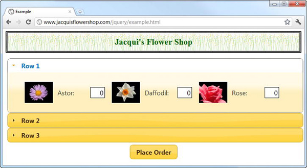
Figure 19-8 A jQuery UI accordion
When the accordion is created, the first content section is displayed while the others are hidden. The content of the a elements are used as the labels for each section, and clicking a label triggers closes the current section and opens the selected one (there is a nice animation effect during the transition that I can't show using screenshots). You can see the effect of clicking the headers in Figure 19-9.
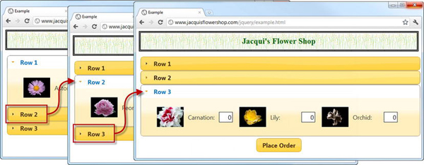
Figure 19-9 The accordion transitions
Configuring the Accordion
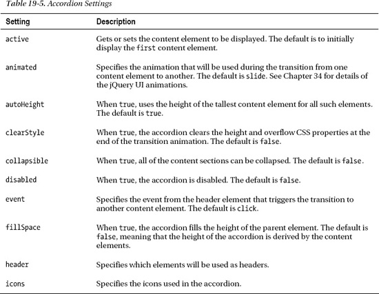
The accordion supports a number of settings that can be used to fine-tune it behavior. These settings are described in Table 19-5. In the sections that follow, I show you how to use these settings to configure the widget.
Setting the Height of the Accordion
You can set the height of the accordion in various ways, based on either the height of the content elements or the height of the parent element. The most common technique is to rely on the default, which is defined by the autoHeight setting. This setting, which is set to true by default, sets all of the content elements to be the same height (the height of the tallest content element) and sizes the accordion based on that.
This is the approach I used in the previous example, although some caution is required when using content elements that contain images, especially when the img elements are inserted into the document using jQuery. The problem is that the call to the accordion method can be made before all of the images are loaded, which causes jQuery UI to get misleading information from the browser about the height of the content elements. In my example document, the height of the content div elements is 55 pixels before the images are loaded and 79 pixels when they are loaded. You can tell whether you have hit this problem when the accordion shows unexpected scrollbars to display the content, as shown in Figure 19-10.
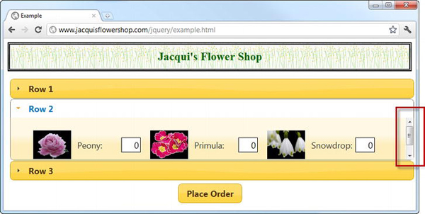
Figure 19-10 Problems caused by incorrect height information
jQuery UI doesn't detect the change in the content element's height when the images are loaded and ends up displaying the content incorrectly. To address this, you need to provide information about the height that the content elements will be once all of the external resources are loaded. There are lots of ways of doing this, and in the example, I chose to set the CSS height property for the img elements in a style element, as follows:
...
<style type="text/css">
#accordion {margin: 5px}
.dcell img {height: 60px}
</style>
...
Image issues aside, the autoHeight setting is useful when you want consistent heights for each of the content elements, but it can lead to some unappealing visuals when there is a large disparity between the sizes of the content elements. Listing 19-11 shows a script that inserts the product information elements in a slightly different way.
Listing 19-11. An Accordion with a Large Height Differential
...
<script type="text/javascript">
$(document).ready(function() {
var data = [{"name":"Astor","product":"astor"},
{"name":"Daffodil","product":"daffodil"},
{"name":"Rose","product":"rose"},
{"name":"Peony","product":"peony"},
{"name":"Primula","product":"primula"},
{"name":"Snowdrop","product":"snowdrop"},
{"name":"Carnation","product":"carnation"},
{"name":"Lily","product":"lily"},
{"name":"Orchid","product":"orchid"}];
var elems = $('#flowerTmpl').tmpl(data);
elems.slice(0, 3).appendTo("#row1");
elems.slice(3, 6).appendTo("#row2");
elems.slice(6).appendTo("#row3");
$('<h2><a href=#>All</a></h2><div id=row0></div>').prependTo('#accordion')
.filter('div').append($('#row1, #row2, #row3').clone())
$('#accordion').accordion();
$('button').button();
});
</script>
...
To create an extra-high content element, I have used jQuery to clone the existing content div elements and insert them into a new content element, creating an element that displays all of the products. This new element is three times the height of the others, which causes the accordion to display a lot of empty space when the smaller content elements are displayed. You can see how this appears in Figure 19-11.
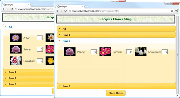
Figure 19-11 The effect of the autoHeight feature with a large height difference
If a large expanse of empty space doesn't suit your application, then you can simple change the autoHeight setting to false, as shown in Listing 19-12.
Listing 19-12. Disabling the autoHeight Feature
...
$('#accordion').accordion({
autoHeight: false
});
...
The accordion will now change its height dynamically as part of the transition between content elements. You can see the effect in Figure 19-12.
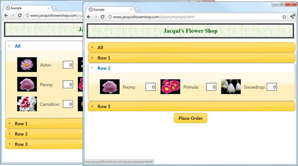
Figure 19-12 The accordion resizing itself to accomodate different content heights
This is a neater approach to displaying the content, but it does mean that the layout of the page changes as the accordion resizes itself. This can be annoying to users, especially if key controls are constantly moving around the screen.
Using the Parent to Determine the Height of the Accordion
An entirely different approach is to set the size of the accordion so that it simply fills its parent element. I find this most useful when I am working with content that is generated dynamically such that I don't have a good handle on the size and I don't want the layout to be adjusted. You can size the accordion this way through the fillSpace setting, as shown in Listing 19-13.
Listing 19-13. Sizing the Accordion to Fill the Parent Element
...
<script type="text/javascript">
$(document).ready(function() {
var data = [{"name":"Astor","product":"astor"},
{"name":"Daffodil","product":"daffodil"},
{"name":"Rose","product":"rose"},
{"name":"Peony","product":"peony"},
{"name":"Primula","product":"primula"},
{"name":"Snowdrop","product":"snowdrop"},
{"name":"Carnation","product":"carnation"}, {"name":"Lily","product":"lily"},
{"name":"Orchid","product":"orchid"}];
var elems = $('#flowerTmpl').tmpl(data);
elems.slice(0, 3).appendTo("#row1");
elems.slice(3, 6).appendTo("#row2");
elems.slice(6).appendTo("#row3");
$('<h2><a href=#>All</a></h2><div id=row0></div>').prependTo('#accordion')
.filter('div').append($('#row1, #row2, #row3').clone())
$('#accordion').wrap('<div style="height:300px"></div>'),
$('#accordion').accordion({
fillSpace: true
})
$('button').button();
});
</script>
...
In this example, I have wrapped the accordion element in a new parent div element that has a fixed size of 300 pixels. When I call the accordion method, I set fillSpace to true. If the parent is smaller than a content element, then the accordion adds a scrollbar. If the parent is larger than a content element, then some padding is added. You can see the application of the scrollbar in Figure 19-13. This arises because the content element that displays all of the flowers is taller than the 300 pixels of the parent element.
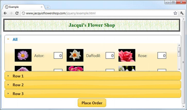
Figure 19-13 Using the accordion to fill the height of the pareent
Changing the Event Type
By default, the user opens and closes content elements by clicking them. You can customize this behavior through the event setting, as shown in Listing 19-14.
Listing 19-14. Using the event Setting
...
<script type="text/javascript">
$(document).ready(function() {
var data = [{"name":"Astor","product":"astor"},
{"name":"Daffodil","product":"daffodil"},
{"name":"Rose","product":"rose"},
{"name":"Peony","product":"peony"},
{"name":"Primula","product":"primula"},
{"name":"Snowdrop","product":"snowdrop"},
{"name":"Carnation","product":"carnation"},
{"name":"Lily","product":"lily"},
{"name":"Orchid","product":"orchid"}];
var elems = $('#flowerTmpl').tmpl(data);
elems.slice(0, 3).appendTo("#row1");
elems.slice(3, 6).appendTo("#row2");
elems.slice(6).appendTo("#row3");
$('#accordion').accordion({
event: "mouseover"
})
$('button').button();
});
</script>
...
In this example, I have used the event setting to specify that content elements should be opened in response to the mouseover event (which I described in Chapter 9). The effect of this change is that as soon as the mouse pointer enters the label for a content element, jQuery UI opens the element and displays its content. I can't show this effect in a screenshot, but I recommend you load this example to see how it works. It is a neat feature, but I recommend it is used carefully. Users are generally quick to grasp the idea of clicking the icon to open a section of content, but responding to mouse events can make for a twitchy and surprising user experience.
Selecting the Active Header
The default behavior of the accordion is to initially show the first content element to the user. You can change this behavior using the active setting. You can set active to be a selector string, a jQuery object, an HTMLElement object, or a number. For the selector and jQuery object, the first matching element is used, and the number is used as a zero-based index. Listing 19-15 shows the use of a selector string.
Listing 19-15. Using the Active Setting
<!DOCTYPE html>
<html>
<head>
<title>Example</title>
<script src="jquery-1.7.js" type="text/javascript"></script>
<script src="jquery.tmpl.js" type="text/javascript"></script>
<script src="jquery-ui-1.8.16.custom.js" type="text/javascript"></script>
<link rel="stylesheet" type="text/css" href="styles.css"/>
<link rel="stylesheet" type="text/css" href="jquery-ui-1.8.16.custom.css"/>
<style type="text/css">
#accordion {margin: 5px}
.dcell img {height: 60px}
</style>
<script type="text/javascript">
$(document).ready(function() {
var data = [{"name":"Astor","product":"astor"},
{"name":"Daffodil","product":"daffodil"},
{"name":"Rose","product":"rose"},
{"name":"Peony","product":"peony"},
{"name":"Primula","product":"primula"},
{"name":"Snowdrop","product":"snowdrop"},
{"name":"Carnation","product":"carnation"},
{"name":"Lily","product":"lily"},
{"name":"Orchid","product":"orchid"}];
var elems = $('#flowerTmpl').tmpl(data);
elems.slice(0, 3).appendTo("#row1");
elems.slice(3, 6).appendTo("#row2");
elems.slice(6).appendTo("#row3");
$('#accordion').accordion({
active: "#row2header"
})
$('button').button();
});
</script>
<script id="flowerTmpl" type="text/x-jquery-tmpl">
<div class="dcell">
<img src="${product}.png"/>
<label for="${product}">${name}:</label>
<input name="${product}" value="0" />
</div>
</script>
</head>
<body>
<h1>Jacqui's Flower Shop</h1>
<form method="post" action="http://node.jacquisflowershop.com/order">
<div id="accordion"> <h2><a href="#">Row 1</a></h2>
<div id="row1"></div>
<h2 id="row2header"><a href="#">Row 2</a></h2>
            <div id="row2"></div>

            <h2><a href="#">Row 3</a></h2>

            <div id="row3"></div>

        </div>

        <div id="buttonDiv"><button type="submit">Place Order</button></div>

    </form>

</body>

</html>
The important thing to remember when using the active setting is that the selector applies to the header elements. For this example, that's the h2 elements and not the div or a element. I have added an id attribute to one of the h2 elements and used this as the selector string. The effect is that the accordion opens the row 2 content element initially, as shown in Figure 19-14.
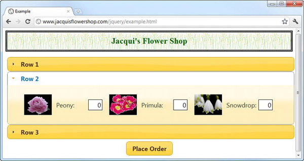
Figure 19-14 Selecting the initial content element to display
You can also have no content initially active by setting active to false. If you do this, you must also set the collapsible setting to true. This disables the default policy that one content element must always be visible. Listing 19-16 shows the application of these settings.
Listing 19-16. Disabling the Initially Active Content Element
...
$('#accordion').accordion({
active: false,
collapsible: true
})
...
You can see the effect of these settings in Figure 19-15.
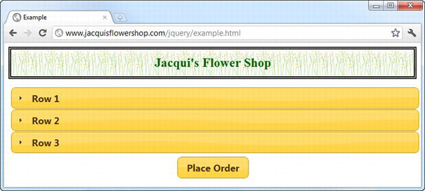
Figure 19-15 The accordion with no initially active content element
The accordion works normally, with the exception that there is no initially active content element and that all of the content elements can be closed. This is a useful technique when screen estate is limited and the content in the accordion is not of primary interest to the user.
Changing the Accordion Icons
You can use the icons setting to change the icons used in the accordion content headers. Listing 19-17 provides an example.
Listing 19-17. Changing the Icons Used by the Accordion
...
$('#accordion').accordion({
collapsible: true,
icons: {
header: "ui-icon-zoomin",
headerSelected: "ui-icon-zoomout"
}
})
...
You set icons to be an object that has header and headerSelected properties. The first property specifies the icon to use when the content element is closed, and the second specifies the icon to use when it is open. I tend to use this setting in conjunction with the collapsible setting because it gives a more natural feel when using icons that suggest that user can perform an action. You can see how these icons appear in Figure 19-16.
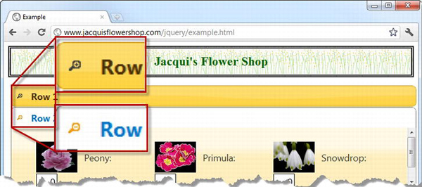
Figure 19-16 Using custom icons for the accordion section headers
Using the Accordion Methods
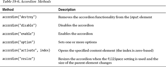
The jQuery UI accordion defines a number of methods. Most are the standard methods shared by all jQuery UI widgets, but there are two that allow you to control the accordion programmatically. Table 19-6 describes the methods available.
The resize method is best used with the jQuery UI resizable feature, which I described in Chapter 24. That leaves us only with the activate method to explore in this chapter, as all of the other methods are common among all jQuery UI widgets, and I explained how they work in Chapter 18. The activate method allows you to control the accordion programmatically, as Listing 19-18 demonstrates.
Listing 19-18. Controlling an Accordion Using the activate Method
...

<script type="text/javascript">

    $(document).ready(function() {

        var data = [{"name":"Astor","product":"astor"},

                    {"name":"Daffodil","product":"daffodil"},

                    {"name":"Rose","product":"rose"},

                    {"name":"Peony","product":"peony"},

                    {"name":"Primula","product":"primula"},

                    {"name":"Snowdrop","product":"snowdrop"},

                    {"name":"Carnation","product":"carnation"},
{"name":"Lily","product":"lily"},
{"name":"Orchid","product":"orchid"}];
var elems = $('#flowerTmpl').tmpl(data);
elems.slice(0, 3).appendTo("#row1");
elems.slice(3, 6).appendTo("#row2");
elems.slice(6).appendTo("#row3");
$('#accordion').accordion({
active: false,
collapsible: true
})
$('button').hide();
var ids = ["2", "1", "0", "None"];
for (var i = 0; i < ids.length; i++) {
$('<button id=' + ids[i] + '>' + ids[i] + '</button>').insertAfter('h1')
}
$('button').button().click(function(e) {
if (this.id == "None") {
$('#accordion').accordion("activate", false);
} else {
$('#accordion').accordion("activate", Number(this.id));
}
});
</script>
...
In this script, I have added buttons that correspond to the index of each content element as well as one marked None. You can see the effect in Figure 19-17.
Figure 19-17 Adding buttons to control accordion activation
When the user clicks one of the numbered buttons, the corresponding content element is activated. I achieve this by using the activate method, as follows:
$('#accordion').accordion("activate", Number(this.id));
The final argument to the method is the id attribute of the button. You can also use a final argument of false to deactivate all of the content elements, like this:
$('#accordion').accordion("activate", false);
The false value will work only if collapsible has been set to true; otherwise, it is ignored.
Using the Accordion Events
The jQuery UI accordion widget supports the three events shown in Table 19-7.
You can use the changestart and change events to monitor the transition between active content elements, as shown in Listing 19-19.
Listing 19-19. Using the change event
script type="text/javascript">

    $(document).ready(function() {

        var data = [{"name":"Astor","product":"astor"},

                    {"name":"Daffodil","product":"daffodil"},

                    {"name":"Rose","product":"rose"},

                    {"name":"Peony","product":"peony"},

                    {"name":"Primula","product":"primula"},

                    {"name":"Snowdrop","product":"snowdrop"},

                    {"name":"Carnation","product":"carnation"},

                    {"name":"Lily","product":"lily"},

                    {"name":"Orchid","product":"orchid"}];


        var elems = $('#flowerTmpl').tmpl(data);

        elems.slice(0, 3).appendTo("#row1");

        elems.slice(3, 6).appendTo("#row2");

        elems.slice(6).appendTo("#row3");


        $('#accordion').accordion({

            active: false,

            collapsible: true,

            change: handleAccordionChange

        })


        function handleAccordionChange(event, ui) {


            var contentElems = $('#accordion').children('div'),


            if (ui.oldContent.length) {

                 var oldIndex =  contentElems.index(ui.oldContent);

                $('button[id=' + oldIndex + ']').button("enable");

            } else {

                $('button[id=None]').button("enable");

            }

            if (ui.newContent.length) {

                 var newIndex =  contentElems.index(ui.newContent);

                $('button[id=' + newIndex + ']').button("disable");

            } else {

                $('button[id=None]').button("disable");

            }

        }


        $('button').hide();

        var ids = ["2", "1", "0", "None"];

        for (var i = 0; i < ids.length; i++) {

            $('<button id=' + ids[i] + '>' + ids[i] + '</button>').insertAfter('h1')

        }


        $('button').button().click(function(e) {

            if (this.id == "None") {
$('#accordion').accordion("activate", false);
} else {
$('#accordion').accordion("activate", Number(this.id));
}
});
});
</script>
In this script, I use the change event to respond to the active content element being changed. I enable and disable the dynamically added buttons so that the button that corresponds to the active content element is always disabled. If there are no active elements, then the None button is disabled. When you use the change or changestart event, jQuery UI passes information to you about the active elements via an additional argument to the handler function, just as for the autocomplete widget. This additional argument, usually called ui, defines the properties shown in Table 19-8.
In the example, I use the newContent and oldContent properties in conjunction with the index method to work out the position of the old and new content elements. This value corresponds to the id attribute of the buttons, which allows you to enable and disable the correct elements. You can see the result that handling the events in this way has on the buttons in Figure 19-18.
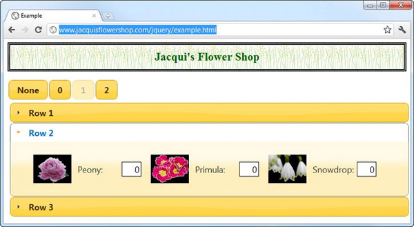
Figure 19-18 Using accordion events to control button states
Summary
In this chapter, I showed you the jQuery UI autocomplete and accordion widgets. These follow the same basic pattern you saw in Chapter 19 but offer richer functionality and a wider range of configuration options to customize the widgets so that they fit neatly into your web application model.