
C H A P T E R 22
Using the Dialog Widget
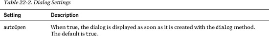
The jQuery UI dialog widget creates a floating window with a title and content area, similar to the kind of dialog you might see from a native application. Dialogs are useful for focusing the user’s attention on an important event or message. However, as with any element that can obscure the document content, the dialog must be used sparingly and only when displaying the content inside the document layout isn’t feasible. Table 22-1 provides the summary for this chapter.
Creating the Dialog
You create a dialog box by using jQuery to select a div element and then calling the dialog method. The dialog widget is one that requires a specific structure of HTML elements in order to operate, although the structure is much simpler than the tabs widget requires, for example. Listing 22-1 shows a document that contains the required elements and a script that creates a dialog box.
Listing 22-1. Creating a Dialog Box Using jQuery UI
<!DOCTYPE html>

<html>

<head>

    <title>Example</title>

    <script src="jquery-1.7.js" type="text/javascript"></script>

    <script src="jquery-ui-1.8.16.custom.js" type="text/javascript"></script>

    <link rel="stylesheet" type="text/css" href="styles.css"/>

    <link rel="stylesheet" type="text/css" href="jquery-ui-1.8.16.custom.css"/>

    <script type="text/javascript">

        $(document).ready(function() {

            $('#dialog').dialog();

        });

    </script>

</head>

<body>

    <h1>Jacqui's Flower Shop</h1>

    <div id="dialog" title="Dialog Box">

      This is the content that will be displayed in the dialog box. This <b>content</b>

      can be <em>styled</em>.

    </div>

</body>

</html>
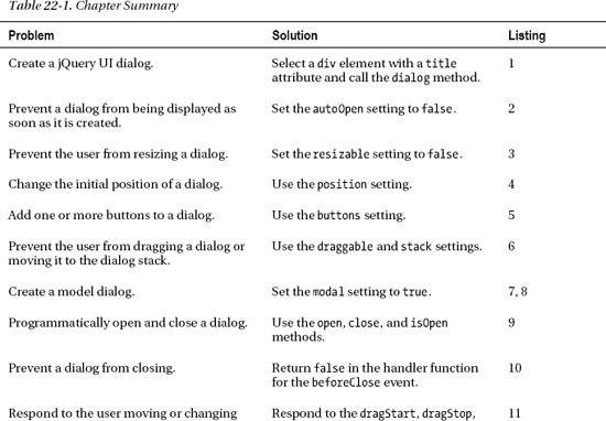
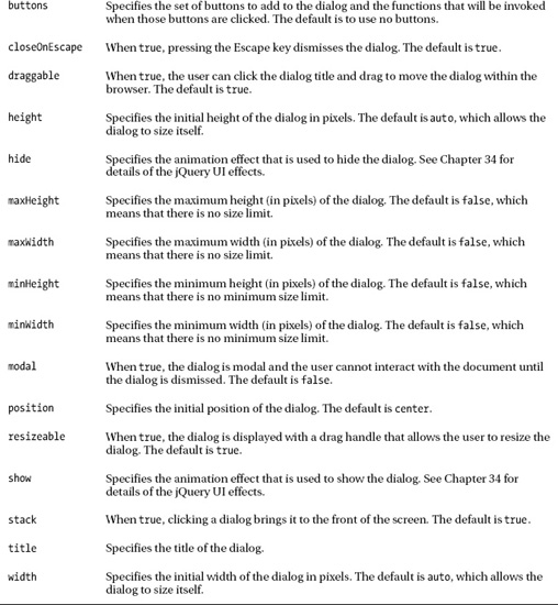
The dialog widget requires a div element that has a title attribute. The value of this attribute will be used in the title bar of the dialog box. The content of the div element will be used as the content for the dialog box, and, as the example shows, this content can contain other elements. When you call the dialog method with no settings, as I have done in the listing, the dialog box appears immediately. You can see how the dialog is presented by the browser in Figure 22-1.
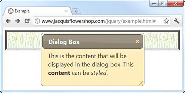
Figure 22-1. A simple dialog box
The dialog box is created through the clever use of HTML elements and is not created through the operating system. This means a jQuery UI dialog box doesn’t behave in quite the same way as a native dialog box does. It doesn’t show up when the user displays all of the open windows on the desktop, and it is possible to resize the browser window so that part (or all) of the jQuery UI dialog is obscured.
That being said, the jQuery UI team has done a pretty good job of making the dialog box as fully featured as possible. By clicking the title and dragging, the user can reposition the dialog within the browser window. The dialog can be resized using the drag handle as the bottom right of the window and dismissed by clicking the close button at the top right. And, since the jQuery UI dialog widget is constructed from HTML, it is styled using the jQuery UI theme you selected in Chapter 17, and it contains complex and styled HTML content.
I want to demonstrate a common usage of the dialog before I get into the details of the settings, methods, and events that the widget supports. When you call the dialog method with no arguments, the dialog widget appears immediately. This isn’t usually that convenient. A more common scenario is that you want to create the dialog box when the document loads (so that the element structure isn’t visible to the user) and then display the dialog box later in response to an event. Listing 22-2 shows how you can do this.
Listing 22-2. Deferring the Appearance of a jQuery UI Dialog Box
<!DOCTYPE html>

<html>

<head>

    <title>Example</title>

    <script src="jquery-1.7.js" type="text/javascript"></script>

    <script src="jquery-ui-1.8.16.custom.js" type="text/javascript"></script>

    <link rel="stylesheet" type="text/css" href="styles.css"/>

    <link rel="stylesheet" type="text/css" href="jquery-ui-1.8.16.custom.css"/>

    <script type="text/javascript">

        $(document).ready(function() {

            $('#dialog').dialog({

                autoOpen: false

            });
            $('button').button().click(function(e) {

                $('#dialog').dialog("open")

            })

        });

    </script>

</head>

<body>

    <h1>Jacqui's Flower Shop</h1>

    <div id="dialog" title="Dialog Box">

      This is the content that will be displayed in the dialog box. This <b>content</b>

      can be <em>styled</em>.

    </div>

    <button>Show Dialog</button>

</body>

</html>
You use the autoOpen setting to prevent the dialog from appearing immediately. When this setting is false, the HTML element structure is hidden from the user, but the dialog isn’t displayed. When you are ready to display the dialog, you can call the open method. You can see how this works in Figure 22-2.
Figure 22-2. Deferring the appearance of a dialog box
Configuring the Dialog
The dialog widget supports a range of settings that allow you to customize the way that the dialog is presented to the user. I showed you the autoOpen setting in the previous section, but there many more, as described in Table 22-2.
Configuring the Basic Dialog Appearance
The title setting allows you to create a dialog from a div element that doesn’t have a title attribute. This can be useful if you are unable to control the generation of the elements that you want to use in the dialog. Listing 22-3 shows the application of the title setting.
Listing 22-3. Using the title Setting
<!DOCTYPE html>

<html>

<head>

    <title>Example</title>

    <script src="jquery-1.7.js" type="text/javascript"></script>

    <script src="jquery-ui-1.8.16.custom.js" type="text/javascript"></script>

    <link rel="stylesheet" type="text/css" href="styles.css"/>

    <link rel="stylesheet" type="text/css" href="jquery-ui-1.8.16.custom.css"/>

    <script type="text/javascript">

        $(document).ready(function() {

            $('#dialog').dialog({

                title: "Hello",

                resizable: false

            });

        });

    </script>

</head>

<body>

    <h1>Jacqui's Flower Shop</h1>

    <div id="dialog">

      This is the content that will be displayed in the dialog box. This <b>content</b>

      can be <em>styled</em>.

    </div>

</body>

</html>
I have also applied the resizable setting in this example. This setting controls the presence of the drag handle at the bottom right of the dialog. I prefer the cleaner appearance of a dialog without the drag handle, but I usually leave the resizable setting set to true because I like to leave the user with the opportunity to resize the dialog to accommodate the content. You can see how the browser shows the dialog in the example in Figure 22-3.
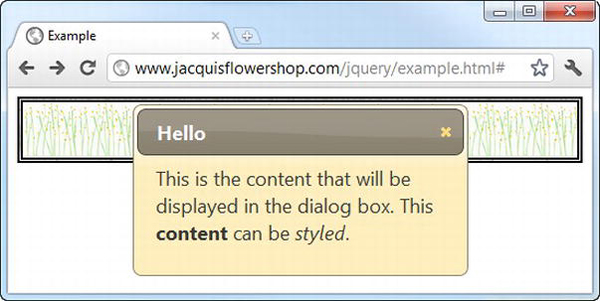
Figure 22-3. A dialog box with a custom title and no resize drag handle
Setting the Location of the Dialog
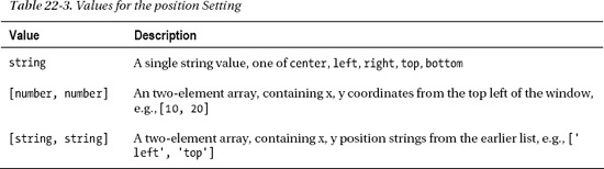
The position setting allows you to specify where the dialog will be displayed in the browser window. You can express the position using three different types of value, as described in Table 22-3.
The default position for a dialog is center. I find that this is generally the best position, but Listing 22-4 shows a dialog that is positioned using an array of string values.
Listing 22-4. Positioning the Dialog
...

<script type="text/javascript">

    $(document).ready(function() {

        $('#dialog').dialog({

            title: "Positioned Dialog",

            position: ["left", "top"]

        });

    });

</script>

...
Notice that the order of these string values requires that the x-position be specified first. This is counter to the way that you would typically describe the position in speech. I commonly reverse these values because in my head I want to position the dialog at the top left of the window, a position that must be specified as [left, top]. You can see how the dialog is positioned in Figure 22-4.
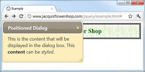
Figure 22-4. Specifying the position of the dialog
Adding Buttons to a Dialog
You can add buttons to a jQuery UI dialog using the buttons setting. The value of this setting is an array of objects, each of which has text and click properties. The value of the text property is used as the label for the button, and you provide a function as the value of click property, which will be invoked when the button is clicked. Listing 22-5 shows the use of this setting.
Listing 22-5. Adding Buttons to a Dialog
...

<script type="text/javascript">

    $(document).ready(function() {

        $('#dialog').dialog({

            title: "Dialog",

            buttons: [{text: "OK", click: function() {/* do something */}},

                      {text: "Cancel", click: function() {$(this).dialog("close")}}]


        });

    });

</script>

...
In this script, I have added two buttons. The function for the OK button doesn’t do anything, but for the Cancel button, I close the dialog. Notice that I use the this variable in the jQuery selector within the Cancel function. This is set to the div element that was used to create the dialog. You can see how the buttons are displayed in Figure 22-5. This example uses the close method, which dismisses the dialog. I describe the dialog methods later in this chapter.
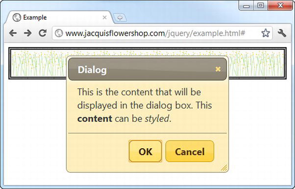
Figure 22-5. Adding buttons to a jQuery UI dialog
Dragging and Stacking Dialogs
The draggable setting determines whether the user can drag the dialog box within the browser window. This setting is true by default, and I recommend that you leave the setting unchanged. It allows the user to see the underlying content. This can be particularly important if you are showing a dialog to express some kind of error or problem. If the draggable setting is false, then the user won’t be able to reposition the dialog box.
The draggable setting can also be important when you are using multiple dialogs in the same window. This is not something I recommend, but if you must display dialog boxes, you need to make sure the user can arrange them so that they can all be read. On small screens, they tend to pile up on top of each other. Another useful setting is stack, which brings a dialog to the front when it is clicked. This setting is also true by default. Listing 22-6 shows these settings in use.
Listing 22-6. Using the draggable and stack Settings
<!DOCTYPE html>

<html>

<head>

    <title>Example</title>

    <script src="jquery-1.7.js" type="text/javascript"></script>

    <script src="jquery-ui-1.8.16.custom.js" type="text/javascript"></script>

    <link rel="stylesheet" type="text/css" href="styles.css"/>

    <link rel="stylesheet" type="text/css" href="jquery-ui-1.8.16.custom.css"/>

<script type="text/javascript">

    $(document).ready(function() {

        $('.dialog').dialog({

            stack: true,

            draggable: true

        })
        $('#d1').dialog("option", "draggable", false);

        $('#d2').dialog("option", "stack", false);

    });

</script>

</head>

<body>

    <h1>Jacqui's Flower Shop</h1>

    <div id="d1" class="dialog" title="First Dialog">

      This is the first dialog

    </div>

    <div id="d2" class="dialog" title="Second Dialog">

      This is the second dialog

    </div>

    <div id="d3" class="dialog" title="Third Dialog">

      This is the third dialog

    </div>

</body>

</html>
I create three dialogs in this document. I disable the draggable setting for one of them and the stack setting for another. The result is shown in Figure 22-6, but you need to experiment with this example to really get a feel for how annoying the changes are.
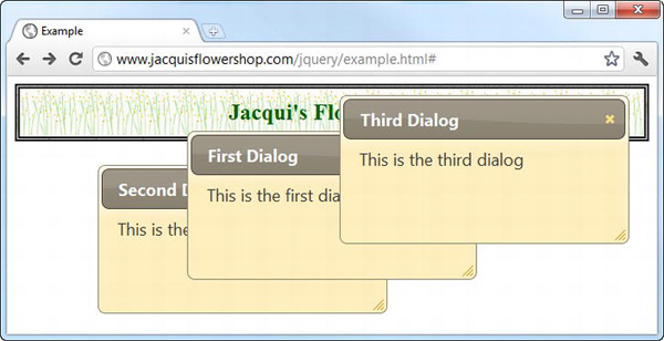
Figure 22-6. Disabling the draggable and stack settings
Creating Modal Dialogs
A modal dialog prevents the user from interacting with the elements in the document until the dialog has been dismissed. A value of true for the modal setting creates a modal dialog, as shown in Listing 22-7.
Listing 22-7. Creating a Modal Dialog
<!DOCTYPE html>

<html>

<head>

    <title>Example</title>

    <script src="jquery-1.7.js" type="text/javascript"></script>

    <script src="jquery-ui-1.8.16.custom.js" type="text/javascript"></script>

    <link rel="stylesheet" type="text/css" href="styles.css"/>

    <link rel="stylesheet" type="text/css" href="jquery-ui-1.8.16.custom.css"/>

    <script type="text/javascript">

        $(document).ready(function() {

            $('#dialog').dialog({

                buttons: [{text: "OK", click: function() {$(this).dialog("close")}}],

                modal: true,

                autoOpen: false

            })


            $('#show').button().click(function() {

                $('#dialog').dialog("open");

            })

        });

    </script>

</head>

<body>

    <h1>Jacqui's Flower Shop</h1>

    <div id="dialog" title="Modal Dialog">

      This is a modal dialog. Press OK to continue.

    </div>

    <button id="show">Show Dialog</button>

</body>

</html>
In this example, I have created a modal dialog that is not initially visible to the user. The dialog is shown in response to a button being clicked. You can see the effect in Figure 22-7. This example relies on the open and close methods, which show and dismiss the dialog. I explain all of the methods that the dialog widget supports later in this chapter.
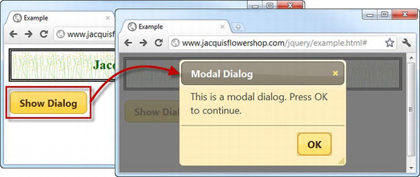
Figure 22-7. Displaying a modal dialog
When showing a modal dialog, jQuery UI places a dark layer behind the dialog but in front of the rest of the document. The document doesn’t return to its original state until the dialog is dismissed. In this example, I have provided the user with an OK button that does this.
 Tip When selecting the button you have added to the document to show the dialog, be careful not to use
 $('button') if you are also adding buttons to the dialog itself. This selector matches the buttons that you have added and those that are created by the dialog method, which means that the dialog buttons will end up with the same click handler as the button in the document, rather than the handlers specified by the buttons setting.
Showing a Form in a Modal Dialog
The benefit of a modal dialog is that it focuses the user’s attention. You can use this to your advantage by displaying simple forms in modal dialogs, as shown in Listing 22-8.
Listing 22-8. Displaying a Form in a Model Dialog
<!DOCTYPE html>

<html>

<head>

    <title>Example</title>

    <script src="jquery-1.7.js" type="text/javascript"></script>

    <script src="jquery-ui-1.8.16.custom.js" type="text/javascript"></script>

    <script src="jquery.tmpl.js" type="text/javascript"></script>

    <link rel="stylesheet" type="text/css" href="styles.css"/>

    <link rel="stylesheet" type="text/css" href="jquery-ui-1.8.16.custom.css"/>

    <style type="text/css">

        #dialog input {width: 150px; margin: 5px; text-align: left}

        #dialog label {width: 100px}
        table {border-collapse: collapse; border: thin solid black; margin: 10px}

        #placeholder {text-align: center}

        #show {margin: 10px}

        td, th {padding: 5px; width: 100px}

    </style>

    <script type="text/javascript">

        $(document).ready(function() {

            $('#dialog').dialog({

                buttons: [{text: "OK", click: addDataToTable}],

                modal: true,

                autoOpen: false,

                width: 340

            })


            $('#show').button().click(function() {

                $('#dialog').dialog("open");

            })


            function addDataToTable() {

                var data = {

                    product: $('#product').val(),

                    color: $('#color').val(),

                    count: $('#count').val()

                }

                $('#placeholder').hide();

                $('#rowTmpl').tmpl(data).appendTo('#prods tbody'),

                $('#dialog').dialog("close");

            }

        });

    </script>

    <script id="rowTmpl" type="text/x-jquery-tmpl">

        <tr><td>${product}</td><td>${color}</td><td>${count}</td></tr>

    </script>

</head>

<body>

    <h1>Jacqui's Flower Shop</h1>

    <div id="dialog" title="Enter Details" class="ui-widget">

        <div><label for="product">Product: </label><input id="product" /></div>

        <div><label for="color">Color: </label><input id="color" /></div>

        <div><label for="count">Quantity: </label><input id="count" /></div>

    </div>

    <table id="prods" class="ui-widget" border="1">

        <tr><th>Product</th><th>Color</th><th>Quantity</th></tr>

        <tr id="placeholder"><td colspan=3>No Products Selected</td></tr>

    </table>

    <button id="show">Add Product</button>

</body>

</html>
In this example, I have defined a simple set of input elements inside the div element that I use to create the modal dialog. When the user clicks the button in the document, the dialog is shown and gathers data from the user. When the user clicks the OK button (which I defined using the buttons setting), I collect the values from the input elements and use a data template to generate a new row for an HTML table. You can see the sequence in Figure 22-8.
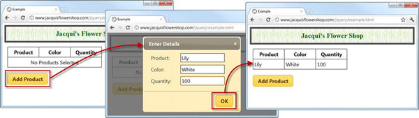
Figure 22-8. Using a modal dialog to capture input from the user
I have tried to keep this example simple, but you can readily apply the validation techniques I showed you in Chapter 13 to reduce the risk of data errors, and you can use the Ajax techniques I showed in Chapters 14 and 15 to submit the data entered by the user to a remote server.
Showing a form inside a modal dialog is a useful technique for simple forms only. You are at risk of confusing and annoying the user if you find yourself trying to combine tabs or accordions with a modal dialog. If a form represents a substantial effort to fill in, then it warrants being properly integrated into the document itself.
Using the Dialog Methods
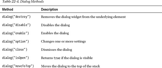
The jQuery UI dialog widget supports the methods described in Table 22-4.
As you might expect, most of these methods allow you to manage a dialog programmatically. The methods that I find myself using most frequently are open and close, of course. Listing 22-9 shows the key methods in use.
Listing 22-9. Using the Dialog Methods
<!DOCTYPE html>
<html>
<head>
<title>Example</title>
<script src="jquery-1.7.js" type="text/javascript"></script>
<script src="jquery-ui-1.8.16.custom.js" type="text/javascript"></script>
<link rel="stylesheet" type="text/css" href="styles.css"/>
<link rel="stylesheet" type="text/css" href="jquery-ui-1.8.16.custom.css"/>
<script type="text/javascript">
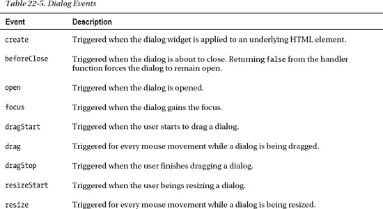
$(document).ready(function() {
$('#d1, #d2').dialog({
autoOpen: false,
position: ["right", "top"]
}).filter("#d2").dialog("option", "position", ["right", "bottom"])
$('#t1, #t2').button().click(function (e) {
var target = this.id == "t1" ? "#d1" : "#d2";
if ($(target).dialog("isOpen")) {
$(target).dialog("close")
} else {
$(target).dialog("open")
}
})
});
</script>
</head>
<body>
<h1>Jacqui's Flower Shop</h1>
<div id="d1" class="dialog" title="First Dialog" class="ui-widget">
This is the first dialog
</div>
<div id="d2" class="dialog" title="Second Dialog" class="ui-widget">
This is the second dialog
</div>
<div>
<button id="t1">Toggle Dialog 1</button>
</div>
<button id="t2">Toggle Dialog 2</button>
</body>
</html>
This document includes two buttons that toggle the visibility of two dialogs. The visibility of each dialog is assessed using the isOpen method. Figure 22-9 shows the document displayed in the browser with both dialogs visible.
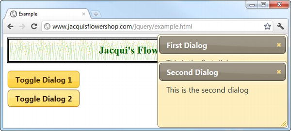
Figure 22-9. Toggling the visibility of dialogs using widget methods
Using the Dialog Events
The jQuery UI dialog widget supports the events described in Table 22-5. I describe some of the more useful events in the sections that follow.
Keeping the Dialog Open
The beforeClose event allows you to receive notification that the user has requested that the dialog be closed. This can be because they have pressed the Escape key (if the closeOnEscape setting is true), clicked the close icon at the top-right of the dialog, or clicked a button you have added through the buttons setting.
Most of the time, you should respect the user’s wishes and allow the dialog to close, but there are rare occasions when you require the user to perform some action using the dialog first or, as Listing 22-10 demonstrates, you require the dialog to be displayed for a certain period before allowing the user to continue.
Listing 22-10. Preventing a Dialog from Closing
<!DOCTYPE html>

<html>

<head>

    <title>Example</title>

    <script src="jquery-1.7.js" type="text/javascript"></script>

    <script src="jquery-ui-1.8.16.custom.js" type="text/javascript"></script>

    <link rel="stylesheet" type="text/css" href="styles.css"/>

    <link rel="stylesheet" type="text/css" href="jquery-ui-1.8.16.custom.css"/>

    <style type="text/css">

        input {width: 150px}

    </style>

    <script type="text/javascript">

        $(document).ready(function() {


            var canClose = false;

            var delay = 15;


            $('#dialog').dialog({

                modal: true,

                autoOpen: false,

                beforeClose: function() {

                    return canClose;

                },

                open: function() {

                    var count = delay;

                    var intID = setInterval(function() {

                        count--;

                        $('#time').text(count);

                        if (count == 0) {

                            clearInterval(intID)

                            canClose = true;

                            $('#dialog').dialog("close")
                        }

                    }, 1000)

                }

            })


            $('button').click(function(e) {

                $('#dialog').dialog("open")

            })


        });

    </script>

</head>

<body>

    <h1>Jacqui's Flower Shop</h1>


    <div class="ui-widget">

        <label for="user">Username: </label><input id="user"/>

        <label for="pass">Password: </label><input id="pass"/>

        <button id="send">Login</button>

    </div>

    <div id="dialog" title="Wrong Password">

        The password you entered was incorrect. Please try again in

        <span id="time">15</span> seconds.

    </div>

</body>

</html>
In this example, I have defined a par of input elements to collect a user name and password from the user. It doesn’t matter what the user enters, however, because I respond to the Login button being clicked by displaying a Wrong Password modal dialog.
I respond to the open event by starting a repeating function that counts down from 15 seconds. During this period, I use the beforeClose event to prevent the user from closing the dialog. At the end of the 15 seconds, I call the close method and dismiss the dialog automatically. By combining the open and beforeClose events, I can ensure that the user immediately cannot try other user name or password combinations (well, at least not without reloading the HTML document, anyway).
Responding to Changing Sizes and Positions
The dialog widget provides a comprehensive set of events for tracking the dialog as it is resized or dragged. These are events that are usually not required but are handy to have in those rare situations where being able to track the changes becomes important. Listing 22-11 demonstrates using the dragStart and dragStop events to disable the input and button elements in a document while a dialog is being dragged.
Listing 22-11. Responding to a Dialog Being Dragged
<!DOCTYPE html>

<html>

<head>

    <title>Example</title>

    <script src="jquery-1.7.js" type="text/javascript"></script>
    <script src="jquery-ui-1.8.16.custom.js" type="text/javascript"></script>

    <link rel="stylesheet" type="text/css" href="styles.css"/>

    <link rel="stylesheet" type="text/css" href="jquery-ui-1.8.16.custom.css"/>

    <style type="text/css">

        input {width: 150px; text-align: left}

    </style>

    <script type="text/javascript">

        $(document).ready(function() {


            $('#dialog').dialog({

                autoOpen: true,

                dragStart: function() {

                    $('input, #send').attr("disabled", "disabled")

                },

                dragStop: function() {

                    $('input, #send').removeAttr("disabled")

                }

            })


            $('button').click(function(e) {

                $('#dialog').dialog("open")

            })

        });

    </script>

</head>

<body>

    <h1>Jacqui's Flower Shop</h1>


    <div class="ui-widget">

        <label for="user">Username: </label><input id="user"/>

        <label for="pass">Password: </label><input id="pass"/>

        <button id="send">Login</button>

    </div>

    <div id="dialog" title="Wrong Password">

        The password you entered was incorrect. Please try again in

        <span id="time">15</span> seconds.

    </div>

</body>

</html>
Summary
In this chapter, I showed you the jQuery UI dialog widget. Following the same format as the other widget chapters, I focused on the settings, methods, and events that the dialog widget supports. I showed you how to create modal and nonmodal dialogs, how to show and hide dialogs in response to events from other elements, and how to prevent a dialog from closing for a fixed period of time. I also showed you how you can use the dialog widget to present the user with simple forms, a technique that can create an elegant user experience when used appropriately.