
C H A P T E R 23
Using the Drag & Drop Interactions
In addition to the widgets I showed you in Chapters 18-22, jQuery UI also includes a set of interactions. These are lower-level building blocks that allow you to add functionality to your web application interface. In this chapter, I describe the draggable and droppable interactions, which you can use to add drag and drop to an HTML document.
The interactions follow the same basic structure as the widgets. They have settings, methods, and events. I will follow the same pattern in describing the interactions, but I'll be jumping around a little to accommodate the unique nature of some of the interactions.
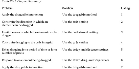
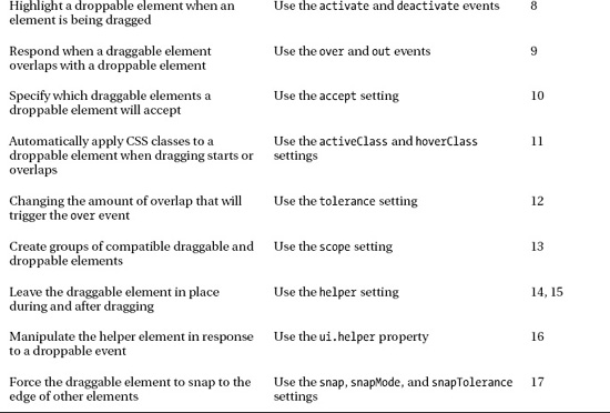
It is hard to show the effect of applying the interactions using screenshots. They are, as the name suggests, dependent on interaction. I tried to give you the essence of what is happening, but to truly understand interactions you should experiment with them in the browser. All of the examples in this chapter (and every other chapter for that matter) are included in the free source code download that accompanies the book. If you want to avoid typing in the HTML and JavaScript, you can get everything you need at www.apress.com. Table 23-1 provides the summary for this chapter.
Creating the Draggable Interaction
An element to which you apply the draggable interaction can be moved (dragged) around the browser window. The element appears in the initial document layout as normal, but the element's position changes if the user holds down the mouse button over the draggable element and then moves the mouse. Listing 23-1 provides a simple demonstration of the draggable interaction.
Listing 23-1. Using the draggable interaction
<!DOCTYPE html>

<html>

<head>

    <title>Example</title>

    <script src="jquery-1.7.js" type="text/javascript"></script>

    <script src="jquery-ui-1.8.16.custom.js" type="text/javascript"></script>

    <link rel="stylesheet" type="text/css" href="styles.css"/>

    <link rel="stylesheet" type="text/css" href="jquery-ui-1.8.16.custom.css"/>

    <style type="text/css">

        #draggable {font-size: x-large; border: thin solid black;
            width: 5em; text-align: center}

    </style>

    <script type="text/javascript">

        $(document).ready(function() {

            $('#draggable').draggable();

        });

    </script>

</head>

<body>

    <h1>Jacqui's Flower Shop</h1>

    <div id="draggable">

        Drag me

    </div>

</body>

</html>
In this example, I selected a div element and called the draggable method to create a draggable element. As Figure 23-1 shows, the element starts in its regular position but can be dragged anywhere in the browser window. Note that the other element in the document, the h1, is not affected by the draggable method.
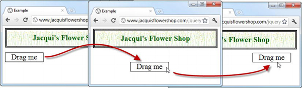
Figure 23-1. Dragging an element around the browser window
 Tip Being able to drag elements can be useful in its own right, but it becomes much more powerful when combined with the droppable interaction, which I describe in later in this chapter.
The draggable interaction is performed using some very clever HTML and CSS. This means that it works in pretty much any browser, but that draggable elements are not able to interact with the native drag and drop implemented by the user's operating system.
Tip HTML5 does include drag and drop that is usually implemented using the native mechanisms. I provide details and examples of the HTML5 mechanism in my book The Definitive Guide to HTML5, also published by Apress. If you are using the jQuery UI drag-and-drop mechanism, I recommend disabling the HTML5 equivalent to avoid confusion. To do this, set the draggable attribute to false on the body element in your document.
Configuring the Draggable Interaction
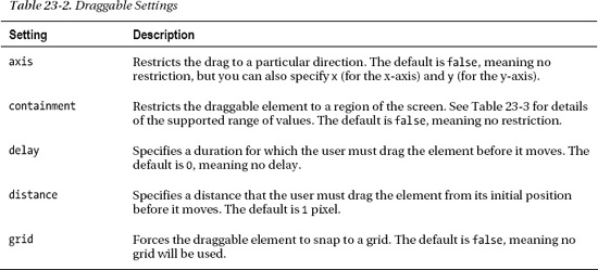
There are lots of ways you can configure the draggable interaction. Table 23-2 summarizes the most important settings available, which I demonstrate in the sections that follow.
Tip In the “Tuning Drag & Drop” section later in the chapter, I describe some additional settings that change the relationship between the draggable and droppable elements.
Constraining the Drag Axis
There are several ways in which you can constrain the way an element can be dragged. The first is to use the axis setting, which allows you to limit dragging to either the x-axis or y-axis. Listing 23-2 provides an example.
Listing 23-2. Using the axis setting to constrain dragging
<!DOCTYPE html>

<html>

<head>

    <title>Example</title>

    <script src="jquery-1.7.js" type="text/javascript"></script>

    <script src="jquery-ui-1.8.16.custom.js" type="text/javascript"></script>

    <link rel="stylesheet" type="text/css" href="styles.css"/>

    <link rel="stylesheet" type="text/css" href="jquery-ui-1.8.16.custom.css"/>

    <style type="text/css">

        div.dragElement {font-size: large; border: thin solid black;

            width: 5em; text-align: center; background-color: lightgray; margin: 4px }

    </style>

    <script type="text/javascript">

        $(document).ready(function() {


            $('.dragElement').draggable({

                axis: "x"

            }).filter('#dragV').draggable("option", "axis", "y");


        });

    </script>

</head>

<body>

    <h1>Jacqui's Flower Shop</h1>

    <div id="dragV" class="dragElement">

        Drag Vertically

    </div>

    <div id="dragH" class="dragElement">

        Drag Horizontally

    </div>

</body>

</html>
In this example, I defined two div elements, selected them with jQuery, and called the draggable method. I use the settings object to define a value of x for both div elements initially, and then use the jQuery filter method to select the dragV element so that I can change the setting to y without having to make jQuery search the entire document again. The result is one div element that can be dragged only vertically and another that can be dragged only horizontally. You can see the effect in Figure 23-2.
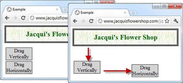
Figure 23-2. Constraining the direction in which an element can be dragged
Constraining the Drag Region
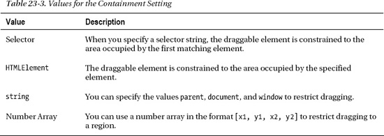
You can also limit the region of the screen in which an element can be dragged. You do this through the containment setting. This setting can be set using several value formats, as described in Table 23-3.
Listing 23-3 shows the use of the containment setting.
Listing 23-3. Using the containment setting
<!DOCTYPE html>

<html>

<head>

    <title>Example</title>

    <script src="jquery-1.7.js" type="text/javascript"></script>
    <script src="jquery-ui-1.8.16.custom.js" type="text/javascript"></script>

    <link rel="stylesheet" type="text/css" href="styles.css"/>

    <link rel="stylesheet" type="text/css" href="jquery-ui-1.8.16.custom.css"/>

    <style type="text/css">

        div.dragElement {font-size: large; border: thin solid black; padding: 4px;

            width: 5em; text-align: center; background-color: lightgray; margin: 4px }

        #container { border: medium double black; width: 400px; height: 150px}

    </style>

    <script type="text/javascript">

        $(document).ready(function() {


            $('.dragElement').draggable({

                containment: "parent"

            }).filter('#dragH').draggable("option", "axis", "x");


        });

    </script>

</head>

<body>

    <h1>Jacqui's Flower Shop</h1>

    <div id="container">

        <div id="dragH" class="dragElement">

            Drag Horizontally

        </div>

        <div class="dragElement">

            Drag within Parent

        </div>

    </div>

</body>

</html>
In this example, I constrained both div elements such that they can be dragged only within their parent element, which is a fixed-size div element. For one of the draggable div elements, I also applied the axis setting, meaning that it can be dragged only horizontally within the parent element. You can see the result in Figure 23-3.
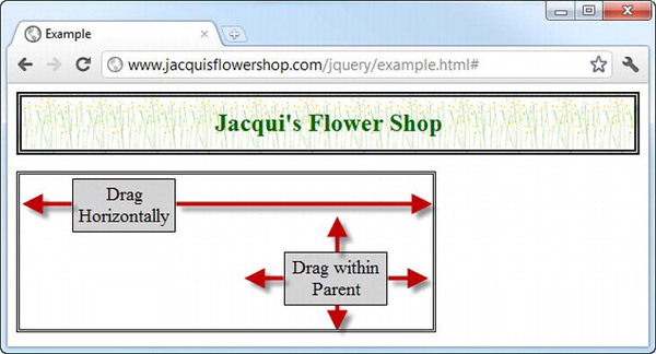
Figure 23-3 Restricting dragging to the parent element
Constraining Dragging to a Grid
The grid setting can be used to make a draggable element snap to a grid as it is dragged. The value for this setting is a two-element array specifying the width and the height of the grid in pixels. Listing 23-4 shows the grid setting in use.
Listing 23-4. Using the grid setting
<!DOCTYPE html>

<html>

<head>

    <title>Example</title>

    <script src="jquery-1.7.js" type="text/javascript"></script>

    <script src="jquery-ui-1.8.16.custom.js" type="text/javascript"></script>

    <link rel="stylesheet" type="text/css" href="styles.css"/>

    <link rel="stylesheet" type="text/css" href="jquery-ui-1.8.16.custom.css"/>

    <style type="text/css">

        #draggable {font-size: large; border: thin solid black; padding: 4px;

            width: 100px; text-align: center; background-color: lightgray; margin: 4px; }

    </style>

    <script type="text/javascript">

        $(document).ready(function() {

            $('#draggable').draggable({

                grid: [100, 50]

            })

        });

    </script>

</head>
<body>

    <h1>Jacqui's Flower Shop</h1>

    <div id="draggable">

        Drag Me

    </div>

</body>

</html>
In this example, I specified a grid in which the cells are 100 pixels wide and 50 pixels high. As you drag the element, it snaps from one (invisible) cell to the next, as shown in Figure 23-4.
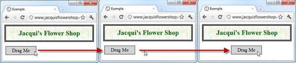
Figure 23-4 Dragging an element with a grid
The snapping effect is hard to represent in a screenshot, and this is an example that particularly benefits from interaction.
Tip You can snap-to-grid in one direction only by specifying a value of 1 for the free-movement axis. For example, setting a value of [100, 1] forces the draggable element to snap to 100 pixel cells along the x-axis but allows free movement along the y-axis.
Delaying Dragging
There are two settings that allow you to delay the dragging action. You can use the delay setting to specify a time span so that the user has to drag the element for a number of milliseconds before the element starts to move. You can also use the distance setting, which makes the user make the drag motion for a certain number of pixels before the element begins to follow the mouse. Listing 23-5 shows both setting in use.
Listing 23-5. Using the delay and distance settings
<!DOCTYPE html>

<html>

<head>

    <title>Example</title>

    <script src="jquery-1.7.js" type="text/javascript"></script>

    <script src="jquery-ui-1.8.16.custom.js" type="text/javascript"></script>

    <link rel="stylesheet" type="text/css" href="styles.css"/>
    <link rel="stylesheet" type="text/css" href="jquery-ui-1.8.16.custom.css"/>

    <style type="text/css">

        #time, #distance {font-size: large; border: thin solid black; padding: 4px;

            width: 100px; text-align: center; background-color: lightgray; margin: 4px; }

    </style>

    <script type="text/javascript">

        $(document).ready(function() {

            $('#time').draggable({

                delay: 1000

            })


            $('#distance').draggable({

                distance: 150

            })

        });

    </script>

</head>

<body>

    <h1>Jacqui's Flower Shop</h1>

    <div id="time">Time Delay</div>

    <div id="distance">Distance</div>

</body>

</html>
I have two draggable div elements in this example, one of which I configured with the delay setting and the other with the distance setting.
When using the delay, the user has to continue dragging for the specified number of milliseconds before the element will begin to move. This is 1,000 milliseconds in the example. The user doesn't have to keep the mouse moving for this duration, but the mouse button has to be held down for the entire period and the mouse has to have been moved to start the dragging process. When the timespan has elapsed, the draggable element will snap to the location of the mouse pointer, subject to the grid, region, and axis constraints I showed you earlier.
The distance setting has a similar effect, but the user has to have moved the mouse pointer at least the specified number of pixels in any direction from the element's starting point. When the mouse has moved that far, the draggable element will snap to the current mouse location.
Tip If you apply both settings to a single element, the draggable element won't move until both conditions have been met—that is, the user has to have been dragging for the specified timespan and moved the mouse the specified number of pixels.
Using the Draggable Methods
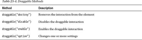
The draggable interaction defines only the set of core methods you saw implemented by the widgets. There are no draggable-specific methods. Table 23-4 describes those that are available.
Using the Draggable Events
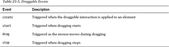
The draggable interaction supports a simple set of events that notify you when an element is dragged. The events are described in Table 23-5.
You respond to interaction events just as you do for widget events. Listing 23-6 demonstrates handling the start and stop events.
Listing 23-6. Using the draggable start and stop events
<!DOCTYPE html>

<html>

<head>

    <title>Example</title>

    <script src="jquery-1.7.js" type="text/javascript"></script>

    <script src="jquery-ui-1.8.16.custom.js" type="text/javascript"></script>

    <link rel="stylesheet" type="text/css" href="styles.css"/>

    <link rel="stylesheet" type="text/css" href="jquery-ui-1.8.16.custom.css"/>

    <style type="text/css">

        #draggable {font-size: large; border: thin solid black; padding: 4px;

            width: 100px; text-align: center; background-color: lightgray; margin: 4px; }

    </style>
    <script type="text/javascript">

        $(document).ready(function() {

            $('#draggable').draggable({

                start: function() {

                    $('#draggable').text("Dragging...")

                },

                stop: function() {

                    $('#draggable').text("Drag Me")

                }

            })

        });

    </script>

</head>

<body>

    <h1>Jacqui's Flower Shop</h1>

    <div id="draggable">

        Drag Me

    </div>

</body>

</html>
In this example, I use the start and stop events to change the contents of the element while it is being dragged. This is a benefit of the way that the draggable interaction (and all of the other jQuery UI interactions, for that matter) is implemented using HTML and CSS: you can use jQuery to modify the draggable element even when it is being moved around the screen. You can see the effect that this example creates in Figure 23-5.
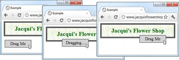
Figure 23-5. Using the draggable events to modify an element while it is being dragged
Using the Droppable Interaction
There are some occasions where just being able to drag an element can be useful, but the real utility of the draggable interaction arises when you combine it with the droppable interaction.
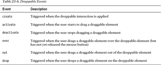
You create droppable elements using the droppable method, but to get any functionality, you need to provide handler functions for the events that the interaction defines. Table 23-6 describes the events that are available.
You can create a basic droppable element with just the drop event, as shown in Listing 23-7.
Listing 23-7. Creating a basic droppable interaction
<!DOCTYPE html>

<html>

<head>

    <title>Example</title>

    <script src="jquery-1.7.js" type="text/javascript"></script>

    <script src="jquery-ui-1.8.16.custom.js" type="text/javascript"></script>

    <link rel="stylesheet" type="text/css" href="styles.css"/>

    <link rel="stylesheet" type="text/css" href="jquery-ui-1.8.16.custom.css"/>

    <style type="text/css">

        #draggable, #droppable {font-size: large; border: thin solid black; padding: 4px;

            width: 100px; text-align: center; background-color: lightgray; margin: 4px;}

        #droppable {padding: 20px; position: absolute; right: 5px;}

    </style>

    <script type="text/javascript">

        $(document).ready(function() {

            $('#draggable').draggable();


            $('#droppable').droppable({

                drop: function() {

                    $('#draggable').text("Dropped")

                }

            });

        });

    </script>

</head>

<body>

    <h1>Jacqui's Flower Shop</h1>

    <div id="droppable">
        Drop Here

    </div>

    <div id="draggable">

        Drag Me

    </div>

</body>

</html>
I added a div element whose text content is Drop Here. I use jQuery to select this element and call the droppable method, passing in a settings object that defines a handler for the drop event. In response to this method, I change the text of the draggable element using the text method. This example creates the dullest possible drag-and-drop interaction, but it also provides a useful foundation to explain the way that the draggable and droppable interactions can be used together. You can see the different stages of the example in Figure 23-6.
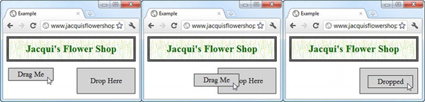
Figure 23-6. Using simple drag and drop
This is pretty basic stuff. I drag the draggable element over the droppable element and let go. The draggable element stays where I left it, and its text content is changed in response to the drop event. In the sections that follow, I'll show you how to use the other droppable events to improve the experience.
Highlighting a Drop Target
You can use the activate and deactivate events to highlight the drop target when the user starts the drag motion. This is usually a very good idea, because it gives the user a clear signal which elements are part of the drag-and-drop model. Listing 23-8 provides an example.
Listing 23-8. Responding to the activate and deactivate events
...

<script type="text/javascript">

    $(document).ready(function() {

        $('#draggable').draggable();


        $('#droppable').droppable({

            drop: function() {

                $('#draggable').text("Dropped");

            },

            activate: function() {
                $('#droppable').css({

                    border: "medium double green",

                    backgroundColor: "lightGreen"

                });

            },

            deactivate: function() {

                $('#droppable').css("border", "").css("background-color", "");

            }

        });

    });

</script>

...
When the user starts dragging an element, my droppable element triggers the activate event and my handler function uses the css method to apply new values for the CSS border and background-color properties. This causes the drop target to light up, indicating to the user that the droppable element has a relationship to the element being dragged. I use the deactivate event to remove the CSS property values and return the droppable element to its original state when the user releases the mouse button. (This event is triggered whenever dragging stops, regardless of whether the user has dropped the draggable element on a droppable element.) You can see the effect in Figure 23-7.
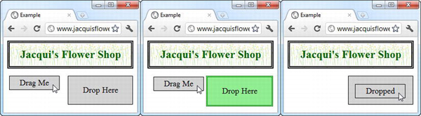
Figure 23-7. Using the activate and deactivate events
Dealing with Overlapping Elements
You can refine your drag-and-drop technique by handling the over and out events. The over event is triggered when 50% of a draggable element is over any part of the droppable element. The out event is triggered when the elements no longer overlap. Listing 23-9 shows how you can respond to these events.
Listing 23-9. Using the over and out events
<script type="text/javascript">

    $(document).ready(function() {

        $('#draggable').draggable();


        $('#droppable').droppable({

            drop: function() {

                $('#draggable').text("Dropped");
            },

            over: function() {

                $('#droppable').css({

                    border: "medium double green",

                    backgroundColor: "lightGreen"

                });

            },

            out: function() {

                $('#droppable').css("border", "").css("background-color", "");

            }

        });

    });

</script>
I used the same event handler functions as in the previous example, but I associated them with the over and out events. The droppable element will show the border and background color when at least 50% of the draggable element overlaps with it, as shown in Figure 23-8.
Tip The 50% limit is known as the tolerance, and you can configure the droppable element with different tolerances, as I demonstrate in the “Changing the Overlap Tolerance” section later in this chapter.
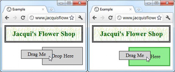
Figure 23-8. Responding to the over and out events
Configuring the Droppable Interaction
I broke away from the usual pattern in this part of the book because the events are so central to the droppable interaction. Of course, this interaction does have a number of settings you can use to change the way that it behaves, and these are described in Table 23-7.
Tip In the “Tuning Drag and Drop” section later in the chapter, I describe some additional settings that change the relationship between the draggable and droppable elements.
Restricting Acceptable Draggable Elements
You can restrict the set of elements you are willing to receive with your droppable interaction by applying the accept setting. You use the accept setting by providing a selector as the value. This has the effect of triggering only the droppable events when a draggable element matches the selector. Listing 23-10 provides an example.
Listing 23-10. Restricting the acceptable elements
<!DOCTYPE html>

<html>

<head>

    <title>Example</title>

    <script src="jquery-1.7.js" type="text/javascript"></script>

    <script src="jquery-ui-1.8.16.custom.js" type="text/javascript"></script>

    <link rel="stylesheet" type="text/css" href="styles.css"/>

    <link rel="stylesheet" type="text/css" href="jquery-ui-1.8.16.custom.css"/>

    <style type="text/css">

        .draggable, #droppable {font-size: large; border: thin solid black; padding: 4px;

            width: 100px; text-align: center; background-color: lightgray; margin: 4px;}

        #droppable {padding: 20px; position: absolute; right: 5px;}

    </style>

    <script type="text/javascript">

        $(document).ready(function() {

            $('.draggable').draggable();
            $('#droppable').droppable({

                drop: function(event, ui) {

                    ui.draggable.text("Dropped");

                },

                activate: function() {

                    $('#droppable').css({

                        border: "medium double green",

                        backgroundColor: "lightGreen"

                    });

                },

                deactivate : function() {

                    $('#droppable').css("border", "").css("background-color", "");

                },

                accept: '#drag1'

            });

        });

    </script>

</head>

<body>

    <h1>Jacqui's Flower Shop</h1>

    <div id="droppable">

        Drop Here

    </div>

    <div id="drag1" class="draggable">

        Drag 1

    </div>

    <div id="drag2" class="draggable">

        Drag 2

    </div>

</body>

</html>
There are two draggable elements in this example, with the IDs drag1 and drag2. When creating the droppable element, I used the accept setting to specify that only the drag1 element should be accepted. When the drag1 element is dragged, you see the same effect as in the previous example. The activate, deactivate, over, out, and drop events are all fired at the appropriate moments. However, when you drag the drag2 element, it fails to match the selector I specified for the accept setting and those events don't fire. I can still drag the element around, but I can no longer drop it on the droppable element. You can see the effect in Figure 23-9.
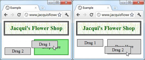
Figure 23-9. Using the accept setting
Notice that I changed the way I select the dropped element so that I can call the text method. When there was only one draggable element in the document, I just used the id attribute, like this:
$('#draggable').text("Dropped");
In this example, there are multiple draggable elements, so selecting by id won't work, because I'll always be changing the text on the same element, regardless of which one was dropped. Instead, I use the ui object, which jQuery UI provides as an additional argument to the event handling functions. The draggable property of the ui object returns a jQuery object that contains the element that the user is dragging or has dropped, allowing me to target that element like this:
ui.draggable.text("Dropped");
Highlighting the Droppable Using Classes
You can use the activeClass and hoverClass settings to change the appearance of the droppable element without using the activate, deactivate, over, and out events. Listing 23-11 provides a demonstration.
Listing 23-11. Using the activeClass and hoverClass settings
<!DOCTYPE html>

<html>

<head>

    <title>Example</title>

    <script src="jquery-1.7.js" type="text/javascript"></script>

    <script src="jquery-ui-1.8.16.custom.js" type="text/javascript"></script>

    <link rel="stylesheet" type="text/css" href="styles.css"/>

    <link rel="stylesheet" type="text/css" href="jquery-ui-1.8.16.custom.css"/>

    <style type="text/css">

        .draggable, #droppable {font-size: large; border: thin solid black; padding: 4px;

            width: 100px; text-align: center; background-color: lightgray; margin: 4px;}

        #droppable {padding: 20px; position: absolute; right: 5px;}

        #droppable.active {border: thick solid green}
        #droppable.hover {background-color: lightgreen}

    </style>

    <script type="text/javascript">

        $(document).ready(function() {

            $('.draggable').draggable();


            $('#droppable').droppable({

                drop: function(event, ui) {

                    ui.draggable.text("Dropped");

                },

                activeClass: "active",

                hoverClass: "hover"

            });

        });

    </script>

</head>

<body>

    <h1>Jacqui's Flower Shop</h1>

    <div id="droppable">

        Drop Here

    </div>

    <div class="draggable">

        Drag Me

    </div>

</body>

</html>
I defined two new CSS styles, which I have highlighted in the listing. I created classes that are specific to the id of the draggable element (for example, #draggable.active) so that they are more specific than the other styles I have been using (for example, #droppable) and so that they take precedence. See Chapter 3 for details of the rules by which CSS styles are applied to elements.
Having defined these styles, I then name them as the values to the activeClass and hoverClass settings. The droppable interaction takes care of adding and removing these classes from the droppable elements in response to the events. You can see the result in Figure 23-10.
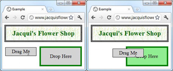
Figure 23-10. Using the activeClass and hoverClass settings
Changing the Overlap Tolerance
By default, the over event will trigger only when at least 50% of the draggable element overlaps with the droppable element. You can change this using the tolerance setting, which accepts the values shown in Table 23-8.
The two values I use most frequently are fit and touch, because these represent the most readily understood approaches to the user. I use fit when I preserve the location of the dropped item and touch when I have the dropped item revert to its original location (something I'll demonstrate later in the chapter). Listing 23-12 shows the use of the fit and touch settings.
Listing 23-12. Changing the tolerance for draggable elements
<!DOCTYPE html>

<html>

<head>

    <title>Example</title>

    <script src="jquery-1.7.js" type="text/javascript"></script>

    <script src="jquery-ui-1.8.16.custom.js" type="text/javascript"></script>

    <link rel="stylesheet" type="text/css" href="styles.css"/>

    <link rel="stylesheet" type="text/css" href="jquery-ui-1.8.16.custom.css"/>

    <style type="text/css">

        .draggable, .droppable {font-size: large; border: thin solid black; padding: 4px;

            width: 100px; text-align: center; background-color: lightgray;}

        .droppable {margin-bottom: 10px; margin-right: 5px; height: 50px; width: 120px}

        #dropContainer {position: absolute; right: 5px;}

        div span {position: relative; top: 25%}

        .droppable.active {border: thick solid green}

        .droppable.hover {background-color: lightgreen}

    </style>

    <script type="text/javascript">

        $(document).ready(function() {


            $('.draggable').draggable();


            $('div.droppable').droppable({
                drop: function(event, ui) {

                    ui.draggable.text("Dropped");

                },

                activeClass: "active",

                hoverClass: "hover",

                tolerance: "fit"

            });


            $('#touchDrop').droppable("option", "tolerance", "touch");

        });

    </script>

</head>

<body>

    <h1>Jacqui's Flower Shop</h1>

    <div id="dropContainer">

        <div id="fitDrop" class="droppable">

            <span>Fit</span>

        </div>

        <div id="touchDrop" class="droppable">

            <span>Touch</span>

        </div>

    </div>

    <div class="draggable">

        <span>Drag Me</span>

    </div>

</body>

</html>
In this example, I created two droppable elements, one of which is configured with the fit value for the tolerance setting and the other with the touch value. There is a single draggable element, and Figure 23-11 shows the effect that the different values create. I took each screenshot at the moment that the over event triggered. Notice that the border I applied to the droppable elements is included when the tolerance setting is used to determine overlap.
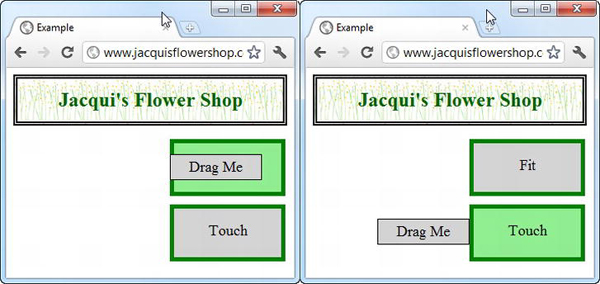
Figure 23-11. Using the fit and touch values for the tolerance setting
CAPTURING THE MOMENT AN EVENT IS TRIGGERED
Using the Droppable Methods
The droppable interaction defines only the set of core methods you saw implemented by the widgets. There are no interaction-specific methods. Table 23-9 describes those that are available.
Tuning Drag and Drop
There are some additional settings you can use to fine-tune the way jQuery UI drag and drop works. In this section, I describe the settings and demonstrate their use.
Using Element Scope
Earlier in the chapter, I showed how the droppable accept setting can be used to filter the elements that will activate the drop zone. Using selectors works just fine for simple projects, but the selector can become overly complex and error prone if you have a lot of draggable elements to manage.
An alternative is to apply the scope setting on both the draggable and droppable elements. A draggable element will activate droppable elements with the same scope value. Listing 23-13 shows the scope setting in use.
Tip The scope setting can be combined with the accept setting in droppable elements. The droppable element will be activated only if the draggable element shares the same scope and matches the selector defined by the accept setting.
Listing 23-13. Using the scope setting
<!DOCTYPE html>

<html>

<head>

    <title>Example</title>

    <script src="jquery-1.7.js" type="text/javascript"></script>

    <script src="jquery-ui-1.8.16.custom.js" type="text/javascript"></script>

    <link rel="stylesheet" type="text/css" href="styles.css"/>

    <link rel="stylesheet" type="text/css" href="jquery-ui-1.8.16.custom.css"/>

    <style type="text/css">

        .draggable, .droppable {font-size: large; border: medium solid black;

            padding: 4px; width: 100px; text-align: center;

            background-color: lightgray; margin-bottom: 10px;}

        .droppable {margin-right: 5px; height: 50px; width: 120px}

        #dropContainer {position: absolute; right: 5px;}

        div span {position: relative; top: 25%}

        .droppable.active {border: medium solid green}

        .droppable.hover {background-color: lightgreen}

    </style>

    <script type="text/javascript">
        $(document).ready(function() {


            $('#apple').draggable({

                scope: "fruit"

            });

            $('#orchid').draggable({

                scope: "flower"

            });


            $('#flowerDrop').droppable({

                activeClass: "active",

                hoverClass: "hover",

                scope: "flower"

            });


            $('#fruitDrop').droppable({

                activeClass: "active",

                hoverClass: "hover",

                scope: "fruit"

            });

        });

    </script>

</head>

<body>

    <h1>Jacqui's Flower Shop</h1>

    <div id="dropContainer">

        <div id="flowerDrop" class="droppable">

            <span>Flowers</span>

        </div>

        <div id="fruitDrop" class="droppable">

            <span>Fruit</span>

        </div>

    </div>

    <div id="orchid" class="draggable">

        <span>Orchid</span>

    </div>

    <div id="apple" class="draggable">

        <span>Apple</span>

    </div>

</body>

</html>
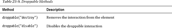
In this example, I created two draggable elements and two droppable elements. When creating these elements, I assigned them to one of two scope values: fruit and flower. The result is that each draggable element will activate and be accepted only by the droppable element with the same scope, as shown in Figure 23-12.
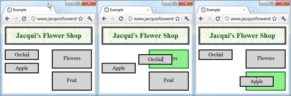
Figure 23-12. Grouping draggable and droppable elements by scope
Tip Notice that I defined the scope for each element in the initial call to the draggable and droppable methods, rather than using the option method. As I write this, there is a bug in jQuery UI where assigning a scope after the interaction has been created doesn't work.
Using a Helper Element
The helper setting allows you to specify an element that will be dragged in place of the draggable element, leaving the original draggable element in place. This is an entirely different effect from previous examples, where the draggable element has been moved from its original position. Listing 23-14 shows an example of using a helper element.
Listing 23-14. Using a large draggable element
<!DOCTYPE html>

<html>

<head>

    <title>Example</title>

    <script src="jquery-1.7.js" type="text/javascript"></script>

    <script src="jquery-ui-1.8.16.custom.js" type="text/javascript"></script>

    <link rel="stylesheet" type="text/css" href="styles.css"/>

    <link rel="stylesheet" type="text/css" href="jquery-ui-1.8.16.custom.css"/>

    <style type="text/css">

        .draggable, .droppable {font-size: large; border: medium solid black;

            padding: 4px; width: 150px; text-align: center;

            background-color: lightgray; margin-bottom: 10px;}

        .droppable {margin-right: 5px; height: 50px; width: 120px}

        #dropContainer {position: absolute; right: 5px;}

        div span {position: relative; top: 25%}

        .droppable.active {border: medium solid green}
        .droppable.hover {background-color: lightgreen}

    </style>

    <script type="text/javascript">

        $(document).ready(function() {


            $('div.draggable').draggable({

                helper: "clone"

            });


            $('#basket').droppable({

                activeClass: "active",

                hoverClass: "hover"

            });

        });

    </script>

</head>

<body>

    <h1>Jacqui's Flower Shop</h1>

    <div id="dropContainer">

        <div id="basket" class="droppable">

            <span>Basket</span>

        </div>

    </div>

    <div class="draggable">

        <img src="lily.png"/><label for="lily">Lily</label>

    </div>

</body>

</html>
The value clone tells jQuery UI to make a copy of the draggable element and all of its contents and use the result as the helper element. You can see the effect in Figure 23-13. The helper element is removed when the user drops it, leaving the draggable and droppable elements in their original positions.
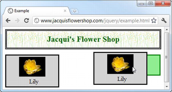
Figure 23-13. A large draggable element
As the figure shows, the original draggable element remains in position and only the helper is moved across the screen to follow the user's mouse. Large draggable elements like the one in this example make it difficult for the user to see the underlying elements in the document, including the position of the droppable element. You can address this by providing a function as the value for the helper setting, as shown in Listing 23-15.
Listing 23-15. Using the helper setting
...

<script type="text/javascript">

    $(document).ready(function() {


        $('div.draggable').draggable({

            helper: function() {

                return $('<img src=lily.png />')

            }

        });


        $('#basket').droppable({

            activeClass: "active",

            hoverClass: "hover"

        });

    });

</script>

...
When the user starts to drag the element, jQuery UI calls the helper function and uses the element that it returns as the draggable item. In this case, I use jQuery to create an img element. You can see the effect in Figure 23-14.
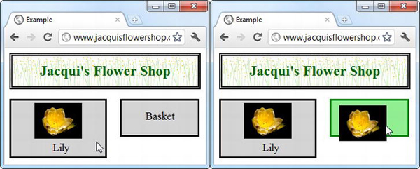
Figure 23-14. Using a helper
The smaller image acts as a more compact stand-in for the draggable element, making it easier to see the rest of the document while dragging.
Manipulating the Helper Element
The ui object that jQuery UI passes to the droppable events contains a helper property, which you can use to manipulate the helper element as it is being dragged. Listing 23-16 shows the use of this property, tied to the over and out events.
Listing 23-16. Using the ui.helper property
...

<script type="text/javascript">

    $(document).ready(function() {


        $('div.draggable').draggable({

            helper: function() {

                return $('<img src=lily.png />')

            }

        });


        $('#basket').droppable({

            over: function(event, ui) {

                ui.helper.css("border", "thick solid green")

            },

            out: function(event, ui) {

                ui.helper.css("border", "")

            }

        });

    });

</script>

...
I use the over and out events and the ui.helper property to display a border on the helper element when it overlaps the droppable element. You can see the result in Figure 23-15.
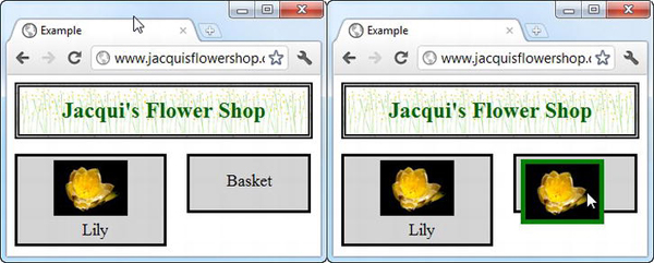
Figure 23-15. Manipulating the helper element
Snapping to the Edges of Elements
You can make the draggable element snap to the edges of the elements that it passes over using the snap setting. The value for this setting is a selector. The draggable will snap to the edges of any element that it is near that matches the selector. Listing 23-17 shows the use of the snap setting.
Listing 23-17. Using the snap setting
<!DOCTYPE html>

<html>

<head>

    <title>Example</title>

    <script src="jquery-1.7.js" type="text/javascript"></script>

    <script src="jquery-ui-1.8.16.custom.js" type="text/javascript"></script>

    <link rel="stylesheet" type="text/css" href="styles.css"/>

    <link rel="stylesheet" type="text/css" href="jquery-ui-1.8.16.custom.css"/>

    <style type="text/css">

        #snapper, .draggable, .droppable {font-size: large; border: medium solid black;

            padding: 4px; width: 150px; text-align: center;

            background-color: lightgray; margin-bottom: 10px;}

        .droppable {margin-right: 5px; height: 50px; width: 120px}

        #dropContainer {position: absolute; right: 5px;}

        div span {position: relative; top: 25%}

        .droppable.active {border: medium solid green}

        .droppable.hover {background-color: lightgreen}

        #snapper {position: absolute; left: 35%; border: medium solid black;

            width: 180px; height: 50px}

    </style>

    <script type="text/javascript">

        $(document).ready(function() {


            $('div.draggable').draggable({

                snap: "#snapper, .droppable",

                snapMode: "both",

                snapTolerance: 50

            });


            $('#basket').droppable({

                activeClass: "active",

                hoverClass: "hover"

            });

        });

    </script>

</head>

<body>

    <h1>Jacqui's Flower Shop</h1>

    <div id="dropContainer">

        <div id="basket" class="droppable">

            <span>Basket</span>

        </div>

    </div>
    <div id="snapper"><span>Snap Here</span></div>

    <div class="draggable">

        <span>Drag Me</span>

    </div>

</body>

</html>
As the draggable element nears one of the matching elements, it jumps (snaps) so that the two closest edges touch. You can select any element to snap to, not just droppable elements. In the example, I added a div element and defined a value for the snap setting, which selects it and the droppable element in the document. It is pretty much impossible to show the effect of snapping using a screenshot, so I encourage you to experiment with this example in the browser.
There are a couple of supporting settings you can use to tweak the snapping behavior. The first is snapMode. This setting lets you specify which edges the draggable will snap to. The accepted values are inner (snap to the inner edges of the underlying element), outer (snap to the outer edges), and both (snap to all edges, which is the default value).
You use the snapTolerance setting to specify how far the draggable element has to be away from the target before it snaps into position. The default is 20, meaning 20 pixels. In the example, I specified a value of 50, which makes snapping occur from further away. Getting the right value for this setting is important. The user won't notice the snapping effect if the snapTolerance value is too small, and if the value is too large the draggable element starts leaping unexpectedly across the screen to snap to far-away elements
Summary
In this chapter, I introduced you to the two most important and useful of the jQuery UI interactions: draggable and droppable. I showed you how to apply and configure these interactions individually, how to respond to their events, and how to tune the way that they work together to get fine-grained control over the drag-and-drop experience you provide to your web application users.