
Chapter 13
The Texture Editor
Layer Opacity and Blending Modes
As discussed earlier, the Texture Editor is where you create your textures to apply to each individual surface property. You open the Texture Editor by clicking on the little “T” next to a surface channel’s name.
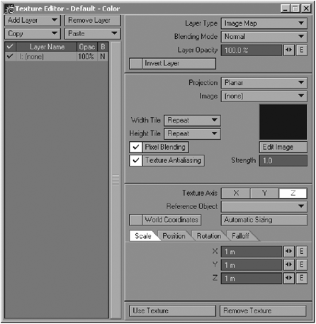
Figure 13-1
Since the subject of creating actual textures is covered in various other chapters of this book, this chapter deals solely with the functions that you use within the Texture Editor to manipulate the texture layers that you create.
To create a new texture layer, click on Add Layer. You can choose to create a new layer for an image map, a procedural texture, or a gradient.

Figure 13-2
Once you have a number of layers in the Texture Editor, you start blending them to get the right effect that you need for the surface, since stacking layers on top of one another without any form of blending is not going to do anything other than leave the top layer the only visible one.
Using Layer Opacity
The simplest way to blend one layer with another is by changing its opacity. The opacity of a layer simply controls the visibility of that layer. The higher the opacity of the layer, the more solid it appears, whereas a lower value makes it more transparent, blending it more with any underlying layers.
Look at Figure 13-3. The sphere on the left has a grid texture of 100% Opacity, whereas the sphere on the right has a grid texture of 20% Opacity. Notice how it blends with the Turbulence procedural below it.
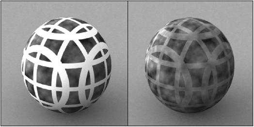
Figure 13-3
To change a layer’s opacity, you can use the spinner or you can type in a new opacity amount yourself.
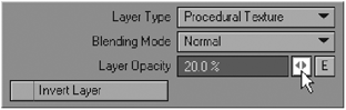
Figure 13-4
Notice that the opacity value for each layer is also listed next to the layer’s name in the layer list in the Texture Editor, under the column heading abbreviated “Opac.”
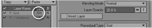
Figure 13-5
The problem with using only opacity to blend layers together is that it doesn’t really take color or intensity of the layer into account, which often results in a very washed-out effect, as opposed to a nice, rich blending of two layers. This can work fine for things like specularity or bump textures, but not for color. Changing the opacity of a color layer takes away the richness and saturation of that color, since the effect of opacity is so linear.
To counteract this effect, we use different blending modes in conjunction with opacity changes to determine the way in which the layers blend with one another, in order to create richer textures.
Understanding and Using Blending Modes
To anyone who has a good working knowledge of any image editing program such as Adobe Photoshop, the concept of blending modes, with regard to image layering, is simple to understand and to use. The blending options found in LightWave are fairly similar to those found within Photoshop’s layer blending modes, and recently several of these Photoshop blending modes were incorporated into LightWave. Keep in mind that even though some blending mode names are similar, the math under the hood is different and therefore produces different effects.
The blending mode of a layer defines the manner in which it blends with the other layers within the Texture Editor.
Blending is different from opacity in that it considers certain factors when blending with surrounding layers, depending on what mode you use. This is great for achieving interesting effects that you can use to enhance or control other layers using the one you are blending with.
To change the blending mode of a layer, click on the Blending Mode button and choose a mode from the list. There are 18 different modes from which to choose, including the Photoshop blending mode equivalents.
Notice that the different blending modes applied to layers are indicated in the layers list, under the column labeled “B” (for Blending mode), by different symbols or letters.
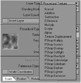
Figure 13-6

Figure 13-7
The letter N represents Normal.
The + symbol represents Additive.
The − symbol represents Subtractive.
The +− symbol represents Difference.
The * symbol represents Multiply.
The / symbol represents Divide.
The letter A represents Alpha.
The letter D represents Texture Displacement.
The letter P represents Photoshop Blending Mode.
If you are familiar with using a computer-based calculator, then you will be familiar with some of these symbols, such as the +, −, *, and / symbols being used for adding, subtracting, multiplying, and dividing, respectively.
Normal
This is the default blending mode that is applied to layers that you create. A layer that is set to Normal will result in the layer being totally solid and not blending in any way with any underlying layers unless you change its opacity.
If you are creating a texture that has only one texture layer, this is usually the best option.
If you wish to create a perfectly even blend between a number of different layers, you can do so using this mode and setting up the Opacity amounts according to a simple equation. You divide the number of each layer (as it appears in order from the bottom up) into 100 and use the resulting values to determine the Opacity values for each layer.
For example, if you had five layers, you would do the following:
The bottom layer (in other words, layer 1) would have an opacity value of 100%, since 100 divided by 1 equals 100. The second layer (the one above the bottom layer) would have an opacity value of 50%, because 100 divided by 2 equals 50. The third layer would have an opacity value of 33%, because 100 divided by 3 equals 33. The fourth layer would have an opacity value of 25%, because 100 divided by 4 equals 25. And the fifth layer, being the topmost layer, would have an opacity value of 20%, since 100 divided by 5 is equal to 20.

Figure 13-8
Using this method ensures that all the layers will blend evenly when using the Normal blending mode.
Additive
Using Additive blending will add the layer times its opacity to the underlying layers. So if, for example, the layer’s opacity is 35%, the layer will be multiplied 35 times to the layers underneath it.
This effect is slightly similar to the Dodge blending mode found in older versions of Adobe Photoshop.
This is a quite strong effect, and can be extremely useful for enhancing parts of layers.
Look at Figure 13-9. The texture layers on the sphere on the left are all set to Normal, whereas the sphere on the right has the same layers, but with two of them set to Additive. Notice how the additive blending makes parts of the texture much more enhanced.
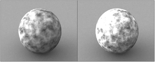
Figure 13-9
When used with gradients, you can create some really nice effects as well. In the following image, the sphere on the left has an Incidence Angle gradient applied with normal blending, while the sphere on the right has the gradient set to Additive. Notice how much more intense the effect of the gradient is when set to Additive.
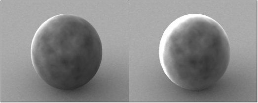
Figure 13-10
To see another example of where the Additive blending mode is used to create a cool effect, take a look at the tutorial in Chapter 9 on making a velvet hat. This mode is used with a gradient to create the effect of light falloff on the material.
Subtractive
Subtractive mode subtracts the layer from underlying layers, usually resulting in a darkening of underlying layers. It is basically the opposite of Additive. It subtracts the value of the layer, multiplied by the layer’s opacity, from the layers below it.
This effect is slightly similar to the Burn blending mode found in Adobe Photoshop.
Figure 13-11 shows a procedural texture using Subtractive blending with increasing opacity values.

Figure 13-11
Notice that the lighter tones in the underlying layer in this example still appear lighter until the Subtractive layer is at 100% opacity. This is because the pixels in the Subtractive layer are subtracting themselves based on a multiplied value of the overall opacity of the layer, which means that lighter pixels in the underlying layer will be less affected than darker pixels, since the darker pixels will be multiplied to black sooner than the lighter ones.
Difference
The Difference blending mode is similar to Subtractive, except that instead of multiplying the effect according to the layer’s opacity, Difference uses the absolute value of the difference between the pixels in the layer and the underlying layers.
Take a look at Figure 13-12.

Figure 13-12
Both spheres use the same texture with the same opacity value, the difference being that the left sphere uses Subtractive blending while the right sphere uses Difference.
Notice that in this case, the effect of Difference is quite subtle, since the gray value that the texture uses is quite light.
This means that the value of this gray is subtracted from the underlying layers, and since it is a medium shade of gray and the layer’s opacity is only at 50%, it does not have a dramatic effect when subtracted from the underlying layers.
If you make the color of the texture lighter and increase the layer’s opacity, the effect becomes much stronger, as in Figure 13-13.
Since the tonal value of the pixels has increased, as well as the opacity, a higher value is being subtracted from the layers below, resulting in a stronger effect.

Figure 13-13
Multiply
This mode multiplies the value of the layer according to the values of the underlying layers. Values that are lighter in layers below this one will result in parts of this layer brightening, and darker tones in the underlying layers will make this layer darker.
In Figure 13-14, the sphere on the left has a very light underlying layer, while the sphere on the right has a rather dark layer underneath it.

Figure 13-14
Divide
Divide multiplies the underlying layers by the inverse of the values within the layer to which it is applied. The following image demonstrates the effect of using lighter tones in the layer (on the right) and using darker tones (on the left).

Figure 13-15
This effect is basically the opposite of the Multiply blending mode.
Alpha
One of the most useful options in the entire Surface Editor, in my opinion, is the Alpha blending mode option for layers. This allows you to control the visibility of underlying layers by using layers on top of them that act as alpha channels (mattes).
When using this mode, remember that the black areas of a layer will allow the underlying layer to show through, while the white parts block out the underlying layer, and the gray areas show varying amounts, depending on the value of the gray.
NOTE: The Alpha blending mode only affects the layer directly beneath it, not all the underlying layers.
Figure 13-16 shows a procedurally textured sphere, an alpha map, and the same sphere with the image applied using the Alpha blending mode on top of the procedural texture.
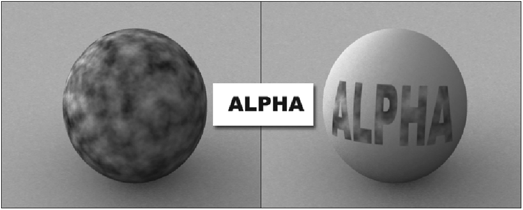
Figure 13-16
NOTE: When using images that actually have their own alpha channels (such as 32-bit TGA files), you do not need to use this option in order to use the alpha channel. You simply have to ensure that the alpha channel is enabled in the Image Editor (see the section on the Source tab in Chapter 12).
You can use any type of layer as an alpha layer, whether it is an image, a procedural texture, or a gradient.
Using gradients with alpha blending can create some cool effects. For example, if you want to create a surface where there are details on the surface that can only be seen from certain angles, you could use an Incidence Angle gradient set to Alpha blending to control the visibility of those details, as in Figure 13-17, which reveals the underlying layer along the edges of the sphere.
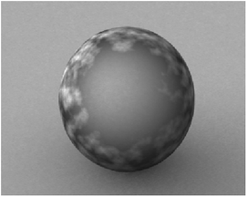
Figure 13-17
In a similar fashion, you could also use a Distance to Camera gradient with Alpha blending to create the effect of an underlying layer becoming more visible as the object moves closer to the camera.
If you wanted to use a light in the scene to reveal details on a surface or to control the visibility of a layer, you could place a Light Incidence gradient over that layer, and set it to Alpha. This technique is used in the “Making a Velvet Surface for an Old Hat” tutorial in Chapter 9 to control an Incidence Angle gradient in order to create the illusion that the Incidence Angle gradient appears only where the lighting is hitting the object.

Figure 13-18
Another great use for this is to use gradients with weight maps to blend different textures together. This can be particularly useful for covering up seams between different UV maps in a single surface, a problem that many artists struggle to deal with.
Similarly, you can also use gradients with weight maps to place procedural textures onto your object.
The model in Figure 13-19 is textured using only procedurals, which are placed using a number of weight map gradients set to Alpha blending.
In fact, one of the greatest strengths of gradients is in being able to use them as alphas for other layers by using the Alpha blending mode. The possibilities are endless!

Figure 13-19
Texture Displacement
This blending mode affects all the layers above the layer it is applied to and causes the layer to displace all those layers. Displacing is similar to bump mapping in that it creates the illusion of distortion. However, this blending mode can be applied to any surface property, not just the bump map.
Displacement can be particularly useful for giving variation to otherwise very uniform patterns, such as the Grid and Veins procedural textures. You control the amount of displacement using the opacity of the layer, as well as the texture value and the individual texture settings when using procedural textures.
The following example shows the results of using a Turbulence procedural to displace a Veins procedural, in varying strengths.
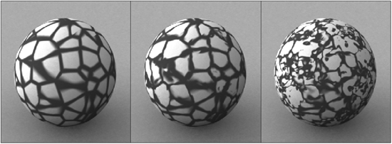
Figure 13-20
PShop Multiply
All of the Photoshop blending modes in LightWave work exactly the same as their Photoshop counterparts. Multiply evaluates the color information of the layer and multiplies the base color or underlying layer with the blending color. Multiply always results in the darkening of color. White has absolutely no effect on the color blending; if the blend color is black, the Multiply mode will result in black.

Figure 13-21
PShop Screen
Screen is the exact opposite of Multiply. Screen evaluates the color information of the layer and multiplies the inverse of the blending color and base color or underlying layer. Screen always results in the lightening of color. Black has absolutely no effect on the color blending; if the blend color is white, the screen mode will result in white.
Figure 13-22
PShop Overlay
This mode is a mix of PShop Multiply and PShop Screen; it will multiply or screen the colors depending on the base color while leaving shadows and highlights of the base intact. This mode produces rich, saturated colors.

Figure 13-23
PShop Softlight
Softlight is like a soft mix of dodge and burn. If your color grayscale value is lighter than 50%, then the color is softly lightened like a soft dodge. On the other hand, if the color grayscale value is over 50%, the color is softly darkened like a soft burn. Black or white will result in the darkening or lightening of color respectively, but will not result in pure black or white.

Figure 13-24
PShop Hardlight
This blending mode is like a mix of PShop Multiply and PShop Screen. If your color grayscale value is lighter than 50%, then the color is lightened like a Screen. On the other hand, if the color grayscale value is over 50%, the color is darkened like a Multiply. Black or white will result in pure black or white.
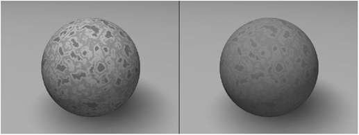
Figure 13-25
PShop Colordodge
With Colordodge the blending color is evaluated and the base color is brightened to show the blend color by reducing the contrast. Black produces no effect at all.
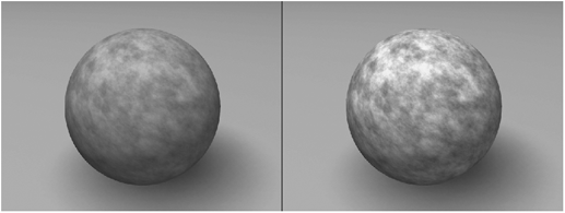
Figure 13-26
PShop Colorburn
With Colorburn the blending color is evaluated and the base color is darkened to show the blend color by increasing the contrast. White produces no effect at all.

Figure 13-27
PShop Darken
With Darken the blending color and the base color are evaluated and the darker of the two will be used. The areas lighter than the blend color are replaced, while areas darker than the blend color remain the same.

Figure 13-28
PShop Lighten
This is exactly the opposite of PShop Darken. The blending color and the base color are evaluated and the lighter of the two will be used. The areas darker than the blend color are replaced, while areas lighter than the blend color remain the same.
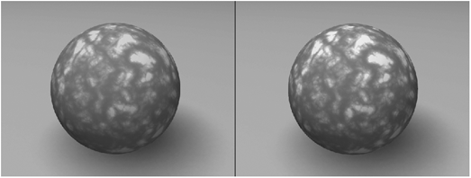
Figure 13-29

Other Options in the Texture Editor
Apart from providing methods of controlling the visibility of layers, the Texture Editor also has a number of options for controlling the placement of layers and some extra options for image layers, falloff options, and a few others.
Invert Layer
The Invert Layer option totally inverts the current layer. To invert a layer, click on the Invert Layer check box.

Figure 13-31
This is particularly useful if you have accidentally inverted an alpha map and don’t wish to go all the way back to your image creation program to change it. Another use for Invert Layer is if you need to use the image in both ways, in which case it saves on RAM to simply invert the single image.

Figure 13-32
This function is also great when texturing with procedural textures, as inverting them can create very different effects.
Figure 13-33 illustrates the vast difference between the Crumple procedural when it is not inverted (on the left) and when it is (on the right).

Figure 13-33
When the texture is not inverted, it is useful for effects like crumpled paper or beaten metal, whereas when it is inverted, it appears far more organic, which is great for surfaces such as leather or even skin.
Here is another example of how radically different a procedural can be when inverted. In Figure 13-34 we see a Ridged Multi-Fractal procedural as it usually is (on the left) and inverted (on the right).
Figure 13-34
Of course you can also use this for any kind of image map layer, as well as gradient layers. However, using them on colored image maps can produce rather odd results, apart from the fact that there would be few instances, if any, where you would need to do that anyway.
Texture Axis
The Texture Axis option is available for images used in layers, except when using UV maps. It is also available for certain procedurals that require an axis projection, namely the Brick, Honeycomb, Marble, STClouds, Wood, Coriolis, and Cyclone procedurals. Most procedurals do not require an axis along which to project since they are mathematically calculated in 3D space and cover an object entirely along its normals.
Choosing the correct axis along which to project your texture is very important, and differs according to your model and how you wish to place your texture onto it.
The options are pretty self-explanatory. You can choose either X, Y, or Z as your texture axis.

Figure 13-35
Depending on what direction you wish to project your texture, you choose an appropriate axis. Remember that x is from side to side, y is from above and below, and z is from front to back.
Reference Object
This option is useful for controlling textures using another object, usually a null object. This reference object can be used to control the position, size, and rotation of textures within a surface. To use an object in this manner, click on the Reference Object button and select the object you wish to use as a reference from the drop-down list.
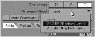
Figure 13-36
Both image layers and procedural layers can use this option. Using a reference object can make the process of animating the position, size, and rotation of textures a lot simpler than using envelopes, as you do not need to use anything complex like graphs. You simply keyframe the changes on the reference object and the texture will react accordingly.
For example, you could use a reference object to make the textured irises of eyeballs follow a null object, which would be a lot simpler than trying to use the Graph Editor to do this. All you would have to do is move the null object to the point where you want the eyes to be looking and they would follow it.
World Coordinates
Usually when texturing we want the textures to stick to the object, so that when the object moves around, the textures move with it.
However, sometimes you may need to have the textures held in place, so that when you move the object, the texture remains static and the object appears to move through the texture. Selecting World Coordinates locks textures on your object to LightWave’s origin instead of to the object.

Figure 13-37
For example, if you wanted to create the effect of a submarine passing through light beams filtering down from the surface, you could create an underwater ripples texture in the color and luminosity channels for the submarine vehicle. You could then set the ripples texture to World Coordinates, so that as the submarine moves forward, it appears to move through the ripples that are seemingly filtering down from the surface of the water.
Automatic Sizing
Use the Automatic Sizing option to size a texture image or procedural texture to the model that you are applying it to.
The size of the object is calculated by an imaginary box completely surrounding the section that the surface is currently applied to. This value is then determined and is used as the size for the texture you are applying when you use this option.
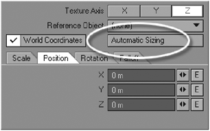
Figure 13-38
For example, if you have a plane that is 4m × 8m, and you have created a texture of the same ratio, you could quickly fit it perfectly to the plane by using Automatic Sizing.
Automatic Sizing is also a useful starting point when texturing with procedurals, as it can give you an immediate indication of the size of the procedural in relation to the size of the object.
NOTE: Automatic Sizing is not available when using UV maps because UV maps have their own sizing.
Scale
You use the fields or the spinners in the scale options to manually set the size that you want your texture to be on the surface. You can set your own scale amounts for the x, y, and z axes individually by typing the desired amounts into the respective fields or by dragging the spinners accordingly.

Figure 13-39
This is very important, particularly when working with procedural textures. You have no other way of setting the size of a procedural since it has no set boundaries and is not visible in OpenGL. When working with procedurals, it is usually better to set the scale of the texture to a value smaller than the surface itself, to allow for more detail. However, this can really vary from object to object, depending on what sort of surface you are creating.
NOTE: As with Automatic Sizing, you cannot change the Scale amounts for a texture when it is UV mapped. Gradient layers also have no Scale options, since scale has no bearing whatsoever on the effect of a gradient.
Position
The position spinners and fields allow you to set the position of your texture in 3D space.
These amounts basically set the center point for the placement of the texture. By default, the position of any texture applied is 0.
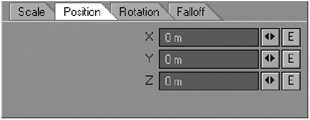
Figure 13-40
Notice that when Automatic Sizing is used, LightWave automatically calculates the position for the texture. The position value is calculated at the center of the imaginary box surrounding the surface.

Figure 13-41
When applying an image map to a texture, you sometimes find that the image will tile, depending on the Scale and Position settings. As we discussed earlier, using Automatic Sizing stretches the image to adjust exactly to the surface, thus eliminating tiling. However, if the position of this image is adjusted, the image will begin to tile again, depending on which way you adjust the setting.
Take a look at Figure 13-42.
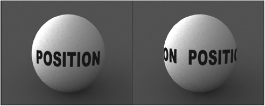
Figure 13-42
The sphere on the left has the image applied in a planar fashion along the z-axis, with Automatic Sizing applied. Notice how the image stretched to fit this projection perfectly. The image on the right is still using Automatic Sizing; however, the position has been altered along the x-axis, causing the image to move sideways, and consequently tile. There are a number of tiling options, which are discussed a little later.
Rotation
Use the spinners and fields in the Rotation panel to rotate textures applied to your surface. Manually enter your own values or drag the spinners to adjust the rotation as you wish.
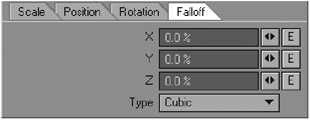
Figure 13-43
The default rotation settings are always 0. Rotation in 3D space is done along the x, y, and z axes, which are referred to as heading, pitch, and bank, respectively.
Figure 13-44 demonstrates the differences between the three axes and how they are used.
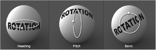
Figure 13-44
Falloff
Essentially, falloff is used to fade textures along a selectable axis. For example, if you are using a procedural texture, but you want to fade it away at some point on your model, one way of doing that would be to use falloff.
Admittedly, I do feel that falloff is a bit of a throwback to an older LightWave world, before we had things like gradients, since in many cases where a falloff type effect is needed, a gradient, or even an image used as an alpha layer, would actually give you far greater control.
To use falloff, you select the type of falloff that you want, and enter in an appropriate value where you want the falloff to happen. You can do this by typing in an amount or by dragging the spinners. You can use positive and negative amounts of falloff to create the desired effect.

Figure 13-45
When deciding on what values to enter, you need to know what unit of measurement LightWave is currently set to, because the falloff is calculated as units of distance from the center point of the texture, which, as we discussed before, is set with the Position value. If, for example, your default unit in LightWave is set to meters, then this is what the distance will be measured in.
TIP: To check your current default unit setting, go to the General Options tab in your Preferences panel in Layout. In Modeler, you can check your unit settings in the Display Options window.
To choose the type of falloff that you want, select an appropriate option from the list labeled Type.
There are five different types of fall-off, and each essentially defines the shape of the falloff.
The first type, Cubic, is the default falloff type. Cubic basically creates falloff that occurs evenly along the edges of the object, in a cubic shape.
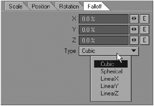
Figure 13-46
Be aware that Cubic works simultaneously in both negative and positive values, despite what you type into the fields. Unlike the Linear types that occur in only one direction (depending on whether you enter a positive or negative value), Cubic falloff occurs in both directions of each axis.
The second type, Spherical, works the same way as Cubic, except that it has a (you guessed it) spherical shape.
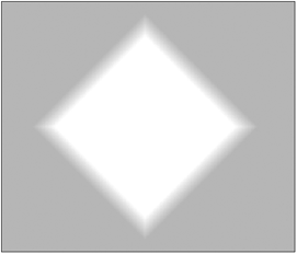
Figure 13-47: Cubic falloff

Figure 13-48: Spherical falloff
The third type, LinearX, works solely on the x-axis. Depending on whether you enter a positive or negative value for this type, you will have the falloff occur on either the right or the left side of the center position of the surface.
The fourth type, LinearY, works the same as LinearX, except that its effect occurs along the y-axis. A positive value will cause the falloff to occur above the center of the surface, while a negative value will cause falloff below.

Figure 13-49: LinearX falloff

Figure 13-50: LinearY falloff
The last type is LinearZ, which is the same as LinearX and LinearY, except that it works along the z-axis.
TIP: If you want to create a linear type falloff, but with the falloff occurring on both sides of the object (above and below, left and right, or front and back), then you could use the Cubic or Spherical types. Simply limit them to only one axis by entering an appropriate value and leaving the other two axes at 0.
A handy use of falloff is for limiting the distance that a texture travels through a surface. If, for example, you were texturing a small box, and you placed an image of a logo onto the front of the box, by default that image would continue all the way to the back of the box if the same surface was applied to the entire model. You could prevent this from happening by applying a falloff to the image along the appropriate axis so that the image no longer shows up on the other side.
Falloff can also be quite useful for creating fake volumetric effects such as flames, gaseous balls, or even fake volumetric light beams.
Take a look at Figure 13-51. The model is a simple disc, and the textures are just procedurals. The textures have Spherical falloff on them, so that it creates the effect of the disc being a gaseous element that has no solid edges.
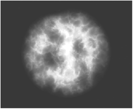
Figure 13-51
Do be aware, however, that despite what this image may look like, the falloff does not affect the alpha channel of the render, which stays completely solid, regardless of your fall-off settings, unless you also set up the falloff in exactly the same manner in the transparency channel as well.
As I mentioned before though, do remember that the effect of falloff can often be better created using gradients, especially with weight maps, or by using images as alpha layers, as those methods give you far greater control and variation.
Extra Options When Using Images
The Texture Editor has a few extra options that are available only in layers that contain images.

Figure 13-52
Width and Height Tile
When using images that are not UV mapped, you can tile them as many times as you like across the surface of your object. Tiling images is used often in the gaming industry to use less memory for real-time graphics. The drop-down lists under Width Tile and Height Tile contain a number of options for tiling your textures.
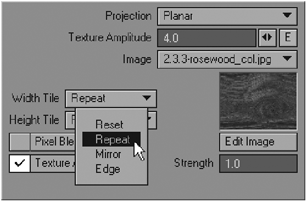
Figure 13-53
The first option on the list is Reset. Using this for your tiling setting creates no tiling for the image. The image will simply appear by itself on the surface, with all its edges clearly visible, provided the image is smaller than the surface itself.
The second option, which is the default when applying images, is Repeat. This simply repeats the image all over the object.

Figure 13-54: Reset option
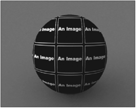
Figure 13-55: Repeat option
The third option is Mirror. Mirror is similar to Repeat, except that it flips the images around so that each repeat of the image mirrors the ones alongside it.
Something to be aware of when using the Repeat and Mirror options is that ideally your images should be totally seamless. Seamless images, as we discussed in Chapter 11, are images that have identical details around the edges, so that when they lie alongside each other, you cannot see any breaks in the texture; all the repeated images flow into one another.
The fourth and final tiling option is Edge. When using Edge, the colors along the edge of the image continue to the edges of the surface.

Figure 13-56: Mirror option

Figure 13-57: Edge option
However, if the image contains an alpha channel that extends to the edges of the image, then this particular setting will not show the pixels at the edge of the image, and will therefore not extend the edges of the image to the edge of the surface.
NOTE: The Width and Height tiling options for an image do not necessarily have to be the same.
Pixel Blending
Activating Pixel Blending for an image helps to smooth out the pixellation that can occur when textures are viewed up close. As we discussed earlier in Chapter 11, it is always better to use high-resolution textures, especially for television or film broadcast work; however, when in extreme close-ups, some textures can still show some slight pixellation. Figure 13-58 shows a texture applied without Pixel Blending (on the left) and with Pixel Blending (on the right). As you can see, the one with Pixel Blending is smoother.

Figure 13-58
By default, Pixel Blending is on. To deactivate it, simply click on the check box.

Figure 13-59
Texture Antialiasing
This option is used to avoid annoying rendering artifacts that often appear on objects, especially when they are in the distance and have detailed textures on them.

Figure 13-60
A common problem that appears in renders is scintillation, those unsightly lines that appear on textures with fine line details in them when the objects are viewed at an angle that causes those detailed lines to converge in the render. To prevent this from happening, simply use Texture Antialiasing.
It is generally good practice to use this on objects that are distant in your scene, as these are the ones that usually cause problems that are particularly noticeable when there is a lot of movement in the scene.
NOTE: Texture Antialiasing is not the same as the antialiasing settings that you choose in your Camera Properties panel. Texture Antialiasing affects only the texture maps, not the actual antialiasing of the objects themselves when rendering.
Strength
When you select Texture Antialiasing, you should notice that a new field, Strength, which was previously grayed out below the image thumbnail on the panel, becomes active.
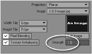
Figure 13-61
This value controls the amount of strength of the antialiasing applied to the image. The default setting is 1, and this value should work for most cases. Using higher values can cause the image to become blurred.
Texture Amplitude
Texture Amplitude is available with bump maps only. When using an image in your Bump channel’s Texture Editor, notice that there is a field labeled Texture Amplitude on your panel.

Figure 13-62
This setting determines how strong an effect the bump map will have on the surface. The default setting is 1. Be careful when using this setting, as having it too high can look pretty nasty. Remember that bump maps should only be used for slight abrasions or irregularities in the surface, not to compensate for any lack of geometry, so lower values for this setting usually suffice. Values from 1 to 3 are usually adequate for most bump maps.