
Now that we have displayed text, let's display a sprite.
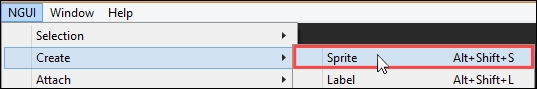
Make sure you have nothing selected, and navigate to NGUI | Create | Sprite, as follows:
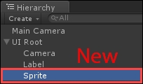
Now, take a look at the following Hierarchy view; you'll see a new GameObject called Sprite:
Great, we have a sprite in the scene. Let's see its Inspector parameters.
Let's define some terms as we review UISprite's parameters:
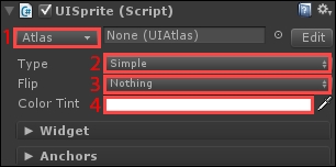
- Atlas: An atlas is an image file containing our sprites and bitmap fonts. Assembling them all together in one large texture enables NGUI to render an entire UI in only one single draw call! That field determines which atlas is going to be used to display this sprite.
- Sprite Type: Select one of these five different behaviors:
Simple: This displays a simple image.Sliced: This is used for nine-slice sprites, letting you resize sprites without stretching the corners. We'll detail and try this shortly.Tiled: This is used for tiled sprites for patterns that can be repeated indefinitely.Filled: This is used for progress bars. This hides the sprite partially, depending on a fill amount value and direction.Advanced: This allows you to choose a different sprite type for each border and center.
- Flip: This flips the sprite in one of the following directions you define:
Nothing,Horizontally,VerticallyorBoth
- Color Tint: This is the sprite's color tint.
Right now, nothing is displayed because we haven't chosen which atlas and sprite we want to use.
We have reviewed the parameters of UISprite. Let's configure it to display something.
We must select an atlas. We'll use an example atlas that comes with NGUI.
Select our Sprite GameObject, and click on the Atlas (1) button showed in the previous screenshot. The following window appears:
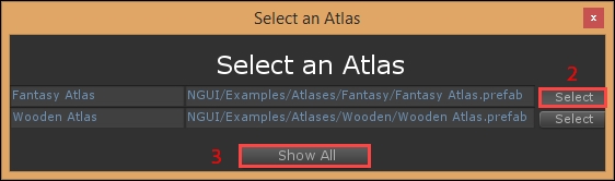
Select Fantasy Atlas (2). If the atlas is not listed, click on the Show All (3) button of the atlas selection window, and it will appear along with other example atlases.
Now that we have selected an atlas, we can select which sprite to render, as shown in the following screenshot:
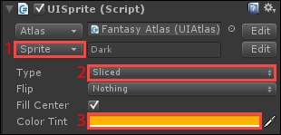
- Click on the Sprite (1) button to open the sprite selection window. Within this new window, select the Dark sprite by double-clicking on it.
- Change the sprite Type (2) to Sliced.
- Click on Color Tint (3) and set:
{R: 255, G: 180, B: 0, A: 255}.
Your Game view should now look like this:

Ok. We now have a square sprite. But we have a problem: it's rendered over our text label. That's because the sprite's Depth value is higher than the label's.
Set the following widget parameters for our new sprite in order to have this result, as follows:
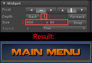
- Depth: The label's depth is at
0. Set this one to-1so that it displays behind. - Size: Set it to 400 x 80 to create a box around our Main Menu label.
Great, our first sprite is correctly configured! Before we move on, we can try out the different sprite types.
With NGUI, we have four basic types of sprites:
- Sliced
- Simple
- Tiled
- Filled
Now that we have a sprite onscreen, let's try them and see their parameters.
Let's start with the Sliced type of sprites, since our sprite is already configured like that.
Select our UI Root | Sprite GameObject in the Hierarchy view. Look at the Preview window at the bottom of Inspector:
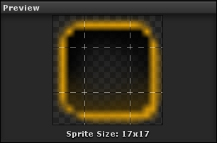
You can see that the Dark sprite's size is only 17 x 17 pixels. We have stretched it up to 400 x 80, and it still looks good—no pixelation or stretched corners!
That's because it is a nine-slice sprite: the four dotted lines in the preceding screenshot represent the slicing lines. Corners always remain at the same size, while other parts of the sprite stretch to cover the demanded area. Sliced sprites are thus very useful to create windows, borders, title bars, and more.
A Simple sprite is used to display an icon or a specific image that does not require slicing. In order to avoid pixelation, you shouldn't resize it too much over its original file size.
If you switch our sprite's Type from Sliced to Simple, slicing parameters are ignored, and our 17 x 17 sprite is stretched and looks terrible, as shown in the following screenshot:

A Tiled sprite is a pattern that can be repeated indefinitely. In order to illustrate it effectively, select our Sprite GameObject and follow these steps:
- Change its Atlas to the Wooden Atlas.
- Set the Type parameter of
UISpriteto Tiled. - Change its Sprite to the Stripes 1 sprite.
Within the Game view, you might notice that our background is now diagonal orange stripes. The pattern is repeated and it looks good compared to a simple stretched sprite.
Here's a comparison:

In the preceding image, the same sprite is used. On the left-hand side, the sprite Type is set to Simple: the sprite is simply stretched and pixelated. On the right, the sprite Type is set to Tiled: the pattern is repeated and not stretched.
Now that we've seen how tiled sprites work, let's talk about filled sprites.
A Filled sprite is displayed partially depending on a FillAmount value between 0 and 1. Set the Type parameter of our UISprite to Filled. Ok. Now, we can review the three new parameters, as follows:
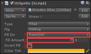
The following parameters are specific to filled sprites:
- FillDir: Select one of the following five fill directions:
- Horizontal: The sprite is filled horizontally. This is usually used for progress bars and life gauges.
- Vertical: The sprite is filled vertically.
- Radial90: The sprite is filled around a 90-degree angle.
- Radial180: The sprite is filled around a 180-degree angle, resulting in a car windshield wiper effect.
- Radial360: The sprite is filled around a 360-degree angle, resulting in a clock or timer effect.
- FillAmount: This floats between
0and1and defines how much of the sprite is visible. The mask's shape depends on the selected FillDir (1). - InvertFill: Check it to invert the sprite's fill direction.
You can visualize the fill effect by modifying the value of Fill Amount(2). If Fill Dir is set to Radial360 with Fill Amount around 0.55, the output will look like this:

You can try out the different fill directions before we explain how UICamera and UIPanel work.
Before we continue to the next section, please set back our sprite's Type parameter to Sliced, with the Dark sprite from Fantasy Atlas.