
It would be great to add a checkbox to enable or disable sound for the game. Before we continue, let's prepare a container box for our future checkbox:
- Select our
UI Root|OptionsGameObject. - Create a new child empty GameObject by pressing Alt + Shift + N.
- Rename this new empty GameObject to
Sound.
We'll add the UISprite component to our new Sound holder GameObject to create the sound toggle's box background.
Select our UI Root | Options | Sound GameObject:
- Click on the Add Component button in the Inspector view.
- Type in
spritewith your keyboard. - Select NGUI Sprite with your keyboard arrows and hit Enter.
Follow these steps to configure the new UISprite component on our Sound GameObject:
- Select the Wooden Atlas for the Atlas parameter.
- Change Sprite to Highlight – Thin.
- Change the sprite Type parameter to Sliced.
- Change its Color Tint parameter to
{R: 180, G: 125, B: 50, A: 255}. - Set Size to 460 x 280.
- Set its Transform position to
{550, 85, 0}.
Good, we have our background sprite. We'll now add a title to this sound toggle box:
- Select our
Options|SoundGameObject. - Press Alt + Shift + L to create a new child label widget.
- Select our new
Options|Sound|LabelGameObject:- Change its Font parameter to Coalition
- Set Size to 460 x 100
- Set Font Size to
52 - Set Color Tint to
{R: 255, G: 190, B: 10, A: 255} - Change Text to
Sound - Set its Transform position to
{0, 65, 0}
Great. We can now create our first checkbox.
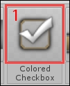
Drag the
Colored Checkbox (1) from our Prefab Toolbar inside our new Sound GameObject in the Hierarchy view, as shown in the following screenshot:
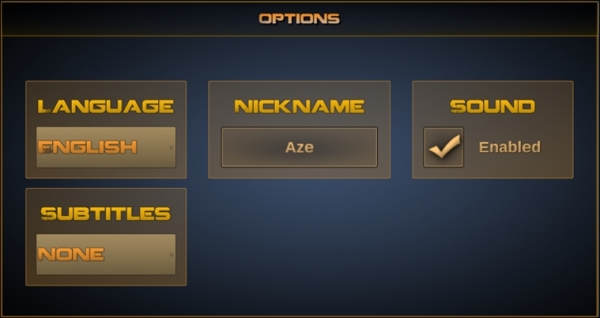
A new checkbox appears on the scene. Hit Unity's play button. The checkbox's title appears gradually with a typewriter effect. The checkbox can be checked or unchecked, with a nice rotation transition animation and fading in/out of the checkmark. Here's how the new checkbox looks:
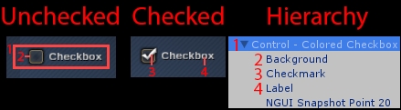
The checkbox in the preceding screenshot is composed of four elements (ignoring the NGUI snapshot):
- Control – Colored Checkbox: This is the main element, with these five components:
UIWidget: Basic NGUI component used to contain widgetsUIToggle: On/off switch used for checkboxes or radio buttonsBox Collider: Used to detect mouse and touch interactionsUIButton: Used to add hover/pressed color effects on checkboxUIButton Rotation: Used to rotate the background on hover
- Background: This is
UISprite, which displays the checkbox's empty rectangle. - Checkmark: This is the animated
UISpritethat displays the actual checkmark. - Label: This is
UILabel, which displays the title withTypewriterEffect.
Select Control – Colored Checkbox. Its attached UIToggle has 5 parameters, as shown in the following screenshot:
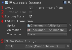
- Group: All
UITogglecomponents within the same group ID act as radio buttons; only one of them can be checked at one time. - State of 'None': Accessible when a Group is defined (other than
0). Enabling this option authorizes you to have none of theUITogglesselected. Disabling it implies that one of them in the group is always selected. - Starting State: This is the default state at runtime.
- State Transition: Here, your can set which
UISpriteholds your checkmark icon and animation. Drag them respectively in the Sprite and Animation fields. You can also choose aSmoothfade in/out or anInstanttransition. - On Value Change: This lets you choose methods to call each time
UITogglechanges state.
Now that we have seen the parameters of UIToggle, we can create a sound toggle.
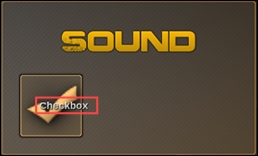
We can now create this sound toggle to switch the game's sound on or off:

The sound toggle box in the preceding screenshot is composed of three main elements:
- The sound box's background: This is
UISprite, which is attached to the container. - The box's title: This is
UILabel, which displays the wordSound. - The checkbox element: This has the
UITogglecomponent attached.
We already have the first two elements: the background and title. We only have to configure our checkbox (3).
Select our Control - Colored Checkbox GameObject of Sound, and rename it Checkbox. Now, follow these steps:
- Set its Transform position parameter to
{-200, -50, 0}. - For its attached
UIWidgetcomponent:- Change Size to 400 x 120
- For its attached
UIButtoncomponent:- Set the Normal color to
{R: 255, G: 200, B: 120, A: 255} - Set the Hover color to
{R: 255, G: 230, B: 200, A: 255} - Set the Pressed color to
{R: 0, G: 0, B: 0, A: 255}
- Set the Normal color to
We have set the container widget to the correct size; UIButton will now change the checkbox's color depending on its state (hover, normal, or pressed).
Let's change the size of the checkbox and the actual checkmark:
- Select our
Checkbox|BackgroundGameObject. - Set its widget Size to 120 x 120.
- Change its Transform position to
{60, 0, 0}.
Good. Let's do the same for our checkmark icon:
- Select our
Checkbox|CheckmarkGameObject. - Set Color Tint to
{R: 255, G: 200, B: 120, A: 255}. - Set widget Size to 120 x 120.
- Change its Transform position to
{60, -8, 0}.
The checkbox looks good, but its associated label is neither positioned nor sized correctly:
Let's take care of this label. Select our Checkbox | Label child GameObject, and then:
- Set its Font parameter to Arimo20.
- Change Font Size to
50. - Change Text to
Enabled. - Set Color Tint to
{R: 255, G: 200, B: 120, A: 255}. - Set widget Size to 250 x 120.
We need to move this label to the right. Currently, this label uses Anchors to position itself relative to another object. Let's disable them to allow us to place it anywhere.
Select our Checkbox | Label GameObject. In the Inspector view, under its attached UILabel, you will find the Anchors group, as shown in the following screenshot:
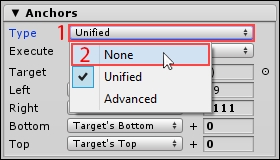
- Click on Unified to open the anchor Type selection.
- Click on None to disable Anchors for this widget.
Ok, we can now move it anywhere we want. Set its Transform position to {160, 0, 0}. Great! We now have a sound toggle box. Your Game view should look like this:
Now, let's see how we can create sliders to adjust the game's different volume levels.