
The flexible UI conserves your UI pixel-perfect using the Flexible scaling style. It will make sure that all your widgets are displayed at their original pixel size. That's good to display your UI as crisp as it can be.
It is recommended that you use this mode for PC games, using anchors intelligently to make sure all the widgets are positioned depending on the screen's bounds.
If you create a 256 x 256 pixels button sprite, it will take a large amount of space on 800 x 480 screens and be very small on a 1920 x 1080 screen. We'll also have the same issue with fonts: a 50-pixel size font will be displayed at a reasonable size on small devices, but will be tiny and unreadable on high resolution tablet screens.
That's where the UIRoot component's Minimum Height and Maximum Height parameters become useful; they define from which screen height the UI will be scaled down or up.
Let's create a new scene to try the flexible UI and other examples in this chapter:
- Create a new scene by navigating to File | New Scene.
- Save it by navigating to File | Save Scene as.
- Browse in the project's
Assetsfolder. - Type
ScreenSizesfor the new scene's filename and hit the Save button.
Now, let's create a new flexible 2D UI Root GameObject:
- Navigate to NGUI | Create | 2D UI.
- Select the new
UI RootGameObject in the Hierarchy view:- Set its Scaling Style value to Flexible
- Change its Minimum Height value to 800
- Change its Maximum Height value to 1600
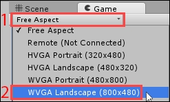
Good! We now have our flexible UI configured. Let's make sure that our Game view has a standard mobile device resolution. Click on the current aspect ratio / resolution button (1) at the top of your Game view, and select WVGA Landscape (800x480) (2):
Okay. We're now ready to work on multiple bitmap font sizes.