
Let's use the OnTooltip() event to show a tooltip for our buttons and different options, as shown in the following screenshot:
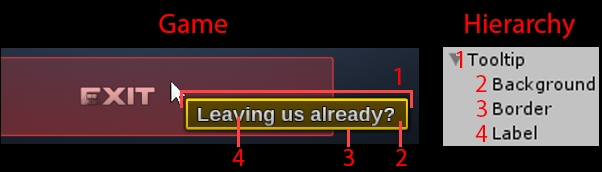
The tooltip object shown in the preceding screenshot, which we are going to create, is composed of four elements:
- Tooltip: The tooltip container, with the
Tooltipcomponent attached. - Background: The background sprite that wraps around Label.
- Border: A yellow border that wraps around Background.
- Label: The label that displays the tooltip's text.
We will also make sure the tooltip is localized using NGUI methods.
In order to create the tooltip object, we'll first create its visual elements (widgets), and then we'll attach the Tooltip component to it in order to define it as NGUI's tooltip.
First, we need to create the tooltip object's visual elements:
- Select our
UI RootGameObject in the Hierarchy view. - Hit Alt + Shift + N to create a new empty child GameObject.
- Rename this new child from
GameObjecttoTooltip. - Add the NGUI Panel (
UIPanel) component to it. - Set this new Depth of
UIPanelto10.
In the preceding steps, we've created the tooltip container. It has UIPanel with a Depth value of 10 in order to make sure our tooltip will remain on top of other panels.
Now, let's create the faintly transparent background sprite:
- With
Tooltipselected, hit Alt + Shift + S to create a new child sprite. - Rename this new child from
SpritetoBackground.
Select our new Tooltip | Background GameObject, and configure UISprite, as follows:
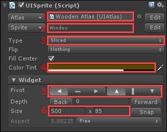
- Make sure Atlas is set to Wooden Atlas.
- Set Sprite to the Window sprite.
- Make sure Type is set to Sliced.
- Change Color Tint to
{R: 90, G: 70, B: 0, A: 180}. - Set Pivot to top-left (left arrow + up arrow).
- Change Size to 500 x 85.
- Reset its Transform position to
{0, 0, 0}.
Ok, we can now easily add a fully opaque border with the following trick:
- With
Tooltip|Backgroundselected, hit Ctrl + D to duplicate it. - Rename this new duplicate to
Border.
Select Tooltip | Border and configure its attached UI Sprite, as follows:
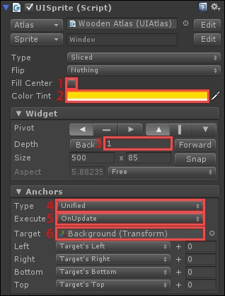
- Disable the Fill Center option.
- Change Color Tint to
{R: 255, G: 220, B: 0, A: 255}. - Change the Depth value to
1. - Set Anchors Type to Unified.
- Make sure the Execute parameter is set to OnUpdate.
- Drag
Tooltip|Backgroundin to the new Target field.
By not filling the center of the Border sprite, we now have a yellow border around our background. We used anchors to make sure this border always wraps the background even during runtime—thanks to the Execute parameter set to OnUpdate.
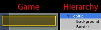
Right now, our Game and Hierarchy views should look like this:
Let's create the tooltip's label. With Tooltip selected, hit Alt + Shift + L to create a new label. For the new Label GameObject, set the following parameters for UILabel:
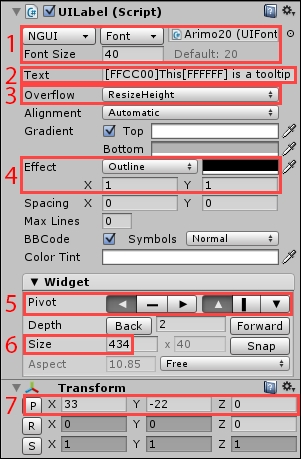
- Set Font Type to NGUI, and Font to Arimo20 with a size of 40.
- Change Text to [FFCC00]This[FFFFFF] is a tooltip.
- Change Overflow to ResizeHeight.
- Set Effect to Outline, with an X and Y of 1 and black color.
- Set Pivot to top-left (left arrow + up arrow).
- Change X Size to 434. The height adjusts to the text amount.
- Set the Transform position to
{33, -22, 0}.
Ok, good. We now have a label that can display our tooltip's text. This label's height will adjust automatically as the text gets longer or shorter.
Let's configure anchors to make sure the background always wraps around the label:
- Select our
Tooltip|BackgroundGameObject. - Set Anchors Type to Unified.
- Drag
Tooltip|Labelin the new Target field. - Set the Execute parameter to OnUpdate.
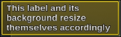
Great! Now, if you edit our tooltip's text label to a very large text, you'll see that it adjusts automatically, as shown in the following screenshot:
We can now add the UITooltip component to our tooltip object:
- Select our
UI Root|TooltipGameObject. - Click the Add Component button in the Inspector view.
- Type
tooltipwith your keyboard to search for components. - Select Tooltip and hit Enter or click on it with your mouse.
Configure the newly attached UITooltip component, as follows:
- Drag
UI Root|Tooltip|Labelin the Text field. - Drag
UI Root|Tooltip|Backgroundin the Background field.
The tooltip object is ready! It is now defined as a tooltip for NGUI. Now, let's see how we can display it when needed using a few simple lines of code.
We must now show the tooltip when needed. In order to do that, we can use the OnTooltip() event, in which we request to display the tooltip with localized text:
- Select our three
Main|Buttons|Exit,Options, andPlaybuttons. - Click the Add Component button in the Inspector view.
- Type
ShowTooltipwith your keyboard. - Hit Enter twice to create and attach the new
ShowTooltip.csscript to it. - Open this new
ShowTooltip.csscript.
First, we need to add this public key variable to define which text we want to display:
// The localization key of the text to display
public string key = "";
Ok, now add the following
OnTooltip() method that retrieves the localized text and requests to show or hide the tooltip depending on the state bool:
// When the OnTooltip event is triggered on this object
void OnTooltip(bool state)
{
// Get the final localized text
string finalText = Localization.Get(key);

// If the tooltip must be removed...
if(!state)
{
// ...Set the finalText to nothing
finalText = "";
}

// Request the tooltip display
UITooltip.ShowText(finalText);
}
Save the script. As you can see in the preceding code, the Localization.Get(string key) method returns localized text of the corresponding key parameter that is passed. You can now use it to localize a label through code anytime! In order to hide the tooltip, we simply request UITooltip to show an empty tooltip.
Ok, we have added the code to show our tooltip with localized text. Now, open the Localization.txt file, and add these localized strings:
// Tooltips
Play_Tooltip, "Launch the game!", "Lancer le jeu !"
Options_Tooltip, "Change language, nickname, subtitles...", "Changer la langue, le pseudo, les sous-titres..."
Exit_Tooltip, "Leaving us already?", "Vous nous quittez déjà ?"
Now that our localized strings are added, we could manually configure the key parameter for our three buttons' Show Tooltip components to respectively display Play_Tooltip, Options_Tooltip, and Exit_Tooltip.
But that would be a repetitive action, and if we want to add localized tooltips easily for future and existing objects, we should implement the following system: if the key parameter is empty, we'll try to get a localized text based on the GameObject's name.
Let's do this now! Open our ShowTooltip.cs script, and add this Start() method:
// At start
void Start()
{
// If key parameter isn't defined in inspector...
if(string.IsNullOrEmpty(key))
{
// ...Set it now based on the GameObject's name
key = name + "_Tooltip";
}
}
Click on Unity's play button. That's it! When you leave your cursor on any of our three buttons, a localized tooltip appears:
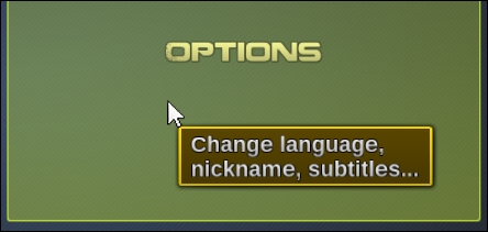
The preceding tooltip wraps around the displayed text perfectly, and we didn't have to manually configure their Show Tooltip components' key parameters!
Actually, I have a feeling that the display delay is too long. Let's correct this:
- Select our
UI Root|CameraGameObject. - Set Tooltip Delay of
UICamerato 0.3.
That's better—our localized tooltip appears after 0.3 seconds of hovering.
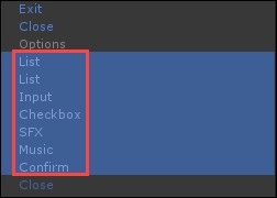
We can now easily add tooltips for our Options page's element. The tooltip works on any GameObject with a collider attached to it. Let's use a search by type to find them:
- In the Hierarchy view's search bar, type
t:boxcollider - Select Checkbox, Confirm, Input, List (both), Music, and SFX:
- Click on the Add Component button in the Inspector view.
- Type
showwith your keyboard to search the components. - Hit Enter or click on the Show Tooltip component to attach it to them.
For the objects with generic names, such as Input and List, we need to set their key parameter manually, as follows:
- Select the
CheckboxGameObject, and set Key toSound_Tooltip. - Select the
InputGameObject, and set Key toNickname_Tooltip. - For the
Listfor language selection, set Key toLanguage_Tooltip. - For the
Listfor subtitles selection, set Key toSubtitles_Tooltip.
Finally, we need to add these localization strings in the Localization.txt file:
Sound_Tooltip, "Enable or disable game sound", "Activer ou désactiver le son du jeu"
Nickname_Tooltip, "Name used during the game", "Pseudo utilisé lors du jeu"
Language_Tooltip, "Game and user interface language", "Langue du jeu et de l'interface"
Subtitles_Tooltip, "Subtitles language", "Langue des sous-titres"
Confirm_Tooltip, "Confirm and return to main menu", "Confirmer et retourner au menu principal"
Music_Tooltip, "Game music volume", "Volume de la musique"
SFX_Tooltip, "Sound effects volume", "Volume des effets"
Hit Unity's play button. We now have localized tooltips for all our options! We now know how to easily use NGUI's tooltip system. It's time to talk about Tween methods.