
We want the player to be able to change his nickname. We can use an Input Field widget to create a nickname box.
Before we continue, let's prepare a container box for our input field:
- Select our
UI Root|OptionsGameObject. - Create a new child, empty GameObject with Alt + Shift + N.
- Rename this new empty GameObject to
Nickname.
Now that we have our Nickname holder GameObject, we can add (and configure) the UISprite component to it to create the nickname box background:
Select our UI Root | Options | Nickname GameObject:
- Click on the Add Component button in the Inspector view.
- Type in
spritewith your keyboard. - Select NGUI Sprite with your keyboard arrows and hit Enter.
We now have the UISprite component on our Nickname. Configure it as follows:
- Select Wooden Atlas for the Atlas parameter.
- Change Sprite to Highlight – Thin.
- Change the sprite Type parameter to Sliced.
- Change Color Tint to
{R: 180, G: 125, B: 50, A: 255}. - Set Size to 520 x 280.
- Set its Transform position to
{0, 85, 0}.
Ok, we have our background sprite. Let's add a title to this language selection box:
- Select our
Options|NicknameGameObject. - Press Alt + Shift + L to create a new child label widget.
- Select our new
Options|Nickname|LabelGameObject:- Change Font to Coalition
- Set Size to 520 x 100
- Set Font Size to
52 - Set Color Tint to
{R: 255, G: 190, B: 10, A: 255} - Change Text to
Nickname - Set its Transform position to
{0, 65, 0}
Good. We are ready to create our first input field.
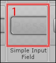
Drag the Simple Input Field (1) shown in the following screenshot from our Prefab Toolbar inside our new Nickname GameObject in the Hierarchy view:
A new input field appears on the scene. Hit Unity's play button and click on the field. You can now enter text and validate it with the Enter key:
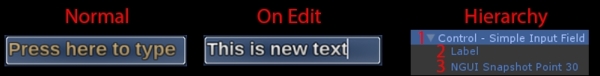
You may notice in the preceding screenshot that the input field is composed of three elements:
- Control – Simple Input Field: Main element, with these three components:
UISprite: This displays the input field's background spriteUIInput: This handles the input field's behavior and parametersBox Collider: This is used to detect mouse and touch interactions
- Label: This is
UILabel, which displays the input text. - NGUI Snapshot Point 30: This is used by the Prefab Toolbar icon. Ignore.
Ok. Now, let's talk about the input field's available parameters.
Select our Control – Simple Input Field. UIInput has 16 parameters, as shown in the following screenshot:
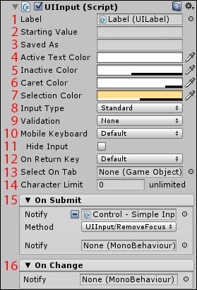
The parameters are as follows:
- Label: Drag the label you want to be editable here.
- Starting Value: This is the default value on play.
- Saved As: Save the value as
PlayerPrefs. - Active Text Color: This is the color of the text while it is being edited.
- Inactive Color: This is the color of the text when the input is not selected.
- Caret Color: Set the color tint for the text cursor.
- Selection Color: Select the selected text's background color.
- Input Type: Select one of three different input text behaviors:
Standard: The input text is displayed, with the auto-correction system disabled on mobile platformsAutoCorrect: The input text is displayed, with the auto-correction system enabled on mobile platformsPassword: The input text is replaced by*characters; auto-correction is disabled on mobile platforms
- Validation: Select a type of validation, limiting the text to certain characters:
None: No validation—any character can be enteredInteger: Only whole numbers (no decimals)Float: Whole and floating point numbers (with decimals)Alphanumeric: Letters of the alphabet and numbers from 0 to 9Username: Alphanumeric, but only in lowercaseName: Letters of the alphabet only, with the first letter in uppercase
- Mobile Keyboard: Choose one of these mobile keyboards:
Default: The operating system's default keyboard.ASCIICapable: All-ASCII-character keyboard (default).NumbersAndPunctuation: Only numbers and punctuation.URL: Adapted to enter URLs—with.combuttons, for example.NumberPad: Adapted for entering integers.PhonePad: Shows the keyboard displayed during phone calls. It is like theNumberPad, but with#,*, and other characters. This one is good for entering float numbers.NamePhonePad: Adapted to enter names and phone numbers.EmailAdress: Keyboard adapted to enter e-mail addresses.
- Hide Input: Hides the mobile OS's input box field while typing. It also avoids the need to have a full-screen keyboard in landscape mode.
- On Enter Key: This defines what happens when the Enter key is pressed:
Submit: The Enter key upon being pressed will trigger theOnSubmiteventNewLine: The Enter key upon being pressed will not submit, but will create a new line
- Select On Tab: Drag the GameObject to be selected when Tab is pressed.
- Character Limit: Enter the maximum number of characters for this input.
- On Submit: This lets you choose a method to call when the input field is validated (by default, Enter). Right now, the input field notifies itself and calls the
RemoveFocus()method to deselect the input. - On Change: This lets you choose a method to call each time a character changes within the input field.
Now that we have seen UIInput's parameters, we can create a nickname box.
We can now create this nickname box for the player to enter his/her name for the game, as shown in the following screenshot:
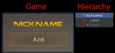
The nickname box from the preceding screenshot is composed of three main elements:
- The whole box's background—it's a
UISpriteattached to the container. - The selection box's title—it's a
UILabeldisplaying the word Nickname. - The input field to enter your name—it uses the
UIInputcomponent.
We already have the first two elements: the background and title. We only have to configure our input field (3), and our nickname box will be ready.
Select our Nickname | Control – Simple Input Field GameObject, and follow these steps:
- Rename the GameObject to
Input. - Set its Transform position to {-225, 10, 0}.
- For its attached
UISpritecomponent:- Set Color Tint to
{R: 255, G: 200, B: 120, A: 255} - Change its widget's Size to 450 x 120
- Set Color Tint to
- For its attached
UIInputcomponent:- In the Starting Value field, type in
Player - In the Saved As field, type in
PlayerName - Set Active Text Color to
{R: 255, G: 200, B: 120, A: 255} - Set Character Limit to 14
- In the Starting Value field, type in
Ok, the input is configured to display Player by default and to save the entered name as the PlayerName value in PlayerPrefs. Now, let's change the input's label to display text larger than the default font size:
- Select our
Input's childLabelGameObject.- Rename it to
Value - Change its Text parameter to
Player - Change Font Size to
50 - Since our Alignment is set to Automatic, the pivot point ((0, 0) coordinate position for the widget) defines the text's alignment. Center the Pivot to center the text vertically and horizontally, as shown in the following screenshot:

- Rename it to
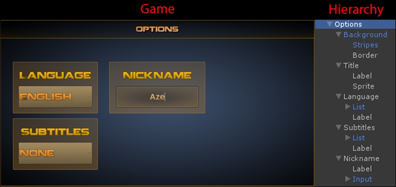
Good! We now have an input field for our player to enter his name. Your Game and Hierarchy views for the Options page should look like this:
Now, let's see how we can create a checkbox to enable or disable sound for the game.