
The player can now enable or disable sound. It would be even better if they could adjust the game's music and sound effect volumes separately. We can do that!
Before we continue, we'll use the sound toggle box we just created to build a new container box for our future sliders:
- With our
Options|SoundGameObject selected, hit Ctrl + D to duplicate it:- Rename our new duplicate to
Volume - Set its Transform position to
{550, -220, 0}
- Rename our new duplicate to
- Select the
Volume|LabelGameObject:- Change Text to
Volume
- Change Text to
- Now, select our
Volume|CheckboxGameObject and delete it.
We are now ready to create our first slider.
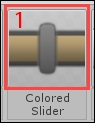
Drag the
Colored Scrollbar (1) from our Prefab Toolbar inside our new Volume GameObject in the Hierarchy view, as shown in the following screenshot:
A new slider appears on the scene. Hit Unity's play button. The slider's thumb can be dragged along the horizontal axis. You may also click anywhere on the slider to jump to the pointed position. The current amount is displayed as a percentage next to the slider and the color changes depending on its value, as shown in the following screenshot:
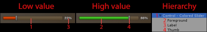
The checkbox shown in the preceding screenshot is composed of four elements (ignoring the NGUI snapshot):
- Control – Colored Slider: This is the main element; it has these five components:
UISprite: This displays the slider's background (1)UISlider: This handles the slider behavior and its parametersBox Collider: This is used to detect mouse and touch interactionsUIButton: This is used to add hover/pressed color effects on the sliderUISlider Colors: This changes color depending on the amount
- Foreground: This is
UISprite, which displays the slider's full sprite. - Label: This is
UILabel, which displays the fill percentage. - Thumb: This is
UISprite, which displays the draggable rectangle.
Ok. Now, let's review the slider's parameters.
Select Control – Colored Slider. Its attached UISlider has five parameters, shown in the following screenshot:
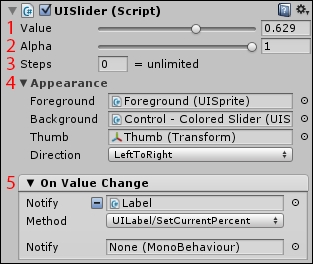
The parameters are as follows:
- Value: The slider's value between
0and1, where0is empty and1is full. - Alpha: You can change the slider's alpha value between
0and1. - Steps: The number of steps to completely fill or empty the slider.
- Appearance: You can drag the UISprite objects you want to assign as Foreground, Background and Thumb here. You can also choose the fill Direction for the slider:
LeftToRight,RightToLeft,TopToBottom, orBottomToTop. - On Value Change: This enables you to choose a method to call within another script each time the slider's value is changed. By default, it is set to update the child label's current percentage value.
Now that we have seen UISlider's parameters, we can create our volume sliders.
We can now create these two sliders to adjust the sound effects and music volumes, shown in the following screenshot:
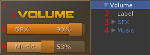
The volume adjustment box shown in the preceding screenshot is composed of four main elements:
We already have the first two elements: the background and the title. We only have to configure our SFX slider (3) and duplicate it to have our music slider (4).
Select our
Control - Colored Slider GameObject of Volume and rename it to SFX.
Now, follow these steps:
- Set its Transform position to
{0, -10, 0}. - For its attached
UISpritecomponent, change Size to 400 x 60. - For its attached
UISlidercomponent, set Value to1. - For the
UISliderColorscomponent, set the Colors array Size to2. - Set the Colors array to:
- Element 0:
{R: 255, G: 240, B: 200, A: 255} - Element 1:
{R: 255, G: 160, B: 30, A: 255}
- Element 0:
Good. Our slider now has a more manageable size and better-looking colors.
The thumb size is too small compared to the slider itself. Let's make it larger and configure the percentage label while we're at it:
- Select our
SFX|ThumbGameObject:- Set widget Size to 70 x 70
- Change Color Tint to
{R: 230, G: 150, B: 50, A: 255}
- Select our
SFX|LabelGameObject:- Rename it to
Value - Change Font Size to
40 - Change Color Tint to
{R: 255, G: 200, B: 150, A: 255} - Set its Transform position to
{55, 0, 0}
- Rename it to
We have enlarged the slider's thumb. We need to adjust the slider's Box Collider accordingly.
Select our Volume | SFX GameObject and for the attached Box Collider:
- Set Center to
{15, 0, 0}. - Set Size to
{430, 60, 0}.
Ok, now, let's add the SFX label inside the slider:
- Select our
Volume|SFX|ValueGameObject and duplicate it by pressing Ctrl + D. - Rename this new duplicate to
Label. - Set the Transform position to
{-155, 0, 0}. - Change Text to
SFX.
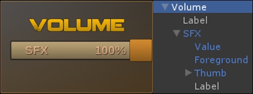
Good. Your volume adjustment box should look like this, with the following hierarchy:
We can now move on to create our second slider to adjust the game's music volume.
Let's use our SFX slider as a base for the new Music slider:
- Select our
Volume|SFXGameObject and duplicate it by pressing Ctrl + D. - Rename this new duplicate to
Music. - Set its Transform position to
{0, -95, 0}. - Select the
Music|LabelGameObject, and change Text toMusic.
Great! We now have both an SFX slider and a Music slider!