
The heuristics presented in this section of the chapter are general guidelines that increase the chances of designing an efficient user interface—they are not specific rules that have to be followed in all circumstances.
Performing an inspection of the game while using heuristics is a good way to evaluate its usability and identify issues the player may encounter. You can do the following:
- Imagine and write down a typical player's journey through the game.
- Follow the scenario, keeping those heuristics in mind, and write down every difficulty you might come across.
- Discuss your findings with the design team to find solutions to fix them.
Now, let's discuss the usability criteria, starting with the notion of guidance.
Guidance is the set of elements used to advise, inform, and lead the player. These elements can be messages, labels, icons, vibrations, or sounds.
These elements help the player in the following ways:
- They improve situation awareness. The player should know where he is in the game (his progress towards his objective), what the status of his character is (health, endurance, and so on), and what the system's status is (loading, saving, and so on).
- They help the player understand available actions and their associated consequences.
- They help the player to obtain more information (if applicable).
Guidance plays an important role in the player's motivation; a player who feels lost or stuck won't be driven to continue and might give up the game. On the other hand, good guidance will result in an easier learning process, therefore increasing the player's overall performance and reducing mistake probability.
An element's affordance is its inherent capacity of suggesting its own use. It is self-explanatory and independent from the player's cultural knowledge and symbols.
For example, a door handle looks like it can be grabbed and turned, and a big red button gives the feeling it's meant to be pressed. A chest has a shape and volume that suggests it contains something—certainly a reward—and can be opened, as shown in the following screenshot:

In Space Run 3D, this box seems like it can be opened and contains something
Prompting helps the player to be aware of available actions and encourages him to perform them. It also includes all the mechanisms and visual clues that will make him gain knowledge of the game's alternatives and the context in which he currently is.
In the following example image of a mobile game, when the player approaches a switch that seems like it can be activated, a dynamic touch sign appears, informing him that he's now in range and prompting him to actually touch it with his finger to interact with it:
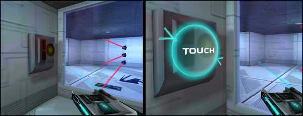
In Space Run 3D on Android, the game prompts players to touch the button as they approach it
Prompting is essential in guiding your player to take the right decisions through the game. We also have to categorize and sort the information layout.
Visual organization and grouping of information items into categories relevant to the player's tasks help the memory access information faster and, therefore, improve learning how to navigate in the game in addition to making it more intuitive.
Position and format can be used to indicate relations between the displayed information items of the UI and their eventual attachment to the same type of item.
When categorizing, thinking about grouping is only one part of the work. The other part is distinction. You must design distinct categories to ensure the player doesn't hesitate as he looks for information or a specific action.
In the following screenshot showing a first-person horror prototype on a mobile platform, the player has just requested to use a health kit. The life gauge located in the top-right corner of the screen is now full, and the remaining health kits are displayed just below it:

Important elements from the health category are grouped within the same area
In the preceding screenshot, the player can, in just one look, monitor their health and their remaining health kits. Grouping them within the same area helps them evaluate their character's current status quickly.
We can now discuss how the game's feedback can impact the player's performance.
The system should give the player an immediate response to his action to ensure he knows it has been successfully interpreted. By doing so, the player remains in the flow of the game and can focus on executing his planned sequence of actions without interruption.
Depending on your game type and your target player, you have to think about how discreet, how visible, or how rewarding your feedback should be. Basically, you should have an appropriate feedback; this means you should probably not congratulate an experienced hardcore player as often as you would a 3-year-old solving his first puzzle.
Feedback can also be used to guide the player in correcting his actions in case of imminent failure. For example, in a car racing game, you can see the wheel and car turn as the player requests it. An obvious feedback is given to the player as he dangerously approaches the race track's borders: the controller vibrates, the camera shakes, and he can hear the engine and tires being shaken up by the grass or sand.
With all this feedback using different channels (visual, audio, and haptic), the player feels he's in a bad situation and might end up crashing against the wall. This feedback acts as guide and prompts him to correct his current trajectory by braking or turning in the opposite direction.
Feedback must be clear and unambiguous; it is through feedback that the player will understand his objectives, his progress, and his current status. Feedback can also be used to inform the player about a new available action and its consequences, as shown in the following screenshot:
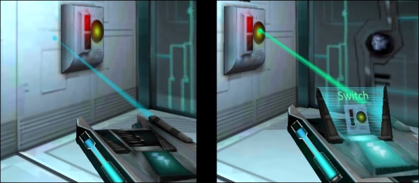
When the player aims at an interactive element, the taser displays information about it
In the image on the left-hand side, the player isn't aiming at anything; the taser gun shows nothing special because, if he shoots right now, nothing will happen.
In the right-hand image, the player now aims at an interactive switch; the aiming laser turns green instead of blue, and the screen attached to the taser gun displays information about the concerned element. With this feedback, the player knows that, if he shoots now, he will activate the aimed switch successfully.
Finally, feedback also acts as a reward and boosts the player's feeling of competence as it makes his in-game successes more explicit.
The workload criterion is here to ensure that our player is not overwhelmed with information. It concerns the elements of the interface that play a part in reducing the perceptive or short-term memory charge, thus increasing the efficiency of the system/user dialog.
It is important to keep in mind that increasing the workload also increases the risks of error, especially for beginners. Moreover, if the player isn't distracted by non-relevant information, he will accomplish his task more efficiently.
This criterion is responsible for a large part of the recent user interface evolution in games. Can you remember a time when a game displayed your character's health bar, name, and unequipped weapons at all times?
Well, that was unnecessary workload; it cluttered the interface and required the player to intentionally focus on UI elements linked to the action he was currently performing. The player had to make his own selection of information.
Today, in most games (except ones that require constant monitoring of health, such as versus-fighting), the health bar system is disguised in feedback; example techniques include blood splatters on the screen, controller vibrations, and louder heartbeat sounds. By doing so, the game becomes more immersive; more importantly, information cluttering is reduced, decreasing the workload at the same time.
The objective is to make sure you give the necessary information to the player at the right time, while hiding any other non-relevant item that could increase the workload.
Reading information onscreen is a task in itself; thus, we should try to reduce the complexity of these elements to make the reading process easier. We must also limit to a minimum the number of necessary actions to complete a specific task.
We should make information easy to read, use concise terms, and avoid ambiguous icons. This works for all types of user interface elements: button labels, text boxes, tutorials, and more.
In the following screenshot, the player has just picked up a jetpack that allows him to fly. You can see two different versions of the tutorial: the one at the top is long and the one at the bottom is concise, which makes it easier to read and understand:
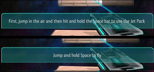
The tutorial sentence at the bottom is more efficient and demands less reading effort thanks to brevity
How you write your words and phrases has an impact on the workload. Now, let's talk about information density.
We must try to reduce the informational charge of all elements. Focus on what the player needs to see to succeed in his current task. Choose wisely what information needs to be displayed at all times according to your gameplay, and keep it to a reasonable amount.
Then, think about your navigation. What needs to be accessed often? What is rarely accessed, but remains critical?
If many information items are within the same area, think about how you can separate them and how you can make the most important elements more visible than the others.
Explicit control criteria concern both the system's ability to take into account the player's explicit actions and the control the player has over the processing of these actions.
The relationship between the player's actions and the system's responses must remain explicit. From a software usability standpoint, it's important that the system only executes actions explicitly requested by the user at the moment they are requested. If a delay is implied, it must be explicitly shown to the user. However, in video games, events can happen regardless of what the player does—so how can we apply this criterion?
The answer is strongly related to a criterion discussed earlier: feedback. What matters here is that the player knows his actions have been considered, and he should never doubt whether the system registered it or not. If he has to do it again, he should immediately know it too.
Actions triggered by the machine should not look like they have been triggered by the player unless your target experience is to confuse him.
The user control criterion also has to be adapted to our field. Generally, we want the user to always be in control of any action in progress. He should be able to stop, resume, cancel, or repeat an action.
In video games, control regularly switches between the player and the game. The player needs to clearly know when he is in control and when he's not.
The player might sometimes need to perform actions quickly; in that case, he shouldn't waste time understanding what is expected of him. For example, think of a player who has to react quickly by hitting a button instantly during a cut-scene (quick time event); even though he isn't really in control of his character, he must know precisely what's expected of him without having to think. This is illustrated in the following screenshot:
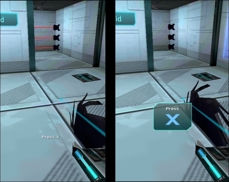
In Space Run 3D on the PC during a non-interactive cut-scene, the player must avoid the saw by hitting the X key instantly
In the left-hand image, we can see what we would call a bad indication: the X key indicator isn't more obvious than the Press word. The entire sign itself isn't very readable; the white label is hard to distinguish from the bright colors of the background.
As for the right-hand side image, the sign is more clear and non-ambiguous; the X key indicator is much larger than the Press word, and it's in a distinct blue color. Moreover, it's more readable thanks to the contrast between the dark background and bright text.
A system's adaptability is its capacity to react and adapt to its context and users. Therefore, it must be flexible enough to answer the needs of a targeted audience despite their individual differences and preferences.
The system needs to provide different ways to complete the same task: an easy, slower way, and a faster way that usually requires some training. This ensures that beginners are guided through their first steps, while experienced users can be more efficient and avoid being irritated by repetitive and time-consuming actions.
The adaptability criteria can be split into two more specific criteria: flexibility and customization.
It is important to take into account the user's experience; he can be a beginner or an experienced user. Flexibility refers to the available means to ensure the system can suit both.
For example, you can hide, sneak in, and move silently, or you can use a sniper rifle, eliminate enemies one by one, and go through the room—this is gameplay flexibility.
User interface flexibility is more about different ways of achieving the same action in the game. Certain game types are more suited to having different ways to execute actions. For example, in real-time strategy games, you can execute all tasks with the mouse by clicking successive buttons. The beginner will hover over the desired buttons, read their tooltip, and remember their icons and positions in the layout.
As a player acquires experience with the game, they will no longer need to read the tooltips and will click on buttons without having to read about their function.
Finally, they will learn their associated shortcuts and will perform the task much faster, but it will have been necessary for them to learn the associated keys in the right order.
Opening your inventory by clicking the Inventory button of the in-game user interface or hitting I on the keyboard is also an example of a flexible command within the user interface.
A good method to decide whether you need to apply flexibility to your interface is to ask yourself these questions:
If your answer to the preceding questions is yes, then it's a good idea to think about flexibility in your UI design.
Customization applies to managing your player's preferences. You shouldn't assume whether your player is right/left handed or whether he'd prefer to invert his vertical and horizontal axes—you should let him choose.
Player preferences, such as PC key mapping, mouse sensitivity, or controllers' predefined configurations, are types of customization and will improve your game's adaptability criterion.
Error management is about preventing or reducing the chances of the player committing a mistake. A game has to be defined and tested to prevent errors. Still, some of them can't be avoided. That's why we need to consider error recovery.
In order to enhance error recovery, you have to provide feedback to inform the player of their error and help them understand how they can correct it.
Why would we try to prevent mistakes if they can correct them easily? We do that because errors create interruptions. They stretch the duration of transitions between UI pages or game states; therefore, they have a negative impact on the global experience and fluidity of the navigation/gameplay.
Moreover, interruptions also have a negative impact on the player's effectiveness to plan and complete tasks; if he knows exactly what his next five actions are and is interrupted just after completing the first one, the correction of this latter mistake might reduce his ability to perform the next four actions according to how they were planned and might lead to frustration—and frustration is fun's worst nightmare!
Consider the following situation as an example: you're hitting a nail with a hammer. The hammer is a part of you and an extension of your arm—your focus is on the nail itself. If the hammer breaks or behaves unexpectedly, your focus is drawn to the ineffective instrument, and you lose focus on what you're supposed to do.
We must avoid situations where our UI acts as the flawed hammer and unexpectedly draws your player's attention.
We have three important steps for error management:
- Protect the user from errors.
- Inform the user precisely about the relevant error.
- Let the user correct the error easily.
Let's first see how we can protect the user from making mistakes.
First of all, before we think about how we can inform the user about errors or correct them, we need to ensure that the most regular and important mistakes do not occur.
For example, on console or mobile games, if only letters are authorized as a nickname, we shouldn't wait for the user to click on the Confirm button to inform him of it.
Protecting him from that error would simply mean not allowing him to enter a number; but that would not actually inform him that he cannot do it—he would be asking himself "I want to enter the nickname carrot24! Where are the numbers?!"
Therefore, a good solution here would be to do both: while he's writing his nickname, we inform him that only letters are authorized and make sure he cannot enter numbers by removing them from the virtual keyboard.
This is possible with mobile devices and consoles since we can customize the displayed virtual keyboard. For a PC game, however, we cannot remove the numbers keypad from his physical keyboard. We would still tell him that he can only enter letters but, since protection from the mistake of entering a number isn't possible, we also would need to inform him that entering anything other than a letter is a mistake.
The second element of error management is informing the user when an error occurs. The error feedback message should be clear, precise, and easy to understand.
For the example of a PC keyboard, with nicknames authorizing letters only, telling them that they just entered an invalid character isn't enough—maybe numbers aren't authorized, yet accents and special characters are? The user doesn't know that.
Here's an example of both a bad and a good error message for that context, which would be displayed as soon as the player enters an invalid character:
- Bad Error Message: For example,
Invalid Character. This message isn't precise enough. Why is it invalid? Which character did I just enter, and what are the valid characters? - Good Error Message: For example,
'5' is an invalid character - only letters are authorized!Here, the user knows what mistake he's just made (entering the invalid5character) and now knows he can avoid making the same mistake again by entering letters only.
As for a gameplay example, if the player must repeatedly press the A button, and he's currently hitting the B button instead, we can provide visual feedback highlighting the A button icon even more, making it more obvious that he's pressing the wrong input.
Once the user is informed of his mistake, there must be an easy and instant way to correct it without having to go through a painful and time-consuming process.
It is especially important to always have an easy correction for destructive or grave mistakes. For example, if the user requests to save his game over an existing one, asking him for a confirmation is a good idea. Indeed, if the user has selected that save slot by accident, he will be able to correct his mistake and prevent the loss of save data.
In the preceding example, the save file overwrite is both a protection and correction because of the following reasons:
- It protects the user from an accidental/wrong file selection
- It gives him the ability to correct his mistake easily by selecting the No option
We can sometimes prevent the user from having to correct his mistake, and that's even better. In the case of our nickname allowing letters only, if the player enters a number, we will of course inform him of his mistake, but we can save him the pain of hitting the Backspace key by simply not taking into account the number he just entered.
Consistency refers to the fact that user interface elements and logic (words, procedures, codes, expressions, buttons, and more) are kept the same in identical contexts.
Procedures, labels, and commands are more recognizable when their position, format, and syntax are identical from one screen to another. In these conditions, the system is more predictable, and the learning process is more generalizable; thus, the error risk is reduced.
It is important to create obvious patterns in design, layout, and language throughout the game to facilitate efficiency; once a player learns how to do something in one context, he should be able to transfer that skill to other contexts within the game.
A lack of consistency considerably increases the search time for a desired command, leading to confusion. This confusion has a negative impact on the player's experience and eventually discourages him—especially if his mistakes are due to a UI or game logic that isn't valid throughout the whole game.
For example, if the X button to close a window is located in the top-right corner, it should always be placed there and have the same appearance—whatever the window's content is.
If the jump action is located in the bottom-left corner of the screen at the beginning of the game, then this area shouldn't be used for crafting in another context because these two actions belong to different categories. On the other hand, it could be used for flying, if the capacity to fly overlaps or replaces the jump capacity later in the game.
Now that we've discussed usability and heuristics, we can talk about how to test your game and UI.