
In the previous chapter, sketches of screens were created. Now, you will start developing the first screen—the Menu page, which is shown after launching the game.
At the beginning, you will create a directory for files regarding the pages, not to place all files just in the main project directory. To do this, you should perform the following:
- Choose the Add and New Folder option from the context menu of the
SpaceAim3Dproject (not solution) in the Solution Explorer window - Type
Viewsas the directory name - Confirm operation by pressing Enter
Next, move the automatically generated MainPage.xaml file into the Views directory, just by drag-and-drop operation.
The last necessary modification involves renaming the existing MainPage.xaml and MainPage.xaml.cs files to GamePage.xaml and GamePage.xaml.cs, respectively. It is required, because the current version of MainPage.xaml contains code that presents the graphics rendered by Direct3D, which—in this example—should be located on the Game page. To rename the file, perform the following:
- Select the Rename option from the context menu of the
MainPage.xamlfile in Solution Explorer - Type
GamePage.xaml - Confirm operation by pressing Enter
The name of the MainPage.xaml.cs file is changed automatically, as well. However, the content of these files remains unchanged. Thus, you need to open GamePage.xaml and replace the following line:
x:Class="SpaceAim3D.MainPage"
with:
x:Class="SpaceAim3D.Views.GamePage"Then, open GamePage.xaml.cs and change the namespace (to SpaceAim3D.Views), the name of the class (from MainPage to GamePage), as well as a name of the constructor (to GamePage). As a result, the code should be similar to the following:
namespace SpaceAim3D.Views
{
  public partial class GamePage : PhoneApplicationPage
  { (...)
    public GamePage()
    {
      InitializeComponent();
    } (...)
  }
}
Currently you can add a new application page that represents the Menu screen, by performing the following steps:
- Choose the Add and New Item option from the context menu of the
Viewsdirectory (not the project node) - Select the Windows Phone Landscape Page option
- Type the page name (
MenuPage) - Click on the Add button
The MenuPage.xaml and MenuPage.xaml.cs files are created automatically.
You should not forget about specifying the page opened after launching the application. By default, the MainPage.xaml file from the main directory is used, however, you do not have such a file. Thus, you should set the Menu screen as the default screen by updating the manifest file (WMAppManifest.xml). The only required modification involves changing the Navigation Page property (on the Application UI tab) to Views/MenuPage.xaml. When the change is made, you should save the manifest file.
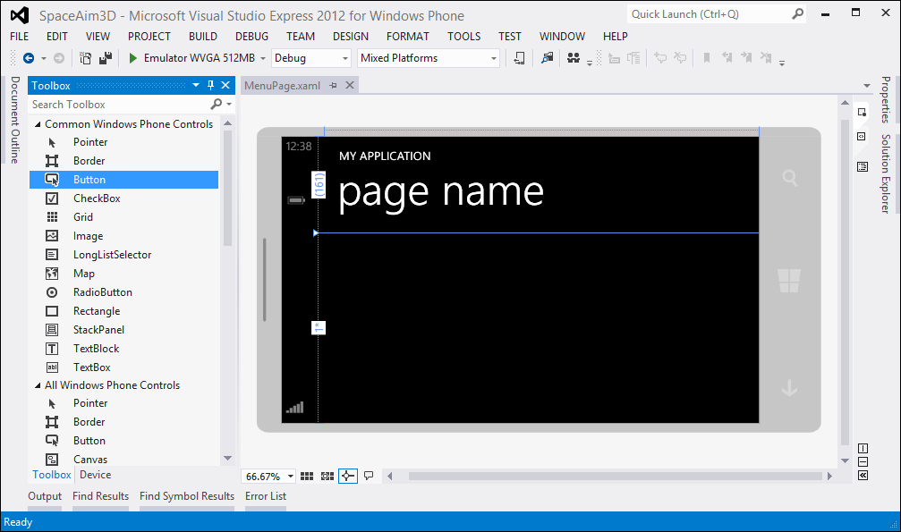
The integrated development environment automatically opens the .xaml file in a specialized editor that consists of two parts—design (on the left) and code (on the right). Therefore, it is possible to compose pages either visually or by writing code in XAML language, as presented in the following part of this section.
The first approach requires an additional window called Toolbox. It can be found in the left part of the IDE, or opened by choosing the View and Toolbox option from the menu.
The Toolbox window contains a list of controls that can be placed on the page. They are shown in two groups: Common Windows Phone Controls and All Windows Phone Controls. Of course, the first group contains a smaller number of elements, but presents only those that are more frequently used while developing applications. They include controls that represent, for example, a button that can be pressed by the user (Button), a special field which allows users to enable or disable an option (CheckBox), an image (Image), a map (Map), a text (TextBlock), or a field where the user can type text (TextBox).
The Toolbox window is shown in the following screenshot:
To place a control on the page, you should choose a suitable one from the Toolbox window and drag it to a proper location. Then, it is possible to easily adjust its size, move to a different location, or even rotate.
Each control has many properties that can be adjusted using an additional window, named Properties. If it is not visible in the IDE, it can be opened by choosing the View and Properties Window option from the menu.
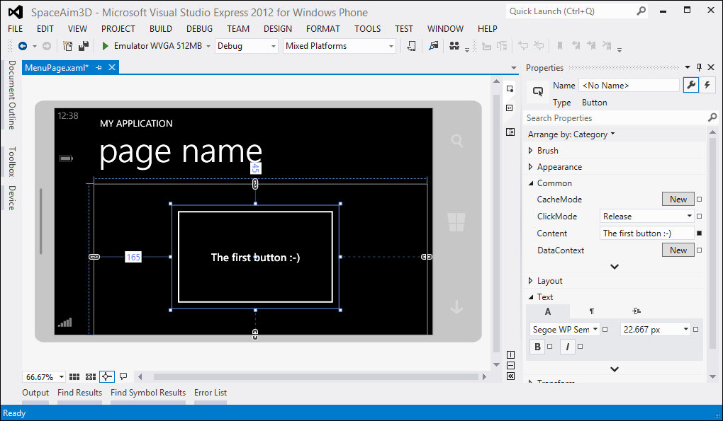
As an example, drag-and-drop the Button control from the Toolbox window to the page. Then select it by pressing the left mouse button. Its properties should be displayed in the Properties window. They can be arranged by category (default), name, or source. To change the text displayed on the button, you should modify the Content property (in the Common group), as shown in the following screenshot. Of course, there are many other settings, including the font size and weight (in the Text group).
You can easily remove a control by selecting it and pressing the Delete button. A suitable option is available in the context menu as well.
It is worth mentioning that the visual editor supports zooming in and out, showing a grid, and snapping elements to it. The designer can be adjusted by using buttons located at the bottom of the window.
Apart from using the designer, you can create application pages by writing the XAML code. As mentioned in Appendix B, Languages and Technologies, XAML is a language based on XML that allows you to describe the user interface in a declarative way.
A page that is based on the Windows Phone Landscape Page template contains some code in XAML that can be adjusted, for example, by adding new controls. Their parameters can be also specified directly in the textual form in XAML, without using the designer.
The automatically generated XAML code contains phone:PhoneApplicationPage as a root element, as shown in the following code:
<phone:PhoneApplicationPage
  x:Class="SpaceAim3D.Views.MenuPage" (...)
  FontFamily="{StaticResource PhoneFontFamilyNormal}" (...)> (...)
</phone:PhoneApplicationPage>
The root element has a set of attributes that represent a default font family (FontFamily), font size (FontSize), foreground color (Foreground), value indicating whether the system tray is visible (shell:SystemTray.IsVisible), as well as supported and default orientation (SupportedOrientation and Orientation). Inside the root, only one element can be placed. Thus, to add multiple controls (for example, a few buttons and captions) on the page, you need a special construction that allows to group many elements and decide how they should be arranged. Such a task is accomplished by the layout control that can be added as a child to the root element.
The layout controls (Grid, StackPanel, and Canvas) allow you to arrange other elements in a convenient way. They are presented in this section, together with some examples.
Tip
Downloading the example code
You can download the example code files for all Packt books you have purchased from your account at http://www.packtpub.com. If you purchased this book elsewhere, you can visit http://www.packtpub.com/support and register to have the files e-mailed directly to you.
Grid is a layout control that can be understood as a kind of table (with a set of rows and columns), which contains child controls. It can be represented by the following code:
<Grid>
  <Grid.RowDefinitions>
    <RowDefinition Height="Auto" />
    <RowDefinition Height="1*" />
    <RowDefinition Height="1*" />
  </Grid.RowDefinitions>
  <Grid.ColumnDefinitions>
    <ColumnDefinition Width="2*" />
    <ColumnDefinition Width="1*" />
  </Grid.ColumnDefinitions>
  <Button Content="Button #1" Grid.Row="0" Grid.Column="0" />
  <Button Content="Button #2" Grid.Row="0" Grid.Column="1" />
  <Button Content="Button #3" Grid.Row="1" Grid.Column="0" />
  <Button Content="Button #4" Grid.Row="1" Grid.Column="1" />
  <Button Content="Button #5" Grid.Row="2" Grid.Column="0" />
  <Button Content="Button #6" Grid.Row="2" Grid.Column="1" />
</Grid>
In the previous code, the RowDefinitions property of the Grid control specifies rows and their heights. The Auto value (in case of the first row) indicates that its height is automatically calculated, based on the content placed inside. Two following rows have the Height value set as 1*. This means that both rows have exactly the same height (proportion 1:1). You can also set a fixed height for a row by specifying it as a number (without a star).
The Grid control contains two columns. The first one has a Width value set as 2*, while the other as 1*. This means that the first column should be twice as wide as the second one (proportion 2:1). Of course, you can specify their widths using fixed values or automatic calculation, depending on the content.
The arrangement of rows and columns is presented in the following figure:
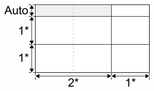
Apart from specifying rows and columns, the Grid control contains six additional Button objects that should be displayed inside. Each of them has a text defined as a value of the Content property. An arrangement of Button objects inside the Grid control is set using the Grid.Row and Grid.Column attached properties (the Row and Column properties of the parent Grid). It is worth remembering that the indices of rows and columns start from zero, instead of one. Thus, to indicate that a control should be placed in the first column and in the second row, you should set the value of Grid.Column to 0 and the value of Grid.Row to 1.
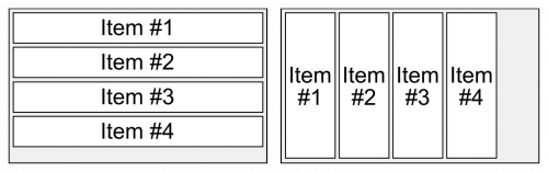
The StackPanel control is another layout control that arranges elements in a quite different way than the Grid control does. In this case, all controls are placed vertically or horizontally without the necessity of specifying rows and columns. StackPanel can be created directly in the XAML code, as presented in the following snippet:
<StackPanel>
  <TextBlock Text="Item #1" />
  <TextBlock Text="Item #2" />
  <TextBlock Text="Item #3" />
  <TextBlock Text="Item #4" />
</StackPanel>
The usage of StackPanel is really simple. You only need to place the controls inside the StackPanel element. In the code presented previously, the TextBlock controls are used, and they display some text on the page. Here, you use the default font settings, but the TextBlock controls can be adjusted, and can use various text fonts, sizes, as well as colors.
By default, the StackPanel layout control arranges elements vertically. However, you can change this behavior by setting the value of the Orientation property to Horizontal, as shown in the following code:
<StackPanel Orientation="Horizontal"> (...)
</StackPanel>
A sketch of the elements arrangement, depending on the StackPanel orientation, is presented in the following figure (vertical—on the left, horizontal—on the right):
Of course, both StackPanel and Grid controls can contain various elements, for example, a few Button, TextBox, and CheckBox controls at the same time.
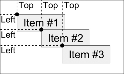
The last layout control is Canvas, which makes it possible to arrange elements by providing coordinates. Thus, you can decide precisely in which location the control is placed. The distance from the top edge of the Canvas control is specified as the value of Canvas.Top, while from the left edge as the value of Canvas.Left. You can also choose a suitable z index (as a value of Canvas.ZIndex) to indicate which controls should be visible at top.
Similar to the Grid and StackPanel layout control, the Canvas control can also be created in XAML. Example code is presented as follows:
<Canvas Width="300" Height="200">
  <TextBox Text="Item #1" Canvas.Top="25" Canvas.Left="25" />
  <TextBox Text="Item #2" Canvas.Top="50" Canvas.Left="50" />
  <TextBox Text="Item #3" Canvas.Top="75" Canvas.Left="75" />
</Canvas>
In this example, you have three TextBox elements. The first one is located 25 pixels from the top and left edge, the second at 50, while the other is at 75. The Canvas control has specified width and height (300 and 200 pixels, respectively). A sketch of this example is shown in the following figure:
It is worth mentioning that the Canvas control is used frequently in 2D games developed in XAML, because it allows you to place some elements (for example, representing players or buildings) in particular locations on the page.
Let's go back to the Menu screen. Currently, you know some basic information about layout controls that are crucial for planning the structure of the first screen in the example game. It should have a header at the top and some options (drawn as asteroids) below. It seems that the Grid control is a good choice for the main layout control for this screen.
The basic version of XAML code can be the following:
<phone:PhoneApplicationPage x:Class="SpaceAim3D.Views.MenuPage"
  xmlns="http://schemas.microsoft.com/winfx/2006/xaml/presentation"
  xmlns:x="http://schemas.microsoft.com/winfx/2006/xaml" (...)
  FontFamily="{StaticResource PhoneFontFamilyNormal}"
  FontSize="{StaticResource PhoneFontSizeNormal}"
  Foreground="{StaticResource PhoneForegroundBrush}"
  SupportedOrientations="Landscape" Orientation="Landscape">
  <Grid>
    <Grid.ColumnDefinitions>
      <ColumnDefinition />
    </Grid.ColumnDefinitions>
    <Grid.RowDefinitions>
      <RowDefinition Height="Auto" />
      <RowDefinition Height="*" />
    </Grid.RowDefinitions>
  </Grid>
</phone:PhoneApplicationPage>
The first line indicates that the MenuPage class (from the SpaceAim3D.Views namespace) contains logic related to this page. This means that handing, for example, pressing the asteroids (acting as menu options) will be performed in that class.
A few following attributes of phone:PhoneApplicationPage specify namespaces. Prefixes such as x, phone, shell, d, or mc sometimes appear in the XAML code (like in case of PhoneApplicationPage) and are related to particular namespaces.
Then, a default font family, font size, and foreground color for the page are set, using resources. For this reason, a syntax of the property value is a bit different. You use StaticResource and then a resource key, separated by a space and placed together inside braces, like {StaticResource PhoneFontFamilyNormal}. There is no need to create these resources on your own, because there is a set of already defined ones, regarding font families, sizes, or colors specific to the Windows Phone platform.
The Grid control has only one column and two rows. The height of the first one is calculated automatically based on the content (Auto). The second one fills the remaining space (*).
The next step consists of adding a header that should present the name of the game. What is more, the word 3D should be bold. To do this, the following code can be used:
<Grid> (...)
  <TextBlock Grid.Row="0" Grid.Column="0"
    Style="{StaticResource PhoneTextTitle1Style}">
    Space Aim <Bold>3D</Bold>
  </TextBlock>
</Grid>
The header is represented by the TextBlock control, which uses one of the predefined styles, named PhoneTextTitle1Style. The text for the TextBlock control can be specified by:
- The value of the attribute (attribute syntax):
<TextBlock Text="Space Aim 3D" /> - An additional element (property element syntax):
<TextBlock> <TextBlock.Text>Space Aim 3D</TextBlock.Text> </TextBlock> - The content (content element syntax):
<TextBlock>Space Aim 3D</TextBlock>
The previous examples show just the normal text, without any bold part. To indicate that a part of its content should be in bold, an additional Bold element is used, and you need to choose the third approach (the content element syntax). Otherwise, the XAML markup will not be correct.
Currently, you will replace the default black background of the screen with a solid color. To set the background color for the whole Grid control, you can set the Background property to a specific color. This can be a name (such as Black) or its representation in the #AARRGGBB format (where A denotes alpha, R—red, G—green, and B—blue). In the following example, a solid color is used:
<Grid Background="#FF3A3D44"> (...) </Grid>
Using an image as the background is often a better approach. To achieve this, some modifications need to be made in the XAML code. First of all, you need to remove the Background property (attribute syntax) from the Grid control, and then add Grid.Background as the property element syntax inside the Grid control. There you can use not only colors specified as strings, but also some more complex objects, such as images and gradients.
In the case of bitmaps, you can add the ImageBrush element and specify a path to the image (for example, Background.png from the Assets directory):
<Grid> (...)
  <Grid.Background>
    <ImageBrush ImageSource="/Assets/Background.png" />
  </Grid.Background> (...)
</Grid>
To add an image file to the project, you should select Add and Existing Item from the context menu of the Assets directory, and choose the file. When the file is added, just rebuild the project by selecting the Build and Rebuild Solution options from the menu. Now, the background image should be visible in the design part.
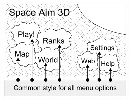
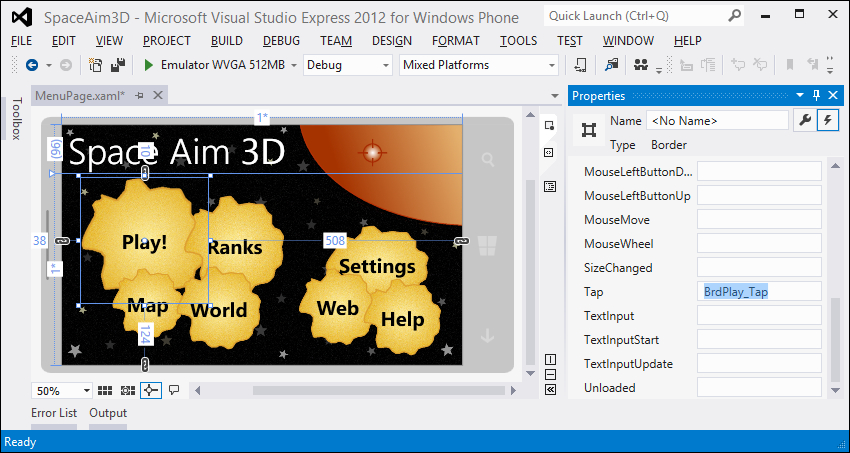
The Menu screen should contain seven buttons that represent the options: playing the game, showing ranks, displaying players in the vicinity on the map and in the augmented reality, adjusting settings, as well as showing the Web and Help screens. Each button should be drawn as an asteroid to be consistent with the style of the whole game. Each asteroid shape is similar to an ellipse.
Thus, you can use the Border control with a suitable value of the CornerRadius property to represent each of them. The Border control simply draws a border around the element, however, it can be also rounded. Here, you use the Border control with TextBlock, which displays a caption indicating an operation that is performed after pressing the item. The XAML code regarding the single option is as follows:
<Grid> (...)
  <Border Grid.Row="1" Margin="38,10,508,124"
    CornerRadius="125" Background="White">
    <TextBlock Text="Play!" FontSize="40" FontWeight="Bold"Foreground="Black" VerticalAlignment="Center"
      HorizontalAlignment="Center" />
  </Border>
</Grid>
The Border control is placed in the second row of the Grid control and has a suitable margin and size, set in the visual editor to place an asteroid in a proper location. Its corner radius is equal to 125 to form an ellipse. For testing purposes, its background color is set to White.
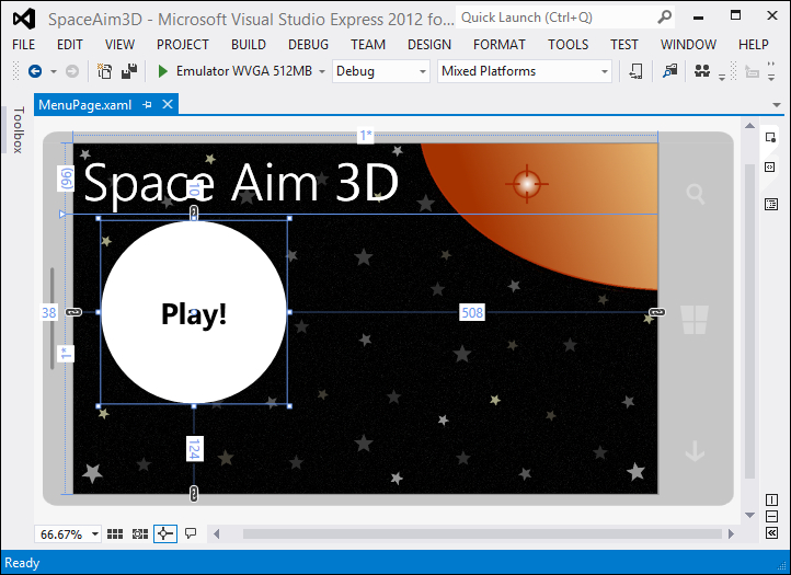
The TextBlock control is added inside the Border control. In the following example, it shows the text Play! with a bold black font of size 40. The text is centered both vertically and horizontally inside the border (the VerticalAlignment and HorizontalAlignment properties), as shown in the following screenshot::
As mentioned earlier, the main screen should contain seven menu items. Currently you have just one and many properties have to be specified for both the Border and TextBlock controls. You could simply copy and paste the same part of code six times and change the text, however it is not a good idea, because any modification later will require changes in a few places.
You can solve the problem mentioned earlier by using styles. They allow you to apply a set of properties to many controls, as shown in the following diagram regarding the Menu screen. What is interesting is that you can automatically apply style for all controls of a specified type (in an implicit way) or only for a particular subset of elements (explicitly). Both types are presented in practice in this section.
In case of the Menu screen, you will specify a style for a single menu item and then apply it automatically to all Border controls that represent options. The corner radius should be set to 125, and the /Assets/Asteroid.png image should be used as the background of each asteroid. You should not forget about adding the image to the project.
Each style is defined as the Style element inside resources, as presented in the following code:
<phone:PhoneApplicationPage (...) >
  <phone:PhoneApplicationPage.Resources>
    <Style TargetType="Border">
      <Setter Property="CornerRadius" Value="125" />
      <Setter Property="Background">
        <Setter.Value>
          <ImageBrush ImageSource="/Assets/Asteroid.png" />
        </Setter.Value>
      </Setter>
    </Style>
  </phone:PhoneApplicationPage.Resources> (...)
</phone:PhoneApplicationPage>
The Style element contains the TargetType property, which indicates controls to which the style is applied. Inside Style, there are the Setter elements that contain two attributes named Property and Value. The first one indicates the name of the property whose value you want to set, while the other specifies its value. If you cannot specify a value as an attribute, you can use another way—the Setter.Value element. Such approaches are very similar to the way in which you can set a value for the property of the control, without using styles.
The second type of styles is applied by the developer to a subset of controls. This means that only controls that are chosen by the developer will use the settings stored in the style. In the Menu screen, this approach is used by the TextBlock controls. The creation of this is very similar to the previous one, however, such a style requires a key (x:Key property), as shown in the following code:
<Style TargetType="TextBlock" x:Key="ButtonText">
  <Setter Property="FontSize" Value="40" />
  <Setter Property="FontWeight" Value="Bold" />
  <Setter Property="Foreground" Value="Black" />
  <Setter Property="VerticalAlignment" Value="Center" />
  <Setter Property="HorizontalAlignment" Value="Center" />
</Style>
The style presented in the previous code has the key ButtonText, and it can be applied to TextBlock controls. The style sets values of a few properties—the same as earlier available for the TextBlock element. It is worth mentioning that the explicit style is chosen mainly for demonstration purposes, because currently you can define it in an implicit way, as in case of the style for the Border controls.
When the styles are defined, the code representing particular menu options is significantly shorter, because you do not need to specify values of all properties for each Border and TextBlock control. What is more, it makes the code easier to maintain, because you can more easily introduce changes. For instance, if you need to change the background image, you can just change the filename in one place.
The XAML code of the first menu item is presented in the following snippet. You can define the six menu items in a very similar way, just by changing the Margin property and displayed text:
<Border Grid.Row="1" Margin="38,10,508,124">
  <TextBlock Style="{StaticResource ButtonText}" Text="Play!" />
</Border>
As you could see, the style for all Border controls is applied automatically. However, to use the style for selected TextBlock controls, the developer needs to set the value of the Style property to an object representing the style (a resource with the ButtonText key).
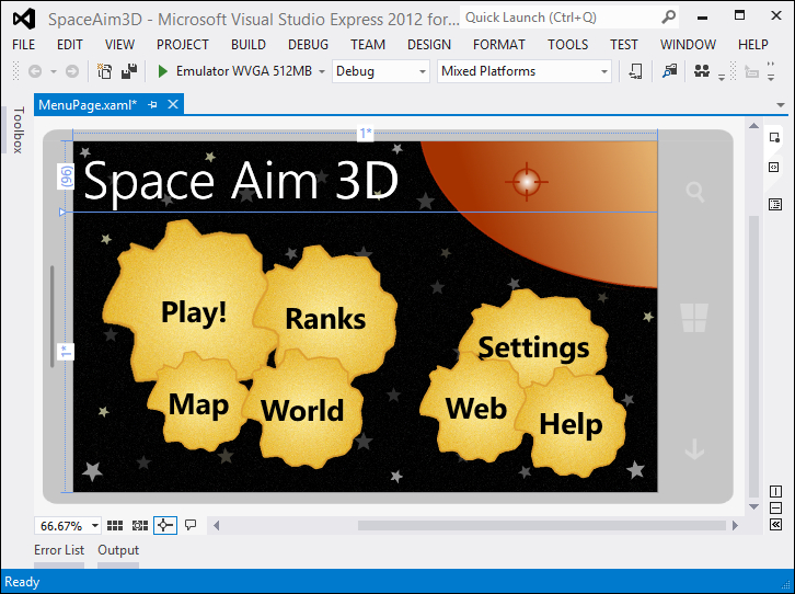
Currently, you have almost finished a creation of the first screen that will be used in the game. It should look as follows:
As you can see, the IDE makes development of application pages really easy. You can design them visually, by writing a code in XAML, or even by combining these two approaches. The latter possibility was used while selecting proper locations for all of the asteroids.
Another interesting feature of the IDE is IntelliSense, which automatically prompts the names of controls, their parameters, or even values. This makes the creation of XAML code much faster and can eliminate mistakes. A similar list with possible options is available in case of the C# and C++ languages, which you will use in the following chapters.
You can see the Menu screen, however, nothing will happen after pressing the asteroids representing the menu options. Thus, let's handle such situations and navigate the player to other screens, such as Game or Map. How can you know that the user pressed the asteroid? To get such an information you can use events, for instance, the Tap event, available in the case of the Border control. Whenever the user taps the menu item, the Tap event is fired and its handler is called. Here, in the C# language, you can specify the operations that should be performed. Therefore, you are able to navigate the user to another screen.
To specify a method that is called after tapping a menu item, you should:
- Select a suitable
Bordercontrol. - Click on the Event handlers for the selected element button (with a lighting icon, in the top-right corner) in the Properties window.
- Type the name of the method (for example,
BrdPlay_Tap) for theTapevent, as shown in the following screenshot. - Press Enter.
The method (in the C# language, in the MenuPage.xaml.cs file) and required attribute for the Border control (in XAML code) are generated automatically.
Each Border control can have a separate handler for the Tap event or you can create a common handler which will be executed whenever any Border control is tapped. Both approaches are presented in the following diagram:
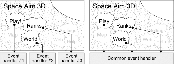
Having separate event handlers is a convenient approach when various operations have to be performed after pressing each asteroid, and you cannot perform the same (or very similar) actions in case of at least two controls. In this case, when the user presses the Play! button, the BrdPlay_Tap method is called. If the Ranks button is pressed, the BrdRanks_Tap method is used instead.
By generating separate handlers for the Tap events for all Border control, seven methods are created in the MenuPage.xaml.cs file, and each of them contains code similar to the following (currently the body of each method is empty):
private void BrdPlay_Tap(object sender,
  System.Windows.Input.GestureEventArgs e) { }
Regarding the XAML code, each Border control should have an additional Tap attribute, as shown in the following snippet:
<Border (...) Tap="BrdPlay_Tap">
  <TextBlock Style="{StaticResource ButtonText}" Text="Play!" />
</Border>
It is worth mentioning that each Border control has a different value of the Tap attribute, which represents the name of the event handler (a method in the MenuPage.xaml.cs file).
Another approach can be used if the operations performed after pressing at least two methods are very similar. In such a case, you do not need to create separate methods for each of them—you can use only one. This does not mean that you have to perform exactly the same operation, because you can recognize the sender object and choose a suitable action.
In case of the Menu screen, the actions taken after pressing each asteroid are very similar, because you just need to navigate to another screen. Thus, it is a good idea to simplify the implementation of the Menu screen by replacing seven separate event handlers with one.
At the beginning, remove the previously generated methods from the MenuPage.xaml.cs file, as well as the Tap attributes from the MenuPage.xaml file. Then, you should create handlers for the Tap event for each Border control using the same name, for example, BrdPage_Tap. At the end, each Border element has additional Tap property with exactly the same value, which indicates the method which is called whenever this event is fired.
To be able to easily recognize the pressed element, you can set a suitable value of the Tag property for each Border control. It will represent the name of the operation performed after pressing the asteroid—play, ranks, map, world, settings, web, and help. Assigning a value to the Tag property is really simple—you can do it in the Properties window (under the Common category) or by modifying the XAML code manually. At the end, the code for a single Border control is similar to the following:
<Border (...) Tap="BrdPage_Tap" Tag="play">
  <TextBlock Style="{StaticResource ButtonText}" Text="Play!" />
</Border>
One of the most important actions taken by the Menu screen is navigating to suitable pages after pressing menu items. The navigation can be performed using the NavigationService property, which is an instance of the NavigationService class. It is equipped with the Navigate method that takes an instance of Uri as a parameter. A proper path to the application page is important, as well as the kind of URI used.
To navigate to the GamePage.xaml page (located in the Views directory) you can use the following instruction:
NavigationService.Navigate(
new Uri("/Views/GamePage.xaml", UriKind.Relative)); Thus, you can just copy this code a few times inside the common event handler (in MenuPage.xaml.cs), modify the paths to particular pages, and add conditional expressions or the switch statement to check which instruction you need to call. However, you will use another solution, which uses a dictionary (a collection of values accessible by a key) containing mapping between the operation name (stored as a Tag property) and a path to the XAML file with a suitable application page.
At the beginning, add (to the MenuPage class) a private field that is an instance of the Dictionary generic class. Keys will represent operation names, while values will represent the paths to particular pages. The type of keys and values is string, as shown in the following code snippet:
private Dictionary<string, string> m_urls =
  new Dictionary<string, string>();
Note
There are many coding conventions regarding naming, layout, or exception handling. They are often specific to particular programming languages, such as C#. However, to comply with the style of the native part of the example game, names of all private fields (in C# and C++) will start with the m_ prefix. This does not have any additional meaning, except that it is a private field.
In the constructor of the MenuPage class, add entries into the dictionary, as follows:
public MenuPage()
{
  this.InitializeComponent();
  this.m_urls["play"] = "/Views/GamePage.xaml";
  this.m_urls["ranks"] = "/Views/RanksPage.xaml";
  this.m_urls["map"] = "/Views/MapPage.xaml"; (...)
}
It is worth noting that the path to the XAML file should contain the Views directory. Of course, you currently have only the Menu screen and a preliminary version of the Game screen, but others will be added in the next chapter.
The most important operation is performed in the BrdPage_Tap method that is called when the Tap event is fired. Its code is presented as follows:
private void BrdPage_Tap(object sender,
  System.Windows.Input.GestureEventArgs e)
{
  string page = ((Border)sender).Tag as string;
  NavigationService.Navigate(
    new Uri(this.m_urls[page], UriKind.Relative));
}
This method is called whenever any Border control is pressed, thus you need to recognize the one that was tapped. To do this, you cast the sender parameter to Border and read its Tag property as a string value. Then, you can get the path to the suitable application page (from the dictionary) and navigate to it using the code snippet presented earlier.
As you could see, in the header of the BrdPage_Tap method, the type of the second parameter is quite long, because it contains the fully qualified name, that is, not only the type name (GestureEventArgs), but also the namespace (System.Windows.Input). You can shorten it by removing the namespace from the method header, however, you need to add the following using directive at the top of the file:
using System.Windows.Input;
Tip
The IDE is equipped with a feature that makes it possible to automatically add a missing using directive for particular class name. To do this, you should select the text with unrecognized name (for example, GestureEventArgs), press the Alt + Shift + F10 shortcut, and choose a suitable option. Instead of using the shortcut, you can also click on the small rectangle presented next to the class name (after selecting the name) and choose the same option.
It is worth mentioning that the same feature can be used, for example, to automatically generate a template of the class, add a property, or even implement a particular interface by the class.
The approach presented previously involves a simple navigation between pages, when you do not need to pass any parameters. However, sometimes passing them is also required. In this case you can use the URI to send some additional data between pages. You can add them by specifying the key and value (separated by =). The following parameters are separated by &, and the first one is placed after the ? character. An example scenario is presented in the following diagram:
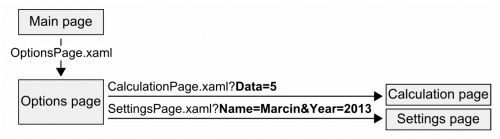
To navigate from the Options page to the Calculation page, you pass an additional parameter Data, whose value is equal to 5. In case of navigating to the Settings page, two parameters are sent—Name (Marcin as a value) and Year (2013). After sending these parameters, it is also important to read them correctly. You can do it using the QueryString property of NavigationContext, as follows:
string name = this.NavigationContext.QueryString["Name"];
int year = Convert.ToInt32(
  this.NavigationContext.QueryString["Year"]);
The QueryString property is a dictionary, thus you can read the values of particular parameters by providing their keys, for example, Name or Data (from the example presented previously). The conversion to an integer number (in case of the Year parameter) is made by the ToInt32 static method of the Convert class.