
You have already used resources in the project for specifying a default font family for the application page or choosing a suitable style for the TextBlock control. Thus, you can understand a resource as any value or object that you can later use in the application, for instance, the default font size (integer value) or the brush used as a foreground color for text.
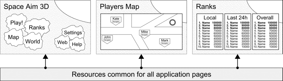
As you can remember, the resources can be defined in the Resources property of the PhoneApplicationPage element. While the resource is defined in the .xaml file related to the specific application page, it is accessible only within this file. This causes some problems in case of applications containing many similar screens. In such a situation, a much better solution will share resources between several application pages, as shown in the following figure:
Sharing resources can be achieved using the App.xaml file. All resources defined in the Resources property of the Application object are accessible to all pages. Here, you add elements representing, for example, a font color (with the SA3DFontColor key) and a few brushes (using a solid color and a linear gradient), as shown in the following code:
<Application.Resources> (...)
  <Color x:Key="SA3DFontColor">#9b450e</Color>
  <SolidColorBrush x:Key="SA3DFontBrush"
    Color="{StaticResource SA3DFontColor}" />
  <LinearGradientBrush x:Key="SA3DBackgroundBrush"
    StartPoint="0.0,0.0" EndPoint="0.0,1.0">
    <GradientStop Color="#fcec9e" Offset="0.1" />
    <GradientStop Color="#e8b937" Offset="1.0" />
  </LinearGradientBrush> (...)
  <Style x:Key="SA3DBox" TargetType="Border">
    <Setter Property="Background"
      Value="{StaticResource SA3DBackgroundBrush}" /> (...)
  </Style> (...)
  <Style x:Key="SA3DHeader" TargetType="TextBlock"
    BasedOn="{StaticResource PhoneTextTitle1Style}">
    <Setter Property="Foreground" Value="White" />
  </Style>
</Application.Resources>
In case of a solid color brush, you need to set the value of the Color property by typing a string color representation or by specifying a resource. As for linear gradient brushes, you have many ways to configure them. In the code presented previously, the color of the background (drawn by SA3DBackgroundBrush) changes from #fcec9e to #e8b937 vertically. Start and end points, as well as offsets for colors, are specified too.
Styles can also be created in Application.Resources in App.xaml instead of other .xaml files, representing particular screens. The syntax regarding a style is the same, but they can be accessible from all application pages inside the project. One of the styles is the SA3DHeader style, which is based on the predefined PhoneTextTitle1Style style. You will apply the created style for the TextBlock controls representing the screen headers (for example, Space Aim 3D on the Menu page). You will present them in white color, regardless of the current theme, that is, dark or light. After specifying the style in the App.xaml file, you should also update the MenuPage.xaml file, as presented in the following code:
<TextBlock (...) Style="{StaticResource SA3DHeader}">
  Space Aim <Bold>3D</Bold></TextBlock>