As we reach the end of our journey with the RPG game, we enter the last aspect of the framework itself. This brings to light one of the hardest parts of any game development: engagement. This centers on how you can keep the players playing the game in effect, how the game balances out to keep them challenged, and how to deliver enough varied content so they feel they are always experiencing something new.
So we'll start with a few finishing touches to the game's battle system itself and then look at deepening the background of the game.
Unlike previous chapters, the focus here will be on the implementation, showing you quite a few tips and tricks and helping you avoid some of the pitfalls of the sometimes strange Unity way of doing things. Also, as we have much to cover, this chapter will flow on to the next to give you time to pause, reflect, and then carry on.
The following is the list of topics that will be covered in this chapter:
- Preparing battle statistics and creating the game's UI
- Implementing the turn-based battle system
- Working with Mecanim in the code
- Building more advanced sprite 2D GUI systems
Taking stock of the various designs that have been floated around in RPG games, conveying important information such as health, stats, and other important details is crucial to any gameplay. If the information is too obscure, the player won't understand when they are close to death (and should run far away) or struggle to understand why their favorite magic trick just isn't going as well as it should. Similarly, if you make the UI too obtrusive, draw players' attention away too much, and obscure the real estate on the screen too much, then the result will be the same.
This balance is hard to maintain in any game, especially in RPG games, because we want to give as many capabilities as possible to our budding adventurer. It gets even harder once you start adding companions and hundreds of available skills and instant use items.
Games such as Baldur's Gate (developed by Black Isle Studios) and many of the difficult and true RPG games from the 80s took the style of surrounding the player with everything at hand.
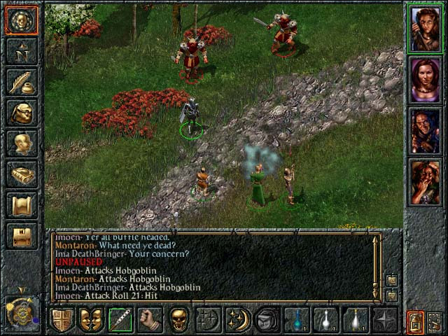
In the preceding screenshot, we see all the party members to the right, all the menu options to the left, and quick use items/skills laid at the bottom of the screen. Although functional, this style of design leaves only a small portion of the screen for the actual gameplay. As these were mostly PC titles and large screens were available, this wasn't too much of an issue.
Today, with smartphones and 10-inch tablets being the norm, this would create a large issue. Put simply, it doesn't scale well.
The developers of Fallout (developed by Interplay Entertainment) took a slightly different approach, taking a similar style to that of Baldur's Gate; it opted for an onscreen approach but were a bit more clever about the use of it.
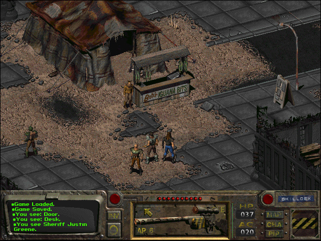
In the preceding screenshot, we see a smaller overlay screen at the bottom of the screen, taking up a lot less real estate. In this game, it was possible to change the overlay based on what was selected, allowing the selection of a character of the player's party to be displayed on the screen; this helped to change the details shown to that character.
Buttons were added to provide pop-up sections for skills, character attributes, and the map.
It also provided two modes: one for traveling and one for battle, each distinctly different based on what the player would need at the time.
A popular pattern that fits more modern titles is to use floating elements on the player's screen, taking advantages of the improvements that Fallout implemented and extending them much further.
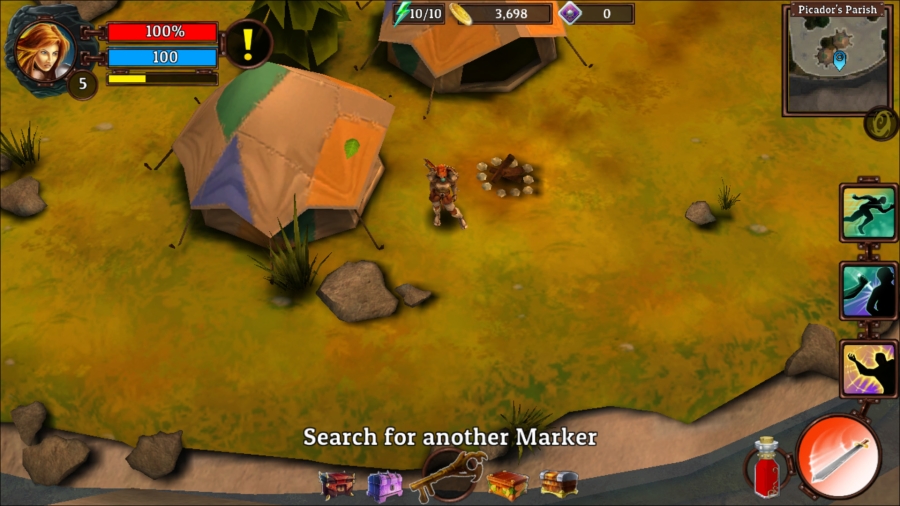
Mobile games such as Pylon (developed by QuantumSquid Interactive) follow the standard of breaking up the important UI for the player and scaling/placing them on top of the main gameplay's screen. With this, the player can easily see their important stats, such as health/magic, and has easy access to actions and skills. Additionally, the map is informative and tapping on it brings out a fullscreen version.
Each of these elements only becomes active when the player needs them and are appropriately sized, so they don't get in the way too much.
As you can see, there are many choices as to how you can layout the important game UI; however, every game is different, so you will need to match up what the player needs to do against what they need to know in order to progress.
Above all, do not sacrifice the core of the gameplay at each point in the game just for a flashy screen element, unless it adds true value to the player.