
Most applications you write will display or manipulate text at some point. Even many games have text input requirements for signup, registration, or to log a high score. Media players often have rolling commentary by other viewers and the ability to add to the social aspects of what you're watching. In short, working with text is important.
For as long as computers have been around and attached to video displays or teletypes, the display of text has been an important aspect of user interaction. Silverlight includes great support for displaying text, with a number of options that control formatting and other aspects of the display.
Of course, if all that the platform supported were the display of text, we'd be pretty limited in the types of applications we build. In addition to its display capabilities, Silverlight includes first-class support for editing text, both plain and rich text formats.
If you can enter and edit text, you may find yourself wanting to copy and paste it between various applications. Silverlight also includes facilities to enable programmatic manipulation of the clipboard to share data within the same application and across applications.
What do you do if you want to show text using a font the user doesn't necessarily have? You embed the font. Silverlight supports font embedding to ensure that your users have the exact experience you'd intended. We'll cover that and the support for international text using input method editors before we get into rich text.
Plain text is useful in many scenarios but, for others, you may want richer text with embedded formatting, images, and even UI elements. Silverlight 4 introduced the RichTextBox control, which can be used for both the display and editing of rich text.
We'll start this chapter with the coverage of the text stack and then move on to the basics of text, under the task of displaying text. Along the way, we'll look at font embedding, displaying international text, and integrating with the clipboard. The information learned when formatting the text for display will be used later when we work on entering and editing plain and rich text.
You'd be forgiven if you looked at the title of this section and thought, "System? Really? It's just text." Getting the text from the Unicode string and presenting it on displays of varying resolutions using different fonts on different systems is actually fairly complex. It's also a task we only notice when done poorly.
In reality, a text stack needs to:
Read in the source text string.
Lay out an overall block of text.
Lay out individual lines within that block.
Obtain the font information for each character, including combining characters for certain languages.
Figure out how to display bold and italics (and other styles/weights). There may be a font for it or it may need to generate pseudo-italic and pseudo-bold text.
Deal with any text expansion for fonts that support it.
Lay out individual characters within that line, including subpixel font rendering.
Render it all out to a rendering surface in software or hardware.
Any one of those individual steps is a pretty serious programming effort. Though all interesting, the internals of the text stack are pretty well abstracted away from the work we'll normally need to do. There are some places where the team has provided options we can set, though.
Before we get on to the high-level controls and elements that allow us to put text on the screen, let's take a look at how Silverlight handles character rendering using ClearType.
In chapters 6 and 7 we learned about the layout system and subpixel layout and rendering. Silverlight can handle elements aligned on subpixel boundaries, such as having a Left of 15.76 rather than just 16. This makes layout easier for design professionals and is also essential for smooth animation.
Subpixel layout and rendering applies to text as well. On Windows machines, Silverlight uses the ClearType algorithm, provided by DirectWrite, to render text using the best quality for a given resolution. An example of ClearType rendering is shown in figure 9.1.

Silverlight supports subpixel rendering and layout of anything, so the text itself may already start on a partial pixel boundary (for example, a Left of 10.32). For that reason and others, the Silverlight ClearType algorithm will produce results slightly different from the base Windows platform. The end result will still be text that's more readable and more pleasing to the eye than no antialiasing or the grayscale used in Silverlight 2.
The ClearType text rendering algorithm is a relatively expensive subpixel antialiasing algorithm that you wouldn't necessarily want to recalculate 60 times per second. Also, as a side effect of the antialiasing, you may also see text that jumps around a bit when you animate it (you'd have to look closely). For those reasons, and to support other optimizations, Silverlight includes a TextOptions.TextHintingMode attached property.
ClearType is an excellent text rendering algorithm, but it's not something you want to be calling thousands of times because it's a complex algorithm with performance implications. In addition, there are other visual optimizations applied to text that would be unnecessary if the text were animated.
Silverlight offers the TextOptions.TextHintingMode attached property to control how hard Silverlight tries to make the text look great. When set to Fixed, it uses the quality ClearType rendering and performs the calculations that make static text look great. When set to Animated, it optimizes for text that's going to change size, rotation, or angle, probably multiple times per second. Listing 9.1 shows the setting in action.
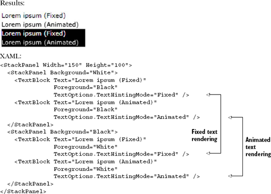
It'll be hard to tell in a printed book (one benefit of the electronic copy), but the Animated text hinting renders the text using grayscale antialiasing, whereas the Fixed text hinting (the default) renders using ClearType rendering. Figure 9.2 shows a close-up of the first word from each line on a white background as well as black.
The rendering optimized for animation avoids both the costly ClearType calculations as well as the jumping/jittering effect. If you use the animation-optimized text in small font sizes for regular text in your application, you'll see it's noticeably fuzzier than ClearType. In fact, this was an issue with Silverlight adoption for line-of-business applications in the Silverlight 2 timeframe, before ClearType was integrated into the stack.
As of this writing, ClearType isn't supported on the Mac, so it always uses some form of grayscale rendering. Also, an interesting limitation of ClearType is that it's sensitive to the orientation of the display. Since the modern ClearType implementation is meant only for LCD displays (if you have an old tube monitor hanging around, don't enable ClearType on it or the world will end in an explosion of subpixels), it takes into account the position of the actual elements (red, green, blue) and uses them to make the text more readable. If you tilt the monitor 90 degrees, those positions are out of whack, and ClearType won't work correctly.
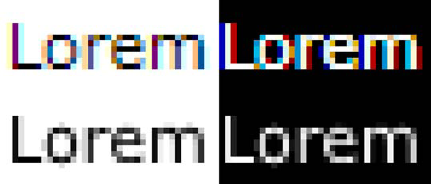
Figure 9.2. The first line uses Fixed text hinting and, therefore, ClearType rendering. The second line uses Animated text hinting and is, therefore, grayscale.
Now that we know a little about what's going on behind the scenes and how to optimize text rendering for different situations, let's look at what's available to us to actually push characters onto our display and how we can set the higher-level properties like what font to use and what size to use when rendering the text.
Displaying text is primarily addressed by an element called TextBlock. This element, which belongs to the System.Windows.Controls namespace, but which itself doesn't derive from Control, is designed to flexibly display text within a variety of scenarios. The following example shows one such scenario, as well as the basic syntax of a TextBlock:
<TextBlock x:Name="myTextBlock"
  Text="Eating a lot of fruit can help you live to a ripe old age."/>
This shows a basic way to include text within your Silverlight applications. The TextBlock can be hosted in any of the panels discussed in chapter 7.
As you've probably guessed, the Text property of a TextBlock is used to set the text to display. The text direction (right to left or left to right) is controlled via the FlowDirection property. The TextBlock provides a rich set of other styling options that mimic or exceed those found in CSS. We'll cover all of these styling options, including setting the font properties, controlling the flow of text, setting the text-related properties, and specifying the spacing options.
The TextBlock has five properties related to the styling of a selected font. These properties replace a lot of the familiar friends from CSS. Table 9.1 shows a font-related CSS property and its equivalent Silverlight TextBlock property.
Table 9.1. The font-related properties available in Silverlight and their CSS equivalents
CSS property name |
| Summary |
|---|---|---|
|
| A list of font names for an element |
|
| The size of the font |
|
| The weight of the font |
|
| Expands or compresses the font |
|
| The style of the font (for example, italics) |
These items are related specifically to the font capabilities of Silverlight. We'll now cover each of these items in detail, in the order they appear in the table.
By default, the TextBlock displays text using the Lucida Sans Unicode font on Windows machines. On Apple Macintosh computers, an almost identical font known as Lucida Grande is used. Alternatively, you can specify a different font.
The FontFamily property enables you to specify the font. More specifically, this property represents the name of the top-level font family. This is important to recognize because some fonts share a common family name; the differences between them lie in their individual features—things such as bold and italic options. Silverlight has built-in support for the font families shown in figure 9.3.
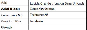
Figure 9.3 shows the nine TrueType fonts supported within Silverlight. In addition to these fonts, Silverlight has support for Eastern Asian fonts. Collectively, the nine TrueType and Eastern Asian fonts are guaranteed to look almost identical on all platforms supported by Silverlight as long as someone hasn't uninstalled the core fonts for those platforms. If you need to use a custom font, you can do so using font embedding or by referring to a local font on the machine. Previous versions of Silverlight restricted you to embedding or a white list of fonts, with no support for local fonts.
Once the FontFamily has been set, this will be the font used within the TextBlock. If your users don't have the font on their machines, the TextBlock will fall back to the default font. You can set fallback priority by providing a comma-delimited list of font family names.
FontFamily is one of the more widely used font options. Another widely used option is the FontSize property.
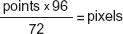
The FontSize property allows you to set the size of a TextBlock using a double-precision value. This value is set by default to 14.66 pixels, which is roughly an 11 pt font. This fact is significant because the FontSize property always represents a specific number of device-independent pixels. This can have undesired effects, because fonts are generally discussed in terms of points (pt). Thankfully, you can easily convert points to pixels using the formula found in figure 9.4.
This formula is based on the fact that Silverlight uses 96 pixels per inch and a point is defined as 72 points per inch. If you want to use a 24 pt font in a TextBlock, you need to set the FontSize property to 32 (24 * 96 / 72 = 32):
<TextBlock Text="I'm a Big Boy Now." FontSize="32" />
This basic line of XAML sets the FontSize to a 24 pt font. In addition to setting the FontSize, there are also times where you may need to work with the weight of a font.
The FontWeight property represents the heaviness, or weight, of the displayed text. This weight is often depicted as a bolding effect, but you can also go the other way and make text appear lighter or thinner. This is made possible by the fact that the FontWeight property accepts any numeric value between 1 and 999. Alternatively, you can use one of the friendly constants available in the FontWeights class:
ThinLightMediumBoldBlackExtraLightNormalSemiBoldExtraBoldExtraBlack
These values are shown in the order of increasing weight. Note that not all fonts support varying weights. In fact, most fonts support only two font weights: Normal and Bold. If the font specified within the FontFamily property doesn't support a specific weight, it falls back to the closest weight supported by the font. The fallback support for this property is also shared by another property called FontStretch.
The FontStretch property gives you the ability to either condense or expand the font associated with a TextBlock. The CSS equivalent of this property is defined within the third version of CSS (CSS3), but few browsers currently implement it. For this reason, this property is one text-related feature not usually seen within a traditional web application. But, with Silverlight, you can stylize your text with this feature using one of the FontStretches values shown in table 9.2.
These values represent the acceptable values for the FontStretch property. The percentages represent the proportion by which the normal font size is stretched. Any value less than 100 percent will condense a font and any percentage greater than 100 percent will expand a font. Either way, the percentage is only taken into consideration if the selected FontFamily has support for font stretching. Even if a font does have support for stretching, it may not have support for all stretch values. If the font doesn't support the stretch value you've selected, the FontStretch resorts to using an algorithm that searches the available fonts for one that matches the properties as closely as possible.
The FontStyle property gives you the ability to switch the text of a TextBlock into italic mode. As you've probably guessed, this property is set to a value of Normal by default. You can easily change this to Italic to give your text an italic effect:
<TextBlock x:Name="myText" Text="Going Italic" FontStyle="Italic" />
The code shows how to set the FontStyle at design time. Setting the FontStyle during runtime involves using a slightly different approach. To set a TextBlock to italic during runtime, you use the FontStyles class:
myTextBlock.FontStyle = FontStyles.Italic;
Note how this uses a FontStyles static property called Italic. This static property represents a FontStyle definition. This fact is significant because, even though you can only set a FontStyle to italic in Silverlight, WPF is a different story. WPF, which is Silverlight's parent technology, provides additional FontStyle options.
The FontStyle is but one of the five font styling options available within a TextBlock. The other four are the FontStretch, FontWeight, FontSize, and FontFamily. Collectively, these give you a significant amount of control over the font styling of a TextBlock. In addition to basic font styling, Silverlight gives you the ability to control the overall flow of text.
The TextBlock enables you to control the overall flow of text through two nested elements. These elements, called Run and LineBreak, belong to the System.Windows. Documents namespace. Both elements derive from the Inline class and have built-in support for the font features we discussed in section 9.1.1. Listing 9.2 shows how these elements can be used.
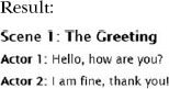
The conversation in this listing shows one way to use the Run and LineBreak Inline elements. These elements get appended in succession to the text defined in the Text property of the hosting TextBlock. In fact, the value inside the Text property itself gets converted to a Run element at runtime. This element and all the other Run and LineBreak items get stored in a collection called Inlines.
The Inlines collection stores the Inline elements of a TextBlock. By default, all the items in this collection use the styling options set by the parent TextBlock. You can override these settings by specifying new values for them within the Inline item itself. This is the approach used in listing 9.2. But, to fully demonstrate how the LineBreak and Run items can be customized, we should jog through several text properties.
Silverlight gives you the ability to further customize your text through four useful properties. These properties focus on rendering text in combination with the font properties we discussed in 9.2.1. To further control how the text is rendered, you can use the Foreground, TextDecorations, TextWrapping, TextTrimming, and TextAlignment properties.
The Foreground property allows you to set the color of a block of text. More specifically, this property represents a Brush, which allows you to do a lot more than just apply solid colors. The various Brush options aren't covered until chapter 18. For now, just know that you can use the name of a color, as shown here, in an example that changes a TextBlock from the default black SolidColorBrush to blue:
<TextBlock Text="I'm feeling blue." Foreground="Blue" />
Significantly, you can use the Foreground property with the Inline elements we discussed in 9.2.2. These Inline elements also have baked-in support for the TextDecorations property.
The TextDecorations property gives you the ability to underline text. This can be accomplished using the Underline TextDecorations property as shown here:
<TextBlock Text="I'm Serious" TextDecorations="Underline" />
Much like the FontStyle property, the TextDecorations property has more options in WPF—the reason why it has such an abstract name.
The next property is more line or paragraph-oriented: TextWrapping.
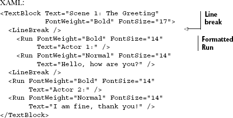
The TextWrapping property enables you to specify how text should wrap across multiple lines within a TextBlock. By default, Silverlight doesn't wrap text within a TextBlock. You can set the TextWrapping attribute to Wrap, and the text will break and resume on the next line if the Width of the TextBlock is exceeded. This wrapping effect is shown in listing 9.3.
Listing 9.3 shows how to change the TextWrapping property from its default value of NoWrap. The value and its destination value of Wrap belong to the TextWrapping enumeration. This type is only available to TextBlock elements—you can't use it in Inline elements such as Run. The Run element also lacks the ability to specify its own TextTrimming or TextAlignment, separate from the TextBlock.
There are often cases when you want to show only as much text as will fit into a predefined rectangle on the screen. The remaining text should be clipped off. In those cases, it's common to provide the user with a visual cue that the text's been trimmed.
Rather than have you calculate the trimming manually, Silverlight supports the TextTrimming property. As shown in listing 9.4, Silverlight supports the WordEllipsis style of text trimming, where the ellipsis is shown after the last whole word that will fit in the rectangle.
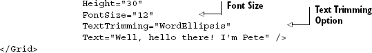
Listing 9.4 shows the TextTrimming option in place with a regular sized font. If you increase the font size, less text will fit in the space. Listing 9.5 shows what happens when you leave everything else the same, but increase the font size.
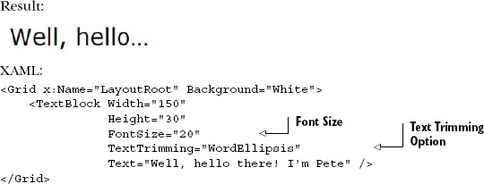
Note how the text is still broken at the word boundary. That's one of the nice things about WordEllipsis trimming. Breaking at a character boundary just looks unprofessional in many cases and can lead to unexpected and inappropriate final words in the worst cases.
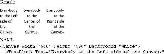
Another way to control the layout of text is to use the TextAlignment property. Though text trimming is typically used with left-justified text, it can also be used with any of the other alignments available to the TextBlock.
The TextAlignment property gives you the ability to align the text within a TextBlock. You can specify whether information should be aligned to the Left, Center, or Right of the rectangular region defined by the Height and Width properties of a TextBlock, as shown in listing 9.6.
Listing 9.6 demonstrates the TextAlignment options. These options provide one way to stylize your text. The TextWrapping, TextDecorations, TextTrimming, and Foreground properties enable you to further format this text. In addition, there's one more important feature that shouldn't be overlooked: the ability to control text spacing.
Spacing is effective for making text easier to read. This can help individuals with diminished eyesight or just make an application look better. To control the spacing of text, the TextBlock exposes two properties: LineHeight and Padding.
The LineHeight property determines the height of the bounding box that a single line of your text will be contained within. This height is represented as the number of pixels and specified as a double-precision value. Listing 9.7 demonstrates this property as well as its relationship to FontSize.
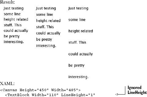
As listing 9.7 illustrates, the LineHeight property often alters the layout of wrapped text. Notably, if the LineHeight is smaller than the FontSize, the LineHeight value is ignored. If the LineHeight is larger than the FontSize, some extra padding is generated around the text. The LineHeight doesn't affect the FontSize.
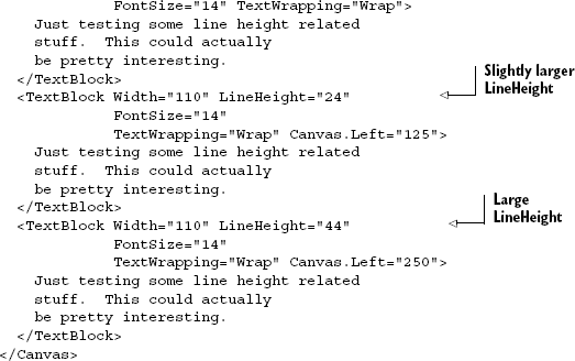
While LineHeight works on individual lines in the TextBlock and only controls vertical spacing, Padding controls the overall spacing within the outside border of a TextBlock.
The Padding property represents the amount of cushion to use within a TextBlock. This space represents the area between the border of the TextBlock and the text of the element. By default, this property doesn't specify any spacing. Using a double-precision value, you can provide a consistent buffer between the text and the virtual borders of a TextBlock, as shown in listing 9.8.
Listing 9.8 shows how a Padding of 20.2 pixels creates a nice bubble around some text. You'll probably notice that the size of this buffer is the same on each side of the content. The Padding property also enables you to use a more granular approach when defining the buffer, as shown in listing 9.9.
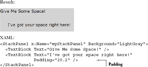
Listing 9.9 shows the Padding property using a space-delimited list of values. The values can also be comma-delimited. This list of values represents the amount of spacing to use on each side of the text, within the outer limits of the TextBlock element. The first value in the list represents the thickness of the spacing on the left side of the text. The subsequent values represent the top, right, and bottom thicknesses of the buffer. As you can see, these values specify the thicknesses in a clockwise order. This granular approach gives the Padding property a significant amount of flexibility.
The Padding property represents one of the more basic features of the TextBlock, which is one of the more basic elements in Silverlight. This element will be used in most Silverlight applications you write.
The TextBlock always renders text using the specified font or a default fallback if unspecified or if the font is unavailable. If the font you're using in your TextBlock or other control isn't a standard font, you may want to consider embedding it with your application.
Sometimes you want to use a special font in your application. Maybe it's the typeface in use in your company logo. Sometimes it's a slick headline font. Or perhaps it's just a sharp and readable font you want to use in your news reading application. I had this issue when I built the trivia application that ran on the screens at Microsoft PDC 2009. I had to use the PDC font but couldn't guarantee it would be on the machines.
What do you do when you can't guarantee that end users will have that font on their machines? One way to tackle this problem is to embed the font into the application.
Silverlight supports embedded fonts—whole fonts and subsets—in applications. When not using font subsetting, you simply add the font to your project and mark it as a resource. You can then refer to it by name using the format FileName#FontName:
<TextBlock FontFamily="Fonts/MSPDC.TTF#Microsoft PDC Squared" ... />
The folder name Fonts is the location where the original TTF file is placed in the project. The name MSPDC.TTF is the name of the font file on disk, and Microsoft PDC Squared is the name of the actual font.
Packaging with font subsetting requires Expression Blend. Even if you use Visual Studio, the required build action is supplied by Expression Blend and can be compiled in Visual Studio, but must be created the first time in Blend. This makes sense, as font subsetting and font embedding are very designer-oriented tasks; most of us programming grunts just default to Comic Sans MS and call it a day.
To support subsetting—reducing the number of glyphs to only those used in the application—the font is packaged up into a zip file and later referred to by its embedded location. For example:
<TextBlock FontFamily="Fonts/Fonts.zip#Microsoft PDC Squared" ... />
The folder name Fonts is the location where the original TTF file is placed in the project. The zip name is the name Expression Blend generated for the archive, and the name after the hash tag is the name after the font. Note that this can be different from the TTF filename itself.
The issue isn't really the technical aspect of embedding itself (it's just a zip file embedded into the DLL as a resource); it's the act of subsetting the font that makes embedding legal for those fonts that support it. Expression Blend actually creates a subset font that has only the glyphs (characters) you use in your application.
In short, though you may find a way to manually embed the fonts, you're better off trusting Expression Blend to do it for you.
Once you have fonts embedded in your application, they can be used anywhere you'd use a regular typeface. For example, they may be used in text boxes for gathering text, which is the subject of the next section.
Collecting and displaying text is a vital part of almost every web application. Silverlight provides several controls designed to make this important task easy. Silverlight supports standard keyboard text input as well as input from input method editors (IMEs). (If you don't know what those are, don't worry; we'll get to that in a minute.) In this section, we'll cover the core of text input, including the two main controls used for gathering plain text from the user.
The most basic text input control is the TextBox. For most forms and other simple data, this is the control you'll use to capture input. TextBox supports all the usual text entry functions, as well as multiline input.
Similar to the TextBox but optimized for sensitive data, we have the PasswordBox. The PasswordBox is what you should use when collecting passwords or other data you want masked from view.
Over the course of this section, you'll learn how to handle basic text entry with the TextBox. In addition, you'll see how to collect sensitive information, such as passwords, with the PasswordBox. Finally, we'll look at the ways to collect and format text simultaneously using the RichTextBox.
The TextBox control enables your users to edit and view text. As basic as this may sound, it'd be difficult to consider a UI technology that didn't include this type of functionality. When a user enters text into a TextBox, it gets stored as a string in the Text property. This property can be programmatically set at runtime, giving you the ability to prepopulate a form. Optionally, this property value can be set at design time if you have a more static value.
XAML:
<TextBox x:Name="NameField" Text="Pete Brown" />
C#:
TextBox nameField = new TextBox();
nameField.Text = "Pete Brown";
This example shows the XAML and C# definitions for a TextBox with a preset Text value. This value will change if a user decides to change the contents of a TextBox. This change will cause the TextChanged event to fire asynchronously, which gives you the opportunity to respond to characters after they're entered. You can also limit how many characters a user can enter by setting the MaxLength property. Limiting the number of characters can be useful for ensuring that data isn't truncated when it's sent back to a data source. In addition, some of the values from a data source should only be seen, not edited. In these cases, you can change the IsReadOnly property to true to prevent a user from editing a TextBox. These basic members of a TextBox are useful, but the multiline and text selection features are perhaps even more interesting.
The TextBox has built-in support for handling multiline text input. By default, this feature is turned off. You can turn it on by toggling two of the properties of a TextBox control. These two properties, AcceptsReturn and TextWrapping, are shown in listing 9.10.
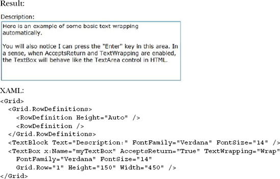
The listing shows a multiline TextBox enabled through the AcceptsReturn and TextWrapping properties. The AcceptsReturn property is a bool that tells the TextBox whether to show and permit newline characters. This property is important because it is what enables a user to press the Enter key and go to a new line within a TextBox. A true multiline TextBox isn't complete until the TextWrapping property is set to Wrap. We discussed this property in relation to the TextBlock element in section 9.2.3; those same rules apply with the TextBox. With this property and the AcceptsReturn property, you can easily implement a multiline TextBox.
Implementing a multiline TextBox in Silverlight is simple. This approach is slightly different than the approach used in HTML, which requires a separate element altogether (the TextArea). The Silverlight approach simplifies the overall API and provides exciting text selection features not found in HTML.
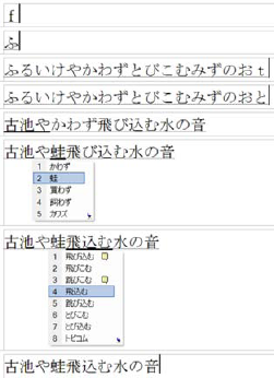
The TextBox has built-in support for selecting portions of text within a TextBox. A user can highlight information and you can programmatically retrieve it through three properties, appropriately named SelectedText, SelectionStart, and SelectionLength. These properties can also be programmatically set, which is especially useful when implementing incremental search and auto-complete functionality in a TextBox. Each is shown in figure 9.5.
This figure shows the three properties associated with text selection. The first property is a string called SelectedText that represents the content currently selected within a TextBox. This content has a specific length, which is available through the SelectionLength property. This int gives you the number of characters currently selected within a TextBox. These characters begin at a specific index, which is accessible through the SelectionStart property. When text isn't selected, the SelectionStart property will return the index of the carat. The selection properties are read/write and allow you to programmatically change their values.
The HTML text box doesn't provide a way to select only portions of text. As shown here, the TextBox in Silverlight does enable you to select text at a more granular level. At the same time, Silverlight still has support for both single and multiline text boxes.
Not all applications are written for the en-US market. If you're writing applications for other markets, especially where the languages have different characters, you'll want to understand input method editors and how they work with Silverlight.
IMEs are operating system components or added programs that allow, among other things, multiple keystrokes to be composited into a single character. This supports languages where there are more possible characters than keys on the keyboard or where the keyboard doesn't have the required character.
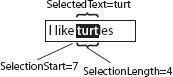
IME text is important for handling text from most Eastern languages. Figure 9.6 shows an example of a typical Japanese Romaji-based IME in operation.
In this section, we'll look at what IMEs are and how to use them in Silverlight. We'll even take a look at how to change your Windows keyboard settings to allow you to test the functions that support IME in Silverlight.
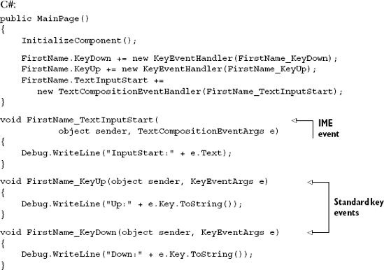
In Silverlight, the TextBox and other controls handle IME-entered text through events defined at the UIElement-level. In particular, if you want your application to work in IME situations, don't respond to KeyDown/KeyUp events of the TextBox. Instead, if you do use editing based on keystrokes, use the TextInput TextInputStart and TextInputUpdated events. Note that, depending on the IME mode in use and the control you're interacting with, some of these events may be handled by the control and not otherwise bubbled up.
Tip
In Windows 7, to change your keyboard layout to US International (if you're in the US) to test basic IME, use Start > Control Panel > Region and Language. Then select the Keyboards and Languages tab and click Change Keyboards.
If you already have the United States - International keyboard listed, select it. Otherwise click Add... to add it, and then select it from the list.
From there, you can type diacritic characters. For example, to type the é in Claudé you'd select the US International keyboard from your system tray, then type the single quote followed by the letter e.
In addition, if you want finer control over IME in your application, use the Input Method class and the attached properties it exposes. For space reasons and to stay on topic, we won't cover those numerous options, but we'll look at an example of the differences between the keyboard and text input events.
To do that, you may want to set the InputMethod.IsInputMethodEnabled to true on your TextBox. While the underlying value of the IsInputMethodEnabled property is True, its actual value is influenced by the state of available input methods at runtime. Setting it to true isn't essential but helps convey your intent, especially if you'll be handling IME events in code.
Listing 9.11 shows the difference between the keyboard events and the text input events. For example, to type the accented e in the first word, I must hit Shift-6 and then the letter e.
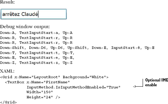
If you have an IME installed on your system or have changed your keyboard layout to do so, you'll be able to type diacritic characters using an IME.
If you live and work in the United States, it can be tempting to create applications that work only with US keyboards. But if you want to move your product to an international market or at least understand what's necessary to support those markets, you'll want to read up on internationalization, including input method editing on Windows and the Mac.
Input method editing is something not every application needs. However, it's a staple of Windows development. Another staple of modern application development is the clipboard. Think about how isolated our applications would be if we didn't have a way to get data from one to another! Luckily, Silverlight allows you to programmatically access the clipboard to move text between applications.
Silverlight 4 added a new API for use with transferring text via the clipboard. Though currently limited to just Unicode strings, the clipboard is an excellent way to enable your Silverlight application to integrate with the rest of the applications on the hosting system.
The Clipboard object is your Silverlight application's interface to the system clipboard. In this section, we'll take a quick look at the clipboard API and its capabilities, starting with the three member functions of the Clipboard class. Table 9.3 shows the static member functions exposed by this object.
Table 9.3. The Clipboard type's static member functions
Member | Description |
|---|---|
| Queries the clipboard and returns true if the clipboard contains compatible text |
| Returns the Unicode text from the clipboard |
| Places Unicode text on the clipboard |
Clipboard exposes static members, so you don't need to instantiate it to use it. For example, to place text on the clipboard, simply call Clipboard.SetText:
Clipboard.SetText("This text will be on the clipboard.");Similarly, to retrieve text this or another application placed on the clipboard, call the GetText method:
string text = Clipboard.GetText();
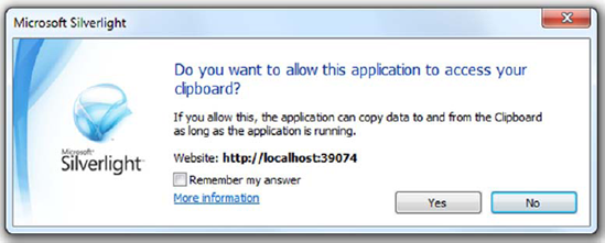
Note that, in both cases, you'll receive a security exception if you're running in the standard (not elevated) permissions mode and either didn't initiate the action from a user event or the user didn't allow access to the clipboard when prompted to do so. Figure 9.7 shows the prompt the user receives when you initiate a clipboard operation.
The prompt helps to protect the user from potentially malicious applications that may try to steal data from the clipboard or fill the clipboard with garbage.
One thing you probably won't want to allow on the clipboard is a user's password. For that and for masking reasons, Silverlight includes a specialized PasswordBox.
Silverlight provides a special control called PasswordBox. This element is designed to hide information from someone who may be lurking behind a user. This is accomplished by hiding the contents of a PasswordBox behind asterisks (*), which serve as familiar reminders to end users that they're entering a password. But, if you'd like to use something other than an asterisk, you're free to use any character you like by setting the PasswordChar property. This property, as well as the syntax of a PasswordBox, is shown in listing 9.12.
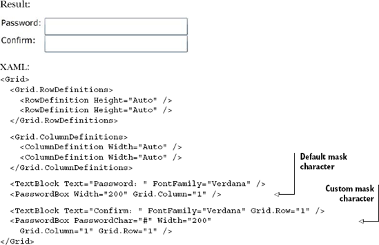
This example shows a default PasswordBox and a custom PasswordChar to show how Silverlight takes a small step beyond the masking approach used in HTML. Still, once a user enters information into these fields, you'll probably need to retrieve it. This is possible thanks to the Password property.
The Password property is a string that represents the value in a PasswordBox. This property can be programmatically set and retrieved. Interestingly, this value can't be copied or cut at runtime by a user. This restriction is designed to ensure a user's password remains protected, short of hacker heroics such as wiring a debugger to the code and inspecting values. To provide this feature, along with the general input control features, the PasswordBox needs to derive from the Control class instead of the TextBox class.
The PasswordBox and TextBox are two controls used for capturing user input. However, they are limited in how the text can be formatted. Unlike the TextBox, the RichTextBox allows the user to have a true document experience with multiple fonts and styles.
From email composition to document creation, we've gotten so used to the simplicity of creating text with multiple fonts, colors, and font styles that, when we see a multiline text box with no formatting control, it simply looks strange. Prior to the introduction of the RichTextBox in Silverlight 4, Silverlight had no way of allowing the user to enter formatted text.
The RichTextBox follows many of the same patterns as the regular TextBox but enhances it with the ability to store the formatting information such as fonts and colors. The RichTextBox also takes it one step further by allowing the embedding of images and other UI elements, even controls, into the text.
In our tour of the RichTextBox control, we'll look at how to format text using different fonts and colors, how to embed hyperlinks in rich text, and even how to embed other controls such as the Button and ComboBox. As you'll want your users to actually work with your text, we'll then look into what it takes to work with the text the user has selected or text you select from code and then change its attributes.
As the main reason the RichTextBox exists is to enable the display and editing of text with multiple fonts, colors, and other visual attributes, we'll start there.
The RichTextBox enables you to format text and add elements inline. This includes formatting tags, text spans, other controls, and—perhaps the most important and most basic of these elements—the Paragraph.
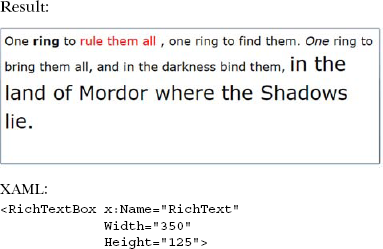
The Paragraph element enables you to break the text in the RichTextBox into one or more separate paragraphs. Each paragraph can have its own formatting independent of the overall control.
Listing 9.13 shows three different paragraphs, each with separate formatting independent of the overall control's formatting.
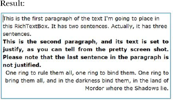
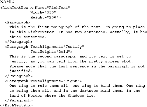
Listing 9.13 shows several interesting features. First, the text in a RichTextBox can be easily broken apart into separate paragraphs. The second feature is that each of those paragraphs can have formatting separate from the others. In this case, I used different text alignment on each of them and also set the middle paragraph to be bold.
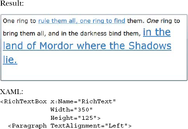
In addition to setting the styles at a paragraph level, you can surround blocks of text with formatting markup, called inline styles.
If formatting could be applied only at the paragraph level, the RichTextBox wouldn't be all that useful. Luckily, formatting can be applied at a much finer-grained level using inline formatting elements such as Bold, Italic, and the versatile Span. Listing 9.14 shows several formatting approaches in a single paragraph.
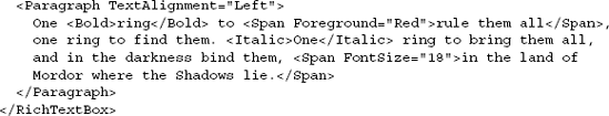
Listing 9.14 shows the use of the Bold and Italic inline styles, as well as Span. Bold and Italic are handy shortcuts, but Span is the most flexible of the three, supporting myriad formatting options. Span itself inherits from Inline and from that gets a number of useful properties. Section 9.2.1 goes into detail about the commonly used properties shared by the Span, TextBlock, and Run elements.
In addition to these inline styles, the RichTextBox also supports LineBreaks via the LineBreak element:
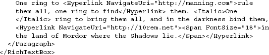
One ring to rule them all,<LineBreak />
one ring to find them.<LineBreak />
As expected, the LineBreak element causes the text following it to start on a new line. You can think of the paragraph tag like the HTML <p></p> pair, and the LineBreak element much like the HTML <br /> tag.
One thing that the other text-display controls can't include is a hyperlink. The RichTextBox is currently unique in its ability to display active Hyperlink controls.
The RichTextBox has the ability to host any UIElement, but it has first-class support for hosting Hyperlinks without requiring any special containers or other work on your part, while keeping them active even for editable text. This makes it easy to display HTML-like text with embedded links.
For example, listing 9.15 shows two Hyperlink elements embedded in the RichTextBox control.
Listing 9.15 shows the use of two hyperlinks embedded in the paragraph text. Note how the hyperlinks also have support for cleanly nesting Spans and other formatting elements.
The Hyperlink control in the RichTextBox is a fully functional Silverlight Hyperlink control, but it's not the same as the one you'd place in regular XAML. Instead, it derives from Span. You can still wire up Click events, supply a NavigateUri as I did here, and otherwise do everything you'd expect to be able to do with a Hyperlink. The Hyperlink control itself is covered in more detail later in this chapter.
In addition to the Hyperlink control, RichTextBox includes support for hosting any other UIElement through the use of InlineUIContainer.
The RichTextBox control allows you to embed any UIElement inline into the text, as long as you contain it in an InlineUIContainer. The catch is that the elements won't be active; they'll only show their disabled representation unless the RichTextBox is set to read-only mode via the IsReadOnly property as shown in listing 9.16.
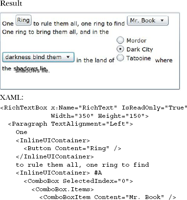
As listing 9.16 shows, you can do some pretty neat things with the inline UIElements, including add items with effects such as drop shadows. The example shown may be a real dog's breakfast of a UI, but the ability to embed controls of any sort into a rich text interface really opens up the options for creating your own UI, especially for scripted questionnaires and similar free-flowing interfaces.
Getting back to basic text manipulation, one thing you may need to do is programmatically select text or work with a selection a user has made. The nature of rich text makes this slightly more complex than plain text, as we'll see in the next section.
Programmatic manipulation of the RichTextBox beyond simply reading or writing the entire contents requires that you work with selections. The selections may be set in code or you may be taking an action based upon a selection the user has made. Either way, the methods are consistent.
There may be times when you need to programmatically select content in the RichTextBox. For example, if you're doing a search and replace, the Find Next function should search the content for the next occurrence of the search term and then automatically select it. The RichTextBox exposes the Selection property, which has a Select function to support programmatic selection.
The Select method takes two parameters, both of type TextPointer: the anchorPosition and the movingPosition. If you think about how you select text with a mouse, you start with one point that stays fixed in place, and you move the mouse cursor, changing the selection relative to that point. Similarly, the anchorPosition remains fixed and the movingPosition is the second or movable point.
Figure 9.8 shows the three main data points of interest. The first, the Selection.Text property, is a public read/write property that enables us to read or modify the text inside the two points.
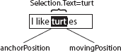
Figure 9.8. RichTextBox selection information, assuming the user selected left to right, starting with the first T in "turtles"
The anchorPosition is the place where you or the user (or your code) started the selection. The movingPosition is the end of the selection.
Note that, unlike the case with the TextBox, we're not dealing with numeric values for the start and end points. Instead, we have pointers to the text. Though this can make it slightly more complex to work with, it both supports the addition of nonvisible markup and makes it more flexible when adding text between the points and the substitution character count isn't 1:1 with the original.
Listing 9.17 shows how to use the anchorPosition and movingPosition TextPointer objects to programmatically select text in the control.
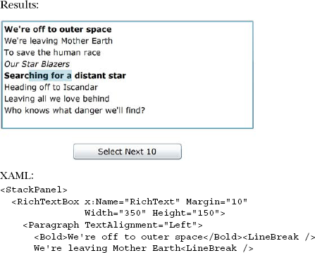
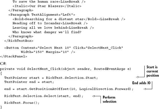
The code in listing 9.17 takes the Selection.Start, which by default is where the caret is currently positioned, and adds 10 characters to it and ends the selection. The end result is the visible text selection.
Selecting text itself is interesting, but it's more interesting to actually manipulate the contents of the selection.
Once either the user or code has made a selection, you can alter the properties of that selection via code. For example, you can change the font face, the weight, the foreground, and other properties for the selection.
If you want to set the foreground color of the 10 characters to Red, simply alter the code in listing 9.17 to add the following ApplyPropertyValue call, passing the Foreground dependency property and a brush with the color red:
RichText.Selection.Select(start, end);
RichText.Selection.ApplyPropertyValue(
    TextElement.ForegroundProperty, new SolidColorBrush(Colors.Red));

RichText.Focus();
Similarly, you can call GetPropertyValue to get the value of a dependency property for the selected text.
Once you have a valid selection, you can also replace the text with your own plain text. The Selection.Text property is a two-way street: you can read the text that's in the selection and you can also assign new text to it. Again modifying listing 9.17, this will replace the 10 characters with haha!!:
RichText.Selection.Select(start, end);
RichText.Selection.Text = "haha!!";

RichText.Focus();
Replacing text is a good common operation, but what about inserting new text without overwriting something else? For that, you'll want to use the Selection.Insert method.
In addition to replacing the selected text, you can insert new text anywhere you create a selection start point. In this example, we'll modify listing 9.17 and insert text wherever the caret happens to be positioned:
private void SelectNext_Click(object sender, RoutedEventArgs e)
{
  Run run = new Run();
  run.Text = "This is some text we're going to insert";
  RichText.Selection.Insert(run);

  RichText.Focus();
}
While Runs can be implicit in the XAML, the Insert method requires a Run element, or something that derives from Run. You can click the button as many times as you'd like and it'll happily insert new text wherever the caret is positioned.
This being Silverlight, you'd expect there to be some way to get the XAML representation of the selected text—and you'd be right. The Selection type exposes a Xaml property that returns the XAML for the selection. Modify listing 9.17 to include the following code to see the XAML representation of the text:
RichText.Selection.Select(start, end);
Debug.WriteLine(RichText.Selection.Xaml);

RichText.Focus();
If you wish to get the XAML for the entire control, first call the SelectAll method and then retrieve the XAML.
The RichTextBox control is a powerful control that allows you to create applications with serious text editing requirements. It builds upon the concepts from the TextBlock and TextBox, and combines them with inline formatting, Hyperlinks, and UIElements to create a versatile Silverlight control for both the display and editing of rich text.
Text handling is one of the most basic and important functions of any presentation layer. Silverlight has a complete text stack, including support for subpixel rendering and ClearType and grayscale font smoothing. Silverlight also includes the TextBlock element, which may be used to display read-only text.
Though typically used for things such as field labels and description paragraphs, the TextBlock supports multiple Runs of text, each with their own distinct attributes.
Any text element in Silverlight can take advantage of embedded fonts. Embedded fonts are useful for situations where you have a custom font or one that's unlikely to be on end-user machines. Rather than compromise and use a different font, you can embed the font or a subset of the glyphs in the font directly into your application.
Silverlight has several ways for entering and displaying text. There's significant overlap between them, but each has its own niche where it performs best. Table 9.4, adapted from information from MSDN, shows how you should think of each control or element when trying to decide between them.
Table 9.4. Recommended uses for the various text display and editing elements
Scenario | Recommended element |
|---|---|
Display unformatted text in a single font |
|
Display formatted text including paragraphs, hyperlinks, images, multiple fonts and styles |
|
Enter or edit plain text, such as would be used for data entry of a single field like a person's name |
|
Enter or edit formatted text including paragraphs, hyperlinks, images, multiple fonts and styles |
|
Enter sensitive information, such as a password, which must be masked for display |
|
Choosing the correct one for any given situation means balancing the runtime resources required with the features desired. In general, the elements from lightest to heaviest in terms of runtime resource requirements are:
TextBlockTextBoxRichTextBox
So, although replacing all the TextBlock elements in your application with read-only RichTextBox controls in order to allow for selectable formatted text may seem appealing, you need to test it in your specific scenario and see if the runtime trade-off is worth the additional functionality. All three controls can display multibyte and right-to-left text and support the use of input method editors (IMEs).
The TextBlock lives in the System.Windows.Controls namespace but, unlike TextBox and RichTextBox, it's not actually a Control. This keeps it lightweight but means that some properties have to be duplicated between TextBlock and System. Windows.Control.Control. In the next chapter, we'll look at the various types of controls in the Silverlight runtime and how they all fit together.