
In the previous chapter, we covered the basics of text, including how to display and edit it. Two of the items discussed—the TextBox and RichTextBox—are both actually controls. The TextBlock isn't.
If you're coming from another technology, you may assume that anything you can see or interact with is a control, and you'd be partially right. Interaction generally requires a Control but, to see something such as a TextBlock, it requires only that it be a UIElement (covered in chapter 6).
In this and the following sections, we'll look at the base control types Control and ContentControl and then dive into the various types of controls, including Button controls and ItemsControls. In your Silverlight travels, you'll find that understanding these categories of controls will be pretty much all you need to make sense of any new control you run across.
Toward the end of this chapter, we'll also take our first trip into creating controls of our own. In this case, we'll follow the simple reuse model: the UserControl. In chapter 24—once we've covered binding, resources, styles, and templates—we'll again revisit creating controls, but with a more robust custom control model.
We've already covered the UIElement and FrameworkElement in chapter 6, so let's continue our walk up the stack and take a look at the base Control type.
Almost every element you'll deal with that accepts input in some form derives from Control. Even the pages and user controls you create in your application ultimately end up deriving from this type. It's also the lowest-level type you can typically get away with when trying to share styles (see chapter 23) between different elements.
The System.Windows.Controls.Control abstract class derives from FrameworkElement. In addition to a number of protected methods that the derived controls can override to provide additional functionality, Control adds a number of new public properties and methods. We'll break these up into several logical groups and cover them separately, starting with appearance, then navigation and state, and finally the support for control templating.
Controls are visual by definition. For that reason, several properties can be shared as a baseline implementation for anything visual and potentially interactive. The appearance-related properties for control are shown in table 10.1.
Table 10.1. Visual style properties for the Control abstract type
Member | Description |
|---|---|
| The brush used to paint the background |
| The brush used to paint the border |
| The thickness of the border line |
| The color used for foreground elements |
| The amount of space to reserve between the control's exterior and interior |
| Controls how the internal control content is aligned |
| Controls how the internal control content is aligned |
The Background property is used to hold the background brush of the control. This can be a simple color or a complex gradient. Similarly, the BorderBrush property does the same for the brush used to paint the border. The BorderThickness is a size to be used to control the pen weight or thickness of the border for the control. The Foreground brush should be used when displaying text or other content for which the user hasn't provided a specific color. The last three—Padding, HorizontalContentAlignment, and VerticalContentAlignment—all control how the content will be displayed.
It's important to know that no specific user interface is implied by these properties. The control author (or person creating the style/template) is required to apply these properties to specific elements in the template. Common sense would say that a BorderBrush should control the color of the outline of the control, but nothing enforces that.
Two other common traits that controls share is the ability to be navigated to via mouse and keyboard and set as either enabled or disabled.
Silverlight controls also support Tab-key navigation as well as manual focusing via the mouse or API. The properties and methods that support that are shown in table 10.2.
Table 10.2. Navigation and state members for the Control abstract type
Member | Description |
|---|---|
| Set to |
| True if the user can tab into this control |
| The tabbing position of this control, relative to its peers in the same panel |
| Controls how the Tab key navigates in this control. It can either cycle, be local, or be a one-stop navigation. More on this shortly. |
| Calling this method attempts to set focus to the control. |
IsEnabled controls the enabled state for the control. The expected behavior is that, if IsEnabled is false, the control won't accept any keyboard, mouse, or other human input and isn't considered a tab stop. It should also display itself using a faded or grayed-out look to convey this state.
The Focus method may be used to attempt to manually set focus to a control via code. If the control can't receive focus (for example, IsEnabled is False), the method will return false.
Three properties control tab navigation for the control. The first—IsTabStop—controls whether the Tab key can be used to access the control. The TabIndex controls the order within the container that the Tab key will navigate between controls. Lower-numbered controls come earlier in the tabbing sequence. Finally, the TabNavigation property controls how tabbing works for elements hosted inside this control. The possible values and their meanings are listed in table 10.3.
If you were to create a composite control, such as the LockableListBox at the end of this chapter, Local tab navigation would be the expected behavior. But, if you created a ListBox-like control, you'd expect the Once behavior because you'd use the arrow keys to navigate between the individual items.
Table 10.3. Possible values for the TabNavigation property
Member | Description |
|---|---|
| Your control is tabbed into. The next tab starts going through the child elements. Once the last child element is focused and the user hits Tab, the next element outside of your main control receives focus. |
| Once this control is tabbed into, individual controls inside this control may be navigated to using Tab. When the last child control has been reached and the user hits Tab, the first one will receive focus again. Doing this effectively traps the user inside your control until he clicks elsewhere. |
| Individual child elements other than the first one don't receive focus via the tab control. |
The next key area of support in the Control type is templating. Templates give Silverlight controls their appearance and user experience.
One key feature that the controls add over the base type is the ability to template the control. As we'll learn in section 23.3, a template is a definition for the visual representation of the control. By default, controls in Silverlight are defined by their model and functionality. The user interface elements can be completely replaced; they're considered lookless controls. Table 10.4 shows the properties and methods that support templating.
Table 10.4. Styling and templating properties for the Control abstract type
Member | Description |
|---|---|
| This is the key of the style to be used when no other style is assigned. Typically, it's set to the type of the class and, therefore, uses an implicit style. |
| Reference to the template that makes up the control's visuals |
| It attempts to rebuild the visual tree from the template. It returns |
The Template property enables this flexible control templating. The DefaultStyleKey property is used by control authors to wire up the control to a default style and template, something which may be overridden by consumers of the control. The ApplyTemplate method is used to rebuild the visual tree for the control, using the supplied template.
Control also supports the FontFamily, FontSize, FontStretch, FontStyle, and FontWeight properties we covered in the chapter on text. For more detail, please refer back to section 9.2.
It's rare that you'll create new controls that derive directly from UIElement or FrameworkElement. Instead, you'll usually derive from Control or one of its descendents such as ContentControl. ContentControl provides functionality above and beyond Control by enabling the containment and templating of arbitrary content.
In older technologies, the content of a control was usually very specific: a button could hold a text string in a caption property; an ImageButton could hold an image and text split across two properties; and so forth. Silverlight and WPF demanded a more flexible content model where a control could indicate that it supports the inclusion of arbitrary content rather than a specific atomic item of known type. From this requirement, the ContentControl was born.
ContentControl is a descendent of Control. As such, it inherits all of the properties, methods, and behaviors Control provides. It also adds the key concept of Content. Table 10.5 shows the two content-related properties that ContentControl adds to the Control type.
Table 10.5. Properties for the ContentControl abstract type
Member | Description |
|---|---|
| Assign the content (anything that can be rendered) to this property. If the content isn't a |
| This is a data template used to display the content assigned via the |
The Content for a ContentControl can be any arbitrary object. But, if the type isn't something that can be natively added to the visual tree (a UIElement), Silverlight will call the object's ToString method to display it. This allows you to add any other Silverlight visual elements or a string value without having to do any additional work. If you've wondered why a button can have a simple string or a complex tree of elements as the content property, this is why.
The ContentTemplate is a data template that can be used to format the content. Consider that you may assign a complex object, such as a Person, to the content property. The ToString approach will leave you with something like MyLib.MyNamespace.Person as the actual text—probably not what you want. The ContentTemplate uses binding to format the object for display. We'll cover data templates in detail in chapter 11.
Table 10.6 shows the flexibility of the content control even without relying on a content template. Note how you can have anything inside the button, including a TextBox and a video. You can even type in the TextBox and watch the video because they're real, live elements.
Table 10.6. The flexibility of a ContentControl as displayed by three buttons
Button | XAML |
|---|---|
|
<Button Width="150" Height="75"
Content="Hello!" /> |
|
<Button Width="150" Height="75">
  <Button.Content>
    <TextBox Height="24" Text="TextBox"
             Width="100" />
  </Button.Content>
</Button> |
|
<Button Width="200" Height="100">
  <StackPanel>
    <TextBlock Text="Playing"
               HorizontalAlignment="Center" />
    <MediaElement Height="75" Width="125"
               Stretch="Uniform"
               Source="PeteAtMIX10ch9.wmv" />
  </StackPanel>
</Button> |
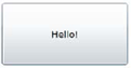
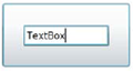

This table begins to show the flexibility provided with a ContentControl, in this case a Button. The first example shows a simple string for content. The second shows the explicit setting of the content property. This is optional, as we see in example three, where the Content property is omitted but the StackPanel is still assigned to it.
As you progress through this book, you'll learn how to make the contents of a ContentControl look exactly how you want. For now, note how the innards of a ContentControl are specified through the Content property.
Most controls that inherit from ContentControl use a ContentPresenter to do that actual display work in their control template. We'll cover more about templates in section 23.3 but, for now, a brief introduction to the ContentPresenter is in order.
The ContentPresenter is a descendent FrameworkElement that exists primarily to support the display of content in a ContentControl. Rather than require you to put a TextBlock, Image, or other strongly typed content presentation element into your control template, you can use a ContentPresenter to bind to and display the content from the Content property.
Table 10.7 shows the properties of the ContentPresenter element.
Without the ContentPresenter, the ContentControl can't do much of anything exciting. The ContentPresenter holds the logic to try and render the object passed into it. In fact, in a typical control template, the ContentPresenter simply is assigned values from the ContentControl via template binding, as seen here:
Table 10.7. Properties for the ContentPresenter element
Member | Description |
|---|---|
| The value assigned from the same property of a |
| The template value assigned from the same property of a |
<ContentPresenter
  Content="{TemplateBinding Content}"
  Margin="{TemplateBinding Padding}"
  HorizontalAlignment="{TemplateBinding HorizontalContentAlignment}"
  VerticalAlignment="{TemplateBinding VerticalContentAlignment}" />
We'll cover TemplateBinding in chapter 23 when we work with control templates. For now, understand that TemplateBinding is used to bind an element in XAML to a dependency property in the control's implementation. For example, the Content property of the ContentPresenter in the preceding code is bound to the Content property of the containing ContentControl.
Together, Controls, ContentControls, and the associated ContentPresenter make up the core of the control tree in Silverlight. One other type of control, the ItemsControl, is equally as important. But before we look at the various types of ItemsControls, let's look at some concrete implementations of ContentControls—specifically, those based on Button.
A button is a type of control that responds to a single-click event. This event can be triggered by either a mouse or a keyboard. With a mouse, a user can click a button by pressing and releasing the left mouse button while hovering over it. With the keyboard, a button can be clicked by pressing Enter or the spacebar when the button has the focus. Either way, the general implementation of a button is spread across two classes, ButtonBase and ContentControl.
ButtonBase is an abstract base class used by all buttons in Silverlight. This class provides three members that are directly related to a user's interaction with a button: IsPressed, Click, and ClickMode. IsPressed returns whether a button is currently depressed. By default, this bool property is set to false. If a user clicks and holds a button, this property will change to true. But, once a user releases the mouse button, the IsPressed property will change back to false. At that point, the Click event will fire, assuming the default ClickMode is used.
The ClickMode property specifies when the Click event will fire. Setting this property can be useful if you want to fully customize a user's experience with your buttons. This experience can be set to any of the options available within the ClickMode enumeration. These options are shown and described in table 10.8.
Table 10.8. The options available within the ClickMode enumeration
Option | Description |
|---|---|
| Fires the |
| Causes the |
| Triggers the This is the default |
The ClickMode enumeration can be used to define a small part of the behavior of a button. The rest of the behavior is defined in the ButtonBase class itself.
As the default property for the content control, you can omit the explicit <Button. Content> reference and simply nest the content as shown in the third example in the table. This property is available on all ContentControl elements, a category that naturally includes all ButtonBase elements such as the Button, HyperlinkButton, RadioButton, and CheckBox elements.
The traditional Button is a simple ContentControl that a user can click to perform an action. This control is defined by the Button class, which derives directly from the ButtonBase class. The Button automatically exposes the Click event. The thing that makes the Button class special is the default appearance it creates around the Content. This appearance and the syntax of a Button are shown in listing 10.1.
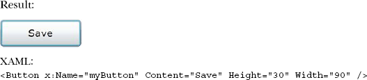
As you can see, the buttons in table 10.6 are slightly more complex than the one shown in this example, but it's intended to show only the basic syntax and look of a Button. This appearance includes a small container that makes a Silverlight Button look similar to the buttons seen in other technologies. This container is designed to hold a Button element's Content. Occasionally, you may want this Content to behave more like a hyperlink. For these situations, you should look to the HyperlinkButton.
The HyperlinkButton control is designed to create a button that looks and behaves like a hyperlink. This behavior is provided through two publicly visible properties called NavigateUri and TargetName, which are shown here:
<HyperlinkButton x:Name="myHyperlinkButton"
  Content="Search in a New Window"
  NavigateUri="http://www.live.com"
  TargetName="_blank" />
The HyperlinkButton control uses the NavigateUri property to determine which page to load. By default, this Uri will be loaded in the current window, forcing your Silverlight application to unload. As you can imagine, this side effect may not be desirable. But, you can take control of this behavior with the TargetName property.
The TargetName property is a string that represents the name of the frame or window to load the NavigateUri within. By default, the TargetName value will be an empty string. You can use any of the values in table 10.9 to create the intended experience.
Table 10.9. The acceptable options for the TargetName property
Target Value | Description |
|---|---|
| Launches the URL specified in the |
| Loads the URL specified in the |
This table describes the values that can be assigned to the TargetName property. If you happen to assign an unrecognized value to the TargetName property, one of two things will happen. If the value has one or more whitespace characters, an InvalidOperationException will be thrown. Alternatively, if the TargetName doesn't have any whitespace characters, the NavigateUri will load in a new window. It's important to remember that, despite its behavior as a hyperlink, the HyperlinkButton is still a type of button.
The HyperlinkButton class derives from the ButtonBase class; it still acts like a button and supports the Click event. In the case of a HyperlinkButton, the Click event will fire before the NavigateUri is evaluated so you can dynamically change the location of the NavigateUri just before it gets loaded. In addition, this event can be useful for performing cleanup operations if you're redirecting the user away from your Silverlight application.
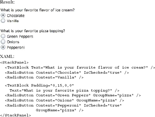
A RadioButton represents a choice within a group of options. For instance, imagine having to choose your favorite pizza topping or flavor of ice cream. Each of these situations requires one and only one choice to be selected. To properly deliver this kind of functionality, you need to familiarize yourself with the selection and grouping behaviors of the RadioButton.
A RadioButton is a kind of ToggleButton. A ToggleButton represents a button that can change states. For a RadioButton, this state can change between a checked state and the default unchecked state. The state can be set at design time through the Boolean-based IsChecked property, the value of which affects both behavior and appearance, as shown in listing 10.2.
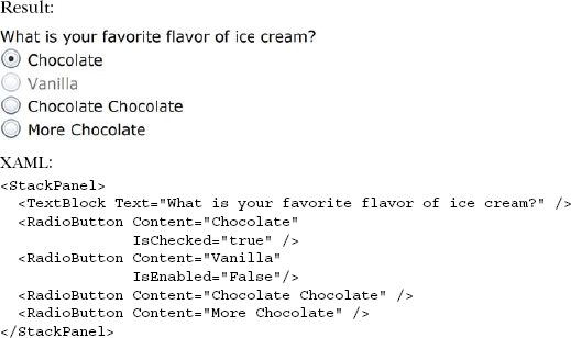
This example shows four answers for a single question, one of which is disabled. You can see that the first option is selected by default when the application starts. Note also that it's chocolate. If it's not chocolate, it's not a dessert.
Once a RadioButton has been selected, it can't be unselected by clicking it again. A RadioButton can only be unselected by using one of two approaches: set the IsChecked property to false at runtime using code or selecting a different RadioButton within the same group.
A grouping of RadioButton items represents the choices available for a single situation. In the previous listing, you saw a StackPanel that grouped together a couple of ice cream flavor choices. These choices were grouped because the StackPanel was the immediate parent of both of the RadioButton items. A problem begins to emerge if you add unrelated RadioButton items to the scenario. For these situations, you use the GroupName property.
The GroupName property allows you to control how RadioButton elements are grouped together. By default, this string-typed property is set as an empty string, indicating there's no group. Because of this, all RadioButton elements with a direct parent will belong to the same group. By explicitly setting this property, you can control the groupings. You can even do this for RadioButton elements that share the same parent, as shown in listing 10.3.
The listing shows how the GroupName property can be used to force RadioButtons to work together. A close relative of the radio button, but one that doesn't handle mutually exclusive choices and, therefore, needs no grouping, is the CheckBox.
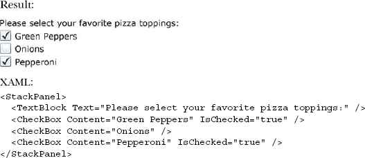
The CheckBox control enables a user to select whether an option is chosen. Unlike the RadioButton, the CheckBox control allows you to select multiple elements that belong to the same grouping so you could do something like select multiple pizza toppings (see listing 10.4).
Selecting multiple CheckBox elements at the same time is possible because the CheckBox isn't bound to a specific group. In fact, the CheckBox does little more than extend the ToggleButton class. Because the CheckBox does extend the ToggleButton class, you can use three-state checkboxes by switching the IsThreeState bool property to true. What happens to the IsChecked property? Well, this property is actually a nullable type so it also supports three states. These states and the look of a three-state CheckBox are shown in listing 10.5.
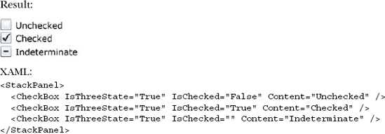
Listing 10.5 shows the look and syntax of a three-state CheckBox. The fact that the CheckBox can support three different states demonstrates one way in which Silverlight is an improvement over HTML. Another improvement is found in the flexibility of the ContentControl class in general. This class was discussed at the beginning of section 10.2 and can be used in the CheckBox, RadioButton, HyperlinkButton, and Button controls. In addition, the flexibility of the ContentControl can be used with Silverlight's item controls.
In this section, we discussed the controls derived from the ButtonBase class that represent buttons available within Silverlight. Often, these controls are used to trigger an action. Occasionally, you may need to provide to present a list of items rather than a single item. This type of functionality can be delivered through an ItemsControl.
An ItemsControl is a type of control designed to show a collection of items. This control exposes the collection of items through a publicly visible property called Items. This property represents an ItemsCollection where each element in the collection is some kind of object. This object can be added at design time through XAML or at runtime through code. Three controls in the Silverlight API are descendents of the ItemsControl class: the ListBox, the ComboBox, and the TabControl.
Though you'll most often use one of its derived classes, the base ItemsControl can be used whenever you want to present a list of items and don't need any selected item tracking. You'll get similar results from using a StackPanel but, if you need to bind items, the ItemsControl is the way to go.
The ItemsControl adds a few properties above and beyond what you would get from a regular Control. These properties are shown in table 10.10.
Table 10.10. Key ItemsControl members
Member name | Description |
|---|---|
| The collection of items to be displayed in the control |
| The panel to be used to display the items By default, this is a |
| Used in binding, this is the source of the items, typically a collection. |
| The data template used to display a single item |
We'll show these properties in use with the ListBox, ComboBox, and TabControl. But they could be just as easily used with a plain old ItemsControl.
The ListBox is one of the most commonly used items controls. Though much of its functionality is directly inherited from ItemsControl, it adds the important distinctions of exposing a selected item and including scrolling in its default template. This control enables you to show multiple items from a collection of items at the same time. If there are more items than the space allowed for the control, the ListBox will display scrollbars to allow scrolling through the content. An example of this scrolling feature as well as the syntax of a ListBox is shown in listing 10.6.
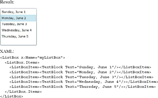
This ListBox uses the Items property to load options at design time. You also have the option of binding to a data source to make this list of items more dynamic. Binding to a data source will be covered in the next chapter. Regardless of whether you're binding to a data source or defining items at design time, each item in the control is a ListBoxItem. A ListBoxItem is a type of ContentControl so you can use any visual tree you want for an item, as shown in listing 10.7.
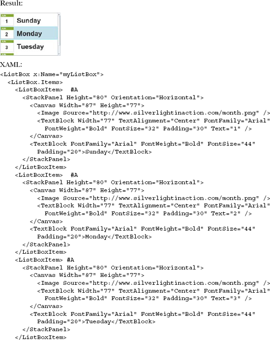
This listing shows a ListBox control with much richer ListBoxItem elements than those shown in listing 10.6. Ultimately, one of the main reasons for using a ListBox is to enable your users to select an item from it. Luckily, the ListBox exposes some properties for this.
The ListBox exposes two properties and an event—SelectedIndex, SelectedItem, and SelectionChanged, respectively—all of which help you handle item selection. The SelectedIndex is a zero-based int that reflects the index of the currently selected item in the ListBox. If no item is selected, this property will return –1. Even more informative is the SelectedItem property, which returns the current selection in object form. This property type is a powerful improvement over the value/text property of items in HTML. Regardless, whenever an item is selected, whether by the user or programmatically, the SelectionChanged event will fire. This event, as well as the SelectedItem and SelectedIndex properties, is also available on the ComboBox.
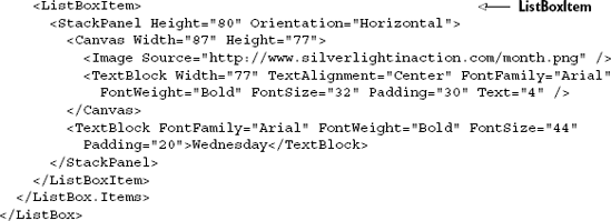
The ComboBox gives users the ability to select a single option from a list of choices. These choices are visible to a user as long as the ComboBox is in an open state, which is set when a user interacts with a ComboBox. Alternatively, this state can be set programmatically through the IsDropDownOpen property. This bool property is by default set to false so a ComboBox starts in a compacted, closed state, as shown in listing 10.8.
Listing 10.8 shows the appearance of a closed ComboBox. As you can see, this control delivers a compact approach for displaying a list of items. In fact, this control resembles the DropDownList found in ASP.NET and the select element used in HTML. But, unlike those controls, each item in the ComboBox can have a fully customized appearance; each item is a ComboBoxItem, which happens to be a kind of ContentControl. This fact enables you to recreate the list shown in listing 10.7 in the more compact form of a ComboBox.
The ComboBox also provides three members that make it unique from the other list controls. The first member is a double property called MaxDropDownHeight that allows you to customize the maximum height of the drop-down list. The second member is an event named DropDownOpened that fires when the drop-down list is shown. The third member is an event that triggers when the drop-down list closes. This event is called DropDownClosed. Collectively, these three members make the ComboBox special—they won't be found on the third and final type of ItemsControl, the TabControl.
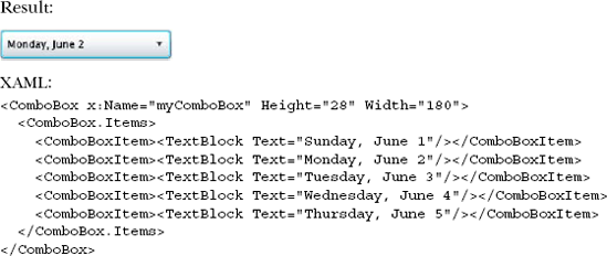
The TabControl is another ItemsControl available within Silverlight. This ItemsControl is designed to show multiple content items in the same physical space on the screen using a tab metaphor to switch between them. Each of these pieces of content is defined within a TabItem, which happens to be a ContentControl. Because of this, you can define the complete visual tree for each TabItem. Before you can do this, you must reference the System.Windows.Controls assembly. The tab-related controls are extended controls like the GridSplitter mentioned in chapter 7, so the sdk prefix will be used once again throughout this section, as shown in listing 10.9.
This listing shows an entire page, which includes a basic TabControl. Because TabControl is an extended control and is part of the System.Windows.Controls.dll, we've shown the entire page's XAML to demonstrate the use of the ext namespace. Now that you can use a TabControl, it's important to understand the behavior of the headers.
Each of the tab headers in listing 10.9 is hardly visible because each header is set by a TabItem property called Header. This property represents the object used when rendering the Header, so you should consider using some UIElement such as a Panel for the Header. Listing 10.10 shows a TextBlock used for one Header and a StackPanel for the other.
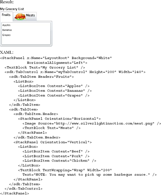
This shows a TabControl with two TabItem elements. Each element has a Header. Note that, if a TabItem has its Header property set, the HasHeader property of the TabItem will change to true. This bool property defaults to false and is useful in the event you need to check whether a TabItem has a header at runtime. For situations where you want to change the location of the tabs, there's another property.
The TabStripPlacement property determines how the tabs align in relation to the tab content area. This property represents an enumeration that can be set to Bottom, Left, Right, or Top. By default, this property value is set to Top on a TabControl.
The TabControl, ComboBox, and ListBox represent three ItemsControl elements available in Silverlight. ItemsControl elements give you the flexibility to allow a user to select from any kind of content. ItemsControls are the key type of control to use whenever you need to display lists of content: menus, list boxes, tab strips, carousels, and more.
Together with the content controls such as Buttons, the ItemsControls help make up the majority of the user interface elements you'll use in Silverlight. Chances are, if you create your own custom control, it'll derive from one of those core types.
Creating your own custom controls is a deep topic, and one that will need to wait for the discussion of styling, templating, binding, and the Visual State Manager—all covered in later chapters. But there's one type of control you can create that doesn't require all this additional complexity. In fact, it was designed for simple reuse and UI composition of existing controls such as those we've discussed in this chapter. That type of control is the UserControl.
There may be times when none of the controls provided within Silverlight contain the functionality you need. For these situations, you may want to consider creating a reusable control. A reusable control can be useful when you want something more than UI enhancements. After all, these types of enhancements can be provided with the style and template features discussed in chapter 23. A reusable control allows you to reuse functionality not found in a preexisting control. For instance, imagine wanting to create a TextBox that can be locked by a user and looks like figure 10.1.
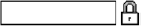
This figure shows a control that provides functionality beyond a basic TextBox. This control adds an image that projects whether the TextBox can be edited. Although the desired functionality is easy to implement, you may not want to recreate it every time; this provides an excellent opportunity to create a reusable control. Now, imagine wanting to name this control LockableTextBox to use it in other projects. To do this, you must create an instance of the UserControl class.
UserControls are intended for simple reuse. You want to be able to compose a control in the designer but not to worry about enabling templating or other advanced control functionality. We'll discuss templating in greater detail in section 23.3 but, for now, understand that the template for a UserControl is the XAML file you create with it.
The UserControl type itself is similar to ContentControl. Like ContentControl, it can have only a single item of content in the Content property. In the default item template in Visual Studio, that content is a grid, as shown in listing 10.11.
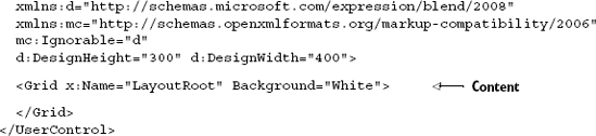
If they're so similar, why doesn't the UserControl derive directly from ContentControl? The ContentControl type allows you to provide a custom template for the Content. In a UserControl, that would be redundant because the content template is the XAML file created when you created the UserControl.
The UserControl also provides compile-time code generation for all the named (using x:Name) elements in the XAML file. The InitializeComponent function, called from the constructor, handles associating the elements in the XAML file with the generated properties. There's no magic; the code is simply loading the associated XAML using the equivalent of XamlReader.Load, then calling FindName for each expected element, and assigning the result to the named property.
You could do this in your own code if you preferred to. If you create the more flexible but marginally more difficult custom controls, you'll perform many of these steps.
The UserControl class is designed to represent a new control or extend an existing one. This class gives you the ability to organize small portions of a UI into more manageable components, which can then be used in your application or shared with other applications. The process to provide this kind of functionality involves:
Defining the appearance of the control.
Defining the behavior of the control.
Calling the control.
This three-step process forms the ABCs of user-control development (Appearance, Behavior, and Call). Over the course of this section, as you create a LockableTextBox, you'll see how these three steps relate to one another.
Defining the appearance of a UserControl involves creating the XAML for the user interface. This process is the same as defining the UI for a page in Silverlight because every page in Silverlight is a UserControl. The XAML for the UserControl (LockableTextBox) is shown in listing 10.12.
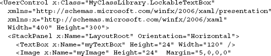
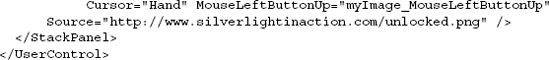
This listing shows the XAML that makes up the default appearance of the LockableTextBox. This UI defines a TextBox and an Image within a StackPanel. The StackPanel is important because, as we discussed, each UserControl can have only one UIElement as a child, so you'll almost always use one of the Panel elements discussed in chapter 7 as the content of a UserControl.
Also note that, in order to make the control truly reusable, we've put it into a separate Silverlight class library project named MyClassLibrary. This project is referenced from our main Silverlight application.
Setting the Content of a UserControl is an important first step in creating a reusable control. This step defines the static parts of the UI, but the real value in creating a reusable control is to provide some kind of new functionality. This functionality is generally delivered when you define the behavior of a control.
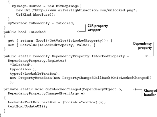
The functionality of a reusable control is also known as the control's behavior. This behavior is defined in the code-behind file of the XAML file, which will contain a class that derives from the UserControl class. It's your responsibility to make sure this class provides the events, methods, and properties that detail the behavior of the control. Look at the code for the LockableTextBox control shown in listing 10.13. This listing uses a DependencyProperty, which was covered in chapter 2.
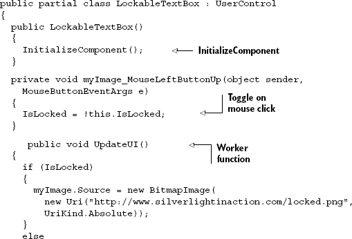
This class includes the call to InitializeComponent inside the constructor. If left out, our control references (to the textbox and the image, for example) would be null at runtime.
The class also includes the creation of a DependencyProperty for IsLocked. We introduced dependency properties in chapter 2, but let's dive a bit deeper into what's required to create them in your own class.
To register a property as a DependencyProperty, you must call the statically visible DependencyProperty.Register method. This method requires the name of the CLR wrapper, the type of the property value, and the type of the object that owns the property. Listing 10.14 shows how to register the IsLocked property.
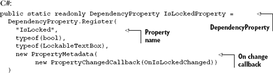
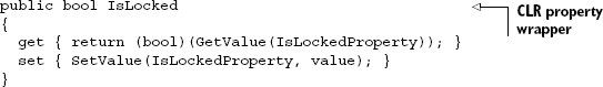
This listing shows how to register a property as a DependencyProperty. Note the name of the DependencyProperty itself. This name can be anything, but it generally follows a naming template of [CLR Wrapper Name]Property. This DependencyProperty serves as a key in the property dictionary used by the GetValue and SetValue methods of a CLR property wrapper. Also note the fourth parameter, which allows you to define behavioral aspects and automatically respond to property value changes.
While the rest of the runtime uses the dependency properties directly, the CLR property wrapper is required because it's used by direct property assignments in XAML or from your own code. Note that, unlike a normal CLR property, you'll assign the value to and read it from the dependency property system. In addition, you won't perform any other logic in the setter; you'll do that inside the changed callback instead.
Dependency properties have the ability to automatically respond to property value changes in a way that you determine. To stay connected with a value change, the PropertyChangedCallback passes along a DependencyPropertyChangedEventArgs instance, which gives you three properties to help you react to a change as necessary. These three properties are described in table 10.11.
Table 10.11. The properties of the DependencyPropertyChangedEventArgs structure
Property | Description |
|---|---|
| The value of the property after the change has completed |
| The value of the property before the change has completed |
| The |
This table shows the properties of the DependencyPropertyChangedEventArgs structure. This structure is associated with the dependency property that was changed. To get the object that this property is associated with, you must rely on the first parameter passed from the PropertyChangedCallback. This parameter represents the DependencyObject whose property value was changed, so you'll most likely need to perform a conversion, as shown here:
private static void OnIsLockedChanged(DependencyObject o,
    DependencyPropertyChangedEventArgs e)
{
    LockableTextBox textBox = (LockableTextBox)(o);
    textBox.UpdateUI();
 }
This example shows the event handler for the PropertyChangedCallback delegate specified earlier. As you can see, this is an event handler that updates the user interface of the UserControl. This optional event handler completes the implementation for the IsLocked dependency property.
At first glance, it seems that a lot of additional coding is associated with creating a dependency property. But, considering the fact that only dependency properties can be animated or used in styling, it's clear that understanding dependency properties is an important part of UserControl development. Once the behavior of a UserControl is completed, you can use the control by calling it.
To include a UserControl in your application, you must do two things. First, you must add an XML namespace that references the location of the UserControl. Then, you must add an instance of that control within your XAML. These two steps are the same for any UserControl. Listing 10.15 shows how to reference the LockableTextBox control built over the past two sections.
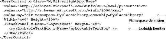
This snippet shows how to add the LockableTextBox to a basic Silverlight page. The my namespace is used to tell Silverlight where to look for the LockableTextBox definition. This definition is used to build the control, which is referenced later. That's all there is to it.
Creating a reusable control in Silverlight is as simple as defining a UserControl that consists of an appearance and a behavior. These two items generally represent a small component within a Silverlight application. Alternatively, a UserControl can represent a component as large as an entire page. This fact is important because it can affect how you decide to share your content.
UserControls are intended for simple reuse. They're great for those times when you need to compose a number of existing elements and reuse them within your application. But they're generally not the best approach for creating controls for broader reuse, which often require binding support and styling flexibility. In those instances, you need to create a custom control, which we'll cover in chapter 24—once we get binding, styling, and visual state management under our belts.
The Control, ContentControl, and ItemsControl types form the base for almost everything you'll interact with on a page in Silverlight.
The Control is a basic type, providing core interaction logic for controls. The ContentControl expands upon that base to provide a type of control that can hold a single item of content. The Button-based controls derive from ContentControl.
ItemsControls are the place to turn to should you ever need to create or use a control that shows a list of items. Remember, it doesn't need to be a traditional list; it could be something like a tab strip, or a carousel, or even a menu. In all of those cases, the ItemsControl base type provides the binding and templating support you need to work with lists of items.
The intent behind the first part of this chapter was to provide enough background so that you can both understand how existing controls function and apply that knowledge to new controls as they appear. New Silverlight controls appear almost daily, but they're almost always variations on one of the control models shown here.
In the last part of this chapter, we introduced the concept of a UserControl. UserControls are great for your own simple reuse scenarios, but you'll also find them handy for creating pages and encapsulating data templates. Though you may never create your own LockableTextBox control, you certainly will work with Pages and the other Silverlight items based on the humble UserControl.
Several times in this chapter, I mentioned the concept of binding. Binding is one of the most important concepts in Silverlight, especially when you start working with controls and templates; we'll cover it next.