
In previous chapters, you've seen interesting controls that include text, rectangles, and sometimes even more complex shapes. Even the lowly button, for example, has text, a couple of rectangles, and a gradient background. Controls such as the popup ChildWindow control have drop shadows to enhance their appearance and help them stand out in the eyes of the user. Those buttons and other controls use vector graphics, brushes, and effects.
Graphics within Silverlight are vector-based; they're mathematically based objects. They're ideal for Internet distribution because vector-based graphics can be condensed to a smaller file size than their raster counterparts for images larger than a thumbnail.
Vector-based graphics are more than eye candy—they're an extension to accessibility. In traditional application environments, users with diminished eyesight generally have to squint to absorb visual content such as text and icons. Through scalability, these same users can fully enjoy your application with ease. Vector graphics retain full fidelity when scaled up, something you can't say about bitmap images. Vectors actually improve in quality when scaled up.
Silverlight also includes rich support for effects to help make your elements and graphics stand out. The built-in drop shadow and blur effects have endless uses throughout the application. When you want to do something more than a shadow or a blur, there's also the ability to create your own pixel shader effects, just as you can in WPF and DirectX/XNA.
Throughout this chapter, you'll see the expanse of graphical capabilities within Silverlight. We'll start by discussing the most primitive shapes such as lines, rectangles, and ellipses. After discussing the concept of geometries, we'll lead you down a new path and show you how to paint shapes and alter the way in which they're rendered. From there, you'll add a little effect to your elements before venturing into the sometimes arcane world of custom pixel shaders.
Shapes are probably the most regularly used elements when creating an illustration because a Shape is the common basis for the Line, Rectangle, and other Shape elements, which you'll see shortly. Each Shape is painted by two fundamental Brush elements. (Brushes are discussed later.) The first Brush, called Stroke, defines the outline of a Shape. The second Brush, called Fill, describes how everything inside the boundary of the Shape should be painted. It's possible to create a Shape without specifying the Stroke and Fill properties, but if you don't specify the Stroke or Fill, you'll basically paint an invisible shape.
Throughout this section, we'll build on the concept of an abstract Shape to create concrete visual elements. A lot of these visual elements will resemble shapes you learned on Sesame Street, and some of these shapes will be a bit more complex. Table 18.1 provides a list of the shapes we'll discuss.
Table 18.1. The Shape objects available within Silverlight
Element | Description |
|---|---|
| A thin, continuous mark that connects two points |
| In layman's terms, a circle that can be stretched vertically or horizontally |
| A collection of connected curves and lines |
| A series of connected lines that make a closed shape |
| A series of connected straight lines |
| A four-sided plane with four corners |
The following sections describe each Shape listed in the table in greater detail. The shapes are described in order of relative complexity. The Path element is part of a more general category that'll be covered later in this chapter. First, you'll learn about the most rudimentary shape, the Line.
A Line is, obviously, a continuous line that connects two end points. Listing 18.1 shows a basic line between two points and the XAML used to define it.
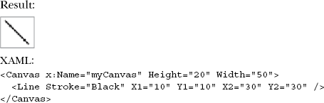
Four double-precision floating-point properties (X1, Y1, X2, Y2) specify the x and y coordinate pairs that define the beginning and ending points of the Line. Without these properties, your Line will be little more than a figment of your imagination.
Interestingly, these coordinates don't represent an absolute position. They specify a relative position within the coordinate space of the containing layout panel. Note that, although Silverlight won't automatically define the endpoints of a Line, the coordinate space of the containing layout panel may be automatically created. Regardless, the values of the coordinates represent pixel values, whether absolute or relative positioning is used.
The Canvas used in listing 18.1 has a specific area. But, as described in chapter 7, some layout panels provide a more dynamic layout environment. For instance, if this Line were the second element defined within a StackPanel, it could end up in a potentially undesirable location because the coordinates within a Line element specify a relative position.
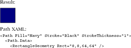
A Rectangle does exactly what its name implies—it defines a rectangle. The Rectangle in Silverlight provides one interesting tidbit that we'll discuss after listing 18.2, which shows the basic syntax of a Rectangle.
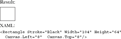
This example shows an archetypal Rectangle. The key properties involved in the definition of the element are Width and Height. Collectively, these double properties assist in creating the boundary of the Rectangle. You can determine the area of the Shape by multiplying these two property values. (This nostalgic mathematical fact isn't the interesting tidbit alluded to earlier.)
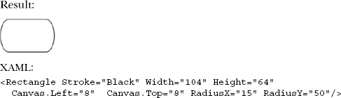
The Rectangle element exposes two properties, RadiusX and RadiusY, which empower you to easily round off the corners of any Rectangle. Before you see an example of this, consider how difficult this task would be in traditional HTML. Although there are several options, the most straightforward involves importing an image. Examine the XAML in listing 18.3, and note how simple it is to implement this elegant feature.

The RadiusX and RadiusY double-precision floating-point properties allow you to set the radius of the ellipse used to round off the corners of the Rectangle. (You'll see the Ellipse element in two shakes of a pup's tail.) By lopsidedly setting the RadiusX and RadiusY properties, you can give a Rectangle a bulging look, as shown in listing 18.4.
The bulging Rectangle is a fun little option. But occasionally, you may need a fully rounded shape. This is where the Ellipse comes into play.
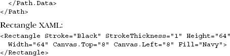
An Ellipse defines a basic circular shape. Listing 18.5 shows a basic Ellipse and the XAML used to define it.
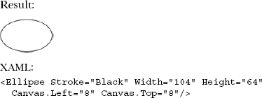
The Ellipse doesn't provide any properties that distinguish it from the Rectangle. The difference lies in how the two Shape elements are rendered. It's important to recognize that Silverlight provides this type of Shape for your graphical needs—if for nothing else than to know that you can draw a circle. Now, let's move on to something a little more interesting: the Polyline.
What if you need to create an application that represents an EKG (or ECG) monitor? How do you go about displaying the electrical impulses projected by a heart? Or, perhaps you need to create a line chart that represents sales or financial trends. These types of scenarios can entail large amounts of data that may be best illustrated through intricate line-art drawings.
You could use several Line elements, but this could prove to be cumbersome. The Polyline provides a nice alternative that allows you to create a series of connected line pieces using a single element. Listing 18.6 shows a Polyline in action.
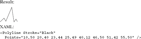
The Polyline uses a space-delimited list of coordinate pairs to define the line drawn. Although each coordinate pair in this example contains integer values, each value represents a Point. A Point is represented in the form of [X-Coordinate],[Y-Coordinate]. Collectively, all these Point elements are stored in the Points property. In being consistent with the Line, each Point within the list is relative to the containing layout panel.
The Polygon goes one step beyond the Polyline by ensuring that the Shape is always closed. A Polyline creates an open Shape, whereas a Polygon always draws a closed Shape. Listing 18.7 shows a basic trapezoid created with a Polygon.
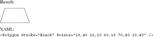
Like the sibling Polyline, the Polygon also utilizes the Points property. This property works in a manner similar to the Points property of the Polyline; but regardless of your selected coordinates, the Polygon always draws a closed shape.
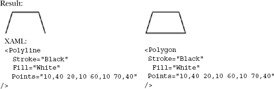
Listing 18.8 shows a Polyline and a Polygon using the same coordinates to illustrate how Silverlight renders them.
The available shapes provide a lot of flexibility to give your users valuable graphical experiences. Occasionally, your requirements may exhaust the abilities of the various shapes. A Geometry is a much more versatile option that can address the inadequacies of a Shape.
At first, a Geometry seems similar to a Shape because they both describe 2D shapes. Unlike Shape elements, Geometry objects aren't UIElement entities. UIElement objects have an intrinsic ability to render themselves and expose graphical properties, such as Opacity, that Geometry objects don't have. Why, then, would you consider using a Geometry? Well, a Geometry allows you to do the following:
Define a geometric shape. For example, imagine creating a user-based rating system. In this scenario, you may want to use a set of five-pointed stars to rate an item. Although a star isn't a predefined shape, you could create this element using a
Geometry.Define a region for clipping. Clipping is used to limit the visible area of another object.
Define a region that can be used for hit-testing.
These compelling reasons make examining the Geometry object a worthwhile endeavor. A Geometry is an abstract concept. In fact, you can't deliberately create just a Geometry. Instead, you must rely on the geometrical concepts spread across three basic categories: simple, path, and composite geometries.
A simple geometry reflects some of the primitive geometrical shapes that you've already seen. Simple geometries—such as LineGeometry, RectangleGeometry, and EllipseGeometry—are provided to help you illustrate lines, rectangles, and circles.
A LineGeometry illustrates the geometry of a basic line. Listing 18.9 shows how to draw a line using a LineGeometry element. The example also shows what the same markup would look like if you used the basic Line Shape described earlier.
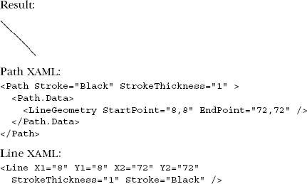
From this example, you can see that using the Line Shape XAML is much more compact. But you can use also Geometry objects for clipping and hit-testing.
In addition to the LineGeometry, a RectangleGeometry is also provided. The RectangleGeometry defines the geometry of a rectangle. Listing 18.10 shows how to create a rectangle using a RectangleGeometry and also provides the corresponding definition with the Rectangle Shape.
Like the Rectangle Shape, the RectangleGeometry also supports corner-rounding via the RadiusX and RadiusY properties. Finally, we'll review the EllipseGeometry for the sake of completeness (see listing 18.11).
As useful as lines, rectangles, and circles are, occasionally, you need to create a more dynamic shape. To create more complex shapes, Silverlight supports the use of the PathGeometry.
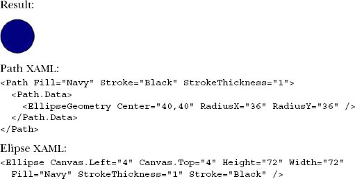
A PathGeometry enables you to construct complex, detailed illustrations composed of a variety of arcs, curves, and lines. These intricate depictions consist of a collection of PathFigure objects, with each PathFigure representing a small section of the overall illustration. In turn, each PathFigure is made up of a series of PathSegment objects. Each PathSegment object describes a small piece of the overall figure. Before we get too far ahead of ourselves, let's review a basic example that shows a variety of meaningless squiggly lines for the sake of illustration (see listing 18.12).

This example uses five different segment types to create random squiggles. Each individual segment sequentially connects to the previous one, much like cars in a freight train. Table 18.2 shows all the available segment types.
From the options presented, it's clear to see that you have tons of flexibility when it comes to creating a geometrical shape. Sometimes you may need to explicitly use other geometry objects. In these scenarios, you can use a composite geometry.
Table 18.2. Available segment types
Segment type | Usage |
|---|---|
| A straight line connecting two points |
| A series of lines |
| An elliptical arch between two points |
| A cubic Bézier curve between two points |
| A series of cubic Bézier curves |
| A quadratic Bézier curve |
| A series of quadratic Bézier curves |
You may need to create a complex shape that consists of disconnected entities. Or, maybe you need to use Geometry entities, and you want to combine their area. The
GeometryGroup adequately addresses these scenarios. A GeometryGroup is a collection of Geometry entities. Listing 18.13 illustrates how to orchestrate a composite geometry.
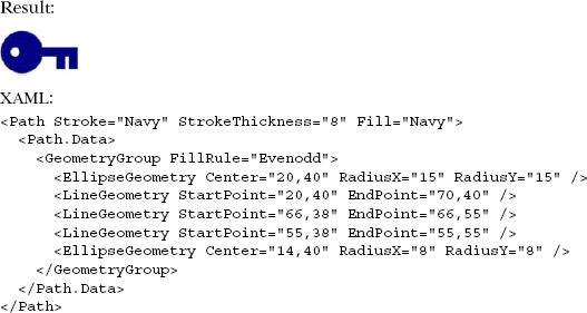
This listing illustrates how to create a key using a complex geometry via the GeometryGroup. It also introduces a property called FillRule, which determines how conflicting areas should be filled. There are two acceptable values: EvenOdd and Nonzero.
EvenOdd, the default used in the previous example, is pretty simple. It begins at a point and goes outside of the overall shape, counting each line that it intersects along the way. If the count is odd, the point is inside the shape. If the count is even, the point is outside the shape. This rule determines how to fill the area.
Alternatively, if the previous example had used the Nonzero option, the hole to place the key on a key ring would've been filled because Nonzero counts the number of lines it intersects along the way. But it also considers the direction of the line. Based on the direction, the count is either incremented or decremented. At the end of counting, if the total is zero, it's assumed that the point is inside the overall shape.
To take control of how an element is filled, you can use one of Silverlight's many brushes.
Up to this point, you've seen how to define the boundaries of the various Shape elements. It's equally important to understand how to fill the area within a Shape. To paint the interior of a Shape or a variety of other visual elements, you must choose from myriad Brush options including SolidColorBrush, LinearGradientBrush, RadialGradientBrush, ImageBrush, and VideoBrush.
The SolidColorBrush is without a doubt the most rudimentary of the Brush options. A SolidColorBrush uses a single, solid color to paint an area. Listing 18.14 shows a basic circle using a SolidColorBrush.
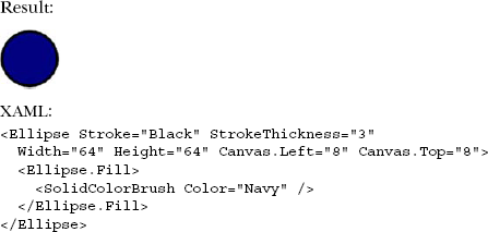
This SolidColorBrush uses a System.Windows.Media.Color property named Color to specify which color fills the area. Properties of this type can accept values represented in one of the following ways:
A predefined named color, such as Navy, that matches one of the names supported in Internet Explorer, .NET Framework, and Windows Forms. Importantly, the
Colorclass in Silverlight belongs to theSystem.Windows.Medianamespace. In Windows Forms, it belongs to theSystem.Drawingnamespace.A Red, Green, Blue (RGB) hexadecimal string in the format of #RxGyBz. For instance, in listing 18.14, you could replace
Navywith its hexadecimal representation,#000080.An RGB hexadecimal string with an alpha channel in the format of #aRGB. This format gives you a greater range than the typical RGB hexadecimal string because it has built-in support for the opacity channel. As an example, you could convert
Navyto#AA000080to give the color a washed-out appearance.
These color options give you a lot of flexibility when you're defining a SolidColorBrush. If you're using XAML, it's much more convenient to explicitly set the Fill property of a Shape, or any property that's a Brush, and let Silverlight automatically convert the value to a SolidColorBrush for you. Because of this, you could condense the previous markup to this:
<Ellipse Stroke="Black" StrokeThickness="3" Fill="Navy"
  Width="64" Height="64" Canvas.Left="8" Canvas.Top="8">
</Ellipse>
Although this explicit approach is convenient, it's still important to remember the SolidColorBrush, because if you're trying to use solid colors through managed code, you'll need to use the System.Windows.Media.SolidColorBrush class.
Occasionally, you may want something richer and more vibrant than a solid color. Thankfully, Silverlight provides several alternatives such as the LinearGradientBrush.
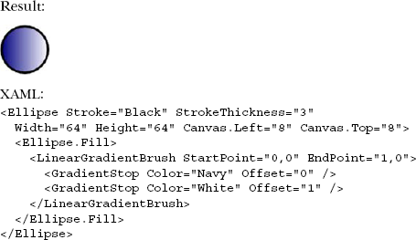
The LinearGradientBrush paints an area with a gradual, soothing shift between colors along a theoretical line. This Brush can shift between one or more colors through the use of a series of predefined locations represented as GradientStop elements. Each GradientStop element specifies where one color should shift to another. Listing 18.15 shows a basic LinearGradientBrush that uses two GradientStop elements to shift from one Color to another.
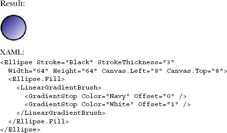
This Ellipse illustrates how the LinearGradientBrush can be used to shift from Navy in the upper-left corner to White in the lower-right corner. Each GradientStop in the LinearGradientBrush specifies an Offset property that determines where the color, specified in the Color property, should be reached within the Brush coordinate space. But how does the Offset property know that 0 means the upper-left corner and 1 means the lower-right corner?
The Offset property relies on two other properties, which are defined within the LinearGradientBrush definition itself. These two System.Windows.Point-based properties are StartPoint and EndPoint and ultimately determine the beginning and ending of a gradient. Collectively, these two properties define a rectangular boundary in which the Offset property works. This coordinate space can best be visualized as shown in figure 18.1, where each corner displays a Point value.
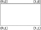
By default, the StartPoint property is set to represent the upper-left corner (0, 0) of this coordinate space. Conversely, the EndPoint defaults to represent the lowerright corner (1, 1) of the coordinate space. You can manipulate both property values to take full control of the range in which the gradient occurs, as well as the direction.
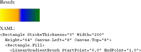
Imagine taking the previous example and making the gradient run horizontally instead of diagonally. This can be accomplished by altering the StartPoint and EndPoint property values, as shown in listing 18.16.
Although you could've rotated the imaginary gradient line by altering the Offset property values of each of the GradientStop elements, the StartPoint and EndPoint properties give you control over the entire range of the gradient. This fact becomes particularly important when you begin to consider using multiple color transitions.
Both the LinearGradientBrush and the RadialGradientBrush, which you'll see shortly, allow you to define as many GradientStop elements as you want. The more GradientStop elements that are added, the more important it is to understand the relationship between the Offset property and the StartPoint and EndPoint properties. Listing 18.17 shows how to use multiple GradientStop elements by adjusting the Offset property.
As the previous examples have shown, the LinearGradientBrush provides you with a lot of opportunity to add richness to your applications. Occasionally, you may want to add a sense of depth to your graphics. Although Silverlight supports only 2D graphics, you can still deliver the illusion of depth by using a RadialGradientBrush.
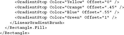
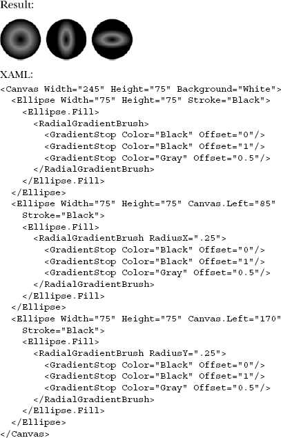
The RadialGradientBrush is similar to the LinearGradientBrush except that the color transitions begin from an originating Point. As the Brush radiates from the center, it gradually paints elliptical transitions until a GradientStop is encountered. This process continues from one GradientStop to the next until each one has been rendered. Listing 18.18 illuminates a basic RadialGradientBrush.
As this example shows, the brush begins at the center of the Ellipse by default. This originating Point can be customized in one of two ways. The first approach involves specifying a Point value within the Center property. The Center Point represents the focal point of the outermost ellipse of the gradient. Alternatively, or in conjunction with the Center, you can use the GradientOrigin property to specify the Point that defines where the radial gradient emanates from.
As a radial gradient is rendered, it grows from the GradientOrigin in a circular fashion. Sometimes it's necessary to use a more elliptical gradient instead of a pure circular effect. To define an elliptical gradient, you need to utilize the RadiusX and RadiusY properties, which are consistent with the properties of the same name from the Ellipse element. Listing 18.19 compares several ellipses using different RadiusX and RadiusY properties, which both default to .5.
As the previous examples show, you can use a RadialGradientBrush to provide basic linear and radial effects. Although these Brush elements are appropriate in certain situations, occasionally you need to deliver a richer, more textured effect. Textures are often delivered via images, which can be painted on visual elements using an ImageBrush.
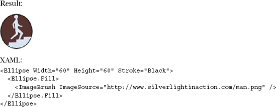
The ImageBrush allows you to fill an area with an image instead of a solid or shifting color. The ImageBrush utilizes a picture specified within the ImageSource property to paint a raster graphic. This Brush supports both .jpg and .png formats to deliver a textured effect to your visual elements. Listing 18.20 shows a basic ImageBrush using an image named man.png.
As you can imagine, an ImageBrush can easily add a rich, vibrant touch to your painting surface. Sometimes, you may want your painting surface to be more dynamic and livelier. With the same type of simplicity as the ImageBrush, you can paint a surface with a video, using the VideoBrush.
Imagine watching a shooting star speed across the night sky through the elliptical eyepiece of a telescope. With the VideoBrush in action, you can deliver this type of scene by drawing an Ellipse and filling it with a MediaElement. Listing 18.21 shows exactly how to use the VideoBrush.
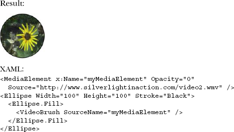
As this example shows, the VideoBrush references a MediaElement through the SourceName property. This fact allows you to manipulate the playback functionality of a VideoBrush by altering the playback of the MediaElement as defined in chapter 7. If you want to pause or stop the video displayed within a VideoBrush, you call the Pause() or Stop() method of the MediaElement that the VideoBrush references.
Up to this point, the Brush elements have been used in relation to a basic Ellipse. An Ellipse was chosen for the sake of illustration; you can use all the Brush elements that we've covered in any number of visual elements, including but not limited to a Canvas, a TextBox, or even a TextBlock, as listing 18.22 shows.
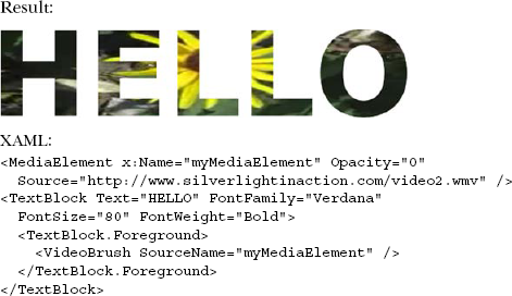
This sample only begins to show the potential allotted by the different Brush elements. All the Brush options are usable in any property that has a Brush type. You can have a video paint text, or an image paint shapes or even controls. The sky's the limit.
In addition to these rich Brush options, Silverlight supports an interesting set of features that can further alter the appearance of your shapes. Collectively, these are called effects.
Much as is the case with animation, the subtle and appropriate use of effects can make the difference between a UI that just sits there and one that really pops, drawing your eye to information that's important to you.
Effects in Silverlight come in two primary forms: built-in effects, implemented in the native Silverlight hardware-accelerated runtime code; and pixel shaders, implemented by folks like us using a combination of managed code and High Level Shader Language (HLSL) and run in software. The former allows for maximum performance for common effects such as blur and shadows. The latter provides a lot of flexibility to allow us to provide our own effects, while not breaking out of the sandbox.
In this section, we'll cover both types of effects. We'll start with how to use the built-in effects and follow that up with a primer on creating your own pixel shader effects.
Silverlight has two built-in effects: blur and drop shadow. The effects may be used on any element or group of elements in the visual tree.
Elements that have effects applied remain as interactive as they did prior to the effect. Although it may be hard to read the text in a blurred-out TextBox, the TextBox is still fully functional.
The blur effect in Silverlight, implemented through the BlurEffect class, provides a way to shift an element or group of elements out of focus, as though you were looking at it through frosted glass or a bad lens.
Blur has only one property of interest: Radius. The Radius property controls how large an area is sampled when the blur is run: the larger the radius, the blurrier the result. Note that the larger the radius, the more computations required to achieve the blur—a potential performance consideration, especially if a large area or animation is involved.
Listing 18.23 shows how to use the BlurEffect on a group of UI elements in a StackPanel.
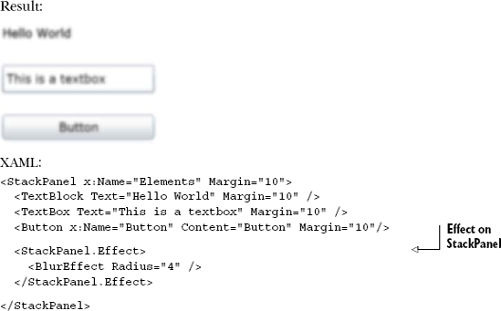
In listing 18.23, the blur effect is applied to the entire StackPanel containing all the UI elements. The net result is to blur everything inside that container. You can also apply a blur to individual elements, of course. The effect is attached to the StackPanel using the Effect property. The Effect property can have only one effect at any point in time. If you want multiple effects on a single element, you need to use nested panels or borders and apply the effects one per panel/border.
The blur effect is useful when combined with things such as a pop-up modal window (see chapter 15). In that case, a slight blur of the page contents helps drive home the fact that the pop-up is modal and demands all of your attention.
The second built-in effect is the drop shadow.
The drop shadow effect is one of those effects that's best used in moderation, and used subtly when used at all. Not only is there a performance and rendering quality concern, but aesthetically, those of us who aren't designers tend to use bold shadows more often than looks good in an application.
The DropShadowEffect class has several knobs you can use to fine-tune the effect. Table 18.3 shows the five properties that alter the appearance of the effect.
Table 18.3. Important DropShadowEffect properties
Property | Description |
|---|---|
Specifies the color of the shadow. Default is | |
| Distance in pixels to displace the shadow relative to the element the effect is applied to. Default is 5 pixels. |
| An angle in degrees from 0 to 360 (counterclockwise), indicating where the shadow lies relative to the element the effect is applied to. The default is 315, which places the shadow in the lower-right corner. |
| Controls the blurriness of the shadow. A double value between 0 and 1, with 1 being the softest. Default is 0.5. |
| Specifies how opaque the shadow is. A double value between 0 and 1, with 1 being fully opaque. Default is 1. |
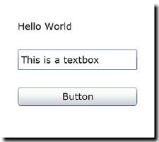
When playing with shadows, I've found it more aesthetically pleasing to have the ShadowDepth be 0 or close to 0, the Opacity set to some value around 0.5 or so, and the BlurRadius set to a value that spreads out the effect—10 usually works well. That gives you a light shadow that bleeds around all the edges. Listing 18.24 shows these settings in use in the effect.
In listing 18.24, note that the effect is applied to a grid with an opaque background  .If the grid had a transparent background, the effect would be applied individually to each of the items inside the grid.
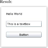
As described before the listing, this example uses a large blur radius, 50 percent opacity, and a shadow depth of only 1 pixel. This provides a more pleasing and subtle effect than the default shadow appearance. Compare that to figure 18.2, with the properties all left at their default values.
Most people would find the default appearance a bit jarring, or at least a little outdated. Fortunately, the Silverlight team gave us all the tweaks we need to be able to make the shadow look better.
In addition to these designer-type recommendations, you should keep a few other things in mind when using effects.
The built-in effects perform well, but they'll tax your system resources if you apply them to a really large area and/or animate any of the values on the effect. For example, one thing I did early on was animate the background blur from 0 to 5 when displaying a new dialog. It worked, but it was a processing hog.
In addition to processing time, another consideration is the quality drop in the result. Any elements with an effect applied to them are rendered out to a bitmap. That means you automatically lose ClearType font rendering and fall back to grayscale rendering. One way to get around this is to apply the effect to a shape of the same size that sits behind the elements. Listing 18.25 shows how to use a rectangle behind the grid to ensure that the grid contents stay at top rendering quality.
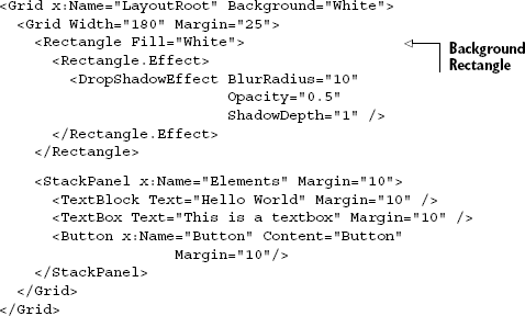
This example removes the effect from the grid and places it on a background rectangle sitting behind the elements. Because the rectangle isn't a parent of the elements, the effect isn't applied to them. The only thing that's rasterized in this example is the Rectangle. The text retains ClearType font rendering.
The Silverlight team may add more effects over time. Requests include true multipass effects such as glow. In the meantime, it's possible to create your own single-pass effects using a little Silverlight code and the shader language.
Most people who know about pixel shaders have run across them in game development. Games and various types of shaders have gone hand in hand because video cards became powerful enough to offload most or all of the shader calculation and logic. Most work done with pixel shaders is performed using the DirectX SDK and optionally XNA.
WPF also supports pixel shaders. Entire libraries of transitions and effects are available on CodePlex, all built using hardware-accelerated shaders.
Pixel shaders in Silverlight are a simplified form of the full pixel shaders used in games or in WPF. For security reasons, the shaders are all run in software and currently support only Pixel Shader level 2. By not running them in hardware, Silverlight can sandbox the code and avoid someone running malicious code on your video card. But as technology progresses, the Silverlight team will likely consider allowing the shaders to run on hardware in selected scenarios.
Pixel shaders perform per-pixel processing on input. That input can be anything you see in the visual tree in Silverlight, including images, video, and controls. Pixel shaders in Silverlight are created using two main files. The first is a .NET class that's used to wrap the shader functionality and expose it to the rest of Silverlight. The second is the pixel shader itself, written in HLSL as an .fx file and compiled into a .ps file as a resource in the Silverlight project.
Pixel shaders are written in HLSL, a C-like language optimized for pixel processing. The language is geared toward running on video card hardware, so you have to deal with things such as registers, fixed numbers of variables, and limitations on overall complexity. In some of those ways, it's like working in assembly language. You can find a reference on HLSL syntax on MSDN at http://bit.ly/HLSLReference.
Pixel shaders in Silverlight are software-rendered, but are parallelized. Although they don't take specific advantage of capabilities of video hardware, they're executed using the CPU's fast SSE instruction set.
Silverlight supports the ps_2_0 profile of the Shader Model 2 specification. A shader profile is the target for compiling a shader, whereas a shader model is a specification for capabilities of the shader. You'll need to understand this when looking at existing shader implementations to port to Silverlight or learning about HLSL syntax. In the case of Shader Model 2, the limitation you're likely to hit is the 96-instruction limit. That limit is broken down into 64 arithmetic instructions and 32 texture-sample instructions. The 64 arithmetic instruction limit will almost certainly be a bounding limit for shaders of any complexity. In addition, if you manually compile the shaders using the DirectX SDK, you'll need to know what profile to use.
The most difficult part of writing a pixel shader is setting up the environment to allow them to compile. There are three main options:
Download the DirectX SDK, and use the compiler there to build the shader.
Repurpose the WPF pixel shader build step.
Use a tool such as Shazzam to create and compile the shader.
You can download the DirectX SDK and use its command-line tools to compile the shader. The SDK is roughly 500 MB and may be a bit much just to compile a shader.
Option 2 is to repurpose the WPF pixel shader build step. Tim Heuer put together a great blog post covering the steps required to set up your environment for developing pixel shaders. It'd be too much to include in this book, so I refer you to his post here: http://bit.ly/SLPixelShaderCompile. I chose option 2, using a build task. It involves some configuration as well as a template for the shader development.
Another option is to use a tool such as Shazzam (http://shazzam-tool.com) to compile the shader and manually add that into your project. Most Silverlight and WPF developers doing serious work with pixel shaders use this tool. It also includes a number of training videos to help you get started with pixel shader development. Finally, Shazzam includes a bunch of existing shaders in source form that you can learn from.
Despite its hackish nature, if you want everything to happen inside Visual Studio, I think you're better off starting with Tim's approach for the project structure. If you don't need everything integrated into Visual Studio and can add the files manually, you'll find that Shazzam is the best long-term solution. In either case, you'll likely have Shazzam open while you explore pixel shader development.
When your environment is set up and you can compile pixel shaders, you're ready to develop one of your own. Go ahead and set up your environment now. I'll wait.
Pixel shaders are typically fairly complex; they do things such as alter the visual location of pixels based on a complex algorithm. Learning how to write shaders is like learning any other programming language, but with a heavy focus on performance and optimization.
A good place to learn is the WPF Pixel Shader Effects library on CodePlex: http://wpffx.codeplex.com. Although originally intended for WPF use, Silverlight effects were added once Silverlight supported HLSL-based pixel shaders.
Listing 18.26 shows the HLSL source code for a pixel shader that takes a color and multiplies every pixel by that color. The result is an image that appears to have been photographed through a tinted lens.
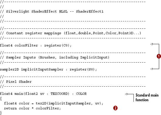
The shader first maps values into registers supported by the shader model. Each input and constant must be mapped to a register. A register is a well-known place in hardware (virtual hardware in the Silverlight case) that can be used to store a value. Registers are much faster than regular RAM when it comes to accessing values. If you've ever done any x86 assembly language programming, or even any old DOS interrupt programming, you know well the concept of registers.
The section comments aren't required, but you'll find them in almost every pixel shader implementation. Usually I'd leave them out of a code listing in this book, but the shader is completely naked without them.
The actual code starts under the Pixel Shader section. Like all pixel shaders in Silverlight, this has a main function that takes in a UV coordinate (a standard way of referring to an x and y position on a texture or image, but normalized into the range of 0 to 1 rather than absolute pixels) and returns a float4 color  .
.
When you have the HLSL source for your shader, you'll need to write a .NET class to expose it in your project.
To use a pixel shader, you need to provide a way for the rest of .NET to interact with it. The wrapper class (often called just the pixel shader class) is responsible for loading the compiled shader code and for exposing properties used to tweak the shader. The Pixel Shader file template includes a wrapper class. In addition, Shazzam will generate the wrapper class for you. The wrapper class for this example is shown in listing 18.27.
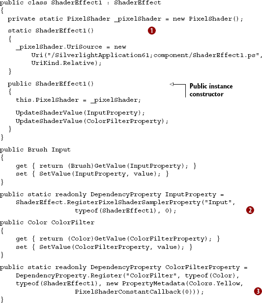
The static constructor loads the pixel shader resource into a static PixelShader typed property. Note the .ps extension: it's loading the compiled resource. The PixelShader is static because only one copy of the compiled code is needed within an application.
Each of the dependency properties maps to a register in the shader. One of the properties, of type Brush, is mapped implicitly . Any additional properties must be mapped directly to registers. In this source, you can see that the ColorFilterProperty maps to constant register zero  in the pixel shader. The
 PixelShaderConstantCallback takes the register number as a parameter. In the HLSL source, constant register zero is mapped to the variable colorFilter.
But how did a Color property become a float4, and what's a float4 anyway? Those are built-in vector types in the language. Table 18.4 has the mapping.
Table 18.4. Mapping from .NET types to HLSL types
Shader type | Description | .NET type |
|---|---|---|
| A single floating-point number |
|
| A vector with two floating-point numbers |
|
| A vector with three floating-point numbers | (Unused in Silverlight) |
| A vector with four floating-point numbers |
|
The member names for the individual floats depend on their usage. For example, a color has the properties r, g, b, and a.
HLSL is interesting in that it can perform multiplication and other operations on whole structures. In that way, the number of instructions is reduced, but it can be hard to understand when you first look at it. For example, the exmple multiplies together two float4 values.
With the shader compiled and the wrapper class in place, it's time to try the shader in your own application. Like any other element used in XAML, you must either include an implicit namespace in your application settings or map a namespace in the XAML file. In this case, because the shader is in the project with the XAML, you'll use an explicit map in the XAML.
Listing 18.28 shows the effect of using the shader with a red tint. It'll look gray in print, but you can tell there's a tint over the whole image.
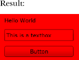
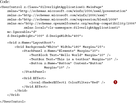
This is the same example used in previous sections, but instead of a drop-shadow, it uses the pixel shader with a parameter of Red for the ColorFilter property . The end result is an angry red form. As was the case in the other examples, the use of a pixel shader has reverted the text back to grayscale font smoothing.
Pixel shaders are a great way to provide your own custom effects or to use effects developed by others. Learning HLSL can be difficult at times, but the payoff is worth it: you can use pixel shaders in Silverlight, in WPF, and, of course, in DirectX and XNA. Pixel shaders, even the software-rendered ones in Silverlight, are extremely efficient as well. When considering pixel-manipulation strategies in an application, the creation of a pixel shader should be high on your list of options.
Silverlight's inherent graphical capabilities go far beyond cartoons and visual fireworks. By shaping these elements into illustrations, graphics can provide a bridge to your users to help them connect with difficult concepts. These valuable illustrations can be composed of a series of shapes compiled from arcs, curves, and lines. These shapes can then be filled with gradient colors or textured visuals such as images and videos.
Effects augment both graphics and controls. The use of a subtle drop shadow or a blur can help users focus their attention on a specific part of the screen. If those effects aren't sufficient, you also have the option to create your own effects in the form of pixel shaders.
Vector graphics and effects are definitely some of the strong points in Silverlight. Previous technologies had no equivalents; you had to write everything from scratch or use primitive drawing options. Silverlight also has rich support for images and media, another of its strong points. We'll discuss that in chapters 20 and 21. Before we get there, let's put our newfound vector graphics skills to use on that oldest of modern media: paper.