
Panels in Silverlight provide a way to host multiple elements and provide unique layout logic. For example, you may want a panel that lays out elements so they appear to radiate out of a central point (think of the wheel on Wheel of Fortune). Rather than provide each and every control with the knowledge required to perform that layout, Silverlight leaves it to the panel.
This delegation to panels and the layout system is why you won't see Left and Top properties on UI elements—those properties are provided by the panels in the form of attached properties (see section 2.1.5 for more information on attached properties).
In typical use, any control you place in the UI in Silverlight is going to be hosted in a panel at some level. Understanding how the different panels work is essential to making the most of Silverlight's UI capabilities.
Though there are numerous types of panels available, the three most important and widely used are the Canvas, the StackPanel, and the Grid.
We'll start with the simplest panel, the Canvas, and from there move on to panels that provide more layout functionality. The StackPanel forms the basis of most list and menu implementations but is still relatively simple in its layout and functionality. The Grid, the final panel in this section, is typically the root of our interfaces and is one of the most powerful, flexible, and complex panels available.
Envision a painter inspired to recreate a mountainous landscape. As you can imagine, a tremendous amount of artistic freedom is required to adequately mimic this majestic view. Painters have the luxury of a conventional canvas, which gives them free rein over their illustrations. Unfortunately, traditional web technologies can occasionally be overly rigid, imprisoning you and making it difficult to deliver awe-inspiring content over the Internet.
Thankfully, in addition to being the highest-performing and lightest-weight layout panel, the Canvas element gives you the same type of freedom that painters have long taken for granted. This Panel allows you to say, "I want this element at this exact location," and accomplish that. Before we discuss the details of Canvas, we should look at the basic syntax of a Canvas, as shown here:
<Canvas Height="200" Width="300" Background="White">
</Canvas>
This bit of XAML shows an empty Canvas with a white background. To show something contained within the canvas, you need to add some content, such as a basic block of text, as seen here:
<Canvas>
  <TextBlock Text="Hello, Silverlight" />
</Canvas>
This shows a basic Canvas with a small amount of content: a single TextBlock. The content of a Canvas consists of elements inside the Canvas. These child elements are added to a collection, called Children, which is accessible from code. Each item in this collection derives from the UIElement type described in section 6.1. We'll use a UIElement called TextBlock to show you how to arrange content within a Canvas.
You can arrange the content within a Canvas by using at least one of two approaches. The first approach involves setting the vertical and/or horizontal offsets of an element within a Canvas. The other method revolves around setting the stack order of an element within a Canvas. These methods can be used in combination for full control over how each piece of content is shown. Let's take it one step at a time and investigate how to set an element's offsets.
By default, the content within a Canvas is automatically arranged at 0,0. This approach places all of the content in the upper-left corner of a Canvas. To move content out of this corner, you must take advantage of two attached properties—Left and Top—which are shown here:
<TextBlock x:Name="tb" Text="Hello" Canvas.Left="20" Canvas.Top="30" />
This TextBlock uses the Left and Top attached properties to set its position within an imaginary Canvas. The Left property specifies the distance, in pixels, from the left edge of the TextBlock element to the left edge of the parent Canvas. Likewise, the Top property sets the number of pixels between the top edge of the parent Canvas and the top edge of the TextBlock. This specific sample places the TextBlock 20 pixels from the left and 30 pixels from the top of a parent Canvas. Alternatively, you may need to set these values at runtime.
To set the position of an element within a Canvas at runtime, you must do so programmatically. The Canvas element exposes two statically visible methods that enable you to set an element's position at runtime. There are also two other methods—illustrated here using the TextBlock from the previous example—that enable you to retrieve an element's position at runtime:
double newLeft = Canvas.GetLeft(tb) + 15.0;
Canvas.SetLeft(tb, newLeft);

double newTop = Canvas.GetTop(tb) + 30.5;
Canvas.SetTop(tb, newTop);
This example shows how the GetLeft and SetLeft methods are used to move a TextBlock 15 pixels to the right. Alternatively, you could've subtracted a value to move the TextBlock to the left. This example also moves a TextBlock down by 30.5 pixels using the GetTop and SetTop methods. In a similar approach, you could've subtracted a value to move the TextBlock up. Either way, it's important to note that you could've passed any UIElement to this method in place of the TextBlock.
Any time you set the location of an element, you must use a double value. This double-precision value represents a specific number of pixels. If you aren't careful, you may inadvertently overlap the content within a Canvas. Although this overlapping effect can occasionally be desirable, it's still useful to know how to set the stacking order.
By default, when content is rendered within a layout panel, each element is rendered on its own imaginary layer. This ensures that the last element in a layout panel is shown on top of all the others. The other elements are still present; they're just overdrawn by the overlapping content, as shown in listing 7.1.
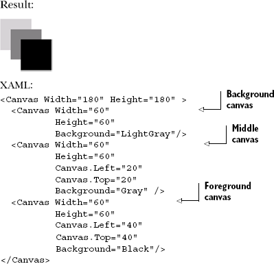
Listing 7.1 shows the natural stacking approach used when rendering overlapping content. The content overlaps in this orderly fashion because, by default, its ZIndex (or stacking position) is set to 0.
Tip
Even though Canvas.ZIndex is an attached property on the Canvas type, it works within other panels such as the grid, even if there's no canvas present anywhere in the visual tree. Note that ZIndex is relative only to the panel and not to the application as a whole.
You can change the ZIndex value to a value greater than 0 to move the Canvas farther into the foreground, as shown in listing 7.2. The element will be placed on top of the elements that have a smaller ZIndex within the same panel.
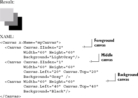
This short example shows how to move an element further into the foreground of a Canvas. You add a value to the integer value represented by the ZIndex. Alternatively, you could've moved the element somewhere into the background by subtracting a value. Either way, the Canvas gives you the ability to set the stack order and offsets to your liking. In addition, the Canvas provides some performance features that really pack a punch.
Tip
Playing around with ZIndex can get frustrating and difficult to track once you have several overlapping panels, each with elements with specific ZIndex values. Whenever possible, arrange your elements so they make sense in the natural order. In addition, try not to animate ZIndex because the Silverlight runtime rearranges the visual tree to get the required z positioning. This can be a real performance drain.
Once in a while, I'll peel my eyes away from my computer and pick up a newspaper. One thing (other than the funnies) that catches my eye in the paper is the crossword puzzle. The layout of a typical puzzle looks like that shown in figure 7.1.

If you look at the overall structure of this crossword puzzle, you can derive that each word consists of either a horizontal or vertical stack of letters. Each of these stacks represents a small segment of the overall puzzle. This representation is used to position each letter successively to create a recognizable word within a smaller context.
Much like a word is a grouping of letters in a crossword puzzle, a StackPanel is a grouping of visual elements. Each successive visual element is positioned vertically or horizontally within a single row or column, as seen in listing 7.3.

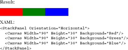
As shown in the listing, elements within a StackPanel are rendered one after another from top to bottom. The StackPanel exposes an Orientation property, which allows you to specify whether child elements are stacked in a Vertical or a Horizontal manner, as shown in listing 7.4.
As you can see in listing 7.4, shifting the layout from a vertical to horizontal orientation is as simple as including a single property. In addition, layout panels of any type can be nested within one another to fully dictate an application's arrangement.
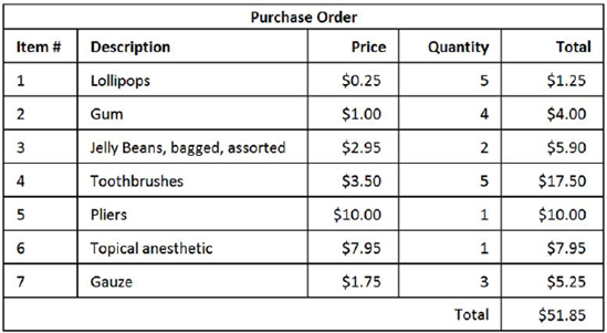
Nesting layout panels is incredibly important when you begin to consider the entire scope of an application. Although the StackPanel is great for one-dimensional (vertical or horizontal) content, it's not suited for organizing large amounts of elements. Consider the illustration in figure 7.2.
Imagine attempting to recreate the purchase order shown in figure 7.2 using a series of StackPanel elements. Up front, you'd have to decide if you want to create vertical or horizontal elements. Then, you'd have to specify the Width of each StackPanel because StackPanel elements are arranged and sized independently of each other. There has to be a better way to organize tabular data. Thankfully, Silverlight provides the powerful Grid panel to do just that.
Of all the layout panels, the Grid is the one you're likely to use the most. It's the default root layout element for all the UserControl and Page templates, and is the one control that allows you to easily resize (not rescale) content to take up the space available to the plug-in.
Though the Grid is similar to an HTML table element, it expands on a number of features, such as proportional and absolute row and column sizing, the ability to have any row or column be the one that takes up all the available space, gracefully handling of column and row spanning, and an easily consumed API for manipulating rows and columns at runtime.
Throughout the remaining sections, we'll take a deep look at the Grid, starting with the basics of how to position content in rows and columns. From there, we'll work on cell spanning and sizing of Grid cells. Up until that point, we'll primarily be working with XAML. For that reason, we'll look at what's required to build and manipulate the Grid from code. Finally, we'll cover using the splitter to allow the end user to resize Grid columns and rows.
The Grid panel gives you the ability to easily lay out content in a tabular format. This tabular format is similar to the table element in HTML, but the table element can occasionally be difficult to work with during development. For instance, it can be challenging to determine how many rows or columns exist in a table while coding. To help overcome this challenge, the Grid in Silverlight defines its rows and columns in two distinct collections. Appropriately, these collections are called ColumnDefinitions and RowDefinitions.
The RowDefinitions collection stores the definitions of the rows of a Grid. Each row is set through an element called RowDefinition. This element is primarily responsible for defining the dimensions of a single horizontal row. Similarly, the Grid also enables you to create a ColumnDefinition element. This element must be defined within the ColumnDefinitions collection. As you'd expect, this element generally sets the dimensions of a vertical column within a Grid. By default, you don't have to set these dimensions, as shown in listing 7.5.
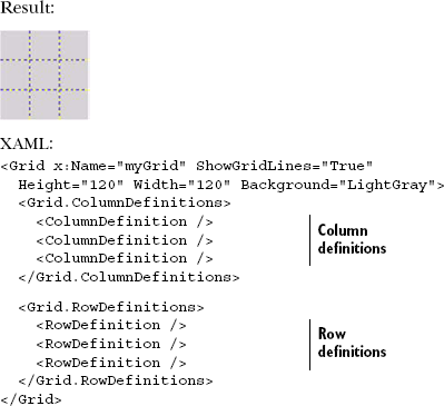
This listing defines a Grid with three columns and three rows. The rows and columns of this Grid are defined within the Grid.RowDefinitions and Grid.ColumnDefinitions elements. These elements represent strongly typed collections that serve as containers for the row and column definitions. The individual row and column definitions are shown by the RowDefinition and ColumnDefinition elements. These elements intersect at different points across the Grid, creating a total of nine cells.
Each cell represents the area allocated to a specific region within a Grid. This region is created by the intersection of a row and a column within a Grid. The easiest way to see the boundaries of each cell is to use the Grid element's ShowGridLines property. Although this property defaults to a value of False, you can set it to True to see the area reserved for each cell. Because these particular grid lines aren't customizable, they're generally only used during development. As you'll see in section 7.3.6, you can add several GridSplitter elements to customize the cell boundaries while giving the user control of cell sizing. Nevertheless, the ShowGridLines property and the GridSplitter element are both useful when sizing a Grid's rows and columns or arranging its content.
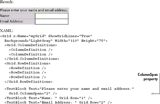
The content of a Grid consists of the elements that you want to arrange in a tabular fashion. These elements could be controls such as TextBox and TextBlock. TextBlock will be covered at the end of this chapter, but TextBox won't be covered until the next chapter when we cover collecting user input. For now, we'll use these basic controls to show how to arrange content in a Grid to create an input form, as shown in listing 7.6.
Listing 7.6 shows a basic input form that uses a Grid to arrange its content. This content is arranged using a number of the Grid's attached properties. The first attached property is ColumnSpan. This property gives you the ability to span an element across multiple cells. We'll discuss this feature in greater detail in a moment. But first, we'll cover the Grid.Row and Grid.Column attached properties. These properties are used more often and enable you to position content within a Grid.
Positioning content within a Grid is handled mainly by two attached properties—Column and Row—which store integer values. These values specify the row and/or column in which to place the content. To illustrate the syntax of these attached properties, we'll use the TextBlock:
<TextBlock Text="Rock On!" Grid.Row="3" Grid.Column="2" />
The properties in this example are assigned explicit integer values. If values aren't assigned, they default to 0. Alternatively, if you provide a value outside the available row or column range, they're simply capped at the end of that range, and the element will be displayed as though you specified the max row or max column for your grid, possibly overlapping other elements.
Although overlapping can be an unwanted side effect, clipped content is also undesirable. Clipped content can happen when a row or column is too small for its content. One way to overcome this problem is to size your row or column using one of the techniques discussed in section 7.3.1. Another option is to let your content span multiple cells.
Occasionally, you run into situations where you need to allow content to span multiple cells. You saw this in section 7.3.1, where we had a heading that demanded this functionality. As you saw then—to accomplish this, you need to use the ColumnSpan attached property.
The ColumnSpan attached property empowers you to spread content across several cells horizontally. By default, this integer value is set to 1, meaning that the content can occupy a single column. If this value is larger than the number of columns available in the row, the content extends to the end of the row but not beyond it. In addition to the ability to span horizontally, you can span vertically with RowSpan, which works just like ColumnSpan:
<TextBox Grid.Row="1" Grid.RowSpan="3"
        Grid.Column="1" Grid.ColumnSpan="2" />
The ColumnSpan and RowSpan properties are easy to add to any piece of content in a Grid. Occasionally, though, allowing content to span multiple cells isn't desirable, but you may need more space for content. Let's look at the Grid's sizing options.
The overall dimensions of a Grid can be set to a specific number of pixels using the Height and Width properties. These dimensions are set like almost every other element in Silverlight. Defining the dimensions of a row or column within a Grid is an entirely different story because the Height of a RowDefinition and Width of a ColumnDefinition are represented as GridLength values.
The System.Windows.GridLength type provides three different ways to specify how to allocate space. We'll discuss each of these options throughout this section. It's important to understand how each approach works because these options can be intertwined within the same Grid. Based on this fact, we'll naturally cover the typical pixel approach to sizing. In addition, we'll also cover the more dynamic auto-sizing approach. But first, we'll cover the default option used for sizing rows and columns: star sizing.
Star sizing enables you to equally distribute the available area of a Grid across its rows and columns. This is the default approach used within a Grid. But, if any row or column in a grid uses some other form of sizing, the other approach will take precedence. (It may be more appropriate to say that star sizing is used by the remaining available area.) Listing 7.7 illustrates this concept.
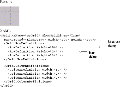
Listing 7.7 shows a Grid using star sizing in addition to absolute sizing. Absolute sizing will be discussed in just a moment; for now, observe the values with the n* in them, for example the Height and Width values for the second and third rows and columns. This asterisk signals that the element will use star sizing with a multiplier. Although this example only uses integer values, you can use any positive double-precision value. This value specifies the proportion of the remaining space to allocate to the element.
Star sizing works by determining how much space is available after the other sizing schemes have rendered. These calculations will return a remaining amount of available space. This space is divided proportionally across all the items using star sizing. As you can see, this approach provides an easy way to provide a proportionate-looking interface. Occasionally, you may want the size of the cells to be automatically determined based on their content. For these situations, it's appropriate to use the Auto GridLength option.
The Auto GridLength option automatically determines how large or small to make an element, as shown in listing 7.8. With this option, the element's size is based primarily on the content that occupies it, but other factors can also dictate the size of an element using the Auto approach.
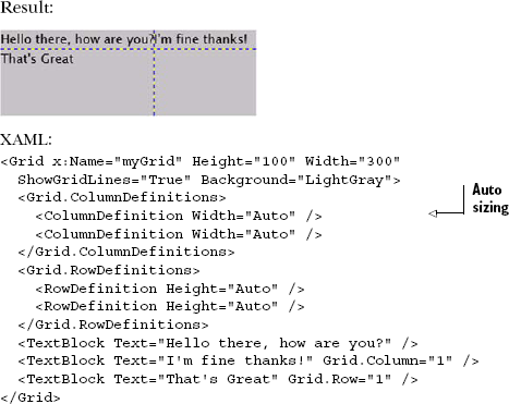
Listing 7.8 uses the Auto sizing approach for the Grid's columns and rows. The result produced from this XAML shows two key aspects of Auto sizing. First, if a row or column uses Auto sizing, the size of the largest element in the row or column determines the size of the others. Second, any remaining space is allocated to the last row or column— this is why the cells in the last row look so bloated. If you want to have complete control over the size of your cells, you need to use a more exact approach.
The final approach for allocating the available area to a row or column involves using a double. This double-precision floating-point value represents a number of pixels. These pixels single-handedly dictate the area reserved for a row or column. If this space is larger than the content, there's no problem. If the amount of space is smaller than the content, you may get some undesired results because the overlapping content is clipped, as shown in listing 7.9.
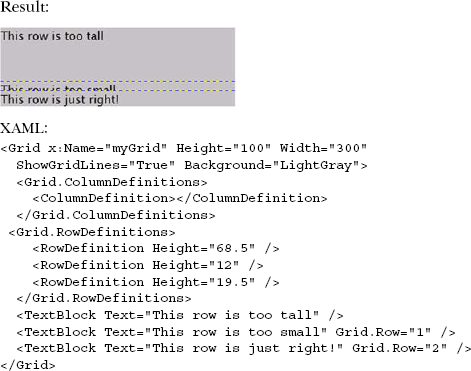
Listing 7.9 shows the absolute sizing approach in action. The rows use a double-precision value to specify their Height. The third row displays the text: "This row is just right!" Although you could use the Auto sizing approach for this row, we chose the absolute approach, primarily for illustration. It's important to know that the absolute approach takes precedence over all other sizing options, giving you some flexibility to get a Grid to look exactly how you want.
As you've seen, the Grid provides three valuable sizing options. These options give you the flexibility to create a great-looking layout at design time. Occasionally, you may need to set the sizing options at runtime. Alternatively, you may need to add or remove rows and columns at runtime. For both these reasons, it's important to understand how to work with the Grid programmatically.
Usually, the rows and columns of a Grid are created at design time using XAML. This approach ensures that you can easily arrange the content of a Grid before an application is up and running. Once the application is running, there may be situations where you need to dynamically add or remove rows or columns from a Grid. In times like these, it's nice to know how to both add and remove these items at runtime.
Adding rows or columns programmatically at runtime is as simple as writing two lines of code. The first line of code is responsible for creating either a RowDefinition or ColumnDefinition object. The other line of code is then responsible for adding the newly created object to the appropriate collection. Significantly, there are two different ways to add the object to the collection. First, here's how to programmatically add a row:
RowDefinition myRow = new RowDefinition();
myGrid.RowDefinitions.Add(myRow);
The preceding adds a row to the grid created in the previous example. Similarly, this code adds a column to the same grid but uses the Insert method to insert the column definition at the far left of the grid:
ColumnDefinition myColumn = new ColumnDefinition();
myGrid.ColumnDefinitions.Insert(0, myColumn);
The first approach adds a single row to the bottom of the Grid because the Add method always appends an object to the end of a collection. In situations where you need to have more control over where a column or row is added to a Grid, you may consider using the Insert method. Either way, you can see how easy it is to add rows and columns on the fly. And, fortunately, it's just as easy to remove them.
To remove either a row or a column from a Grid, you must use one of two approaches. The first approach uses the Remove method, which attempts to remove the first occurrence of the object provided. If the row or column is successfully removed, this method returns true. Otherwise, if something unexpected has occurred, this method returns false:
RowDefinition myRow = myGrid.RowDefinitions[0];
myGrid.RowDefinitions.Remove(myRow);
Occasionally, you may want to explicitly state which row or column to remove based on an index. For these situations, you should consider using the RemoveAt method:
int lastColumnIndex = myGrid.ColumnDefinitions.Count - 1;
myGrid.ColumnDefinitions.RemoveAt(lastColumnIndex);
The RemoveAt method enables you to specify which row or column to remove by using a specific index. This index is based on the zero-based indexing scheme used by the RowDefinitions and ColumnDefinitions collections. Once the row or column is removed, the remaining rows or columns will simply move up in the collection. This process occurs completely at runtime and demonstrates how powerful the Grid can be. Another feature that shows the power of the Grid is the ability to customize the cell boundaries.
Silverlight provides a way to customize the cell boundaries of a Grid that's similar to the border property in CSS. But, Silverlight goes one step further and gives the user the ability to use this boundary to dynamically resize the cells of a Grid. This user-controlled sizing feature enables a user to reallocate space from one cell to another. During this process, as one cell increases in size, other cells in the Grid may decrease in size. Significantly, this resizing process doesn't change the dimensions of the overall Grid. To take advantage of this powerful feature, you use a GridSplitter.
A GridSplitter is an element in the System.Windows.Controls namespace. But, this item isn't part of the core Silverlight runtime. Instead, this element is known as an extended control. These types of controls must be accessed slightly differently than a standard element such as a Grid. Over the course of this section, you'll learn how to access the library of extended controls. Then you'll learn how to use the GridSplitter within a Grid.
The extended controls, including the GridSplitter, are part of an assembly called System.Windows.Controls, which is included in the Silverlight SDK, itself part of the developer tools download. This assembly includes a number of controls designed to complement the core Silverlight controls. You'll learn about the core Silverlight controls in chapter 10 and the other extended controls throughout this book. For now, it's important to recognize that this assembly is not part of the core Silverlight runtime; if you want to use any of the extended controls, you must reference the System.Windows. Controls assembly. You can do so by adding a reference to the assembly in Visual Studio and then referencing the namespace through a prefix:
<UserControl x:Class="ExtendedControls.Page"
  xmlns="http://schemas.microsoft.com/winfx/2006/xaml/presentation"
  xmlns:x="http://schemas.microsoft.com/winfx/2006/xaml"
  xmlns:ext="clr-namespace:System.Windows.Controls;
 [CA]assembly=System.Windows.Controls"
  Width="400" Height="300">
  <Grid x:Name="LayoutRoot" Background="White" />
</UserControl>
This code shows how to reference the extended controls assembly to pull in a control not included in the core Silverlight runtime.
Warning
Referencing the System.Windows.Controls assembly will cause it to be bundled with your application's .xap, increasing the size of the .xap file by about 427 KB before compression (as of the time of writing). This can cause your application to take slightly longer to download unless you take advantage of assembly caching described in chapter 3.
We've given this assembly the friendly prefix ext to reference the extended controls. The sdk prefix will also be used in relation to our current discussion involving the GridSplitter.
The GridSplitter defines a divider within a Grid. This divider can be used to style the boundaries of the cells in the Grid. Alternatively, a GridSplitter can be moved by a user with the mouse or keyboard. To get a feel for how this works and the basic syntax of a GridSplitter, take a look at listing 7.10.
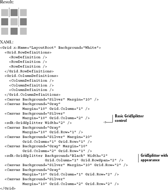
Listing 7.10 shows a 3×3 Grid that has two GridSplitter elements. The first GridSplitter shows the most basic implementation of a GridSplitter. At the same time, the second GridSplitter goes a step further and shows how to control the appearance. The appearance of a GridSplitter is based on a variety of properties, including Width and Background.
The Width property is a double-precision value that defines the thickness of a GridSplitter. By default, this property is not set to a value so the GridSplitter takes on a default appearance of a bar with a handle the user can grab. When the Width is set to a value greater than 0, the GridSplitter takes the shape of a basic line. This line will be visible as long as the Background isn't Transparent.
The Background property defines how a GridSplitter is painted. We use the term painted because the Background property is defined as a Brush. We'll cover brushes in chapter 18. For now, just know that the Background defaults to being transparent. Also know that you have the GridSplitter to empower a user to resize the columns of a Grid at runtime.
In general, the Grid is the most powerful layout panel in Silverlight because it can do almost everything that the other layout panels can do. There may be times when you don't want the additional bulk of the Grid. For these situations, it's nice to know you have the StackPanel and Canvas layout options. For other situations, you may want to tap into the new layout panels included in the Silverlight SDK or Silverlight Toolkit: DockPanel and WrapPanel.
A rich and interactive user experience is primarily about presenting information. The users' acceptance and adoption of your application can hinge on how that information is presented to them, so it's important to understand how to show this information in a pleasing way. To help accomplish an orderly UI, Silverlight provides the Canvas, StackPanel, and Grid layout options, as well as the other brand new panels such as the DockPanel and WrapPanel.
The Canvas is the panel to use if you want to have the lightest layout possible and simply position elements using Left and Top properties. Canvas offers no scaling and no other layout.
When you want to build a list of items, such as you'd see in a ListBox or a Menu, the StackPanel is the panel to use. Like the Canvas, it offers no scaling but it does offer automatic placement of elements in a vertical or horizontal list.
Finally, if you want to lay out elements using a grid or tabular format and take advantage of automatic scaling, the Grid is the panel for you. By far, the Grid is the most commonly used layout panel in Silverlight.
With the layout and rending background from the previous chapter and the information about panels from this chapter under our belt, we're ready to move on to the fundamentals of working with human input such as mouse, keyboard, and touch.