
If I included a top-three list of the most important features to learn in-depth in Silverlight or WPF, binding would be on that list. Binding—specifically, data binding—tends to conjure up images of the old Visual Basic VCR control bound directly to tables in an Access database, mishandled lost-focus events, and circular validation problems. In more recent times, binding tends to be associated with specialized data controls on web forms. In both cases, binding is associated with traditional business or application data on its way to or from a persistent data store.
Though binding is most commonly thought of in relation to persistent application or business data, it's used for much more than that in Silverlight and WPF.
In Silverlight and WPF, you can bind properties such as IsEnabled to bool values hanging off any arbitrary object. You can also bind controls to each other so that, for example, a slider controls the z-axis rotation of an object in 3D space. Neither of those properties (IsEnabled or z rotation) would normally be thought of as "data" in a data binding sense but, in the strictest sense of the term, they are.
Want to show the number of characters entered in a TextBox? You guessed it: binding will help you do that with no code required.
What if you want to set up a ListBox so each item displays a photo on the left along with a name and description stacked on the right? Binding and data templates are essential for that type of user interface customization.
In chapter 16, when we cover the ViewModel pattern, you'll see just how essential binding can be for good application architecture. Throughout this chapter, we'll prepare the foundation by covering the mechanics of binding the input controls we discussed in chapter 10 with in-memory objects, as well as how to bind controls to each other. Then, because data may come in any format, you'll learn how to format and convert it using value converters and binding expressions. Finally, we'll end the chapter with a discussion about data templates.
Binding is a powerful way to create a connection between your UI and a source of data. This simple technique can be used to create a clean separation between your user interface and its underlying data and is essential for good application architecture, as we'll see in chapter 16. Regardless of the reason, you can use data binding in your application by creating an instance of the Binding class.
The Binding class is used to define a connection between a CLR object and a UI component. This connection is defined by three essential elements: the source of the data (the CLR object), the binding mode, and the target for the data (the dependency property; see section 2.1.4 for more information). These three items are part of a conceptual model that explains binding, which is shown in figure 11.1.
This illustration uses the situation of binding the current time of day to a TextBox to give a high-level overview of what data binding looks like. This conceptual binding sets the Text property of a TextBox to the current TimeOfDay. To create a binding like this, you must use one of the two available binding syntaxes. These syntaxes require you to define both the source and the target of a binding. Each approach is appropriate at a different time, so we'll cover each in its own right in section 11.1.1. Once you've decided which syntax is appropriate for your situation, you must decide how data can pass between the source and the target. This is the responsibility of the BindingMode, which will be covered in section 11.1.2.
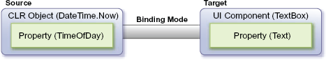
Figure 11.1. A conceptual view of data binding. The source owns the data; the target operates on (displays, edits, and so forth) the data.
Silverlight gives you the ability to create a Binding using two different approaches. The first approach allows you to dynamically create a binding at runtime. The second gives you the opportunity to specify a binding at design time. Either way, the scenario from figure 11.1 will be used to show both approaches.
Binding to a data source at runtime is a common approach used in event-driven application development. For instance, you may decide to display a list of basketball games based on a date selected by a user. Or, you may decide to show the current time when an application is loaded. Either way, creating a Binding at runtime follows a common pattern, which is shown here. First, the XAML in the page:
<TextBox x:Name="myTextBox" />
Next the code to create the binding source and the binding itself:
DateTime currentTime = DateTime.Now;
Binding binding = new Binding("TimeOfDay");
binding.Source = currentTime;
binding.Mode = BindingMode.OneWay;
myTextBox.SetBinding(TextBox.TextProperty, binding);
This shows how to bind the value of a CLR property to a UI element at runtime. The preceding code binds the current time of day to the TextBox created in XAML. You first retrieve the DateTime object that represents the current moment in time. This object is then bound to the UI element (the TextBox) in just four lines of code. These four lines of code specify the source, the binding mode, and the target of a binding.
The source of a binding is made up of two codependent items that specify which property of a CLR object to bind to. The name of the property to bind to is set when you create a Binding instance through the constructor. This constructor takes a single string parameter, which represents the name of the property to bind to. This property belongs to a CLR object that must be associated with a Binding through the Source property. Once this happens, the source of the binding is officially set. You can then choose a BindingMode, which we'll cover in section 11.1.2 (in this case, OneWay). Once the source and binding mode have been set, you need to turn your focus to the target.
The target element of a binding will always derive from the DependencyObject class. Virtually every visual element in Silverlight can be a target because the DependencyObject class exposes a method called SetBinding. This method associates a target property, which must be a dependency property, with a Binding instance. After this method is called, the source will be bound to the target.
Occasionally, you may want to unbind a data source. Fortunately, data binding can be halted by manually setting the target property of a binding. For example:
myTextBox.Text = "Binding Removed";
This feature is only available at runtime because that's the only time it makes sense. Using a Binding at runtime is a powerful option. Equally as powerful and more often used is the ability to create a Binding at design time in XAML.
Binding to a data source at design time is a common feature in declarative markup languages such as XAML. You've probably seen the power of this data-binding approach if you've used ASP.NET or WPF. If you haven't, don't worry. In essence, this approach allows you to keep your code separate from its presentation so that you can take advantage of the developer/designer workflow available within Silverlight. It also helps to keep your code clean and maintainable, as seen in this markup:
<TextBox x:Name="myTextBox" Text="{Binding TimeOfDay, Mode=OneWay}" />This shows how to create a binding at design time in XAML. The binding is associated with a target through the use of the XAML markup extension syntax, which uses curly braces ({}). These braces, along with the use of the Binding extension name, inform a property that a data source will be bound to it. This data source will be a CLR object that has a TimeOfDay property, which may provide or receive a value, depending on the binding mode. The other properties associated with the binding are set using a propertyName=propertyValue syntax (Mode=OneWay).
The curly brace syntax is helpful, but it's simply shorthand. We'll use the shorthand syntax throughout XAML in the rest of this book, but it can be helpful to understand the fuller version of the syntax. For example, the longer form (using property element syntax) of the earlier TextBox binding is this:
<TextBox x:Name="myTextBox">
  <TextBox.Text>
    <Binding Path="TimeOfDay" Mode="OneWay" />
  </TextBox.Text>
</TextBox>
The markup in this example does exactly the same thing as the previous but doesn't invoke the markup extension triggered by the curly brace. Obviously, the syntax is much more verbose and would be cumbersome to use for all values. If Silverlight ever gets MultiBinding (a concept currently in use in WPF), understanding the full binding syntax will be essential to its use.
Note
All parameters in a binding expression may be set using name=value syntax. The binding expression {Binding TimeOfDay} is just shorthand for {Binding Path=TimeOfDay}. Though you'll find that certain tools, such as Expression Blend and Visual Studio 2010, prefer one syntax over the other, both may be used interchangeably and are equally valid.
When creating a binding in XAML, the source may be set in procedural code. This code is responsible for setting the context in which a data source can be used via the appropriately named DataContext property. This property will be explained in further detail in section 11.2.2. For now, know that this is how a CLR object can be bound to a DependencyObject. In this case, the code-behind would have the following code to set the DataContext for the TextBox:
DateTime currentTime = DateTime.Now;
myTextBox.DataContext = currentTime;
The DataContext may also be set in markup using a StaticResource, if the type being used supports it. This approach is sometimes used for binding to a view model, which we'll see in chapter 16.
Binding at design time is a valuable option when it comes to working with data. It empowers you to separate UI from code. This functionality allows a designer to enhance a UI without worrying about where the data is actually coming from. In a similar light, binding at runtime enables you to create a more dynamic form of data binding. Regardless of where you define the binding, both approaches define a bridge between a source and a target. Data can flow in multiple directions across this bridge. To control the direction of that flow, you must learn about the various binding modes.
The Binding class gives you the ability to determine how data can flow between the source and the target. This flow can be controlled by setting the Binding instance's Mode property. This property represents one of the three options available in the BindingMode enumerator—OneTime, OneWay, and TwoWay.
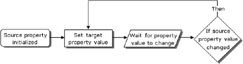
The OneTime option sets the target property to the source property when a binding is initially made. When this BindingMode is used, any changes to the data source won't be automatically sent to the target. Instead, the target will be set only when the source is initialized, as shown in figure 11.2.
This figure shows the simplistic nature of the OneTime BindingMode. As you can imagine, this BindingMode is appropriate in situations where you only care about the initial value of a property. For instance, you may want to display the creation date of a database record. Because this value shouldn't change, the OneTime BindingMode is a great choice. For property values that will change such as the date/time when a database record was last modified, you may want to use the OneWay binding option.
The OneWay BindingMode is the default when you create a Binding. This option gives you the ability to automatically receive changes from a source property. Whenever the binding source property changes, the target property will automatically change, but the source property won't change if the target is altered. This process is shown in figure 11.3.
This figure shows how the OneWay BindingMode works at a high level. Think of the speedometer in your car as a OneWay binding from your gas pedal. When you press or release the gas pedal, the speedometer changes; but, if you somehow changed the value of the speedometer itself, your gas pedal wouldn't change. This inability to send a change from the target back to the source shows how OneWay binding works. For situations where you do want to send changes in the target back to the source, you use the TwoWay option.
TwoWay binding enables two properties that are bound to change each other. This may sound recursive, but it's not. A TwoWay binding changes the target when the source changes. If the target changes, the source is updated. This process can be seen in figure 11.4.
This figure shows a conceptual view of the TwoWay binding. This binding approach is useful for data entry forms using Silverlight because forms generally allow users to add as well as edit data. This process of editing the preexisting data practically begs for TwoWay binding.
The TwoWay BindingMode is one of the options available to control the flow of your data. The other alternatives are available through the OneWay and OneTime options. Collectively, these options are an important part of setting up a binding.
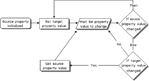
Figure 11.4. A conceptual view of TwoWay binding to a data source. The target control reflects changes to the source, and the source is updated with any changes made in the target.
After the target and binding mode have been selected, you need to choose an appropriate source.
In section 11.1, we looked at the general concept of binding. We discussed this concept in the limited scope of binding to an individual property. This approach can be valuable in certain situations but, to truly harness the power of data binding, we must build a better understanding of data sources, which we'll do over the course of this section.
We'll discuss what it takes to bind to a property of a CLR object, but we won't cover just any property. We've already done that. Instead, we'll discuss what it takes to bind to properties in your CLR objects and how to bind to entire CLR objects. We'll cover how to bind UI elements to each other and how to bind a UI element to itself. We'll close out the section by talking about binding to entire collections of objects. Collectively, these items will help you to wield the power of binding.
Silverlight gives you the flexibility to bind to any CLR property you want. You saw this with the examples using the TimeOfDay property in section 11.1. Significantly, if you visited http://www.silverlightinaction.com and ran the application, you saw that, once the time was displayed, it just sat there. It didn't automatically update with each passing second because, by default, CLR properties don't broadcast their changes—that and because the TimeOfDay property doesn't automatically continue ticking. To update the target with a change in the CLR property, you must create a change-notification handler.
A change-notification handler notifies a binding target that a change has been made. This enables a target to automatically respond to changes. Dependency properties already have this feature built in, but CLR properties don't. If you want your CLR properties to broadcast their changes, you must implement the INotifyPropertyChanged interface, which is demonstrated in listing 11.1.
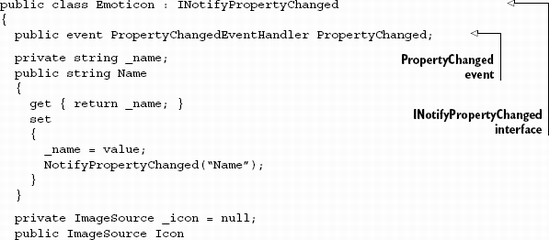
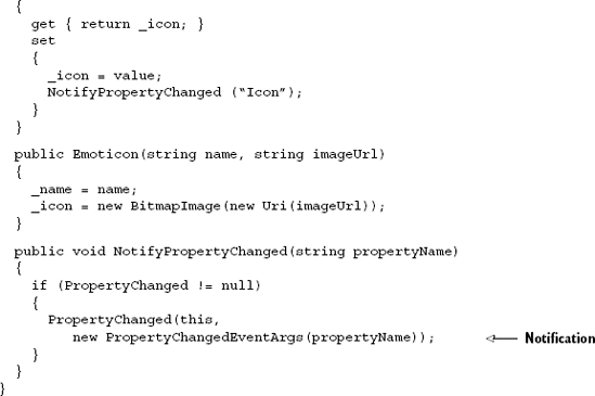
Listing 11.1 shows how to implement the System.ComponentModel namespace's INotifyPropertyChanged interface on a class. This class represents an emoticon (such as a smiley face) that uses the INotifyPropertyChanged interface as a guide for broadcasting changes in property values. The interface can be used to ensure that your UI component and desired CLR property are in sync during OneWay and TwoWay binding. This synchronization effort will take effect as long as you've implemented the PropertyChanged event.
The PropertyChanged event is what keeps things in sync, so you must make sure this event is triggered whenever a property value has changed. You can accomplish this by firing the event in a property's setter. Alternatively, if you plan on keeping multiple properties in sync, you may want to refactor the PropertyChanged event to a common method—as shown in listing 11.1. Either way, the binding system's PropertyChanged event handler uses reflection to examine the value of a property and pass it on to the binding target. This is why the PropertyChangedEventArgs type takes a string parameter that represents the name of the CLR property that changed.
Binding to a CLR property is a powerful way to work with your objects. These objects generally represent real-world entities that may also need to be bound to. Fortunately, Silverlight also provides an elegant way to bind to a CLR object.
Up to this point, we've primarily focused on binding individual properties to UI components. This technique is pretty simple, but it can also be somewhat tedious if you need to bind multiple properties of an object to a UI. You can make this task less tiresome by using the DataContext property.
The DataContext property allows you to share a data source throughout a DependencyObject. This data source can be used by all the child elements of a DependencyObject that define a Binding. Binding uses the most immediate ancestor's DataContext unless another data source is set to it. If another data source is set, that source is used for the Binding. Either way, by relying on the DataContext of an ancestor, you can easily bind several properties of an object to a UI. This approach is shown in listing 11.2.
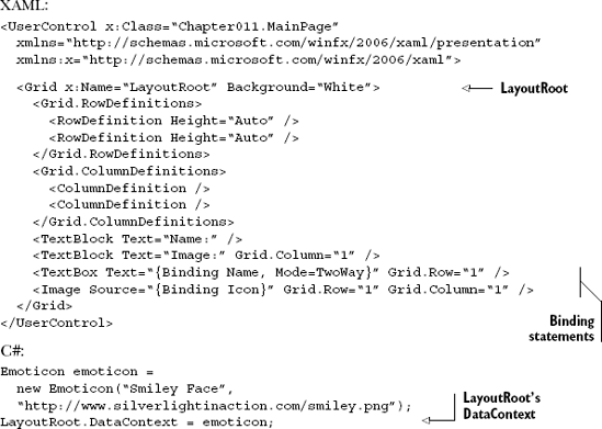
Listing 11.2 shows how an object can be bound to elements within a DependencyObject. The TextBox and Image elements in this example show their intent to bind to two different properties of an object. These elements don't have their DataContext property set in the code behind, so the elements look to their immediate parent, myGrid, and try to use its DataContext. This DataContext has been set in the codebehind. The object assigned to the DataContext serves as the data source for the Grid and its children. If the DataContext of the Grid hadn't been set, the elements would've continued up the tree and checked the UserControl element's DataContext. If that DataContext were set, it would've been used. Either way, this example shows how much more succinct and maintainable the DataContext approach can be.
So far, our examples have fallen squarely in the zone we tend to think of as traditional data binding. But, Silverlight also supports the ability to bind controls to each other simply as a way to reduce plumbing code.
Setting the DataContext in XAML
In the previous section, I mentioned that you can set the data context using a static resource, all from within XAML. Though the DateTime example didn't fit that model, the Emoticon example can.
Recall from chapter 2 that XAML is, in essence, a way to represent and initialize CLR objects in markup. To support binding this way, we'll add in a resources section (covered in chapter 23), which holds a reference to a single Emoticon object in the local namespace:
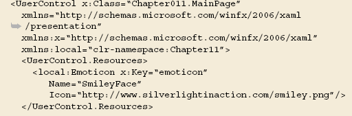
The Emoticon in the resources section is initialized directly on the page when the rest of the elements are constructed. But as written, the Emoticon class requires parameters in its constructor, something that isn't supported in the .NET 4 version of XAML used by Silverlight 4. This is remedied by adding a default (parameterless) constructor to the class:
public Emoticon() {}Finally, we set up the relationship via the DataContext using the StaticResource markup extension and referring to the x:Key of the resource that corresponds to our emoticon:
<Grid x:Name="LayoutRoot"
      DataContext="{StaticResource emoticon}" ...
The end result is a binding relationship set entirely from within XAML in a tool and designer-friendly way. We'll see more examples of this when we look at .WCF RIA Services in chapter 17, and some of the optional XAML data source controls it provides.
Binding one or more properties of a UI element to the values on an entity, view model, or business object is a compelling use of binding. Sometimes, though, you want to use binding for things we wouldn't traditionally consider "data"—things within the user interface. You may want to bind the height of two controls together so that they resize equally or perhaps you want to bind three sliders to the x, y, and z-axis rotations of a plane (see section 6.5 for more information on 3D rotation in Silverlight). Rather than binding to gather input or display data to the user, you're binding to avoid writing extra plumbing code.
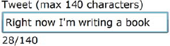
Let's say that you want to display a count of characters entered into a TextBox in real time, something like figure 11.5.
You could do that in code, but that would be fairly uninteresting code to write. It would need to refer to XAML elements by name or have event handlers wired in XAML, introducing a dependency on the specific page's code-behind and making it less portable and potentially more brittle. In addition, you'd find yourself doing it enough that you'd either wrap the TextBox in your own CountingCharsTextBox control or add a helper buddy class or something.
Or, if you prefer a XAML approach, which I hope I've sold you on by now, you would use element binding introduced in Silverlight 3. Element binding allows you to bind the properties of one FrameworkElement to another FrameworkElement. The usual restrictions apply (the target must be a DependencyProperty; the source must notify of changes), so you can't use element binding quite everywhere.
To produce the TextBox shown in figure 11.5 with the automatic count of characters using element binding, the markup is pretty straightforward and entirely self-contained:
<StackPanel Orientation="Vertical" Margin="50">
  <TextBlock Text="Tweet (max 140 characters)" />
  <TextBox x:Name="tweetText"
           MaxLength="140"
           Text="Right now I'm writing a book" />
  <StackPanel Orientation="Horizontal">
    <TextBlock Text="{Binding Text.Length, ElementName=tweetText}" />
    <TextBlock Text="/" />
    <TextBlock Text="{Binding MaxLength, ElementName=tweetText}" />
  </StackPanel>
</StackPanel>
This XAML will show a TextBox with a count of characters underneath it. The character count will update in real time to show the number of characters typed into the TextBox. Note also that the MaxLength displayed under the text box is actually coming from the TextBox itself (the 140 in the label is not, though). The key item that makes this happen is the ElementName parameter in the binding expression. ElementName is, as it suggests, the name of another element on the XAML page.
Sometimes, you'll want to bind two elements together, as we've done here. Other times, you may want to bind an element to a value on itself using something called relative source binding.
WPF supports a number of different types of relative source bindings. In Silverlight, it's used for one thing: binding an element to itself. Let's assume for a moment that we have a simple property in our user control's code-behind. It could (and should) be a DependencyProperty but, to keep it short, we're going to declare a good old CLR property and assume it's set only in the constructor. We could then refer to that property in XAML but, without somehow telling the binding system that the source of the data is the control hosting the XAML, we'd be stuck.
Warning
Here be dragons. Relative source binding can not only encourage bad application practices, such as binding to things defined in code-behind instead of following a pattern such as ViewModel, but also be hard to debug, especially when you get into changes to DataContext set by external consumers of your user control. Use RelativeSource Self binding, but understand that your debugging workload will probably go up for the choice. Don't use RelativeSource Self binding just to avoid creating an appropriate container or abstraction for your data.
This is where RelativeSource Self binding comes in. RelativeSource can be set anyplace you'd normally have a binding statement, including the DataContext. Listing 11.3 shows how to bind a TextBlock in the UI to a simple CLR property in the code-behind.
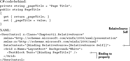
RelativeSource Self binding is useful for those occasions when you really do need to bind to a property of the control or need to bind a property of a control to itself. Use it sparingly and not as a part of the overall application architecture and you'll find it helps enable those few scenarios where other solutions are just too cumbersome.
Another quiet addition to Silverlight binding is the ability to bind to a specific element in an array or list.
Silverlight 3 introduced the ability to bind to a numerically-indexed element in a collection. This can be useful in instances where you may have an indexed property bag hanging off a class or you really do want to get just a specific element out of a larger collection without prefiltering it in code.
Let's assume for a moment that we have a class Repository that exposes a collection of Emoticon objects through a property named Emoticons. We could then set up a static resource for pure XAML binding or set the DataContext from the page or within the code-behind, as shown in the previous examples. Once that's set up, we'd be able to refer to individual elements in the collection using the index syntax within the binding statement, as shown in listing 11.4.
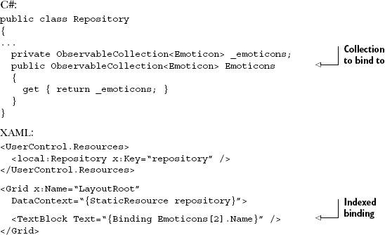
In listing 11.4, the TextBlock will resolve its text property to be the value in repository.Emoticons[2]`Name and display that on the screen. The syntax is consistent with C# indexing conventions.
Binding to a single element in a collection using a numeric index in a binding expression is useful, but often we want to bind using a string key instead.
Property bags and datasets are commonplace in the desktop application world. Silverlight 4 introduced the ability to bind to these types of structures by introducing keyed or string-indexed binding expressions.
Listing 11.5 shows the same example as 11.4 but now the collection is being accessed via a string key.
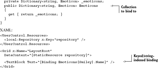
Listing 11.5 works assuming your Emoticons dictionary has an element with the key Smiley. This feature enables a ton of must-have scenarios in Silverlight, specifically around binding to the data of a shape unknown at design time.
Binding to a single element in a collection using a numeric index or string key in a binding expression is useful, but it's more common to bind to an entire collection rather than a single element within that collection. That's the situation you'll run into when you want to populate a ListBox or other ItemsControl.
Binding to a collection is an important task in a lot of applications. There are numerous times when you need to show a list of the items in a collection. You may want to display a collection of emoticons or you may want to show a list of the days of the week. Either way, these lists are made up of individual items, so it's only natural to use a control derived from ItemsControl.
An ItemsControl is a basic control used to show a collection of items. We discussed this control in chapter 10, but we didn't talk about the process of binding data to the control. Instead, you saw the manual approach of adding items one by one to the Items collection. Although this technique is useful in some situations, the ItemsControl provides a more elegant approach through the ItemsSource property (see listing 11.6).
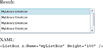
This listing shows how to bind a collection of objects to an ItemsControl—in this case, a ListBox control (which derives from ItemsControl). Using the ItemsSource property, this ListBox loads a collection of Emoticon objects from our earlier examples using a function we'll assume exists in our code: GetEmoticons.
The ItemsSource property is used solely for the sake of data binding. This property can be used to bind to any collection that implements IEnumerable. This property is necessary because the Items collection of the ItemsControl class isn't a DependencyProperty, and only DependencyProperty-typed members have support for data binding.
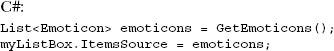
The ItemsSource property can only be used if the Items collection of an ItemsControl is empty. If the Items collection isn't empty, your application will throw an InvalidOperationException when you try to set the ItemsSource property. If you intend to use this property, you should also consider using the DisplayMemberPath property.
The DisplayMemberPath property determines which CLR property value to use for the text of a list item. By default, each list item will use the ToString method of the object it's bound to for the display text—the reason each of the items in listing 11.5 is shown as MyLibrary.Emoticon. You can override the ToString method to fully customize the text shown for an item. If you want to go a step further, you can customize the entire look of an item using the data template information discussed in section 11.3.2. But, for the quickest approach, you can use the DisplayMemberPath as shown in listing 11.7.
This shows the impact of the DisplayMemberPath property on binding items. As you can see, this property makes the items in a list much more meaningful. This approach allows you to easily display information from a CLR property, an object, or a collection.
The approaches we've talked about so far work well when you need to bind a single value to a single property without modifying the display format of the values in any way. We covered how to bind to simple values, how to get individual values by index or key, and how to set the display member when it's different from the data member.
In the next two sections, we'll cover how to build upon what we learned in this section to customize the display of single values and aggregate several values up into a single data template to be repeated for each entry in a collection.
As you saw throughout section 11.2, data binding is a powerful way to show data. Occasionally, this information may be stored in a format not suitable to display in a UI. For instance, imagine asking your user, "Does two plus two equal four?" This question clearly demands a yes or no response. The problem begins to arise when the response is saved to a more persistent data source.
A lot of times, a piece of data such as a property will be saved one way but need to be presented in another. In the case of a yes-or-no question, the answer may be stored in a bool CLR property. This property may run under the assumption that "yes" is equivalent to true and "no" is the same as false. This assumption can become a problem if you need to bind to that data because, by default, data binding calls a type's ToString method. Your users could see a statement that looks like "Does two plus two equal four? True." when, in reality, it'd be better to show "Does two plus two equal four? Yes." This small but common problem demands a better approach.
If Silverlight couldn't handle the simple task of formatting values for display, binding wouldn't be particularly useful. Luckily, Silverlight has everything you need to format display values, convert both inbound and outbound values, provide special handling for null values and even provide fallbacks for cases when binding fails. Throughout this section, you'll see how to customize the visual representation of your data using these powerful features, several of which are new to Silverlight 4.
When writing code, you can format values using the string.Format function. But until Silverlight 4, there was no good way to do the equivalent during a binding operation. You could write a custom value converter, but that gets old quickly, and becomes another testing and maintenance point.
Silverlight 4 introduced the ability to use string formatting when binding. The syntax is essentially the same as the string.Format function. For example, this will set the value of the TextBlock to be "DOB: May 19, 2007" assuming the DateOfBirth property on your binding source contains the value 5/19/2007:
<TextBlock Text="{Binding DateOfBirth, StringFormat=DOB:{0:D}}" />Similarly, this binding expression will set the value of the TextBlock to be $1,024.10 assuming the decimal BilledAmount field contains the value 1024.10m:
<TextBlock Text="{Binding BilledAmount, StringFormat={0:C}}" />Sometimes, simply formatting the value isn't enough. In those cases, you may need to perform a real data conversion and write your own custom value converter.
Silverlight allows you to dynamically convert values during data binding. You can accomplish this by first creating a custom class that implements a value converter. This value converter can then be referenced directly in XAML. This approach is recommended over custom setter/getter code because it helps keep the design separate from the code. Let's begin by discussing how to create a value converter.
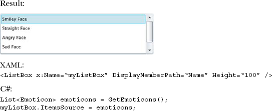
To create a value converter, you must create a class that implements the IValueConverter interface, which enables you to create some custom logic that transforms a value. This transformation may take place in one of two methods depending on the flow of your data. The first method, Convert, is used when the data is moving from the source to the target—for example, from your object to a TextBox. If the data is flowing from the target back to the source, such as when the value entered in a TextBox goes back to your object, a method called ConvertBack is used. Both methods are members of the IValueConverter interface. This interface and its methods are demonstrated in listing 11.8.
This listing shows a value converter that converts between a bool and Yes or No. This converter uses the Convert method when data is being bound to your UI. It's this method that converts a bool to Yes or No. When the UI is passing data back to its source (TwoWay binding), the ConvertBack method is used. This method converts Yes to true and No to false. These methods control the conversion process. To assist in this process, both these methods give you the opportunity to provide custom information.
Both the Convert and ConvertBack methods allow you to use two optional pieces of information. The first is an arbitrary object called parameter that can be used by your conversion logic. By default, this object will be null, but you can set it to any value that you find useful. The other piece of information specifies the CultureInfo object to use when converting the values. We'll discuss both parameters in a moment. But, to set the CultureInfo or pass along a custom parameter, you first must know how to use a value converter from markup.
Using a value converter involves setting the Converter property of a Binding object. This property determines which IValueConverter to use when transforming data. By default, this property isn't set to anything (null), but you can set it to reference an IValueConverter you've created. Before you can reference an IValueConverter, you must add it as a resource. Resources will be discussed in chapter 23. For now, just know that you can reference an IValueConverter by first adding it to the Resources collection, as shown here:
<UserControl x:Class="Chapter11_9.MainPage"
  xmlns="http://schemas.microsoft.com/winfx/2006/xaml/presentation"
  xmlns:x="http://schemas.microsoft.com/winfx/2006/xaml"
  xmlns:local="clr-namespace:Chapter11_9"
  Width="400" Height="300">

  <UserControl.Resources>
    <local:YesNoValueConverter x:Key="myConverter" />
  </UserControl.Resources>

  <Grid x:Name="LayoutRoot" Background="White" />
</UserControl>
This shows how to introduce a custom value converter to the XAML world. The local prefix is assumed to be defined as a namespace (see chapter 2). The key myConverter is used to reference the YesNoValueConverter in XAML. The following is an example of referencing a value converter:
<TextBlock x:Name="myTextBlock"
  Text="{Binding IsCorrect, Converter={StaticResource myConverter}}" />
This example shows a basic Binding that uses a custom converter. This converter alters the displayed text of a bool property called IsCorrect. The example shows that the custom converter is referenced through the Converter property. This property uses the curly-brace markup extension syntax just like the Binding syntax because it's the syntax used to reference a resource. You can also pass a custom parameter or the culture information if you need to.
Tip
A statement such as the binding statement shown in the previous example can seem to be a jumble of curly braces. Think of each matched set of braces as a separate statement, substituted in when parsed and evaluated. For example, the {StaticResource myConverter} statement is a complete StaticResource markup extension statement itself, the result of which, after evaluation, is passed in to the Converter parameter of the Binding statement.
The Binding class exposes an object property called ConverterParameter, which can be used to pass an arbitrary value to an IValueConverter. The value converter uses the value of the ConverterParameter in the Convert and ConvertBack methods. By default, this value is null but you can use it to pass along any data you want, such as a format string or an index. If you need to pass along culture-related data, we recommend using the ConverterCulture property.
The ConverterCulture property of the Binding class allows you to set the culture. This culture is passed along as a CultureInfo object that can be used by the Convert and ConvertBack methods. By default, the CultureInfo object reflects the value of the Language attribute of the calling FrameworkElement. The Language attribute is used for localization and globalization. This value uses a string that defaults to en-US, which represents U.S. English.
Creating and using a value converter can be valuable when working with data, as shown with our basic yes/no example. Value converters can be useful in even more complex scenarios. For instance, Silverlight doesn't have support for HTML tags in regular text controls, so you may consider using a value converter to scrub the HTML tags from a string before binding it to your UI.
Value converters were often used to format values for binding. We've already seen a way to format strings for display. Let's now look at how to handle fallback values and null value display.
Things can go wrong during binding. The property path may be unable to be resolved or an exception may be thrown when getting the value. Perhaps the index or key doesn't exist. In those cases, it can be helpful to have a fallback value defined in your binding expression. These values are provided using the FallbackValue property.
In this example, assuming you have an ApprovalCode field in your object, but it throws an exception in the getter (odd, I know) or is otherwise unavailable, the TextBlock will display the value "Unavailable".
<TextBlock Text="{Binding ApprovalCode, FallbackValue=Unavailable}" />In many cases, I think it's preferable to have default values and fallbacks defined in your model or view model, especially because that'll make it easier to test. But fallback values in binding can help in a pinch or in cases where you need to handle an exception condition happening between your view model and view.
More common than fallback values is custom null value handling.
Similar to fallback values but more useful, in my opinion, is the TargetNullValue property of the binding expression. TargetNullValue allows you to display a custom value when the value you've bound to is null.
In many applications, a value of null truly means something different than the value of empty or zero. In the former, it means that no value has been entered. The latter indicates that a value has been entered but it's blank or zero. To make it easier to work with, many applications disregard the null value and simply replace it with the default value for the type. This makes it easier to display in the UI, but at the cost of losing the distinction.
Starting with Silverlight 4, you can preserve the null value and still have a friendly UI. Simply provide a TargetNullValue in your binding expression:
<TextBlock Text="{Binding ApprovalCode, TargetNullValue=(missing)}" />In this example, when the ApprovalCode returns null, the TextBlock will display the text "(missing)".
These techniques all handle the formatting and display of a single bound value. Though powerful on their own, often you'll want to display something more complex, perhaps containing multiple bound values in a list. That's where a data template comes into play. Happily, data templates build upon everything we've covered so far, so you'll find their implementation easy to understand.
In section 11.2, we learned how to bind individual properties and entire collections. In section 11.3, we covered how to provide formatting and conversion for single-bound values. What about those cases when you need to have even more control over the presentation of your list-based data? What about something like a ListBox item that contains three or four pieces of data in each row? That's where data templates come in.
A data template is a way to define how a piece of information will be shown. Imagine looking at a baseball player's statistics. Although these statistics can be easily viewed in tabular format, it's much more interesting to look at them on a baseball card. For an example, see table 11.1.
Table 11.1. One example of a data template
Raw data (statistics) | Presentation via data template |
|---|---|
Player: Scarpacci Position: Pitcher (P) Team: J-Force Picture: [A URL] |
|
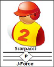
This table demonstrates the general idea of a data template: it gives your data a face. The value in this approach is that it allows you to quickly change the way your data looks without changing your code—the main raison d'être for XAML. Just as baseball card designs change each year, your data may change its look based on its context. Data templates allow you to make this change easily, without affecting the underlying model. To take advantage of this feature, you must create a DataTemplate object.
A DataTemplate object describes the visual representation of a piece of information. This object can be used with two types of controls within the Silverlight class library. The first is a ContentControl. More interesting and probably more commonly used is the ItemsControl. Within this section, you'll see how to create a data template with each of these control types.
A ContentControl is a type of control defined by a single piece of content, which we discussed in chapter 10. Every ContentControl exposes a property called ContentTemplate, which specifies the DataTemplate to use when displaying the content of a ContentControl. This content can be styled with a DataTemplate using an approach similar to that shown in listing 11.9.

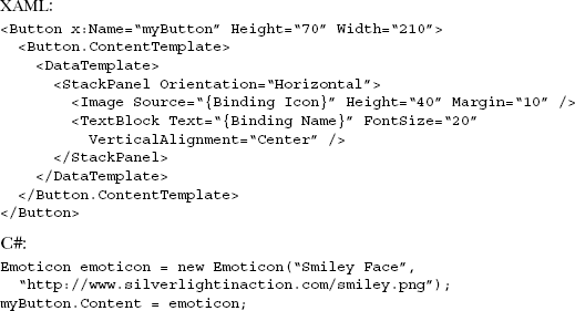
This shows a DataTemplate applied to a Button. This DataTemplate is applied to an assumed Emoticon (from the previous examples in this chapter) assigned to the Button object's Content property. This property must be set at runtime when using a DataTemplate. If the Content property is set at design time, it'll be trumped by the DataTemplate, resulting in no data being shown in your UI. In addition, if you set the DataContext property at runtime instead of the Content property, your data won't be shown. When you're binding data to a ContentControl, you may want to remember the following:
When assigning your data source to the
DataContextproperty, use the binding syntax within the control'sContent.When assigning your data source to the
Contentproperty, use aDataTemplateinstead.
These two points make it seem like you're running in circles. You may be wondering why you should use a DataTemplate. Well, a DataTemplate can be defined as a resource (discussed in chapter 23), which makes it usable across multiple ContentControl elements simultaneously. The DataTemplate approach is much more flexible. In reality, you probably won't use a DataTemplate with a ContentControl often, but you should expect to use data templates frequently with ItemsControl elements.
The ItemsControl element is designed to display a collection of items, which are bound to a control through the ItemsSource property. By default, each item is displayed by using an object's ToString method. By setting the DisplayMemberPath property, you can use a specific CLR property for the text of an item, but you can go one step further using the ItemTemplate property.
The ItemTemplate property of the ItemsControl class allows you to fully control how each item will be displayed. This property uses a DataTemplate to determine how to show each item in an ItemsControl. A basic ItemTemplate for a collection of Emoticon objects is shown in listing 11.10.
This shows a basic DataTemplate associated with an ItemTemplate. There's nothing complex about this example—the main thing is to understand that this DataTemplate is used with the items bound through the ItemsSource property. In addition, this begins to show the power of using data templates.
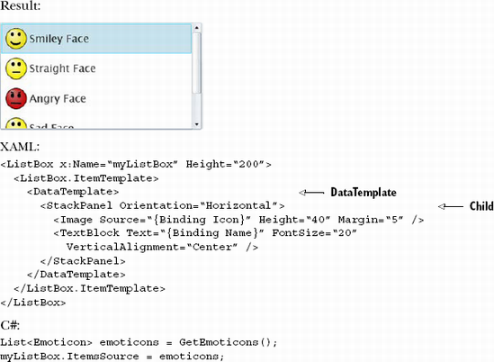
This example shows the DataTemplate assigned to the ItemTemplate property of the ListBox control. Note that a DataTemplate must have only one child, typically a panel. Within that panel you may have any number of other controls.
Data templates are a powerful way to use everything you've learned about binding to provide a top-notch customized display for your list-based data. In technologies before WPF and Silverlight, the idea of having complete control over what's displayed in a ListBox was a dream at best. Now, using binding and templates, it's an easy reality.
Throughout this chapter, you've seen the power of the Binding object and the vast tree of functionality that grows from it. This object gives you the flexibility to bind to individual entities, to collection of entities, to indexed entries in a collection, and even to other UI elements. If you need to massage the data either coming or going, Silverlight provides a way for you to create your own value converters to do that. If you simply need to format the display, Silverlight provides a way for that too.
Throughout this chapter, you've seen how to fully customize the look of your data with data templates. Data templates are an amazingly powerful way to control the presentation of your list-based data.
Most importantly, you've seen binding in action. Binding rises to the near top of the most important topics to understand when getting into Silverlight. Once you master binding, you may find that you never again will write another line of control.property = value code.
Silverlight includes two complex and useful controls that were designed to work well with binding: the DataGrid and the DataForm. We'll discuss those in the next chapter.