
13
WORLD ENERGY
13.1 INTRODUCTION
This chapter describes a recent energy trend in the world. Energy is separated into primary and secondary categories. Primary energy is further classified into fossil fuels and non‐fossil fuels. Fossil fuels include oil, natural gas, and coal, while non‐fossil fuels include nuclear and renewable energies (e.g., solar, water, wind, biomass and other energy resources). Energy consumption is essential for developing economic prosperity in all nations. This chapter considers electricity as a representative of secondary energy because it is produced through the use of primary energy sources.
As the initial step for the DEA environmental assessment to be discussed in Section II, this chapter summarizes a general trend in energy whose consumption has been increasing along with economic development and population increase in the world. The purpose of this chapter is to describe the research necessity of DEA environmental assessment from the perspective of supply and demand on energy, along with population increase, in the world. Based upon our observation on energy, this chapter conveys an academic rationale regarding why DEA is important in investigating various issues on energy, environment and sustainability.
The remainder of this chapter is organized as follows: Section 13.2 describes the world energy trend. Section 13.3 describes primary energy sources. Section 13.4 discusses electricity as secondary energy. Section 13.5 discusses the current situation on petroleum and world trade. Section 13.6 explains energy economics by using an illustrative example of power trading. Section 13.7 summarizes this chapter.
13.2 GENERAL TREND
World primary energy consumption continues to increase, along with economic growth. From 1965 to 2013, it increased from 3.8 to 12.7 billion tons of oil equivalent, indicating an average annual growth rate of 2.6%. The growth of energy consumption varies, depending on the region and its regional industrialization. For example, advanced countries such as OECD nations (where OECD stands for the Organization for Economic Co‐operation and Development) had lower growth rates. In contrast, developing countries (e.g., non‐OECD countries) had higher growth rates than the more advanced nations. One rationale is that the advanced counties have already attained a high level of industrial infrastructures so that they are sufficient in maintaining moderate growth rates in their economies and populations. Furthermore, they have improved the efficiency level of energy consumption equipment over the past due to technology development. In contrast, energy consumption has been steadily increasing in developing countries. In particular, a significant increase in the world energy consumption can be found in the Asia‐Pacific region. Under such an energy consumption trend, the share of OECD countries in energy consumption has decreased from 70% in 1965 to 43% in 2013, as depicted in Figure 13.1, where the left vertical axis indicates the amount of energy consumption, measured by million tons of oil equivalent and the right vertical axis indicates the percentage of the OECD share. The annual period is shown on the horizontal axis.

FIGURE 13.1 Trend of world primary energy consumption
(a) Source: BP Statistical Review of World Energy (2014)1.
(b) We prepared the figure based upon the numbers listed in the data source. (c) A large increase in energy consumption can be found in the Asia Pacific region during the observed decades. An increase can be found in Europe and Eurasia, as well. A rapid economic development has been accomplished in the two regions.
Figure 13.2 visually describes world primary energy consumption by each energy source. In the figure, the vertical axis indicates the amount of energy consumption by each energy source and the horizontal axis indicates the annual period. Oil has been a major source of primary energy consumption, accounting for the largest share of total energy consumption with 31.53% in 2012, particularly supported by a steady increase in the usage of a transport sector. The average annual growth rate was 1.2% over the period from 1971 to 2012.

FIGURE 13.2 World energy consumption by energy sources in the annual periods
(a) Source: International Energy Agency (IEA), World Energy Statistics and Balances, OECD2.
(b) We prepared the figure based upon the numbers listed in the source data. (c) The figure indicates that fossil fuel components (i.e., oil, natural gas and coal) are the major energy resources in the world, all of which are used not only for modern business (e.g., transport and industry sectors) and the household sector but also for military purposes. (d) Fluctuations in the oil price may influence the market condition of business because oil is the most important primary energy resource.
The consumption of coal and natural gas has grown faster than oil over the observed annual periods. Coal consumption has increased for electricity generation, particularly in Asian counties such as China, where coal is very popular as an inexpensive generation fuel. Natural gas consumption is favored in developed countries not only for generation fuel but also for city gas demand because they are required to cope with the global warming and climate change problem.
The fastest growing energy sources during the observed annual periods (1971–2012) were nuclear and renewable energies (including geothermal, solar, wind, biofuels and waste, and excluding hydro) whose annual average growth rates in consumption were 7.9% and 2.1%, respectively. The rationale for this rapid growth of nuclear and renewable energies includes the necessity of diversified energy supply capabilities, directing toward a low carbon society. However, it is important to mention that their shares in primary energy consumption in total were not high enough, with approximately 5% and 11%, respectively, in 2012. Thus, even now, it is almost impossible for most nations to use their renewable energies as their main energy sources. Of course, it is hoped that their shares will be able to increase more in future. See Chapter 26 for our concern on nuclear energy.
13.3 PRIMARY ENERGY
13.3.1 Fossil Fuel Energy
13.3.1.1 Oil
The amount of proved oil reserve as of 2012 was one trillion and 687 billion barrels, after excluding Canadian oil sands and Venezuela’s Orinoco Belt, as depicted in Figure 13.3, where the oil reserve of each nation is expressed as a part of the pie chart. The reserve‐production (RP) ratio calculated from the numbers is 52.9 years. The RP ratio has remained almost constant during the four decades after the 1980s due to an improvement in resource recovery technology as well as newly detected and confirmed oil resources, although oil resource depletion was a serious problem after the oil shocks in the 1970s. In particular, recently, the RP ratio rather increased because of an increase in the heavy oil reserve in Venezuela and Canada.

FIGURE 13.3 World oil proved reserves as of 2012
(a) Source: BP Statistical Review of World Energy (2014)3.
(b) We prepared the figure based upon the numbers listed in the data source. (c) The figure excludes an amount of Canadian oil sands and Venezuela’s Orinoco Belt. The shale oil reserve is also excluded from the figure. The largest shale oil reserve exists in China and the second is the United States.
In 2012, the country with the largest proved reserves was Venezuela, although Saudi Arabia had been in first position for a long time before it became second in 2010. The share of the proved reserve of Venezuela was 18% with 297.6 billion barrels, followed by 16% with 265.9 billion barrels in Saudi Arabia, and 10% with 174.3 billion barrels in Canada. These were followed by Iran (9%), Iraq (9%), Kuwait (6%) and United Arab Emirates (6%). Middle East countries accounted for approximately half of the total share of proved oil reserves in the world.
Figure 13.4 illustrates that world oil production, on the vertical axis, has increased from 53.66 to 86.75 million barrels per day from 1972 to 2013, so becoming approximately 1.6 times larger than the level of 1972 over the past four decades. Since 2000, European countries decreased in their amount of oil production, while Asia‐Pacific region, Africa, and Latin America remained almost constant in their oil production. Production from Russia and the Middle East steadily increased during the observed annual periods. As depicted in the figure, the world has a large amount of supply capability to satisfy demand.

FIGURE 13.4 Trend of world oil production: regional classification
(a) Source: BP Statistical Review of World Energy (2014)4.
(b) We prepared the figure based upon the numbers listed in the source data.
As depicted in Figure 13.5, oil production in the OPEC countries, on the vertical axis, decreased in the early 1980s after a large increase in the 1970s, but the amount of production gradually recovered in the late 1980s. Here, OPEC stands for the Organization of Petroleum Exporting Counties.

FIGURE 13.5 Trend of world oil production by OPEC and non‐OPEC nations
(a) Source: BP Statistical Review of World Energy (2014)5.
(b) We prepared the figure based upon the numbers listed in the source data.
The decreasing oil production trend of OPEC nations in the early 1980s was because of both a production increase from non‐OPEC countries, looking for a high oil price, and lower oil consumption in the world. Consequently, the production share of OPEC countries decreased from more than 50% in the early 1970s to a level of less than 30% in the middle of 1980s. However, it increased again to a level of low 40% in the 2000s.
Oil production in non‐OPEC countries, including the former republics of the Soviet Union, the United States, Mexico, Canada, the United Kingdom, Norway, China and Malaysia, has steadily grown from 17.88 to 49.93 million barrels per day from 1965 to 2013. In recent years, oil production in the United States has received a major attention from the world, because their production grew rapidly due to the shale oil and gas revolution. A problem with shale oil production is that the production cost is high (e.g., US$ 50 per barrel) due to the technical difficulty of water cracking, so that many US oil companies, dependent upon shale oil production, may have a financial problem because of the recent low oil price. See Chapter 24 for a detailed description of the United States petroleum industry. See also Chapter 16 which compares international petroleum companies with national ones.
It is important to add, here, that recent shale technology has replaced the hydro‐cracking approach by using “supercritical CO2.” Carbon dioxide is a gas in air at standard temperature and pressure. It becomes a supercritical fluid below the critical condition on temperature and pressure. The new cracking technology uses the liquid stage of CO2 to extract oil and gas from underground wells. The new approach can keep a large amount of CO2 in drilling wells so that it can reduce the amount in the air, so being ecological but costly. See https://en.wikipedia.org/wiki/Supercritical_carbon_dioxide.
Figure 13.6 depicts that world oil consumption, on the vertical axis, has grown from 55.56 to 91.33 million barrels per day from 1973 to 2013. The annual average growth rate was 1.3%. In OECD countries, oil consumption increased during the late 1970s, from 41.32 million barrels per day in 1973, and then decreased in the beginning of the 1980s because an economic recession occurred after the two oil shocks. Energy sources, such as nuclear and natural gas, were proposed as an alternative to oil, as well. Along with an expansion of the economy after the late 1980s, oil consumption slowly increased, but it stagnated after 2005 because of the improved fuel efficiency of vehicles and a rising oil price.
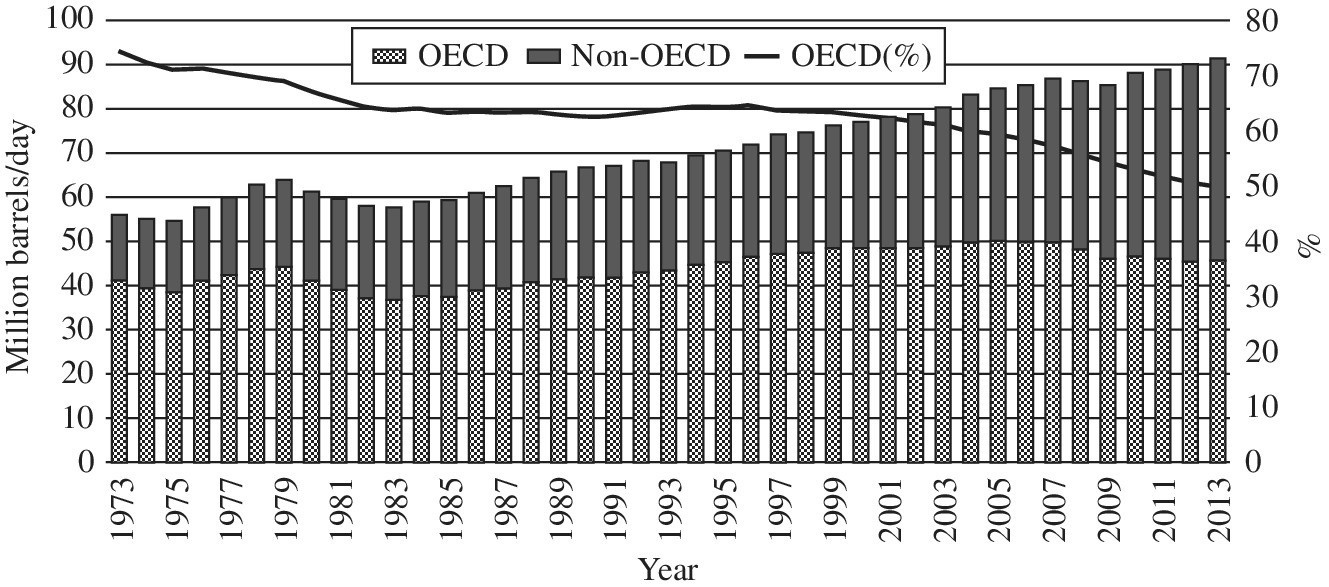
FIGURE 13.6 Trend of world oil consumption by OECD and non‐OECD nations
(a) Source: BP Statistical Review of World Energy (2014)6.
(b) We prepared the figure based upon the numbers listed in the data source. (c) There was no major increase in OECD nations, but there was an increasing trend in the non‐OECD nations. The result indicates that industrial nations in the OECD attained the almost maximum limit on oil consumption. In contrast, non‐OECD nations increased consumption for their industrial developments along with their population increase.
In contrast, non‐OECD countries exhibited a large amount of oil consumption in recent years. The increase was supported by their economic growth. For example, the consumption increased from 14.25 to 45.77 million barrels per day from 1973 to 2013, indicating an increase of 3.0% as an average annual growth rate. As a result, the share of oil consumption in non‐OECD counties increased from 26% in 1973 to 50% in 2013, whereas developed countries decreased their shares of consumption from 74% to 50% during the same annual periods.
World oil trading has steadily increased along with the increase in oil consumption. The volume of total oil trade has reached 55.67 million barrels per day in 2013. The 50% of the total volume of oil imports was occupied by the three large markets, including Japan, the United States and European nations. Meanwhile, the Middle East occupied the largest share of the total volume of exports with 35% share in 2013. In addition, the 10% of the total volume of exports from the Middle East (2.01 million barrels per day) was delivered to the United States, 11% (2.07 million barrels per day) to Europe and 76% (14.74 million barrels per day) to the Asia‐Pacific region. The evidence confirms that the Asia‐Pacific region is the largest sales channel of oil from the Middle East. This regional oil dependency on the Middle East remained higher in Asian countries than in Europe and the United States over the 1990s in order to support their rapid economic growth, in particular China and Japan.
13.3.1.2 Natural Gas
As visually summarized in Figure 13.7, the world gas reserve was 185.7 trillion cubic meters as of at the end of 2013. The Middle East occupied the largest share of gas reserve with 43%, followed by Europe, Russia and the former republics of the Soviet Union with 31% of the total share. Differing from the high level of regional concentration of oil reserves in the Middle East, natural gas has a low regional concentration. Natural gas production was 3.4 trillion cubic meters in 2013. The average annual growth rate was 2.5% between 2003 and 2013, which was higher than the growth rate (1.1%) of oil during the same annual periods. Two large regions of natural gas production in 2013 were North America (with 27% share) and Europe, Russia and the former republics of the Soviet Union (with 31% share).
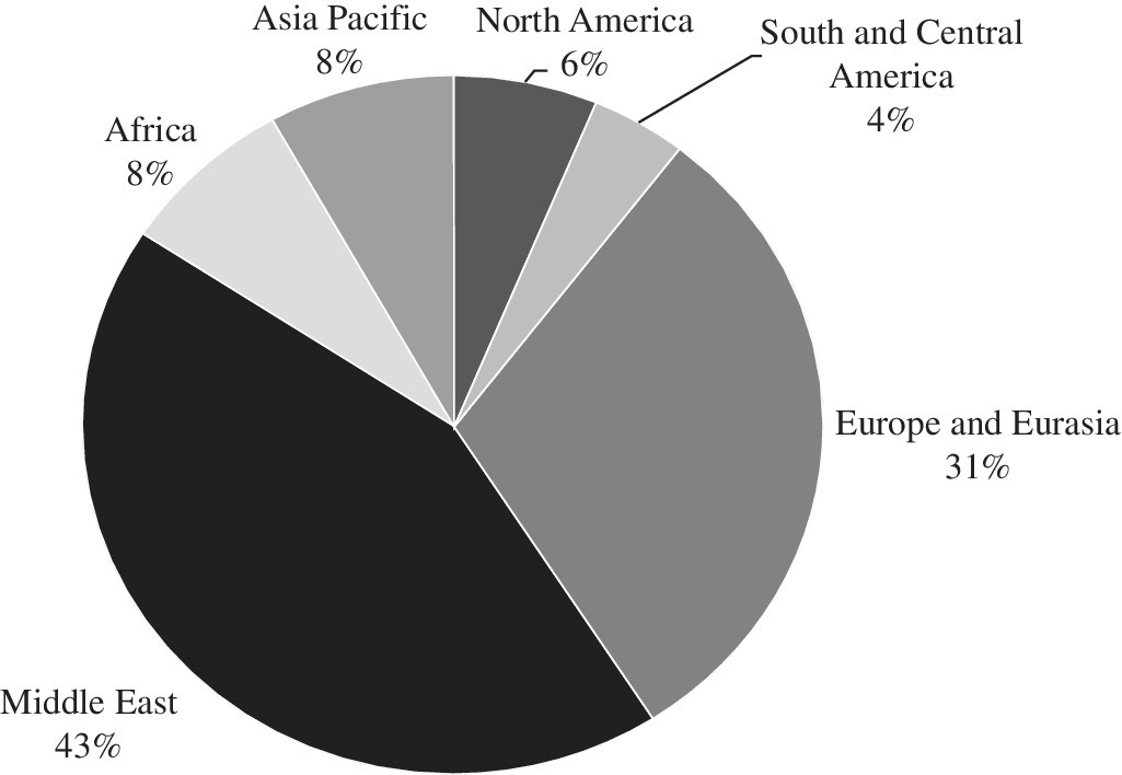
FIGURE 13.7 World natural gas: proved reserves as of 2013
(a) Source: BP Statistical Review of World Energy (2014)7.
(b) We prepared the figure based upon the numbers listed in the source data.
Although the amount of natural gas reserve in the Middle East was 43%, the production share was only 17%. This gap between reserve and production occurred because of two business rationales. One of these rationales was that a very large amount of investment was necessary to transport natural gas through a huge pipeline network. The other rationale was that investment for natural gas production was relatively small because gas was usually produced alongside oil. The oil price (per unit) was much higher than the gas price. Thus, no gas pipeline network was constructed from the Middle East to the large consumption areas in the world. The situation was different between Russia and Western Europe where a gas pipeline network already existed between them. Most of the natural gas produced in Middle East countries was consumed by themselves and the remaining was liquefied and exported as liquefied natural gas (LNG).
Responding to increasing natural gas consumption in the world, the major oil companies in Europe and the United States developed large natural gas plants. In particular, new LNG projects have been planned and prepared to increase the amount of LNG. In addition, new technologies such as gas to liquids (GTL) and di‐methyl ether (DME) have been applied to natural gas production. Part of these has been already commercialized for gas production.
About 60% of the world natural gas consumption arises from North America, Europe, Russia and the former republics of the Soviet Union. There are two rationales for the large share in those regions. One of these rationales is that they produce an abundant amount of natural gas and have promoted the usage of natural gas. The other rationale is that these areas have already well developed pipeline infrastructures. A large amount of natural gas can be easily transported through their established huge infrastructure systems.
From 2003 to 2013, the world natural gas consumption increased by 2.6% as an average annual growth rate. A business rationale for the recent growth of natural gas consumption was because of a demand increase for electricity generation. Natural gas has a lower environmental impact than other fossil fuels. In addition, the economic advantage of natural gas for electricity generation has been increased through technological progress using gas turbine combined cycle generation. As of 2013, natural gas accounted for 30%, 32% and 22% in the total primary energy consumption in the United States, the OECD nations in Europe, and Japan, respectively.
The pricing system of natural gas varies from one region to another. For example, the price of natural gas (i.e., LNG) exported to Japan is linked to the Japan crude cocktail (JCC), which provides an average crude oil price for Japanese imports. The pricing formula is designed to reduce the degree of variation in the natural gas price. Meanwhile, the gas price in the United States and north‐western Europe such as the United Kingdom is determined by the relationship between demand and supply in each gas market. In the other countries in continental Europe, the natural gas price is linked to the prices of alternative fuels such as petroleum products or crude oil.
13.3.1.3 Coal
Confirmed coal resources were 891.5 billion tons at the end of 2013, most of which were reserved in the United States (26.6%), Russia (17.6%) and China (12.8%), respectively. Bituminous coal, referred to as “black coal,” amounted to 403.2 billion tons. Subbituminous coal, referred to as “brown coal,” amounted to 488.3 billion tons. The advantage of coal is its lower regional concentration than oil and natural gas. Coal reserves are widely distributed over the world. Besides, according to BP statistics in 2014, the RP ratio was 113 years, considerably longer than the ratio for other energy resources, such as oil.
World coal production in 2013 was estimated as 7.896 billion tons. Among the total coal production in 2013, the sum from China (47%) and the United States (13%) provided more than half of the total, followed by Australia, Indonesia, India and Russia, whose production sum became 84% of the total coal production.
China has been increasing coal production since 2001 in order to cope with rapidly expanding domestic energy consumption that is mainly used for electricity generation. In the United States, coal has been long positioned as an important energy resource, followed by oil. Coal‐fired power generation had more than 50% share of electricity generation until the early 2000s. However, because of increased social consciousness on various air pollution problems and increased natural gas generation, the number of coal‐fired power plants has gradually decreased so that the share of electricity generation in the United States became about 43% in 2013. Another rationale for explaining the share decrease was because of a large price decrease in natural gas, caused by the recent development of shale gas. The decrease of coal‐fired power generation reduced the consumption and production of coal.
The total coal consumption in the world was estimated at 7.697 billion tons in 2012, implying a growth of 2.3% over the previous year. The two largest coal consumption countries were China (48%) and the United States (11%), whose sum accounted for approximately 60% of the world consumption in 2012.
The total coal export in the world was estimated at 1.255 billion tons in 2012. The largest exporter of coal was Indonesia, occupying 30.5% of the world total. The second was Australia with a share of 24.0%, followed by Russia (10.7%). China was the second largest exporter of coal in 2003. However, the amount of Chinese export drastically decreased after 2004 because of its rapid expansion in domestic coal consumption. In recent years, Asian countries such as China and India increased their coal consumption for electricity generation at many coal‐fired power plants to satisfy an increase in electricity consumption. In 2012, the total sum of coal imports by Asian countries, including Japan, China, Korea, India and Taiwan, was estimated to be 0.822 billion tons, or 64.4% of the world total coal import. In particular, China’s import of coal exceeded 0.1 billion tons in 2009 and China became a pure importer of coal as a result of a drastic increase in coal consumption.
Note that Chapter 17 discusses coal‐fired power plants in the United States. These have made a fuel mix shift from coal to other types of fuels (e.g., natural gas, renewable and nuclear energies) under strict regulation on air pollution. Chapter 18 confirms that United States coal‐fired power plants with bituminous coal have outperformed those of subbituminous coal in terms of their efficiency measures.
13.3.2 Non‐fossil Energy
13.3.2.1 Nuclear
After the world’s first nuclear power generator began operation in 1951 in the United States, many other countries have actively promoted the development of nuclear power generation. However, from the late 1980s, the growth of a nuclear power generation capacity became steady across the world, as visually summarized in Figure 13.8. The figure depicts the nuclear generation capacity of three groups (i.e., Europe, Asia and America) of OECD nations.

FIGURE 13.8 Nuclear generation capacity in three groups of OECD nations
(a) Source: IEA Electricity Information Statistics8.
(b) We prepared the figure based upon the numbers listed in the source data. (c) GWe stands for Gigawatt‐electrical.
Many nations have paid serious attention to nuclear power generation both to alleviate global competition for fossil‐fuel energy resources and to tackle global warming and climate change. As a result, the total nuclear power generation capacity has steadily increased in the world, as depicted on the vertical axis of Figure 13.8.
Figure 13.9 visually describes the amount of nuclear power generation in these three groups of OECD nations. The United States and Europe have constructed only a limited number of new nuclear power plants. However, during the observed annual periods, the amount of nuclear power generation indicated an increasing trend because of its enhanced generation capacity and improved utilization factor. For example, the utilization factor was approximately 90% in the United States as a result of efforts for high operational efficiency since the accident of Three Mile Island. Meanwhile, after the disaster of the Fukushima Daiichi nuclear power plant on 11 March 2011, the amount of nuclear power generation decreased in Japan and Asian regions, but it has not largely changed in the other regions. See Sueyoshi and Goto (2015c) and Chapter 26 for a detailed description of Japanese fuel mix strategy after the disaster at the Fukushima Daiichi’s nuclear power plant. See also Goto and Sueyoshi (2016)9.

FIGURE 13.9 Amount of nuclear power generation in three groups of OECD nations
(a) Source: IEA Electricity Information Statistics10.
(b) We prepared the figure based upon the numbers listed in the data source. (c) TWh stands for Terawatt hour.
Uranium resources are widely distributed in the world. As of 2012, Canada, Australia and Kazakhstan ranked high in terms of their amount of uranium reserve and production. The uranium price in the spot market fluctuated with nuclear power plant constructions. The price was also influenced by other difficulties such as oil shocks and accidents at nuclear power plants. In 2007, the price once rose to US$ 136 per pound of U3O8 and it remained above US$ 60 per pound of U3O8 until March 2011 before the disaster of Fukushima Daiichi’s nuclear power plant. Here, U3O8 stands for triuranium octoxide. After the disaster, the uranium price slightly dropped and it has remained at a relatively stable level because of tight conditions on supply and demand as well as the influence of speculation money.
13.3.2.2 Renewable Energy
Solar Photovoltaic Power Generation: According to the statistics of the International Energy Agency, Photovoltaic Power Systems Program (IEA PVPS, 2014), the total installed capacity of solar photovoltaic (PV) power generation was 125 GW in 2013 over IEA countries.
Figure 13.10 visually describes the amount of cumulative installed PV power from 1999 to 2013. Although Japan was the largest installer of the PV capacity before 2004, the installation grew faster in Germany and Spain because the two nations adopted a feed‐in tariff (FIT) to support the high cost of PV. See Sueyoshi and Goto (2014d) about their positive and negative concerns on FIT.
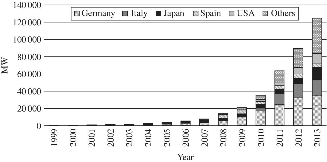
FIGURE 13.10 Cumulative installed photovoltaic power from 1999 to 2013
(a) Source: IEA Photovoltaic Power Systems Program, Trends 2014 in Photovoltaic Applications (IEA‐PVPS T1‐25, 2014)11.
(b) We prepared the figure based upon the numbers listed in the data source. (c) MW stands for Megawatt.
Wind Power Generation: The world installed capacity of wind power generation rapidly increased in recent years, reaching a level of 369.55 GW in 2014. Figure 13.11 depicts the global cumulative installed wind power generation capacity between 1997 and 2014. As of 2015, the new installation of wind power generation capacity was 30753 MW (48.5%) in China and was 8598 MW (13.5%) in the United States, together accounting for 62.0% of world capacity. In addition, off‐shore wind power generation has been rapidly expanding, reaching a cumulative capacity of 12.1 GW by 2015. In particular, the United Kingdom focuses on the off‐shore wind power generation, accounting for 41.8% of the accumulated installed capacity in the world in 2015.

FIGURE 13.11 Global cumulative installed wind power generation capacity from 1997 to 2014
(a) Source: Global Wind Energy Council12.
(b) We prepared the figure based upon the numbers listed in the data source. (c) MW stands for Megawatt.
Biomass: In 2012, biomass supplied approximately 10% of the world’s primary energy. In particular, biomass accounts for an average of 4.8% of the primary energy supply in OECD countries, while it is 13.6% in non‐OECD countries. The OECD countries, such as the United States and European nations, have been promoting biomass generation through their energy policies in the context of a countermeasure against global warming and climate change.
To enhance biomass usage, many countries have been developing various energy policies that attempt to reduce oil dependency in their transportation sector and reduce their GHG emissions. Meanwhile, there are social concerns about the rapid increase in biomass usage. For example, the use of biomass seriously influences a steep rise in food prices and it invites cutting down rain forests to convert them into farm land. Thus, to reduce the impact of biomass usage upon the natural environment and food markets, international conferences are open to discuss how to construct global sustainability standards on biomass. In addition, research has been promoted to produce biofuel from non‐food materials such as straw, timber and algae. International major oil companies are currently focusing on new research and development on the next‐generation biofuel.
Hydro: The capacity of hydro power generation amounted to 1010 GW, which was approximately 20% of the total generation capacity in the world as of 2012. Countries with large hydro power generation capacities include China, the United States, Canada and Japan.
Geothermal: The installed capacity of geothermal power generation amounted to 11.7 GW as of 2013. Countries with large geothermal power generation include the United States, Philippine and Indonesia. In 2013, they had a generation capacity of approximately 3.4, 1.9 and 1.3 GW, respectively.
13.4 SECONDARY ENERGY (ELECTRICITY)
As depicted in Figure 13.12, world electricity consumption has increased constantly until today. In the 1970s, the annual growth rate remained high at 5.3% on average, although there was a temporary stagnation in growth after the oil shock. The growth rate gradually decreased to 3.6% in the 1980s and 2.5% in the 1990s, but it recovered to attain a steady growth at 3.1% in the 2000s.

FIGURE 13.12 Trend in world electricity consumption
(a) Source: IEA World Energy Statistics and Balances13.
(b) We prepared the figure based upon the numbers listed in the data source. (c) TWh stands for Terawatt hour.
The electrification rate in the world increased from 12.2% in 1980 to 18.1% in 2012, exhibiting an increase by 5.9% during the observed periods. A rationale for the increase was the rapid and widespread growth of the use of electric appliances in the world. Generation capacity in the world continuously increased and reached 5680 GW in 2012.
The average annual growth rate of a total generation capacity was 3.5% in the 1980s, decreasing to 2.2% in the 1990s but increasing to 3.9% in the 2000s. In the world, China’s growth forecast will be tremendous in future. According to the Chinese government’s official announcement in the 12th version of their five‐year energy development plan from 2011 to 2015, China has set a new policy goal on generation capacity to increase from 970 to 1490 GW, so indicating an increase of 9% as an average annual growth.
Considering the world’s generation capacity in 2013, we find that steam‐power generations by fossil fuels were major energy sources, accounting for 64.5% share of the total generation capacity. However, since the oil shocks in the 1970’s, it became necessary for many counties to develop alternative energy sources to oil. Nuclear power generation was promoted for such an industrial goal. Consequently, the nuclear power generation capacity had 9.6% as an average annual growth rate in the 1980s. However, the growth of nuclear power generation decreased in developed countries. The annual growth rate stagnated at 0.5% on average in the 1990s and remained 0.8% in the 2000s. In similar manner, hydro power generation capacity had a problem in identifying new sites for construction, so that its growth rate was low as a result of growing capacity in the 1990s.
The world’s electricity generation continuously increased and produced 23.3 million GWh in 2013. The average annual growth rate of generation capacity was 3.5% in the 1980s and 2.2% in the 1990s, whereas the growth rate of generation amount was larger than that of generation capacity, exhibiting 3.8% in the 1980s and 2.5% in the 1990s, respectively. The average annual growth rates in capacity and generation indicated that the utilization rate of generation plants increased during the observed periods. However, the average annual growth rate of generation was 3.0% on average in the 2000s, which was lower than that of the generation capacity with 3.8%. This was due to the influence of world‐wide economic recession after the financial crisis in the fall of 2008.
Among the fossil fuels, coal‐fired power generation increased its share from 37% in 1975 to 41% in 2013, indicating that coal‐fired power generation increased faster than total power generation. The amount of oil‐fired power generation steadily increased at an average annual growth rate of 5.7% in the 1970s. However, as a result of the shift from oil to alternative energy sources because of the influence of oil shocks, the annual average growth rate became constantly negative: –2.3% in the 1980s, –0.8% in the 1990s and –2.2% in the 2000s. In contrast, the annual growth rate of gas‐fired power generation was 4.1% on average in the 1970s, thus exhibiting an increasing trend. The growth rate of gas‐fired power generation was 5.4% in the 1980s, 4.4% in the 1990s and 5.4% in the 2000s, which was larger than the growth rate of total generation. Thus, it is easily thought that gas‐fired power generation served as an alternative energy to coal‐fired and/or oil‐fired ones.
13.5 PETROLEUM PRICE AND WORLD TRADE
Oil is the most important primary energy source in terms of trade volume and wide applicability in electricity generation, chemical products, automobile fuels and military fuels for operating armed forces. Oil is clearly a strategic energy source for business and military.
According to the US Energy Information Administration (2016)14, the price fluctuation may be separated into five periods after 2004. The first period was from 2004 to 2008, when the oil price sharply increased during all five years. After 2008, corresponding to the financial crisis, the crude oil price in the second period decreased to less than US$ 62 per barrel until 2009. The third period was from 2009 to 2011. The crude oil price returned to the price level held before the crisis. The fourth period was from 2011 to 2014. The oil price was mostly unchanged, compared to the other periods. Finally, the oil price after 2014 dropped below US$ 60 per barrel and remained at this low price until recently.
The decline in oil price after 2014 was because of several compound reasons on oil production. Five concerns need to be discussed here as examples. First, there was economic recession in China. According to the Energy Information Administration (EIA, 2014), China was the world’s largest importer of oil in 2014. There was a sharp drop in oil demand within the global oil market partly because of China’s demand drop. Second, Saudi Arabia, which had been a market power, could no longer control the market price. See Chapter 16 for a description on the size of Saudi Arabia’s oil production. There is only a single company, named “Saudi Aramco,” that is 100% owned by the King of Saudi Arabia. It may be a good strategic policy direction for Saudi Arabia to privatize the company so that privatization may generate more benefits for the nation. For example, the government of Saudi Arabia can obtain huge capital by selling its equity. Third, there was speculation on a rising crude oil production from Iran, after the economic sanction from Western nations was lifted. The nation is the second largest OPEC supplier regarding oil production capacity. Fourth, the oil production nations (i.e., OPEC and non‐OPEC) had a difficulty in consensus building among themselves. Finally, there was an increasing supply from shale oil and gas production in the United States. The US shale revolution may considerably change the relationship between supply and demand in the global oil market.
Acknowledging the existence of an oil price fluctuation, the world economy has been increasing from 2004 to 2016. During the annual periods, world trade has exhibited a steady growth. It is important to note that the amount of world trade in 2008 and 2009 temporarily dropped below the volume of 2005 under the impact of a financial crisis. During 2009–2011, recovery came up to the same volume as before the crisis. After 2014, the volume of world trade in terms of the US dollar decreased despite the growing volume of world trade. A possible rationale for such a decline in the dollar amount was perhaps the decreasing price of oil. See CPB World Trade Monitor (2016)15.
Implications for DEA: Energy resources serve as inputs to produce desirable outputs (e.g, electricity). The amount of all energy resources has increased in most periods, as found in the figures summarized in this chapter. There are two implications for DEA and its environmental assessment. The first implication is that the world population has increased and it is expected to reach 11.2 billion in the year 210016. Thus, along with the population increase, DEA environmental assessment needs to incorporate an increasing direction into an input vector, or energy resources, until the increase can reach an efficiency frontier shaped by undesirable outputs. The frontier may serve as an upper limit on the increase of an input vector. The methodological implication is inconsistent with a conventional use of DEA, discussed in the chapters of Section I, where an input vector should decrease or maintain a current level for efficiency enhancement. See Chapter 4. The other implication is that science development and technology innovation make it possible to increase the world population. Thus, economic growth, supported by science and technology, is essential for sustainability development in the world. Therefore, it is necessary for DEA environmental assessment to consider such technology innovation in the proposed performance assessment.
13.6 ENERGY ECONOMICS
It is necessary for us to discuss DEA from the perspective of energy economics, which can be considered as an auction market in this chapter. Our description is important in understanding the underlying concepts and frameworks to develop DEA environmental assessment. To simplify our discussion, let us consider a power trading market, as an illustrative example, in the United States, where generators and wholesalers participate by their bids based upon generation capabilities and demand forecasts on electricity consumption. See, for example, Sueyoshi and Tadiparthi (2007)17 for a detailed description on the US wholesale market for power trading. See also Sueyoshi and Tadiparthi (2008)18.
Figure 13.13 visually describes the market coordination mechanism of power trading. In the market, the i‐th generator (i = 1, …, 6) bid on an amount of generation (sit) and its bidding price (pit) for the t‐th period. Similarly, the j‐th wholesaler (j = 1, …, 5) bid an amount of demand (djt) and its bidding price (pjt) in the wholesale market. The number of generators and wholesalers can easily increase to any realistic specification (e.g., 10,000) in a computer simulator.

FIGURE 13.13 An equilibrium point in power trading market
(a) Source: Sueyoshi and Tadiparthi (2008).
(b) The market clearing price (MCP) is found on the equilibrium point (EP).
The bidding price of generators is usually determined by a “marginal cost” for generation19. Considering the bidding price, the figure visually describes the market coordination mechanism. Each independent system operator (ISO) reorders their bids of generators and wholesalers. That is, the supply side combinations (sit and pit) are reordered according to an ascending order of these bids on price (pit). The bidding process can be considered as a sealed English auction with the acceptance of multiple bids. Meanwhile, the demand side combinations (djt and pjt) are reordered according to a descending order of these bids on price (pjt). The bidding process can be considered as a sealed Dutch auction with the acceptance of multiple bids.
In Figure 13.13, ISO allocates the generation amount (s1t) of the first generator to satisfy the demand (d1t) of the first wholesaler. Such a power allocation is continued until an equilibrium point is found in the market. In the figure, the equilibrium point is identified as EP, where the four generators are used to satisfy the demand required by the three wholesalers. Consequently, p4t (the bidding price of the fourth generator) becomes the market clearing price (MCP: ![]() ) for all participating traders in the wholesale market.
) for all participating traders in the wholesale market.
Implications for DEA: Figure 13.13 has four implications for DEA applied to environmental assessment for energy sectors. First, two smooth curves usually express a supply and demand relationship, as found in any textbook of economics. Such smooth curves are due to conceptual description and computational tractability. However, the relationship should be expressed by two step functions as depicted in Figure 13.13. It can be easily imagined that the supply and demand relationship is not differentiable, rather being in reality expressed by step functions. Thus, the DEA models proposed in this book, which do not need differentiability, can easily fit into an investigation of the relationship between supply and demand. Second, as discussed in Chapter 9, if congestion occurs in a grid system, then the market clearing mechanism does not function as depicted in Figure 13.13. Therefore, DEA needs to consider such a possible occurrence of congestion in the performance assessment. See, for example, Chapters 9 and 21. Third, the amount of a desirable output (e.g., electricity) is influenced by a market clearing price on EP. If there are many players, they can reduce their bidding prices in such a manner that they have an opportunity to generate electricity in the wholesale power market. In DEA, the performance of a DMU (e.g., a generator and a wholesaler) should be relatively compared by the others. Therefore, it is necessary for DEA to consider how to measure the effectiveness of the strategies of many DMUs (e.g., generators and wholesalers) in a market dynamics process with a time horizon. See Chapter 19. Finally, Figure 13.13 does not incorporate undesirable outputs. The existence of undesirable outputs may be not important in this illustrative example on energy economics. However, the undesirable outputs are very important production factors in discussing various issues on environmental protections. Thus, the DEA environmental assessment needs to incorporate undesirable outputs in the mathematical formulations, as discussed in Chapters from 14 to 27.
13.7 SUMMARY
This chapter described a recent energy trend in the world. Energy was separated into primary and secondary categories. Primary energy was further classified into fossil and non‐fossil fuels. Fossil fuels included oil, natural gas and coal, while non‐fossil fuels included nuclear and renewable energies (e.g., solar, wind, biomass and others). This chapter also discussed a fuel mix issue on electricity generation as a representative of the secondary energy.
It is easily imagined that energy consumption is essential for the development of economic prosperity in all nations. However, the use of various energy sources usually produces many different types of pollution (e.g., air, soil and water pollution) on the earth, so resulting in great damage on our society, economics and human health. See Chapter 14 for a detailed description on environmental issues. Thus, it is essential for us to understand a general trend of world energy, as discussed in this chapter.
After reviewing the conventional use of DEA in Section I, this chapter discussed its important methodological implications in various applications for environmental assessment as a holistic methodology. One such methodological implication is that DEA applications to energy and environmental assessment need to pay attention to the fact that total energy consumption, along with an increase in the world population, has been increasing in most annual periods after World War II, except some periods under economic recession. Energy resources are usually employed as inputs in DEA performance analysis. So, is it possible for conventional DEA to find an efficiency frontier that locates above an observed input vector? The answer is “no” because the conventional DEA excludes such an efficiency frontier required for environmental assessment. See Chapters 4 and 5 for a description of DEA radial and non‐radial models in their conventional frameworks. As discussed in these chapters, all the components of an input vector need to decrease under input‐oriented measurement in a conventional framework of DEA. Meanwhile, they should maintain the current observed values under the measurement. An opposite case is observed under output‐oriented measurement. Thus the conventional use of DEA is useful in conducting the performance assessment of many different organizations under economic stability, but not under economic growth for sustainability. As a result, all the previous discussions in Section I reflect part of business reality and economic phenomena, but most previous DEA studies had limited practicality in modern business and economy where environmental concerns are essential. Of course, we clearly acknowledge their contributions that have advanced our knowledge dissemination on DEA‐based performance assessment.
In addition to the above methodological implication, this chapter needs to mention that it is not easy for us to maintain a social balance (so, sustainability) between economic development and environmental protection. DEA, as discussed in Section II, may serve as a holistic methodology to make such a balance by identifying the source(s) of efficiency and inefficiency, later referred to as unified (operational and environmental) efficiency and inefficiency. The unification process to attain a status of sustainability needs a new approach to combine desirable outputs (e.g., electricity) and undesirable outputs (e.g., GHG emission) in the performance assessment. The existence of undesirable outputs was not considered in the conventional assessment by DEA. Consequently, the conventional DEA has a limited capability in environmental assessment. An exception can be found in Chapter 25. See Chapter 12.
As the initial step for DEA environmental assessment, this chapter starts proposing a new research direction of DEA by considering the current trend of energy in the world. The methodological importance and practicality of DEA environmental assessment will be discussed in the remaining chapters of Section II.