
Sometimes projects fail, and they do not get released on time or if they are released, they do not meet the planned quality. With all this pressure during testing, many activities could be carried out successively or even concurrently. For instance, the manual test case generation and implementation, the automated scripts' development and validation, test lists crafting, and perhaps some execution also could overlap in time. Such diverse tasks distributed among team members, or even teams, require management and monitoring. Charts are an effective way that helps in achieving these purposes. Every testing task that yields a number can participate in building visual, informative report charts. They can help in various domains briefly described in the following list:
- Explain how testing is going and relay discrete numbers to the management instead of speculative assessments.
- Give visibility on testing results by also transmitting numbers related to the result of the executed tests.
- Present the progress of testing, especially for critical areas either containing coding challenges or with high impact on user satisfaction.
- Draw future trends since they not only hold a meaningful evaluation of the present, but are furthermore very important in predicting efforts and quality with respect to time constraints.
Before chart generation takes place, a goal must be identified. For example, developing a testing plan that will address high-risk areas first. That identified, you need to secondly list down the questions that address the perspective of your goal. For example, can test case generation and implementation be calculated? Can the actual test case number be estimated against risky areas? Can test case automation and execution be quantified? Thirdly, you extract the helpful metrics. The suggested metrics for this example are as follows:
- Manual test case count with respect to risk areas
- Actual test case count with respect to planned test cases based on risk areas
- Automated test case count with respect to risk areas
- Actual count of passing and failed tests
The preceding described example follows the GQM (Goal Question, Metric) paradigm. More material on the GQM paradigm can be found in this paper, http://www.cs.umd.edu/~basili/publications/technical/T78.pdf.
Before you totally decide on the list of metrics, you need to first confirm that they are measurable. This means that there is a clear data type in question, and its corresponding data is available. Once, this is achieved, the implementation phase comprises of making the data available, collecting it, communicating it, and finally analyzing and taking the needed measurements.
In addition to displaying test results with respect to time, Test Studio also has ready-made reports that can be extended, thanks to its integration with outside tools. Switch to the Report tab to view the automatic reports generated by Test Studio. A typical report is shown in the following screenshot:
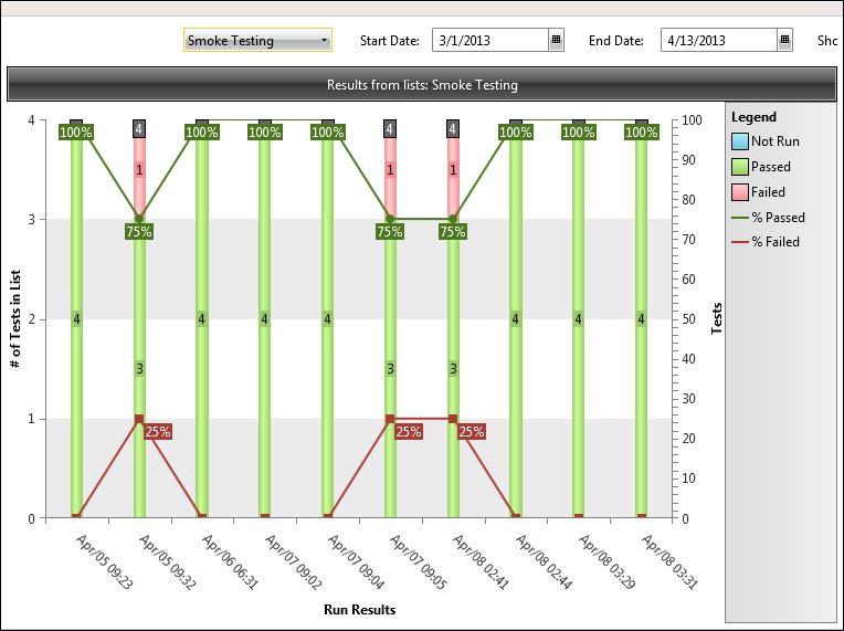
Test list execution summary report
The chart depicts the execution status with respect to time. In our case, the Smoke Testing list was executed several times from April 5 until April 8. On the first day, the list was executed with four tests that were run at 9:23 a.m and yielded a successful result for all. The second execution resulted in a failing test out of the four, and thus, the line denoting the Passed metric fell from 100 percent to 75 percent. On the other hand, the line denoting the Failed metric increased from zero percent to 25 percent, which complements the behavior noticed with the Passed line. The last three executions for the list resulted in a fully successful end result that gives us some assurance for the rest of the day. The report is customizable through some parameters on top, where switching between the test list's parameters, Start Date and End Date, is possible.
So, you are probably thinking that the result of the second run on April 5 is interesting, especially that the bug was directly fixed on the second day. What was the bug? All you have to do is double-click on the column from where you need to gather more information. The report will drill down one level to display the following chart on the left, which allows you to easily navigate back and forth between tests by clicking on the links of the list results pointed by red arrows:
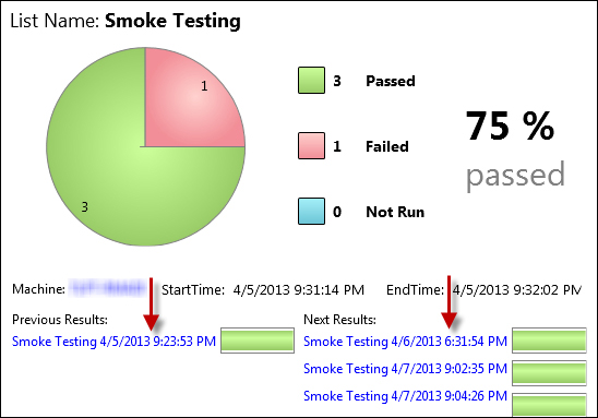
The test list execution report
To the left, details about the currently displayed test are shown similar to the previous screenshot.
While on the Results tab, the upper ribbon shows further capabilities that comes within Test Studio, and that is its integration with external tools, which is close to what we have seen during a regular automation and source control. The Export tab depicted in the following screenshot lists these possibilities:
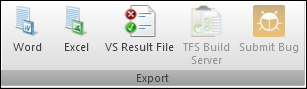
The Export tab
Click on the Excel button and save the file on your local machine. The following is the report table automatically generated by Test Studio:
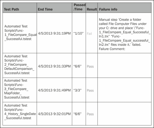
The report table
The description for each of the table columns is as follows:
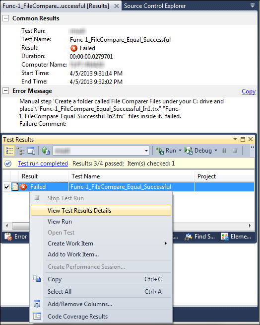
Test Studio has the capability of generating files with the .trx extension, which can be viewed from Visual Studio. Hence, click on the VS Result File button and save the resulting file on your machine. This file can be previewed in Visual Studio as shown in the following screenshot:
Viewing reports in Visual Studio