
(RAY)
Job:08-20331/20788/21373 Title:RP-Logo Lounge 6
#175 Dtp:223 Page:20
020-031_21373.indd 20 9/23/10 9:16 AM
20
LogoLounge 6
(Text)
Design Firm
Sagmeister
Casa da Música
Identity Redesign
Client
Project
When Stefan Sagmeister presented his identity solution to client Casa da
Música, a remarkable arts and music space in Porto, Portugal, an equally
remarkable group of Porto citizens—800 in number—came to watch and
learn. The presentation had been moved twice to accommodate the bur-
geoning audience, and if the Casa’s 1,300-seat hall had been available, it
likely would have been filled, so great was the interest in the project.
The larger hall was not available because it was hosting an international
piano virtuoso that evening, just part of another full day of culture at Casa
da Música: an art exhibition opening at 10 a.m., a sound installation at
noon, a large group of disabled children visiting at 1 p.m., followed by Sag-
meister’s presentation/event at 4 p.m., the virtuoso at 7 p.m., and a rave for
some 2,000 people at midnight. Sagmeister attended every single event.
Porto is a city in love with the arts. After opening in 2005, Casa da Música
quickly became a landmark, a destination, and a hub of civic pride. Citizen
interest in and participation with Casa runs high.
“If we had redesigned the logo for Lincoln Center, you would not read about
it in the New York Times,” Sagmeister says. “In Porto, the identity design
process had been featured in full-page articles in the general press. The
facility is really a manifestation of how well a center can be run through gov-
ernment funding and private donations. The center can host super-popular
events as well as esoteric events, and has funds for both. The client was
incredibly smart and lovely, and the city and architecture are first-rate.”
When Sagmeister’s office was brought into the project in 2007, the venue
did have an existing logo, simply a literal representation of the building that
showed its unusual architecture. The client was also using the tagline, “One
house, many musics.”
Initially, the client desired to keep the old tagline in the new identity, but
Sagmeister did not agree. “I thought they should not have a tagline at all.
If you have to say what you are, you are not it. I almost instinctively do
not believe in taglines at all. Instead, we made the main trajectory for the
project to be how to display the tagline in a visual system without having
to say it,” he recalls.
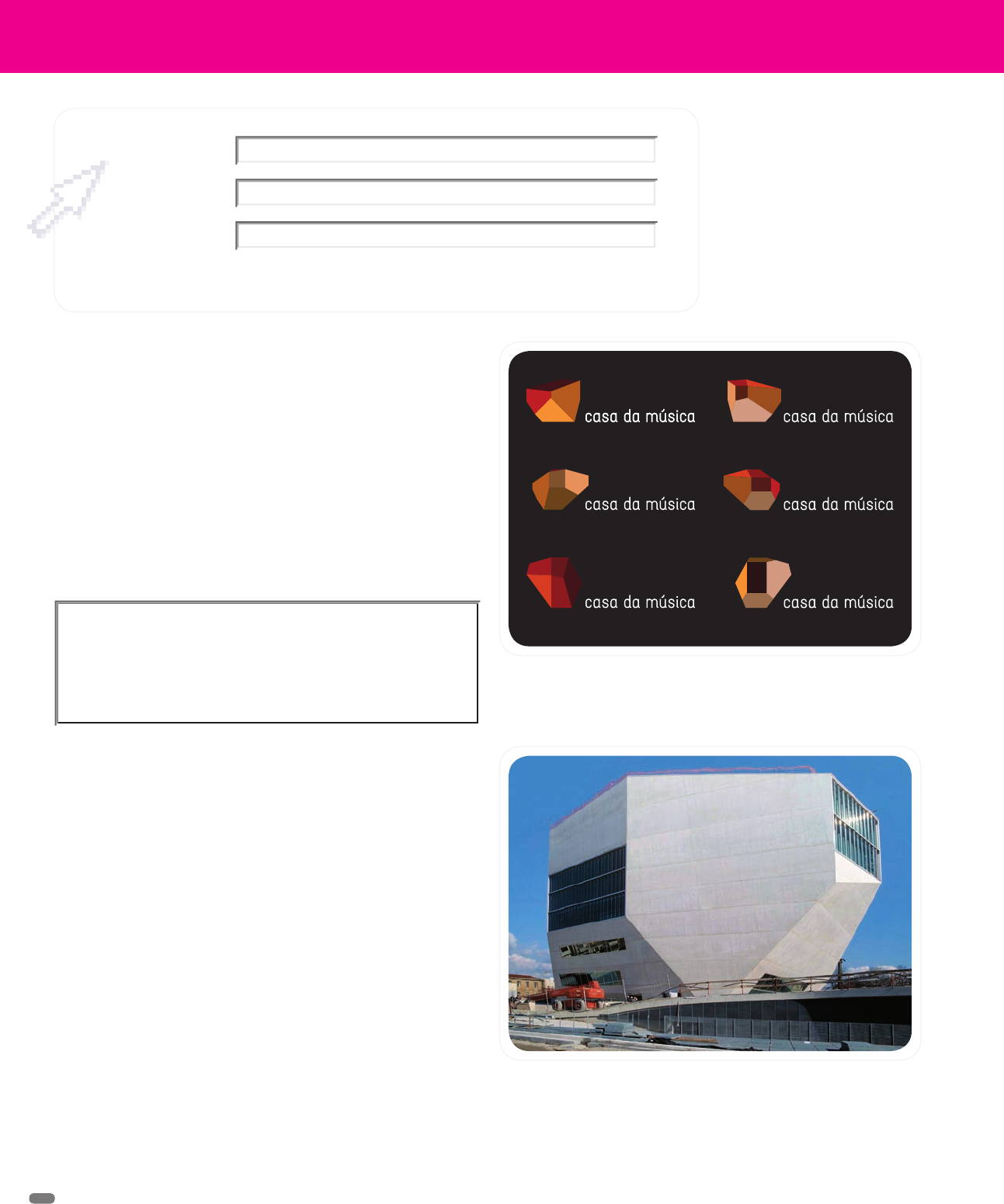
The Casa da Música logo, based on different views of the venue,
created by Sagmeister, Inc.
The architecture of the Casa da Música in Porto, Portugal, is
extraordinary from any view. The building and the events that
it houses are a source of great civic pride for the city. Its new
identity, created by Sagmeister, Inc., is as accommodating and as
expressive as the place itself.
I thought they should not have a tagline at all.
If you have to say what you are, you are not it.
(RAY)
Job:08-20331/20788/21373 Title:RP-Logo Lounge 6
#175 Dtp:223 Page:20
020-031_21373.indd 20 9/23/10 9:15 AM
(RAY)
Job:08-20331/20788/21373 Title:RP-Logo Lounge 6
#175 Dtp:223 Page:21
020-031_21373.indd 21 9/23/10 9:16 AM
21
(Text)
Another thing the designer did not wish to do was to participate in the pitch
for which his office was originally contacted. Three different design compa-
nies had been asked to present their ideas. The project especially appealed
to Sagmeister’s team, which has always been very close to music, person-
ally and through design for clients. As music packaging and video projects
have gone away as a result of downloads and online presence replacing
CDs and other media, their involvement has changed.
“The physical manifestation of music in life has become more and more
important, and this project was a great opportunity to design in that space,”
Sagmeister says.
So, he worked hard to talk the client out of the pitch approach, in the end
convincing them to allow his office to handle the project.
Having landed the project, the first thing Sagmeister told the client was
that any solution he presented would not involve the architecture of the
building. He noted that many identities for such cultural facilities do rely
on the architecture to suggest visual cues, but all these really say is that
the institution is housed in a beautiful or otherwise remarkable building.
The approach does not communicate that this is a music center or that it
is a community resource or that it supports many different sorts of music.
In this instance, just relying on the shape of the building especially did not
say, “one house, many musics.”
Although initially Stefan Sag-
meister did not want to use
the shape of the building in the
new identity—such identities
say more about the architec-
ture than what the organiza-
tion is about—he eventually
came to see the shape as so
emblematic of the organization
and so representative of the
layers’ meaning that his team
did use the shape. Here, the
building is broken into indi-
vidual planes.
The client agreed. So, Sagmeister embarked on a two-day visit of Porto to
learn what the city and its people were like. He interviewed everyone from
the marketing director of Casa da Música to its music director, members
of music groups, and participants in community groups. He studied how
the building had become an iconic shape in the city and what it meant to
its people.
“Koolhaas talks about the building being an exploration of various layers
of meaning. I translated his architectural words to words we would use:
What are the layers of meaning? Discovering that is what logo making is.
If you explore the various layers, you eventually reduce them down to a
logo,” the designer says. “At that point, we began to understand that the
entire building was a logo.”
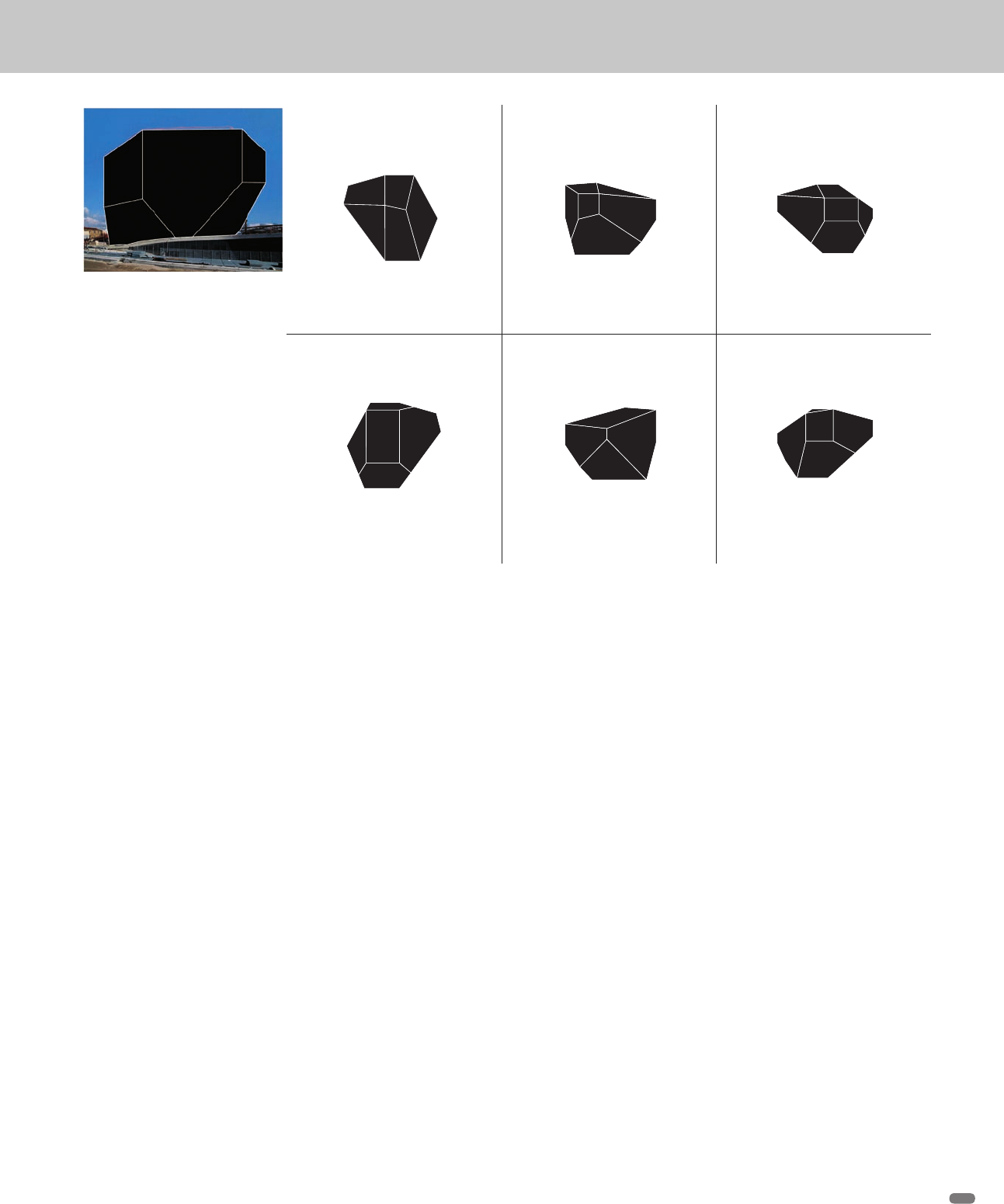
With this new trajectory in mind, the design team assembled six different
views of the building—from the east, west, north, south, top, and bottom—
and considered the shapes. Which represented the meaning of the building
best? It was soon clear that one representation would not convey enough
meaning, of the building or of what it contained. Instead, all angles could
be used, in addition to interior shapes revealed in transparent views. The
building’s many asymmetric facets held myriad possibilities.
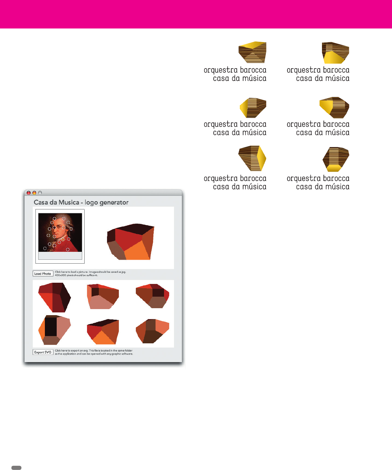
There were so many possibilities, in fact, that the design team had software
written that would actually generate logo directions. Color direction was
N
S
OW
N
S
TOP
BOTTOM
SOUTH VIEW
NORTH VIEW
EAST VIEW
WEST VIEW
OW
OW
(RAY)
Job:08-20331/20788/21373 Title:RP-Logo Lounge 6
#175 Dtp:223 Page:21
020-031_21373.indd 21 9/23/10 9:15 AM
(RAY)
Job:08-20331/20788/21373 Title:RP-Logo Lounge 6
#175 Dtp:223 Page:22
020-031_21373.indd 22 9/23/10 9:16 AM
(Text)
22
LogoLounge 6
provided by, say, a photo of an artist who would be performing at Casa da
Música or by a painting that might be on display. The software samples
fifteen points in the photo or painting and builds a coordinating palette that
is applied to surfaces of the logo.
“In a matter of seconds, you have an animated logo that is built from the
visual information of the event and from the building stills, all in Photoshop
and ready to place,” Sagmeister explains. “You still have to select one, but
conceptually and through color, the logos will always fit visually. The client
can never end up with jarring colors or such.”
The chameleon effect works just as well for logo portraits based on photos
of Casa da Música employees that are applied to their business cards, or
for identities of the various music organizations that the center supports.
“Whether it is for the symphony orchestra or contemporary music, the
system works,” he adds.
As the city of Porto provides plenty of space for posting promotional post-
ers, the design team suggested that for the first six to seven months of the
identity’s life the client rely heavily on posters to introduce the new look to
the public. These posters would only use the building-shaped logos and
color cues from the events as visuals.
After this initial period, the designers and the client began to expand the
ways in which the logo shapes could be used—incorporated into photos,
for instance, or as part of a larger illustration.
Over time, and now that the client has an in-house design group, the iden-
tity based on shapes has continued to grow and develop. Some logos are
multicolored, almost jewel-like in their appearance. Others are opaque, like
chunks of dense stone, or like line drawings or even ice.
Even though he had initially sworn that the building shape would not
drive the design of the logo, Sagmeister says that in this case, even
though the architectural shape plays such an enormous part of the overall
identity, the end result is still about the content of the building: one house,
many musics.
Art direction: Stefan Sagmeister
Design: Matthias Ernstberger, Quentin Walesh
Logo generator: Ralph Ammer
Because the identity had to be so chameleon-like in nature, and
to guarantee the client’s eventual success with the new identity,
the design team created a software program that samples fifteen
points on an image and assigns color and/or texture to various
forms of the building/logo. “In a matter of seconds, you have an
animated logo that is built from the visual information of the event
and from the building stills, all in Photoshop and ready to place,”
Sagmeister explains.
The generated samples can have solid color, textured, or even
transparent surfaces.
(RAY)
Job:08-20331/20788/21373 Title:RP-Logo Lounge 6
#175 Dtp:223 Page:22
020-031_21373.indd 22 9/23/10 9:15 AM

(RAY)
Job:08-20331/20788/21373 Title:RP-Logo Lounge 6
#175 Dtp:223 Page:23
020-031_21373.indd 23 9/23/10 9:16 AM
(Text)
23
The new graphic can be used
as line art, as an object, as
part of a photo, as part of an
illustration, or even as art itself.
These samples are all posters,
which were especially effective
in Porto, which has plenty of
public space for posting.
(RAY)
Job:08-20331/20788/21373 Title:RP-Logo Lounge 6
#175 Dtp:223 Page:23
020-031_21373.indd 23 9/23/10 9:15 AM

(RAY)
Job:08-20331/20788/21373 Title:RP-Logo Lounge 6
#175 Dtp:223 Page:24
020-031_21373.indd 24 9/23/10 9:16 AM
(Text)
After attending a TED (Technology, Entertainment, Design) Con-
ference, Stefan Sagmeister came away with two related insights:
First, he witnessed that complex scientific information could be
presented in an exciting and clear manner. The speakers made
that abundantly clear.
That first insight revealed another: As a general rule in everyday
life, scientific ideas and concepts are not well presented to the
layperson. Because media did not share the information well,
understanding of and enthusiasm for important scientific issues
is often lacking.
These communication problems are something that Seed Media
Group, a scientific media company, works hard to solve. Seed
Media has been successful in making science sexy and personally
meaningful to the general consumer.
Sagmeister took a literal interpretation of Seed Media’s goals in
creating a new identity for the company. His solution is able to
represent all scientific fields, existing and yet to be discovered: He
Seed Media
Identity Redesign
Sagmeister, New York, New York
uses a phyllotaxis structure, a Fibonacci-derived algorithm pat-
tern that is present in many natural aspects of the world, including
the seeds in the face of a sunflower, the spiraling leavings on a
plant stem, pinecone petals, seashells, pineapples, and the horns
of the gazelle, to name a very few, as a literal lens or window
through which any science can be viewed.
The designer first converted the basic phyllotaxis structure into a
window of pixels. Any image can be viewed through the window,
be it a microbe or the head shot of a scientist. Any image is enor-
mously simplified, made more graphic by the extreme reduction of
visual information. So, the effect is both literal and highly abstract.
For the client’s letterhead, Sagmeister added another twist: He
printed the pixilated phyllotaxis with iridescent ink. The ink reflects
the surroundings of the setting in which the reader is placed.
Seed Media loved the concept. “The identity was done simply and
with love and care,” says Sagmeister. This idea was a good match
to Seed Media’s abilities.
Above: Stefan Sagmeister’s identity for Seed Media uses a converted phyllotaxis structure, changing it into a window of pixels that allows
colors or images to show through, depending on the subject/event it is representing.
24
(RAY)
Job:08-20331/20788/21373 Title:RP-Logo Lounge 6
#175 Dtp:223 Page:24
020-031_21373.indd 24 9/23/10 9:15 AM
..................Content has been hidden....................
You can't read the all page of ebook, please click here login for view all page.