
(RAY)
Job:08-20331/20788/21373 Title:RP-Logo Lounge 6
10-C59061 (204) #175 Dtp:223 Page:127
118-129_21373.indd 127 10/12/10 9:51 AM
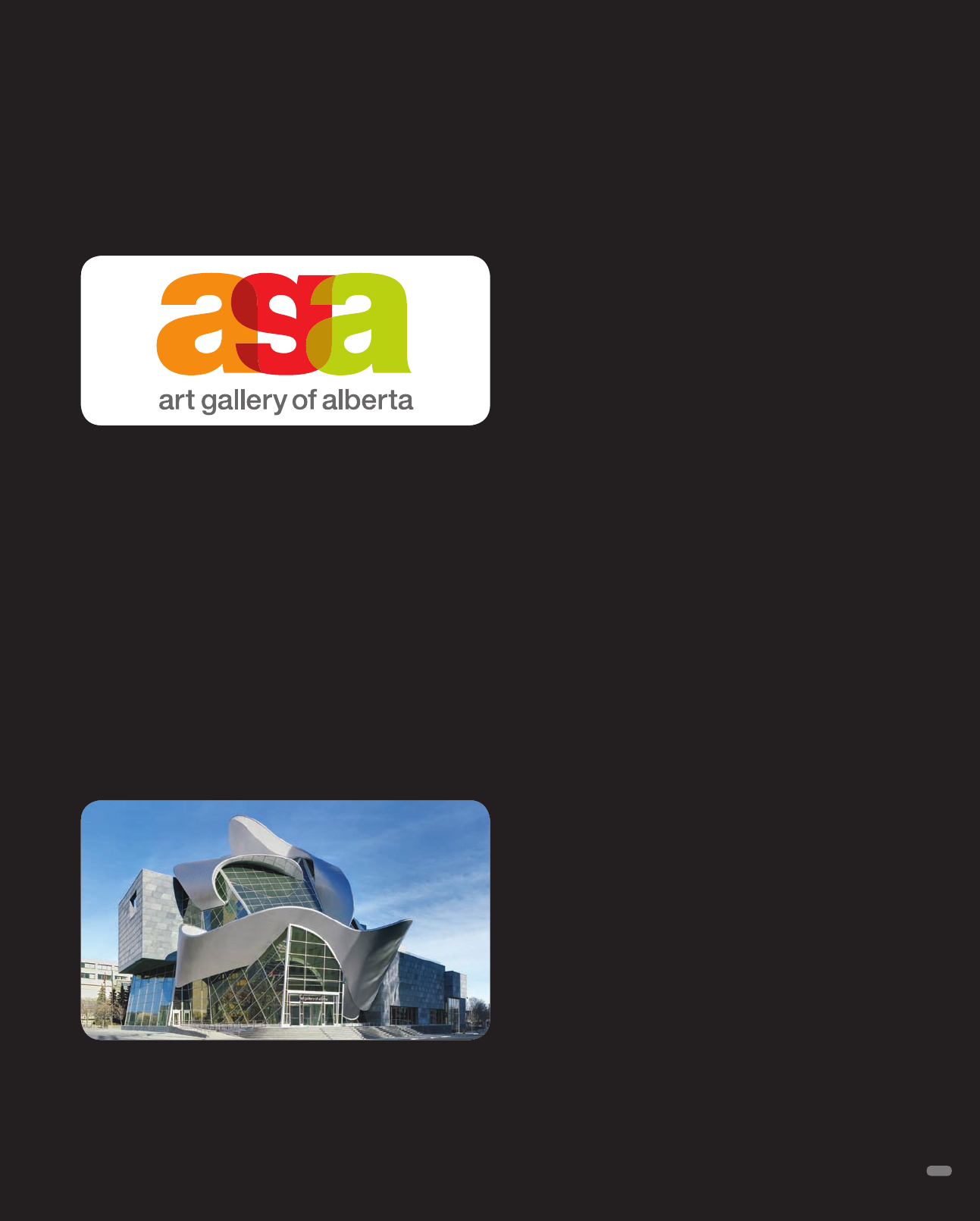
Art Gallery of Alberta
Identity Design
Vision Creative, Edmonton, Alberta, Canada
In late 2009, after months of developing a brand strategy for the
gallery, Vision Creative designed a new identity for the Art Gal-
lery of Alberta. The gallery’s old building, located in the center of
Edmonton’s Arts District, was demolished, and an extraordinary
new building went up in its footprint. The new structure signaled
the ideal moment to reintroduce the gallery and a new experience
to the populace.
“Many people have lived here for years, but have never stepped
inside. The gallery wanted to build membership outside of the
traditional core audience, which was small,” explains Vision
Creative art director and partner, Brad Blasko. The new building
and new identity could serve together to reintroduce this com-
munity asset to everyone.
The building has a rather fantastic shape. Designed by Randall
Stout Architects, it is crowned with an enormous ribbon of twist-
ing, undulating steel meant to represent both the aurora borealis
and the city’s winding North Saskatchewan River. It is a structure
that clearly has a personality of its own.
Blasko’s team was, at the same time, challenged and inspired by
the structure. They wanted to play into the building’s shape, but
not so much as to overwhelm.
“There are many waves and curves in the architecture. The new
identity, though, does need to be somewhat case-neutral to the
building. We couldn’t go too modern, because this is not a modern
gallery. It is the province’s gallery, with a mandate to exhibit many
forms of art,” Blasko says. Lowercase Helvetica, he explains, was
an excellent, case-neutral choice. “Helvetica is a classic face that
has stood the test of time. It is not specific to an era.”
The designers’ solution utilizes a single letter a and simply repeats
its shape. The a used as a g is clearly readable, but the flip provides
a visual and creative twist that speaks to the art gallery’s core
purpose. Overlapping the shapes connected them, which Blasko
says relates the gallery connecting to the community—the primary
component of the new brand promise.
The palette comes from colors in the aurora borealis: It includes
green, red, orange, blue, purple, and a cool gray. The colors are
translucent, allowing the letter shapes to play off of each other
and create new tones.
Blasko says he likes the typographic play. It subtly represents the
artistic process.
“It’s the simplest of shapes and reads well large or small. It plays
well off of a core thought: Look at art again. It changes perception,
which I like,” Blasko says.
127
Above: The new Art Gallery of Alberta (Photo: Robert Lemermeyer)
Above center: The AGA logo encourages the viewer to take a
second look, just as the gallery developers wanted Alberta citizens
to take a fresh look at art and the facility.
(RAY)
Job:08-20331/20788/21373 Title:RP-Logo Lounge 6
#175 Dtp:223 Page:127
118-129_21373.indd 127 9/23/10 4:34 PM
A
1
2
3
4
5
B C D
1C 1D
2A 2B 2C 2D
3A 3B 3C 3D
4A 4B 4C 4D
5A 5B 5C 5D
(RAY)
Job:08-20331/20788/21373 Title:RP-Logo Lounge 6
#175 Dtp:223 Page:128
118-129_21373.indd 128 9/23/10 3:09 PM
128
D
= Design Firm
C
= Client
Birds
LOGO SEARCH
Keywords
Type:
Symbol Typographic
Combo
All
D
Kuznetsov Evgeniy | KUZNETS
C
Kuznetsov Evgeniy
D
Glitschka Studios
C
Brett St.Amour
D
Gardner Design
C
Phoenix Productions
D
Archrival
C
Academy of Rock
D
Draward
C
MW
D
Fargo Design Co., Inc.
C
PA Council Against the Drink Tax
D
Gardner Design
C
Johnathan Goodwin
D
Lippincott
C
UniGroup
D
Lippincott
C
TACA Airlines
D
GeniusLogo
C
sky
D
Fitch Seattle
C
Page Plus Cellular
D
Karl Design Vienna
C
Bildungszentrum Wien
D
Roy Smith Design
C
Roy Smith
D
Gardner Design
C
Kansas Health Ethics
D
A3 Design
C
American Falconry Conservatory
D
Gobranding.eu
C
European Solidarity Center
D
Evenson Design Group
C
St. Vincent Medical Center
D
Clockwork Studios
C
Gethsemane Partners
(RAY)
Job:08-20331/20788/21373 Title:RP-Logo Lounge 6
#175 Dtp:223 Page:128
118-129_21373.indd 128 9/23/10 3:07 PM
1
2
3
4
5
A B C D
1A 1B 1C 1D
2A 2B 2C 2D
3A 3B 3C 3D
4A 4B 4C 4D
5A 5B 5C 5D
(RAY)
Job:08-20331/20788/21373 Title:RP-Logo Lounge 6
#175 Dtp:223 Page:129
118-129_21373.indd 129 9/23/10 3:09 PM
129
D
= Design Firm
C
= Client
D
Yatta Yatta Yatta
C
Nuthatch Yarn Works
D
Porch Creative
C
Porch Creative
D
TOKY Branding+Design
C
David Bailey
D
Ray Dugas Design
C
Ray Dugas Design
D
Roger Oddone Design Studio
C
Taiama
D
Sean Heisler
C
Sean Heisler
D
Strange Ideas
C
James Strange
D
Marketsplash by HP
C
Carmita Products
D
creative space
C
Rise and Shine Bakery
D
Stebbings Partners
C
Mission Oak Grill
D
Diann Cage Design
C
Bluebird Publishing Company
D
Gardner Design
C
Mend Physiotherapy
D
X3 Studios
C
Personal
D
supersoon good design
C
Renate Heyer
D
dale harris
C
Little Bangs
D
Blue Clover
C
Blue Clover
D
Caliber Creative, LLC
C
Caliber Creative
D
Combustion
C
Indie Memphis
D
Alphabet Arm Design
C
Lisa Rigby
D
The Action Designer
C
Personal Project
(RAY)
Job:08-20331/20788/21373 Title:RP-Logo Lounge 6
#175 Dtp:223 Page:129
118-129_21373.indd 129 9/23/10 3:07 PM

A
1
2
3
4
5
B C D
1A 1B 1C 1D
2A 2B 2C 2D
3A 3B 3C 3D
4A 4B 4C 4D
5A 5B 5C 5D
(RAY)
Job:08-20331/20788/21373 Title:RP-Logo Lounge 6
#175 Dtp:223 Page:130
130-141_21373.indd 130 9/23/10 3:35 PM
130
(Text)
D
= Design Firm
C
= Client
D
Bertz Design Group
C
unused
D
ZORRAQUINO
C
Gobierno Vasco
D
TomJon Design Co.
C
CTT
D
Newhouse Design
C
Double Happiness Interior Design
D
Kindred Design Studio, Inc.
C
Sterling Construction
D
www.macamecanica.com
C
Comtributo Lda.
D
Judson Design
C
Cradle Robbers
D
Gardner Design
C
Graphic Impressions
D
IF marketing & advertising
C
IF marketing & advvertising
D
Nastasha Beatty Designs
C
Student Work
D
Chris Rooney Illustration/Design
C
Daily Food Company
D
Tetro Design Incorporated
C
Prairie Theatre Exchange
D
Chris Rooney Illustration/Design
C
Daily Food Company
D
Rudy Hurtado Global Branding
C
Chicos Chicken
D
A3 Design
C
A3 design
D
RedBrand
C
RusPole
D
Dotzero Design
C
Falcon Art Community
D
Dotzero Design
C
Falcon Art Community
D
Gardner Design
C
Phoenix Productions
D
Gardner Design
C
Phoenix Productions
(RAY)
Job:08-20331/20788/21373 Title:RP-Logo Lounge 6
#175 Dtp:223 Page:130
130-141_21373.indd 130 9/23/10 3:34 PM
1
2
3
4
5
A B C D
1A 1B 1C 1D
2A 2B 2C 2D
3A 3B 3C 3D
4A 4B 4C 4D
5A 5B 5C 5D
(RAY)
Job:08-20331/20788/21373 Title:RP-Logo Lounge 6
#175 Dtp:223 Page:131
130-141_21373.indd 131 9/23/10 3:35 PM
131
(Text)
D
= Design Firm
C
= Client
D
Kommunikation & Design
C
Storchen Apotheke Tiengen
D
J Fletcher Design
C
Charleston Naturally
D
creative space
C
Motherhood Later
D
insight design
C
South Texas Surfacing
D
X3 Studios
C
Ugly Duck
D
Siah Design
C
Siah Design
D
mIQelangelo
C
Canada
D
Sabingrafik, Inc.
C
Hotel Bel-Air
D
Karl Design Vienna
C
Karl Design
D
Univisual
C
Loretoprint
D
Steve Cantrell
C
Escape Bahamas
D
Johnston Duffy
C
OKI Data America
D
MINE
C
MINE
D
Jason Kirshenblatt
C
Pingwins Table Tennis Team
D
IF marketing & advertising
C
IF marketing & advertising
D
ballard::creative
C
Gaylord Texan Resort
D
Todd Linkner Design Associates
C
Todd Linkner Design Associates
D
Deutsch Design Works
C
Environmental Action Committee West Marin
D
Bronson Ma Creative
C
Fire Action Pros
D
Logoguppy
C
elefly
(RAY)
Job:08-20331/20788/21373 Title:RP-Logo Lounge 6
#175 Dtp:223 Page:131
130-141_21373.indd 131 9/23/10 3:34 PM
..................Content has been hidden....................
You can't read the all page of ebook, please click here login for view all page.