
(RAY)
Job:08-20331/20788/21373 Title:RP-Logo Lounge 6
#175 Dtp:223 Page:32
032-043_21373.indd 32 9/23/10 9:19 AM
(Text)
Design Firm
MetaDesign
Commerzbank
Identity Design
Client
Project
The merger of Commerzbank and Dresdner Bank in May 2009 caused
tremors throughout the financial system in Germany that few could have
predicted.
In sheer size, the new organization was suddenly the second largest bank
in Germany, just after Deutsche Bank. The merger was also a cultural phe-
nomenon: Commerzbank and Dresdner were both very historic brands,
comparable with Mercedes Benz. Commerzbank was founded in 1870,
and Dresdner Bank in 1872; both had long been household brand names.
Consumers and bank employees were understandably a bit unsettled in
wondering what would happen to these familiar, trusted banks, and in turn,
what would happen to their jobs, accounts, loans, and so on.
But making everyone even more nervous was the global financial crisis,
which was ripening in 2009. Things were not going well. It appeared as if
matters could only get worse.
In the middle of all of this angst was the design team at MetaDesign’s
Berlin office. When the two banks merged, the designers were already in
the midst of an identity redesign for Commerzbank only. Suddenly, news
of the merger was on the horizon. Now, two banks had to be considered
in the redesign equation.
The financial crisis was hard enough on bank employees and bank cus-
tomers, but adding the merger on top of malaise made the job of uniting
the two banks and the people they represented that much more difficult.
“When we started on the Commerzbank project, we thought of it as an
opportunity to do a really historic redesign. But then we had to bring
together these companies and all of these people and establish a new
idea that worked for everyone,” says MetaDesign creative director, Thomas
Klein. “People at the banks were confused and worried about their futures.”
The clear direction for the design team was to bring the best aspects of
both companies into a new identity. The new identity needed to reassure
and motivate employees and customers alike. The first step would be to
decipher what those best aspects were.
Commerzbank’s old logo used yellow as its corporate color. Its
design was simple: Four arrows surround a central point.
The Dresdner brand had an emotionally charged history. Its logo
was called “the eye of Ponto,” after its beloved and well-trusted
former chairman, Jürgen Ponto.
When we started on the Commerzbank project,
we thought of it as an opportunity to do a really
historic redesign.
32
LogoLounge 6
(RAY)
Job:08-20331/20788/21373 Title:RP-Logo Lounge 6
#175 Dtp:223 Page:32
032-043_21373.indd 32 9/23/10 9:19 AM
(RAY)
Job:08-20331/20788/21373 Title:RP-Logo Lounge 6
#175 Dtp:223 Page:33
032-043_21373.indd 33 9/23/10 9:19 AM
(Text)
Commerzbank had long been overshadowed by Deutsche Bank, which
had fantastic recognition as a global performer. Commerzbank did not
have that same recognition as a strong personality driving forward toward
the next successful deal.
But what it did have on the positive side was a reputation for having excel-
lent character and of being a good partner to its customers. That feeling of
trustworthy partnership needed to be maintained. The concept of stronger
performance—which the merger would provide—needed to be added to
the mix.
“This combination makes the new bank unique, because in Germany only
Commerzbank combines partnership with performance,” says Klein.
Commerzbank’s existing logo used yellow as its corporate color. Its design
was simple: Four arrows surround a central point. The logo could be read
as a sunrise, as people or ideas coming together, or simply as a common
goal. Its actual origin sprang from a much earlier merger of four banks into
one: It was commonly referred to as “the four winds.”
The Dresdner brand had an emotionally charged history. Its logo was called
“the eye of Ponto,” after its beloved and well-trusted former chairman,
Jürgen Ponto. Ponto was murdered in a failed Red Army Faction (RAF)
kidnapping scheme in July 1977.
The employees of Dresdner, and by extension its customers, had a very
deep identification with their brand and logo—a simple triangle set inside a
green pentagon—and they strongly related to the brand. Abandoning that
mark completely would mean abandoning some very valuable equity as
well as upsetting many people.
The designers carefully considered concepts that would truly be a coming
together of two equals. What eventually emerged was a very evenhanded
mix: The Commerzbank name and the Dresdner bank logo were brought
together in a deft weave.
“The new branding clearly symbolizes the ongoing integration of the two
banks, both internally and externally,” Klein explains. “The new mark,
which combines elements of both banks in a contemporary manner, is a
visible sign of the new Commerzbank. At the same time, the branding is in
harmony with the bank’s overall strategy. The new Commerzbank vision is
to become the best bank in Germany, and in order to achieve this goal, we
have sharpened the focus of the brand positioning.”
33
The new Commerzbank logo and wordmark is an elegant and effective combination of two existing German brands, preserving equity
from each yet creating a strong new presence.
(RAY)
Job:08-20331/20788/21373 Title:RP-Logo Lounge 6
#175 Dtp:223 Page:33
032-043_21373.indd 33 9/23/10 9:19 AM
(RAY)
Job:08-20331/20788/21373 Title:RP-Logo Lounge 6
#175 Dtp:223 Page:34
032-043_21373.indd 34 9/23/10 9:20 AM
(Text)
34
LogoLounge 6
The new branding clearly symbolizes the ongoing integration of the two banks, both internally and
externally. The new mark, which combines elements of both banks in a contemporary manner, is a
visible sign of the new Commerzbank.
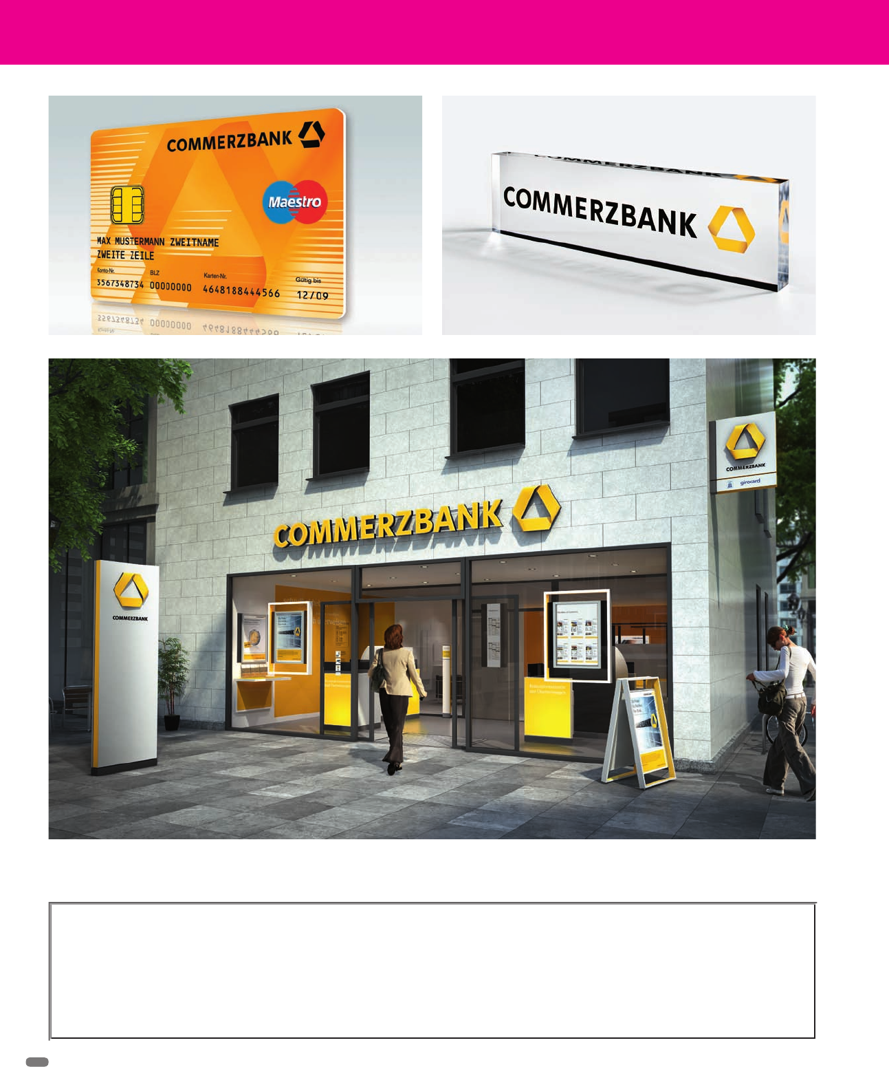
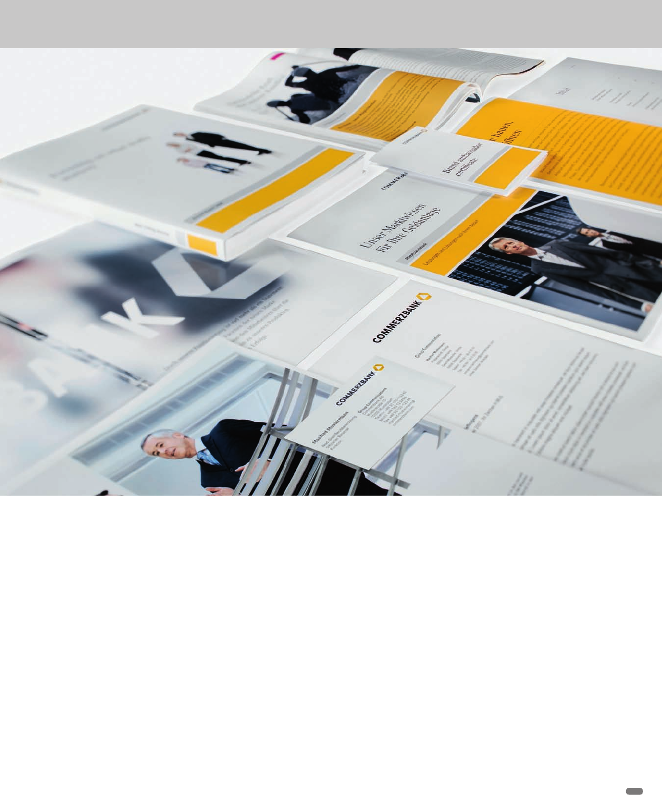
A selection of collateral showing the new Commerzbank logo in use
(RAY)
Job:08-20331/20788/21373 Title:RP-Logo Lounge 6
#175 Dtp:223 Page:34
032-043_21373.indd 34 9/23/10 9:19 AM
(RAY)
Job:08-20331/20788/21373 Title:RP-Logo Lounge 6
#175 Dtp:223 Page:35
032-043_21373.indd 35 9/23/10 9:20 AM
(Text)
35
The new trademark consists of three elements: the name “Commerzbank”
in a new font, the color yellow, and the three-dimensional ribbon.
The three-dimensionality in “the eye of Ponto” emphasized the modern
and sophisticated nature of the design. Additionally, the infinite loop of the
sign in the eye stands for the ongoing dialog between customer, partner,
and consultants of the new bank.
Commerzbank’s house font is Compatil, which has a professional, modern
look. It is the unifying element across all modes of the organization’s
communication. The interplay between the two font families of Compatil
Text (serif) and Compatil Fact (sans serif) provides a design bandwidth
that is capable of meeting all of the requirements of effective financial
communication.
Strong brands are more than just logos and brand promises, says Klein.
“They are a harmonious system of colors, visual worlds, and font types
which serve to create a unified and consistent brand identity. A coherent
corporate design increases the recognition and uniqueness of our brand.
This is the best way to let the power of the new Commerzbank unfold.
“Now the identity has a new image, but the old brands are still there,” he
adds. “The logo is a merger of equals, from an identity perspective. We feel
it is very successful for the look and feel of the new group, but it is possibly
even more important for the motivation of the employees and the future of
the bank. The people of the banks feel that they were not just taken over.
We realize that this was very helpful for the whole community and for the
new culture.”
(RAY)
Job:08-20331/20788/21373 Title:RP-Logo Lounge 6
#175 Dtp:223 Page:35
032-043_21373.indd 35 9/23/10 9:19 AM
(RAY)
Job:08-20331/20788/21373 Title:RP-Logo Lounge 6
#175 Dtp:223 Page:36
032-043_21373.indd 36 9/23/10 9:20 AM
(Text)
36
Say the words “personal genomics” to most people, and you’ll
probably get a blank stare in return. But personal genomics is a
mind-expanding and meaningful new field of genetic study that
allows individuals to learn more about their personal genomes
through an easy, noninvasive test so that they can make smarter
life choices.
23andMe is a personal genomics company that was founded in
2007 to provide a simple service. Basically, a customer uses a
spit kit to provide a DNA sample to the company, and 23andMe
returns practical information that applies directly to that person’s
life, hopefully to improve it. The service is personable, scientific,
bright, and slightly audacious: The company needed a brand
identity that matched that personality. The identity also needed
to explain visually what the company does.
23andMe
Identity Design
MetaDesign, San Francisco, California
MetaDesign’s San Francisco office developed the client’s bright
new identity. The designers knew that the brand needed to be
scientific but not clinical, personable but not chatty. Customers
needed to feel that the client was trustworthy and approach-
able. Bold color would help differentiate 23andMe from the
starkness that pervades the visual landscape of health care and
pharmaceuticals.
MetaDesign’s director of strategy, Sean Ketchem, explains the
final design and its many iterations.
“We based the logo on the idea of the human chromosome and
the twenty-three chromosomes that inspired the company name.
We created twenty-three unique versions of the identity using
color and layout variations that express how even small variations,
such as that within your genes, can result in something unique,”
he says.
A single version is used consistently as a lockup with the com-
pany name, but the different color and pattern variations can be
used across applications to create variety in print pieces and on
the Internet.
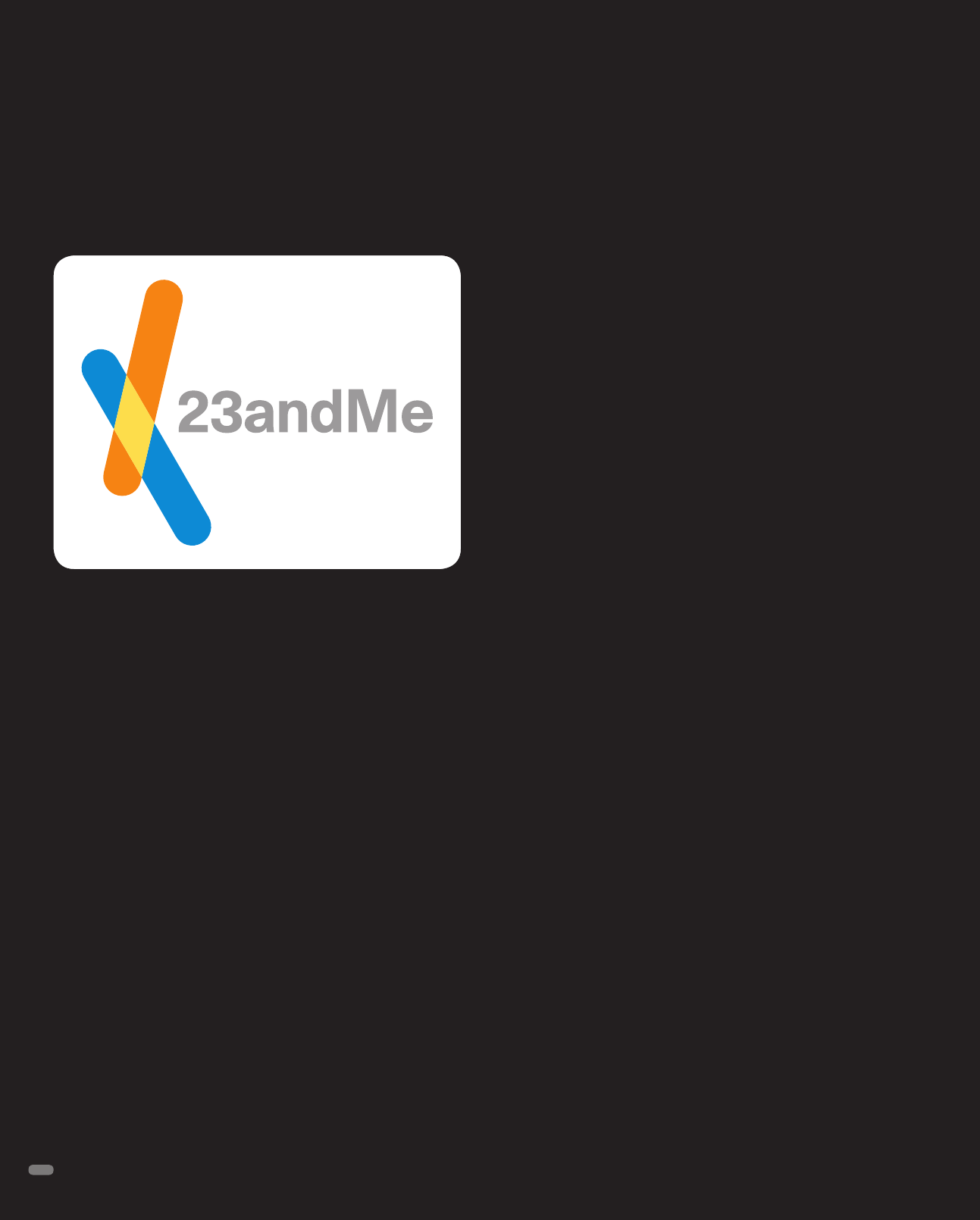
The forms in the logo represent chromosomes; their many and
varied transparent colors show again and again the unique cre-
ations that new combinations form. Every one—that is, every-
one—is different.
“The bright colors enliven the often intimidating complexities of
personal genetics with personable, colorful forms, while the silver
type expresses the scientific precision and rigor of the company,”
Ketchem explains.
The main 23andMe logo creates a personable, approachable iden-
tity for a company that deals with very complex medical issues.
(RAY)
Job:08-20331/20788/21373 Title:RP-Logo Lounge 6
#175 Dtp:223 Page:36
032-043_21373.indd 36 9/23/10 9:19 AM
..................Content has been hidden....................
You can't read the all page of ebook, please click here login for view all page.