
(RAY)
Job:08-20331/20788/21373 Title:RP-Logo Lounge 6
#175 Dtp:223 Page:26
020-031_21373.indd 26 9/23/10 9:16 AM
26
LogoLounge 6
(Text)
Design Firm
Office
Ogilvy & Mather/IBM
Branding Campaign
Client
Project
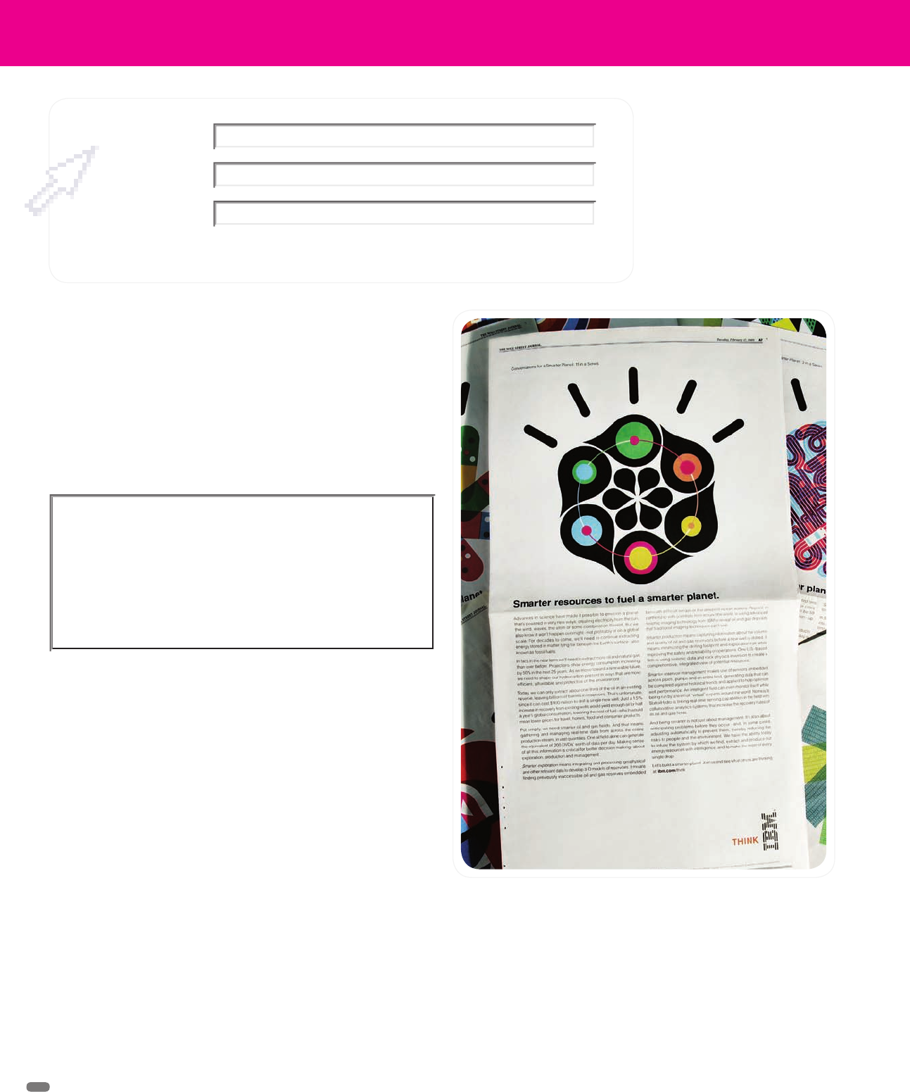
“The year 2008 was one of the most volatile years in history, from the
meltdown of our financial system, to the ongoing consequences of a global
energy crisis, to a health care system teetering on the brink of collapse,”
says Greg Ketchum, executive creative director for Ogilvy & Mather (New
York), IBM’s advertising agency. In this extremely challenging marketing
landscape, many companies chose to retreat. “IBM saw it as an opportunity
to provide new leadership where leadership was urgently needed.”
Using its global reach and influence, IBM decided to address the world’s
biggest problems through its unprecedented Smarter Planet campaign.
“It isn’t about marketing products,” explains Tom Godici, executive creative
director for Ogilvy & Mather (New York). “It’s about educating the world
that the technology and thinking needed to make the world work better
exists today.”
With this in mind, IBM’s Smarter Planet plan began to take shape in late
2008.
Ogilvy had developed the original globe icon internally, and Godici asked
Office (San Francisco) to build on it by developing a visual vocabulary for
the campaign.
This involved illustrating a series of lengthy, provocative essays about
making the systems of the world smarter, in areas such as energy, traffic,
food, banking, and health care.
“Our challenge was to create a graphic language that illustrated these
complicated concepts in simple, engaging ways,” says Jason Schulte,
founder and creative director of Office (San Francisco). The ads included
significantly more content than typical print ads, so the accompanying
illustrations had to be visually arresting, to draw people in and encourage
them to read.
Office was asked by Ogilvy & Mather on behalf of its client IBM to
create a visual vocabulary for the Smarter Planet campaign, which
began with a series of lengthy, provocative essays about making
the systems of the world smarter in areas such as energy, traffic,
food, banking, and health care. The result was a series of twenty-
one smart, simple icons.
It isn’t about marketing products, it’s about
educating the world that the technology and
thinking needed to make the world work better
exists today.
(RAY)
Job:08-20331/20788/21373 Title:RP-Logo Lounge 6
#175 Dtp:223 Page:26
020-031_21373.indd 26 9/23/10 9:15 AM
(RAY)
Job:08-20331/20788/21373 Title:RP-Logo Lounge 6
10-C59061 (204) #175 Dtp:223 Page:27
020-031_21373.indd 27 10/12/10 9:35 AM
27
(Text)
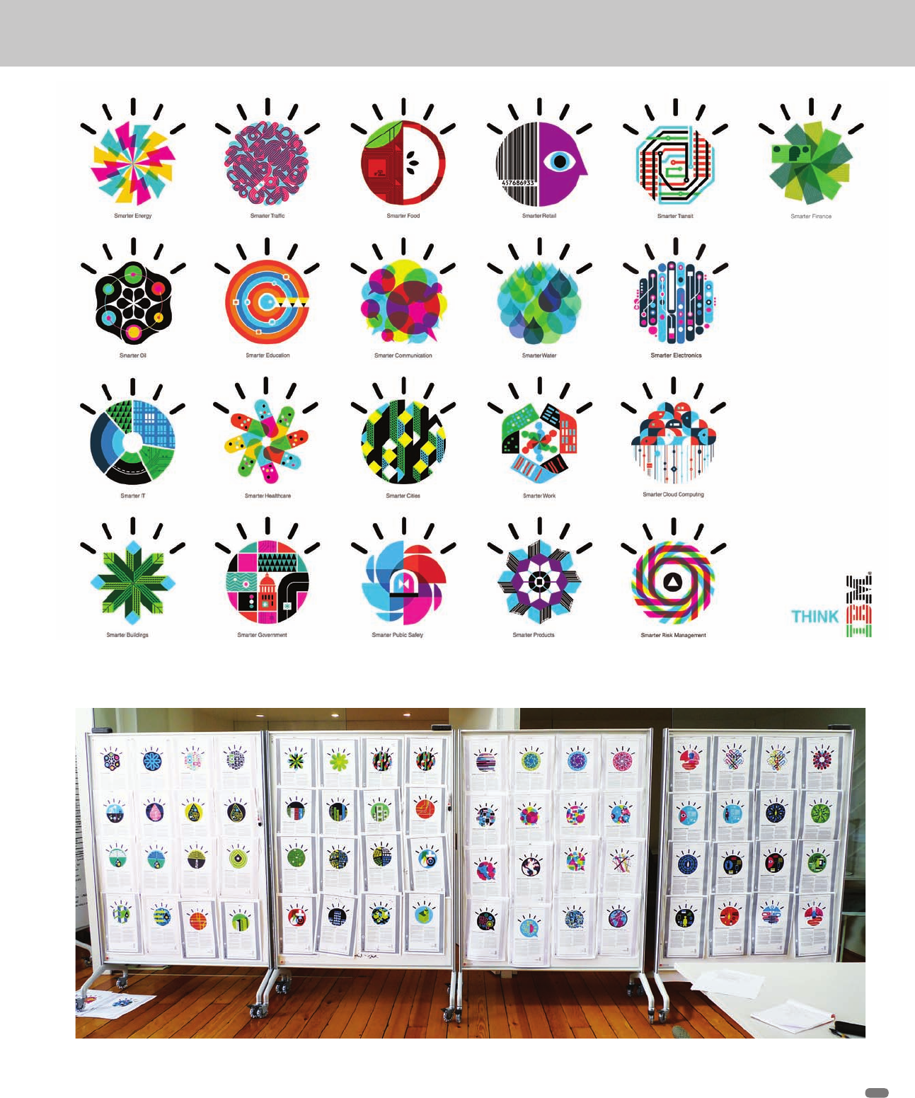
These process boards show many of the icons/illustrations in development. The familial shape, color, and basic personality of the icons
are evident.
The full suite of IBM Smarter Planet icons. Although the content of each is very different, it’s clear that they all are part of a greater effort
but that each is a separate and cogent point.
(RAY)
Job:08-20331/20788/21373 Title:RP-Logo Lounge 6
#175 Dtp:223 Page:27
020-031_21373.indd 27 9/23/10 9:15 AM
(RAY)
Job:08-20331/20788/21373 Title:RP-Logo Lounge 6
#175 Dtp:223 Page:28
020-031_21373.indd 28 9/23/10 9:17 AM
(Text)
28
LogoLounge 6
As the Office team began its work, the designers studied Paul Rand’s
original creative vision for IBM, which they found was still relevant today.
Rand, whose work for IBM spanned several decades, believed that the
company’s visual representation should not be based on a strict set of rules
and instead should be defined by an attitude and an aspiration, explains
Schulte.
“Rand was about boldness and clarity,” he says. “And his work usually
included a ‘wink’-something unexpected that made his work emotionally
connect with people.” That became a driving force in Office’s work.
Office worked with Ogilvy to develop a set of design principles to help
create a cohesive vocabulary, so that people recognized the ads as part
of a single campaign. This included the thought rays above each icon, the
round shape, a consistent color palette (including IBM blue), and the bold,
simple illustration style.
“We avoided technology cues and clichés,” says Schulte. “We wanted
them to be less expected.” Each icon has the specificity of an infographic,
the visual strength of a successful logo, and the emotional appeal of an
illustration.
A new ad ran each week, so the timeline for creating each icon was tight.
Schulte calls the process “creative wind sprints.”
Once Ogilvy briefed the team with a white paper explaining the essay,
Office had two to three days to explore the concept. “There was no time to
overthink or overtweak any one sketch—you just had to go,” says Schulte.
“We started with a very broad range of explorations, sometimes up to 30
per topic, threw them up on boards for our team to discuss, and narrowed
down the concepts, making sure they were bold and simple enough to fit
within the overall system.”
Keeping it simple was the biggest challenge, says Office design director
Rob Alexander. When dealing with complicated problems, it’s natural that
some of the explorations would be visually complex. The Office team had
to keep stripping them down to their simplest form. “During the design
process, we were often asking ourselves how much can we remove and
still get the idea across,” he says.
Each week, the team presented a range of ideas to Ogilvy, whose team
would then provide feedback and present its favorites to IBM. Once Ogilvy
and the client had selected a concept, the design team would have a day
to refine and finalize the design before it ran in a full-page ad in major
newspapers around the world.
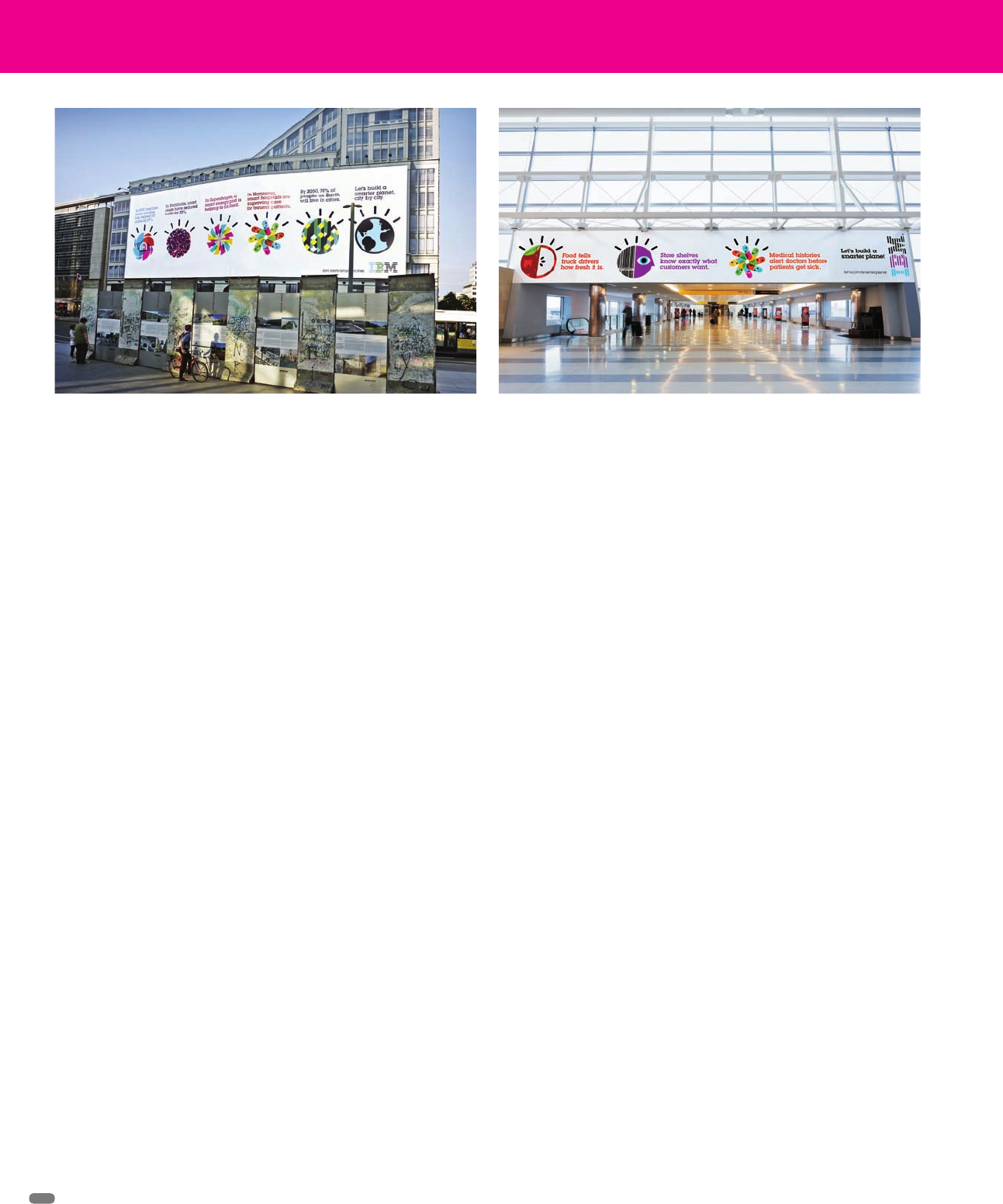
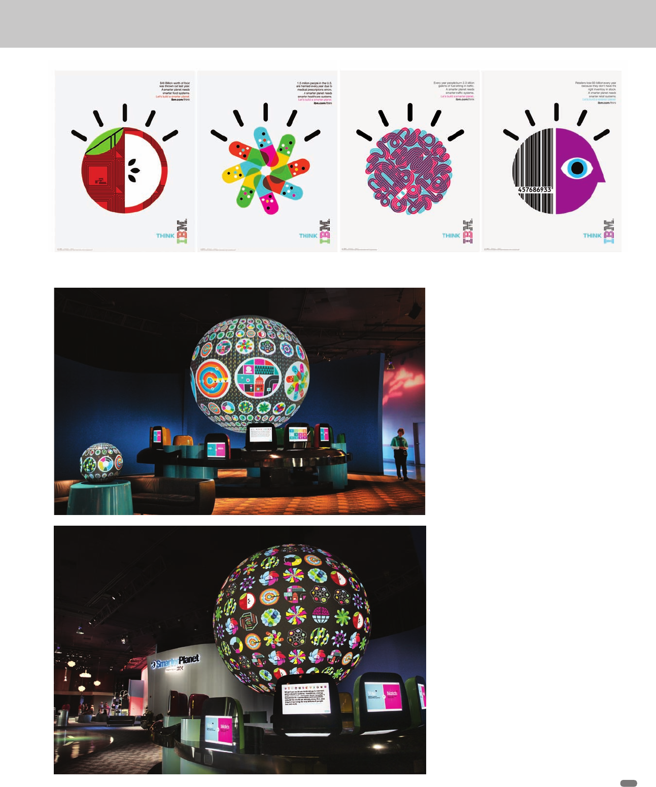
The icons also appeared on a website, online ads, billboards, airport ads,
trade show exhibitions, and an IBM Smarter Planet attraction at Walt Disney
World’s Epcot Center.
Working on a project inspired by Rand was ideal for the Office team. “Rand
is a design hero,” says Schulte. “And the collaboration with the team at
Ogilvy was rewarding. All of us felt good about being part of a campaign
that’s helping build a better world.”
According to Ketchum and Godici, the campaign has been successfully
provoking conversations about building a smarter planet, from classrooms,
to boardrooms, to the White House.
“Eight days after being sworn into office, in his first major speech on
the economy, President Barack Obama invited IBM Chairman Sam
Palmisano to the White House to stand by him as he unveiled his plan
to move the nation forward. With the launch of Smarter Planet, IBM
turned a mandate for change into a mandate for smart,” says Ketchum.
Billboards from the Smarter Planet campaign. The original globe
icon that spawned the entire direction is at far right.
The icons in airport mode.
(RAY)
Job:08-20331/20788/21373 Title:RP-Logo Lounge 6
#175 Dtp:223 Page:28
020-031_21373.indd 28 9/23/10 9:15 AM
(RAY)
Job:08-20331/20788/21373 Title:RP-Logo Lounge 6
#175 Dtp:223 Page:29
020-031_21373.indd 29 9/23/10 9:17 AM
(Text)
29
IBM Smarter Planet icons also became
part of an attraction at Walt Disney
World’s Epcot Center. (The exhibit was not
designed by Office.)
The icons/illustrations are shown here in posters.
(RAY)
Job:08-20331/20788/21373 Title:RP-Logo Lounge 6
#175 Dtp:223 Page:29
020-031_21373.indd 29 9/23/10 9:15 AM
(RAY)
Job:08-20331/20788/21373 Title:RP-Logo Lounge 6
#175 Dtp:223 Page:30
020-031_21373.indd 30 9/23/10 9:18 AM
(Text)
If you find yourself in need of Peg Leg Oil, Captain Blackbeard’s
Beard Dye (color: black), or Scurvy BeGone pills, then set course
for 826 Valencia Pirate Supply Store, San Francisco’s only pur-
veyor of buccaneer supplies.
Named for its address in San Francisco’s Mission District, 826
Valencia, a nonprofit tutoring center for kids, was founded in 2002
by best-selling author Dave Eggers and educator Ninive Calegari.
Upon learning that the space for their new youth center was zoned
strictly for commercial use, they opened a pirate supply store to
meet city regulations. Since then, the unconventional storefront,
which features drawers of hidden treasures, a vat of lard, and
trapdoors filled with surprises, has helped draw curious kids into
its free tutoring programs held in the back.
The model has also helped fund the organization’s programs
and has been successfully replicated in seven cities around the
country, including 826 Brooklyn’s Super Hero Supply Store and
826 Boston’s Bigfoot Research Center.
826 Valencia
Identity Redesign
Office, San Francisco, California
In 2008, San Francisco–based creative studio Office approached
826 Valencia to help it reinvigorate the pirate store. The pro bono
project included creating a new identity and nearly fifty new prod-
ucts, posters, signage, and interactive ideas for the store.
“The pirate store was already a wildly imaginative, inspiring, inter-
active experience,” says Jill Robertson, president of Office. “We
needed to create a visually cohesive story that reflected that same
sense of humor and delight.”
The goal was to create an authentic experience for an eighteenth-
century pirate who happened to walk into San Francisco today.
“We tried to design something for pirates, rather than something
about pirates,” says Jason Schulte, creative director of Office.
The team started by developing a logo, which was something the
store had never used before.
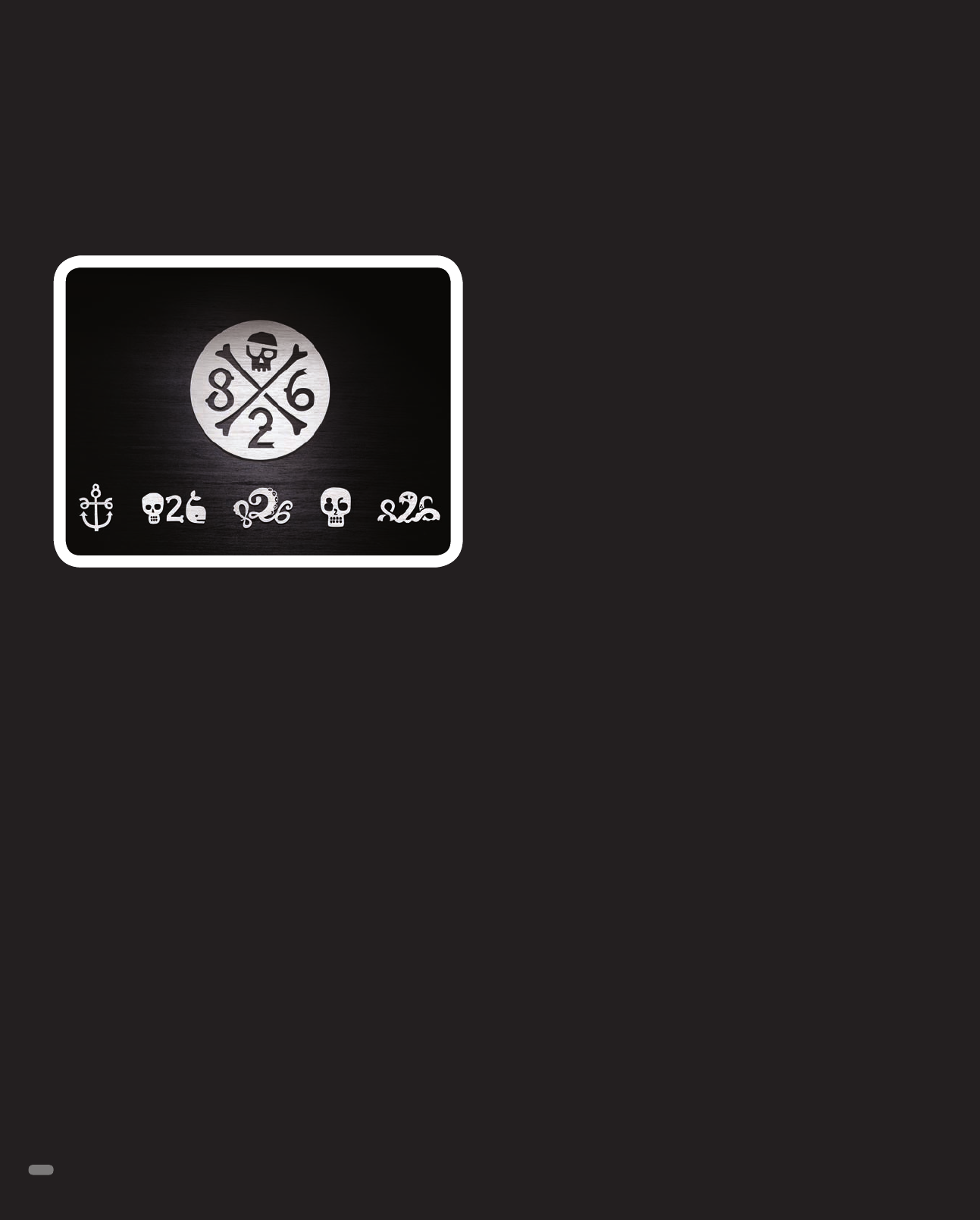
Nothing says “pirate” like a classic skull and crossbones. The
Office team created many iterations of the mark to develop a
proprietary, 826 version of the ubiquitous symbol—tough but not
scary, and quirky but not cute. The typography was hand drawn
with subtle flourishes that reflect bones and flags.
To achieve a sense of authenticity, team went out of their way to
make sure nothing appeared computer generated. “We created
everything by hand first, with pencil sketches and ink drawings,”
says Rob Alexander, design director, Office. “And then we didn’t
polish them too much once we brought them into the computer.”
The Office team also developed a series of secondary marks, to
use on products like T-shirts for kids. Reflecting the unexpected
and fun spirit of the store, the numbers “826” are created with sea
creatures, an anchor, and other pirate-related themes.
Selected products and posters are available at 826valencia.org/
store. All proceeds directly benefit 826 Valencia’s writing programs.
The Valencia 826 logo is simultaneously modern and of a pirate
world. It’s as if it was designed to appeal to buccaneers rather
than just being about them.
30
(RAY)
Job:08-20331/20788/21373 Title:RP-Logo Lounge 6
#175 Dtp:223 Page:30
020-031_21373.indd 30 9/23/10 9:15 AM
..................Content has been hidden....................
You can't read the all page of ebook, please click here login for view all page.