
(RAY)
Job:08-20331/20788/21373 Title:RP-Logo Lounge 6
#175 Dtp:223 Page:14
012-019_21373.indd 14 9/23/10 9:13 AM
14
LogoLounge 6
(Text)
Saffron
Rompetrol
Identity Redesign
Consider the standard gas/petrol station with requisite convenience store.
It presents a relatively utilitarian picture, no more than a stop for vehicles
and their drivers to refuel. The lights are harsh, the branding messages—
from the station and from the hundreds of other brands it sells—strident
and abrupt.
As a rule, none of this is offensive because this is what we’ve come to
expect from this retail category. But it’s also what makes the new Litro
brand, created by Saffron, so remarkable.
Rompetrol is the second largest private petrol company in Romania, with
an extensive network in Eastern Europe. It is a very ambitious company,
with budget for expansion into areas of Western Europe. Saffron worked
with Rompetrol to rebrand and renovate stations in Romania, and, although
these projects were successful, the company’s expansion into Europe
presented new roadblocks.
The Romanian brand was not well accepted there. Romanian goods, in
general, did not have a stellar reputation, nor were they especially well
known. In fact, a new network in southeast France was not at all successful.
It was clear that a completely new brand, one that could thrive alongside
existing European brands such as BP and Repsol, was needed. The Saffron
design team could imagine how the new brand could even outshine these
brands, literally and financially.
“We wanted to create something from scratch,” explains Jacob Benbunan,
CEO and founder of Saffron. “The idea was to be the practical gas sta-
tion, very uncomplicated and straightforward, providing a completely new
experience for drivers.”
The new brand also needed to instill pride in investors and employees.
Local governments, too, needed to be impressed. “When a long stretch of
highway is developed,” explains Benbunan, “it is these bodies who decide
which stations to place where. Rompetrol wanted to make sure its stations
were attractive and different enough to be desirable.”
The idea was to be the practical gas station, very
uncomplicated and straightforward, providing a
completely new experience for drivers.
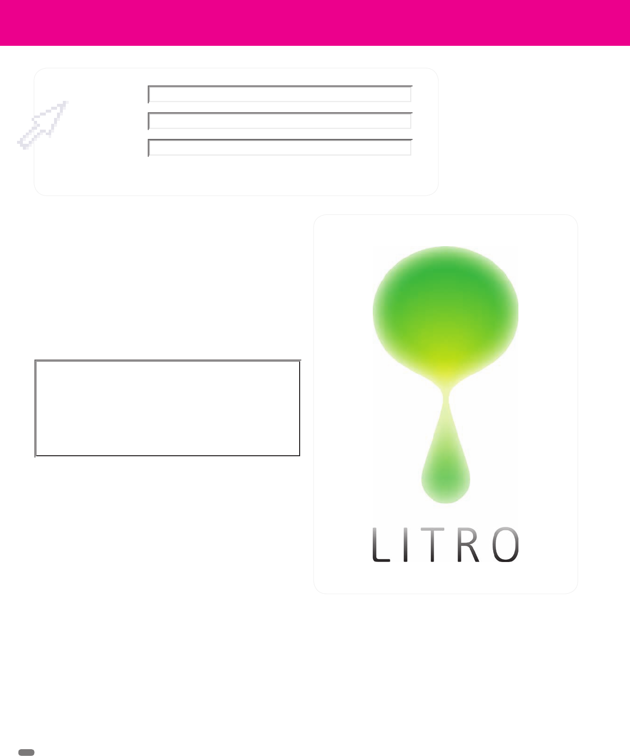
Litro has a very different sort of identity for a petrol station. Its
logo’s droplet design suggests refreshment—through fuel or
nourishment—but its glowing, simple nature feeds the entire brand
experience.
Design Firm
Client
Project
(RAY)
Job:08-20331/20788/21373 Title:RP-Logo Lounge 6
#175 Dtp:223 Page:14
012-019_21373.indd 14 9/23/10 9:12 AM
(RAY)
Job:08-20331/20788/21373 Title:RP-Logo Lounge 6
10-C59061 (204) #175 Dtp:223 Page:15
012-019_21373.indd 15 10/12/10 9:32 AM
15
(Text)
But what could be different about a gas station? It would sell fuel and
food. But what if the design of the station itself was modular so that other
features, such as a laundromat, could be added? What if the fueling experi-
ence could be improved? What if the entire experience could be improved?
Saffron’s team began by revamping the name of the station chain. A very
simple name was needed, something that was memorable and clear from
a vehicle zipping past.
The result was a mix of the unit of measurement by which fuel is sold—the
liter—and the international code for Romania—RO. Combining the two to
form “Litro” couldn’t have been simpler. In addition, it’s a very unique name
that differentiates it from corporate-sounding competitors.
The visual expression of the name was more complicated. Other station
brands, such as BP, are actually very progressive and have decent logos and
graphic systems. So, just having a memorable logo would not be enough.
“When you think of BP and Shell, they have great, long histories, but as
typical petrol stations, they are very monolithic and static. They don’t
involve the consumer at all,” says Mila Linares, consultant at Saffron. “We
wanted to create a dynamic brand that would involve consumers in a more
emotive way through light and sound—allow them to really experience
what Litro is all about.”
The design team worked on very different logo concepts. From the begin-
ning, all concepts focused on building a differentiating, strong graphic
language based on a distinctive expression that could complement and
interact with the architecture on one hand and, on the other hand, build a
strong language for the communication.
Some of the ideas were based on a pictorial approach with a handwritten
wordmark; others on a simple logotype and a minimalist, geometric graphic
style to mark the station’s functions and architecture. There were also ideas
around using the “L” shape as the shortcut of the liter measurement or
working with big icons to act as beacons on station canopies.
One idea that stood out was that of a droplet. It had a very recognizable
shape and could represent fuel, a soft drink, coffee, or a refreshing pause of
any sort. It could be portrayed in any color, wrapped with a pattern, made
three-dimensional, or lit from within. The droplet was a very straightforward,
sophisticated, and memorable shape, but, above all, it challenged the
status quo of Petrol brand logos. Its versatility made for a very robust and
simple icon that, independent of its color or pattern, could stand for Litro.
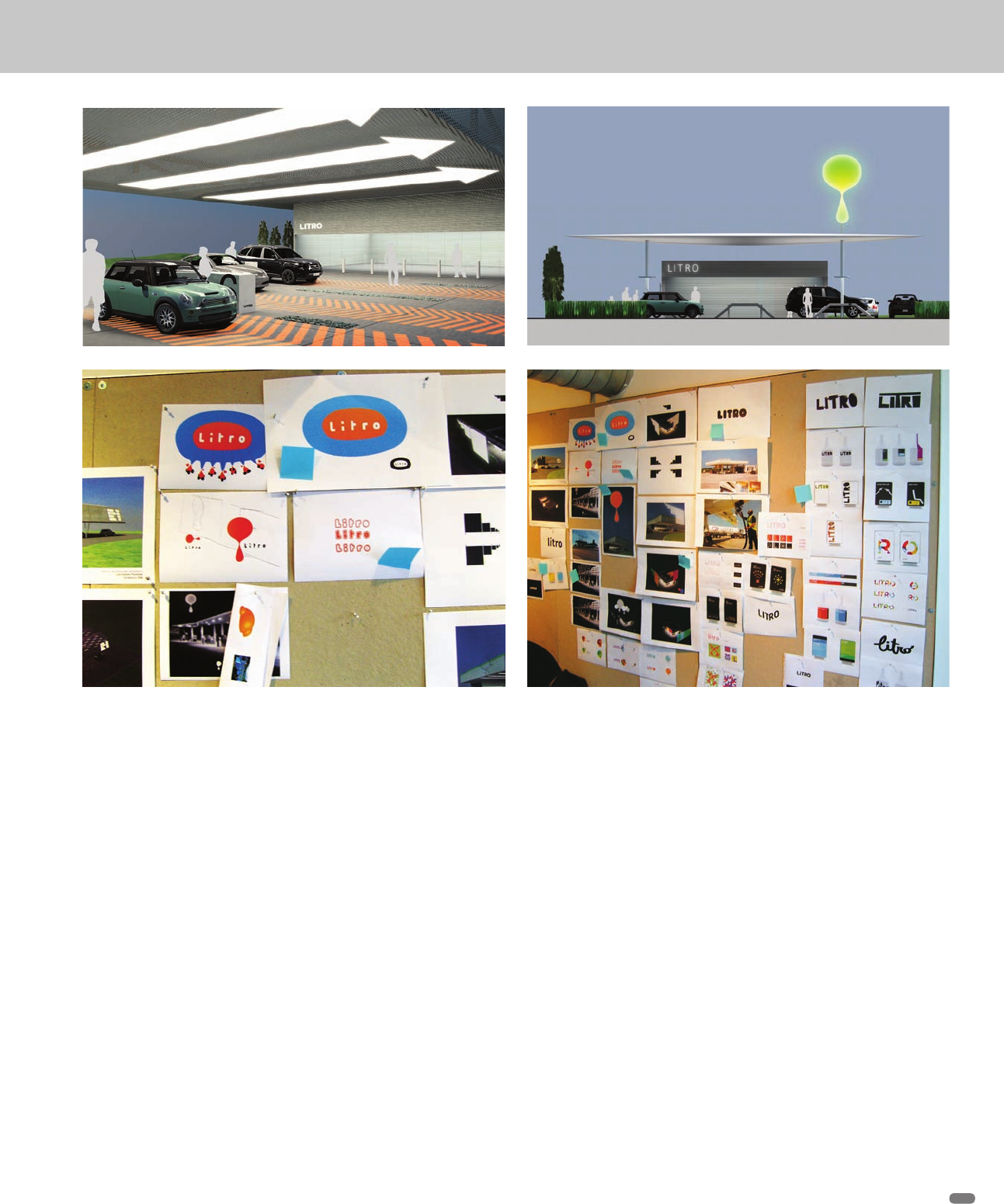
Saffron designers wanted to create a very different sort of brand experience for Litro customers. Unlike other stations where visitors are
bombarded with messaging, stopping at Litro was meant to be a calming, quiet, and very comprehensible event. These visuals show a
variety of directions, early in the project.
(RAY)
Job:08-20331/20788/21373 Title:RP-Logo Lounge 6
#175 Dtp:223 Page:15
012-019_21373.indd 15 9/23/10 9:12 AM

(RAY)
Job:08-20331/20788/21373 Title:RP-Logo Lounge 6
#175 Dtp:223 Page:16
012-019_21373.indd 16 9/23/10 9:13 AM
(Text)
16
LogoLounge 6
(Text)
The wordmark is based on the Frutiger Next typeface, a simple, func-
tional, yet elegant typeface to complement, rather than compete with, the
droplet symbol. At the same time, the chosen typeface is strong enough
to work on the signage elements of the stations. Frutiger Next is also the
corporate typeface for communication. Although already a classic, the
new and improved Frutiger Next is available in a large range of weights
and language versions, crucial for Litro’s expansion into markets where
the Cyrillic alphabet is used.
The station is the most important touch point of the brand. In order to create
a new experience that was much different from the monolithic image of the
competitors, Saffron defined a color scheme that consists of four different
colors plus a gray version. The different color versions are applied randomly
within the station environment.
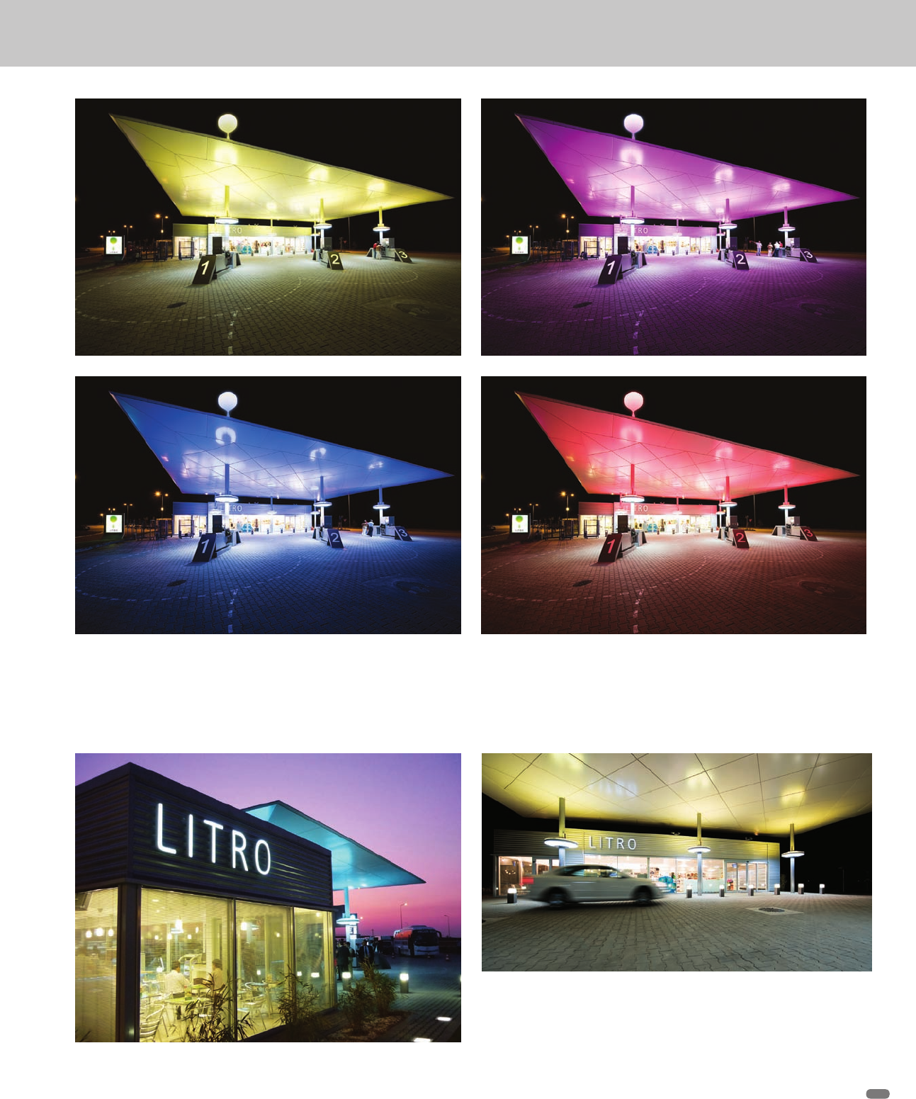
One very extraordinary feature of the new stations is almost ethereal. Every
two, five, or ten minutes, depending on the station manager’s preference,
the lighting in the station area changes color. The color may change from
blue to pink, purple, green, or white in the time it takes to fill up the tank.
“Since winter nights can be long in that part of the world, the changing
colors are a welcome sight,” says Gabor Schreier, creative director at
Saffron. “On very long highways, the stations may be set to change more
frequently, maybe every two minutes, catching the drivers’ attention and
helping them identify the stores from a great distance.”
The architecture of the stations embraces the new identity and brings it
to life. In addition to very modern typography in the signage, the actual
structures, gas pumps, lights, and other features are very clean. Saffron
teamed up with Eight, Inc., to create the stations.
“There is a real sense of purpose in the design,” says Schreier. “Any
driver approaching and then using the station would know exactly where
to fuel up, pay, or do anything else. Gone are the complicated and com-
peting messages found at other stations. Compared to them, Litro is
almost peaceful.”
The first two Litro stations were built in the summer of 2009 on the highway
that connects Bucharest to Constanta on the Black Sea, with six to eight
more planned.
Implementation of the brand in
the actual environment proved
out the philosophy behind the
design. All elements are simple
and clean.
(RAY)
Job:08-20331/20788/21373 Title:RP-Logo Lounge 6
#175 Dtp:223 Page:16
012-019_21373.indd 16 9/23/10 9:12 AM
(RAY)
Job:08-20331/20788/21373 Title:RP-Logo Lounge 6
#175 Dtp:223 Page:17
012-019_21373.indd 17 9/23/10 9:13 AM
(Text)
17
One of the key elements of the new Litro design is light. Periodically, the light color of an entire Litro station changes. It’s an effect that
can be seen from a long distance, and its warm quality serves as a welcoming beacon during long, cold winters.
More views of the new Litro identity in motion
(RAY)
Job:08-20331/20788/21373 Title:RP-Logo Lounge 6
#175 Dtp:223 Page:17
012-019_21373.indd 17 9/23/10 9:12 AM
(RAY)
Job:08-20331/20788/21373 Title:RP-Logo Lounge 6
#175 Dtp:223 Page:18
012-019_21373.indd 18 9/23/10 9:13 AM
(Text)
Apollo is the leading tire brand in
India, but it was not well known in
the Western world, more specifically
in competitive European markets
such as Germany and the United
Kingdom, where the company
wanted to enter the market with a
wide range of world-class passen-
ger vehicle tires for cars and SUVs.
Saffron understood Apollo’s prob-
lem. Although Apollo is a very good
brand of tires, when people think of
tires they aren’t likely to think of a
brand from India. Saffron’s goal was
to help Apollo reposition itself. In
the German market, the new brand
was formally introduced at the IZB
technology show organized by VW
in Wolfsburg in October 2008. It was
important to make people under-
stand that if Apollo could engineer tires for some of the most
unpredictable roads in the world, it could certainly build tires for
the Autobahn.
Saffron was asked by Apollo to create a completely renewed brand
for Apollo, one that did not look like a typical tire/automotive prod-
uct at all. Instead, the client wanted to convey the bold, dynamic,
confident, and colorful ethos of India and make a definite state-
ment about this new kid on the block. The company’s competition
included Michelin, Continental, Bridgestone, Dunlop, Hankook,
and Goodyear, but Apollo did not want to adopt a “me too” attitude.
Apollo
Identity Redesign
Saffron, London, England
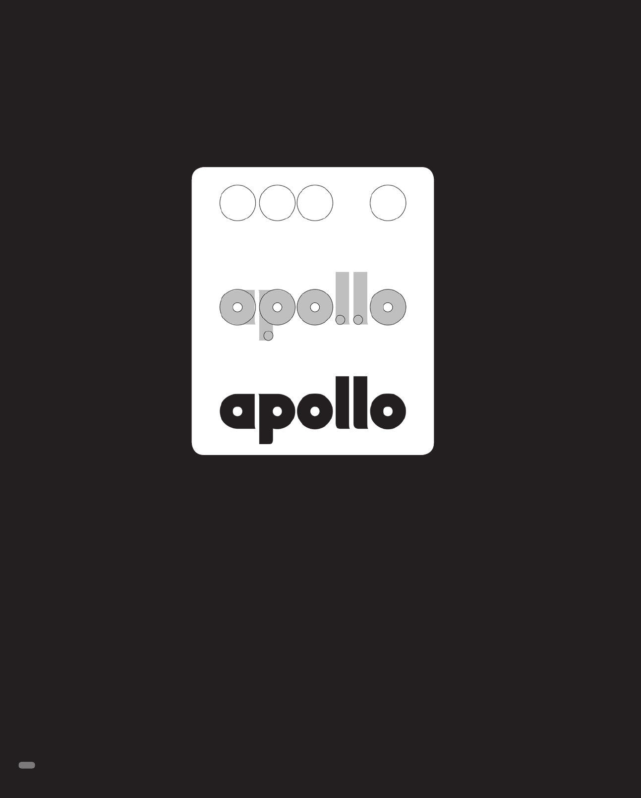
Saffron designers wholeheartedly
embraced the bold challenge. They
created an identity graphically
founded in the symbolism behind
the Greek sun god, Apollo. The new
system is built around a circle/sun/
tire shape, printed in clean, bright
colors. The centers of the circles
can be made larger or smaller.
Repeated in a grid, the pattern
almost seems to move or pulse.
But the individual pieces of the
pattern weren’t purely decorative.
Instead, each circle, with its varying
center fills and colors, represents
a different tire use and variety. The
purple inner color stands for radial
tires while the orange stands for
cross-ply/bias tires. Also, the purple
denotes “premium” while the orange
signifies “warmth” in the way the company interacts with all stake-
holders. The system was built to help the customer dispense with
the typically confusing jargon encountered as he or she shopped.
The wordmark for the new design is also based entirely on circles.
Letters are built from circles, and they also contain more circles.
The circles obviously stand for the sun, the wheel, and mobility.
The look is young, bold, and certainly eye-catching—or, as Apollo
states, “young, ambitious, Indian, and proud of it.”
Above: The new Apollo logo and identity system is based on
circles or tires.
18
(RAY)
Job:08-20331/20788/21373 Title:RP-Logo Lounge 6
#175 Dtp:223 Page:18
012-019_21373.indd 18 9/23/10 9:12 AM
..................Content has been hidden....................
You can't read the all page of ebook, please click here login for view all page.