
(RAY)
Job:08-20331/20788/21373 Title:RP-Logo Lounge 6
#175 Dtp:223 Page:171
166-177_21373.indd 171 9/23/10 5:58 PM
(Text)
Dooo Design Studio
Identity Design
Dooo Design Studio, Beijing, China
Dooo Design Studio is a graphic design
studio formed by Wenjie Huo (also known
as Ksama) and Fengkun Bai, both of
whom received master’s degrees in art
and design from BIFT (Beijing Institute of
Fashion Technology). After graduation in
2009, they formed Dooo Design Studio and
have gone on to specialize in posters and
brand identities.
Faced with the challenge of creating an
identity for their own studio, Ksama and his
fellow designers wanted to communicate
their high standards for design work through
their own logo.
“In general, logos should be easily read-
able, but as the logo of a studio that creates
logos, it should be more creative. We want
it to be special, not so easy to understand at first glance, but not
easy to forget when you get it,” says Ksama.
The Dooo Design Studio designers feel that they can always meet
clients’ needs. But they have an even higher requirement in their
own work. Ksama says they strive to be more innovative in their
work than what might otherwise be found in their region.
Fonts in China are a good example, says Ksama. Most of the
fonts there are very similar, just standard computer faces. So,
when a client might need a unique font for
a logo, other designers instead choose to
create a unique graphic and mix it with a
regular font. Dooo wanted a unique font
and graphic for its logo.
The solution that the designers finally devel-
oped is based on a Chinese character that
has the English pronunciation “doo.”
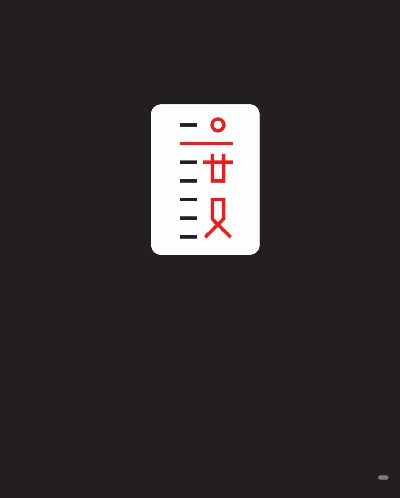
“The right side of the Dooo logo surely
looks like a figure of a person. On the left
side of it is a simulation of a ruler or scale,”
explains Ksama. “In Chinese, the character
we used means ‘measure.’ We believe there
is a limited zone between good design and
bad design.”
His team’s goal is to make the most out-
standing design, so the figure’s “arm” is placed high on the scale.
The designers chose red for the little person to convey their enthu-
siasm and energy for the life of design. The result is a design that
is readable by Chinese viewers but which can also be read by
non-Chinese audiences.
Above: The right side of the Dooo Design logo looks like a person,
the left side like a ruler. Actually, the two sides form a Chinese
character that has the pronunciation “doo.” In Chinese, the word
means “measure.”
171
(RAY)
Job:08-20331/20788/21373 Title:RP-Logo Lounge 6
#175 Dtp:223 Page:171
166-177_21373.indd 171 9/23/10 5:57 PM
..................Content has been hidden....................
You can't read the all page of ebook, please click here login for view all page.