

(RAY)
Job:08-20331/20788/21373 Title:RP-Logo Lounge 6
#175 Dtp:223 Page:62
056-069_21373.indd 62 9/23/10 10:26 AM
62
LogoLounge 6
(Text)
Empik has sixty years of experience in the Polish market as a leading media
and entertainment retailer, with 103 multimedia stores in Poland and 24
stores in the Ukraine. It offers an impressive selection of books, record-
ings, films, multimedia, stationery, and photo items—but so do many other
international competitors such as Amazon, which in 2008 and 2009 was
making serious online inroads into the Polish market.
Despite its many offerings and specialized knowledge of the Polish con-
sumer, Empik’s existing visual identity and in-store experience did not
correspond with the age of the Internet. Its stores were overloaded with
goods, and customers often felt disoriented and tired after shopping—
some described Empik shops as “warehouses”—and said they would
rather do their shopping online and at home. This less-than-positive experi-
ence was causing customers to lose their loyalty to a historic and cultural
brand that they had long been faithful to.
The Polish design studio BNA (Brand Nature Access, of Warsaw) was asked
to help Empik reestablish that connection in a modern, intelligent way that
would, over time, help Polish consumers fall in love again with the brand
and feel more attached to it than they would any outside interloper. BNA
felt it had a solid case in establishing its client as the go-to brand: In 2008,
eBay had been driven out of the country by the already established Polish
brand Allegro. So, BNA knew that cultural loyalty could be an effective tool
in the redesign.
The original Empik logo was difficult to explain, says BNA president,
Mariusz Przybyl.
“It was very old fashioned, and not in a good sense. And the brand had
nothing to do with being vintage. The logo showed a ball going through
the lettering of the name, like it was some sort of magic or fantasy. It was
strange, but it was also very characteristic. Many people recognized
it—about 96 percent of Poles recognize the Empik brand—but the logo
offered no suggestion of what the brand was,” Przybyl says of the thirty-
year-old mark.
The new Empik logo, by BNA (Brand Nature Access), Warsaw,
Poland
The original Empik logo had outlived its usefulness. But as about
96 percent of Poles recognize the Empik brand, it had exceptional
equity.
Design Firm
BNA (Brand Nature Access)
Empik
Identity Redesign
Client
Project
Many people recognized it—about 96 percent of
Poles recognize the Empik brand—but the logo
offered no suggestion of what the brand was.
(RAY)
Job:08-20331/20788/21373 Title:RP-Logo Lounge 6
#175 Dtp:223 Page:62
056-069_21373.indd 62 9/23/10 10:25 AM

(RAY)
Job:08-20331/20788/21373 Title:RP-Logo Lounge 6
#175 Dtp:223 Page:63
056-069_21373.indd 63 9/23/10 10:26 AM
63
(Text)
To move the store brand from being seen as a warehouse to being
embraced by shoppers, a new Empik brand mission was written. It included
these attributes:
• Easy, unlimited access to the whole world
• Giving the pleasure of discovery
• Joyful guidance through the labyrinth of culture
• Faith in human creation
• Entertainment as the most human expression
• Disseminating the mindset of openness, understanding, optimism,
tolerance, and joy
• Understanding the variety, diversity, and complexity of life, cultures,
and creative attitudes
• Infecting others with the fascination for knowledge
• Explaining the meaning of cultural phenomena
• Free individual expression as the basis of culture
• A sense of humor
Because the client wanted the brand to speak in a more relevant way
to consumers, the BNA team decided to conduct a personality audit of
what Empik aspired to be. Among the traits that were discovered were
these: wise, enlightened, a good sense of humor, Polish, cosmopolitan,
young, has traveled abroad, straightforward, confident but humble, helpful,
mellow, creative, classic in appearance, provocative, and eloquent.
“We even conjectured what the handwriting of this person would be like.
We discovered a very literate person who speaks a lot about his discover-
ies of the whole world. This was the most important thing to design into
the brand—that this person knows a lot and can speak of it,” Przybyl says.
The design team began by working with the “rolling ball” from the old logo.
It was easy to parlay into new visuals—of a hat, a ball of yarn, a pump
handle, and more—but what made perfect sense with the new definition
of the brand as an erudite, verbal person was an apostrophe, or more
specifically, a single quote mark.
“The apostrophe is more like a brand property,” says Przybyl. “It’s really not
a logo as much as an art element that you can use in many different ways.”
The apostrophe or quote easily symbolizes the quoting of culture, of people
talking and writing. It is the tool of writers, musicians, actors, and everyone
else associated with culture and entertainment.
A new proprietary Empik typeface was designed by a leading Polish typog-
rapher, Lukasz Dziedzic. The face is simple, modern, and bold. It has a
friendly, approachable feel, but feels definite and solid. Placing the apos-
trophe element in the store’s name in the same place as the rolling ball
element in the old logo established an immediate connection between the
old and new identities.
The apostrophe element was immediately seized upon by BNA
designers as the key element in the existing Empik identity. Here,
they sketch out ways that the little mark could be used.
The apostrophe is more like a brand property. It’s really not a logo as much as an art element that
you can use in many different ways.
(RAY)
Job:08-20331/20788/21373 Title:RP-Logo Lounge 6
#175 Dtp:223 Page:63
056-069_21373.indd 63 9/23/10 10:25 AM

(RAY)
Job:08-20331/20788/21373 Title:RP-Logo Lounge 6
#175 Dtp:223 Page:64
056-069_21373.indd 64 9/23/10 10:26 AM
(Text)
64
LogoLounge 6
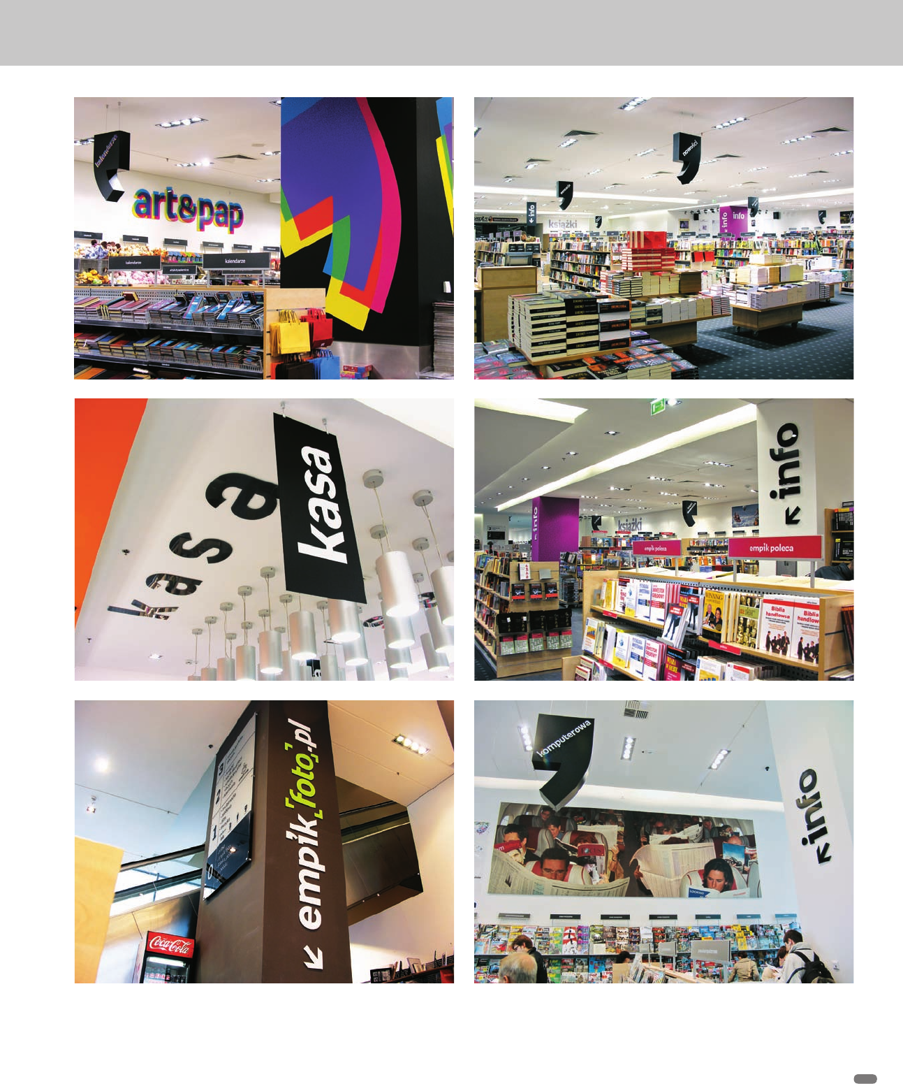
The apostrophe/quote element and new typeface/identity system was
put to use immediately in the store environment. The BNA team devised
a layout and signage system that helped visitors move around easily and
quickly find goods and products.
The designers also used the apostrophe/quote as an art element. In the
stores, its shape can be used as a sign, or it can be repeated in posters as
collage. In the future, they see it taking on surface treatments, too: It could
be a thought bubble, a chunk of cheese, a hook about to be bitten by a fish,
or just about anything else the Empik team might dream up.
The effect is to create a unified, understandable, and comfortable source
for culture and entertainment, all under one roof. And the proof is in the
numbers: Empik has enjoyed a 25 to 30 percent increase in sales per year
since the new identity was implemented in 2008.
The brand implementation is still underway, and some stores are still being
outfitted. It has been successful, Przybyl says, because of the attention to
detail. “The system is special because of typography. It makes the identity
work,” he says.
Above: The old Empik store presence was
outdated and uninspiring. The store interior
did not play off of the identity, nor did the
logo or identity say anything about what the
organization is all about.
Right: The new Empik identity is bold and
distinctive, as shown by these two store
exteriors. It is simple and modern, and the
valuable apostrophe element sits very
comfortably in the new logo.
(RAY)
Job:08-20331/20788/21373 Title:RP-Logo Lounge 6
#175 Dtp:223 Page:64
056-069_21373.indd 64 9/23/10 10:25 AM
(RAY)
Job:08-20331/20788/21373 Title:RP-Logo Lounge 6
#175 Dtp:223 Page:65
056-069_21373.indd 65 9/23/10 10:27 AM
(Text)
65
Inside the Empik stores, the apostrophe element is used as art, as sculpture, and as an organizational agent. A bright color palette,
combined with the new proprietary Empik typeface, produces a clean, distinct, and organized experience for the customer.
(RAY)
Job:08-20331/20788/21373 Title:RP-Logo Lounge 6
#175 Dtp:223 Page:65
056-069_21373.indd 65 9/23/10 10:25 AM

(RAY)
Job:08-20331/20788/21373 Title:RP-Logo Lounge 6
#175 Dtp:223 Page:66
056-069_21373.indd 66 9/23/10 10:27 AM
(Text)
In 2010, Bank BPH merged with GE Money Bank Poland and now
operates under the name of BPH Bank, GE Capital Group (Poland).
Both of the original banks had a different focus and customer
group. Bank BPH focused on small and medium-size enterprises
(SMEs), corporate accounts, and wealthy individual clients, while
GE Money Bank focused on typical consumer-level finances.
The original banks were also very different in terms of their identity.
“GE Money benefited from using the familiar General Electric
identity, while BPH used an identity that was very generic in
terms of color—most financial institutions use blue and red in
their identities here—and it aimed to communicate the values
of dynamism and modernity,” says Maja Malinowska, brand
consultant with BNA, the design firm that created a new identity
for the merged banks.
The new client was to be positioned as a “bank that plays fair.”
“We were looking for a visual symbol that would show that the
bank was a partner for the customer and that they had an equal
relationship,” explains Malinowska. “We were also looking for a
visual concept which is capacious enough to talk about many
aspects of the bank-client relationship.”
BPH Bank, GE Capital Group
Identity Design
BNA, Warsaw, Poland
As no elements had to be saved from either of the former identi-
ties, the BNA design team could and did begin fresh. They eventu-
ally decided on the concept of an unbroken line. It could be used
as both an identity element and a way to illustrate the new bank’s
philosophies and activities. The line could form just about any
illustration—of items, of people working together, and so on—and
it could also be used in interior/exterior design, in print publica-
tions, and in other applications.
In the Bank BPH logo, the line is used to draw out two simple
forms that represent the figures of the customer and banker, just
touching in a simple, friendly manner.
“The unbroken line was both very clear as a cultural symbol of
functioning hand in hand and it is an adaptable graphic motif,”
Malinowska says.
The designers decided to use the motif of blended colors as
another visual symbol that demonstrates how the bank world
and the customer world are combined at BPH. The mix of red and
orange was distinctive to the banking category in Poland (where
most use red and blue).
66
(RAY)
Job:08-20331/20788/21373 Title:RP-Logo Lounge 6
#175 Dtp:223 Page:66
056-069_21373.indd 66 9/23/10 10:25 AM
..................Content has been hidden....................
You can't read the all page of ebook, please click here login for view all page.