
(RAY)
Job:08-20331/20788/21373 Title:RP-Logo Lounge 6
#175 Dtp:223 Page:50
044-055_21373.indd 50 9/23/10 9:31 AM
50
LogoLounge 6
(Text)
Design Firm
Landor
The Public-Private Partnership for Handwashing with Soap
Identity Design
Client
Project
Landor’s identity design for Global Handwashing Day (GHD) is a study
in contrasts. The design was meant to inspire the humblest of human
actions—washing one’s hands with soap and water—but it had to spread
that notion worldwide. Its goal was to save thousands of lives, but it was
aimed squarely at the smallest among us, the young child.
The design firm had become involved in the project through its connec-
tion to client Procter & Gamble. P&G is a partner with the World Bank, the
Water and Sanitation Program, UNICEF, USAID, the Centers for Disease
Control and Prevention, and Unilever in the Public-Private Partnership for
Handwashing with Soap (PPPHW), an organization with a simple goal: to
dramatically reduce deaths around the world due to disease caused by
poor or inadequate hygiene. The group had many directions it could pursue
to achieve this goal—point-of-use water treatment, sanitation, and hygiene
education, for example—but the effort that would yield the greatest degree
of benefit most efficiently and cost-effectively was handwashing with soap.
P&G, a leader in advocating the power of design, reached out to Landor
as a strategic partner. Landor’s global reach and long-term history taking
insight and transforming it into design that connects with P&G consumers
around the world made them the partner of choice.
“Part of the problem is that in some developing countries, people don’t
understand that soap is a necessary part of handwashing. Our job was
to cause a change that would transform handwashing with soap from
an abstract idea into an automatic behavior,” says Adam Waugh, senior
designer in Landor’s Cincinnati office.
That critical change would yield astounding results. “Thousands of kids can
be saved per day just by washing with soap,” says Gerhard Koenderink,
executive creative director, also in the Cincinnati office. Diarrheal diseases
and pneumonia kill almost two million children each year, making them
the second leading killers of children worldwide, according to the World
Health Organization.
Global Handwashing Day is a worldwide initiative aimed to reduce
disease and death by turning effective handwashing into an auto-
matic behavior for all people. Its identity was created by Landor
Associates.
Our job was to cause a change that would
transform handwashing with soap from an
abstract idea into an automatic behavior.
(RAY)
Job:08-20331/20788/21373 Title:RP-Logo Lounge 6
#175 Dtp:223 Page:50
044-055_21373.indd 50 9/23/10 9:21 AM
(RAY)
Job:08-20331/20788/21373 Title:RP-Logo Lounge 6
#175 Dtp:223 Page:51
044-055_21373.indd 51 9/23/10 9:31 AM
51
(Text)
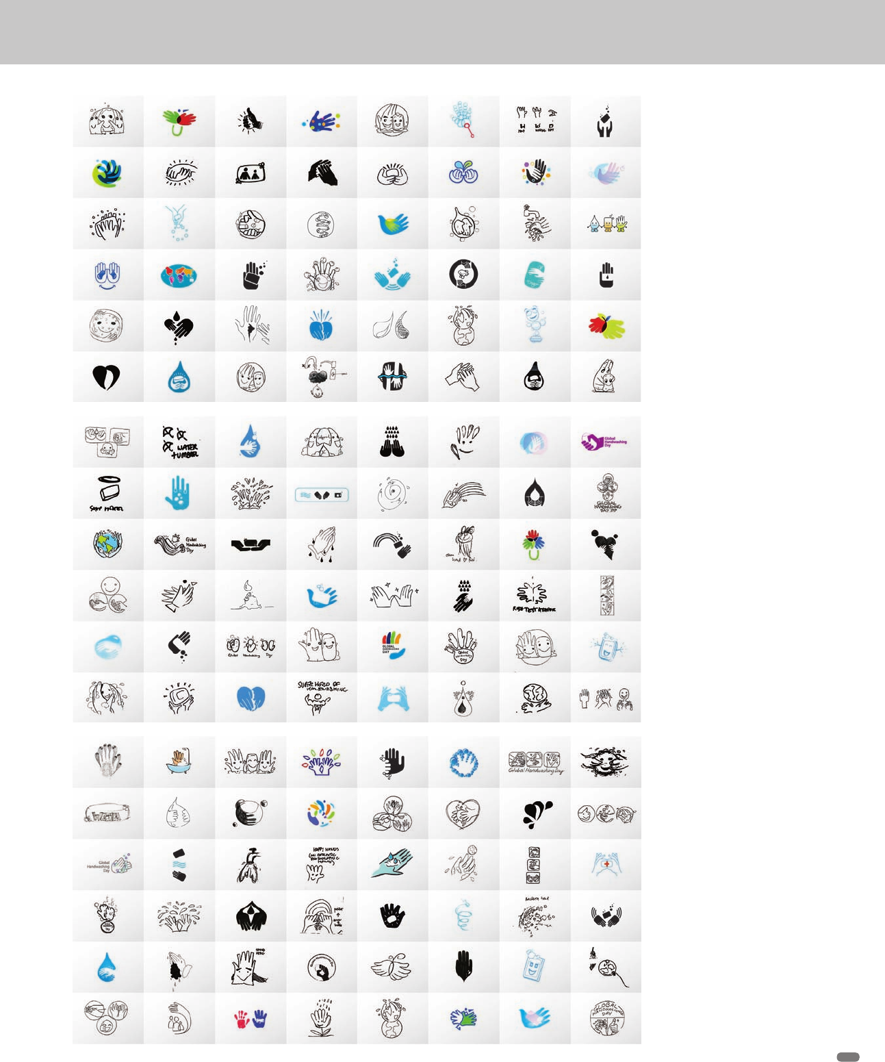
Top: The logo for Global Hand-
washing Day started with a
wide variety of trials submitted
from Landor offices in Sydney,
London, Hong Kong, Dubai,
and Mexico City. The Landor
team leaders were looking
for ideas that unmistakably
communicated handwashing
with soap at first glance. The
communication tone needed
to be warm, educational, direct,
and simple.
This is the first page of
sketches from the various
offices. The seed of the final
solution can be seen on the
far left of the page.
Center: A second page of
design trials from various
Landor offices
Bottom: A third page of
experiments
(RAY)
Job:08-20331/20788/21373 Title:RP-Logo Lounge 6
#175 Dtp:223 Page:51
044-055_21373.indd 51 9/23/10 9:21 AM
(RAY)
Job:08-20331/20788/21373 Title:RP-Logo Lounge 6
#175 Dtp:223 Page:52
044-055_21373.indd 52 9/23/10 9:31 AM
(Text)
52
LogoLounge 6
The brief for the GHD identity project indicated that the effort needed a
strong visual identity that could be instantly understood by people in any
country, even by those who were illiterate. It needed to communicate
quickly and appeal to adults and children. The new identity also had to
work in a range of media and for any size of budget, and it had to avoid
offending by concept, image, or color in all cultures.
“To change the way people act, you have to find the simplest way of making
the biggest change in their lives,” explains Koenderink. “Many times, and
around the world, kids are the ones who bring new information to the family.
So, this effort really was from the bottom up.”
The identity also had to appeal to governments and leaders around the
world. “We needed their advocacy in the communities. We created the
teaching tools, and it was up to them to implement,” adds Waugh.
As soon as Landor’s Cincinnati office gathered all of the necessary infor-
mation, Koenderink and Waugh sent it out to Landor’s offices in Sydney,
London, Hong Kong, Dubai, and Mexico City. Each office was given
six days to submit ideas and sketches, all of which would be considered
as solutions.
Koenderink and Waugh were looking for ideas that unmistakably com-
municated handwashing with soap at first glance. The communication
tone needed to be warm, educational, direct, and simple. Solutions were
presented on a range of rational, emotional, and experiential attributes.
The remainder of this article visually tracks the path of the project.
(RAY)
Job:08-20331/20788/21373 Title:RP-Logo Lounge 6
#175 Dtp:223 Page:52
044-055_21373.indd 52 9/23/10 9:21 AM

(RAY)
Job:08-20331/20788/21373 Title:RP-Logo Lounge 6
#175 Dtp:223 Page:53
044-055_21373.indd 53 9/23/10 9:32 AM
(Text)
53
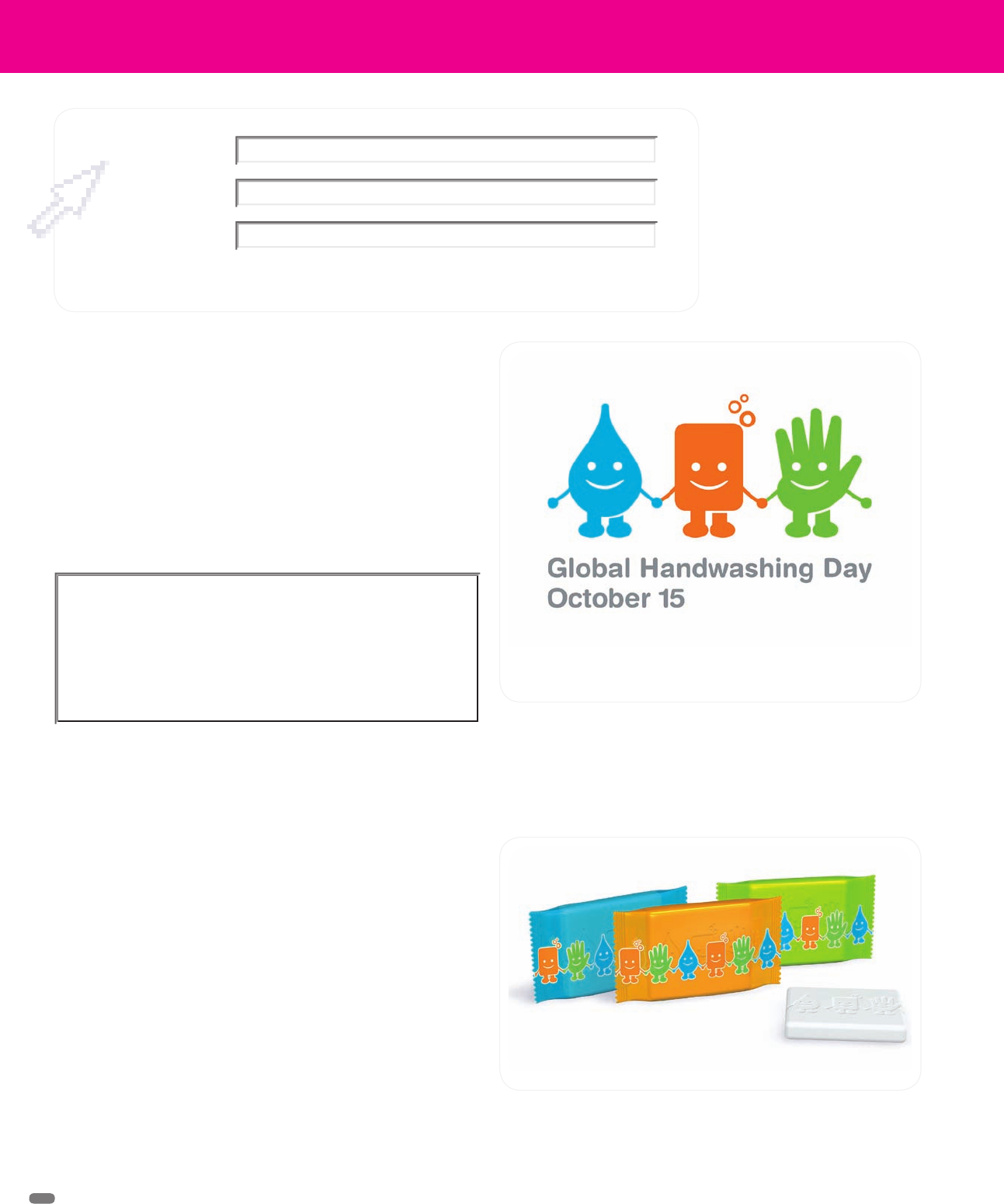
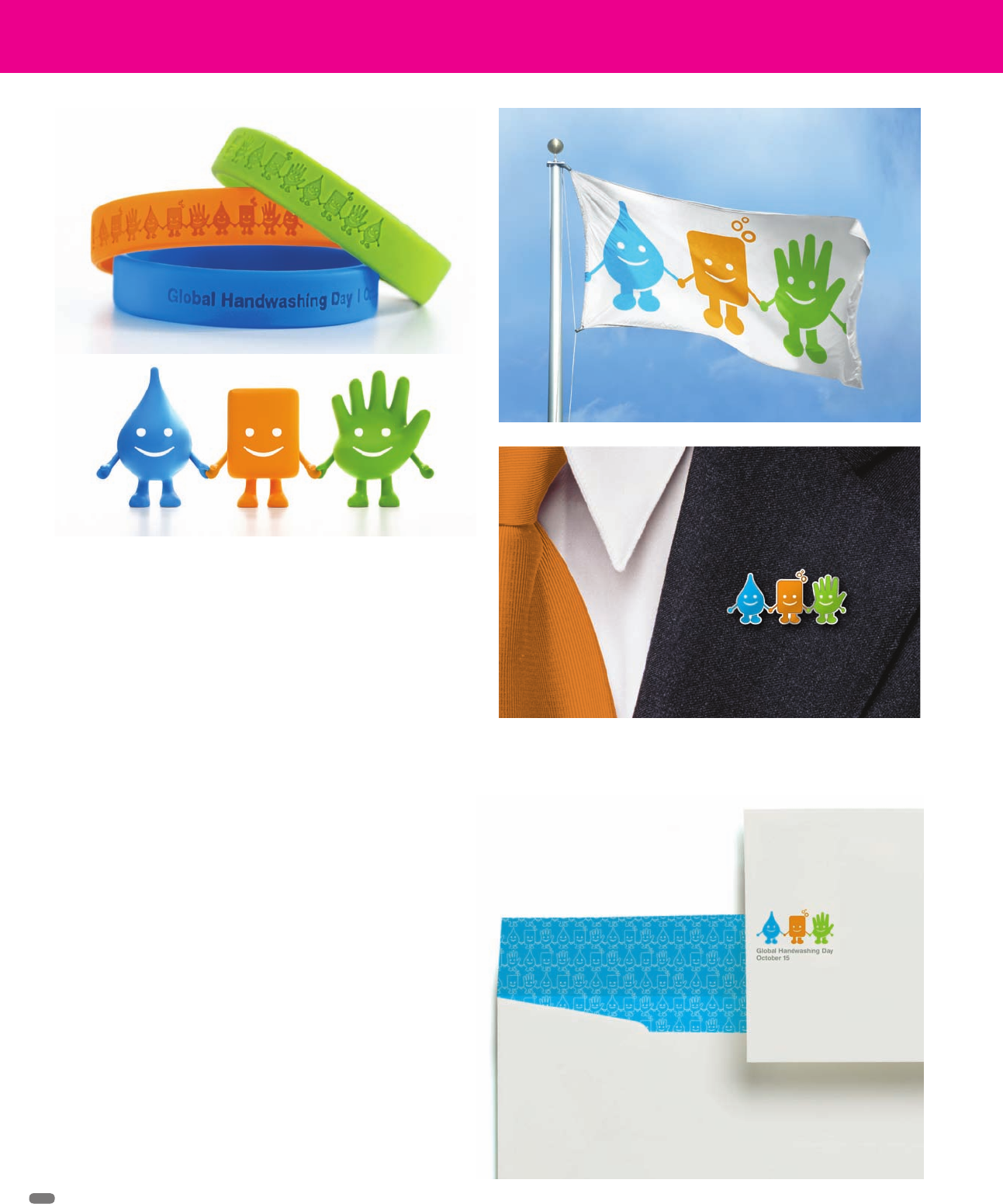
A variety of applications for the Global
Handwashing Day identity. The char-
acters in the logo are easily translat-
able into print or three-dimensional
objects such as soap or toys.
(RAY)
Job:08-20331/20788/21373 Title:RP-Logo Lounge 6
#175 Dtp:223 Page:53
044-055_21373.indd 53 9/23/10 9:21 AM
(RAY)
Job:08-20331/20788/21373 Title:RP-Logo Lounge 6
#175 Dtp:223 Page:54
044-055_21373.indd 54 9/23/10 9:32 AM
(Text)
Few events are more visually charged than the day of September
11, 2001. Everyone has a picture, a memory, a moment that will
stay with him or her always. Just the mention of the numbers 9/11
brings it back instantly.
That is perhaps why the name “The National September 11 Memo-
rial & Museum at the World Trade Center” didn’t particularly reso-
nate well with the public, although it does describe the nonprofit
organization. It operates, programs, raises funds for, and over-
sees the memorial and museum, currently under construction
for completion in 2011, but its name was too wordy to evoke the
immediacy and emotion of the day.
Since 2007, the organization was represented by a purple and
gray lockup that contained representations of the two reflecting
pools that are planned for the site, with the lengthy name at its
center. The gradients in the pools made them difficult to repro-
duce, especially at smaller sizes, and overall, the design looked
grim and static, not hopeful and forward-looking.
In 2009, the group contacted Landor for assistance in implement-
ing its unwieldy name. Rietje Gieskes, associate design director
for the project, recalls that the design firm promptly suggested
shortening the fifty-eight-character name which resulted in the
shorthand name, 9/11 Memorial.
9/11 Memorial
Identity Design
Landor, New York, New York
“We tried to consider the images of that day. Everyone in the
studio felt very close to the project. There are many visuals that
come to mind, but we needed a new icon based on a singular
image. If you say ‘9/11,’ you picture the towers. It became appar-
ent that that was the obvious and appropriate choice,” she says.
The pools-as-logo were not evocative because their image is not
something people know yet. “In this case it seemed important to
use an image that people were already familiar with instead of
creating a new one. The reflecting pools may be associated with
the site in the future, but are not now.”
Whatever the Landor team created, it had to work with Gotham,
a typeface already heavily in use by the organization. For the new
logo, they chose Verlag, a face that has a sense of the sophisti-
cation of New York. The font works well with Gotham and has an
austere, timeless feel, which was extremely important given the
simplicity of the numerals: Its design doesn’t overshadow what it
represents in the logo.
That being said, the numerals were substantially altered to make
sure the entire design was balanced, that each character was
compatible, and that they were bold enough in black or reverse.
Finding the right blue for the design also took time. “Everyone
always says how blue the sky was that day,” Gieskes says. “We
tried to incorporate that with the right sense of hope and stature.
The blue could not be too cyan or too navy.”
Since the new mark has been in use since August 2009, the client,
the public, and even the mayor of New York have embraced it.
“It’s forward looking,” Gieskes says of the strong, two-pillared
design. “A horrible thing happened, but as people rebuild their
lives, there must be hopefulness.”
The new 9/11 Memorial identification, created by Landor Associates
54
(RAY)
Job:08-20331/20788/21373 Title:RP-Logo Lounge 6
#175 Dtp:223 Page:54
044-055_21373.indd 54 9/23/10 9:21 AM
..................Content has been hidden....................
You can't read the all page of ebook, please click here login for view all page.