(RAY)
Job:08-20331/20788/21373 Title:RP-Logo Lounge 6
#175 Dtp:223 Page:56
056-069_21373.indd 56 9/23/10 10:25 AM
56
LogoLounge 6
(Text)
Design Firm
Gee + Chung
National Semiconductor Corporation
Brand Identity Design
Client
Project
National Semiconductor Corporation of Santa Clara, California, is one
of the world’s leading analog chipmakers. The company’s SolarMagic
technology is a proprietary brand of power optimizer that maximizes the
energy output of solar photovoltaic panel systems in a revolutionary way.
Current solar power solutions consist of solar panels connected to invert-
ers, which change direct current into alternating current for household or
commercial use. The SolarMagic power optimizer is a small converter box
between the panels and inverter in the system that can recoup up to 57
percent of the power that is lost to less-than-ideal situations, such as shade
and irregular panel performance. This recapturing of power significantly
improves an owner’s return on investment and makes installation possible
in many other less-than-ideal sites.
Having already designed National Semiconductor’s industry-leading
PowerWise brand of energy-efficient chips, Earl Gee and Fani Chung
of Gee + Chung Design (San Francisco) were asked to also develop the
client’s SolarMagic brand of solar converter/power optimizer technology.
The primary audience for the SolarMagic brand included solar install-
ers and solar panel manufacturers, aged eighteen to fifty-five and
predominately male. Key geographic sales areas included North America
(California, Arizona, Nevada, Oregon, and New Jersey), Europe (Germany,
Italy, and Spain), Japan, and China. The secondary audiences included
financial analysts, industry reporters, semiconductor engineers, and
government agencies.
The primary marketing objectives of the SolarMagic brand were to position
National as an innovative, creative technology leader in delivering system
solutions, and as the leader in energy-efficiency design. As the first mover
in the solar panel power optimizer market, the new brand had no immedi-
ate competition, although competitors were anticipated in the next three
to five years.
The single most important advantage the brand has over other systems is
that the SolarMagic converter enhances the performance of each panel,
allowing it to achieve maximum efficiency under adverse conditions, while
existing solutions do not. The client wanted the new SolarMagic identity
to represent the qualities of “innovative,” “cutting-edge technology,” and
“easy to use.” The brand should not convey “commodity item,” “expen-
sive,” or “complicated.”
National Semiconductor, one of the world’s leading analog
chipmakers, develops a brand of innovative solar conversion
technology which transforms solar energy into electric current by
multiplying the power of the sun. The progression of emanating
silicon wafers in perspective symbolizes the transformative nature
of the company’s power optimizer technology, using alternating
yellow and blue colors to represent the conversion and optimization
of solar input to electrical output.
“The SolarMagic brand was successful in conveying the innovative and
transformative nature of National’s power optimizer technology and
in establishing an entirely new product category within the industry,”
says Gee.
In this article, we are sharing Gee + Chung Design’s actual presentation
to National Semiconductor, to share the project’s story as well as the
presentation’s look and feel.
The design firm was very fortunate to work with an extremely astute,
talented, and dedicated team at National, including Todd D. Whitaker,
vice president, Worldwide Marketing Operations; Jocelyn King, direc-
tor, Worldwide Marketing Operations; and HoMan Lee, design manager,
Brand Management & Advertising/Corporate Marketing. The National team
was instrumental in making the case for the SolarMagic brand’s attributes
to senior management and throughout the company to enable a highly
successful launch.
(RAY)
Job:08-20331/20788/21373 Title:RP-Logo Lounge 6
#175 Dtp:223 Page:56
056-069_21373.indd 56 9/23/10 10:25 AM
(RAY)
Job:08-20331/20788/21373 Title:RP-Logo Lounge 6
#175 Dtp:223 Page:57
056-069_21373.indd 57 9/23/10 10:26 AM
57
(Text)
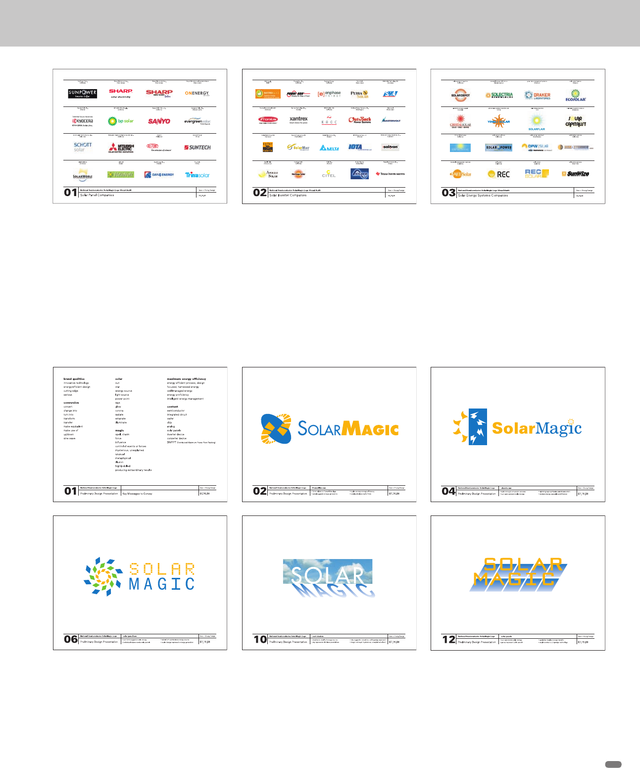
Gee + Chung Design began its process with a thorough visual
audit. They examined existing identities, conceptual directions,
and visual trends within the client’s circle of business to identify
opportunities that would differentiate the SolarMagic brand. The
categories reviewed included everything from solar panel com-
panies to solar energy conferences, as well as SolarMagic brands
(companies with the same name but not in the client’s industry).
The designers found that while the majority of solar energy com-
panies utilize sun imagery to communicate solar energy, solar
panels, or solar energy systems, very few companies went further
in conveying additional qualitative attributes. This presented an
important strategic opportunity for the client to conceptually
represent the process of solar conversion and the qualities of a
cutting-edge, breakthrough technology that is easy to use.
Preliminary Design The designers developed a list of key mes-
sages based on National’s answers to the creative brief (top left).
They explored several options in their first round of designs, trying
to explore as many brand attributes as possible in the most com-
pelling manner, constantly checking design solutions against the
key messages list to determine effectiveness. Each concept in the
presentation was assigned a number and descriptive name, with
its attributes listed underneath for easy reference. Five representa-
tive slides from the presentation are shown here.
(RAY)
Job:08-20331/20788/21373 Title:RP-Logo Lounge 6
#175 Dtp:223 Page:57
056-069_21373.indd 57 9/23/10 10:25 AM
(RAY)
Job:08-20331/20788/21373 Title:RP-Logo Lounge 6
#175 Dtp:223 Page:58
056-069_21373.indd 58 9/23/10 10:26 AM
(Text)
58
LogoLounge 6
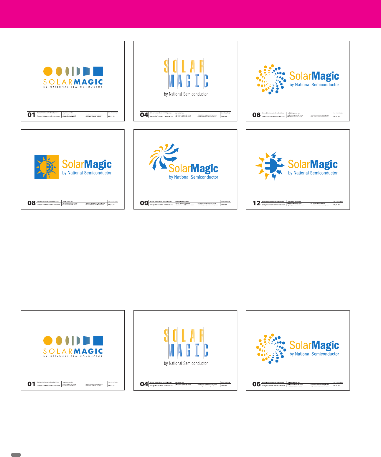
Design Refinement While refining the most promising direc-
tions selected by the client, the designers explored several new
and equally promising directions that they felt should be reviewed.
From extensive experience meeting extremely tight deadlines
during the dot-com period, Gee + Chung Design sometimes had
to proceed with the Design Refinement phase before they would
Final Design The creation of the final signature involved the
resolution of several important issues, including creating the most
effective scale progression within the logo, providing the optimal
have liked. This time around, they were determined to present the
client with the most effective ideas possible within this project’s
very short time frame. As it turned out, the most compelling
direction, Multiplying Power Sun, emerged from this additional
exploration. Below are sample representative slides from that
presentation.
letterspacing and relationship of the logo to logotype, designating
the appropriate clear area around the logo, and defining the most
legible usage of the logo on color backgrounds.
(RAY)
Job:08-20331/20788/21373 Title:RP-Logo Lounge 6
#175 Dtp:223 Page:58
056-069_21373.indd 58 9/23/10 10:25 AM
(RAY)
Job:08-20331/20788/21373 Title:RP-Logo Lounge 6
#175 Dtp:223 Page:59
056-069_21373.indd 59 9/23/10 10:26 AM
(Text)
59
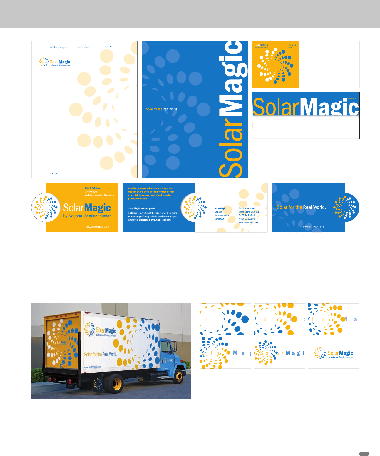
Applications The designers applied the SolarMagic logo to sta-
tionery, trucks, and an animated intro. With each component, the
designers tried to discover new ways to conceptually extend the
ideas behind the brand and create a graphically compelling piece.
The graphics use color in a flexible manner to define the truck’s
different surfaces, featuring a bright white side panel with a giant
cropped logo, a yellow roll-up door, blue cab, yellow wheels, and
custom mud flaps.
The launch intro for dealers and distributors features the logo
dynamically spiraling into the frame and locking into position. The
letterforms come together as a metaphor for the creation of a new
technology. The logo constantly pulsates to represent the continu-
ous conversion of solar energy to electric current.
The letterhead splits the logo in half, as a screened-back pattern
on the front and alternating color on the back. The envelope uses
the logo on a yellow background with a bold, eye-catching flap.
The business card employs a unique die-cut to highlight the logo
and create additional panels for marketing information.
(RAY)
Job:08-20331/20788/21373 Title:RP-Logo Lounge 6
#175 Dtp:223 Page:59
056-069_21373.indd 59 9/23/10 10:25 AM
(RAY)
Job:08-20331/20788/21373 Title:RP-Logo Lounge 6
#175 Dtp:223 Page:60
056-069_21373.indd 60 9/23/10 10:26 AM
(Text)
Gee + Chung Design has enjoyed a successful ten-year rela-
tionship with client DCM, a leading Silicon Valley venture capital
company with significant investments in China, having designed
everything from ads and corporate literature to its website and
internal messaging. During that time, Earl Gee and Fani Chung
have also had the opportunity to design a Lunar New Year logo
for each of the four past years.
“DCM is the only U.S.-based venture capital firm to host its own
Lunar New Year celebration in China to promote networking
among its entrepreneurs and limited partners,” says Gee. “The
events demonstrate the firm’s strong commitment to its technol-
ogy ventures in China, and have been instrumental in establishing
DCM as a leading global venture capital firm in China.”
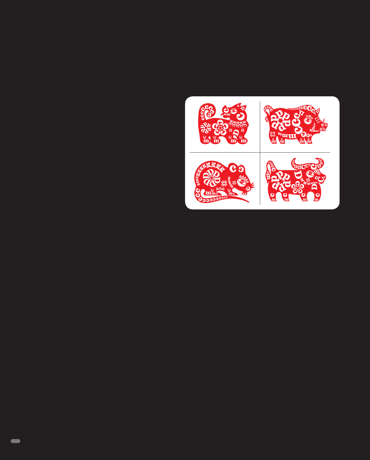
The centerpiece of each of the annual identities is a curious crea-
ture. The Dog, Boar, Rat, and Ox that the team created are on their
surfaces traditional Chinese lunar calendar animals. But on closer
inspection, some extraordinary illumination reveals itself. Each
logo is designed using the firm’s initials in the client’s Clarendon
Bold corporate font. Each letter, its size and case, were chosen to
suggest physical attributes and sometimes pure whimsy.
“We started out by tracing different sized letterforms to create the
general form and character of each animal. It was fun figuring out
which combination of upper- and lowercase letters would best
represent the individual features of each animal,” says Gee. The
effect is to convey DCM’s bold, confident outlook for the firm’s
investments in China in the new year.
The logos were applied to a wide variety of Lunar New Year pro-
motions, including the party invitations, greeting cards, gift bags,
online invitations, and event banners.
“We selected New Page Centura Silk 100# Cover, being the high-
est-quality stock with the highest amount of recycled content
available,” says Gee. “Oscar Printing provided incredible attention
to detail in producing the party invitations and greeting cards.
Fong & Fong Printers and Lithographers printed the gift bags and
DCM
Logo Designs
Gee + Chung Design, San Francisco, California
sourced the custom red and gold grommets and handles. We used
metallic gold foil to evoke a festive, New Year appeal whenever
possible, creating items that attendees would want to save as
keepsakes of the event, or in the case of the gift bag, reuse.”
DCM, recognizing that successful venture investing is built upon
strong personal relationships, designed the Lunar New Year cel-
ebrations not as formal, “sit-down” Chinese banquets, but as
informal receptions that would foster interaction and relationship
building between the entrepreneur and investor attendees.
Each year’s celebration has been extremely well received, and the
events continue to attract a greater number of entrepreneurs and
limited partners. The Lunar New Year campaigns have proved to
be an effective extension of the DCM brand, and have been suc-
cessful in establishing DCM as one of the preeminent U.S.-based
venture capital firms in China.
DCM, a leading Silicon Valley venture capital firm with significant
investments in China, welcomes the Year of the Dog, Boar, Rat,
and Ox, using the firm’s initials to create proprietary Chinese lunar
calendar animals and convey the firm’s bold, confident outlook for
its investments in China.
60
(RAY)
Job:08-20331/20788/21373 Title:RP-Logo Lounge 6
#175 Dtp:223 Page:60
056-069_21373.indd 60 9/23/10 10:25 AM
..................Content has been hidden....................
You can't read the all page of ebook, please click here login for view all page.
