
(RAY)
Job:08-20331/20788/21373 Title:RP-Logo Lounge 6
#175 Dtp:223 Page:44
044-055_21373.indd 44 9/23/10 9:30 AM
44
LogoLounge 6
(Text)
Design Firm
Client
Project
People depend on forests, and forests depend on the decisions that people
make. A sustainable balance, now and in the future, requires knowledge,
skill, and commitment.
These simple principles form the foundation of Indufor’s operations. Indufor
is a global, independently owned company based in Finland that gathers
and analyzes information from forests for private and governmental clients
involved in such industries as furniture, papermaking, lumber, construction,
and more. These clients need forest products for current as well as future
profits, so they are very interested in sustainability. Indufor helps them make
wise decisions that will carry them profitably into the future.
In fact, Indufor’s name is formed from the words industry and forest, two
seemingly disparate concepts. “Indufor’s expertise is to combine sustain-
able values with economic opportunities to find the best solution for both
society and nature without compromising the environment,” says Jonni
Kuutsa, partner in Porkka-Kuutsa (Helsinki).
“Indufor had a somewhat convoluted visual identity before our work,” says
Kuutsa. “The former identity didn’t reflect the crisp expertise and knowl-
edge the staff at Indufor has, or the high quality and in-depth services that
the company provides to industry, NGOs, and government agencies, such
as the UN. It lacked emotion, direction, and consistency, and moreover,
it needed a complete visual overhaul,” Kuutsa explains. Porkka-Kuutsa
partnered with input & output (Thomas Barbieri) to create Indufor’s new
visual identity, graphic guidelines, and signature (logo).
Most of Indufor’s competitors are bigger consulting groups that operate in
many business areas besides forest consulting. “What makes Indufor differ-
ent and unique compared to other forest-related consultancy agencies is that
its core business is focused on forests and the environment,” says Kuutsa.
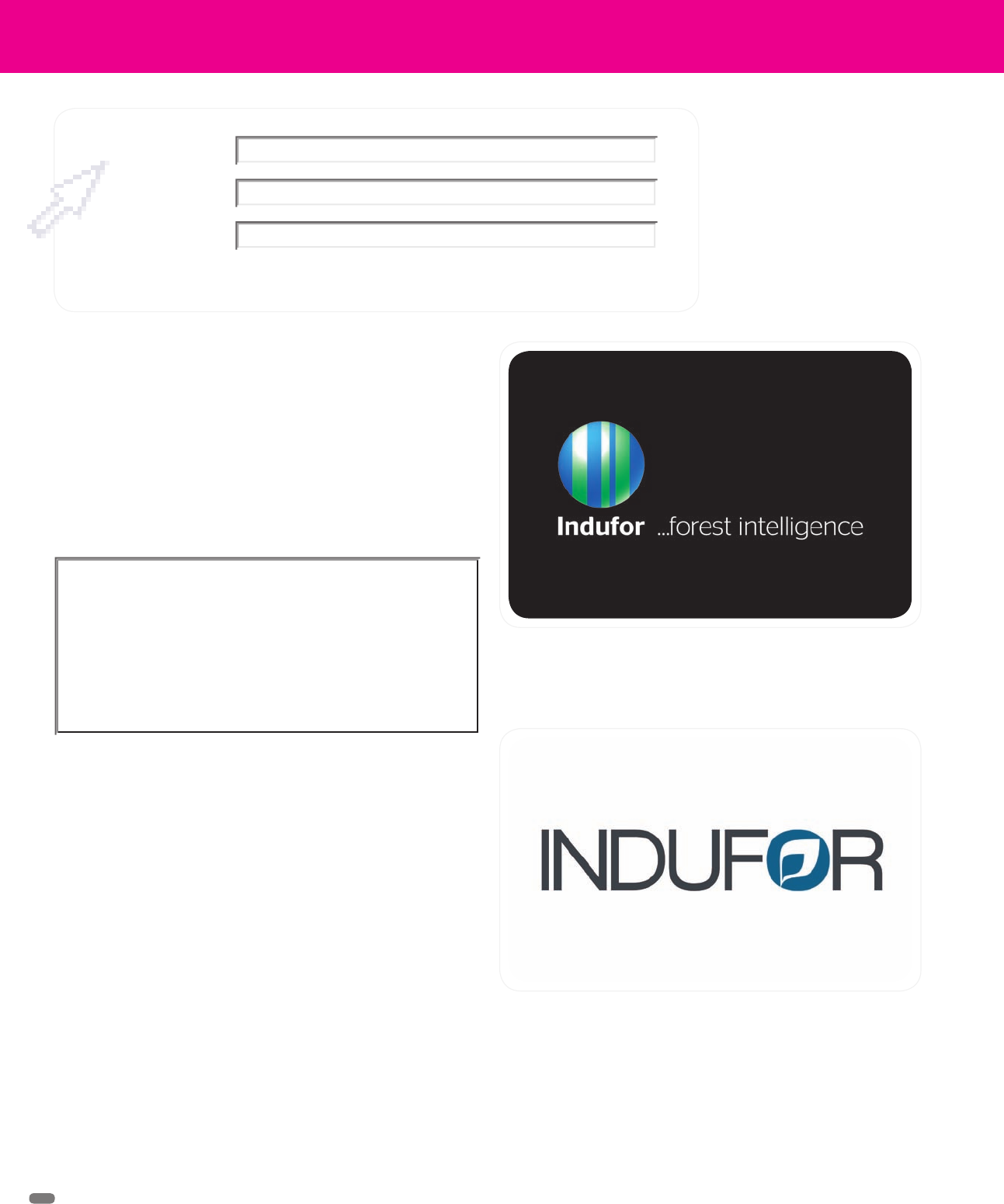
The new logo for Indufor Oy, a company that collects forest
intelligence worldwide, created by Porkka-Kuutsa (Helsinki)
Indufor’s original logo said nothing about the company’s expertise,
nor did it have any emotional content or even say much about its
role in advising on the natural world.
The former identity didn’t reflect the crisp
expertise and knowledge the staff at Indufor
has, or the high quality and in-depth services
that the company provides.
Porkka-Kuutsa
Indufor
Identity Redesign
(RAY)
Job:08-20331/20788/21373 Title:RP-Logo Lounge 6
#175 Dtp:223 Page:44
044-055_21373.indd 44 9/23/10 9:21 AM
(RAY)
Job:08-20331/20788/21373 Title:RP-Logo Lounge 6
#175 Dtp:223 Page:45
044-055_21373.indd 45 9/23/10 9:30 AM
45
(Text)
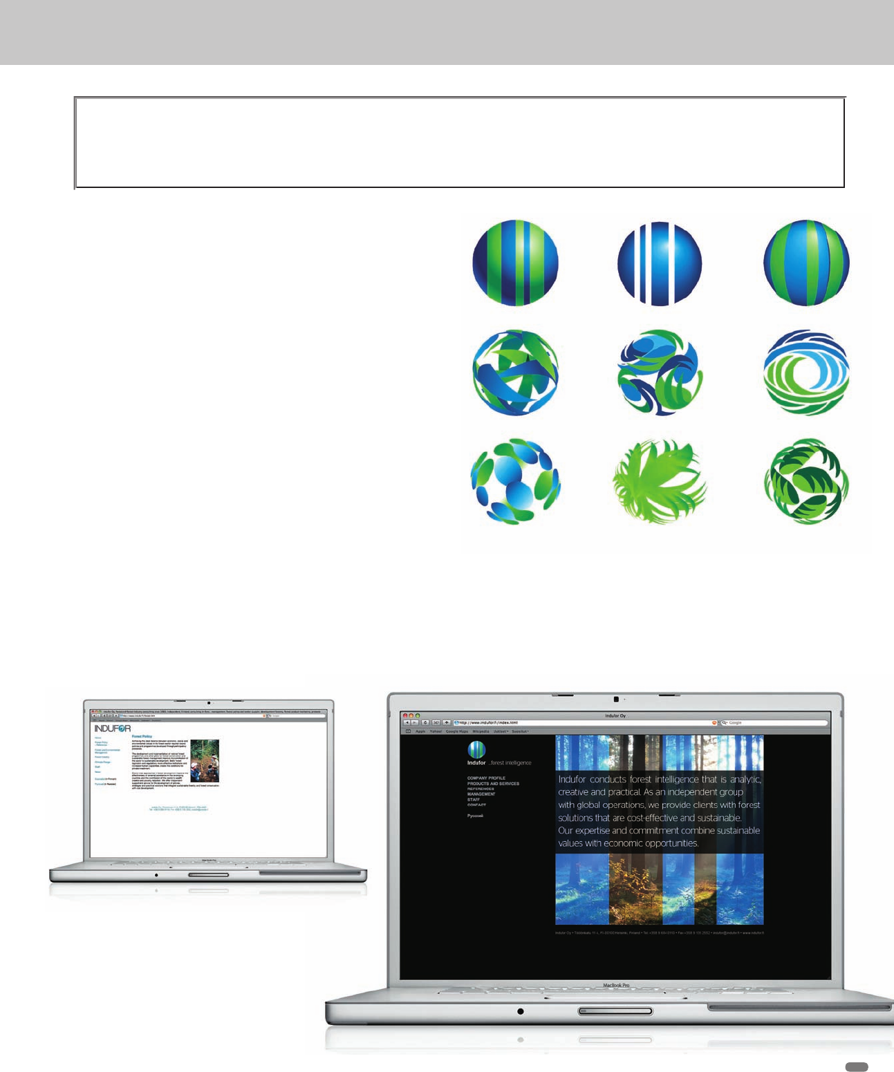
Because Indufor’s core business deals with forests, the design team started
the redesign by considering related themes such as trees, leaves, and so
on. But because varieties of trees and forests are so different in various
parts of the world—for instance, the eucalyptus tree alone has more than
700 species—any specific leaf, bark, trunk, or tree shape image they might
have selected would be too restrictive for a global identity. So, this idea
was abandoned, in part.
Another attribute the client wanted to include in the new identity was Indu-
for’s global presence. This led naturally to a globe-shaped logo, a globe
as seen from space. But the designers still wanted to somehow bring in
the images of trees.
They developed an intriguing bar effect that could represent both the globe
and trees. Blue is used to represent the globe, and green bars represent
forests and trees (trunks). The design team selected natural, fresh hues,
and surrounded them with black to represent space.
“The blue and green striping effect can be used in several ways. For
instance, it can be laid over photos of almost any kind so that the client
(Indufor) has flexibility in presentations, documents, and so on, while
rebranding themselves with their new visual identity. The combination
makes Indufor unique, incorporating forests, the world, and the environ-
ment. The transparency in the colors is symbolic of the company’s trans-
parency in its operations,” says Kuutsa.
A set of sketches from Porkka-Kuutsa’s design trials shared the
same natural palette, but most centered on organic shapes such
as leaves. However, representing any specific leaf shape made the
logo too specific.
The new identity compared with the old shows a
much more interesting and dramatic presentation.
In the new version, the use of a photo behind the
identity is demonstrated.
Another attribute the client wanted to include in the new identity was Indufor’s global presence.
(RAY)
Job:08-20331/20788/21373 Title:RP-Logo Lounge 6
#175 Dtp:223 Page:45
044-055_21373.indd 45 9/23/10 9:21 AM
(RAY)
Job:08-20331/20788/21373 Title:RP-Logo Lounge 6
#175 Dtp:223 Page:46
044-055_21373.indd 46 9/23/10 9:30 AM
(Text)
46
LogoLounge 6
The designers specified the Stag Sans family because it is modern and
reader-friendly, and it offers a wide family to choose from. “Moreover, the
Stag Sans font with its rounded edges is symbolic of the roundness of the
globe,” says Kuutsa.
The slogan, “Indufor . . . forest intelligence,” as well as the new logo, are
successful because they are solidly based on three fundamental elements
that the company incorporates in all its work.
Barbieri explains: “Analytical intelligence = reasoning, processing informa-
tion, and solving problems/issues. Indufor conducts analyses, evaluates,
judges, and compares. Creative intelligence = utilizes past experiences to
achieve insights to deal selectively, effectively, and efficiently with situa-
tions and/or areas of operation worldwide. And practical intelligence = the
way in which Indufor’s people have the ability to select, adapt, and shape
the best and most appropriate solutions in which clients benefit, not only
economically, but including social and environmental responsibly exercis-
ing sound stewardship and international legislation.”
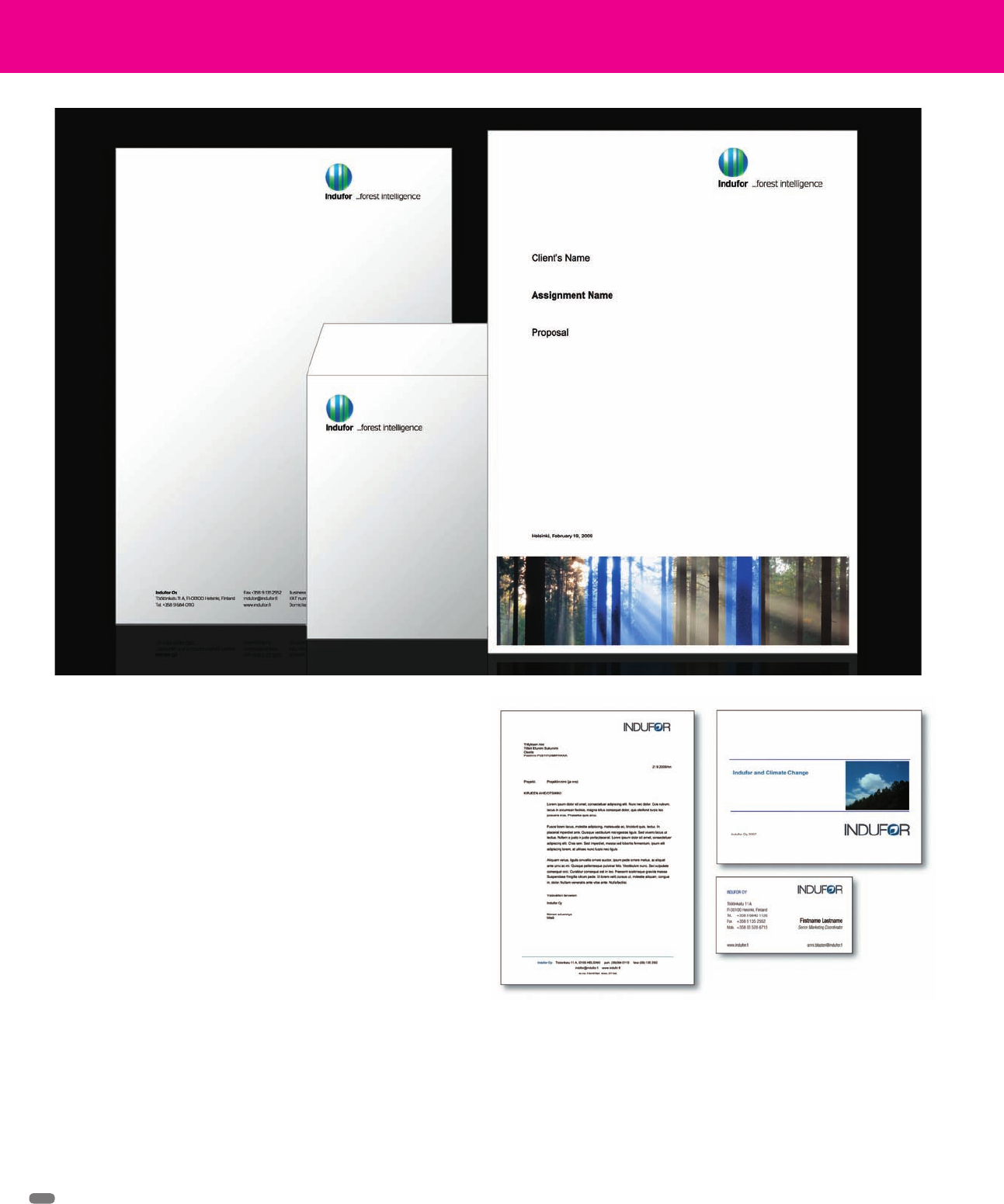
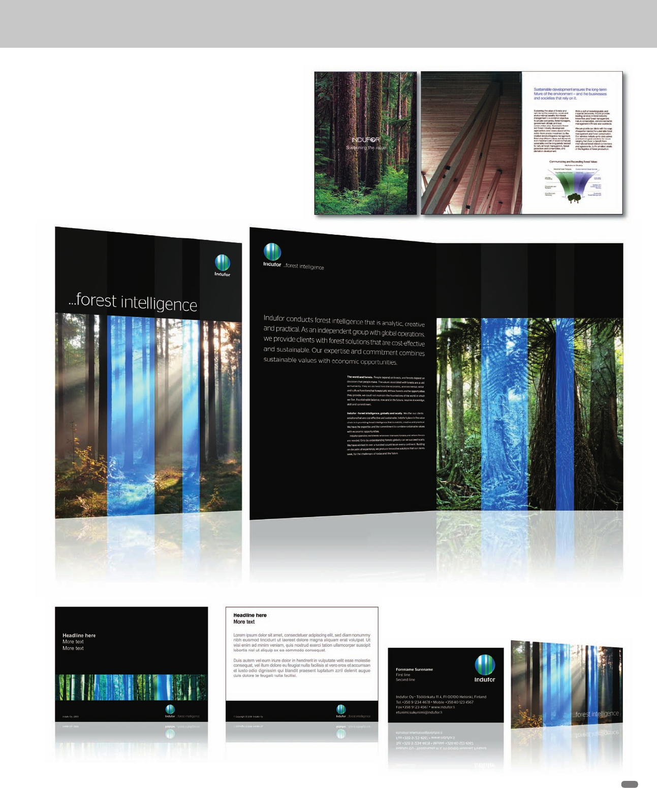
The new identity is endlessly adaptable, no matter what part of the world
Indufor needs to represent or work with: Photos from forests from anywhere
in the world can be used behind the bar system.
The old and new letterhead systems
(RAY)
Job:08-20331/20788/21373 Title:RP-Logo Lounge 6
#175 Dtp:223 Page:46
044-055_21373.indd 46 9/23/10 9:21 AM
(RAY)
Job:08-20331/20788/21373 Title:RP-Logo Lounge 6
#175 Dtp:223 Page:47
044-055_21373.indd 47 9/23/10 9:31 AM
(Text)
The old and new identities used in an Indufor publication.
The client is still able to use lush photos of forests, but
superimposing the bar identity adds the Indufor message.
The new identity shown on a business card and an information card
47
(RAY)
Job:08-20331/20788/21373 Title:RP-Logo Lounge 6
#175 Dtp:223 Page:47
044-055_21373.indd 47 9/23/10 9:21 AM
(RAY)
Job:08-20331/20788/21373 Title:RP-Logo Lounge 6
#175 Dtp:223 Page:48
044-055_21373.indd 48 9/23/10 9:31 AM
(Text)
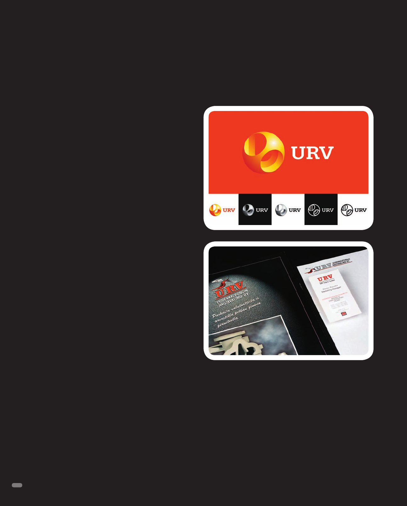
URV Foundry (from the full name, Uudenkaupungin Rautavalimo)
is a Finnish company that produces ductile and gray iron castings.
The production specializes on single and short series castings
with weights ranging from 20 to 6,000 kg/pc for power plants, the
marine industry, wind turbines, the lift and elevator industry, and
the pulp and paper industry.
Porkka-Kuutsa was contacted to create a new signature to reflect
URV’s worldwide business activities in a modern and fresh way.
“URV has a good reputation in the machine building industry,
but its former signature was dull in appearance and lacked the
dynamic and hot look it now has,” says Jonni Kuutsa, a partner
at the design firm. “Moreover, URV produces objects with very
interesting shapes, forms, and angles.”
Porkka-Kuutsa studied the company, its products, its clients, and
the end-users of its products. “We started out by focusing on a
ball shape that combined the shape of a cast object—a valve—
coupled with the letter U. As time progressed, the round shape
also suggested the globe, which reflects URV’s customers, supply
systems, and global presence,” says Antti Porkka, also a partner
at the design firm.
At URV, the iron is cast into shapes by first melting it in a furnace.
The liquid metal is poured into a mold, and then the casting is
removed after the iron has solidified as it cools. “The heat in the
foundry helped us to select the logo colors of warm yellow and
orange shades for the identity,” Kuutsa explains.
“The holes in the logo ball create a feeling of a technically com-
plicated and demanding iron casting, coupled with the globe,” he
says. “We selected the Slab Serif typeface to create a technical
and mechanical feeling. But the face is still usable as the com-
pany’s main typeface,” says Kuutsa.
The logo is not animated as of this writing, but Kuutsa says that
it could be done easily in the future.
URV Foundry
Identity Design,
Porkka-Kuutsa, Helsinki, Finland
The old and new URV identities. The new identity is based on the
image/shape of a metal casting, representing the client’s work,
and it subtly reveals the letter U.
48
(RAY)
Job:08-20331/20788/21373 Title:RP-Logo Lounge 6
#175 Dtp:223 Page:48
044-055_21373.indd 48 9/23/10 9:21 AM
..................Content has been hidden....................
You can't read the all page of ebook, please click here login for view all page.