
(RAY)
Job:08-20331/20788/21373 Title:RP-Logo Lounge 6
#175 Dtp:223 Page:90
082-093_21373.indd 90 9/23/10 11:42 AM
(Text)
Although the designers were creating a new identity, the team real-
ized there was still equity in the old mark. They looked at the red
circle that was part of the core brand in the previous “stamped”
identity and realized that by breaking it up and putting it back
together, they could convey the notions of perspective and conver-
gence. “We call the new mark ‘the prism,’” says Sadée. “It speaks
to the previous logo yet goes in a completely new direction.”
While the core mark had been established, the identity still
needed to be extended to Cinereach’s three divisions. Narguess
Noshirvani, senior program manager, explains that creating a sepa-
rate mark for each of these areas could result in a similar brand
hierarchy confusion that the company was already struggling with.
“We decided that color would be the most effective way to pro-
duce a clear distinction among the three program areas and still
communicate their connection to Cinereach and each other. We
created three different color palettes that borrow from and build
off of one another. Grants and Awards has a greenish-yellow
to greenish-blue palette; the Reach Film Fellowship area has a
palette that ranges from blues to pinks to purples; Productions
ranges from oranges to reds.”
Cinereach, a nonprofit film production company and foundation,
was started by young philanthropists and filmmakers as a vehicle
for promoting, funding, supporting, and producing well-crafted
films that represent fresh and thought-provoking viewpoints. As
the group’s mission statement says, their goal is to champion
“vital stories, artfully told.”
The organization helps filmmakers in three specific ways: through its
Reach Film Fellowship, a specialized program for early-career film-
makers who are making socially conscious short films; Cinereach
Productions, which searches for the stories behind the headlines,
providing a new, personal take on national and international affairs;
and Grants and Awards, which supports films that possess an inde-
pendent spirit, depict underrepresented perspectives, and resonate
across international boundaries.
The company’s mission and values were not reflected properly in
Cinereach’s previous identity. Based on the concept of passport
stamps, it spoke well to the idea of travel and the exploration of
new cultures and ideas, but did not communicate the importance
of craft and art in filmmaking or the multiple people and per-
spectives that come together to tell a story through this medium.
Another challenging aspect of the identity was that each of the
company’s three programs had its own unique stamp design that,
when brought together with the Cinereach mark, created visual
dissonance and an unclear brand hierarchy.
Cinereach approached Method (San Francisco, New York, and
London) for help in refitting its identity. Milena Sadée, Method’s
design director, says that understanding what their client did was
simple. Conveying the many different facets of their organization
and vision of the company was more of a challenge.
“Creating films requires a convergence of people, resources, and
ideas,” she says. “The goal is to challenge people and expose
them to these different stories and views so that hopefully a dia-
logue is started and maybe even some prejudices challenged.”
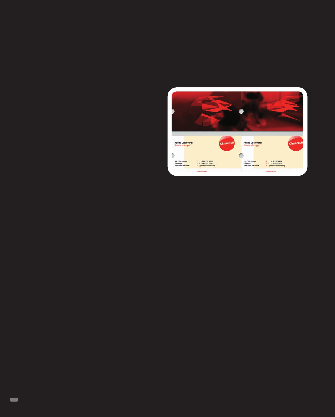
Cinereach
Identity Redesign
Method
The new Cinereach identity, played out on business cards.
90
(RAY)
Job:08-20331/20788/21373 Title:RP-Logo Lounge 6
#175 Dtp:223 Page:90
082-093_21373.indd 90 9/23/10 11:41 AM
1
2
3
4
5
A B C D
1C 1D
2A 2B 2C 2D
3A 3B 3C 3D
4A 4B 4C 4D
5A 5B 5C 5D
(RAY)
Job:08-20331/20788/21373 Title:RP-Logo Lounge 6
#175 Dtp:223 Page:91
082-093_21373.indd 91 9/23/10 11:42 AM
91
D
= Design Firm
C
= Client
(Text)
D
M. Brady Clark Design
C
gomerch
D
Sakideamsheni
C
Imedi TV
D
Filip Komorowski
C
Filip Komorowski
D
Tweet Design
C
Tweet Design
D
Tweet Design
C
Full Service Music
D
Scott Oeschger
C
M&M
D
The Brand Hatchery
C
Three Blind Ants
D
Pop Ovidiu Sebastian
C
Nige impex
D
The Jake Group, LLC
C
Veronique Morrison
D
Hernandez Design Studio
C
Jugar Creative
D
Stefan Romanu
C
Allnet Telecom
D
SOULSEVEN
C
True O2
D
iHua Design
C
O.L. Style
D
a. pounds design
C
Carol Chapman
D
AkarStudios
C
Fresh Cutt
D
www.MikeyBurton.com
C
20x200 / Jen Bekman
D
Webster Design Associates Inc.
C
Jones Bros. Cupcakes
D
Banowetz + Company, Inc.
C
Tim McEneny
Enclosures
Keywords
Type:
Symbol Typographic
Combo
All
LOGO SEARCH
(RAY)
Job:08-20331/20788/21373 Title:RP-Logo Lounge 6
#175 Dtp:223 Page:91
082-093_21373.indd 91 9/23/10 11:41 AM
A
1
2
3
4
5
B C D
1A 1B 1C 1D
2A 2B 2C 2D
3A 3B 3C 3D
4A 4B 4C 4D
5A 5B 5C 5D
(RAY)
Job:08-20331/20788/21373 Title:RP-Logo Lounge 6
#175 Dtp:223 Page:92
082-093_21373.indd 92 9/23/10 11:42 AM
92
(Text)
D
= Design Firm
C
= Client
D
Extrabrand
C
Intesys
D
D&Dre Design
C
Radiant
D
AT PACE
C
Occhiali
D
Brent Couchman Design
C
Tactik Interactive
D
Bailey Lauerman
C
Nebraska Health and Human Services
D
Rose
C
MFI & Lloyds TSB
D
Hilary Dana Williams
C
atitu
D
rajasandhu.com
C
Ikon
D
ARTENTIKO
C
PSO Sp. z.o.o
D
Jesse Kirsch
C
Melt Chocolate
D
Holler Design
C
Rojo Architecture
D
Romulo Moya / Trama
C
Colegio de Arquitectos del Ecuador
D
PUSH Branding and Design
C
Blur MediaWorks
D
raudesign
C
Double Dragon Chinese Restaurant
D
Lucero Design
C
Calle 66
D
eleven07
C
Tijuana Gift Shop
D
orangebird
C
take 3 studios
D
LogoDesignGuru.com
C
Tajdar Sultan
D
eight a.m. brand design (shanghai) Co., Ltd
C
WWW.8-A-M.COM
D
Kevin Zwirble Design Co.
C
Paul Minor Band
(RAY)
Job:08-20331/20788/21373 Title:RP-Logo Lounge 6
#175 Dtp:223 Page:92
082-093_21373.indd 92 9/23/10 11:41 AM
1
2
3
4
5
A B C D
1A 1B 1C 1D
2A 2B 2C 2D
3A 3B 3C
3D 4A 4B 4C
4D 5A 5B 5C 5D
(RAY)
Job:08-20331/20788/21373 Title:RP-Logo Lounge 6
#175 Dtp:223 Page:93
082-093_21373.indd 93 9/23/10 11:42 AM
93
(Text)
D
= Design Firm
C
= Client
D
Muhina Design
C
KIAF
D
The Navicor Group
C
Susan Albert
D
nelnet
C
WikiDebate
D
Kommunikat
C
Jakub Rutkowski
D
The Pink Pear Design Company
C
Bi-State Autism Initiative (proposed)
D
LindyLazar Marketing
C
Annie’s of Traverse City
D
Glitschka Studios
C
Veer
D
adamgf
C
frut smoothies
D
Ishan Khosla Design
C
Jaipur Virasat Foundation and Anantaya
D
Sockeye Creative
C
Travel Portland
D
Brotbeck Corporate Design AG
C
BIHAG Bieler Holzbau AG
D
Hazen Creative, Inc.
C
EPIC - Engaging Philanthropy
D
Oxide Design Co.
C
The Biatomic Point
D
Sudduth Design Co.
C
Hill Country Scouts
D
PUSH Branding and Design
C
CMMI Marketplace
D
DEI Creative
C
GTS Development
D
Tomko Design
C
PURO Gelato
D
Schwartzrock Graphic Arts
C
BI
D
Rock Creek Strategic Marketing
C
Pitango Gelato
D
Banowetz + Company, Inc.
C
Kent Rathbun
(RAY)
Job:08-20331/20788/21373 Title:RP-Logo Lounge 6
#175 Dtp:223 Page:93
082-093_21373.indd 93 9/23/10 11:41 AM
A
1
2
3
4
5
B C D
1A 1B 1C 1D
2A 2B 2C 2D
3A 3B 3C 3D
4A 4B 4C 4D
5A 5B 5C 5D
(RAY)
Job:08-20331/20788/21373 Title:RP-Logo Lounge 6
#175 Dtp:223 Page:94
094-105_21373.indd 94 9/23/10 12:37 PM
94
D
= Design Firm
C
= Client
(Text)
D
Sudduth Design Co.
C
Lush Landscape Design
D
Kilmer & Kilmer
C
Albuquerque Youth Symphony
D
Tweet Design
C
Covet
D
Robin Easter Design
C
Pumps: A Shoe Boutique
D
University of North Texas
C
University of North Texas
D
Majorminor
C
Cumulous
D
1981
C
1981
D
Artini Bar Designs
C
spec
D
Rovillo Design Associates
C
Harding Road
D
Ferreira Design Company
C
Coca-Cola Mexico
D
Stuph Clothing
C
Love At War
D
Double A Creative
C
Makeup By Amber
D
SOULSEVEN
C
Target - MoMA
D
Spoonbend
C
Obrien Architecture
D
Stitch Design Co.
C
The James Pond
D
Cricket Design Works
C
Forward Music Festival
D
Periscope
C
Michelle Rollins
D
Strange Ideas
C
James Strange
D
Chris Trivizas | Design
C
Zisimopoulou Stamatia
D
Timber Design Company
C
Hancock Regional Hospital
(RAY)
Job:08-20331/20788/21373 Title:RP-Logo Lounge 6
#175 Dtp:223 Page:94
094-105_21373.indd 94 9/23/10 12:41 PM
..................Content has been hidden....................
You can't read the all page of ebook, please click here login for view all page.