
(RAY)
Job:08-20331/20788/21373 Title:RP-Logo Lounge 6
#175 Dtp:223 Page:38
032-043_21373.indd 38 9/23/10 9:20 AM
38
LogoLounge 6
(Text)
Design Firm
FutureBrand
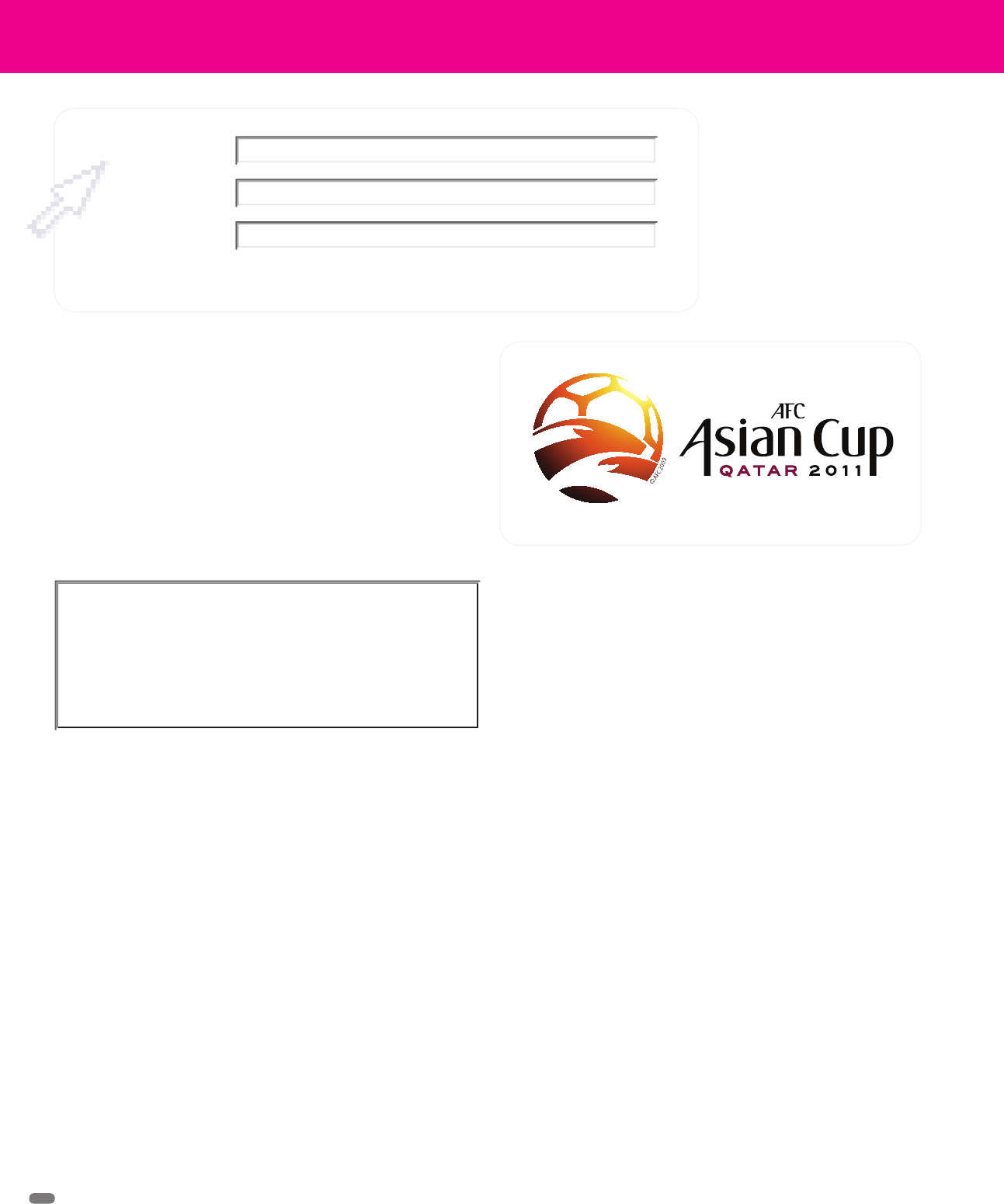
The Asian Cup 2011
Identity Design
Client
Project
Held only once every four years, the Asian Cup is a football competition
that raises extreme passions and hopes for fans and national teams alike.
It attracts the attention of literally billions of fans around the world. The
winning team is honored as the prestigious champion of Asia, and it auto-
matically qualifies for the FIFA Confederation Cup.
But there are other honors to be had as well. The 2011 Asian Cup will be
held in Doha in Qatar January 7–29, 2011. The Qatar Football Association
in conjunction with the AFC sought to host the 2011 Cup not only for the
recognition and business it would bring the country, but also in the hopes
that a successful event would elevate the country so that it would be in the
running for consideration for hosting the World Cup in 2022.
So, everything that Qatar did in presenting the 2011 Asian Cup—organiza-
tion, promotion, performance, and logistics—had to show that it could be
a world-class venue. For help in creating the identity and marketing for the
2011 Cup, the QFA group contacted FutureBrand’s Dubai office.
FutureBrand designers knew from the start that one idea unites football
fans worldwide: goal. The new identity would need to speak of the host
country, but it would also have to convey the sense of speed, excitement,
world-class talent, and pride in performance that would enrich the Asian
Cup games.
FutureBrand creative director Mark Thwaites says the client’s position-
ing statement included the following aspects: Arabic, competition, spirit,
sportsmanship, and excitement. His team’s first round of logo trials dialed
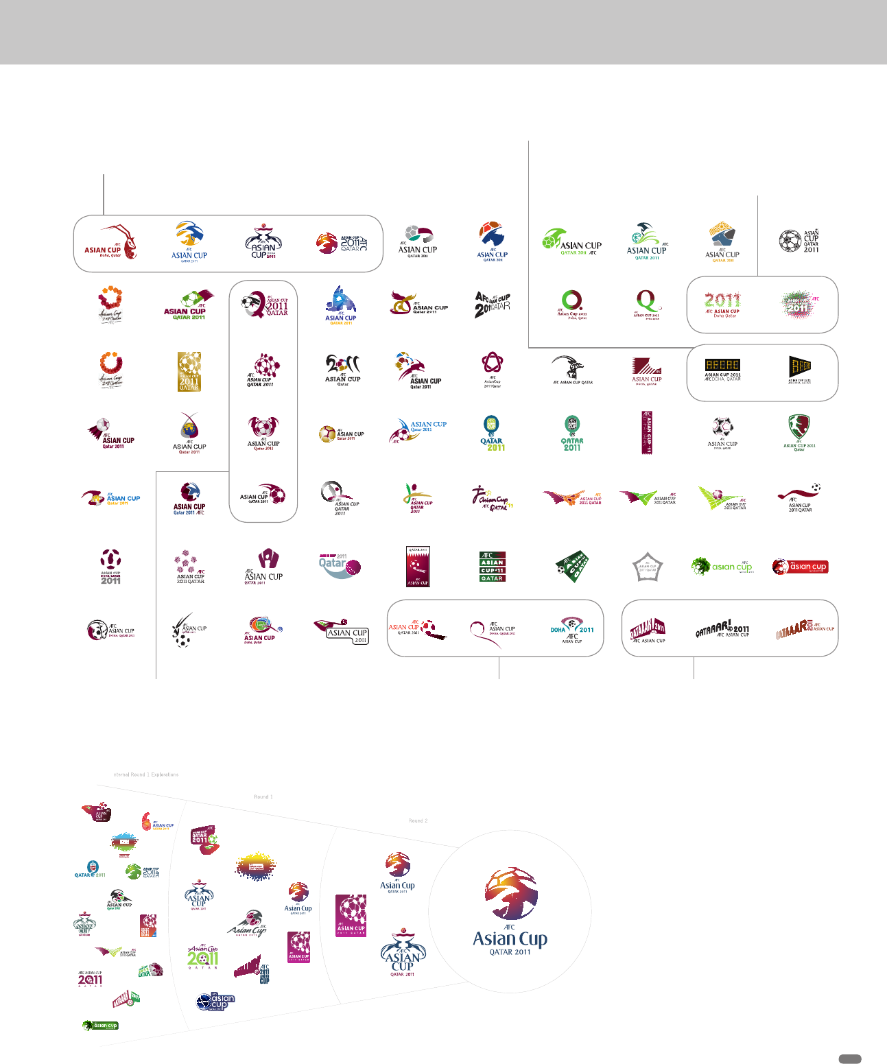
these attributes up and down in various combinations in what they called
an identity exploration quilt. The quilt was still for in-house use only, to help
them zero in on the strongest directions.
From the exploration quilt, the designers selected thirteen and then
nine specific directions to present to the client. “The designs were
selected because they provided a wide spectrum of potential ideas that
all achieved the attributes and positioning,” says Thwaites. “They all
The logo for The Asian Cup in Qatar 2011, created by FutureBrand,
is an exciting combination of the soccer ball, the globe, the oryx
(the national animal of Qatar), the region of Qatar, and the excite-
ment of football.
The client’s positioning statement included the
following aspects: Arabic, competition, spirit,
sportsmanship, and excitement.
achieved the desired attributes with different levels of youth appeal or
pure football appeal.”
The final nine were narrowed down to three. The feeling of motion and
excitement in the ball-in-net logo had the right feeling, but perhaps didn’t
say as much about Qatar. The lowercase design did better: It achieved
the desired attributes, had strong positive and negative balance, and was
completely appropriate for the region, says Thwaites.
But the crossed oryxes contained everything the client wanted—country,
Arabic, color, speed, gracefulness, two entities competing, all coming
together in an abstracted soccer ball.
“The two oryxes crossing became the two teams competing,” explains
Thwaites. “This one had the right sense of national feeling. But it still had
some problems with symmetry and with positive and negative space. The
ball looked more like cracked ice than a soccer ball.”
So, the team took the chosen design and moved it into refinement, where
it was simplified and the type was tweaked to better integrate it.
As the design was simplified, the stronger Arabic attributes were dialed
down. Line quality and color would add these qualities back in the next
stage of refinement.
(RAY)
Job:08-20331/20788/21373 Title:RP-Logo Lounge 6
#175 Dtp:223 Page:38
032-043_21373.indd 38 9/23/10 9:19 AM
(RAY)
Job:08-20331/20788/21373 Title:RP-Logo Lounge 6
#175 Dtp:223 Page:39
032-043_21373.indd 39 9/23/10 9:20 AM
39
(Text)
This exploration quilt shows the very wide range of approaches
that FutureBrand designers created at the start of the project.
Many of their experiments involved the oryx, a large antelope
with swept-back horns that is the national animal of Qatar.
The experiments below are
based on the concept of
looking down from a satellite
view of the event, revealing
the many people who would
attend.
Some design trials, such as
these, were very simple and
clean.
Other trials explored move-
ment, such as the ball in
motion or hitting the net.
This group represents some
more literal concepts, where
basic ideas such as the Q are
presented simply.
These logos were built from a
sound—the rallying cry issued
by the football announcer when
he says, “GOOOOALLL!”
From the exploration quilt, the most
promising thirteen directions were
selected (far right). From that group,
FutureBrand narrowed the choices
down to nine, and then finally three
that were presented to the client, who
selected the design shown at far left.
(RAY)
Job:08-20331/20788/21373 Title:RP-Logo Lounge 6
#175 Dtp:223 Page:39
032-043_21373.indd 39 9/23/10 9:19 AM
(RAY)
Job:08-20331/20788/21373 Title:RP-Logo Lounge 6
#175 Dtp:223 Page:40
032-043_21373.indd 40 9/23/10 9:20 AM
(Text)
40
LogoLounge 6
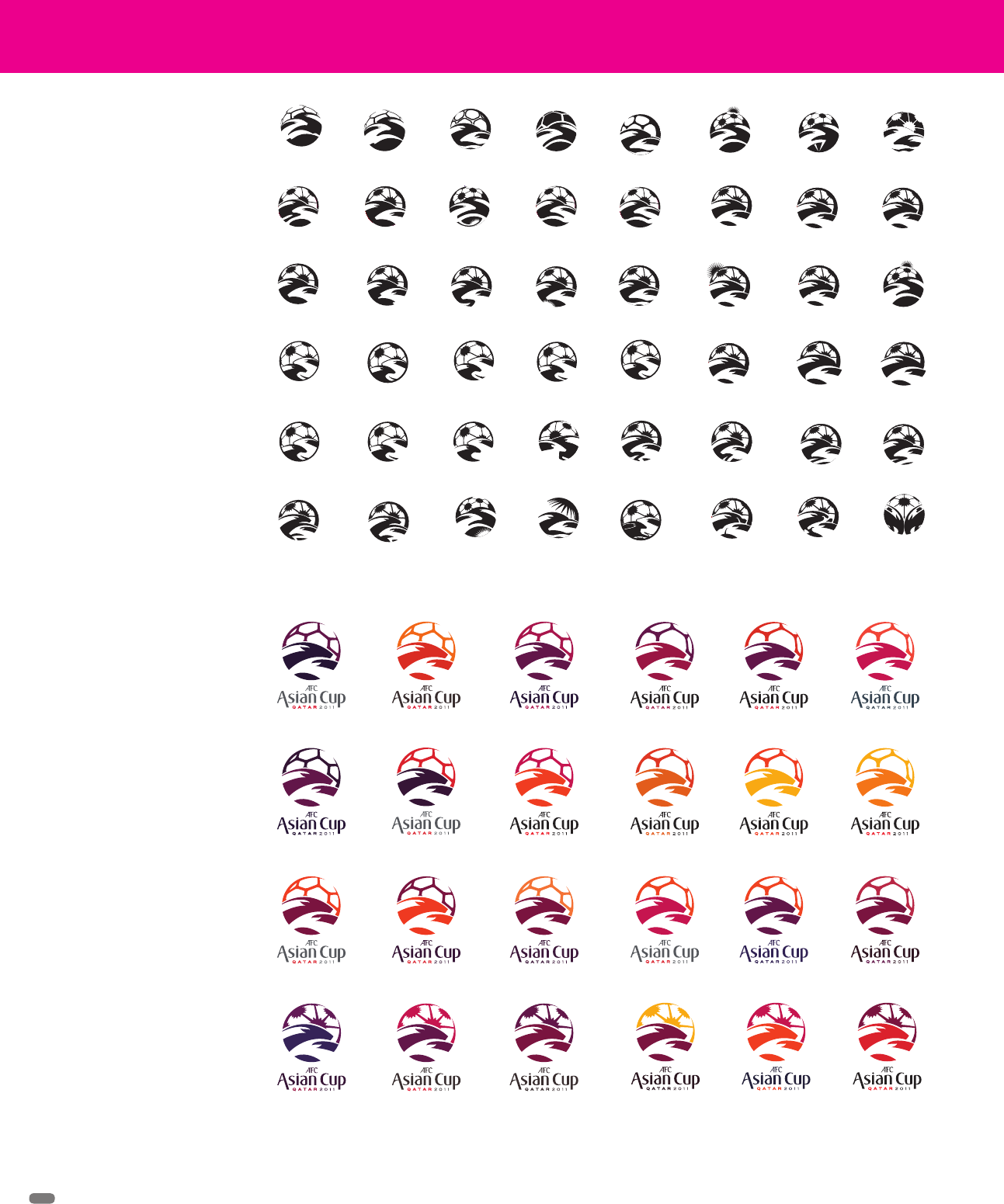
Refining the selected mark
meant working out the delicate
interplay between positive
and negative space. As the
designers fine-tuned the logo,
aspects of Qatar, the animals,
the soccer ball, and the world
were dialed up and down.
With the design finalized,
the designers turned their
attention to color selection.
Qatar’s national colors are
maroon and white, so they
were natural choices. But
the designers also wanted
to convey excitement and
energy with brighter colors.
(RAY)
Job:08-20331/20788/21373 Title:RP-Logo Lounge 6
#175 Dtp:223 Page:40
032-043_21373.indd 40 9/23/10 9:19 AM
(RAY)
Job:08-20331/20788/21373 Title:RP-Logo Lounge 6
#175 Dtp:223 Page:41
032-043_21373.indd 41 9/23/10 9:20 AM
(Text)
41
Thwaites notes that it was important for the team to remember to not be
overly Arabic, because that would not represent the entire Middle Eastern
fan base well. The logo would have to appeal to fans/customers from Korea
and Australia, as well, to name just a few participant countries.
The designers also conducted plenty of color studies, gauging warm and
cool colors while trying to integrate Qatar’s national colors of maroon and
white. Although they wanted to convey plenty of excitement and energy
through their color choices, they also had to be careful to not let color
combinations get too playful and childlike.
The final design is an ideal identity and solution for the client, says Thwaites.
“It’s a beautifully balanced mark that captures the essence of the host
country and also has the attributes that make football known as a beautiful
game. The typography works well with the mark, and the integration of the
oryx and global football creates a balanced mark,” he says.
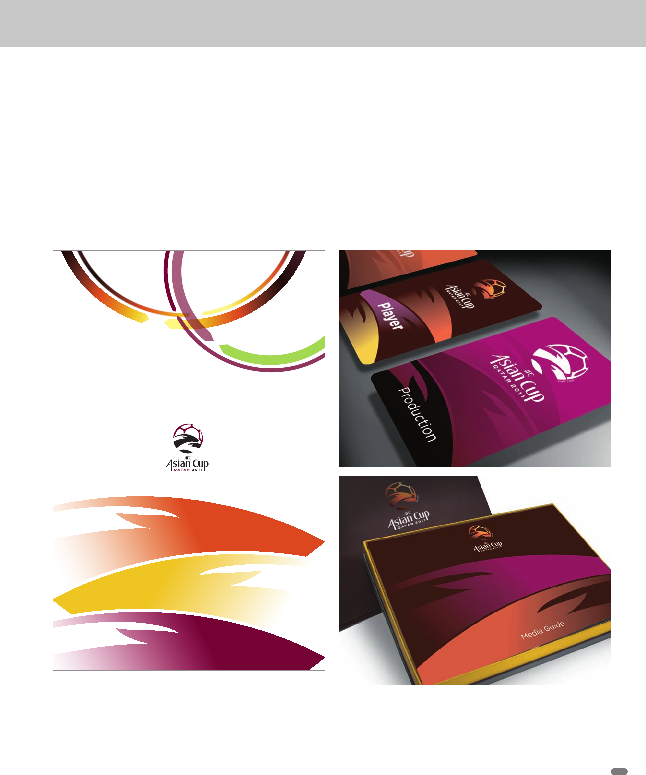
The Asian Cup logo contains several extendable elements. The
oryxes (below) are intriguing and suggest very rapid movement.
Above are “motion rings” that mimic the logo’s shape, color,
and gradations.
Several documents that show the identity system in use
(RAY)
Job:08-20331/20788/21373 Title:RP-Logo Lounge 6
#175 Dtp:223 Page:41
032-043_21373.indd 41 9/23/10 9:19 AM

(RAY)
Job:08-20331/20788/21373 Title:RP-Logo Lounge 6
#175 Dtp:223 Page:42
032-043_21373.indd 42 9/23/10 9:20 AM
(Text)
42
In the past few years, it has become increasingly
common for professional golfers to develop
their own brand—not necessarily to imprint on
their own goods, but to use as personal mono-
grams for products produced by sponsors such
as Nike and Adidas, for example.
FutureBrand worked with golfer Sergio Garcia
to develop a personal imprint in 2009. His was
a fortunate instance: Like Madonna or Prince,
he was readily identifiable (in golf circles at
least) by one name. He was widely known for
his charming smile and bold manner of play.
The FutureBrand team discovered he had many
other valuable characteristics as well.
“The torque of his swing twists him almost into a pretzel; it has a
very spiral nature. He is also known for a devilish sense of humor,
and he is also very Spanish-centric—some would call him the
ultimate Spaniard,” explains Mark Thwaites, creative director for
FutureBrand.
The design team also benefited in that the letter S was a very
strong shape. As they began to work, they could see that the
Sergio Garcia
Identity Design
FutureBrand
S and the G could easily be combined into a
distinctly new, twisting shape.
They presented seven very different ideas
to the golfer. He particularly liked two of the
directions, one very Gothic in nature and the
other more modern but still with plenty of
variation in stroke width. From those two, he
finally selected the modern S/G combination.
The designers then took the basic idea and
moved it into refinement, where it underwent
some dramatic changes. More of the Gothic
traits that Garcia liked were brought back in,
as was a sense of playfulness.
“Some of the letters are almost hornlike. They’re very devilish. It’s
sort of like a tattoo in some ways,” says Thwaites. “The final logo
feels very Spanish, with even the colors of the Spanish flag. It has
a lot of things wrapped up in it, and the most beautiful story. It has
very rich attributes that got combined in a very simple, reproduc-
ible way. Simplicity can tell the most amazing stories.”
(RAY)
Job:08-20331/20788/21373 Title:RP-Logo Lounge 6
#175 Dtp:223 Page:42
032-043_21373.indd 42 9/23/10 9:19 AM
..................Content has been hidden....................
You can't read the all page of ebook, please click here login for view all page.