The user interface lets you communicate with a program. In the old days, you had to type a command to make a program do something. If you didn't know the command to type or if you misspelled it, your command wouldn't work, and the program wouldn't respond to your actions.
Fortunately, today's programs use a graphical user interface (GUI) that displays options on the screen for the user to select using the mouse or keyboard. For most programs, the simplest way to offer options for the user to select involves using buttons.
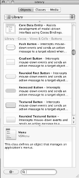
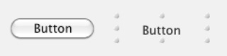
A button typically appears on the screen as a rectangular object with a descriptive command displayed inside such as the word Print or Cancel. However, buttons can appear in different sizes, shapes, and colors, as shown in Figure 15-1, which you can display by choosing Tools
In this chapter, you'll learn how to create and customize different buttons and connect them to your Objective-C code to make them work.
These are some of the more common types of buttons available for your user interface:
All buttons work alike, but they just look different. The Push Button is the standard button appearance for Mac programs, but you can just as easily replace it with a Recessed Button or Square Button instead.
Some buttons, such as the Round Button, can't display as much text as the PushButton or Rounded Rect Button. Others types of buttons, such as the Help Button and Disclosure Button, don't display any text inside them at all, as shown in Figure 15-2.
The basic idea behind all of these buttons is to provide the user with one-click access to a single command. Generally, use buttons when you need to give the user a limited number of options, such as two or three choices. If you display too many buttons on the screen at once, you may just wind up confusing the user and making your user interface look too cluttered.
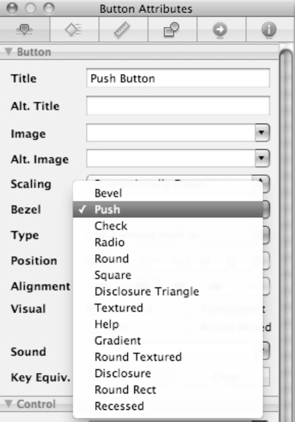
There are two ways to create a button. First, you can scroll through the Object Library window (see Figure 15-1), find the type of button you want such as a Bevel Button or Round Button, and then drag and drop that button on your user interface.
Second, you can drag and drop any button on the user interface and then change it to another button style by following these steps:
Click a button on your user interface that you want to change.
Choose Tools
Click the Bezel pop-up menu, and choose the button type you want, as shown in Figure 15-3.
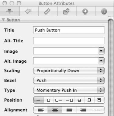
Nearly all types of buttons (with the exception of Disclosure Triangles, Disclosure Buttons, and Help Buttons) let you display a title inside the button. This title typically displays the name of the command that the button represents such as Save, OK, or Options.
There are two ways to create a title on a button. First, you can double-click the button directly and, when the button's title appears highlighted, type any text that you want to appear on the button.
A second way is to open the Attributes window, which not only lets you type text into the Title field to display text on a button but also lets you align text on a button as left-justified, centered, justified, or right-justified, as shown in Figure 15-4.
The Alternate field is used to define text that appears on a button that toggles between displaying the Title field text and the Alternate field text. Any text in the Alternate field appears only if the button's Type is set to Toggle.
The toggle feature can replace two separate buttons with a single button. For example, you might have one button that displays Go and a second button that displays Stop. Rather than clutter your user interface with two buttons, you could have one button that initially displays Go, and after the user clicks it, the button changes its text to display Stop. Of course, you'd have to write additional Objective-C code to make the button behave differently when displaying different text, but toggling lets you eliminate the need for two separate buttons.
To see how to display alternate text on a button, follow these steps:
Open the MyTest program you created in the previous chapter.
Double-click
MainMenu.xibfile inside the Resources folder to switch to Interface Builder.Click the Window icon in Interface Builder window. Your user interface appears.
Click the button that appears on the user interface. (If a button does not appear, drag and drop a Push Button object on the window.)
Choose Tools
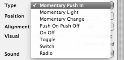
Click the Type pop-up menu, and choose Toggle, as shown in Figure 15-5.
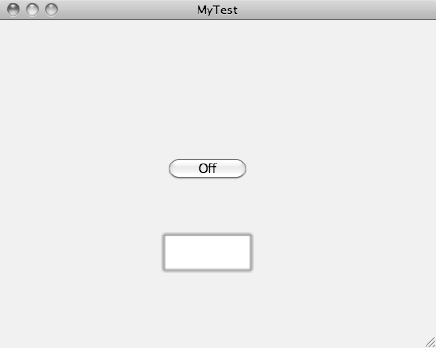
Click in the Title field, and replace the current text with new text such as On.
Click in the Alternate field, and type new text such as Off.
Choose File
Switch to Xcode; click the Build and Run button, or choose Build
Click the On button on your user interface. Notice that it now toggles to display Off, as shown in Figure 15-6.
Click the Off button. Notice that it now reads On.
Quit the program by choosing MyTest
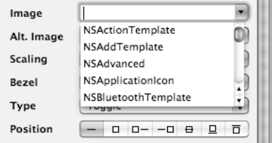
Besides displaying a title, most buttons can also display a graphic image that appears next to a button's title or replaces it altogether. To add a graphic image, you need to use the Image, Alternate, Position, and Scaling options in the Attributes Inspector, as shown in Figure 15-7.
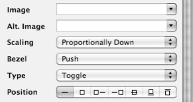
Figure 15-7. The Image, Alt. Image, Position, and Scaling options for displaying graphic images on a button.
The Image and Alternate pop-up menus let you choose from various icons commonly found in Mac programs. Any images defined by the Alt Image pop-up menu appear only if you have also set the button's Type option to Toggle.
Turning on this toggle feature would let a button display an initial image, and then after the user selects that button, a new image appears on that button. For example, a button might display a green traffic light, and then when the user clicks it, the image changes to a red traffic light, allowing the button to visually represent a toggled state, such as allowing or blocking something.
The Position options let you define how your graphic image should appear on the button next to any existing title. The Scaling pop-up menu lets you define how the graphic image should appear if the button gets resized.
To see how to add graphic images to a button, follow these steps:
Open the MyTest program you created in the previous section, and double-click
MainMenu.xibfile inside the Resources folder to switch to Interface Builder.Click the Window icon in Interface Builder window. Your user interface appears.
Click the button on your user interface, and then choose Tools
Make sure that Toggle appears in the Type option (see Figure 15-5).
Click the Image pop-up menu, and choose any option. Graphic images appear as class names such as
NSUserorNSColorPanel, as shown in Figure 15-8.Click the Alt. Image pop-up menu, and choose any option, preferably a different option than the one you chose in step 5.
Click an icon in the Position group (see Figure 15-8). The straight line represents your button's title, and the square represents your button's graphic image.
Choose File
Switch to Xcode; click the Build and Run button, or choose Build
Click the button. Notice that the button now displays a different graphic image, defined by the Alt. Image pop-up menu.
Quit the program by clicking the Stop button or choosing Product
Note
To delete an option displayed in the Image or Alt. Image options, just highlight the currently displayed option and press the Delete or Backspace key.
In most cases, you'll just need to create a button on a user interface, change its title, and be done. Occasionally, you may want to modify the appearance of a button to hide (or display) a border, as shown in Figure 15-9.
To hide (or display) a button's border, you just need to select (or clear) the Bordered check box in the button's Attributes Inspector, as shown in Figure 15-10. By default, the Bordered check box is selected to display a border around a button since the border helps identify the button's boundaries so the user knows where to click.
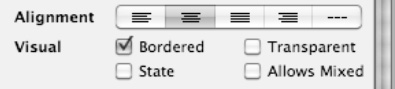
Figure 15-10. Clearing or selecting the Bordered or Transparent check box can hide (or display) the button border or the entire button.
One curious option is the ability to make a button transparent, which essentially makes it invisible. By making a button transparent or just removing its border, you could overlap a button on another object, such as placing a borderless or transparent button over different parts of a map. Now instead of seeing the button, users would see the map and be able to click an object that really has a button overlaid on top of that object.
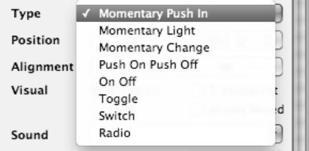
Another way to customize the behavior and appearance of a button is to modify its Type, which defines how the button behaves when the user clicks it. Normally when the user clicks a button, that button appears highlighted momentarily until the user releases the mouse button. However, a button can also remain highlighted even after the user releases the mouse button or moves the mouse away from the button.
The default behavior is called Momentary Push In, which is where the button appears highlighted as long as the user holds the mouse button down while pointing at the button. To change a button's behavior, click in the Type pop-up menu, and choose a different option, as shown in Figure 15-11.
Buttons are one of the simplest user interface objects available since most users know that they can click a button to choose that particular command. However, you can make your buttons even easier to use by adding tooltips, sound, or keystrokes that allow users to choose a button by pressing the keyboard rather than using the mouse.
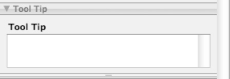
Tooltips are short, descriptive text that appears if the user leaves the mouse pointer over a button for a few seconds. The tooltip text appears next to the button, displaying a short description of the button's purpose, as shown in Figure 15-12.
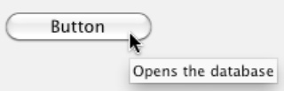
To create a tooltip, click a button, and then choose Tools
Normally when users click a button, the only feedback the user gets is the visual change in the button's appearance. To give the user audible feedback when the user has clicked a button, you can add simple sounds.
To add a sound to a button, click the button, choose Tools
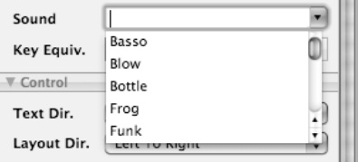
After you choose a sound, that sound will play every time the user clicks that button. To remove a sound, select the currently displayed sound effect in the Sound pop-up menu, and press the Backspace or Delete key.
Normally you can select a buttononly by clicking it with the mouse. In case you want to give users an alternative way of selecting a button, you can assign keystroke combinations to that button, such as
To assign a keystroke combination to a button, click the button, and choose Tools
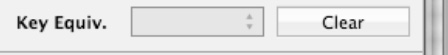
Keystroke combinations typically consist of a modifier key followed by another key such as a letter key or a function key such as F8. The four common types of modifier keys are as follows:


^ (Control)
When you create a button using Interface Builder, you can make that button look as pretty as you like, but whether you add graphics or change the size of the button, it won't do anything until you connect that button to a method written in Objective-C.
Methods that respond to user interface objects are called IBAction methods (Interface Builder Action). To connect a button to an Objective-C method, you must write the method in a class file (in both the header and implementation files) and then connect the button to that method.
Note
You can identify methods that respond to the user interface because they include the word IBAction as their data type such as –(IBAction) methodName.
An IBAction method in the header (.h) file looks like this:
-(IBAction)methodName : (id) sender;
The method name is any descriptive name. The (id) sender portion of the method name identifies which user interface object is calling that IBAction method to run since it's possible to have two or more user interface objects connected to the same IBAction method.
To see how to create and connect an IBAction method to a button, follow these steps:
Open the MyTest program you created in the previous section. The
MainMenu.xibuser interface file should already have a button on the user interface window. If not, then add a button to the user interface window.Click in the
MyTestAppDelegate.hfile stored in the Classes folder, and add the bold code as follows:#import <Cocoa/Cocoa.h> @interface MyTestAppDelegate : NSObject <NSApplicationDelegate> { NSWindow *window; } @property (retain) IBOutlet NSWindow *window;-(IBAction)testMessage:(id)sender;@endChoose File
Click in the
MyTestAppDelegate.mfile stored in the Classes folder, and add the bold code as follows:#import "MyTestAppDelegate.h" @implementation MyTestAppDelegate
@synthesize window; - (void)applicationDidFinishLaunching:(NSNotification *)aNotification { // Insert code here to initialize your application } - (void)dealloc { [window release]; [super dealloc]; }-(IBAction)testMessage:(id)sender{NSLog (@"The button works!");}@endChoose File
Double-click the
MainMenu.xibfile in the Resources folder to open Interface Builder.Click the Window icon that appears in the Interface Builder window. The user interface's window appears, displaying the button you created earlier.
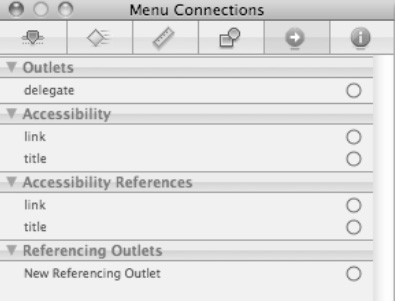
Choose one of the following three methods to connect your
IBActionmethod to your button:Click the button, and choose Tools
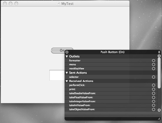
Right-click the button to display a heads-up window, as shown in Figure 15-17. Note that this heads-up window is identical to the Connections Inspector in Figure 15-16.
Move the mouse over the button, hold down the Control key, and drag the mouse over the App Delegate icon to display a heads-up display.
Move the mouse pointer over the circle that appears to the right of selector, which appears under the Sent Actions heading.
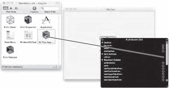
Drag the mouse from the selector circle over the icon that represents the Test App Delegate, as shown in Figure 15-18.
Release the mouse button while keeping the mouse pointing over the Test App Delegate icon. A pop-up menu of all available
IBActionmethods appears. In this case, the onlyIBActionmethod available is calledtestMessage.Click
testMessageinside this pop-up menu. You've now connected your button to anIBActionmethod.Choose File
Switch to Xcode; click the Build and Run button, or choose Build
Click the button on your user interface. You won't see anything since the button runs the
testMessageIBActionmethod, which uses theNSLogcommand to print a message to the log window.Quit the program by choosing MyTest
Choose Run
2010-09-16 18:35:46.668 UITest[15098:a0f] The button works!
In step 8, you dragged from the push button to the App Delegate icon that contains your IBAction method. You can also go in reverse and drag from the App Delegate icon (or any icon that represents a class file) and connect it to a button on the user interface. To use this method, follow these steps:
Within Interface Builder, right-click the icon that represents the class file that contains the
IBActionmethod you want to connect to a user interface object. A heads-up window appears, listing all the availableIBActionmethods under the Received Actions category, as shown in Figure 15-19.Move the mouse pointer over the circle that appears to the right of the
IBActionmethod you want to use (which istestMessagein Figure 15-18), and drag the mouse over the button that you want to connect to yourIBActionmethod.Release the mouse button when the mouse pointer appears over the button that you want to connect to the
IBActionmethod. Your button is now connected to yourIBActionmethod.
A button can link to only one IBAction method at a time, although multiple buttons can link to the same IBAction method. If you want to link a button to a different IBAction method, you can connect it to a different IBAction method, which breaks the link to any previously connected IBAction method.
To break a link to an IBAction method, you have three options:
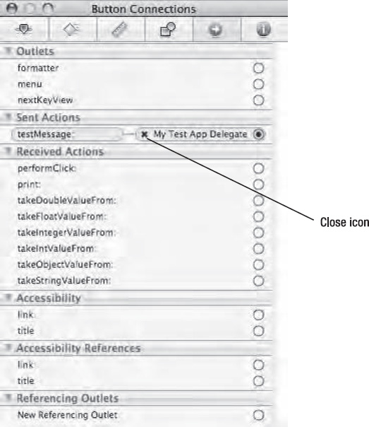
Click the button, and choose Tools Connections Inspector. Then click the close icon that appears to the left of the currently connected user interface object, as shown in Figure 15-20.
Right-click the button to display a heads-up version of the Connections Inspector. Then click the close icon that appears to the left of the currently connected user interface object.
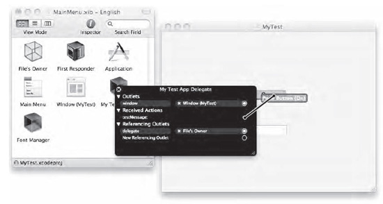
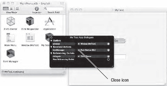
Right-click the class file icon (such as App Delegate) that contains the
IBActionmethod that you want to disconnect. This displays a heads-up window where you can click the close icon that appears to the left of the user interface object under the Received Actions category, as shown in Figure 15-21.
The most common type of button found in Mac programs is the Push Button, but there are a variety of other types of buttons that you can choose that look differently but act the same by displaying a command directly on the button.
Although buttons represent the simplest way to display commands on the user interface, there are many ways to customize a button beyond its size, position, and title text. You can also display graphic images on a button.
If you choose the Toggle option for a button's Type, you can make the button display different title text and graphic images each time the user clicks that button. To make buttons easier for users, you can also add tooltips to display brief, descriptive information about a button when the user moves the mouse pointer over that button.
To provide auditory feedback, you can add sounds that play every time the user clicks a button. In case you want to give users the option of selecting a button without using the mouse, you can assign keystroke combinations to choose a button without clicking it.
No matter how you customize the appearance of a button, you'll eventually need to connect it to a special method called an IBAction method. After you write an IBAction method in Objective-C and store it in a class file, you'll need to connect your IBAction method code to the actual button on your user interface. If you make a mistake or change your mind, you can always break a connection between a button and an IBAction method.
Buttons represent one of the more common ways for users to control a program. Use buttons sparingly because too many buttons on a user interface tends to clutter the screen and overwhelm the user with too many choices. Buttons may be simple, but there are so many choices that you can modify a button to make it unique to your particular Mac program.