
Before the sibling inventions of WPF and Silverlight, individual programming languages and platforms had a variety of ways of specifying the user interface (UI). Most of them touted the concept of separating the UI from the implementation code. In some cases, such as on the web with HTML and CSS, the representation of the UI was theoretically separated from its underlying implementation but not truly so until tried and true patterns, such as Model-View-Controller (MVC), were applied. In others, such as Windows Forms, the separation was due only to hidden autogenerated, uneditable files that contained the language-specific code necessary to create the UI.
With WPF, Microsoft introduced XAML to provide a cleaner separation of concerns between the definition of the user interface and the code that makes it work. This not only allows for some sleek design patterns such as the MVVM or ViewModel pattern (discussed in chapter 16 and here referred to simply as the ViewModel pattern) but also makes it easier to create tooling.
Consider Windows Forms for a moment. The definition of the interface was so tied to the compiler and the existing tooling that it was extremely difficult for a third party to create a tool that designed (or assisted in the design) of the UI. The files were hidden, made in multiple implementation languages, and had that "don't even think of editing this file" comment at the top of the generated code. It was good at the time but the world has moved on.
XAML helps fix those problems—it lets you, not the tools, own your UI. XAML files are editable individually and in relative isolation from the rest of the project. You can edit XAML in Expression Blend, Visual Studio, Notepad, Kaxaml, and other tools listed at the end of this chapter, thereby making it easier to incorporate into your own specific workflow. Even hand-edited XAML is round-trippable with tooling because the XAML rules are well-defined and consistent internally and across implementation languages.
XAML is so fundamental to Silverlight that this entire chapter is devoted to introducing you to it. Though XAML appears in just about every chapter in this book, we'll cover the core concepts here and ensure sufficient understanding so that, when you open an XAML file in Visual Studio or Notepad, you can read and understand what it's doing, even as you're still learning Silverlight. For those of you interested in the guts of XAML processing and use, I've included information on using tree structures, creating your own converters, and working with the property system.
XAML is a declarative language that enables you to create and initialize .NET objects in XML. Everything you can do in XAML you can do in code. But to make the most of the platform and its tooling, you'll want to embrace the code-plus-markup philosophy rather than go with a 100 percent code solution.
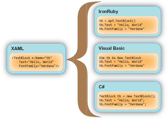
The XAML format enables you to easily visualize a hierarchy of elements while separating presentation from code. This separation is possible because each XAML element maps to a .NET type. Each attribute within an element corresponds to a property within a .NET type. This concept is illustrated in figure 2.1.
Figure 2.1 shows three code equivalents of an XAML segment. Note that the TextBlock element in the XAML code corresponds to an initialization statement within the code segments. This initialization occurs because, each time an element is created in XAML, the corresponding .NET type's default constructor is called behind the scenes.
To understand the structure of an XAML file, it's important to understand the representation and use of objects, namespaces, properties, and events.
Objects (or instances of types) are represented in XAML using XML elements. The elements have the same name as the associated class and are considered instantiated upon declaration in the markup.
Note
Any type you use in XAML must have a default (parameterless) constructor. Silverlight XAML currently has no provision for passing arguments into a constructor or an initialization function, so you'll need to make sure your types can be initialized using defaults and properties alone.
Certain types of objects may contain one or more of other nested objects. For example, a button may contain a single content object, which itself may contain one or more other objects. In listing 2.1, the UserControl contains the Grid, the Grid contains the Button, and the Button contains a StackPanel, which is a panel that by default lays its children out in a vertical list. The StackPanel itself contains three TextBlock elements.
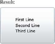
The UserControl and Button are both content controls, a concept we'll discuss in greater detail in chapter 10. For now, it's important to understand that a content control may only have one direct child element, typically a panel that holds other elements. The x:Name and x:Class properties are part of the namespace specified by the xmlns:x statement. More on that in a moment... The Grid and StackPanel are both Panels, which is a type that has a Children collection to allow multiple contained elements. We'll discuss panels in chapter 7.
The ability to flexibly nest objects permits a composition approach to UI design. Rather than having to purchase or custom-code a button control that allows, say, three lines of text and an image, you can simply compose those into an appropriate layout panel and make that panel the content of the button control.
The nesting of objects is part of what gives us an object tree. We'll cover that in more detail shortly.
Now that we've covered the basic structure of an XAML file, let's talk about how you differentiate your SuperButton control from my SuperButton control, even though we used the same control name: namespaces.
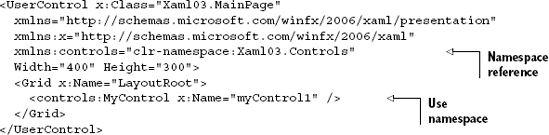
A namespace provides a way of organizing related objects within a common grouping. These groupings, or namespaces, give you a way to define where the compiler should look for a type. Namespaces in XAML are similar to namespaces in other languages such as C# and Java. To specify where to look, you reference a namespace within an element of an XAML file, typically the root or outermost element. Listing 2.2 illustrates the use of the two default namespaces.
Example 2.2. A basic XAML file referencing the two default namespaces
<UserControl x:Class="Xaml01.MainPage"
  xmlns="http://schemas.microsoft.com/winfx/2006/xaml/presentation"
  xmlns:x="http://schemas.microsoft.com/winfx/2006/xaml"
  Width="400" Height="300">
  <Grid x:Name="LayoutRoot" Background="White">
    <TextBlock x:Name="myTextBlock" Text="Hello" />
  </Grid>
</UserControl>
Note
WPF supports the Name property in both the namespace prefixed with x: and the default namespace, allowing them to be specified as x:Name or just Name. Silverlight supports only x:Name. For compatibility with Silverlight markup, the recommended approach for WPF is to use x:Name.
As listing 2.2 illustrates, you're permitted to reference multiple namespaces within a single XAML file. When you reference multiple namespaces, each namespace must be uniquely prefixed. For instance, the x prefix in this example is used in association with the http://schemas.microsoft.com/winfx/2006/xaml namespace. At the same time, the http://schemas.microsoft.com/winfx/2006/xaml/presentation namespace doesn't use a prefix.
The two namespaces we just mentioned will be used in almost every Silverlight application you work with or see. These namespaces are generally defined in the following manner:
xmlns="http://schemas.microsoft.com/winfx/2006/xaml/presentation"— This is the default Silverlight namespace. It provides your applications with core Silverlight elements. For that reason, this namespace generally omits a prefix, making it the default namespace within the page. Such approach enables you to reference elements within this specific namespace without having to include the prefix.xmlns:x="http://schemas.microsoft.com/winfx/2006/xaml"—This is the common XAML namespace. It provides functionality that's common across XAML. It's important to remember that XAML is used by other technologies such as WPF, Oslo, and Windows Workflow Foundation (WF), all of which need access to common features such asName, Key, andClassproperties.
Note
In addition to the standard namespaces, the Silverlight runtime supports the Silverlight-specific http://schemas.microsoft.com/client/2007 namespace as a default namespace. But, you should use the previously mentioned http://schemas.microsoft.com/winfx/2006/xaml/presentation namespace as the default because Expression Blend, Visual Studio, and other tools are all configured to recognize that namespace. The use of standard namespaces also makes it easier to share your markup with WPF applications.
When another assembly is referenced, it gets copied into the configuration-specific Bin folder of your Silverlight application. In fact, when you compile your Silverlight application, it gets compiled into an assembly that's placed in this directory. We'll discuss the application model later; for now, in order to reference these assemblies, you need to define a new XAML namespace, which includes a prefix, CLR namespace, and assembly. Listing 2.3 illustrates this concept.
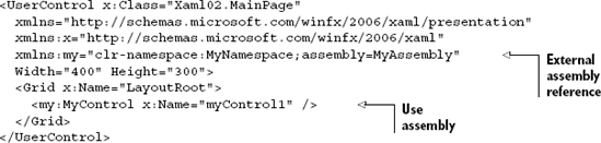
As listing 2.3 illustrates, referencing other elements, including custom elements, only requires you to provide the namespace and assembly name of the external element. Of course, you'll still need to reference the external assembly so that its types are accessible to code and to the XAML parser/compiler. The name my was used as a convenience here; you can use any identifier that makes sense to you.
If the referenced type is defined in the same assembly as the markup, you'll still need to create an XAML namespace reference for it. But the ;assembly= clause of the namespace definition may optionally be left out, as illustrated in listing 2.4.
Namespaces are typically declared within the outermost element of an XAML file, as in listing 2.4, but that doesn't always need to be the case. When using XAML generated by tools, you'll sometimes find namespaces defined at lower levels, particularly within control templates (covered in chapter 23). In those cases, the namespace only applies to the elements within the enclosing type (and the enclosing element itself) rather than to the XAML document as a whole.
Listing 2.5 shows the definition of a namespace at the Grid level rather than at the UserControl level. The namespace could also have been defined at the MyControl level, but then we'd need to do it for each instance of MyControl. This approach is sometimes taken when using control templates and other situations where you want to minimize possible namespace prefix collisions, while still preserving the ability to reference external code.
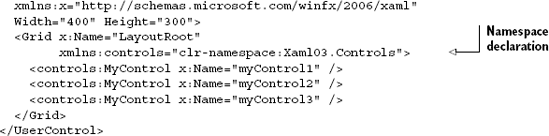
The namespace shown in listing 2.5 will only apply to the grid LayoutRoot and its children. Controls outside of that hierarchy won't have access to the controls namespace or prefix. You'll typically find this inside complex styles in resource dictionaries. The same approaches to referencing namespaces and assemblies apply to resource dictionaries, pages, and other types commonly associated with XAML. Though it's important to understand the rules for referencing namespaces, in practice, the tooling will create the namespaces for you either by IntelliSense or when you drag and drop items into the markup editor or onto the design surface.
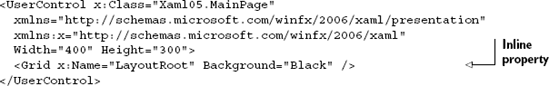
There are two ways to reference properties in XAML: in line with the element as you would any XML attribute and as a nested subelement. Which you should choose depends on what you need to represent. Simple values are typically represented with inline properties, whereas complex values are typically represented with element properties.
The use of an inline property requires a type converter that will convert the string representation— for example, the "Black" in Background="Black"—into a correct underlying .NET type (in this case, a SolidColorBrush). We'll cover type converters later in this chapter. The example in listing 2.6 shows a built-in type converter in use to convert the string "Black" for the inline property Background.
Another way to specify properties is to use the expanded property element syntax. While this can generally be used for any property, it's typically required only when you need to specify something more complex than the inline syntax will easily allow. The syntax for element properties is <Type.PropertyName>value</Type.PropertyName>, as seen in listing 2.7.
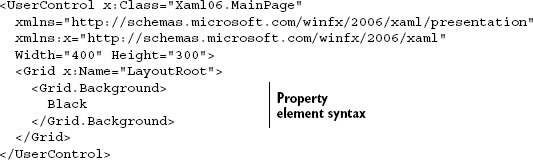
The use of the string to invoke the type converter is, in its end result, identical to using <SolidColorBrush Color="Black" /> in place of "Black". Though these examples are rarely seen in practice, the more complex example of setting the background to a LinearGradientBrush is common, so we'll cover that next.
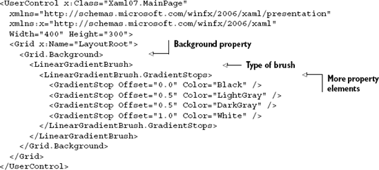
Rather than have the value represented as a simple string such as "Black", the value can be an element containing a complex set of elements and properties such as the <LinearGradientBrush> seen in listing 2.8.
Now that we know how to specify properties in markup, let's dive deeper into how those properties work.
Dependency properties are part of the property system introduced with WPF and used in Silverlight. In markup and in consuming code, they're indistinguishable from standard .NET CLR properties, except that they can be data bound, serve as the target of an animation, or set by a style.
Tip
A property can't be the target of an animation or obtain its value through binding unless it's a dependency property. We'll cover binding in detail in chapter 11.
To have dependency properties in a class, the class must derive from DependencyObject or one of its subclasses. Typically, you'll do this only for visuals and other elements that you'll use within XAML and not in classes defined outside of the user interface.
In regular .NET code, when you create a property, you typically back it by a private field in the containing class. Storing a dependency property differs in that the location of its backing value depends upon its current state. The way that location is determined is called value precedence.
Dependency properties obtain their value from a variety of inputs. What follows is the order the Silverlight property system uses when assigning the runtime values of dependency properties, with the highest precedence listed first:
Active or hold animations—Animations will operate on the base value for the dependency property, determined by evaluating the precedence for other inputs. In order for an animation to have any effect, it must be highest in precedence. Animations may operate on a single dependency property from multiple levels of precedence (for example, an animation defined in the control template and an animation defined locally). The value typically results from the composite of all animations, depending on the type being animated.
Local value—Local values are specified directly in the markup and are accessed via the CLR property wrappers for the dependency property. Because local values are higher in precedence than styles and templates, they're capable of overriding values such as the font style or foreground color defined in the default style for a control.
Templated properties—Used specifically for elements created within a control or data template, their value is taken from the template itself.
Style setters—These are values set in a style in your application via resources defined in or merged into the
UserControlor application resource dictionaries. We'll explore styles in chapter 23.Default value—This is the value provided or assigned when the dependency property was first created. If no default value was provided, normal CLR defaults typically apply.
The strict precedence rules allow you to depend on behaviors within Silverlight, such as being able to override elements of a style by setting them as local values from within the element itself. In listing 2.9, the foreground of the button will be red as set in the local value and not black as set in the style. The local value has a higher precedence than the applied style.
Example 2.9. Dependency property precedence rules in practice
<UserControl x:Class="Xaml08.MainPage"
  xmlns="http://schemas.microsoft.com/winfx/2006/xaml/presentation"
  xmlns:x="http://schemas.microsoft.com/winfx/2006/xaml"
  Width="400" Height="300">
  <UserControl.Resources>
    <Style x:Key="ButtonStyle" TargetType="Button">
      <Setter Property="Foreground" Value="Black" />
      <Setter Property="FontSize" Value="24" />
    </Style>
  </UserControl.Resources>
  <Grid x:Name="LayoutRoot">
    <Button Content="Local Values at Work"
            Style="{StaticResource ButtonStyle}"
            Foreground="Red" />
  </Grid>
</UserControl>
The Style tag in UserControl.Resources is a reusable asset that sets some key properties for our button.
We'll cover creating dependency properties in chapter 24 when we create our own controls. For the purposes of this chapter, it's sufficient to understand that the majority of the properties you'll refer to in XAML are dependency properties. One type of dependency property that has a slightly odd appearance is an attached property.
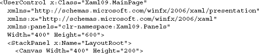
Attached properties are a specialized type of dependency property that is immediately recognizable in markup due to the TypeName.AttachedPropertyName syntax. For example, Canvas.Left is an attached property defined by the Canvas type. What makes attached properties interesting is that they're not defined by the type you use them with; instead, they're defined by another type in a potentially different class hierarchy.
Attached properties allow flexibility when defining classes because the classes don't need to take into account every possible scenario in which they'll be used and define properties for those scenarios. Layout is a great example of this. The flexibility of the Silverlight layout system allows you to create new panels that may never have been implemented in other technologies—for example, a panel that lays elements out by degrees and levels in a circular or radial fashion versus something like the built-in Canvas that lays elements out by Left and Top positions.
Rather than have all elements define Left, Top, Level, and Degrees properties (as well as GridRow and GridColumn properties for grids), we can use attached properties. The buttons in listing 2.10, for example, are contained in panels that have greatly differing layout algorithms, requiring different positioning information. In this case, we'll show a fictional RadialPanel in use.
Attached properties aren't limited to layout. You'll find them in the animation engine for things such as Storyboard.TargetProperty as well as in other places of the framework.
Before we wrap up our discussion of properties, there's one concept left to understand: property paths. Property paths provide a way to reference properties of objects in XAML both when you have a name for an element and when you need to indirectly refer to an element by its position in the tree.
Property paths can take several forms, and may dot-down into properties of an object. They can also use parentheticals for indirect property targeting as well as for specifying attached properties. Here are some examples of property paths for the Storyboard target property:
<DoubleAnimation Storyboard.TargetName="MyButton"
                 Storyboard.TargetProperty="(Canvas.Left)" ... />

<DoubleAnimation Storyboard.TargetName="MyButton"
                 Storyboard.TargetProperty="Width" ... />
...
<Button x:Name="MyButton"
        Canvas.Top="50" Canvas.Left="100" />
We'll cover property paths in detail in chapter 11 when we discuss binding.
Properties are one of the pieces that define an object's interface. Because XAML doesn't allow us to do anything specifically with methods, the only other part of the interface left is the definition of events.
Events in Silverlight are used much like events in any other .NET technology. The sender of the event wants to notify zero or more receivers of something that happened. Silverlight enhances that, though, in that it may want events to work their way up the object tree, from the event source to the root element.
Silverlight and WPF introduce the concepts of routed events and event bubbling. These allow events to be generated at one level of the tree, and then provide an opportunity to be handled by each level above, until reaching the root of the tree—an effect known as bubbling.
The main difference between routed events and standard CLR events, to the handler of the event, is that the event sender isn't necessarily the original source of the event. In order to get the original source of the event, you need to check the OriginalSource property of the RoutedEventArgs supplied to the handler.
User-created events, such as the ones you might create in your own code, can't bubble. Instead, bubbling is reserved only for built-in core events such as MouseLeftButtonDown. Bubbled events include a Handled property in the event arguments, as well as the standard RoutedEventArgs information.
In XAML, referencing an event handler defined in code-behind is simple. In fact, if you use Visual Studio when doing so, the event handler in the code-behind can be created for you automatically.
For example, if we have a button in XAML:
<Button Click="MyButton_Click" />
We can wire it up to an appropriate event handler in the code-behind:
private void MyButton_Click(object sender, RoutedEventArgs e)
{
  MessageBox.Show("Click event");
}
The approach is a good shortcut for hooking up events. When working in XAML, the tooling in Visual Studio will even let you define a new event handler or use an existing one. One slight advantage of this approach is that you don't necessarily need to define a name for your button.
To attach an event handler from code, you follow the same approach you would for any normal CLR event: create a new event handler and add it to the event using the += syntax. So, if we have the same button as earlier and give it a name that can be referenced from the code-behind:
<Button x:Name="MyButton" />
We can then wire up the event handler in the constructor. Do this after the InitializeComponent call so that MyButton is valid:
public MainPage()
{
    InitializeComponent();

    MyButton.Click += new RoutedEventHandler(MyButton_Click);

}
private void MyButton_Click(object sender, RoutedEventArgs e)
{
  MessageBox.Show("Click event");
}
Both approaches are equally valid. The approach you use will depend primarily on your personal style. My preferred approach when not using commands is to wire up events in the code-behind, in the constructor as shown.
Silverlight 4 added the ability to use commands as a way to clean up event handling and wire-up code. Rather than specify an event handler, you can specify one or more command properties in XAML.
One of the more architecturally significant additions to Silverlight 4 was the addition of WPF-style commands. Commands allow you to remove the event handler middleman from your code-behind when you want something other than the code-behind to handle the action. For example, if you follow the ViewModel pattern, you probably want the button clicks to be handled by the view model and not the code-behind. Typical event handler code to forward the event might look like this:
private void Save_Click(object sender, RoutedEventArgs e)
{
  _viewModel.Save();
}
That's extra goo that you don't necessarily want in your view. It complicates unit testing and makes the code-behind an essential ingredient. It also requires separate view-model properties to set the IsEnabled property on the Save button. It's not terrible, but it's not great. The command code that eliminates the code-behind goo might look like this:
// no code in code-behind required :)
I love the code I don't have to write. It's all handled in the markup and the view model, so you don't need any forwarding code at all. The controls in the view bind to a command that exists somewhere in the binding path. Assuming you have the page's data context set to the view model, the markup to bind to the exposed view-model command looks like this:
<Button x:Name="SaveButton"
        Height="25"
Width="75"
Content="Save"
Command="{Binding SaveCommand}" />The related bits of the view model might look something like this, assuming you've implemented an EmployeeSaveCommand that implements ICommand:
private EmployeeSaveCommand _saveCommand;
public ICommand SaveCommand
{
    get { return _saveCommand; }
}
In this way, you avoid having your code-behind stand in the way of separating your view from your view model. Commands also provide other capabilities such as automatically disabling the associated controls if the command can't be run at that time via an implicit binding of the ICommand.CanExecute method with IsEnabled property of the Button.
Commands are supported on any control that inherits from ButtonBase as well as on the Hyperlink control (not to be confused with HyperlinkButton, which inherits from ButtonBase).
We'll create our own commands in chapter 16 when we discuss how to build applications using the ViewModel pattern. Another interesting bit of attached functionality you may see in the markup is a behavior.
Behaviors are bits of designer-friendly packaged interactivity introduced in Silverlight 3, originally tied to Expression Blend to make it easy to drag functionality directly onto the design surface and associate it with controls. Behaviors included capabilities such as physics, sound, automatic shadows, drag and drop, and even nonvisual behaviors such as one that's used to wire up the window-close events to a view model in WPF. The appeal was much broader than just Blend users, though, so the functionality was released for all Silverlight and WPF developers to enjoy.
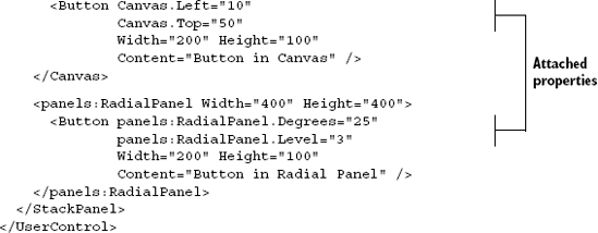
The SDK includes a number of default behaviors as well as a ton of community-created behaviors for both Silverlight and WPF on the Expression community site. Figure 2.2 shows the Behaviors section of the Assets panel in Expression Blend, listing the eight included behaviors.
Figure 2.2. The default behaviors in Expression Blend include items from utilitarian, to sound playing, to complex interactions such as mouse drag and drop. Additional behaviors may be found on the Microsoft Expression Community Gallery at http://gallery.expression.microsoft.com.
Behaviors typically don't require using any code because they're wired up using XAML. For example, listing 2.11 shows the markup required to use the MouseDragElementBehavior, one of the stock behaviors, with a Border element.
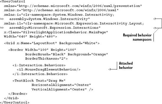
All of the code required to implement the dragging of the border is encapsulated within the behavior. Behaviors are a great way to package up common UI functionality that would augment other UI elements.
We'll discuss behaviors in more detail in chapter 22, where we'll also create our own custom behavior.
Objects, properties, events, commands, and behaviors make up the majority of what you'll see when you look at an XAML file. At this point, you should be able to read XAML and have a general understanding of what you're looking at. Another thing you may see in XAML is object and property names inside curly braces. We'll cover that later in this chapter, but first we'll go through what Silverlight sees when it looks at XAML source and builds out the in-memory representation of the elements.
In the previous sections, I mentioned the concept of an object tree. In order to understand the object tree, you need to understand the layout and contents of XAML files. Once you do, it's easier to conceptualize the object tree and its related concept, namescope.
A common misconception is that Silverlight creates XAML for any objects you create in code. In fact, the opposite is what happens: Silverlight creates objects from XAML. Objects you create in code go right into the trees as their native .NET object form. Elements in XAML are processed and turned into objects that go into the same tree.
Now that we've covered the structure of an XAML file, you can look at one and quickly realize it represents a hierarchical tree of objects starting from the root (typically a UserControl or Page) and going all the way down to the various shapes, panels, and other elements that make up the control templates in use. That hierarchical structure is known as an object tree. Figure 2.3 shows a hypothetical object tree.
Each element has the concept of a parent (the containing element) and may have a child or children in panel-type collection properties, content properties, or other general-purpose properties.
Note
Unlike WPF, Silverlight doesn't expose the concept of a logical tree. Operations that, in WPF, might return logical tree information will, in Silverlight, return visual tree information. This distinction is really only important if you're coming from the WPF world or porting code from WPF that happened to use tree traversal functions.
The visual tree is a filtered view of the object tree. While the object tree contains all types regardless of whether they participate in rendering (collections, for example), the visual tree contains only those objects with a visual representation. Figure 2.4 shows the visual tree; note the lack of nonvisual objects such as collections.
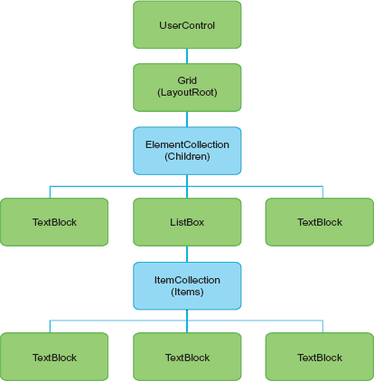
Figure 2.3. A hypothetical object tree showing not only the visual elements such as TextBlocks and ListBoxes, but also the internal collections used to
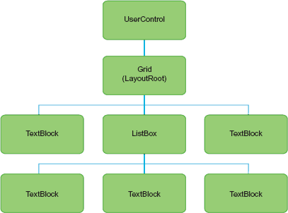
Figure 2.4. The visual tree representation of the object tree from figure 2.3. Note that only visual elements, not collections, are represented.
Silverlight includes the VisualTreeHelper static class to assist in examining the visual tree. Using the GetChild and GetChildrenCount methods, you can recursively walk the tree from any element down as deeply as you want. The GetParent method allows you to trace the tree from a given element up to the visual tree root, as seen in listing 2.12.
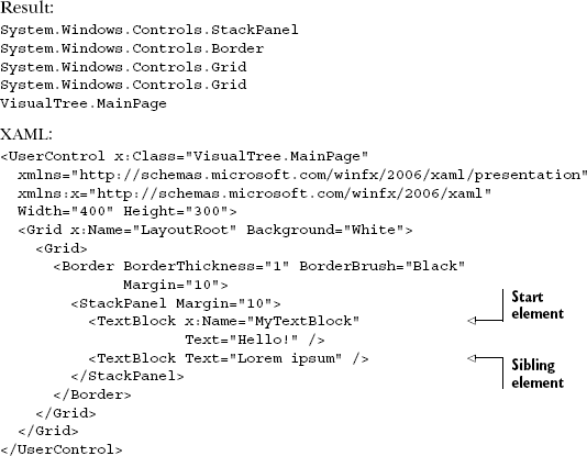
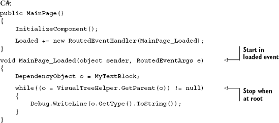
We start the tree walk in the Loaded event handler because the tree isn't valid until the UserControl has been loaded. We know the walk is complete when we hit an element with a null parent—the root of the tree.
You'll notice that, when you generate an object tree for an entire application, you'll have multiple instances of controls, each of which contains elements with the same name. Namescope, the next topic, is how Silverlight ensures that the names remain uniquely addressable across the breadth of the object tree.
Earlier in this chapter we saw that you can define an x:Name for elements in XAML. This provides a way to find the control via code and perform operations on it, or handle its events.
Consider for a moment the idea of having multiple controls on the same page, each of which contains named elements. To handle this situation, XAML introduces the concept of a namescope. A namescope simply ensures that the names across instances of controls don't collide. This is similar in concept to the approach taken by ASP.NET to mangle control names to ensure they remain unique. Listing 2.13 shows an example where namescope is required to prevent duplicate control names.
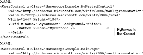
With three instances of the user control in listing 2.13, how does the XAML parser prevent naming collisions between all the MyButtons in the object tree but still allow you to uniquely reference each one? Namescope. As you'd expect, using the same name twice within the same XAML namescope will result in a parsing error. This is similar to the compile-time error you'd receive if you gave two variables the same name within the same scope level in a C# application.
Note
Silverlight 2 had a namescope bug that manifested itself when you named an element inside a tooltip (or pop up) attached to items in an ItemsControl such as a ListBox. The resulting error indicated that there were duplicate names in the object tree. This was fixed in Silverlight 3.
In practice, you typically don't need to worry about namescopes unless you're loading and parsing XAML at runtime using the createFromXaml JavaScript API or XamlReader.Load managed API. The namescopes are created for you automatically at runtime when you instantiate your controls.
Now that we understand namescope, let's go back to one of the other things you'll run into in XAML: the curly brace syntax for markup extensions.
Now that we know the structure and rules for XAML files, let's look at a something that allows us to bend those rules a little: extensions.
XAML allows you to represent almost anything using the object element and property attribute syntaxes. But some things can get cumbersome to do that way. For that reason, XAML includes the concept of extensions in the form of markup extensions and type converters. Silverlight also includes the concept of a value converter but, because that's used almost exclusively with binding, we'll cover it in chapter 11.
You'll want to internalize both concepts to understand what's happening when XAML is parsed or what those curly braces mean. Though you can't currently create your own markup extensions, type converters will give you a powerful way to extend XAML using your own code. We'll start with markup extensions and then move into using existing type converters and, later, creating our own type converters.
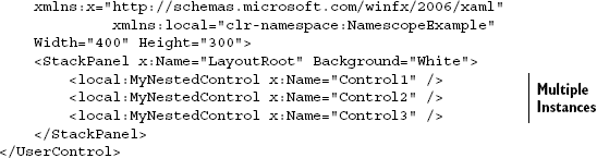
When viewing XAML of any complexity, you're going to come across things such as Style="{StaticResource MyStyle}" or Text="{Binding LastName}". The curly braces indicate that you're looking at a markup extension. Markup extensions are code that can provide a value to a dependency property. In the case of the Style example, the markup extension provides a full style object to the Style property.
You can't create new markup extensions but you can use the built-in set, which currently consists of StaticResource, Binding, and TemplateBinding. Listing 2.14 illustrates the use of StaticResource and Binding.
In the case of the Text example in listing 2.14, the markup extension is providing a value from the data binding engine. We'll cover data binding in chapter 11.
Markup extensions are a great way to get some additional functionality out of XAML, without needing to use a verbose object syntax. One downside is that you can't create them yourself. The two extensions you can create yourself are type converters and value converters.
Type converters are used throughout the .NET framework to handle translation of one CLR type to another. Specifically in the context of XAML, type converters are used to convert string representations such as "Black" into their equivalent .NET CLR objects. In the case of the example in listing 2.14, a SolidColorBrush with Color set to Black is converted to a string that resolves to the color Red=0, Green=0, Blue=0, Alpha=255. This is shown in listing 2.15.
There are enough built-in type converters that you may never have to write a new one yourself. But they're an extensibility point in XAML and, therefore, provide you with flexibility to do some things that XAML may not handle natively.
First, since you need to decorate your type with a type converter attribute, you'll need access to the source. If you don't have access to the type source and can specify the converter just for a single property of your own class, that'll work too. The difference is that a converter specified at the property level will only work for that one property in that one class and not in all instances of that type in all properties and in all classes.
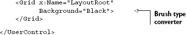
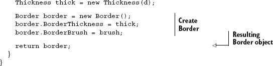
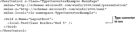
Next, you'll need to decide on a string format. The options are wide open, with the exception that you can't use the curly braces {} because they initialize the processing of markup extensions (discussed earlier in this chapter). Listing 2.16 shows a sample type converter that converts a string into a Border object. The format for the border is <color> <thickness>, where color is a named color or an eight-digit hex color and thickness is a number greater than or equal to zero.
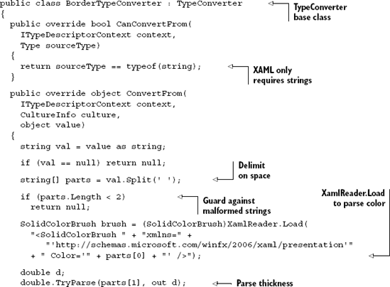
Note that this example, in order to be production ready, would require additional guard conditions and the ability to delimit on commas as well as spaces.
To create a custom type converter, you must first inherit from the TypeConverter base class. For the type converter to be used in XAML, you only need to support converting from the string type. More general-purpose converters will support additional types.
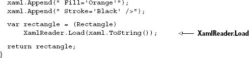
Note the hack I use to get the color information—it allows us to use any color representation that the XAML parser can parse. XamlReader.Load is a nifty function that has lots of uses, not only for its intended purpose of creating branches of the object tree at runtime but also for simply invoking the parser as we did here. Some things in Silverlight are simply easier to parse in XAML than they are in code—color is one of them.
Note
The Silverlight color enumeration understands only a few of the many named colors, and the Silverlight Color class has no parse method to get the remaining colors or the hex representation. Using the XAML parser via XamlReader.Load() in listing 2.16, you reduce hundreds of lines of parsing code down to a single line. We'll cover more on the XamlReader class in the next section.
Listing 2.17 illustrates a simple example of our custom type converter. Note that this example also shows how to declare a dependency property—something we'll cover in more detail in chapter 24.
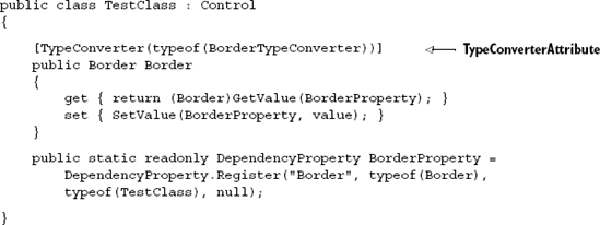
The TypeConverterAttribute that specifies the type converter to use for this specific property in this class is shown in listing 2.17. The attribute is applied to the public property because that's what's used by XAML. The converter is declared on the single property so it'll apply only there and not to all instances of the Border type. It's also important to note that the border isn't actually used for anything other than illustrating how to use a type converter.
Finally, listing 2.18 shows the type converter implicitly in use in XAML.
Because we used the XamlReader.Load method, we could easily use any valid color string such as "LemonCream" or "#C830019F". Bonus points if you caught the Star Wars reference in listing 2.18.
Type converters are a great way to extend the flexibility of XAML to include types you create yourself or new representations of existing types. We've used them in projects to provide serialization support for legacy format strings stored in databases and to extend the known representations of existing types.
Now that we understand the basics of XAML and have seen a simple example of dynamically loading XAML to parse a color string, let's take that a bit further and look at runtime loading or more complex content.
In listing 2.16, we saw a brief example of loading XAML at runtime using XamlReader.Load. Let's expand on that to do more than just some basic color conversion. You can use dynamically loaded XAML to create entire sections of the object tree at runtime. This could be useful for rendering user-generated content such as shapes drawn on a screen and saved in a database or for creating highly dynamic controls.
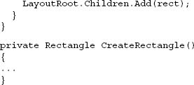
The process of loading XAML at runtime is incredibly easy. You only need to rely on the XamlReader class, which belongs to the System.Windows.Markup namespace. This class empowers you to parse XAML and convert it into an in-memory object. This object can be created by a statically visible method called Load. This method takes a string of XAML and converts it to the appropriate object. Then you can insert this object into another UIElement. Listing 2.19 shows this entire process in action.
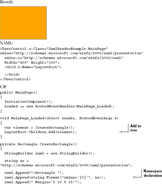
This example dynamically creates a rectangle and adds it to the object tree. The code in CreateRectangle simply builds up a string with XAML similar to what we'd have inside a regular .xaml file. Note that we need to specify the namespaces used for any segment of XAML we'll pass into XamlReader.Load. The code that adds the generated XAML to the object tree can be seen inside the loaded event.
You can of course do more with the element than just add it to the LayoutRoot. Listing 2.20 illustrates how we can take the XAML and integrate it with the managed code representations of XAML constructs to create multiple instances of the rectangle.
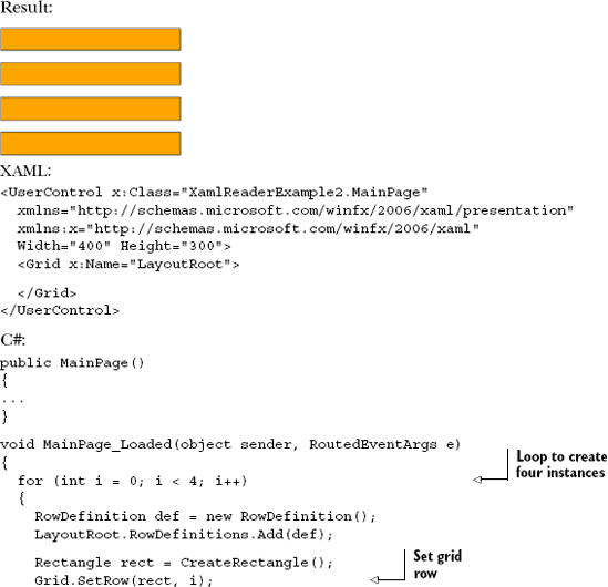
In this example, we loop to create four instances of the rectangle object. We then dynamically create grid row definitions (see chapter 6) in code rather than in parsed XAML and assign them via attached properties to our rectangle object.
This shows a mix of the CLR representations of elements such as the grid row and the XAML representations of elements such as the rectangle. In practice, you'll rarely create visual elements in code except for specific circumstances, but the power and flexibility to do so is available to you.
That covers the core concepts for XAML. Next, we'll look at some of the tools you can use to make working in XAML more efficient.
So far we've looked at a lot of raw XAML files. When working on Silverlight applications, you'll find yourself bouncing back and forth between raw XAML and some sort of visual editor or design surface. Here are some of the tools available for working with Silverlight XAML files:
Visual Studio 2010—Visual Studio 2008 provides a great XAML editor but a fairly useless Silverlight design surface, and it is limited to Silverlight 2 and 3. Visual Studio 2010 includes a fully capable Silverlight design surface that'll handle most of a developer's needs and includes full support for Silverlight 3 and 4. If you want to do more design-type work, including finer-grained control over the UI, animations, states, behaviors, and transitions, you'll want to use Expression Blend.
Expression Blend—Expression Blend's sole reason for existence is to edit XAML. This is the primary XAML editor for both design professionals and creative developers. While someone used to typing markup may bounce back and forth between the XAML editor and the design surface, there's little in Blend that you can't accomplish with the designer alone.
Kaxaml—Sometimes you don't want an editor as heavy as Visual Studio or Expression Blend. Kaxaml is a lightweight XAML editor created by Robby Ingebretsen. You can download Kaxaml for free from
www.kaxaml.com.Eclipse—If you want some freedom on other platforms such as the Mac, you can use the Silverlight tools for Eclipse found at
www.eclipse4sl.orgto edit XAML files.
Hundreds of other tools have support for exporting or importing XAML. Typically these are graphics tools, add-ins to existing graphics tools such as Adobe Illustrator, or 3D tools with XAML add-ins. Many of them are primarily targeted at WPF, but work at least partially with Silverlight.
Silverlight development is all about code plus markup. To make the most of the platform, you'll want to learn how to leverage the capabilities that XAML provides, while keeping a balance between what you write in code and what you put in the markup. Learning the markup language will allow you to use tooling to quickly create great user interfaces, work on a team including designers and developers without friction, and help enforce the separation of the view from the rest of the application architecture.
A basic understanding of XAML is fundamental to getting the most from the rest of this book and from Silverlight itself. In later chapters, we'll expand on what we did here to encompass topics such as brushes, shapes, controls, animation, and all of the other things that make Silverlight such a great presentation platform.
In the next chapter, we'll cover the Silverlight plug-in and how to use it to create applications that run inside and outside the browser.