
Chapter 12
Usability and Accessibility Testing
In this chapter—
12.1 WHAT IS USABILITY TESTING?
Hit any key to continue!
Hit any key to abort!
Hit any key to retry!
Usability testing attempts to characterize the “look and feel” and usage aspects of a product, from the point of view of users. Most types of testing we have discussed are objective in nature. There is a debate whether usability testing really belongs to the realm of testing at all. Some of the factors that fuel this debate are as follows.
- Usability and look-and-feel aspects are subjective in nature and cannot always be objectively measured
- Perceptions of “good usability” varies from user to user. For example, while a system administrator or a developer would consider use of command line flags as good user interface, an end-user will want everything in terms of GUI elements such as menus, dialog boxes, and so on.
- User interface can be construed as a design time activity. If a particular user interface does not meet the users’ needs, it is really a problem with not gathering the right requirements or not translating the requirements into the right design.
For all the above reasons, there is a view that usability can only be validated and cannot be tested. Regardless of the semantics of whether usability is a testing activity or a validation activity, some of the characteristics of “usability testing” or “usability validation” are as follows.
- Usability testing tests the product from the users’ point of view. It encompasses a range of techniques for identifying how users actually interact with and use the product.
- Usability testing is for checking the product to see if it is easy to use for the various categories of users.
- Usability testing is a process to identify discrepancies between the user interface of the product and the human user requirements, in terms of the pleasantness and aesthetics aspects.
The testing that validates the ease of use, speed, and aesthetics of the product from the user's point of view is called usability testing
If we combine all the above characterizations of the various factors that determine usability testing, then the common threads are
- Ease of use
- Speed
- Pleasantness and aesthetics
Usability testing addresses these three aspects from the point of view of a user. Combining these characterizations, usability testing can be formally defined.
From the above definition it is easy to conclude that
- Something that is easy for one user may not be easy for another user due to different types of users a product can have.
- Something what is considered fast (interms of say, response time) by one user may be slow for another user as the machines used by them and the expectations of speed can be different.
- Something that is considered beautiful by someone may look ugly to another.
- A view expressed by one user of the product may not be the view of another.
For these reasons, usability remains subjective, as mentioned earlier. However, if a product can incorporate the different views and requirements of the entire user base, it can become a successful product. Throughout the industry, usability testing is gaining momentum as sensitivity towards usability in products is increasing and it is very difficult to sell a product that does not meet the usability requirements of the users. There are several standards (for example, accessibility guidelines), organizations, tools (for example, Microsoft Magnifier), and processes that try to remove the subjectivity and improve the objectivity of usability testing.
12.2 APPROACH TO USABILITY
When doing usability testing, certain human factors can be represented in a quantifiable way and can be tested objectively. The number of mouse clicks, number of sub-menus to navigate, number of keystrokes, number of commands to perform a task can all be measured and checked as a part of usability testing. Obviously, if there are too many mouse clicks or too many commands to execute a user task, then the product would not be considered easy to use.
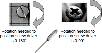
Usability improvements sometimes can be very marginal but can give huge benefits, with the number of users for the product increasing. For example, when a Philips (or a star) screwdriver was invented, it saved only few milliseconds per operation to adjust the screwdriver to the angle of the screw compared to a “flat” screwdriver. See Figure 12.1. However, its repeated use by multiple users saved several person years of effort. That's why marginal usability improvements should not be ignored. Something marginal to the product organization may mean big usability advantage to users. Let us extend this example to a software product that enables data entry operators to take customer orders. If one can reduce the number of mouse clicks by, say, three for each order, when a few hundred thousand orders are entered, the savings in the overall time taken can be substantial.
Usability testing is not only for product binaries or executables. It also applies to documentation and other deliverables that are shipped along with a product. The release media should also be verified for usability. Let us take an example of a typical AUTORUN script that automatically brings up product setup when the release media is inserted in the machine. Sometimes this script is written for a particular operating system version and may not get auto executed on a different OS version. Even though the user can bring up the setup by clicking on the setup executable manually, this extra click (and the fact that the product is not automatically installed) may be considered as an irritant by the person performing the installation.
Generally, the people best suited to perform usability testing are
- Typical representatives of the actual user segments who would be using the product, so that the typical user patterns can be captured, and
- People who are new to the product, so that they can start without any bias and be able to identify usability problems. A person who has used the product several times may not be able to see the usability problems in the product as he or she would have “got used” to the product's (potentially inappropriate) usability.
Hence, a part of the team performing usability testing is selected from representatives outside the testing team. Inviting customer-facing teams (for example, customer support, product marketing) who know what the customers want and their expectations, will increase the effectiveness of usability testing.
A right approach for usability is to test every artifact that impacts users—such as product binaries, documentation, messages, media—covering usage patterns through both graphical and command user interfaces, as applicable.
Usability can sometimes be a by-product and get noticed when other types of testing are performed. It is difficult to develop test cases for usability. Generally, checklists and guidelines are prepared for usability and they are observed during the testing. Having an eye for detail, intuition and the building skills to bring out usability defects from underneath will make usability testing more effective than having test cases for usability. There are many things to look for (explained in subsequent sections) in usability and it is essential to train and develop awareness of and expertise in usability in the organization to build and test usability.
Another aspect of usability is with respect to messages that a system gives to its users. Messages are classified into three types—informational, warning, and error. Usability depends on the type of error message. When there is an informational message, the message is verified to find out whether an end-user can understand that message and associate it with the operation done and the context. When there is a warning, such a message is checked for why it happened and what to do to avoid the warning. Whenever there is an error message, three things are looked for—what is the error, why that error happened, and what to do to avoid or work around that error.
Usability is not only for correct usage. It is not right to say that a product will be usable/or behave correctly only when the user has not made a mistake and that the product can behave wrongly (or in a user-unfriendly manner) when a user makes a mistake. A system should intelligently detect and avoid wrong usage and if a wrong usage cannot be avoided, it should provide appropriate and meaningful messages to steer the user to the right path. Hence, usability should go through both positive and negative testing—that is, both correct and incorrect usage of the product.
Usability should not be confused with graphical user interface (GUI). Usability is also applicable to non-GUI interface such as command line interfaces (CLI). A large number of Unix/Linux users find CLIs more usable than GUIS. SQL command is another example of a CLI, and is found more usable by database users. Hence, usability should also consider CLI and other interfaces that are used by the users.
12.3 WHEN TO DO USABILITY TESTING?
The most appropriate way of ensuring usability is by performing the usability testing in two phases. First is design validation and the second is usability testing done as a part of component and integration testing phases of a test cycle.
When planning for testing, the usability requirements should be planned in parallel, upfront in the development cycle, similar to any other type of testing. Generally, however, usability is an ignored subject (or at least given less priority) and is not planned and executed from the beginning of the project. When there are two defects—one on functionality and other on usability—the functionality defect is usually given precedence. This approach is not correct as usability defects may demotivate users from using the software (even if it performs the desired function) and it may mean a huge financial loss to the product organization if users reject the product. Also, postponing usability testing in a testing cycle can prove to be very expensive as a large number of usability defects may end up as needing changes in design and needing fixes in more than one screen, affecting different code paths. All these situations can be avoided if usability testing is planned upfront. The phases and activities of usability testing are given in Figure 12.2.
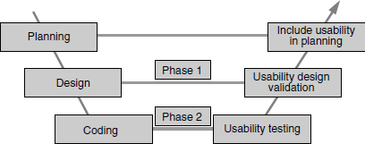
A product has to be designed for usability. A product designed only for functionality may not get user acceptance. A product designed for functionality may also involve a high degree of training, which can be minimized if it is designed for both functionality and usability. In the first phase of usability testing, this aspect of usability design is validated.
Usability design is verified through several means. Some of them are as follows.
- Style sheets Style sheets are grouping of user interface design elements. Use of style sheets ensures consistency of design elements across several screens and testing the style sheet ensures that the basic usability design is tested. Style sheets also include frames, where each frames is considered as a separate screen by the user. Style sheets are reviewed to check whether they force font size, color scheme, and so on, which may affect usability.
- Screen prototypes Screen prototype is another way to test usability design. The screens are designed as they will be shipped to the customers, but are not integrated with other modules of the product. Therefore, this user interface is tested independently without integrating with the functionality modules. This prototype will have other user interface functions simulated such as screen navigation, message display, and so on. The prototype gives an idea of how exactly the screens will look and function when the product is released. The test team and some real-life users test this prototype and their ideas for improvements are incorporated in the user interface. Once this prototype is completely tested, it is integrated with other modules of the product.
- Paper designs Paper design explores the earliest opportunity to validate the usability design, much before the actual design and coding is done for the product. The design of the screen, layout, and menus are drawn up on paper and sent to users for feedback. The users visualize and relate the paper design with the operations and their sequence to get a feel for usage and provide feedback. Usage of style sheets requires further coding, prototypes need binaries and resources to verify, but paper designs do not require any other resources. Paper designs can be sent through email or as a printout and feedback can be collected.
- Layout design Style sheets ensure that a set of user interface elements are grouped and used repeatedly together. Layout helps in arranging different elements on the screen dynamically. It ensures arrangement of elements, spacing, size of fonts, pictures, justification, and so on, on the screen. This is another aspect that needs to be tested as part of usability design.
If an existing product is redesigned or enhanced, usability issues can be avoided by using the existing layout, as the user who is already familiar with the product will find it more usable. Making major usability changes to an existing product (for example, reordering the sequence of buttons on a screen) can end up confusing users and lead to user errors.
In the second phase, tests are run to test the product for usability. Prior to performing the tests, some of the actual users are selected (who are new to the product and features) and they are asked to use the product. Feedback is obtained from them and the issues are resolved. Sometimes it could be difficult to get the real users of the product for usability testing. In such a case, the representatives of users can be selected from teams outside the product development and testing teams—for instance, from support, marketing, and sales teams.
When to do usability also depends on the type of the product that is being developed. For example, client applications (Windows client32) designed for LAN environments are generally very rich in features and every screen tries to accomplish various tasks and they provide a lot of information. Web services go the other way and the amount of information and the list of tasks in each screen is limited to enable fast loading of the web pages. The usability activities are performed at different stages for these types of applications. Table 12.1 lists the differences in the way client and web services are developed and tested in general.
Table 12.1 Development and testing of client applications and web application.
| Client application | Web application |
|---|---|
| Step 1: Design for functionality | Step 1: Design for user interface |
| Step 2: Perform coding for functionality | Step 2: Perform coding for user interface (prototype) |
| Step 3: Design for user interface | Step 3: Test user interface (Phase 1) |
| Step 4: Perform coding for user interface | Step 4: Design for functionality |
| Step 5: Integrate user interface with functionality | Step 5: Perform coding for functionality |
| Step 6: Test the user interface along with functionality (Phase 1 and 2) | Step 6: Integrate user interface with functionality |
| Step 7: Test user interface along with functionality (Phase 2) |
As indicated in Table 12.1, web application interfaces are designed before designing functionality. That gives adequate time for doing two phases of usability testing (phase 1 and phase 2). In the case of client application, the user interface becomes available only after functionality is available. As user interface coding is the last-leg activity, not much of design validation can be done in a separate phase. Therefore, phase 1 and 2 are merged and done together. At the same time, there is no hard and fast rule that client application cannot have a user interface design prior to functionality. This is only a common practice that can be changed as more and more focus is put on usability.
Testing alone cannot make the product completely usable. The product has to be designed, coded, tested for usability; furthermore, the usability aspects should be reviewed by real users for getting maximum benefits.
A “usable product” is always the result of mutual collaboration from all the stakeholders, for the entire duration of the project.
There are several phases of testing that were explained in earlier chapters. The responsibility for usability testing is spread across all the testing phases and all the testing teams. Usability cannot be “added on” to a product—it should be planned upfront and must be tested throughout. Hence, usability as a requirement can be indirectly tested (while direct testing is performed by a test team) starting from day one of product development and can continue till the product is released. Everyone performing various roles in product development needs to contribute to the various perspectives and requirements of usability.
12.4 HOW TO ACHIEVE USABILITY?
If anybody expects the users to explicitly report usability problems, it is not likely to happen. Users who are frustrated by the user interface may evolve some clever workarounds (or even stop using part of the product!). However, involving the users proactively on user interface design can yield good results. User interface requirements cannot be expressed in terms of words. One has to use the product to get a feel of its usability. That is why involving the customers to give feedback on all the user interface requirements upfront or during the design (or even requirements gathering) phase is essential. Of course, this is not always possible because
- The users may not have the time or bandwidth to participate in this exercise.
- There may be a number of users who may give conflicting requirements and it would not be possible to satisfy everyone.
- In the case of breakthrough products, the users may not even be able to visualize the usage of the product. Hence, the feedback may not be directly relevant.
There can be different categories of users. Some users can be experts, some can be beginners, and some novices. Expert users usually do not report usability problems. Instead they invent workarounds and adapt themselves to the product though they hope for a better product. Beginners generally get impacted because of lack of usability but still they do not report usability problems as they are eager to learn more about the product. They are generally in two minds whether the problems are due to usability or due to their being new to the product. Within each category of users the expectations could be still different. Novice users report plenty of usability issues but some of them may get ignored because they do not have adequate skills to use the product. Irrespective of the category of users, the product is expected to be usable by all.
There is also an additional dimension to the categories of users. In addition to all of the above, the product is expected to be usable to another category of challenged users such as those who are hearing impaired, vision impaired, and mobility impaired. The type of usability that deals with overall-, visual-, and motion-challenged users is called accessibility testing. It is explained in Section 12.7.
In order to create to a product that is usable for all categories of the users, at least one user from each category must be involved in usability testing. As explained earlier, it is not always possible to get each type of user for usability testing. For that reason, part of the team for usability testing is picked up from different teams, to replicate and test different categories of real end-users.
Usability is a habit and a behavior. Just like humans, the products are expected to behave differently and correctly with different users and to their expectations.
It was explained earlier that many categories of users and customers do not report usability defects. It is not just whether the product has a usability defect or not, but also how the user reacts as he or she goes through the product usage. Sometimes these user reactions (for example, an irritated user banging on the keyboard indicates a system that is not responding fast enough) can be even more informative than the actual defect they report. When the users are using the product during usability testing, their activities are closely monitored and all observations are recorded and defects are raised by the test team rather than expecting, every problem to be reported. Recording the operating sequence, screens, and user reactions and making observations needs some equipment to be set up for a usability lab. This is explained in Section 12.9. When making observations certain guidelines/checklists are created and verified during usability testing. Some of the items in the checklist are as follows.
- Do users complete the assigned tasks/operations successfully?
- If so, how much time do they take to complete the tasks/operations?
- Is the response from the product fast enough to satisfy them?
- Where did the users get struck? What problems do they have?
- Where do they get confused? Were they able to continue on their own? What helped them to continue?
Apart from checklists, the product is also verified for various other usability components such as comprehensibility, consistency, responsiveness, and aesthetics. They are explained in Sections 12.5 and 12.6.
12.5 QUALITY FACTORS FOR USABILITY
In the earlier sections, usability testing, and the approach and methodology for performing usability testing were explained. Some quality factors are very important when performing usability testing. As was explained earlier, usability is subjective and not all requirements for usability can be documented clearly. However focusing on some of the quality factors given below help in improving objectivity in usability testing are as follows.
- Comprehensibility The product should have simple and logical structure of features and documentation. They should be grouped on the basis of user scenarios and usage. The most frequent operations that are performed early in a scenario should be presented first, using the user interfaces. When features and components are grouped in a product, they should be based on user terminologies, not technology or implementation.
- Consistency A product needs to be consistent with any applicable standards, platform look-and-feel, base infrastructure, and earlier versions of the same product. Also, if there are multiple products from the same company, it would be worthwhile to have some consistency in the look-and-feel of these multiple products. User interfaces that are different in different operating systems underlying, services irritates the users since they need to become comfortable with different templates and procedures for using each of them. For example, if an operating system uses a template for error message with a set of icons, error number, error message and link to the related documentation, following the same format will make users more comfortable with a product on that operating system. Unless there is a major problem with the user interface of a product, the current interface and usage should be consistent with the earlier versions of the same product. Following some standards for usability helps in meeting the consistency aspect of the usability.
- Navigation This helps in determining how easy it is to select the different operations of the product. An option that is buried very deep requires the user to travel to multiple screens or menu options to perform the operation. The number of mouse clicks, or menu navigations that is required to perform an operation should be minimized to improve usability. When users get stuck or get lost, there should be an easy option to abort or go back to the previous screen or to the main menu so that the user can try a different route.
- Responsiveness How fast the product responds to the user request is another important aspect of usability. This should not be confused with performance testing. Screen navigations and visual displays should be almost immediate after the user selects an option or else it could give an impression to the user that there is no progress and cause him or her to keep trying the operation again. Whenever the product is processing some information, the visual display should indicate the progress and also the amount of time left so that the users can wait patiently till the operation is completed. Adequate dialogs and popups to guide the users also improve usability. Responsiveness should not be mistaken for too many popups and dialog boxes. Too many notifications within a short interval works only to reduce usability and may, in fact, slow down responsiveness.
Including some of the quality factors as discussed above in the usability checklist and ensuring that they are designed and tested, will help in achieving a good, usable product.
12.6 AESTHETICS TESTING
Another important aspect in usability is making the product “beautiful.” Performing aesthetics testing helps in improving usability further. This testing is important as many of the aesthetics related problems in the product from many organizations are ignored on the ground that they are not functional defects. All the aesthetic problems in the product are generally mapped to a defect classification called “Cosmetic,” which is of low priority. Having a separate cycle of testing focusing on aesthetics helps in setting up expectations and also in focusing on improving the look and feel of the user interfaces.
“Beautiful” or not can be a subjective matter (Remember the old adage “Beauty is in the eye of the beholder!”). Something that is acceptable to one person may appear ugly to another person. Adequate care, for the aesthetics aspect of the product can ensure that product is beautiful, at least a product must not end up being termed ugly. Beauty sets the first impression for any product and the perception that beauty is not important for the product may impact product acceptance by users.
It's not possible for all products to measure up with the Taj Mahal for its beauty. Testing for aesthetics can at least ensure the product is pleasing to the eye.
However, in many product companies, aesthetics takes a back seat. Aesthetics is not in the external look alone. It is in all the aspects such as messages, screens, colors, and images. A pleasant look for menus, pleasing colors, nice icons, and so on can improve aesthetics. It is generally considered as gold plating, which is not right. Gold plating is normally done after the ornament is ready; aesthetics testing should not be taken as the last leg of testing activity. Some of the aesthetics aspects must be done during the design phase and should not be taken as the last and a low-priority activity before the release.
Aesthetics testing can be performed by anyone who appreciates beauty—that means everyone. Involving beauticians, artists, and architects who have regular roles of making different aspects of life beautiful (not just products), serve as experts here in aesthetics testing. Involving them during design and testing phases and incorporating their inputs may improve the aesthetics of the product. For example, the icons used in the product may look more appealing if they are designed by an artist, as they are not meant only for conveying messages but also help in making the product beautiful.
12.7 ACCESSIBILITY TESTING
There are a large number of people who are challenged with vision, hearing, and mobility related problems—partial or complete. Product usability that does not look into their requirements would result in lack of acceptance. For such users, alternative methods of using the product have to be provided. There are several tools that are available to help them with alternatives. These tools are generally referred as accessibility tools or assistive technologies. Accessibility testing involves testing these alternative methods of using the product and testing the product along with accessibility tools. Accessibility is a subset of usability and should be included as part of usability test planning.
Verifying the product usability for physically challenged users is called accessibility testing.
Accessibility to the product can be provided by two means.
- Making use of accessibility features provided by the underlying infrastructure (for example, operating system), called basic accessibility, and
- Providing accessibility in the product through standards and guidelines, called product accessibility.
12.7.1 Basic Accessibility
Basic accessibility is provided by the hardware and operating system. All the input and output devices of the computer and their accessibility options are categorized under basic accessibility.
12.7.1.1 Keyboard accessibility
A keyboard is the most complex device for vision- and mobility-impaired users. Hence, it received plenty of attention for accessibility. Some of the accessibility improvements were done on hardware and some in the operating system. An example of hardware accessibility improvement is the little protrusion one can find in any keyboard on top of the F and J keys. This little projection helps vision-impaired users to get a feel and align their fingers for typing. Keyboard keys with different sizes, and providing shortcut function keys are other examples of improving accessibility, provided at the hardware level.
Similarly, the operating system vendors came up with some more improvements in the keyboard. Some of those improvements are usage of sticky keys, toggle keys and arrow keys for mouse.
Sticky keys To explain the sticky keys concept, let us take an example of <CTRL= <ALT> <DEL>. One of the most complex sequences for vision-impaired and mobility-impaired users is <CTRL> <ALT> <DEL>. This keyboard sequence is used for various purposes such as log in, log out, locking and unlocking machines, shutdown, and bringing up task manager. Sometimes the keyboard sequence is complex for users without disabilities too as it requires holding down two of the keys when pressing the third. This particular sequence requires three fingers to be coordinated from both hands. The sticky keys setting in the operating system removes the requirement for holding the keys. When sticky keys feature is enabled, <CTRL> and <ALT> keys are pressed once and released by the user before pressing the <DEL> key. This allows a single finger operation to complete the sequence.
Filter keys When keys are pressed for more than a particular duration, they are assumed to be repeated. Sometimes this troubles physically challenged users. Some of them may not be as fast as a normal user in pressing and releasing the keys. Filter keys help in either stopping the repetition completely or slowing down the repetition.
Toggle key sound When toggle keys are enabled, the information typed may be different from what the user desires. For example, in a typical Word Processing package, the <INS= key is a toggle; if its normal setting is that characters are inserted, when the key is pressed once and released, it goes into a REPLACE mode, wherein the typed characters overwrite what is already there. Vision-impaired users find it difficult to know the status of these toggle keys. To solve this problem sound is enabled, and the different tones are played when enabling and disabling toggle keys.
Sound keys To help vision-impaired users, there is one more mechanism that pronounces each character as and when they are hit on the keyboard. In some operating systems, this feature is available as part of a Narrator utility (discussed below); however, many accessibility tools have this feature.
Arrow keys to control mouse Mobility-impaired users have problems moving the mouse. By enabling this feature, such users will be able to use the keyboard arrow keys for mouse movements. The two buttons of the mouse and their operations too can be directed from the keyboard.
Narrator Narrator is a utility which provides auditory feedback. For example, it may pronounce the events when they are executed by the users, read out the characters typed, notify the system events by distinguishing sounds, and so on. Since this provides the sound equivalent for keyboard and system events, this feature is considered as one of the significant utilities used for accessibility and increases the accessibility of the product.
12.7.1.2 Screen accessibility
Many of the keyboard accessibility features assist the vision-impaired and mobility-impaired users. These features may not help the hearing-impaired users who require extra visual feedback on the screen. Some accessibility features that enhance usability using the screen are as follows.
Visual sound Visual sound is the “wave form” or “graph form” of the sound. These visual effects inform the user of the events that happen on the system using the screen.
Enabling captions for multimedia All multimedia speech and sound can be enabled with text equivalents, and they are displayed on the screen when speech and sound are played.
Soft keyboard Some of the mobility-impaired and vision-impaired users find it easier to use pointing devices instead of the keyboard. A soft keyboard helps such users by displaying the keyboard on the screen. Characters can be typed by clicking on the keyboard layout on the screen using pointing devices such as the mouse.
Easy reading with high contrast Vision-impaired users have problems in recognizing some colors and size of font in menu items. A toggle option is provided generally by the operating system to switch to a high contrast mode. This mode uses pleasing colors and font sizes for all the menus on the screen.
12.7.1.3 Other accessibility features
There are many other accessibility features provided at the operating system level. A vision- or mobility- impaired user can find both keyboard and mouse devices difficult to use. In such cases, the option to use any other device should be provided. For example, a joystick device canbe used as analternative toapointing device and suchapointing device can be used in combination with a soft keyboard to accomplish the things a user desires.
Some of the features explained above try to address users with multiple disabilities. For example, sticky keys remove the need to hold the keys as well as display the status of all sticky keys on the screen on the toolbar portion of the computer.
12.7.2 Product Accessibility
A good understanding of the basic accessibility features is needed while providing accessibility to the product. A product should do everything possible to ensure that the basic accessibility features are utilized by it. For example, providing detailed text equivalent for multimedia files ensures the captions feature is utilized by the product.
Sample requirement #1: Text equivalents have to be provided for audio, video, and picture images.
A good understanding of basic accessibility features and the requirements of different types users with special needs helps in creating certain guidelines on how the product's user interface has to be designed. These different requirements of different categories of users, their abilities and challenges need to be kept in mind throughout while providing accessibility of the product.
There is much information on various websites on accessibility standards and requirements that can be used to collect the requirements for accessibility. Accessibility standards such as 508 and W3C can be referred to for a complete set of requirements. This section takes a few requirements to set the context and to explain the concepts.
This requirement explains the importance of providing text equivalents for picture images and providing captions for audio portions. When an audio file is played, providing captions for the audio improves accessibility for the hearing-impaired. Providing audio clippings improves accessibility impaired users who cannot understand the video streams and pictures. While trying to meet this requirement, the knowledge of accessibility tools comes in handy. For example, people who do not have knowledge of accessibility tools may perceive that there is no visible advantage of providing a text equivalent for a picture because vision-impaired users cannot see either. But when users use tools like the narrator, the associated text is read and produced in audio form whereby the vision-impaired are benefited. A sample picture from the website along with the associated text equivalent is given in Figure 12.3.
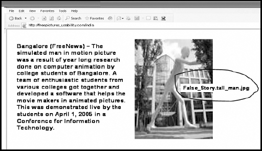
In the above example, even if an impaired user cannot see the picture, the associated tag of the image and text on the left-hand side help the person when tools like narrator are used.
Hence text equivalents for audio (captions), audio descriptions for pictures and visuals become an important requirement for accessibility.
People with low vision would like to see the pages in extra-large fonts for them to use the product comfortably. Hence, a product expecting a particular resolution and font size to display all fields on the screen may face usability issues. There should be adequate spacing between the fields and text so that the messages that appear on the screen do not look cluttered when font size is increased.
Sample requirement #2: Documents and fields should be organized so that they can be read without requiring a particular resolution of the screen, and templates (known as style sheets).
Normally, information on web page is displayed on the screen using templates called style sheets. There are two types of style sheets: internal and external. Internal style sheets are those hard coded sheets that dictate the fields, size, and their positions on the screen. This creates problems for users when they want to adjust the windows and size of fonts. The safest method is to use external style sheets, and programs written for the product should not tamper with user-defined external style sheets.
Sample requirement #3: User interfaces should be designed so that all information conveyed with color is also available without color.
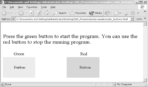
Not only users with low vision but those with good vision too may have problems in identifying the numerous colors and their combinations that are available. This is termed as color blindness. Hence, products using color text, color pictures, and color screens should not use color as the sole method of identification of user interface elements. For example, in the picture in Figure 12.4, the colors (green and red) are used as methods to identify the buttons for different operations. However, color blind users may not be able to select the right button for operations. The right approach would be to retain the colors and name the buttons appropriately. In the following example, naming the green button as “Continue” and red button as “Stop” will improve accessibility.
Sample requirement #4: Reduce flicker rate, speed of moving text; avoid flashes and blinking text.
Different people read at different speeds. People with below-average speed in reading may find it irritating to see text that is blinking and flashing as it further impacts reading speed. Even people with good vision find the flashes and flickers beyond a particular frequency uncomfortable. The flickers should be between the frequencies of 2 Hz and 55 Hz, as defined by some of the usability standards.
Some mobility-impaired users and those with nerve-related problems cannot move their eyeballs as fast as others. There may also be other health problems that prevent them from reading as fast as others. In case of rolling and moving text, the speed at which the text rolls or moves should be compatible with the reading capability of the slowest product user or the product should have a feature to alter the speed of moving text.
Sample requirement #5: Reduce physical movement requirements for the users when designing the interface and allow adequate time for user responses.
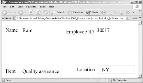
When designing the user interfaces, adequate care has to be taken to ensure that the physical movement required to use the product is minimized to assist mobility-impaired users. Spreading user interface elements to the corner of the screens should be avoided, as this requires the users to move the pointing devices to the corners, involving effort. Figure 12.5 is an example where four fields are kept in the corners of the screen. The same user interface can be better designed to have the fields one below the other, given that there is adequate space on the screen.
Not only individual screens, but the entire set of screens in totality have to be designed keeping minimum movement requirements in mind. When multiple screens are used in performing a set of operations (say, validating multiple screens of user information), the corresponding sequence of positive responses such as CONTINUE, ACCEPT BACK, EXIT buttons are aligned across screens so that the pointing devices need not be realigned when the screen changes.
As much as possible, user interfaces should expect users to use fewer devices for regular operations. For example, in Figure 12.5, using the keyboard is essential as it expects information to be typed but using a pointing device may be avoided if the <TAB> key can be used to navigate among the fields. Mixing the use of several devices such as keyboard and mouse increases the complexity of user interface.
When a timed response is required, the user should be alerted and given sufficient time to indicate that more time is required. Some users require more time to think and act, as they may be challenged in some fashion. Giving messages in user interface such as “Click on OK button within 5 seconds if information is correct” puts pressure on the users and should be avoided.
The sample requirements given above are some examples to improve accessibility. There are many more requirements like these and they are normally classified on the basis of the technology used for providing the user interface (for example, web-based interface, client-based interface, and so on) in the popular standards (such as 508 guidelines) defined for accessibility. Selecting the right standard for the technology used in the interface will go a long way in improving accessibility.
12.8 TOOLS FOR USABILITY
There are not many tools that help in usability because of the high degree of subjectivity involved in evaluating this aspect. However, there are adequate tools available for accessibility testing. A sample list of usability and accessibility tools is given in Table 12.2. Some of those tools have been explained in the previous sections.
Table 12.2 Sample list of usability and accessibility tools.
| Name of the tool | Purpose |
|---|---|
| JAWS | For testing accessibility of the product with some assistive technologies. |
| HTML validator | To validate the HTML source file for usability and accessibility standards. |
| Style sheet validator | To validate the style sheets (templates) for usability standards set by W3C. |
| Magnifier | Accessibility tool for vision challenged (to enable them to enlarge the items displayed on screen |
| Narrator | Narrator is a tool that reads the information displayed on the screen and creates audio descriptions for vision-challenged users. |
| Soft keyboard | Soft keyboard enables the use of pointing devices to use the keyboard by displaying the keyboard template on the screen. |
Testing with a black-and-white monitor instead of a color monitor ensures the right combination of colors used and also ensures that the information available with color is also available without color. Some color monitors have a feature to display information in gray scale. Some operating systems have a display setting for black and white. Using this display setting and testing it ensures that information available with color, can be made without color.
Inviting physically challenged users for review of the product also serves as a method and tool to validate product accessibility.
12.9 USABILITY LAB SETUP
As mentioned earlier, expecting users to give inputs on usability is unlikely to happen. Product developers often ignore usability defects. Users too ignore some of them as they may have faced similar defects and got used to those defects. Hence, expecting the users to give inputs alone will not make a product usable. Observing the “body language” of the users may point to some usability defects, or which may never get reported oterwise.
Not only the body language, the context that is, the screen on which the user got stuck and what event confused the user, and so on, also needs to be associated with the feedback received from the user for those defects to be rectified.
The above points become a compelling reason to set up a usability lab so that all associated information for usability is recorded, observed, and the defects resolved. Figure 12.6 gives some of the key elements of the usability lab.
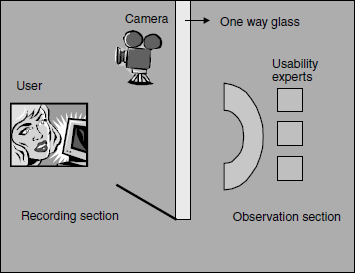
As illustrated in the figure, a usability lab has two sections—“Recording section” and “Observation section.” A user is requested to come to the lab with a prefixed set of operations that are to be performed with the product in the recording section of the lab. The user is explained the product usage and given the documentation in advance. The user comes prepared to perform the tasks. While the whole sequence is recorded, a set of usability experts observe the whole process.
In the observation section, some usability experts sit and observe the user for body language and associate the defects with the screens and events that caused it. The observation is made through a “one-way glass”—the experts can see the user but the user cannot see the experts. This helps avoid any disturbance to the user from the expert's body movements and allows them to be natural. The camera additionally helps in capturing live images of the user and the computer monitor from different angles. After watching the different users use the product, the usability experts suggest usability improvements in the product.
The recorded version of usability testing is used to make further observations after the event, and also to get more information (if needed) for fixing the usability defects.
Therefore, keeping a separate lab for usability serves as a tool for locating more usability defects and in resolving them.
12.10 TEST ROLES FOR USABILITY
Usability testing is not as formal as other types of testing in several companies and is not performed with a pre-written set of test cases/checklists. Various methods adopted by companies for usability testing are as follows.
- Performing usability testing as a separate cycle of testing.
- Hiring external consultants (who understand ergonomics and special accessibility needs) to do usability validation.
- Setting up a separate group for usability to institutionalize the practices across various product development teams and to set up organization-wide standards for usability.
Irrespective of when and how usability testing is done, there are certain skills that are very important for performing full-fledged usability testing. These skills and expectations are consolidated for the different roles in Table 12.3.
Table 12.3 Roles and responsibilities for usability testing.
| Role | Responsibility |
|---|---|
| Usability architect/consultant |
|
| Usability expert |
|
| Human factors specialist |
|
| Graphic designer |
|
| Usability manager/lead |
|
| Usability test engineer |
|
12.11 SUMMARY
There is an increasing awareness of usability testing in the industry. Soon, usability testing will become an engineering discipline, a life cycle activity, and a profession or career.
However, usability testing is not without challenges. Often usability testing engineers and consultants are brought in just before an usability test release to complete the formalities and may not improve usability. Even if usability test is done, it is done by engineers who are not adequately skilled/trained on usability. Usability is an evolving area and training is important to keep people up to date with technology.
Several companies plan for usability testing in the beginning of the product life cycle and track them to completion. However, adequate investments interms of training the engineers on standards, tools, lab setup, and so on are ignored. Effectiveness in usability increases only if there is adequate focus on these aspects and if investments are done in training the people on usability aspect and inform such aspects in the product.
Usability is not achieved only by testing. Usability is more in the design and in the minds of the people who contribute to the product. Usability is all about user experiences. Thinking from the perspective of the user all the time during the project will go a long way in ensuring usability.
Accessibility tools and related documentation available with Microsoft Windows is a good reference material for understanding accessibility. [508] provides 508 guidelines set by the American government. [W3C] explain how the usability standards (with a special focus on web based application) can be built and tested. [Yog-2002] is an article which stresses the importance of Aesthetics testing and the guidelines associated in performing this testing.
- What are the different methods by which usability design can be validated?
- Classify different impaired users and give a summary of how accessibility testing and tools can help them to use the product.
- What is aesthetics testing and why it is important to include it in usability checklists?
- Explain the different tools that are available for usability and accessibility. What is the role played by these tools in testing usability?
- What are the key objectives of setting up usability test lab? In what way it is different from using other traditional labs for testing?
- Explain different roles that can be played by test professionals in usability testing?
- Explain the V model and explain how different activities of usability testing can be mapped to the V model?