
Chapter 17
Test Metrics and Measurements
In this chapter—
17.1 WHAT ARE METRICS AND MEASUREMENTS?
This is the period we noticed excellent profits in the organization…and…Boss, you were on vacation that time!

All significant activities in a project need to be tracked to ensure that the project is going as per plan and to decide on any corrective actions. The measurement of key parameters is an integral part of tracking. Measurements first entail collecting a set of data. But, raw data by itself may not throw light on why a particular event has happened. The collected data have to be analyzed in totality to draw the appropriate conclusions. In the above cartoon, the two data points were that the boss had gone on vacation and the profits zoomed in the previous quarter. However (hopefully!) the two events are not directly linked to each other! So the conclusion from the raw data was not useful for decision making.
What cannot be measured cannot be managed.
Metrics derive information from raw data with a view to help in decision making. Some of the areas that such information would shed light on are
- Relationship between the data points;
- Any cause and effect correlation between the observed data points; and
- Any pointers to how the data can be used for future planning and continuous improvements
Metrics are thus derived from measurements using appropriate formulae or calculations. Obviously, the same set of measurements can help product different set of metrics, of interest to different people.
From the above discussion, it is obvious that in order that a project performance be tracked and its progress monitored effectively,
- The right parameters must be measured; the parameters may pertain to product or to process.
- The right analysis must be done on the data measured, to draw correct conclusions about the health of the product or process within a project or organization.
- The results of the analysis must be presented in an appropriate form to the stakeholders to enable them to make the right decisions on improving product or process quality (or any other relevant business drivers).
Since the focus of this book is on testing and products under test, only metrics related to testing and product are discussed in this chapter and not those meant for process improvements.
The metrics and analysis of metrics may convey the reason when data points are combined. Relating several data points and consolidating the result in terms of charts and pictures simplifies the analysis and facilitates the use of metrics for decision making. A metrics program is intended to achieve precisely the above objectives and is the intended focus of this chapter. We will first baseline certain terminology we will be using in this chapter.
Effort is the actual time that is spent on a particular activity or a phase. Elapsed days is the difference between the start of an activity and the completion of the activity. For example, ordering a product through the web may involve five minutes of effort and three elapsed days. It is the packaging and shipping that takes that much duration, not the time spent by the person in ordering. However, in the schedule, this latency or delay needs to be entered as three days. Of course, during these three days, the person who ordered the product can get on to some other activity and do it in simultaneously. In general, effort is derived from productivity numbers, and elapsed days is the number of days required to complete the set of activities. Elapsed days for a complete set of activities becomes the schedule for the project.
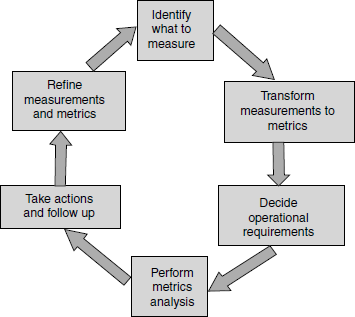
Collecting and analyzing metrics involves effort and several steps. This is depicted in Figure 17.1. The coloured figure is available on Illustrations. The first step involved in a metrics program is to decide what measurements are important and collect data accordingly. The effort spent on testing, number of defects, and number of test cases, are some examples of measurements. Depending on what the data is used for, the granularity of measurement will vary.
While deciding what to measure, the following aspects need to be kept in mind.
- What is measured should be of relevance to what we are trying to achieve. For testing functions, we would obviously be interested in the effort spent on testing, number of test cases, number of defects reported from test cases, and so on.
- The entities measured should be natural and should not involve too many overheads for measurements. If there are too many overheads in making the measurements or if the measurements do not follow naturally from the actual work being done, then the people who supply the data may resist giving the measurement data (or even give wrong data).
- What is measured should be at the right level of granularity to satisfy the objective for which the measurement is being made.
Let us look at the last point on granularity of data in more detail. The different people who use the measurements may want to make inferences on different dimensions. The level of granularity of data obtained depends on the level of detail required by a specific audience. Hence the measurements—and the metrics derived from them—will have to be at different levels for different people. An approach involved in getting the granular detail is called data drilling. Given in the next page is an example of a data drilling exercise. This is what typically happens in many organizations when metrics/test reports are presented and shows how different granularity of data is relevant for decision making at different levels.
The conversation in the example continues till all questions are answered or till the defects in focus becomes small in number and can be traced to certain root causes. The depth to which data drilling happens depends on the focus area of the discussion or need. Hence, it is important to provide as much granularity in measurements as possible. In the above example, the measurement was “number of defects.”
Not all conversations involve just one measurement as in the example. A set of measurements can be combined to generate metrics that will be explained in further sections of this chapter. An example question involving multiple measurements is “How many test cases produced the 40 defects in data migration involving different schema?” There are two measurements involved in this question: the number of test cases and the number of defects. Hence, the second step involved in metrics collection is defining how to combine data points or measurements to provide meaningful metrics. A particular metric can use one or more measurements.
Tester: We found 100 more defects in this test cycle compared to the previous one.
Manager: What aspect of the product testing produced more defects?
Tester: Usability produced 60 defects out of 100.
Manager: Ok! What are the components in the product that produced more defects?
Tester: “Data migration” component produced 40 out of those 60.
Manager: What particular feature produced that many defects?
Tester: Data migration involving different schema produced 35 out of those 40 defects.
Knowing the ways in which a measurement is going to be used and knowing the granularity of measurements leads us to the third step in the metrics program—deciding the operational requirement for measurements. The operational requirement for a metrics plan should lay down not only the periodicity but also other operational issues such as who should collect measurements, who should receive the analysis, and so on. This step helps to decide on the appropriate periodicity for the measurements as well as assign operational responsibility for collecting, recording, and reporting the measurements and dissemination of the metrics information. Some measurements need to be made on a daily basis (for example, how many test cases were executed, how many defects found, defects fixed, and so on). But the metrics involving a question like the one above (“how many test cases produced 40 defects”) is a type of metric that needs to be monitored at extended periods of time, say, once in a week or at the end of a test cycle. Hence, planning metrics generation also needs to consider the periodicity of the metrics.
The fourth step involved in a metrics program is to analyze the metrics to identify both positive areas and improvement areas on product quality. Often, only the improvement aspects pointed to by the metrics are analyzed and focused; it is important to also highlight and sustain the positive areas of the product. This will ensure that the best practices get institutionalized and also motivate the team better.
The final step involved in a metrics plan is to take necessary action and follow up on the action. The purpose of a metrics program will be defeated if the action items are not followed through to completion. This is especially true of testing, which is the penultimate phase before release. Any delay in analysis and following through with action items to completion can result in undue delays in product release.
Any metrics program, as described above, is a continuous and ongoing process. As we make measurements, transform the measurements into metrics, analyze the metrics, and take corrective action, the issues for which the measurements were made in the first place will become resolved. Then, we would have to continue the next iteration of metrics programs, measuring (possibly) a different set of measurements, leading to more refined metrics addressing (possibly) different issues. As shown in Figure 17.1, metrics programs continually go through the steps described above with different measurements or metrics.
17.2 WHY METRICS IN TESTING?
Since testing is the penultimate phase before product release, it is essential to measure the progress of testing and product quality. Tracking test progress and product quality can give a good idea about the release—whether it will be met on time with known quality. Measuring and producing metrics to determine the progress of testing is thus very important.
Days needed to complete testing = Total test cases yet to be executed/Test case execution productivity
Knowing only how much testing got completed does not answer the question on when the testing will get completed and when the product will be ready for release. To answer these questions, one needs to know how much more time is needed for testing. To judge the remaining days needed for testing, two data points are needed—remaining test cases yet to be executed and how many test cases can be executed per elapsed day. The test cases that can be executed per person day are calculated based on a measure called test case execution productivity. This productivity number is derived from the previous test cycles. It is represented by the formula, given alongside in the margin.
Thus, metrics are needed to know test case execution productivity and to estimate test completion date.
It is not testing alone that determines the date at which the product can be released. The number of days needed to fix all outstanding defects is another crucial data point. The number of days needed for defects fixes needs to take into account the “outstanding defects waiting to be fixed” and a projection of “how many more defects that will be unearthed from testing in future cycles.” The defect trend collected over a period of time gives a rough estimate of the defects that will come through future test cycles. Hence, metrics helps in predicting the number of defects that can be found in future test cycles.
The defect-fixing trend collected over a period of time gives another estimate of the defect-fixing capability of the team. This measure gives the number of defects that can be fixed in a particular duration by the development team. Combining defect prediction with defect-fixing capability produces an estimate of the days needed for the release. The formula given alongside in the margin can help arrive at a rough estimate of the total days needed for defect fixes.
Total days needed for defect fixes = (Outstanding defects yet to fixed + Defects that can be found in future test cycles)/Defect-fixing capability
Hence, metrics helps in estimating the total days needed for fixing defects. Once the time needed for testing and the time for defects fixing are known, the release date can be estimated. Testing and defect fixing are activities that can be executed simultaneously, as long as there is a regression testing planned to verify the outstanding defects fixes and their side-effects. If a product team follows the model of separate development and testing teams, the release date is arrived at on the basis of which one (days needed for testing or days needed for defect fixes) is on the critical path. The formula given alongside in the margin helps in arriving at the release date.
Days needed for release = Max (Days needed for testing, days needed for defect fixes)
The defect fixes may arrive after the regular test cycles are completed. These defect fixes will have to be verified by regression testing before the product can be released. Hence, the formula for days needed for release is to be modified as alongside in the margin.
Days needed for release = Max [Days needed for testing, (Days needed for defect fixes + Days needed for regressing outstanding defect fixes)]
The above formula can be further tuned to provide more accuracy to estimates as the current formula does not include various other activities such as documentation, meetings, and so on. The idea of discussing the formula here is to explain that metrics are important and help in arriving at the release date for the product.
The measurements collected during the development and test cycle are not only used for release but also used for post-release activities. Looking at the defect trend for a period helps in arriving at approximate estimates for the number of defects that may get reported post release. This defect trend is used as one of the parameters to increase the size of the maintenance/sustenance team to take care of defects that may be reported post release. Knowing the type of defects that are found during a release cycle and having an idea of all outstanding defects and their impact helps in training the support staff, thereby ensuring they are well equipped and prepared for the defects that may get reported by the customers.
Metrics are not only used for reactive activities. Metrics and their analysis help in preventing the defects proactively, thereby saving cost and effort. For example, if there is a type of defect (say, coding defects) that is reported in large numbers, it is advisable to perform a code review and prevent those defects, rather than finding them one by one and fixing them in the code. Metrics help in identifying these opportunities.
Metrics are used in resource management to identify the right size of product development teams. Since resource management is an important aspect of product development and maintenance, metrics go a long way in helping in this area.
There are various other areas where metrics can help; ability of test cases in finding defects is one such area. We discussed test case result history in Chapter 8, Regression Testing. When this history is combined with the metrics of the project, it provides detailed information on what test cases have the capabilities to produce more/less defects in the current cycle.
To summarize, metrics in testing help in identifying
- When to make the release.
- What to release — Based on defect density (formally defined later) across modules, their importance to customers, and impact analysis of those defects, the scope of the product can be decided to release the product on time. Metrics help in making this decision.
- Whether the product is being released with known quality — The idea of metrics is not only for meeting the release date but also to know the quality of the product and ascertaining the decision on whether we are releasing the product with the known quality and whether it will function in a predictable way in the field.
17.3 TYPES OF METRICS
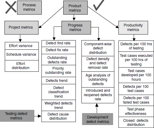
Metrics can be classified into different types based on what they measure and what area they focus on. At a very high level, metrics can be classified as product metrics and process metrics. As explained earlier, process metrics are not discussed in this chapter.
Product metrics can be further classified as
- Project metrics A set of metrics that indicates how the project is planned and executed.
- Progress metrics A set ot metrics that tracks how the different activities ot the project are progressing. The activities include both development activities and testing activities. Since the focus of this book is testing, only metrics applicable to testing activities are discussed in this book (and in this chapter). Progress metrics is monitored during testing phases. Progress metrics helps in finding out the status of test activities and they are also good indicators of product quality. The defects that emerge from testing provide a wealth of information that help both development team and test team to analyze and improve. For this reason, progress metrics in this chapter focus only on defects. Progress metrics, for convenience, is further classified into test defect metrics and development defect metrics.
- Productivity metrics A set of metrics that takes into account various productivity numbers that can be collected and used for planning and tracking testing activities. These metrics help in planning and estimating of testing activities.
All the types of metrics just discussed and specific metrics that will be discussed in this chapter are depicted in Figure 17.2. The coloured figure is available on Illustrations.
17.4 PROJECT METRICS
A typical project starts with requirements gathering and ends with product release. All the phases that fall in between these points need to be planned and tracked. In the planning cycle, the scope of the project is finalized. The project scope gets translated to size estimates, which specify the quantum of work to be done. This size estimate gets translated to effort estimate for each of the phases and activities by using the available productivity data available. This initial effort is called baselined effort.
As the project progresses and if the scope of the project changes or if the available productivity numbers are not correct, then the effort estimates are re-evaluated again and this re-evaluated effort estimate is called revised effort. The estimates can change based on the frequency of changing requirements and other parameters that impact the effort.
Over or under estimating the effort are normal experiences faced by many organizations. Perils of such wrong estimates are financial losses, delay in release, and wrong brand image among the customers. Right estimation comes by experience and by having the right productivity numbers from the team.
Effort and schedule are two factors to be tracked for any phase or activity. Tracking the activities in the SDLC phase is done by two means, that is, effort and schedule. In an ideal situation, if the effort is tracked closely and met, then the schedule can be met. The schedule can also be met by adding more effort to the project (additional resources or asking the engineers to work late). If the release date (that is, schedule) is met by putting more effort, then the project planning and execution cannot be considered successful. In fact, such an idea of adding effort may not be possible always as the resources may not be available in the organization every time and engineers working late may not be productive beyond a certain point.
At the same time, if planned effort and actual effort are the same but if the schedule is not met then too the project cannot be considered successful. Hence, it is a good idea to track both effort and schedule in project metrics.
The basic measurements that are very natural, simple to capture, and form the inputs to the metrics in this section are
- The different activities and the initial baselined effort and schedule for each of the activities; this is input at the beginning of the project/phase.
- The actual effort and time taken for the various activities; this is entered as and when the activities take place.
- The revised estimate of effort and schedule; these are re-calculated at appropriate times in the project life.
17.4.1 Effort Variance (Planned vs Actual)
When the baselined effort estimates, revised effort estimates, and actual effort are plotted together for all the phases of SDLC, it provides many insights about the estimation process. As different set of people may get involved in different phases, it is a good idea to plot these effort numbers phase-wise. Normally, this variation chart is plotted as the point revised estimates are being made or at the end of a release. A sample data for each of the phase is plotted in the chart in Figure 17.3. The coloured figure is available on Illustrations.
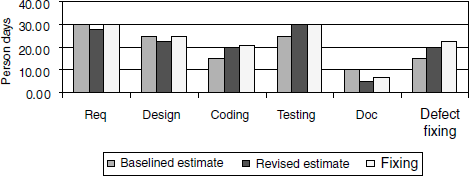
If there is a substantial difference between the baselined and revised effort, it points to incorrect initial estimation. Calculating effort variance for each of the phases (as calculated by the formula below) provides a quantitative measure of the relative difference between the revised and actual efforts.
If variance takes into account only revised estimate and actual effort, then a question arises, what is the use of baselined estimate? As mentioned earlier, the effort variation chart provides input to estimation process. When estimates are going wrong (or right), it is important to find out where we are going wrong (or right). Many times the revised estimates are done in a hurry, to respond fast enough to the changing requirements or unclear requirements. If this is the case, the right parameter for variance calculation is the baselined estimate. In this case analysis should point out the problems in the revised estimation process. Similarly, there could be a problem in the baseline estimation process that can be brought out by variance calculation. Hence, all the baselined estimates, revised estimates, and actual effort are plotted together for each of the phases. The variance can be consolidated into as shown in Table 17.1.

Variance % = [(Actual effort – Revised estimate)/Revised estimate] * 100
A variance of more than 5% in any of the SDLC phase indicates the scope for improvement in the estimation. In Table 17.1, the variance is acceptable only for the coding and testing phases.
The variance can be negative also. A negative variance is an indication of an over estimate. These variance numbers along with analysis can help in better estimation for the next release or the next revised estimation cycle.
17.4.2 Schedule Variance (Planned vs Actual)
Most software projects are not only concerned about the variance in effort, but are also concerned about meeting schedules. This leads us to the schedule variance metric. Schedule variance, like effort variance, is the deviation of the actual schedule from the estimated schedule. There is one difference, though. Depending on the SDLC model used by the project, several phases could be active at the same time. Further, the different phases in SDLC are interrelated and could share the same set of individuals. Because of all these complexities involved, schedule variance is calculated only at the overall project level, at specific milestones, not with respect to each of the SDLC phases. The sample chart in Figure 17.4 gives a method for plotting schedule variance. The coloured figure is available on Illustrations.
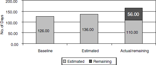
Using the data in the above chart, the variance percent can be calculated using a similar formula as explained in the previous section, considering the estimated schedule and actual schedule.
Schedule variance is calculated at the end of every milestone to find out how well the project is doing with respect to the schedule. To get a real picture on schedule in the middle of project execution, it is important to calculate “remaining days yet to be spent” on the project and plot it along with the “actual schedule spent” as in the above chart. “Remaining days yet to be spent” can be calculated by adding up all remaining activities. If the remaining days yet to be spent on project is not calculated and plotted, it does not give any value to the chart in the middle of the project, because the deviation cannot be inferred visually from the chart. The remaining days in the schedule becomes zero when the release is met.
Effort and schedule variance have to be analyzed in totality, not in isolation. This is because while effort is a major driver of the cost, schedule determines how best a product can exploit market opportunities. Variance can be classified into negative variance, zero variance, acceptable variance, and unacceptable variance. Generally 0–5% is considered as acceptable variance. Table 17.2 gives certain scenarios, probable causes, and conclusions.
Table 17.2 Interpretation of ranges of effort and schedule variation.
| Effort variance | Schedule variance | Probable causes/result |
|---|---|---|
| Zero or acceptable variance | Zero variance | A well-executed project |
| Zero or acceptable variance | Acceptable variance | Need slight improvement in effort/schedule estimation |
| Unacceptable variance | Zero or acceptable variance | Underestimation; needs further analysis |
| Unacceptable variance | Unacceptable variance | Underestimation of both effort and schedule |
| Negative variance | Zero or acceptable variance | Overestimation and schedule; both effort and schedule estimation need improvement |
| Negative variance | Negative variance Negative variance | Overestimation and over schedule; both effort and schedule estimation need improvement |
While Table 17.2 gives probable causes and outcomes under the various scenarios, it may not reflect all possible causes and outcomes. For example, a negative variance in phase/module would have nullified the positive variance in another phase of product module. Hence, it is important to look at the “why and how” in metrics rather than just focusing on “what” was achieved. The data drilling exercise discussed earlier will help in this analysis. Some of the typical questions one should ask to analyze effort and schedule variances are given below.
- Did the effort variance take place because of poor initial estimation or poor execution?
- If the initial estimation turns out to be off the mark, is it because of lack of availability of the supporting data to enable good estimation?
- If the effort or schedule in some cases is not in line with what was estimated, what changes caused the variation? Was there a change in technology of what was tested? Was there a new tool introduced for testing? Did some key people leave the team?
- If the effort was on target, but the schedule was not, did the plan take into account appropriate parallelism? Did it explore the right multiplexing of the resources?
- Can any process or tool be enhanced to improve parallelism and thereby speed up the schedules?
- Whenever we get negative variance in effort or schedule (that is, we are completing the project with lesser effort and/or faster than what was planned), do we know what contributed to the efficiency and if so, can we institutionalize the efficiencies to achieve continuous improvement?
17.4.3 Effort Distribution Across Phases
Variance calculation helps in finding out whether commitments are met on time and whether the estimation method works well. In addition, some indications on product quality can be obtained if the effort distribution across the various phases are captured and analyzed. For example,
- Spending very little effort on requirements may lead to frequent changes but one should also leave sufficient time for development and testing phases.
- Spending less effort in testing may cause defects to crop up in the customer place but spending more time in testing than what is needed may make the product lose the market window.
Adequate and appropriate effort needs to be spent in each of the SDLC phase for a quality product release.
The distribution percentage across the different phases can be estimated at the time of planning and these can be compared with the actuals at the time of release for getting a comfort feeling on the release and estimation methods. A sample distribution of effort across phases is given in Figure 17.5. The coloured figure is avilable on Illustrations.
Mature organizations spend at least 10–15% of the total effort in requirements and approximately the same effort in the design phase. The effort percentage for testing depends on the type of release and amount of change to the existing code base and functionality. Typically, organizations spend about 20–50% of their total effort in testing.
17.5 PROGRESS METRICS
Any project needs to be tracked from two angles. One, how well the project is doing with respect to effort and schedule. This is the angle we have been looking at so far in this chapter. The other equally important angle is to find out how well the product is meeting the quality requirements for the release. There is no point in producing a release on time and within the effort estimate but with a lot of defects, causing the product to be unusable. One of the main objectives of testing is to find as many defects as possible before any customer finds them. The number of defects that are found in the product is one of the main indicators of quality. Hence in this section, we will look at progress metrics that reflect the defects (and hence the quality) of a product.
Defects get detected by the testing team and get fixed by the development team. In line with this thought, defect metrics are further classified in to test defect metrics (which help the testing team in analysis of product quality and testing) and development defect metrics (which help the development team in analysis of development activities).
How many defects have already been found and how many more defects may get unearthed are two parameters that determine product quality and its assessment. For this assessment, the progress of testing has to be understood. If only 50% of testing is complete and if 100 defects are found, then, assuming that the defects are uniformly distributed over the product (and keeping all other parameters same), another 80–100 defects can be estimated as residual defects. Figure 17.6 shows testing progress by plotting the test execution status and the outcome.

The progress chart gives the pass rate and fail rate of executed test cases, pending test cases, and test cases that are waiting for defects to be fixed. Representing testing progress in this manner will make it is easy to understand the status and for further analysis. In Figure 17.6, (coloured figure is available on Illustrations) the “not run” cases reduce in number as the weeks progress, meaning that more tests are being run. Another perspective from the chart is that the pass percentage increases and fail percentage decreases, showing the positive progress of testing and product quality. The defects that are blocking the execution of certain test cases also get reduced in number as weeks progress in the above chart. Hence, a scenario represented by such a progress chart shows that not only is testing progressing well, but also that the product quality is improving (which in turn means that the testing is effective). If, on the other hand, the chart had shown a trend that as the weeks progress, the “not run” cases are not reducing in number, or “blocked” cases are increasing in number, or “pass” cases are not increasing, then it would clearly point to quality problems in the product that prevent the product from being ready for release.
17.5.1 Test Defect Metrics
The test progress metrics discussed in the previous section capture the progress of defects found with time. The next set of metrics help us understand how the defects that are found can be used to improve testing and product quality. Not all defects are equal in impact or importance. Some organizations classify defects by assigning a defect priority (for example, P1, P2, P3, and so on). The priority of a defect provides a management perspective for the order of defect fixes. For example, a defect with priority P1 indicates that it should be fixed before another defect with priority P2. Some organizations use defect severity levels (for example, S1, S2, S3, and so on). The severity of defects provides the test team a perspective of the impact of that defect in product functionality. For example, a defect with severity level S1 means that either the major functionality is not working or the software is crashing. S2 may mean a failure or functionality not working. A sample of what different priorities and severities mean is given in Table 17.3. From the above example it is clear that priority is a management perspective and priority levels are relative. This means that the priority of a defect can change dynamically once assigned. Severity is absolute and does not change often as they reflect the state and quality of the product. Some organizations use a combination of priority and severity to classify the defects.
Table 17.3 Defect priority and defect severity—sample interpretation.
| Priority | What it means |
|---|---|
1 |
Fix the defect on highest priority; fix it before the next build |
2 |
Fix the defect on high priority before next test cycle |
3 |
Fix the defect on moderate priority when time permits, before the release |
4 |
Postpone this defect for next release or live with this defect |
Severity |
What it means |
1 |
The basic product functionality failing or product crashes |
2 |
Unexpected error condition or a functionality not working |
3 |
A minor functionality is failing or behaves differently than expected |
4 |
Cosmetic issue and no impact on the users |
Since different organization use different methods of defining priorities and severities, a common set of defect definitions and classification are provided in Table 17.4 to take care of both priority and severity levels. We will adhere to this classification consistently in this chapter.
Table 17.4 A common defect definition and classification.
| Defect classification | What it means |
|---|---|
| Extreme |
|
| Critical |
|
| Important |
|
| Minor |
|
| Cosmetic |
|
17.5.1.1 Defect find rate
When tracking and plotting the total number of defects found in the product at regular intervals (say, daily or weekly) from beginning to end of a product development cycle, it may show a pattern for defect arrival. The idea of testing is to find as many defects as possible early in the cycle. However, this may not be possible for two reasons. First, not all features of a product may become available early; because of scheduling of resources, the features of a product arrive in a particular sequence. Second, as seen earlier in the chapter, some of the test cases may be blocked because of some show stopper defects. If there are defects in the product features that arrive later or if the tests that are supposed to detect certain defects are blocked, then the goal to uncover defects early may not be achieved. Once a majority of the modules become available and the defects that are blocking the tests are fixed, the defect arrival rate increases. After a certain period of defect fixing and testing, the arrival of defects tends to slow down and a continuation of that trend enables product release. This results in a “bell curve” as shown in Figure 17.7.
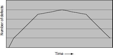
The purpose of testing is to find defects early in the test cycle.
For a product to be fit for release, not only is such a pattern of defect arrival important but also the defect arrival in a particular duration should be kept at a bare minimum number. A bell curve along with minimum number of defects found in the last few days indicate that the release quality of the product is likely to be good.
17.5.1.2 Defect fix rate
If the goal of testing is to find defects as early as possible, it is natural to expect that the goal of development should be to fix defects as soon as they arrive. If the defect fixing curve is in line with defect arrival a “bell curve” as shown in Figure 17.7 will be the result again. The coloured figure is available on Illustrations. There is a reason why defect fixing rate should be same as defect arrival rate. If more defects are fixed later in the cycle, they may not get tested properly for all possible side-effects. As discussed in regression testing, when defects are fixed in the product, it opens the doors for the introduction of new defects. Hence, it is a good idea to fix the defects early and test those defect fixes thoroughly to find out all introduced defects. If this principle is not followed, defects introduced by the defect fixes may come up for testing just before the release and end up in surfacing of new defects or resurfacing of old defects. This may delay the product release. Such last-minute fixes generally not only cause slips in deadlines or product quality but also put the development and testing teams under tremendous pressure, further aggravating the product quality.
The purpose of development is to fix defects as soon as they arrive.
17.5.1.3 Outstanding defects rate
The number of defects outstanding in the product is calculated by subtracting the total defects fixed from the total defects found in the product. As discussed before, the defects need to be fixed as soon as they arrive and defects arrive in the pattern of bell curve. If the defect-fixing pattern is constant like a straight line, the outstanding defects will result in a bell curve again as shown in Figure 17.7. If the defect-fixing pattern matches the arrival rate, then the outstanding defects curve will look like a straight line. However, it is not possible to fix all defects when the arrival rate is at the top end of the bell curve. Hence, the outstanding defect rate results in a bell curve in many projects. When testing is in progress, the outstanding defects should be kept very close to zero so that the development team's bandwidth is available to analyze and fix the issues soon after they arrive.
In a well-executed project, the number of outstanding defects is very close to zero all the time during the test cycle.
17.5.1.4 Priority outstanding rate
Having an eye on the find rate, fix rate, and outstanding defects are not enough to give an idea of the sheer quantity of defects. As we saw earlier, not all defects are equal in impact or severity. Sometimes the defects that are coming out of testing may be very critical and may take enormous effort to fix and to test. Hence, it is important to look at how many serious issues are being uncovered in the product. The modification to the outstanding defects rate curve by plotting only the high-priority defects and filtering out the low-priority defects is called priority outstanding defects. This is an important method because closer to product release, the product team would not want to fix the low-priority defects lest the fixes should cause undesirable side-effects. Normally only high-priority defects are tracked during the period closer to release.
The priority outstanding defects correspond to extreme and critical classification of defects. Some organizations include important defects also in priority outstanding defects. (See Table 17.3 for defect classification terminology.)
Some high-priority defects may require a change in design or architecture. If they are found late in the cycle, the release may get delayed to address the defect. But if a low-priority defect found is close to the release date and it requires a design change, a likely decision of the management would be not to fix that defect. If possible, a short-term workaround is proposed and the design change can be considered for a future release.
Some defect fixes may require relatively little time but substantial effort to test. The fix may be fairly straightforward, but retesting may be a time-consuming affair. If the product is close to release, then a conscious choice has to be made about such defect fixes. This is especially true of high-priority defects. The effort needed for testing needs to be estimated before proceeding to fix such defects. Some of the developers may go ahead and fix the defects if the effort involved in fixing is less. If the defect fix requires enormous amount of effort in testing to verify, then careful analysis needs to done and a decision taken on the basis of this analysis. In this case, trying to provide a workaround is more important than fixing the defect because of the large amount of test effort involved. Hence, the priority outstanding defects have to be monitored separately.
When priority outstanding defects are plotted, the objective is to see the curve going towards zero all the time during the test cycle. This means priority defects need to be fixed almost immediately.
Provide additional focus for those defects that matter to the release.
17.5.1.5 Defect trend
Having discussed individual measures of defects, it is time for the trend chart to consolidate all of the above into one chart. Figure 17.8 shows a chart with sample data containing all the charts discussed in this section.
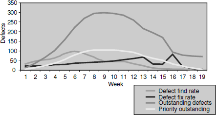
The effectiveness of analysis increases when several perspectives of find rate, fix rate, outstanding, and priority outstanding defects are combined.
From Figure 17.8, (coloured figure available on Illustrations) the following observations can be made.
- The find rate, fix rate, outstanding defects, and priority outstanding follow a bell curve pattern, indicating readiness for release at the end of the 19th week.
- A sudden downward movement as well as upward spike in defect fixes rate needs analysis (13th to 17th week in the chart above).
- There are close to 75 outstanding defects at the end of the 19th week. By looking at the priority outstanding which shows close to zero defects in the 19th week, it can be concluded that all outstanding defects belong to low priority, indicating release readiness. The outstanding defects need analysis before the release.
- Defect fix rate is not in line with outstanding defects rate. If defect fix rate had been improved, it would have enabled a quicker release cycle (could have reduced the schedule by four to five weeks) as incoming defects from the 14th week were in control.
- Defect fix rate was not at the same degree of defect find rate. Find rate was more than the fix rate till the 10th week. Making find rate and fix rate equal to each other would have avoided the outstanding defects peaking from the 4th to 16th week.
- A smooth priority outstanding rate suggests that priority defects were closely tracked and fixed.
Further points can be arrived at by analyzing the above data and by relating each data point and the series. The outcome of such an analysis will help the current as well as the future releases.
17.5.1.6 Defect classification trend
In Figure 17.8, the classifications of defects are only at two levels (high-priority and low-priority defects). Some of the data drilling or chart analysis needs further information on defects with respect to each classification of defects—extreme, critical, important, minor, and cosmetic. When talking about the total number of outstanding defects, some of the questions that can be asked are
Providing the perspective of defect classification in the chart helps in finding out release readiness of the product.
- How many of them are extreme defects?
- How many are critical?
- How many are important?
These questions require the charts to be plotted separately based on defect classification. The sum of extreme, critical, important, minor, and cosmetic defects is equal to the total number of defects. A graph in which each type of defects is plotted separately on top of each other to get the total defects is called "Stacked area charts." This type of graph helps in identifying each type of defect and also presents a perspective of how they add up to or contribute to the total defects. In Figure 17.9, the sample data explains the stacked area chart concept.
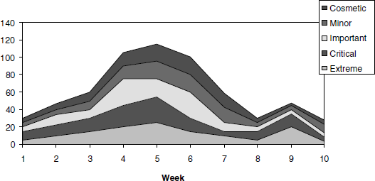
From the above chart, the following observations can be made
- The peak in defect count in the 5th week is due to all types of defects contributing to it, with extreme and critical defects contributing significantly.
- The peak defect count in the 9th week is due to extreme and critical defects.
- Due to peak in the 9th week, the product needs to be observed for another two weeks to study release readiness.
The priority distribution trend (Figure 17.9) can be plotted for both arrival rate and outstanding rate. However, if the analysis for incoming defects is needed separately, then the defect classification trend can be plotted for arrival rate.
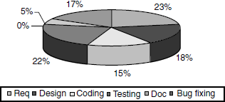
For analysis of release readiness, it is important to consider what percentage of incoming or outstanding defects is made up of extreme and critical defects. A high percentage of minor and cosmetic defects and low percentage of extreme and critical defects indicate release readiness. For making this analysis, the defect classification for a particular week can be plotted in a pie chart. The pie chart corresponding to the 10th week of the above trend chart is given in Figure 17.10 for release readiness analysis.
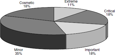
From the above chart it can be observed that close to 29% of the defects belong to the extreme and critical category, and may indicate that the product may not be of acceptable release quality.
17.5.1.7 Weighted defects trend
The stacked area chart provides information on how the different levels or types of defects contribute to the total number of defects. In this approach all the defects are counted on par, for example, both a critical defect and a cosmetic defect are treated equally and counted as one defect. Counting the defects the same way takes away the seriousness of extreme or critical defects. To solve this problem, a metric called weighted defects is introduced. This concept helps in quick analysis of defects, instead of worrying about the classification of defects. In this approach, not all the defects are counted the same way. More serious defects are given a higher weightage than less serious ones. For example, the total weighted defect count can be arrived at using a formula like the one given below. The numbers by which each defect gets weighted or multiplied can be organization specific, based on the priority and severity of defects.
When analyzing the above formula, it can be noted that each extreme defect is counted as five defects and cosmetic defect as one. This formula removes the need for a stacked area and the pie chart for analysis while incorporating both perspectives needed. The weighted defects trend corresponding to Figure 17.10 is given in Figure 17.11.
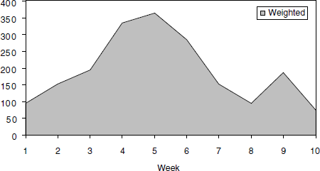
Weighted defects = (Extreme* 5 + Critical * 4 + Important *3 + Minor *2+ Cosmetic)
From Figure 17.11 it can be noted that
- The ninth week has more weighted defects, which means existence of “large number of small defects” or “significant numbers of large defects” or a combination of the two. This is consistent with our interpretation of the same data using the stacked area chart.
- The tenth week has a significant (more than 50) number of weighted defects indicating the product is not ready for release.
Hence, weighted defects provide a combined perspective of defects without needing to go into the details. This saves time for analysis of defects.
Both “large defects” and “large number of small defects” affect product release.
17.5.1.8 Defect cause distribution
All the metrics discussed above help in analyzing defects and their impact. The next logical questions that would arise are
- Why are those defects occurring and what are the root causes?
- What areas must be focused for getting more defects out of testing?
Finding the root causes of the defects help in identifying more defects and sometimes help in even preventing the defects. For example, if root cause analysis of defects suggests that code level issues are causing the maximum defects, then the emphasis may have to be on white box testing approaches and code reviews to identify and prevent more defects. This analysis of finding the cause of defects helps in going back to the SDLC phases and redoing that phase and the impacted areas, rather than finding and fixing the defects that may mean an “endless loop” in certain scenarios. Figure 17.12 presents a “defect cause distribution” chart drawn with some sample data.

As it can be seen from Figure 17.12, code contributes to 37% of the total defects. As discussed above, more testing focus would have to be put on white box testing methodologies. The next area that contributes most to defects (20%) is change request. This may mean that requirements keep changing while the project is in progress. Based on the SDLC model followed (Chapter 2), appropriate actions can be taken here. For example, the 20% of change request in a project following spiral or agile methodologies is acceptable but not in a project that is following the V model or waterfall model, as these changes may impact the quality and time of release.
Knowing the causes of defects helps in finding more defects and also in preventing such defects early in the cycle.
This root cause analysis can be repeated at periodic intervals and the trend of the root causes can be observed. At the start of the project, there may be only requirement defects. As we move to subsequent phases, other defects will start coming in. Knowing this will help in analyzing what defects are found in which phase of the SDLC cycle. For example, finding a requirement defect at the time of the final regression test cycle involves great effort and cost compared to defects found in the requirement phase itself. This kind of analysis helps in identifying problem areas in specific phases of SDLC model and in preventing such problems for current and future releases.
17.5.2 Development Defect Metrics
So far, our focus has been on defects and their analysis to help in knowing product quality and in improving the effectiveness of testing. We will now take a different perspective and see how metrics can be used to improve development activities. The defect metrics that directly help in improving development activities are discussed in this section and are termed as development defect metrics. While defect metrics focus on the number of defects, development defect metrics try to map those defects to different components of the product and to some of the parameters of development such as lines of code.
17.5.2.1 Component-wise defect distribution
While it is important to count the number of defects in the product, for development it is important to map them to different components of the product so that they can be assigned to the appropriate developer to fix those defects. The project manager in charge of development maintains a module ownership list where all product modules and owners are listed. Based on the number of defects existing in each of the modules, the effort needed to fix them, and the availability of skill sets for each of the modules, the project manager assigns resources accordingly. As an example, the distribution of defects across the various components may look like the chart in Figure 17.13.

It can be noted from the chart that there are four components (install, reports, client, and database) with over 20 defects, indicating that more focus and resources are needed for these components. The number of defects and their classification are denoted in different colors and shading as mentioned in the legend. The defect classification as well as the total defects corresponding to each component in the product helps the project manager in assigning and resolving those defects.
Knowing the components producing more defects helps in defect fix plan and in deciding what to release.
There is another aspect of release, that is, what to release. If there is an independent component which is producing a large number of defects, and if all other components are stable, then the scope of the release can be reduced to remove the component producing the defects and release other stable components thereby meeting the release date and release quality, provided the functionality provided by that component is not critical to the release. The above classification of defects into components helps in making such decisions.
17.5.2.2 Defect density and defect removal rate
A good quality product can have a long lifetime before becoming obsolete. The lifetime of the product depends on its quality, over the different releases it goes through. For a given release, reasonable measures of the quality of the product are the number of defects found in testing and the number of defects found after the product is released. When the trend of these metrics is traced over different releases, it gives an idea of how well the product is improving (or not) with the releases. The objective of collecting and analyzing this kind of data is to improve the product quality release by release. The expectations of customers only go up with time and this metric is thus very important.
However it is not appropriate to just compare the number of defects across releases. Normally, as a software product goes through releases (and later through versions), the size of the product—in terms of lines of code or other similar measures—also increases. Customers expect the quality of the product to improve, notwithstanding the increase in product size.
One of the metrics that correlates source code and defects is defect density. This metric maps the defects in the product with the volume of code that is produced for the product.
There are several standard formulae for calculating defect density. Of these, defects per KLOC is the most practical and easy metric to calculate and plot. KLOC stands for kilo lines of code. Every 1000 lines of executable statements in the product is counted as one KLOC.
Defects per KLOC = (Total defects found in the product)/(Total executable lines of code in KLOC)
This information is plotted on a per milestone or per release basis to know the quality of the product over time. The metric is related to product quality measured over several releases of the product. The metric compares the defects per KLOC of the current release with previous releases. There are several variants of this metric to make it relevant to releases, and one of them is calculating AMD (added, modified, deleted code) to find out how a particular release affects product quality. In a product development scenario, the code that makes up the product is not developed completely from scratch for every release. New features to the existing product are added, the product is modified to fix the existing defects, and some features that are no longer being used are deleted from the product for each release. Hence, calculating the complete lines of code may not be appropriate in that situation to analyze why product quality went up or came down. For such reasons, the denominator used in the above formula is modified to include “total executable AMD lines of code in KLOC.” The modified formula now reads
Defect per KLOC can be used as a release criteria as well as a product quality indicator with respect to code and defects. Defects found by the testing team have to be fixed by the development team. The ultimate quality of the product depends both on development and testing activities and there is a need for a metric to analyze both the development and the testing phases together and map them to releases. The defect removal rate (or percentage) is used for the purpose.
The formula for calculating the defect removal rate is
The above formula helps in finding the efficiency of verification activities and unit testing which are normally responsibilities of the development team and compare them to the defects found by the testing teams. These metrics are tracked over various releases to study in-release-on-release trends in the verification/quality assurance activities. As an example, the two metrics discussed above—defects/KLOC and defect removal rate/percentage—are plotted together in the chart in Figure 17.14.
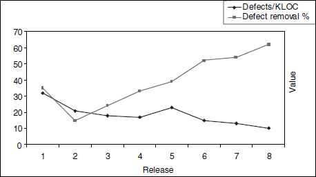
In this chart, it can be noticed that the defect removal percentage is going up and defects per KLOC is coming down, indicating improvement in product quality over releases. The drop in the defect removal percentage during the second release compared to the first release and the like in the defects per KLOC during the fifth release compared to the fourth release indicate some problems that need more analysis to find out the root causes and to rectify them.
The time needed to fix a defect may be proportional to its age.
17.5.2.3 Age analysis of outstanding defects
Most of the charts and metrics discussed above—outstanding defect trend, their classification, and their fix rate—just indicate the number of defects and do not reflect the information on the age of the defects. Age here means those defects that have been waiting to be fixed for a long time. Some defects that are difficult to be fixed or require significant effort may get postponed for a longer duration. Hence, the age of a defect in a way represents the complexity of the defect fix needed. Given the complexity and time involved in fixing those defects, they need to be tracked closely else they may get postponed close to release which may even delay the release. A method to track such defects is called age analysis of outstanding defects.
To perform this analysis, the time duration from the filing of outstanding defects to the current period is calculated and plotted every week for each criticality of defects in stacked area graph. See Figure 17.15. This graph is useful in finding out whether the defects are fixed as soon as they arrive and to ensure that long pending defects are given adequate priority. The defect fixing rate discussed earlier talks only about numbers, but age analysis talks about their age. The purpose of this metric and the corresponding chart is to identify those defects—especially the high-priority ones—that are waiting for a long time to be fixed.
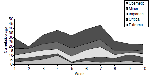
From the above chart, the following few observations can be made.
- The age of extreme defects were increasing in week 4.
- The age of cosmetic defects were not in control from week 3 to week 7.
- The cumulative age of defects were in control starting from week 8 and in week 2.
17.5.2.4 Introduced and reopened defects trend
When adding new code or modifying the code to provide a defect fix, something that was working earlier may stop working. This is called an introduced defect. These defects are those injected in to the code while fixing the defects or while trying to provide an enhancement to the product. This means that those defects were not in the code before and functionalities corresponding to those were working fine.
Sometimes, a fix that is provided in the code may not have fixed the problem completely or some other modification may have reproduced a defect that was fixed earlier. This is called a reopened defect. Hence, reopened defects are defects for which defects fixes provided do not work properly or a particular defect that was fixed that reappears. A reopened defect can also occur if the defect fix was provided without understanding all the reasons that produced the defect in the first place. This is called a partial fix of a defect.
All the situations mentioned above call for code discipline and proper review mechanisms when adding and modifying any code for the purpose of proving additional functionality or for providing defect fixes. Such a discipline optimizes the testing effort and helps in arriving at regression test methodology discussed in Chapter 8. Too many introduced and reopened defects may mean additional defect fixing and testing cycles. Therefore, these metrics need to be collected and analyzed periodically. The introduced and reopened defects trend with sample data is plotted in Figure 17.16.
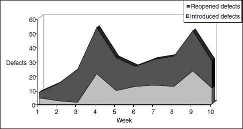
From the above chart, the following observations can be made.
- Reopened defects were at a high level from week 4. (Thickness of area graph corresponding to reopened defects suggests this in the above chart.)
- After week 3, introduced defects were at a high level, with more defects observed in week 4 and week 9.
- The combined data of reopened and introduced defects from week 9 and week 10 suggests the product is not ready for release and also suggests the code is not stable because there is no declining trend. In such a case, the development team should examine the code changes made during the week and get to the root causes of the trend. Doing such an analysis at more frequent intervals enables easier identification of the problem areas.
Testing is not meant to find the same defects again; release readiness should consider the quality of defect fixes.
17.6 PRODUCTIVITY METRICS
Productivity metrics combine several measurements and parameters with effort spent on the product. They help in finding out the capability of the team as well as for other purposes, such as
- Estimating for the new release.
- Finding out how well the team is progressing, understanding the reasons for (both positive and negative) variations in results.
- Estimating the number of defects that can be found.
- Estimating release date and quality.
- Estimating the cost involved in the release.
17.6.1 Defects per 100 Hours of Testing
As we saw in Chapter 1, program testing can only prove the presence of defects, never their absence. Hence, it is reasonable to conclude that there is no end to testing and more testing may reveal more new defects. But there may be a point of diminishing returns when further testing may not reveal any defects. If incoming defects in the product are reducing, it may mean various things.
- Testing is not effective.
- The quality of the product is improving.
- Effort spent in testing is falling.
The first two aspects have been adequately covered in the metrics discussed above. The metric defects per 100 hours of testing covers the third point and normalizes the number of defects found in the product with respect to the effort spent. It is calculated as given below:
Effort plays an important role in judging quality. The charts in Figure 17.17 explain this role with sample data plotted using the above formula.
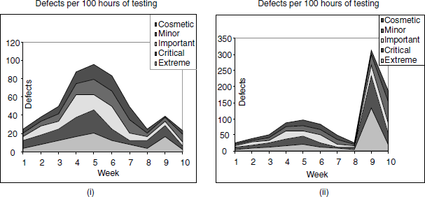
Both the charts use the same defect data as that of defect classification trend in Figure 17.17 with only difference in effort spent. In (i), it is assumed that constant effort is spent in all the weeks. The chart produced a bell curve, indicating readiness for the release.
However, in real life, the above assumption may not be true and effort is not spent equally on testing week by week. Sometimes, the charts and analysis can be misleading if the effort spent towards the end of the release reduces and may mean that the downward trend in defect arrival is because of less focus on testing, not because of improved quality. In (ii), it is assumed that 15 hours are spent in weeks 9 and 10 and 120 hours in all other weeks. This assumption, which could mean reality too, actually suggests that the quality of the product has fallen and more defects were found by investing less effort in testing for weeks 9 and 10. This example in (ii) clearly shows that the product is not ready for release at all.
Normalizing the defects with effort spent indicates another perspective for release quality.
It may be misleading to judge the quality of a product without looking at effort because a downward trend shown in (i) assumes that effort spent is equal across all weeks. This chart provides the insight—where people were pulled out of testing or less number of people were available for testing and that is making the defect count come down. Defects per 100 hours of testing provides this important perspective, to make the right decision for the release.
17.6.2 Test Cases Executed per 100 Hours of Testing
The number of test cases executed by the test team for a particular duration depends on team productivity and quality of product. The team productivity has to be calculated accurately so that it can be tracked for the current release and be used to estimate the next release of the product. If the quality of the product is good, more test cases can be executed, as there may not be defects blocking the tests. Also, there may be few defects and the effort required in filing, reproducing, and analyzing defects could be minimized. Hence, test cases executed per 100 hours of testing helps in tracking productivity and also in judging the product quality. It is calculated using the formula
17.6.3 Test Cases Developed per 100 Hours of Testing
Both manual execution of test cases and automating test cases require estimating and tracking of productivity numbers. In a product scenario, not all test cases are written afresh for every release. New test cases are added to address new functionality and for testing features that were not tested earlier. Existing test cases are modified to reflect changes in the product. Some test cases are deleted if they are no longer useful or if corresponding features are removed from the product. Hence the formula for test cases developed uses the count corresponding to added/modified and deleted test cases.
17.6.4 Defects per 100 Test Cases
Since the goal of testing is find out as many defects as possible, it is appropriate to measure the “defect yield” of tests, that is, how many defects get uncovered during testing. This is a function of two parameters—one, the effectiveness of the tests in uncovering defects and two, the effectiveness of choosing tests that are capable of uncovering defects. The ability of a test case to uncover defects depends on how well the test cases are designed and developed. But, in a typical product scenario, not all test cases are executed for every test cycle. Hence, it is better to select test cases that produce defects. A measure that quantifies these two parameters is defect per 100 test cases. Yet another parameter that influences this metric is the quality of product. If product quality is poor, it produces more defects per 100 test cases compared to a good quality product. The formula used for calculating this metric is
17.6.5 Defects per 100 Failed Test Cases
Defects per 100 failed test cases is a good measure to find out how granular the test cases are. It indicates
- How many test cases need to be executed when a defect is fixed;
- What defects need to be fixed so that an acceptable number of test cases reach the pass state; and
- How the fail rate of test cases and defects affect each other for release readiness analysis.
All the productivity metrics discussed in this section except defect per 100 hours of testing are plotted together with sample data in Figure 17.18.
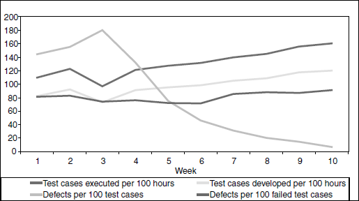
The following observations can be made by looking at the above chart.
- Defects per 100 test cases showing a downward trend suggests product readiness for release.
- Test cases executed per 100 hours on upward trend suggests improved productivity and product quality (Week 3 data needs analysis).
- Test cases developed per 100 hours showing a slight upward movement suggests improved productivity (Week 3 needs analysis).
- Defects per 100 failed test cases in a band of 80–90 suggests equal number of test cases to be verified when defects are fixed. It also suggests that the test case pass rate will improve when defects are fixed.
17.6.6 Test Phase Effectiveness
In Chapter 1, Principles of Testing, we saw that testing is not the job of testers alone. Developers perform unit testing and there could be multiple testing teams performing component, integration, and system testing phases. The idea of testing is to find defects early in the cycle and in the early phases of testing. As testing is performed by various teams with the objective of finding defects early at various phases, a metric is needed to compare the defects filed by each of the phases in testing. The defects found in various phases such as unit testing (UT), component testing (CT), integration testing (IT), and system testing (ST) are plotted and analyzed. See Figure 17.19.
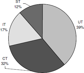
In the above chart, the total defects found by each test phase is plotted. The following few observations can be made.
- A good proportion of defects were found in the early phases of testing (UT and CT).
- Product quality improved from phase to phase (shown by less percent of defects found in the later test phases—IT and ST).
Extending this data, some projections on post-release defects can be arrived at. CT found 32% of defects and IT found 17% of defects. This is approximately a 45% reduction in the number of defects. Similarly, approximately 35% reduction in the number of defects was found going from IT to ST. A post release can now assume 35% reduction in the number of defects which amounts to 7.5% of the total defects. A conservative estimate thus indicates that close to 7.5% of total defects will be found by customers. This may not be an accurate estimate but can be used for staffing and planning of support activities.
17.6.7 Closed Defect Distribution
The objective of testing is not only to find defects. The testing team also has the objective to ensure that all defects found through testing are fixed so that the customer gets the benefit of testing and the product quality improves. To ensure that most of the defects are fixed, the testing team has to track the defects and analyze how they are closed. The closed defect distribution helps in this analysis. See Figure 17.20.

From the above chart, the following observations can be made.
- Only 28% of the defects found by test team were fixed in the product. This suggests that product quality needs improvement before release.
- Of the defects filed 19% were duplicates. It suggests that the test team needs to update itself on existing defects before new defects are filed.
- Non-reproducible defects amounted to 11%. This means that the product has some random defects or the defects are not provided with reproducible test cases. This area needs further analysis.
- Close to 40% of defects were not fixed for reasons “as per design,” “will not fix,” and “next release.” These defects may impact the customers. They need further discussion and defect fixes need to be provided to improve release quality.
17.7 RELEASE METRICS
We discussed several metrics and how they can be used to determine whether the product is ready for release. The decision to release a product would need to consider several perspectives and several metrics. All the metrics that were discussed in the previous sections need to be considered in totality for making the release decision. The purpose of this section is to provide certain guidelines that will assist in making this decision. These are only set of guidelines and the exact number and nature of criteria can vary from release to release, product to product, and organization to organization. Table 17.5 gives some of the perspectives and some sample guidelines needed for release analysis.
Table 17.5 Some perspectives and sample guidelines for release analysis.
| Metric | Perspectives to be considered | Guidelines |
|---|---|---|
| Test cases executed | Execution % Pass % |
|
| Effort distribution | Adequate effort has been spent on all phases |
|
| Defect find rate | Defect trend |
|
| Defect fix rate | Defect fix trend |
|
| Outstanding defects trend | Outstanding defects |
|
| Priority outstanding defects trend | High-priority defects |
|
| Weighted defects trend | High-priority defects as well as high number of low-priority defects |
|
| Defect density and defect removal rate | Defects/KLOC Defect removal % |
|
| Age analysis of outstanding defects | Age of defects |
|
| Introduced and reopened defects | Quality of defect fix Same defects reappearing again |
|
| Defects per 100 hours of testing | Whether defect arrival is proportional to effort spent |
|
| Test cases executed per 100 hours of testing | Whether improved quality in product allowing more test cases being executed Whether test cases executed is proportional to effort spent |
|
| Test phase effectiveness | Defects found in each of the test phases |
|
| Closed defects distribution | Whether good proportion of defects found by testing are fixed |
|
17.8 SUMMARY
The metrics defined in this chapter provide different perspectives and are complementary to each other. Hence, all these metrics have to be analyzed in totality, not any of them in isolation. Also, not all metrics may be equally significant in all situations.
Management commitment and a culture for promoting the capture and analysis of metrics are important aspects for the success of the metrics program in an organization. There is a perception that if project management experience is available in an organization, then metrics are not needed. One may hear statements like “I trust my gut feeling, why do I need metrics?” The point is that in addition to validating the gut feeling, metrics provide several new perspectives that may be very difficult even for experienced project managers to visualize. There are several other perceptions on metrics that can be addressed only if metrics are part of the habit and culture in an organization.
Metrics are meant only for process improvement, project management, and to assess and improve product quality. The metrics and productivity numbers generated for the purpose of metrics should never be used to evaluate the performance of the team and individuals in the team. This will defeat the purpose of metrics and the intention behind it.
If the people in an organization do not consistently understand the intention and purpose of metrics, then they may not supply actual, accurate, and realistic data. The analysis of such a wrong data will be misleading. Even if the data is correct, it can be twisted by the people to suit their own perspectives and needs.
Generating metrics and producing charts are only part of the effort involved in a metrics program. The analysis of metrics and tracking the action items to closure are time-consuming and difficult activities. When metrics are generated but if there is a tendency of ignoring the results and if the team goes by the so-called gut feeling to release the product, then it is as good as not having any metrics at all.
Automating data collection and producing the charts automatically can reduce the effort involved in metrics. However, analysis of metrics and taking actions still remains manual activities since analysis needs human intelligence and effort. Assigning the right people in the organization to analyze the metrics results and ensuring that the right follow through actions take place in a timely fashion will help build the credibility of a metrics program and increase the effectiveness of the metrics in an organization.
Metrics & Measurements are discussed in several books and articles. [KARL-E] is a place to go to understand the basics of metrics and to create the culture of metrics creation. This place has several metrics that are defined for people performing various roles.
- What is the difference between effort and schedule?
- What are the steps involved in a metrics program. Briefly explain each step.
- What are the key benefits in using metrics in product development and testing?
- If there is a negative variance in effort and schedule, what does it signify?
- What is the additional value of plotting weighted defects? In what way does it provide an additional perspective than the defect classification trend?
- List and discuss the metrics that can be used for defect prevention and how?
- How do you calculate defect density and defect removal rate? Discuss ways to improve these rates for a better quality product?
- What are the insights and quality factors that are to be considered for a product release? Please explain few guidelines on how those quality factors can be plotted and analyzed in the form of metrics.