
THE EARLY APP STORE
When the App Store first launched in mid-2008, it was like the first primordial soup from which certain life forms are thought to originate. It was a volatile place with app prices in extreme flux, and huge numbers of early adopters.
Developers had already released more than 600 apps that took advantage of the iPhone device in exciting new ways, providing both monetary incentive and creative ideas to new developers. Figure 1-2 shows what the iTunes App Store looked like on launch.

FIGURE 1-2: Looking at the App Store on launch in July, 2008, note the abundance of white space, lack of the “App of the Week,” and the absence of a Books category
Novel Uses of the Touch Screen
The iPod Touch and iPhone's touch screen was a giant step in the evolution of interface control for several reasons. Sure, the Nintendo Wii started the trend when it announced its novel “Wii-mote” motion controller in 2005 that provided yet unseen interactivity for home consoles. But for mobile devices, tablets, and indeed future touch devices yet to come, credit for navigation protocol will typically go to Apple's first touch devices.
When you begin to create your app, the more naturally the app is integrated with the device it's hosted on, the better feedback and reviews you'll get from your customers. To that end, and as a primer for what's possible using these touch screens, Table 1-2 shows the four main ways the features seen in the original iPod Touch and iPhone are part of today's user expectations in a touch device.
TABLE 1-2: iPod Touch and iPhone Touch Screen Features
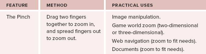


Each of the four touch-screen control mechanisms shown in Table 1-2 has helped with innovating user experience design, and has had a huge influence on the way people interact with apps and games. This, combined with the phenomenal user adoption rate of the iPhone and touch screens in general, has virtually locked these in as being standards in interface design for many years to come.
Not mentioned in Table 1-2 is the Double Tap, where you simply double-tap the screen to perform an action. While this is often used to “reset” photos or viewpoints from a zoomed level, it is less intuitive than the other more natural touch innovations because of it being somewhat arbitrary. It is, therefore, used only as a last resort, or in special circumstances in games/apps.
A few other innovations for the iPhone such as the accelerometer (tilt mechanism) and newer gyroscope were also not described in Table 1-2. These have less to do with a touch screen than additional control options. When combined with a touch screen, however, even more exciting options for interface design become available.
In store for the future of touch devices are all sorts of multi-finger gestures. Apple is already at work patenting as many as it can. There may be a few multi-finger gestures that are naturally intuitive and, thus, destined to become instant classics (for example, putting at least three fingers down and rotating to rotate an image or object, or perhaps a multi-finger swipe down or zigzag to erase or close). Perhaps even further in the future on new generations of iPhones you might see 3D motion recognition using a built-in camera (similar to the Kinect by Microsoft), where touching a two-dimensional (2D) surface is no longer a feature, but rather a limitation. However, that's getting a little ahead of the game.
With unlimited invention possible in these four mainstays of touch screen controls, it can be easy to overcomplicate apps in the drive to keep them fresh and new. Let's take a look at why innovation goes hand in hand with simplification.
Simplicity Succeeds While Complexity Fails
Apple was built on simplicity and intuitive user experience (as you will see in Chapter 9), and so it's not surprising that signature apps built into the devices help paved the way for others in terms of what to expect and what can be done. In essence, Apple's push toward simplicity, combined with the quick adoption of the device from people who've come to expect a certain usability with the brand, has helped to push this mentality to the forefront of app development.
With the fierce competition of the App Store, not only must your app be innovative to a certain extent to be acknowledged, but if it isn't also intuitive and easy to learn, then (except in rare cases where the niche is still unsaturated) it simply won't have the longevity to succeed or outlast the competition.
There's another reason why simplicity is key for this device. Simplicity caters to the casual user, and that's typically where the big money is, but it comes with a disclaimer. No matter which audience you're going for, even highly niche or technical, keeping it as simple as possible will always broaden the range of people that can adopt it.