CASE STUDY: TAPBOTS
Tapbots is a company and brand that has developed a “suite” of practical and paid apps branded around one theme — cute robots that each performs a core feature exceptionally well, and usually with a highly polished, intuitive interface.
Let's take a look at some of the design strategies Tapbots has used to be successful in its niche with generally exceptional reviews. Specifically, let's look at its current latest app, “Tweetbot,” released April 2011. You might think that with all of the Twitter clients available, the niche could be overly saturated already, but Tapbots makes use of its existing brand and reputation to break into a popular niche.
High-Contrast Branding
Taking a look at the Tapbots web page as shown in Figure 9-7, you see an Apple-like simplicity and branding with grays and whites against vibrant color, placing the importance on the product. This is not uncommon for Apple-related or OS X–related web pages, and shows that it can be applied to app branding as well.

FIGURE 9-7: The high-contrast and user-friendly web page for Tapbots demonstrates the professional type of app you would be buying
Figure 9-8 shows an array of the icons for current apps offered by Tapbots, each (except for “Pastebot”) recognizable for being branded around the Tapbots robot theme. Having a tight, unified brand provides consumer comfort that if you enjoy the current selection, you can expect more of similar quality or consistency. Furthermore, each icon is generally recognizable for its functionality, or, in the case of “Convertbot” (a conversion utility) and “Weightbot,” an engaging icon or interface. “Tweetbot” has improved from the earlier apps.

FIGURE 9-8: Polished App Store icons help sell an app and, in this case, tie in with the theme of a brand (cute robots from Tapbots)
Refined, Responsive, Simplistic Interface
Everything offered by Tapbots is fluid, provides instant animated feedback, makes good use of standard iconography, and features large, tappable icons, and thoughtful graphic touches everywhere. Simplistic interfaces can be designed to hide depth, and this is precisely what “Tweetbot” does.
As shown in Figure 9-9, the Settings menu is laid out with unique radio buttons and simplistic, user-friendly text. Combined with the ever-present bottom navigation bar for instant access to any main function, this helps make the app fun to use. In the end, it may not be quite as full-featured as some other Twitter apps, but it is fairly robust with features, while at the same time providing valuable ease-of-use, reduced clutter, and hidden depth (that is, screens show only what is necessary, and provide simple icons to unlock depth when needed).
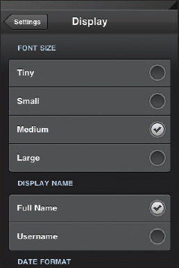
FIGURE 9-9: The Settings menu in “Tweetbot” is simplified because of its user-friendly, concise text, large checkmarks, and lack of clutter
No Transitions
The “Tweetbot” app is almost entirely comprised of one large menu that seamlessly flows in and out of various functions, partly because of the ubiquitous, customizable navigation bar at the bottom that provides a starting point, as well as the upper-left navigation bar to get you back to a previous menu level. There are almost no transitions to new full screen interfaces that do not appear to be a new, integrated pop-up covering your last known place. “Tweetbot” makes heavy use of the navigation bar and pop-over elements (as shown in Figure 9-10) so that users almost never see a loading animation.
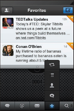
FIGURE 9-10: Almost anywhere within the app is within easy reach from the bottom navigation menu, which can be prioritized to the user's preference
Standard Conventions
As shown in Figure 9-11, “Tweetbot” uses iconography seen in other Apple apps and Twitter clients, as well as zero non-standard navigation, keeping the app easy to use, but with exceptional layout and intuitive button placement. In this respect, it follows general design rules and human interaction principles. For example, when viewing the default page of someone you are following, the most relevant information is at the top, while scrolling down is possible for more in-depth information and choices.
You might argue that the Tapbots apps have not been overly popular yet, and, therefore, the approach is not one that can (or should) be modeled exactly. However, some of that is likely caused by other factors such as pricing, marketing, or the lack of a lite version for any of the Tapbots apps. Also note that “Tweetbot” is within striking distance in its niche (within the top ten social apps) and has exceptional user review feedback, a vindication at least for its design.
What should be taken from this case study is that the Tapbots has a solid reputation now for the amount of thought that went into creating each aspect of this and most of its other apps, especially in the way of button placement, streamlining (simplifying) the interface, and lack of transitions, helping to keep you in the apps seamlessly with little to no loading. Apps like this are fun to use, and do not have to be as full-featured as other apps in order to be more desirable. Have the right features, and do them well.
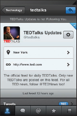
FIGURE 9-11: None of the screens in “Tweetbot” feature much clutter, and almost all relevant information uses a top-down approach