
Job:03171 Title:Typography Referenced (Rockport)
Page: 78
068-121 03171.indd 78 9/22/11 4:54 PM
78
Typography, Referenced
Text
Job:03171 Title:Typography Referenced (Rockport)
Page: 78
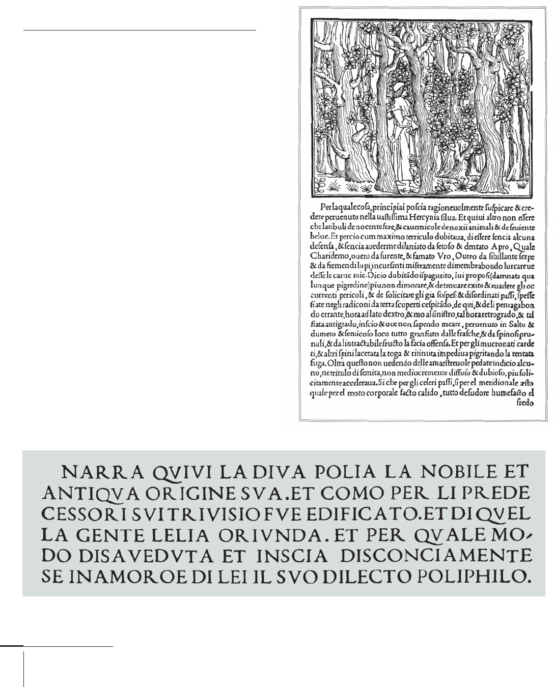
Manutius, 1499
Poliphilli, 1499
Aldus Manutius
Italian, 1449–1515
Aldus Manutius was born in 1449 in the Duchy of
Sermoneta. He spent his early career working for Alberto
Pio, the Count of Capri, but left for Venice in 1489 to
pursue his dream of publishing Greek classics in their
original Greek. He released his fi rst publication in 1484.
The early typefaces of this prolifi c Renaissance printer
and publisher and his punchcutter Francesco Griff o (76)
greatly improved on earlier Jenson (77) types. Manutius
commissioned Griff o to design several typefaces, the
most important of which is now revived under the name
Bembo (155). The basis for the typeface fi rst appeared in
Pietro Bembo’s de Aetna, printed by Manutius in a font
designed by Griff o.
Because of the attractiveness and legibility (330) of
these typefaces, they became the publishing models
for the next 250 years. Manutius and Griff o typically get
credit for the invention of italic type, which made its fi rst
appearance in a 1501 edition of Virgil.
068-121 03171 C2.indd 78 10/12/11 9:24 AM

Job:03171 Title:Typography Referenced (Rockport)
Page: 79
068-121 03171.indd 79 9/22/11 4:54 PM
Type Designers
Text
Job:03171 Title:Typography Referenced (Rockport)
Page: 79
Otl Aicher was born in Ulm, Germany, in ,
the same place where he established his own
design studio in . He studied sculpture at
the Munich Academy of Fine Arts and was a
founding member of the school Hochschule
für Gestaltung in Ulm.
He was a type designer, graphic designer,
author, and teacher who gained worldwide
recognition during the post–World War
II period for his identity programs for
international corporations such as Braun
() and Lufthansa (), as well as for
his pictogram system for the Olympic
Games in Munich.
Aicher designed the typeface Traffi c,
which was used in the public transport
systems in Munich and at the Munich Airport.
But his best-known typeface, Rotis, combined
elements of serif, semi-serif, sans serif, and
semi-sans serif. Aicher produced Rotis in four
weights—light, roman, bold, and black—with
related italics for light and roman.
Twentieth Century
to the Present
Otl Aicher, Jonathan Barnbrook, Ed Benguiat, Morris Fuller Benton,
David Berlow, Lucian Bernhard, Charles Bigelow, Peter Bilak, Neville Brody,
Margaret Calvert, Matthew Carter, Oswald Bruce Cooper, Willem Hendrik Crouwel,
William Addison Dwiggins, Tobias Frere-Jones, Adrian Frutiger, Eric Gill,
Frederic Goudy, Luc(as) de Groot, Jonathan Hoefl er, Rudolf Koch, Zuzana Licko,
Herb Lubalin, Martin Majoor, Max Miedinger, James Montalbano,
Stanley Morison, Aldo Novarese, Paul Renner, Bruce Rogers, Christian Schwartz,
Robert Slimbach, Fred Smeijers, Erik Spiekermann, Sumner Stone,
Jan Tschichold, Carol Twombly, Gerard Unger, Jürgen Weltin, Hermann Zapf
Otl Aicher
German, –
Typefaces: Traffi c (1974), Rotis (1988)
068-121 03171.indd 79 9/22/11 4:54 PM
Job:03171 Title:Typography Referenced (Rockport)
Page: 80
068-121 03171.indd 80 9/22/11 4:54 PM
Typography, Referenced
Text
Job:03171 Title:Typography Referenced (Rockport)
Page: 80
Ed Benguiat
American, –
Typefaces: Charisma (1969), Souvenir (1972),
Korinna (1974, with Victor Caruso), Tiff any (1974),
Bauhaus (1975, with Caruso), Bookman (1975),
Benguiat (1978), Benguiat Gothic (1979),
Barcelona (1981), Modern No. 216 (1982),
Panache (1988), Edwardian Script (1994)
Ed Benguiat is a prolifi c calligrapher and type designer
with more than typefaces to his name. He played
a critical role in establishing International Typeface
Corporation () (), the fi rst independent licensing
company for type designers, with his fi rst typeface,
Souvenir. He was vice president of and worked with
Herb Lubalin () on the infl uential U&lc magazine.
Benguiat attended the Workshop School of Advertising
Art and studied calligraphy under Arnold Bank and Paul
Standard, both in New York City. After he left his job as
associate art director of Esquire magazine in , he
opened his own design studio. In , he joined Photo-
Lettering, Inc., as its typographic design director.
In addition to typeface design, he has created logotypes
for the New York Times, Playboy, Reader’s Digest, Sports
Illustrated, Esquire, Photoplay, McCall’s, and Look.
In , Benguiat received the Gold Medal from the
Type Directors Club () and the prestigious Frederic W.
Goudy Award in Typography from Rochester Institute of
Technology (). That same year, he was inducted into
the New York Art Directors Hall of Fame.
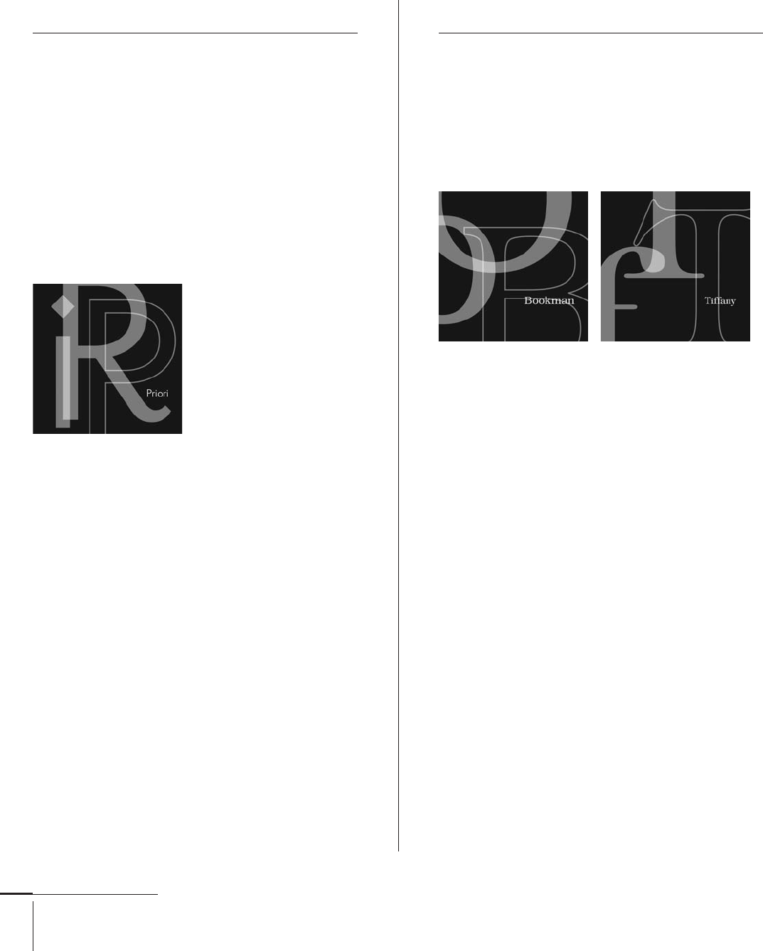
Jonathan Barnbrook
British, –
Typefaces: Exocet (1990), Mason (1991),
Mason Sans, Mason Serif (1992),
Bastard, Delux, Draylon, Drone, Nixon Script,
Nylon, Patriot, Prototype, Prozac (1995),
Apocalypso, False Idol (1997), Newspeak (1998),
Echelon, Moron (2000), Melancholia (2001), Coma (2002),
Priori (2003), Tourette (2003, with Marcus Leis Allion),
Expletive Script (2004, with Allion),
Infi del, Shock & Awe (2004),
State Machine (2004, with Allion), Bourgeois (2005),
Doublethink (2006, with Allion), Sarcasti (2007),
Hopeless Diamond, Regime (2009, with Allion)
Jonathan Barnbrook is a British typographer and graphic
designer. Born in Luton in , Barnbrook studied at
Central Saint Martins College of Art & Design from to
and at the Royal College of Art from to .
Initial recognition for his typographic work came
for his cover art for David Bowie’s album Heathen,
which featured the debut of Barnbrook’s Priori typeface.
Barnbrook has worked with London’s why not associates,
and in started freelancing as a designer. In , he
launched his own digital type foundry, Virus.
Other well-known typefaces designed by Barnbrook,
such as Exocet, False Idol, Infi del, and Mason, have emo-
tional and controversial titles refl ecting the style and
themes found in most of his work.
068-121 03171.indd 80 9/22/11 4:54 PM
Job:03171 Title:Typography Referenced (Rockport)
Page: 81
068-121 03171 C2.indd 81 10/12/11 9:28 AM
81
Type Designers
Text
Job:03171 Title:Typography Referenced (Rockport)
Page: 81
Morris Fuller Benton is known as the most prolifi c type designer
in U.S. history and for making enormous contributions to type
design development in the fi rst half of the twentieth century
(16). Benton’s father, Linn Boyd Benton, was the fi rst director of
the American Type Founders () design department. There
the younger Benton became his father’s assistant and learned
every aspect of type founding and design.
He was the director of the design department from
to . During his tenure, Benton designed typefaces,
ranging from historic revivals and original typefaces to his large
family of Grotesque (60) sans serifs known as Gothics, plus
eighteen variations on the typeface Century (159), including the
popular Century Schoolbook. Benton also worked closely with
his contemporary at , Henry Lewis Bullen, collector of the
company’s famous type library and mentor of type publicist and
scholar Beatrice Warde.
Benton, 1935
Morris Fuller Benton
American, –
Typefaces: Academy (1896), Cloister (1897),
Century Expanded (1900), Engravers Old Style,
Linotext, Marriage, Wedding (1901),
Alternate Gothic, Franklin Gothic (1903),
Bold Antique, Cheltenham (1904),
Linoscript (1905), Century Old Style (1906),
Clearface (1907), Clear Gothic, Commercial Script,
Lightline Gothic, News Gothic (1908),
Hobo (1910), Souvenir (1914),
Century Schoolbook (1919),
Canterbury Old Style (1926), Broadway (1927),
Bulmer, Chic, Modernique, Novel Gothic,
Parisian (1928), Louvaine (1929),
Bank Gothic, Piranesi (1930), Stymie (1931),
American Text, Raleigh Gothic (1932),
Agency, Agency Gothic, Eagle (1933),
Benton, Tower (1934), Phoenix (1935), Empire (1937)
Benton, 1934
068-121 03171.indd 81 9/22/11 4:54 PM
Job:03171 Title:Typography Referenced (Rockport)
Page: 82
068-121 03171.indd 82 9/22/11 4:54 PM
Typography, Referenced
Text
Job:03171 Title:Typography Referenced (Rockport)
Page: 82
David Berlow
American, –
Typefaces: Belizio (1988),
Grot, Millennium (1989), Numskill (1990),
Phaistos (1991), Vernacular (1992),
Berlin Sans, Gra,
Meyer Two, Moderno (1994),
Esperanto, Hitech, Nature, Online
Gothic, Throhand, Truth, Zenobia (1995),
Charcoal, Rhode, Techno (1997),
Gadget (1998)
Born in Boston, Massachusetts, in ,
David Berlow studied art history at
the University of Wisconsin–Madison.
From to , he worked as a type
designer for Mergenthaler, Linotype (),
D. Stempel AG, and Haas type
foundries. In , he started as a type
designer for the newly formed
digital type foundry Bitstream ().
Seven years later, in , Berlow
opened the type foundry The Font
Bureau, Inc. () with Roger Black, a
former art director for Rolling Stone. To
date, The Font Bureau has produced
more than new and revised type-
faces and logotypes for clients such as
the Chicago Tribune, the Wall Street
Journal, Entertainment Weekly, News-
week, Esquire, Rolling Stone, and Hewlett
Packard, as well as fonts for Apple
Computer, Microsoft, and . The Font
Bureau’s entire retail library is made
up of mostly original type designs and
includes more than typefaces.
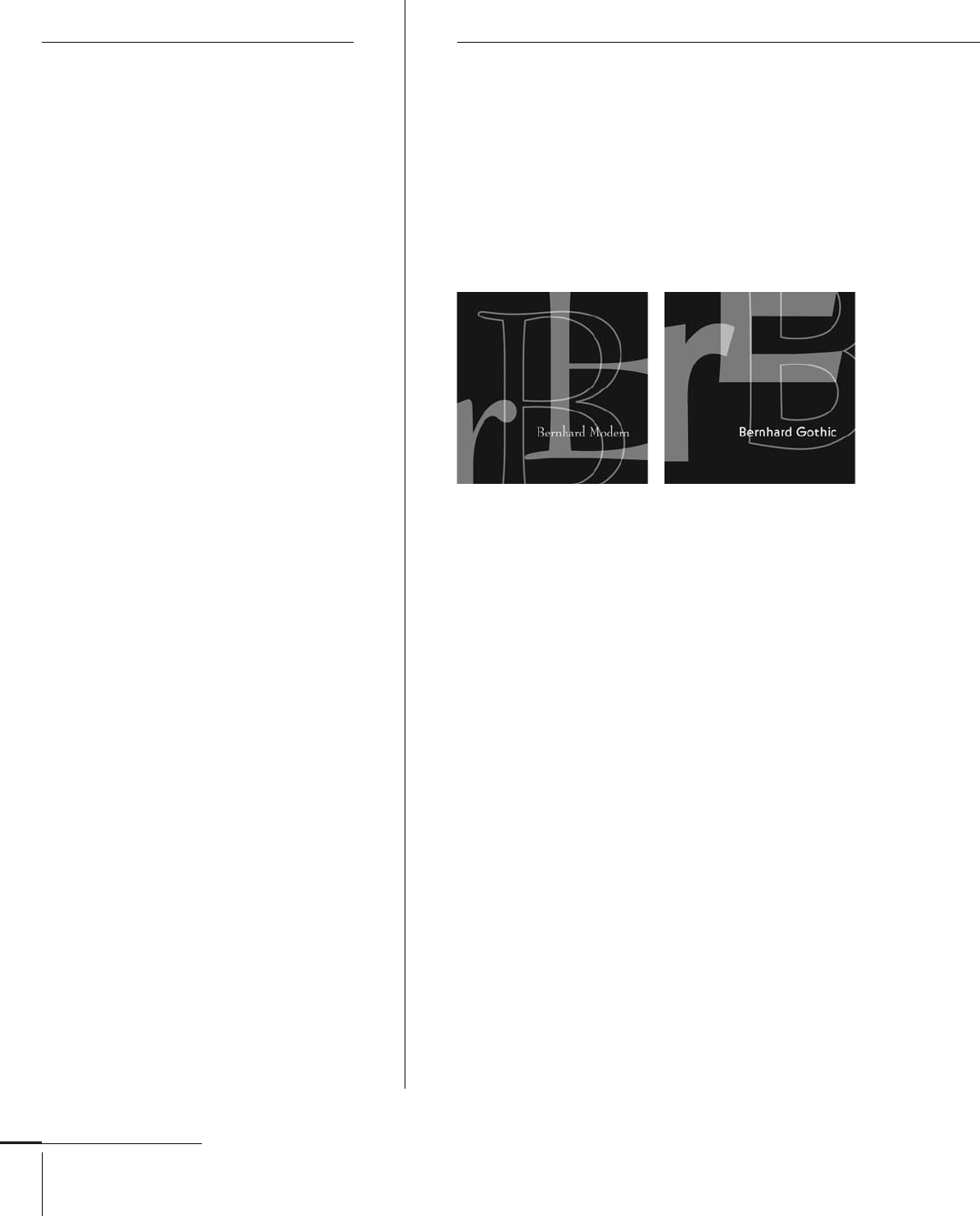
Lucian Bernhard
German, –
Typefaces: Bernhard Antiqua, Bernhard Fraktur (1912),
Bernhard Privat (1919), Bernhard Brushscript,
Bernhard Cursive Madonna, Bernhard Schönschrift, Lucian (1925),
Bernhard Bold Condensed (1926), Bernhard Handschrift (1928),
Bernhard Fashion, Bernhard Gothic (1929), Lilli, Negro (1930),
Bernhard Booklet (1932), Bernhard Tango (1934),
Bernhard Modern (1937), Bernhard Tango Swash Capitals (1939)
Lucian Bernhard (a.k.a. Emil
Kahn) was a German graphic
designer, type designer, teacher,
interior designer, and fi ne
artist during the fi rst half
of the twentieth century
(). He was born in in
Stuttgart, Germany. Though
he studied briefl y at the
Akademie in Munich, he was
largely self-taught. In ,
he moved to Berlin, where
he became a poster designer
and magazine art director.
Bernhard was infl uential
in creating two distinctive
twentieth-century design styles,
namely Plakatstil (or “Poster
Style”), which relied on reductive
imagery and fl at color, and
Sachplakat (or “Object Poster”),
which simplifi ed the image
to the object being advertised
and its brand name. Both
of these styles appear in his
renowned work for Stiller shoes,
Manoli cigarettes, and Priester
matches. He also designed
several roman typefaces
distinguished by their long
extenders. These were primarily
cut and cast by American
Type Founders and Bauer.
From until when he
immigrated to the United States,
Bernhard taught at the Akademie
der Künste in Berlin. In ,
he started the Contempora
Studio with artists Rockwell
Kent, Paul Poiret, Bruno Paul,
and Erich Mendelsohn. There
he worked as a graphic artist
and interior designer. Between
and his death in ,
Bernhard worked primarily
as a painter and sculptor.
068-121 03171.indd 82 9/22/11 4:54 PM
..................Content has been hidden....................
You can't read the all page of ebook, please click here login for view all page.